10,000 search results
(0.03 seconds)
- Geodezyx NF by Nick's Fonts,
$10.00Based on a disco-era typeface named—perhaps not surprisingly—Disco, this offering has strong geometric elements which blend together nicely to form tight, commanding healines. This font contains the complete Latin language character set (Unicode 1252) plus support for Central European (Unicode 1250) languages as well. - Dayana by Stefani Letter,
$14.00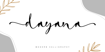 dayana is a lovely and delicate handwritten font. It looks gorgeous on wedding invitations, thank you cards, quotes, greeting cards, logos, business cards, and every other design which needs a handwritten touch, and much more! It features a varying baseline, smooth lines, gorgeous glyphs, and stunning alternates.
 - Golden Leaves by Innire,
$14.00 I am pleased to present "Golden Leaves" - a stylish floral font inspired by nature and last autumn. It is perfect for business and wedding cards, logos, branding, and much more, and well to emphasize your unique style. It is especially good to put emphasis on the text.
 - Superbrush by Hanoded,
$20.00 Superbrush is, well, a super brush font! Made with Chinese ink, a flat brush and a lot of patience. Superbrush would look great on book covers, product packaging, old school rock albums and T-shirts. Comes with a super amount of diacritics and double letter ligatures.
 - Gotten by Stringlabs Creative Studio,
$25.00 Gotten combines authenticity and elegance into one truly stunning script. Use it to turn any design project into a true piece of art! The Gotten font is a great choice to increase the prominence in your project. Although the typography is traditional, the basic elements are great.
 - Bokis by Sign Studio,
$10.00 Bokis is a sans serif family that has simple and strong characters. This font will provide a confident and impressive base headline to any of your designs. Balance on each side is well maintained. It's ideal for headlines, titles, posters, branding, and logotypes that require big impact.
 - Hebrew Latino by Wiescher Design,
$39.50 Hebrew Latino was started out of frustration. I could not find a font that looked like Hebrew - actually I found one, but it had only capitals. So I decided to make my own. Strangely enough it looks a little bit Jugendstylish! Here it is. Shalom! Gert Wiescher
 - Adelines by Gassstype,
$28.00 New font Adelinesis a handwritten brush that is 2 Style and written casually and quickly. Letters are made with brushes on Procreate. That is why Adelines has charming, authentic and relaxed characteristic more natural look to your text with a more natural look to your text.
 - Mineola by Haiku Monkey,
$10.00 Mineola got tired of being like all the other serifed fonts, got some hip body art, and moved to the cool part of town. But every so often, when no one's watching, Mineola puts on a light blue oxford shirt and listens to top 40 radio.
 - Roronoa by Gienlee,
$15.00 Yo! Welcome to gienlee cartoon, design, and other artworks Roronoa is Japanese Font. Commonly used for communication in the Japanese or Chinese language for Universal Words. Item Description Standard Glyphs (Uppercase, Lowercase, Numeral & Punctions) Works on PC & Mac No Special Software is required Do enjoy your download
 - Kelso Round by Talbot Type,
$18.00Kelso Round is a highly original, outline display font. Each character is represented by a single continuous line to create a fluid and rhythmic look. A friendly and distinctive typeface that’s both easy to read and easy on the eye. Also available as Kelso, with sharper edges. - Barkley by AdultHumanMale,
$20.00 BARKLEY is a messy pencil drawn display font. It has over 200 glyphs and several variations on the standard alphabet and those extra pesky foreign features. I wanted it to look messy and rough but also with a little heart. Buy it, I know I might.
 - Troublemarker by PizzaDude.dk,
$15.00 Real trouble is going to hit you with this font! In fact, you most like didn't know what hit you! Perhaps one of the 5 different versions of each letter?! Well, these cycles automatically as you type! Besides all the trouble, Troublemarker has got extensive language support!
 - Springloved by Almarkha Type,
$23.00 Springloved is a cute display font, carefully created to become a true favorite. Its casual charm makes it appear wonderfully down-to-earth, readable and, ultimately, incredibly versatile. Springloved will look outstanding in any context, whether it’s being used on busy backgrounds or as a standalone headline!
 - P22 BlancoNeg by IHOF,
$24.95 BlancoNeg was inspired by the lettering of Saul Bass with some thoughts of Op-Art. Each character relies on the positive and negative spaces of its neighboring letters to help define its own shape. This font is casual with the look of cut out paper forms.
 - Recreation JNL by Jeff Levine,
$29.00 Recreation JNL is Jeff Levine's own take on a popular vintage typeface from the late 50s or early 60s that's seen a resurgence in recent years. While the basic alphabet is somewhat modeled from the classic design, all the other characters in the font are original.
 - Nakata by Hanoded,
$15.00 Mr. Nakata is another one of my favorite Haruki Murakami characters. Nakata typeface is handwritten, sloppy and messy, but comes with intelligent features like alternates and ligatures, to make it look more like handwriting and less like a font. Of course, Nakata speaks most Roman-based languages.
 - Assay by Solotype,
$19.95This is our name for Antique Tuscan, of which there were many variations. This font came from a large lot purchased around 1970 from an east coast newspaper shop. Subsequently, we acquired several more versions of the face, but this one had lowercase so we used it. - Wondar Quason by Maulana Creative,
$22.00 Introducing Wondar Quason Classic Serif Typeface. Wondar Quason Classic Serif Typeface is a handmade Modern Victorian handlettering, which is combining modern and classic typography with some awesome alternates. Yes we back to early 1800s, bring classic touch on this decade. Thanks for use this font. MaulanaCreative.
 - Thrainly Sellier by Namara Creative Studio,
$12.00 Thrainly Sellier is a stylish and incredibly elegant script font, Includes uppercase and lowercase letters, numerals, punctuation, alternates, ligatures, swash and multilingual support. It looks stunning on wedding invitations, thank you cards, quotes, greeting cards, logos, business cards and every other design which needs a handwritten touch.
 - Oggie Marker by Dear Sue,
$15.00 Oggie Marker is a hand drawn thick marker display font with a textured edge. It has a raw but whimsical feel, which makes it perfect for posters, signage, menus, comics and toys/ product/ packaging for kids. Try it on themes of summer, Halloween, camping/ outdoors, and more!
 - Ottmar by Atom,
$17.00 Ottmar is a bold casual script font, created using a brush that is etched on paper with care to produce a unique and organic character. With contextual alternate and ligature it will give a very special nuance if used in the design. Hope you like it!
 - Pills by UNDT,
$45.00PILLS is a modular font based on overlayed circular and square forms, the characters have been spaced mathematically. 'PILLS' can have interesting side effects, when the leading is set very close. Feelings of anxiety, loneliness and depression can be avoided by 'PILLS'. Do not exceed daily dose. - Astrologer Symbols by Deniart Systems,
$20.00 Contains over 130 symbols based on the Western astrology system - it features the 12 zodiac signs, the 12 astrology symbols, the 12 corresponding planets, along with the 30 phases of the moon and charting signs. NOTE: this font comes with an interpretation guide in pdf format.
 - Belgravia by Scriptorium,
$24.00Belgravia is an Art Nouveau period design based on hand lettering from the 1890s. Like our popular Pantagruel font it has a lot of the elements which would influence later Psychedelic poster lettering in the 1960s. Very nice looking with a good weight for title designs. - Beta Dance - Unknown license

- Futura by Linotype,
$42.99 First presented by the Bauer Type Foundry in 1928, Futura is commonly considered the major typeface development to come out of the Constructivist orientation of the Bauhaus movement in Germany. Paul Renner (type designer, painter, author and teacher) sketched the original drawings and based them loosely on the simple forms of circle, triangle and square. The design office at Bauer assisted him in turning these geometric forms into a sturdy, functioning type family, and over time, Renner made changes to make the Futura fonts even more legible. Futura’s long ascenders and descenders benefit from generous line spacing. The range of weights and styles make it a versatile family. Futura is timelessly modern; in 1928 it was striking, tasteful, radical — and today it continues to be a popular typographic choice to express strength, elegance, and conceptual clarity. NEW: the new Futura W1G versions features a Pan-European character set for international communications. The W1G character set supports almost all the popular languages/writing systems in western, eastern, and central Europe based on the Latin alphabet including Vietnamese, and also several based on Cyrillic and Greek alphabets Futura® font field guide including best practices, font pairings and alternatives.
 - Rockinstead by PintassilgoPrints,
$35.00 Rockinstead counts 1, 2, 3, 4, 5, 6, 7, 8... Eight variations per letter, plus alternates for numbers and even for punctuation marks! It is equipped with some clever OpenType programming to make substitutions on-the-fly: the Contextual Alternates feature, with the help of a very careful kerning table, takes care of cycling the alternates in an amazing random-like way, impressively mimicking a true handwritten text. The Discretionary Ligatures feature manages the substitution of handy cursive catchwords, adding that charming twist. To put it more bluntly, this font AUTOMATICALLY alters your typing so that it substitutes glyph variations while you do nothing but type away! No need to use PopChar here to do the substitutions manually, the font itself takes care of that for you. This typeface was originally painted on paper, drawing inspiration from Ralph Steadman’s seminal lettering style. On a first glance it may look quite wild - and it proudly is, indeed. But look again: it is stylishly wild, it is strong, unpredictable, full of attitude and good energy. This multifaceted font will certainly strike its way for free-spirited design applications. Just please be warned: it’s seriously addictive!
 - Fixture by Sudtipos,
$39.00 Fixture is our massive 72-font take on plentiful offerings of the late 19th century’s typefaces, posters and wood letterpress sundry done in the Grotesk genre. Four widths ranging from Ultra Compressed to Expanded each come in nine weights and accompanying italics. Some common sans-serif alternates, such as the a and g, are included in all the fonts. The idea with this design was to put together a workhorse font family with enough functional flexibility to work in multiple environments, from the subtlety of magazine layout or film credits to the visual drama of billboards or packaging. Aesthetically speaking, it is quite interesting — though in retrospect quite unintentional — that each different width and/or weight of this face ended up pulling a different dominant trait from the melting-pot origins of the entire family. It’s almost like a tribute album to some famous band’s covers of older songs. It may also be a good conversation piece on our tools shaping the very things for which they’re used. Can’t really get any more post-Grotesk than this. In the 21st century, this is the one genre to rule them all.
 - Ambicase Fatface by Teeline Fonts,
$48.00 Most fonts include uppercase and lowercase letters. Some experimentally-minded designers have proposed unicase typefaces as well: rather than having two different forms for a given letter, unicase fonts have one, chosen from the upper- or lowercase forms. Ambicase Fatface takes the next step, offering not "either/or", but rather "both/and". Each letter in Ambicase Fatface is a combination of its traditional upper- and lowercase forms, in an extra-bold style. Its inventive, hybrid forms are a bolder take on those of its 2010 sibling typeface, Ambicase Modern. Ambicase Fatface stands out as a carefully crafted experimental font: its eccentric forms do not hinder its readability. It is suitable for high-style display settings. Ambicase Fatface offers a large character set and extensive OpenType features. Most notably, in modern OpenType-aware applications, Ambicase Fatface can be set in swash mode, which features sophisticated decorative flourishes that differ depending on whether the letter is at the beginning, middle, or end of a word. Ambicase Fatface is available in two optical sizes: Regular and Poster. At very large sizes, the Poster cut, with its finer details, is recommended.
 - FS Sammy by Fontsmith,
$80.00 Chalky Spritely and full of personality, FS Sammy is a hand-drawn font with a chalky texture, available in one weight only. Give Sammy a run in branding, packaging or billboard advertising for a fresh, informal, honest personality. Calligraphic Too many script fonts have a rushed and thrown-together feel about them. It’s a deceptively complex feat to achieve forms that hold together neatly in text yet still have the breezy, natural air of real handwriting. That’s FS Sammy: considered and crafted. Pencil FS Sammy was originally drawn for a drinks manufacturer by Fontsmith’s calligrapher, Sehmi Satwinder, who made handwritten impressions with a large soft pencil on textured watercolour paper. The digital interpretation of Sehmi’s letters was pushed to its limits and, after a lot of experimentation, a balanced alphabet was achieved. Texture and spirit FS Sammy’s success and uniqueness within the script font category is down to its versatility. In the large text of billboard advertising or headlines, all of its texture comes to life, and small, on menus or booklets, it conveys all of the spirit and personality of a considered piece of handwriting.
 - Chopper by Canada Type,
$24.95 In 1972, VGC released two typefaces by designer friends Dick Jensen and Harry Villhardt. Jensen’s was called Serpentine, and Villhardt’s was called Venture. Even though both faces had the same elements and a somewhat similar construct, one of them became very popular and chased the other away from the spotlight. Serpentine went on to become the James Bond font, the Pepsi and every other soda pop font, the everything font, all the way through the glories of digital lala-land where it was hacked, imitated and overused by hundreds of designers. But the only advantage it really had over Venture was being a 4-style family, including the bold italic that made it all the rage, as opposed to Venture’s lone upright style. One must wonder how differently things would have played if a Venture Italic was around back then. Chopper is Canada Type’s revival of Venture, that underdog of 1972. This time around it comes with a roman, an italic, and corresponding biform styles to make it a much more attractive and refreshing alternative to Serpentine. Chopper comes in all popular formats, boasts extended language support, and contains a ton of alternate characters sprinkled throughout the character map.
 - Milk Drops by Duck Soup Design,
$12.00 Milk Drops is a semi-casual-feeling cross between a didone and slab serif display font. Elegant, flourishy, whimsical and bold, as much as one font can be any or all of those things! It has highly contrasting weights, but not so much to take itself too seriously or risk legibility. Playfully, it entertains the teardrop motif wherever it can – in expected areas like the descender of a "y" and the ascender of an "f", but also in some whimsical flourishes. Many of the uses of the teardrop motif are implemented on the terminals and ears where many old prints may have suffered from bleed of ink – answering a "what if" question like "what if those accidental bleeds were designed on purpose?" or "what if a font were designed as though it was already seen through blurry eyes?" Milk Drops also features stencil-like open counters and lots of ligatures (32). Note also, it has some super-nerdy additions like symbols for Bitcoin, Pilcrow, Interrobang and Irony Mark. Language Support Milk Drops is highly versatile – with an impressive count of 470 glyphs, it can accommodate up to 78 latin-based languages.
 - MVB Diazo by MVB,
$59.00 Mundane information—the sort you might ignore—often appears in the form of very simple, utilitarian lettering, devoid of personality, the sort of industrial lettering you find on old blueprints, park restrooms, and electrical boxes. MVB Diazo is such a thing. It looks like lettering done earnestly with a plastic template. The monoline caps—constructed from straight lines and simple curves—have rounded details as if rendered by a blunt pen on a topographical survey or by a router on a rustic campground sign. The MVB Diazo fonts are compact, available in two widths: Condensed and Extra Condensed. Each width offers four weights from Light to Black. The fonts are perfect for wherever plain and boring letterforms are required. All widths and weights are also available in two distressed textures (#1 and #2) that accentuate the industrial character of the design. Rough #1 is gritty, with finer texture for use at larger sizes. Rough #2 exhibits more damage, the roughness apparent when used at smaller sizes. The Rough fonts include alternates of a number of glyphs so that variation of texture is possible when letters repeat in a word.
 - Dx Slight by Dirtyline Studio,
$39.00 Dx Slight a new fresh & modern Sans with a Ultra Condensed style. The font it’s look good in posters, it is ideally suited for setting titles. However, the font has gained wide popularity among designers, and now you can find Dx Slight on the covers of magazines, on restaurant signs and on the main pages of websites. Dx Slight Display Typeface is the part of a strong and modern display family. This typeface both impressive at display sizes and easily readable in text size, while the sharp shapes of the triangular sans and the distinctive letter shapes show their strength in logo design and impressive editorial use. Dx Slight comes with elegant style, strength, and contrasts, with features an extended Latin character set of 366 glyphs covering over 88 languages. It has been designed as a variable font to give lots of options and access to unique type looks, however, it also includes nine weights, three axis H-height and Slant to give just as much access to creativity to those without access to variable supporting software. Its distinctive character and many variables make it a versatile, stylish workhorse, great for interfaces and design.
 - Ongunkan Ogham by Runic World Tamgacı,
$50.00 This font is a latin based version of the ogham alphabet used in the writing of the old irish language. It can be used on Latin keyboards. I will make a unicode font version of this font in the future. Ogham (/ˈɒɡəm/ OG-əm, Modern Irish: [ˈoː(ə)mˠ]; Middle Irish: ogum, ogom, later ogam [ˈɔɣəmˠ] is an Early Medieval alphabet used primarily to write the early Irish language (in the "orthodox" inscriptions, 4th to 6th centuries CE), and later the Old Irish language (scholastic ogham, 6th to 9th centuries). There are roughly 400 surviving orthodox inscriptions on stone monuments throughout Ireland and western Britain, the bulk of which are in southern Munster. The largest number outside Ireland are in Pembrokeshire, Wales. The vast majority of the inscriptions consist of personal names. According to the High Medieval Bríatharogam, the names of various trees can be ascribed to individual letters. For this reason, ogam is sometimes known as the Celtic tree alphabet. The etymology of the word ogam or ogham remains unclear. One possible origin is from the Irish og-úaim 'point-seam', referring to the seam made by the point of a sharp weapon.
 - Ardela Edge by EllenLuff,
$38.00 The altered cut glyphs feature as the capitals of the font; to sample the cuts and ligatures type in ALL CAPS in the Typetester. Ardela Edge is opentype in overdrive. Its a stylised geometric sans serif family with extreme cuts, sharp angles and multi-sensory interactive ligatures. Affected characters are spread into three upper-case only subfamilies, with distinct styles, and different personalities. The bold character breaks and considered ligatures create edgy, modern type that feels like bespoke typography. Ardella Edges three subfamilies appear as - X01, X02, X03 These three styles create thousands of combinations with options from super minimal to the more experimental. This is a hands on designer package, available in 9 weights, with italic and outline faces and as a variable font - each one containing over 550 glyphs. Full European latin based language support. Ardela Edge's three family concept means all character alternates are accessible to all, on any software. The cut glyphs feature as the CAPS of the font, whilst the unaffected letters appear as the lowercase. Many subtle ligatures are accessed by typing in all caps, however to access all ligatures requires software with opentype capabilities, such as Adobe Illustrator, Photoshop, InDesign or Inkscape.
 - APF Lagoon Regular by Pomegranate,
$30.00 In 2007-8, Carolyn Puzzovio developed this OpenType typeface: Lagoon which is based on an Armenian model from the Mechitarist monastery, Venice, 1810. This project was supported by a grant from the AHRC (Arts & Humanities Research Council, UK) and won a first prize in the Granshan 08 type design competition. Oſten, Armenian digital types are designed to match the forms of Latin type characters and ‘Latinized’, by uprighting the forms; truncating ascenders and descenders and raising the x-height – but in this case the Latin characters in the OpenType font have been designed to blend in with the traditional Armenian proportions which are based on cursive forms – also incorporating some of the quirky shapes from the original model. Faithfully following the original created difficulties of ‘clashing’ characters, particularly those with long descenders, so the font contains over 100 alternative characters in the Armenian part, which will normally substitute automatically where necessary. The sloping lower case characters and upright capitals are traditional in Armenian – capitals are used less in the Armenian language. Three new characters for the Armenian unicode range are included: the Armenian dram (currency) symbol; the eternity symbol; and the index number symbol. This font which will be one of the first OpenType fonts to incorporate these newly unicoded characters.
 - Philadelphian by FontMesa,
$29.00 Philadelphian is a revival of a MacKellar, Smiths & Jordan font from 1867 by the same name. The regular version with shadow outline was the only style that was offered in 1867. We've taken the original design further by creating two additional weights of medium and bold plus plain black versions. The medium and bold weights are unique because only the horizontal strokes increase in thickness while the vertical strokes remain the same in each weight. Philadelphian Nite is the plain black version of this font family, Nite is the casual spelling of the word Night meaning dark or black. In the late 1800's Philadelphian was a very popular typeface which can be seen on many billheads and letterheads through the early 1900's. If you're looking for a western style font that doesn't look like any other then Philadelphian is the right choice. While the name doesn't remind you of the cowboy genre we've kept the original name for historical reasons because this font was so popular in its day. We plan on going forward with a weathered version of Philadelphian which will be released under a southwestern style name. With Philadelphian we've decided to set the complete family price to an amount that may be considered on sale all of the time.
 - Campeno by Craft Supply Co,
$20.00 Geometric Precision Let’s step into the world of Campeno, a Geometric Sans Serif font that embodies precision and order. This font is the epitome of geometric perfection, making it an ideal choice for various editorial applications. Editorial Excellence Campeno’s geometric form is what sets it apart and makes it a top choice for editorial needs. Whether you’re working on magazines, long-form text, or other editorial projects, its geometric precision enhances readability and offers editorial excellence. Versatile Typography What makes Campeno even more exceptional is its versatility. It seamlessly adapts to diverse design contexts, ensuring that it can be used for a wide range of projects, from magazines to websites and beyond. Engaging Readability Beyond its geometric aesthetics, Campeno excels in providing engaging readability. It guides the reader through the content, focusing on the message while maintaining a visually appealing design. In Conclusion In summary, Campeno – Geometric Sans Serif is the font that brings precision and clarity to your editorial projects. Its geometric form ensures that your content is not only engaging but also visually appealing, catering to a broad readership while maintaining a high standard of clarity. Whether you’re working on magazines, websites, or other editorial endeavors, Campeno stands out as a font that combines aesthetics with functionality, offering editorial excellence for your projects.
