8,126 search results
(0.012 seconds)
- Mister B by Bogstav,
$17.00 Mister B is my go on a handmade organic font. The letters are clumsy, with the width and height somewhat off here and there. Nevertheless, the result is a naive and charming font, which is suitable for most things that has to do with kids toys, organic products or comics.
 - Blushing Woman by Balpirick,
$15.00 Blushing Woman is a Modern Handwritten Font. Whether you’re using it for crafts, digital design, presentations, or making greeting cards, this font has the potential to become your favorite go-to font, no matter the occasion! - also multilingual support Enjoy the font! Feel free to comment or feedback! Thank you!
 - Roundabout by URW Type Foundry,
$35.99 Roundabout is a typeface that is extracted from an ellipse shape. Each and every character started at the same geometrical figure. By cutting it up in sections, twist and rotate the separate characters could be build. The ellipse provides this typeface with evident and smooth looking features. The name Roundabout is misleading, an ellipse is not round. But the word Roundabout has a nice ring to it and it seems to fit this typeface perfectly. The Roundabout as we know it is a place where the traffic circles. Sometimes in the greater metropoles it jams like clotting veins. Various exits are presented for those who know which way to go, for those who don’t it seems an eternal treadmill. Unlike my typeface, that seems rather careless, light weighted and knows her way around. A roundabout in a child’s mind is a playful carrousel or a merry go round. Merry go round has the sweetest sound and a match is found. My Roundabout is a joyful, optimistic and open typeface, which can be used over and over and over again for many or any purposes. ----- Roundabout ist eine Schrift die aus der Form einer Ellipse entstand. So teilen alle einzelnen Zeichen denselben geometrischen Ursprung. Durch das zerteilen, verdrehen und verflechten der elliptischen Grundform konnten die separaten Zeichen so geformt werden, dass sie einen klaren und weichen Charakter erhielten. Der Name Roundabout scheint auf den ersten Blick etwas irreleitend - ist eine Ellipse ja nicht wirklich rund. Er hat aber einen schönen Klang und doch eine tiefe Verbindung zu dieser Schrift. In unseren Gedanken ist Roundabout ein Kreisverkehr: Manchmal, in großen Städten, kann er blockieren, so wie eine verstopfte Ader. Verschiedenste Auswege zeigen sich denen, die ihr Ziel kennen; für alle anderen erscheint dieser Ort wie eine endlose Schlaufe. Dieses Bild widerspricht dem Auftreten meiner Schrift, welche eher sorglos und leichtfüßig ist; sie kennt ihren Weg. In dem Kopf eines Kindes jedoch ist ein Roundabout ein verspieltes Karussell, ein „merry go round“. ,,Merry go round“ klingt bezaubernd und so fiel die Entscheidung. Meine Roundabout ist eine fröhliche, optimistische und offene Schrift, die immer und immer wieder genutzt werden kann, zu jedem erdenklichen Zweck.
 - Kelvinized - 100% free

- Fleurons Three by Wiescher Design,
$39.50 Fleurons are embellishments and here is my third and so far nicest round. I found some old ones in London and made them more modern ones. These go very well with my scripts Nadine and Ellida and a lot of my other scripts!!! Yours once more in a beautiful mood, Gert Wiescher
 - Peanut Crumble by Balpirick,
$15.00 Peanut Crumble is a Handwritten Font. Whether you’re using it for crafts, digital design, presentations, or making greeting cards, this font has the potential to become your favorite go-to font, no matter the occasion! This font only has allcaps letters. Enjoy the font! Feel free to comment or feedback! Thank you!
 - London History by Attract Studio,
$13.00 Introducing London History a quirky casual handwritten font duo with a flowy script and a sans font to go with it! The font duo is perfect for branding, logo, wedding invitations, greeting cards, fashion, and all so much more! What's included: London History London History Sans Includes international language support. Happy Creating!!
 - Bought Something by Aldedesign,
$25.00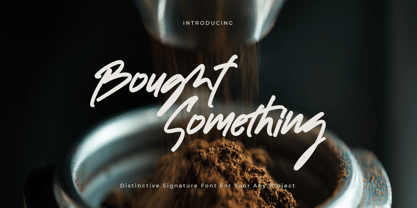 Bought Something is a simple, quirky and adaptable handwritten font. Its informal style and casual vibe will make this font a go-to choice for each of the creations that require a relaxed touch. Bought Something is PUA encoded which means you can access all of the glyphs and swashes with ease!
 - Bodoni Classic Swirls by Wiescher Design,
$39.50 Bodoni Classic Swirls breaks all the rules. The idea of Bodoni typefaces is no embellishments and here I go again and do another decorated set of Bodonis. But I find this is another very nice and useful typeface for all kinds of cards and certificates. Enjoy! Yours, again breaking the rules, Gert Wiescher
 - Zero Output by PizzaDude.dk,
$15.00 You may recognize the shapes of this font - it's because it's my Universitet font, but this time it took some beating, and turned into a grunge font! The output was Zero Output! It has 5 different versions of each letter and of course multilingual support! Go ahead and grunge up your next project!
 - American Oak by Ian Barnard,
$15.00 I've always been drawn to the beautiful typography of whiskey, gin, rum & bourbon bottle labels, as they enhanced the history that is behind this aged old spirits. A combination of elegant scripts and rugged serifs, these labels give sensibility to the slow process which these spirits go through in the distilling process.
 - P22 Tyndale by IHOF,
$24.95Quill-formed roman/gothic with an olde-worlde flavor. Some background in the designer's own words: "A series of fonts came to mind which would be rooted in the medieval era -for me, a period of intense interest. Prior to Gutenberg's development of commercial printing with type on paper in the mid-1400s, books were still being written out by hand, on vellum. At that time, a Bible cost more than a common workman could hope to earn in his entire lifetime. Men like William Tyndale devoted their energies to translating the Scriptures for the benefit of ordinary people in their own language, and were burned to death at the stake for doing so. Those in authority correctly recognized a terminal threat to the fabric of feudal society, which revolved around the church. "This religious metamorphosis was reflected in letterforms: which, like buildings, reflect the mood of the period in which they take shape. The medieval era produced the Gothic cathedrals; their strong vertical emphasis was expressive of the vertical relationship then existing between man and God. The rich tracery to be seen in the interstices and vaulted ceilings typified the complex social dynamics of feudalism. Parallels could be clearly seen in Gothic type, with its vertical strokes and decorated capitals. Taken as a whole, Gothicism represented a mystical approach to life, filled with symbolism and imagery. To the common man, letters and words were like other sacred icons: too high for his own understanding, but belonging to God, and worthy of respect. "Roman type, soon adopted in preference to Gothic by contemporary printer-publishers (whose primary market was the scholarly class) represented a more democratic, urbane approach to life, where the words were merely the vehicle for the idea, and letters merely a necessary convenience for making words. The common man could read, consider and debate what was printed, without having the least reverence for the image. In fact, the less the medium interfered with the message, the better. The most successful typefaces were like the Roman legions of old; machine-like in their ordered functionality and anonymity. Meanwhile, Gutenberg's Gothic letterform, in which the greatest technological revolution of history had first been clothed, soon became relegated to a Germanic anachronism, limited to a declining sphere of influence. "An interesting Bible in my possession dating from 1610 perfectly illustrates this duality of function and form. The text is set in Gothic black-letter type, while the side-notes appear in Roman. Thus the complex pattern of the text retains the mystical, sacred quality of the hand-scripted manuscript (often rendered in Latin, which a cleric would read aloud to others), while the clear, open side-notes are designed to supplement a personal Bible study. "Tyndale is one of a series of fonts in process which explore the transition between Gothic and Roman forms. The hybrid letters have more of the idiosyncrasies of the pen (and thus, the human hand) about them, rather than the anonymity imbued by the engraving machine. They are an attempt to achieve the mystery and wonder of the Gothic era while retaining the legibility and clarity best revealed in the Roman form. "Reformers such as Tyndale were consumed with a passion to make the gospel available and understood to the masses of pilgrims who, in search of a religious experience, thronged into the soaring, gilded cathedrals. Centuries later, our need for communion with God remains the same, in spite of all our technology and sophistication. How can our finite minds, our human logic, comprehend the transcendent mystery of God's great sacrifice, his love beyond understanding? Tyndale suffered martyrdom that the Bible, through the medium of printing, might be brought to our hands, our hearts and our minds. It is a privilege for me to dedicate my typeface in his memory." - Unava by Myristica,
$15.00 The font is inspired by the history of the native land - a city that blossoms on a high mountain, surrounded by the blue ribbon of the Unava River. The swift rapidity of the river, the important slow flow of its reservoirs, golden beaches and steep banks of which remember the glorious times of Cossack glory. Times when bright flags flew over the Cossack army, which swiftly swept the green meadows with lightning cavalry, and dusty paths under the scorching sun. To go out to defend their homes, to cross the cold steel of ringing sabers with the enemy, and, bravely going into battle, to fight back the invaders. The font combines the straight lines of sharp steel sweeps, the broken lines of jousting blows, and the refinement of the accent of undulating flag lines.
 - Budmo Jiggler - Unknown license

- Degrassi - 100% free

- Contour Generator - Unknown license

- Crystal Radio Kit - Unknown license

- Carbon Block - Unknown license

- Dyspepsia - Unknown license

- DirtyBakersDozen - Unknown license

- Droid - Unknown license

- CrackMan - Unknown license

- Deftone Stylus - Unknown license

- Burnstown Dam - Unknown license

- Credit River - Unknown license

- Duality - Unknown license

- Die Nasty - 100% free

- Dendritic Voltage - Unknown license

- Coolvetica - Unknown license

- Butterbelly - Unknown license

- Cretino - Unknown license

- Charles in Charge - Unknown license

- Boron - Unknown license

- Counterscraps - Unknown license

- Cranberry Gin - Unknown license

- Dignity Of Labour - Unknown license

- Mucho Sans by Fontforecast,
$17.00 Mucho Sans is a geometric sans serif type family that comes in six weights with matching Italics. The design is very clean, yet friendly and modern. Some of its characteristics are the generous x-height, the Ascender-height that matches the Cap-height, the friendly looking real italics and the low contrast. The result is a contemporary versatile type family that is excellently suited for both display and text uses and that supports a wide range of languages. Mucho Sans is equipped with many Opentype features such as five numeral styles, numerators, denominators, superiors, inferiors, automatic fractions, alternative a and g, case sensitive forms and ordinals.
 - Hello Sierra Sans by Letterhend,
$17.00 Hello Sierra is a pair of font that brings the fun, playful look with feminine feel. The handwritten sans serif combined with the natural hand writing script are the perfect match for you who needs a typeface for headline, logotype, apparel, invitation, branding, packaging, advertising etc. Features : 2 fonts (sans serif and script font) uppercase & lowercase numbers and punctuation multilingual alternates & ligatures PUA encoded We highly recommend using a program that supports OpenType features and Glyphs panels like many of Adobe apps and Corel Draw, so you can see and access all Glyph variations. How to access opentype feature : letterhend.com/tutorials/using-opentype-feature-in-any-software/
 - Hando by Eko Bimantara,
$24.00 Being one of the most popular font style; Neo Grotesk, Hando offers a wide range of usage possibilities. It's low x-height and variety of light size options make it a good choice for reading, it's tenuous white spaces in the counter letterforms make it legible enough to be recognized remotely. It's curve tensions on the circular letterforms gave a futuristic impression. It's sleek and simple strokes make it perfect for a broad range design purposes. Hando consist of 10 syles from Hairline to Black with each matching oblique. Contain more than 440 glyphs that support a broad latin languages. Also some Opentype features e.g. stylistic alternates, variation of figures, e.t.c
 - Abigile by HansCo,
$15.00 Abigile is a beautiful and modern script font. It features an incredibly classic style, while still keeping a friendly feel. Abigile is the perfect font for making original and outstanding designs. Its casual charm makes it appear wonderfully down-to-earth, readable and, ultimately, incredibly versatile. Abigile will look outstanding in any context, whether it’s being used on busy backgrounds or as a standalone headline! Comes with a full uppercase, lowercase, numbers and punctuation + standard multilingual support. It’s great for branding, logo designs, lettering, logotype, craft, posters, packaging and much more. We recommend using Adobe Illustrator or Photoshop. Tutorial how to Install & use Alternate / Special Character : https://hanscostudio.com/tutorial/ Enjoy!


