10,000 search results
(0.184 seconds)
- Goudy Two Shoes by Canada Type,
$24.95Goudy Two Shoes is a digitization and expansion of a 1970s type called Goudy Fancy, which originated with Lettergraphics as a film type, then was released into the dry transfer (rub-on) arena, where it became really popular. This digital expansion of the original design contains many additional characters, including "plain" variants on the caps, as well as extra alternates and swashes, and even a few curly ornaments. Goudy Two Shoes comes in all popular font formats. The Postscript and True Type versions ship as 2 fonts, while the OpenType version is a single font programmed with features for OT-savvy applications. - Goudy Text CT by CastleType,
$19.00 This version of Goudy Text is based on drawings from which Frederic Goudy based his Goudy Text typeface. However, there is a big difference between his original drawings (in The Alphabet and Elements of Lettering) and the subsequent metal type version, and my version maintains the greater warmth (and irregularities) of the original drawings. Goudy's Lombardy caps look especially nice when used as initial capitals with Goudy Text.
 - ITC Goudy Sans by ITC,
$29.99 Frederic W. Goudy designed three weights of this friendly-looking sans serif font from 1922-1929 for Lanston Monotype in the United States. Goudy was attempting to impart freedom and personality to the sans serif form at a time when geometric sans serifs, such as Futura, were gaining rapid world-wide popularity. To achieve this challenging goal, he looked to lapidary inscriptions and manuscript writing for inspiration. He included elements such as slight swellings of terminal strokes, slab serifs on a few of the caps, alternate uncial forms, and a few swash strokes. The result is uniquely Goudy: charming, instinctive, and just right for adding warmth to magazine or advertising layouts. The design staff at ITC updated and filled out the family for a total of eight styles in ITC Goudy Sans. ITC Goudy Sans® font field guide including best practices, font pairings and alternatives.
 - Monotype Goudy Catalogue by Monotype,
$29.99Originally designed for American Type Founders, Goudy drew inspiration from the classical old style faces for Goudy Old Style. Round characters have a strong diagonal stress, ascenders are fairly long but descenders are very short. Goudy bold was introduced in 1920; this was designed by Morris Fuller Benton. This typeface has been particularly popular in America where it is extensively used in advertising, book jackets, for labels and packaging. - LTC Goudy Extras by Lanston Type Co.,
$24.95 A set of over 50 ornaments, connecting borders, flourishes and decorative motifs originally designed by Frederic Goudy throughout his career. Many of these designs were used by Goudy at his Village Press and offered by his Village Foundry in the 1920s. The styles range from complex title page illustrations to simple linking borders, but all have the unique Goudy style. This set is completely different from the Goudy Ornaments found in the P22 Goudy Aries Set.
 - Goudy Handtooled SH by Scangraphic Digital Type Collection,
$26.00Since the release of these fonts most typefaces in the Scangraphic Type Collection appear in two versions. One is designed specifically for headline typesetting (SH: Scangraphic Headline Types) and one specifically for text typesetting (SB Scangraphic Bodytypes). The most obvious differentiation can be found in the spacing. That of the Bodytypes is adjusted for readability. That of the Headline Types is decidedly more narrow in order to do justice to the requirements of headline typesetting. The kerning tables, as well, have been individualized for each of these type varieties. In addition to the adjustment of spacing, there are also adjustments in the design. For the Bodytypes, fine spaces were created which prevented the smear effect on acute angles in small typesizes. For a number of Bodytypes, hairlines and serifs were thickened or the whole typeface was adjusted to meet the optical requirements for setting type in small sizes. For the German lower-case diacritical marks, all Headline Types complements contain alternative integrated accents which allow the compact setting of lower-case headlines. - Monotype Goudy Modern by Monotype,
$29.99First cut by Lanston Monotype, the Goudy Modern font family was based on designs used by French engravers during the eighteenth century. Although called a modern it possesses a number of old style characteristics. Capitals are much shorter than the ascenders, serifs are fully bracketed and round shapes have a slight stress. The overall weight of Monotype Goudy Modern is on the heavy side, giving good emphasis in display sizes but it is not too heavy for use in text. - LTC Goudy Oldstyle by Lanston Type Co.,
$39.95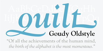
- LTC Goudy Sans by Lanston Type Co.,
$24.95 Goudy Sans Bold was originally designed by Fredric Goudy in 1922 as a less formal "gothic" and finished in 1929. The light was designed in 1930 and the Light Italic in 1931. Alternate letterforms are included in these three Goudy designs which are digitized true to their original design. In 2006, designer Colin Kahn drew "LTC Goudy Sans Regular" which is a medium weight version intended for text purposes. Kahn has also designed an experimental "LTC Goudy Sans Hairline" which has a skeletal almost mono-width stroke and results in a surprisingly elegant display face.
 - Goudy Old Style by Bitstream,
$29.99 Inspired by the Froben capitals believed to have been cut by Peter Schoeffer the Younger, son of Gutenberg’s apprentice, this design is neither strictly a Venetian nor an Aldine. The archaic approach and lack of the Aldine model lead us to place the face in the Venetian group. The design owes more to Goudy than to Schoeffer.
 - P22 Goudy Aries by P22 Type Foundry,
$24.95 Frederic W. Goudy (1865-1947) created over 100 typefaces during his lifetime. Like most type designers, he is known principally to most people only through his eponymously titled faces such as Goudy Modern, Goudy Old Style etc. This set includes one of Goudy's rarest Arts & Crafts styled faces, a font known as Aries. The font was originally created by Goudy for a private press in Eden, New York in 1926. Also included in this set are two decorative fonts: one font of 52 decorative Ornaments & one font that contains 52 Ampersands.
 - LTC Goudy Initials by Lanston Type Co.,
$24.95LTC Goudy Initials has been a best-seller since it was reformatted to font format by P22 in 2005. We decided that while it works very well at medium sizes, when it was used extra large, the outlines were not as true to Frederic Goudy’s 1917 drawings as they could be. We decided to redraw from the ground up—and here we have the NEW LTC Goudy Initials! Meticulously redrawn by Miranda Roth, these ornaments referenced original proofs of large sizes of Cloister Initials. In our quest for artwork for this project, we even arranged a quickly sold out recasting of the 120 point size and have produced a limited edition letterpress print from this casting This new digital version features two additional layers to allow for quick colorizing of the central letter and/or the floriated background. Registered users of the previous version of LTC Goudy Initials may upgrade to the set at a discount. - Goudy Catalogue EF by Elsner+Flake,
$35.00 - LTC Goudy Thirty by Lanston Type Co.,
$24.95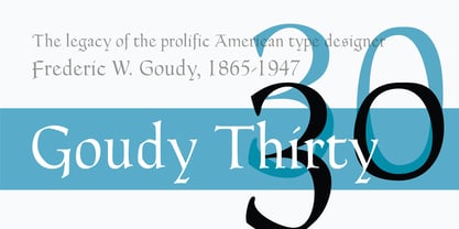
- Astra Goldie by Putracetol,
$28.00 Astra Goldie font makes for more elegant, trendy and more lively. This font is inspired by the bold font style and well balanced lines.This font has a surprise from alternate that will make your work even more beautiful. This font is perfect for a professional touch which makes it even more unique and classic. But this font is also suitable for logos, branding, greeting cards, invitation cards, advertisements, titles, healines, book titles, stickers, packaging, quotes, posters, t-shirts/apparel, billboards and others. The alternative characters were divided into several Open Type features such as Swash, Stylistic Sets, Stylistic Alternates, Contextual Alternates, and Ligature. The Open Type features can be accessed by using Open Type savvy programs such as Adobe Illustrator, Adobe InDesign, Adobe Photoshop Corel Draw X version, And Microsoft Word. This font is also support multi language.
 - Retro Goldy by Nirmana Visual,
$22.00 Introducing our new retro style font, designed to take you back to the good old days. With its bold and playful design, this font is perfect for creating eye-catching designs that evoke nostalgia and fun. Inspired by the groovy typography of the 60s and 70s, this font features thick and rounded letterforms, playful curves, and a distinct retro feel. Its versatility and legibility make it a great choice for a wide range of projects, from branding and packaging to posters and social media graphics.
 - Goodie Bag by Hanoded,
$15.00 The correct spelling, apparently, is Goody Bag. But I like it with an ‘ie’ ending. Goodie bag is a 4 member display font family. Use it for your book designs, magazines or websites - maybe even for the goodie bag you want to hand out!
 - Gaudi ND by Neufville Digital,
$29.60 Gaudí ND was designed in 1962 by Ricard Giralt Miracle and awarded with a Delta d’Or from ADIFAD. It combines the constructive spirit of the lapidary Roman with the modern sans serif. The rectangular endings constitute a recurring rhythm, resulting in a futuristic character that refers to a digital context and the interior life of computers. Gaudí is a Trademark of BauerTypes SL.
 - Goldie Rainbow by Balpirick,
$15.00 Goldie Rainbow is a flowing and lovely handwritten font, created with the help of a beautiful brush pen. Fall in love with its incredibly versatile style and use it to create gorgeous wedding invitations, beautiful stationary art, eye-catching social media posts, and much more!
 - Goodies Stencil by Sohel Studio,
$16.00 Say hi to “Goodies Stencil” Modern Stencil Serif . That has a unique style & luxurious look. This typeface is perfect for an elegant & luxury logo , classy editorial design, women's magazine, fashion brand , cosmetic brand, fashion promotion , modern advertising design, invitation card, art quote, home decoration , book/cover titles, special events, and much more. Goodies Stencil Features: · 2 Weights font (Regular,Italic) · Uppercase And Lowercase · Numerals & Punctuation · Accented characters · Multilingual Support · Unicode PUA Encoded While using this product, if you encounter any problem or spot something we may have missed, please don't hesitate to drop us a message. We'd love to hear your feedbacks in order to further fine-tune our products. Thanks and have a wonderful day
 - Sunny Goldie by Maulana Creative,
$12.00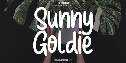 Sunny Goldie is a natural handwritten font. With regular mono-line stroke, fun character with a bit of ligatures. To give you an extra creative work. Sunny Goldie font support multilingual more than 100+ language. This font is good for logo design, Social media, Movie Titles, Books Titles, a short text even a long text letter and good for your secondary text font with sans or serif. Make a stunning work with Sunny Goldie font. Cheers, MaulanaCreative
 - Goody Buttie by Zamjump,
$13.00 Hello goody butty is a laid-back, casual paint brush handwriting font. Whatever the topic, this font will be a wonderful asset to your font library, as it has the potential to enhance any creation. Included uppercase and lowercase multi language ligature
 - Goldie Boxing by Balpirick,
$15.00 Goldie Boxing is a Bold Brushed Handdrawn Font. Goldie Boxing is a bold display font with an autumn theme. Add this chunky lettered font to your designs and notice how it makes them come alive! Goldie Boxing also multilingual support. Enjoy the font, feel free to comment or feedback, send me PM or email. Thank you!
 - Goldie Sans by Blythe Green,
$15.00 Goldie Sans is a clean sans serif that is perfect for logos, quotes, long-form copy, and more. Both uppercase and lowercase are included in light and bold, but I am particularly fond of using it as an all caps font for logos, headlines, and short quotes. INCLUDED uppercase letters lowercase letters numbers & punctuation light and bold fonts foreign language characters
 - Marcus Traianus by Eurotypo,
$48.00 The famous lettering “Capital Trajana” (inscription at the bottom of the column that bears its name erected in the year114 A.D.) is usually identified as the classic example that defines Imperial Capital forms. However, much earlier, there were already countless examples of Greco-Roman epigraphy of excellent execution, as evidenced by the monumental inscriptions from year 2 b.C. sculpted in the Portico di Gaio e Lucio Cesari in front of the facade of the Basilica Emilia, in the Roman Forum, erected by Augustus, dedicated to his two grandchildren for propaganda and dynastic needs. It has been more than two thousand years and the forms of these letters are still part of our daily life, product of their qualities of readability and beauty. It is probably the added semantic value that have made them an icon full of symbolism that expresses majesty, monumentality, order and universal power. Numerous authors, calligraphers and designers have studied this legacy such as Giovanni Francesco Cresci, Edward Catich, L.C. Evetts, Armando Petrucci, Carol Twombly, John Stevens, Claude Mediavilla, just to name a few. Marcus Traianus font is a fitted version of the two models mentioned, which is accompanied by Small Caps, lowercase (carolingas) and a set of numbers (Indo-Arabics) in addition to the Romans figures and diacritics for Central European languages Marcus Traianus is presented in two weight: Regular, Italic, Bold and ExtraBold.
 - FS Truman by Fontsmith,
$80.00 Beyond broadcast Like Truman Burbank, the star of The Truman Show, FS Truman was born for TV. You’ll know it from Sky One’s on-screen trails and announcements, but it’s just as at home in other media. Its starting point was the skeleton of a highly legible, space-saving, corporate font with some of FS Dillon’s geometric discipline built in. Its distinctive tone of voice and “ownability” are in its boxy but friendly shapes, and characters with hybrid features. FS Truman’s weights and widths were honed to work at TV screen resolutions. A face for TV it may have been, but this is a font that works on every level, on screen, in print, in headlines, in listings, in longer text, in tight corners and open spaces. The space-saver Compact, condensed but crystal clear, FS Truman comes into its own where a lot needs to be said in not a lot of space. Its letter spacing allows the type room to breathe, even at small sizes, while its fulsome x-height and diminutive descenders pave the way for tighter leading. A natural for headlines and titles over three or four lines. “Hybrid” features With every font, Fontsmith look for crafty new ways to imbue letterforms with a consistent character. The idea with FS Truman was to introduce “hybrid” features. In open letters such as “c” and “s”, for example, the top terminals have straight, vertical cuts while their lower terminals have a more angular, cursive finish. Boxy, spacious forms with unusual curves and angles create not just highly legible and efficient letters but strongly distinctive ones, too.
 - PGF Trajanite by PeGGO Fonts,
$29.00 “PGF-Trajanite” is a simple Roman typeface, with capital letters inspired on classical Trajan schemmas such regular square and circle, simple and double root five, early ideas based on the golden ratio, while lowercase have more organic but yet balanced proportions with short ascenders/descenders stems allowing more air to flow between textlines, both (capitals and lowercases) optically adjusted to deliver a better reading experience. Due to simple and universal look it result in versatile typeface perfectly suitable for branding, packaging, label design, UI Interface design. Include standard and discretionary ligatures, alternate glyphs, oldstyle numers, various numerical arrangements. Altogether you will find this a very clean, fashionable, and elegant typeface.
 - Medina by Hatftype,
$15.00 Medina - Cute Valentine Display Font is a font with distinctive handwritten characters perfect for branding projects, logos, wedding designs, media posts, advertisements, product packaging, product designs, labels, photography, watermarks, invitations, stationery, and any project who need handwritten dishes. Features : • Character Set A-Z • Numerals & Punctuations (OpenType Standard) • Accents (Multilingual characters) • Ligature. Multilingual Support : Afrikaans, Albanian, Asu, Basque, Bemba, Bena, Catalan, Chiga, Cornish, Danish, English, Estonian, Faroese, Filipino, Finnish, French, Friulian, Galician, German, Gusii, Icelandic, Indonesian, Irish, Italian, Kabuverdianu, Kalenjin, Kinyarwanda, Low German, Luo, Luxembourgish, Luyia, Machame, Makhuwa-Meetto, Makonde, Malagasy, Malay, Manx, Morisyen, North Ndebele, Norwegian Bokmål, Norwegian Nynorsk, Nyankole, Oromo, Portuguese, Romansh, Rombo, Rundi, Rwa, Samburu, Sango, Sangu, Scottish Gaelic, Sena, Shambala, Shona, Soga, Somali, Spanish, Swahili, Swedish, Swiss German, Taita, Teso, Vunjo, Zulu. There it is. I really hope you enjoy it. Comments & likes are always welcome and accepted.
 - Helium by Red Rooster Collection,
$45.00 Re-tooled from the QBF Collection.
 - Medika by MC Creative,
$15.00 Medika is a sweet and a natural script stylish script. Medika Modern Calligraphy is perfect for branding wedding designs, invitation, social media posts, advertisements, product packaging, product designs, label, projects, logo, photography, watermark,stationery and any projects that need handwriting taste. What’s Included : · Standard glyphs · Ligature · Works on PC & Mac · Simple installations · Accessible in the Adobe Illustrator, Adobe Photoshop, Adobe InDesign, even work on Microsoft Word. · PUA Encoded Characters – Fully accessible without additional design software. · Fonts include multilingual support for; ä ö ü Ä Ö Ü ß ¿ ¡ Thank you for your purchase! Hope you enjoy with our font!
 - Radium by Typespec,
$32.00 Radium is a futuristic display face with a robust attitude and sharp geometric ideals. Drawing inspiration from computer games, graffiti and nineties dance music, Radium is a versatile typeface for branding, posters, packaging and point of sale. Radium is available in three weights and comes in OpenType (.otf) format for Mac and Windows. Features: Radium supports the following OpenType features: Standard ligatures, discretionary ligatures, ordinals, custom fractions, numerators, denominators, superscript, scientific inferiors, proportional and tabular lining figures, and a slashed zero. Supported Languages: Each weight has a 528 glyph character set for use in the following Latin languages: Albanian, Afrikaans, Basque, Bosnian, Breton, Catalan, Croatian, Czech, Danish, Dutch, English, Esperanto, Estonian, Faroese, Finnish, French, Gaelic, German, Greenlandic, Hungarian, Icelandic, Indonesian, Irish, Italian, Latvian, Lithuanian, Luxembourgish, Maltese, Norwegian, Occitan, Polish, Portuguese, Romanian, Sami, Serbian (Latin), Slovak, Slovene, Sorbian, Spanish, Swedish, Swahili, Turkish, Walloon and Welsh.
 - Mediator by ParaType,
$30.00 Mediator is a balanced contemporary sans serif typeface that performs well both in display sizes and body text. The family contains 30 fonts in 3 widths: 8 romans with matching italics, of slightly extended proportions, from Thin to Black; 7 narrow and 7 condensed, from Thin to ExtraBold. The character set in normal upright faces was expanded to include small caps and all faces include old style figures. The typeface was designed by Manvel Shmavonyan with the participation of Alexander Lubovenko and released by ParaType in 2016.
 - Cesium by Hoefler & Co.,
$51.99 An inline adaptation of a distinctive slab serif, Cesium is an unusually responsive display face that maintains its high energy across a range of different moods. The Cesium typeface was designed by Jonathan Hoefler in 2020. An energetic inline adaptation of Hoefler’s broad-shouldered Vitesse Black typeface (2000), Cesium is named for the fifty-fifth member of the periodic table of the elements, a volatile liquid metal that presents as a scintillating quicksilver. From the desk of the designer, Jonathan Hoefler: I always felt that our Vitesse typeface, an unusual species of slab serif, would take well to an inline. Vitesse is based not on the circle or the ellipse, but on a less familiar shape that has no common name, a variation on the ‘stadium’ that has two opposing flat edges, and two gently rounded sides. In place of sharp corners, Vitesse uses a continuously flowing stroke to manage the transition between upright and diagonal lines, most apparent on letters like M and N. A year of making this gesture with my wrist, both when drawing letterforms and miming their intentions during design critiques, left me thinking about a reduced version of the typeface, in which letters would be defined not by inside and outside contours, but by a single, fluid raceway. Like most straightforward ideas, this one proved challenging to execute, but its puzzles were immensely satisfying to solve. Adding an inline to a typeface is the quickest way to reveal its secrets. All the furtive adjustments in weight and size that a type designer makes — relieving congestion by thinning the center arm of a bold E, or lightening the intersecting strokes of a W — are instantly exposed with the addition of a centerline. Adapting an existing alphabet to accommodate this inline called for renovating every single character (down to the capital I, the period, and even the space), in some cases making small adjustments to reallocate weight, at other times redesigning whole parts of the character set. The longer we worked on the typeface, the more we discovered opportunities to turn these constraints into advantages, solving stubbornly complex characters like € and § by redefining how an inline should behave, and using these new patterns to reshape the rest of the alphabet. The New Typeface The outcome is a typeface we’re calling Cesium. It shares many of Vitesse’s qualities, its heartbeat an energetic thrum of motorsports and industry, and it will doubtless be welcome in both hardware stores and Hollywood. But we’ve been surprised by Cesium’s more reflective moods, its ability to be alert and softspoken at the same time. Much in the way that vibrant colors can animate a typeface, we’ve found that Cesium’s sensitivity to spacing most effectively changes its voice. Tighter leading and tracking turns up the heat, heightening Cesium’s sporty, high-tech associations, but with the addition of letterspacing it achieves an almost literary repose. This range of voices recommends Cesium not only to logos, book covers, and title sequences, but to projects that regularly must adjust their volume, such as identities, packaging, and editorial design. Read more about how to use Cesium. About the Name Cesium is a chemical element, one of only five metals that’s liquid at room temperature. Resembling quicksilver, cesium is typically stored in a glass ampule, where the tension between a sturdy outer vessel and its volatile contents is scintillating. The Cesium typeface hopes to capture this quality, its bright and insistent inline restrained by a strong and sinuous container. Cesium is one of only three H&Co typefaces whose name comes from the periodic table, a distinction it shares with Mercury and Tungsten. At a time when I considered a more sci-fi name for the typeface, I learned that these three elements have an unusual connection: they’re used together in the propulsion system of nasa’s Deep Space 1, the first interplanetary spacecraft powered by an ion drive. I found the association compelling, and adopted the name at once, with the hope that designers might employ the typeface in the same spirit of discovery, optimism, and invention. —JH Featured in: Best Fonts for Logos
 - Reditum by Mans Greback,
$59.00
- Modicum by Elemeno,
$10.00 - Podium by Identikal Collection,
$23.00 - LT Festive Medium - 100% free

- Wiegel Latein Medium - 100% free

- Tt-Kp Medium - Unknown license

- COM4t Sans Medium - Unknown license


