10,000 search results
(0.034 seconds)
- Ballyhaunis NF by Nick's Fonts,
$10.00Lewis F. Day, in his 1910 classic Alphabets Old and New, filed this work by Laurence Schall under the category of Celtic-inspired, and surely it is both. This font included a few special extras, including a Celtic cross in the florin position, a Celtic knot is the dagger position, a shamrock as the asterisk, and a double shamrock in the double-dagger position. Both versions of this font include the Latin 1252 and Central European 1250 character sets. - Inverted Squircle by Aurora Borealiz Design,
$- What is an inverted squircle? To answer that we must first identify a squircle, which is a square with rounded edges. An inverted squircle isn't just a regular old square. It is a square with inverted rounded edges. This font is a modular font designed to create inverted rounded square edges. This font was created with using just a few shapes stacked and rotated to make a unique, digital font with a little bit of quirky personality.
 - Docket by Parker Creative,
$18.00 With it's distressed markings and rough edges, Docket mimics the appearance of a vintage typewriter from the 1940s. With Docket, you can quickly create graphics with an instant classic feel, and it's application is quite versatile. Create logos, stamps, sublimation designs, social media quotes, monogram products, and even websites with this bohemian typewriter font! Docket's characters are proudly hand-crafted, meticulously kerned, and come in two variations to capture the unique look of an old grunge typewriter.
 - New Romantine by Orenari,
$18.00 Hi! It's Orenari here want to introduce a romantic display serif font, New Romantine. This font has lovely curves and almost of all the uppercase and lowercase has stylishtic alternates. The fact of this font is Romantine was my very first font. This New Romantine is the newer version of Romantine. It's bolder than the old version. Just launch the New Romantine in February so this font will bring the Valentine's Vibe to your creative projects.
 - Message by Wire JNL by Jeff Levine,
$29.00 A Western Union telegram from 1951 provided the typographic inspiration for Message by Wire JNL, which is available in both regular and oblique versions. Unlike other available type fonts which emulate the ink ribbon-struck printed characters from the teletype machines, this version was redrawn to celebrate the actual type design itself. The typeface letter spacing has been equalized so that when in use, it looks much like the printed output of an old telegram messsage.
 - Aberfoyle by Mysterylab,
$19.00 Aberfoyle is an elegant and ornate modern condensed serif. It’s a great choice for unique branding and banners of anything from gourmet food packaging, to high-end accessories and cosmetics, to winter holiday headline vibes. With its old-world flair, it features a wealth of eye-catching details and a whimsical variety in its approach to letter width and shape. Aberfoyle straddles two worlds, referencing historical embellishment traditions, but squarely looking forward into the future of typographic design.
 - LeKing by Misprinted Type,
$39.00 LeKing is a Frankenstein of vintage ornamental typefaces of the past centuries. Each character is a collage of different bits of different letters. The font has the classic elegant feel of the old ornamental typefaces, combined with a modern and edgy feel. It has 2 uppercase variations, so you can mix letters without repeating them or find the exact type that suits your needs. Le King also comes with an EPS file with 24 vector ornaments! Enjoy!
 - Snow Job JNL by Jeff Levine,
$29.00 Snow Job JNL was inspired by the hand lettered titles for the 1964 Rankin-Bass animated holiday classic "Rudolph the Red Nosed Reindeer". Because of the variable heights of the characters they float about the baseline in a free-form design. Available in both regular and oblique versions, the typeface gets its name from both the winter theme of the TV special along with the old term for deceiving someone with compliments while hiding one's true intent.
 - Billsville by Chank,
$49.00Billsville is a fun font that mixes the casual sassy flair of an old Flintstone cartoon with the upright legible nature of a classic serif font to create something entirely new. Although based primarily on straight lines and simple letterforms, Billsville has got softly rounded corners that make everything seem softer. A friendly, versatile display font named after Williamstown, MA, home of a website called Tripod who originally commissioned this font for their members in 1997. - Night Wind Sent by Ana's Fonts,
$12.00 Night Wind Sent is an elegant handwritten script font family inspired by old-fashioned handwritten postcards and letters. It includes ligatures (for a true handwritten feel), stylistic alternates, handwritten small caps, and swashes (for an extra bit of drama). Plus! Extra versions of the font: underline and strikethrough, and an ornaments font, to help decorate your text. Night Wind Sent is perfect for any design that needs a handwritten look, such as signatures, notes and quotes, logos and branding.
 - Merisk by Imoodev,
$20.00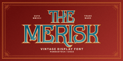 Merisk is old fonts with visual elegance, smooth curves, and beautiful ligatures clear, making your work look true and attractive. A very versatile font that works in both large and small sizes. This font is suitable for a wide variety of projects such as invitations, logos, branding, magazine, photography, card, product packaging, mugs, quotes, poster, labels, signatures, and more. Font which is perfect for all business sectors including personal projects, studio, corporate, creative agency, industrial, company, etc.
 - Brer Rabbit by Kitchen Table Type Foundry,
$15.00 Brer Rabbit (or Brother Rabbit) is the central figure in an oral tradition passed down by African-Americans. Brer Rabbit is a trickster, just like the other popular trickster character in African stories called Anansi the spider. Brer Rabbit was based on an old font of mine called Rabbit On The Moon. It is a nice, cute children’s book font that comes with extensive language support and Brer Rabbit himself, in the shape of the alternative asterisk glyph.
 - Romantico by Kustomtype,
$25.00 Kustomtype's "Romantico" font is a sans serif font family with a regular & oblique version. It contains all upper & lower cases. The "Romantico" family is coordinated into letterforms, metrics, and weights to work better together. Why still looking for old school types for your posters, advertising, text, design, artwork, headtext, editoral design, magazines, etc.? "The true genius shudders at incompleteness - imperfection - and usually prefers silence to saying the something which is not everything that should be said." Edgar Allan Poe
 - Nonchalant by PizzaDude.dk,
$20.00 Nonchalant was inspired by an old Peter Sellers poster from the around 1970 (the year that I was born!) I wanted to keep the funky look of the 70's but update with a more modern 21st century look. That's how Nonchalant ended up looking like a hybrid between funk, grafitti and sans serif! Use Nonchalant for your posters, commercials, postcards, invitations, shout-outs or whatever needs something funky! Comes with an extensive amount of international letters!
 - FF Meta Georgian by FontFont,
$67.99 FF Meta® Georgian is based on the same humanistic shapes and proportions as the original 1991 FF Meta design. The narrow proportions, slight variation in stroke thickness and sheared terminals that are hallmarks of FF Meta are also present in the Georgian design. Each of the two weights in the family contain all the characters needed to set modern Georgian, as well as additional symbols for the Old Georgian, Megrelian, Svan, Abkhazian and Ossetian languages.
 - Matogrosso Script by Sudtipos,
$59.00 Matogrosso is another rough script from Argentine calligraphy team Koziupa and Paul. With its expressive urge at the importance of discovery, it is ideal to use on wine labels or organic food packaging, stationery and old maps. It also makes a great choice for designs relating to outdoor activities and rugged travel, where the concept of the wild is to be accentuated. Matogrosso's OpenType programming combines several alternate lowercase characters to generate perfectly fit and more natural textures.
 - Revelstoke by Rook Supply,
$14.00 Revelstoke is a family of five sans serif fonts designed with a vintage print look in mind. Rounded edges and imperfections were added to the characters to give that old school printing vibe. For those looking to take things one step further with some texture, we’ve added in grunge versions as well. Revelstoke is extremely versatile on its own. The font family also works great as a secondary font to go along with existing logos and branding.
 - Cowboy Lament JNL by Jeff Levine,
$29.00 A lament is a sad song, and the music of the cowboys of the Old West had their fair share of them. However, a vintage piece of sheet music from the early part of the 20th century with the title "The Dying Cowboy" brought at least one positive trait to its mournful song. The title lettering was drawn in a fashion that emulated lettering made with quick strokes of a paintbrush, and became the inspiration for Cowboy Lament JNL.
 - Vinice by Illuminaut Designs,
$15.00 This typeface was created as a personal project. Inspired by places like Chattanooga and Berkley, I wanted to create a bespoke typeface family for the US Virgin Islands. I noticed that the typeface Berlin Sans was in use all over the islands, in signs, logos, even on the side of police cars. So I built this typeface from the ground up with the goal of updating an old tried-and-true font into a family with versatile potential.
 - Armstead by Larin Type Co,
$18.00 Inspired by classic calligraphy, Armstead is an elegant and sophisticated handwritten font with a classic charm. All lowercase have 8 - 9 variants, total of 203 alternates, 7 ligatures, 20 swash of which 10 are final, and there are old roman numerals from 0 to 12. This font is perfect for your wedding invitation, greeting card, certificate, branding, magazine, book cover and much more and the alternates will help you to make your design unique. Thank you!
 - Losta Masta by Creativemedialab,
$15.00 Losta Masta - fun and playful serif family. Unique, playful and versatile serif family with 40+ ligatures and 100+ alternates that you can combine to get curves and beautiful shapes just in seconds. Play with the ornaments to create a more stunning display. This font is suitable for use in many design forms, for example magazines, postcards, logos, vintage look, old classic ,60s, 70s, 80s era, wedding projects and many more. We recommend using Adobe Illustrator or Photoshop.
 - Phaserwave by Mysterylab,
$22.00 Part of the wave of modern explorations expanding on the 50+ year-old traditions of groovy psychedelic typography, Mysterylab brings you Phaserwave. With an intriguing fusion of pillowy shapes and sharp stroke ends, this font cooks up a heady mélange of whimsical flow and high precision. We've applied our usual meticulous attention to great kerning, extensive character set, and seamless functionality, so this font's ready to rock your designs any way you might want to do it.
 - Kroist by Just Font You,
$16.00 Kroist was born from the rebellious mindset to break the rules of perfection of typographic hierarchy. Pushing to the very edge of possibilities to craft something different yet remarkable in the industry. Combining the reference of classic band posters, old records, and a spirit to be loud in sending the message. Kroist will be your perfect choice for your logo, branding, music project, cover artwork, merchandise, apparel, clothing, fashion, movie title, serial project, and many more.
 - TT Severs by TypeType,
$29.00 TT Severs useful links: Specimen | Graphic presentation | Customization options TT Severs is a geometric grotesque with emphasized elements of internal brackets. A distinctive feature of TT Severs is the unusual form of internal ovals, which refers us to the style of traditional Arabic writing. TT Severs has a strong character and is great for use in high tech (IT), the web, in robotics, computer games, and sports. TT Severs is a 2-in-1 font family. In a large body size, it works great as a display font, creating a distinctive character for logos and headings. At the same time, when TT Severs is used in a small body size or in large text arrays, the font’s peculiarities of bracket construction fade, and it perfectly functions as a text font, thanks to both the low contrast between vertical and horizontal strokes and the detailed logic of interaction of black and white letter elements. The font family TT Severs includes 18 fonts, each of which consists of 558 glyphs. The family has standard and discrete ligatures, which include experimental ligatures for the Cyrillic alphabet. In addition, TT Severs can be made a little more humanist—it is enough to turn on stylistic alternates, and due to them the font takes the form of a humanist grotesque, which refers us to traditional broad nib writing. As part of the font family, you will also find old-style figures and a large number of OT features such as case, ordn, sups, sinf, dnom, numr, onum, tnum, pnum, liga, dlig, salt (ss01), frac.
 - Longhorn by Belldorado,
$20.00 I saw a cool UT-Ligature on an old (maybe 70's or 80's) Texas Longhorns fan-shirt - it was in 3D and I wanted something like that with my own initials A and B to print it on a baseball hat. I started drawing it and when I was finished, I thought it might be nice to do the same for my officemates. I needed another G, T and K. After finishing that I thought it might be cool to do this for other people as well. Since the source of all the 3D glyphs is found in the regular ones which get moved by a 45 degree angle and then connected with lines , I first draw all the uppercase regular glyphs. The thing that followed was kind of an addiction: after finishing the uppercase letters, I wanted to add lowercase letters, after finishing the 3D letters, I thought it would be nice to have a fill version to layer with the 3D letters. Having a rough, woodcut version of the regular style would be cool, too. And the font is also pretty much suited to make a stencil version. When all this was done, I was interested on how the font would look like without the serifs and curves instead of the 45 degree angles, so I did the Longhorn Sans. Good to use for all sports-related designs, especially retro-style soccer/football shirts. Uppercase characters can be combined to form ligatures or logotypes.
 - Klainy by Identity Letters,
$29.00 An unadorned Grotesque with a refreshingly personal touch. If “Grotesque” mainly means “industrial, mechanical, anonymous typeface” to you, Klainy might redefine your image of the genre. Yes, it’s a Grotesque—but with a contemporary look and a lot of personality. Klainy’s apertures are more closed at the top and more open at the bottom, creating an informal rhythm that sets Klainy apart: a confident, optimistic voice with a clean appearance. Terminals are subtly back-bent: these quaint “hooks” make Klainy a bit more personal, a bit friendlier. (You can find them in the a, c, f, and r.) Just like its old-style Grotesque ancestors, Klainy is optimized for display sizes and short texts. There, its unobtrusive quirks can be wholly appreciated. However, the familiar Grotesque appearance makes sure that the typeface is comfortable to read in smaller sizes, as well. Use Klainy whenever a basically classic sans-serif typeface with a modern and individual twist is called for. This font family comes in eight weights ranging from Thin to Black, each with a matching italic style. More than 500 glyphs and a bunch of Open Type Features make it a reliable companion for all of your projects. You can fine-tune the flavor of Klainy with Stylistic Alternates such as a one-story a and a two-story g. Their simple construction blends perfectly with the design concept of this typeface. Klainy is a seasoned blue-collar worker that surprises you with wit and team spirit. It’ll be a great addition to your font library.
 - Palsam Pro by Abjad,
$110.00 Since the beginning, Palsam was intended to be a super multilingual family, with a real cursive Arabic companion, and a display cut. The typeface was designed to be used for setting text and titles of contemporary Arabic content, specially magazines, and websites. The Arabic and Latin scripts were designed at the same time, to make a true authentic bilingual typeface. Both scripts have affected each other in several ways through the entire design process, which happened within ten years. Palsam has an inviting, approachable, fashionable and humanist look. Thanks to its low contrast, open apertures, detailed calligraphic strokes, and smooth counters, which also make it easy to read at smaller sizes. The main highlight for Palsam was the Cursive companion. For the first time, the calligraphic Ijaza style was used as a model for designing the Arabic cursive. Since the Ijaza is a hyper combination of Naskh and Thuluth, which makes it perfect to be a companion for the upright Naskh. Moreover this script was used in margins, and to highlight specific content inside a paragraph in older manuscripts. With true cursive companions in five weights, and many opentype features, Palsam grants all the tools needed to set complex information and editorial designs applications. More than 1000 characters are included per weight, including small caps, fractions, old style and lining numbers, ligatures, contextual ligatures, and discretionary ligatures. It supports over 40 languages that use the Latin extended, as well as Arabic, Farsi, and Urdu Languages. The latin script was designed in collaboration with the Slovenian type designer Alja Herlah.
 - Grava by Positype,
$35.00 Grava is Neil Summerour’s injection of warmth within the geometric sans font category. Historically, geometric sans families have been based on primal shapes — triangle, circle, square — and the more closely they held to those rigid rules, the more internal inconsistencies they showed. Angles won’t match up correctly, letters will lean, overshoots complicate clean typesetting, and idealized circles become grotesque and unwieldy in some weights. Because of issues like these, geometric sans fonts have a reputation of being cold, austere, even a bit “off”. Grava was made to hold a T-square and triangle in one hand while giving a welcoming handshake with the other. The Grava font family comes in two styles (a normal and a Display), each with 20 weights (Thin to Ultra) and paired with italics. Its design allowed the three scripts of Latin, Cyrillic, and Greek to emerge seamlessly, ensuring Grava will find its home in multilingual publications. Even better, each character in the three scripts is spaced with every other character for a beautifully matched fit, and it’s a buy-one-get-all-three deal since they are all packaged together. The normal style’s large x-height won’t let you down in paragraphs, headings, and any call-out text. And have you seen the angles on those numerals? Pairing Grava’s numerals on a jersey is sure to catch some eyes, just sayin'. Grava Display is purposefully quirky and sharp, and made for poster sizes, book and album covers, and those websites with a well-defined character — somewhere between playfully self-aware and overtly vintage. Flat edges are abandoned to make way for sharp points and conspicuousness, for geometrical attitude and respectful expressiveness. Corporate reports use Grava Display to take on a professional and current look. The optional ligatures (N–T, L–L, G–A, C–O, almost anywhere an ‘A’ is placed, and more) in both the normal and Display styles invoke a midcentury modernist and high art feel. Now that introductions are done, you can let go of Grava’s hand and put it to work for you.
 - FS Split Sans by Fontsmith,
$80.00 Quirky and irregular FS Split is no ordinary typeface. Its irregular proportions make it unique, with round letters appearing wide, and straight letters narrow. Other quirks include its eclectic crossbars – the uppercase ‘A’ has an unusually low bar, while the bar on ‘G’ is particularly long. The uppercase has many interesting features in fact, including large counters, closed terminals on certain letters like ‘J’, and a cap-height that lines up with ascenders. The lowercase also holds surprises – the dots on ‘i’ and ‘j’ are unusually large, and some characters, such as ‘g’, feature double-storey counters. An extreme but stylish italic The italic versions of FS Split Sans and Serif are particularly striking. While similar in style to their upright, Roman versions, they take on a larger-than-usual 18-degree angle, making the forward-slant more dramatic. Although the main purpose of any italic is to help words and phrases stand out, this unique execution helps to make the italic variants of FS Split stylish fonts in their own right – they would work brilliantly on magazine covers, in titles and headlines, pull quotes, and even used commercially in logos and corporate branding. Serif and sans: a split personality FS Split Sans and Serif have their differences but also their similarities, contrasting and complementing each other perfectly. This ‘love hate’ relationship inspired the name of the typeface family, and means the two variants provide a versatile, typographic palette for use in graphics and branding. While its proportions are similar to the sans, the serif has a bigger contrast between its weights of bold, regular and light, bracketed serifs, and different styles of terminals, some being straight and others ball-shaped. FS Split Sans has more subtlety and simplicity, with a smaller weight contrast, less flamboyant terminals, and more consistent counter sizes. The two variants are distinct yet alike, so can be used successfully either in isolation or together.
 - FS Split Serif by Fontsmith,
$80.00 Quirky and irregular FS Split is no ordinary typeface. Its irregular proportions make it unique, with round letters appearing wide, and straight letters narrow. Other quirks include its eclectic crossbars – the uppercase ‘A’ has an unusually low bar, while the bar on ‘G’ is particularly long. The uppercase has many interesting features in fact, including large counters, closed terminals on certain letters like ‘J’, and a cap-height that lines up with ascenders. The lowercase also holds surprises – the dots on ‘i’ and ‘j’ are unusually large, and some characters, such as ‘g’, feature double-storey counters. An extreme but stylish italic The italic versions of FS Split Sans and Serif are particularly striking. While similar in style to their upright, Roman versions, they take on a larger-than-usual 18-degree angle, making the forward-slant more dramatic. Although the main purpose of any italic is to help words and phrases stand out, this unique execution helps to make the italic variants of FS Split stylish fonts in their own right – they would work brilliantly on magazine covers, in titles and headlines, pull quotes, and even used commercially in logos and corporate branding. Serif and sans: a split personality FS Split Sans and Serif have their differences but also their similarities, contrasting and complementing each other perfectly. This ‘love hate’ relationship inspired the name of the typeface family, and means the two variants provide a versatile, typographic palette for use in graphics and branding. While its proportions are similar to the sans, the serif has a bigger contrast between its weights of bold, regular and light, bracketed serifs, and different styles of terminals, some being straight and others ball-shaped. FS Split Sans has more subtlety and simplicity, with a smaller weight contrast, less flamboyant terminals, and more consistent counter sizes. The two variants are distinct yet alike, so can be used successfully either in isolation or together.
 - Kohaku Monoline by HayyType Foundry,
$12.00 Kohaku Monoline! A Monoline font with a Japanese style. With thin strokes and an extraordinary curve, Kohaku Monoline is perfect for branding projects, cool text, product packaging - or simple style for your poster text.
 - FatmanLight - Unknown license

- Kid Kosmic - Personal use only

- Fanboy Hardcore - Personal use only

- SF Cartoonist Hand SC - Unknown license

- SF Foxboro Script Extended - Unknown license

- LetterOMatic! - Personal use only

- Artlookin - Unknown license

- Spectre Verde BB - Personal use only

- Grrrrrr - Unknown license


