10,000 search results
(0.038 seconds)
- Gerolinda by RM&WD,
$95.00 Gerolinda has almost 1900 glyphs per weight; with its OpenType features it recreates the feeling of a mid-19th century Italian gentlewoman's handwriting. There are more than 1900 glyphs each weight with 250 variants covering all European accents and a broad choice of numbers: lined, tabular, ordinal, old style, etc. Also ligatures, discretional ligatures, contextual and stylistic alternates, smashes, contestual swashes, stylistic sets and ornaments. (la terminologia la do per buona!) This is a complete font for both editorial and graphic design. Gerolinda font is complemented by Gerolinda Design, dedicated exclusively to upper case letters: around 1,600 glyphs with all the accents. For best results, use of OpenType features is strongly recommend.
 - Tafel Sans by Sudtipos,
$39.00 Tafel is Sudtipos’ contemporary take on early- to mid-century geometric fonts; it has the intrinsic qualities of a geometric without following the strict rules they customarily employ. Tafel is notable for its versatility as it works well in both small and display sizes; its sophisticated elegance and refined simplicity make it ideal for corporate identities, street signage, fashion brands, luxury packaging and much more. From Thin to Black, Tafel is comprised of 8 weights, 3 sets of Small Caps with different x-heights (Big Caps, Small Caps and Petite Caps), many alternative glyphs and a complete range of figures including old-style figures with matching italics. The extended character set supports Central, Western and Eastern European languages.
 - Aloe by ROHH,
$29.00 Aloe is a characterful and friendly display font family inspired by headlines from 1930’s newspapers and calligraphy. The family consists of 9 weights, ranging from Thin to Heavy, with matching ornament fonts. It features a variable font with weight axis. Each weight has over 900 glyphs including advanced typographic features, such as vast number of stylistic alternates, swashes, titling and terminal forms, case sensitive forms, ligatures, symbols, ornaments as well as lining and old style figures, fractions, subscripts and superscripts. This original mixture of display typeface with calligraphy gives a versatile family great for all sorts of uses - from advertising, packaging, branding, wedding invitations, menu cards and other editorial uses to screen and web projects.
 - Genia by Akufadhl,
$40.00 Genia is a script typeface that carries roundhand calligraphy DNA. Instead of using pointed nib pen, Genia was created using a fine brush resulting in clean and wavy character. With the OpenType features, Genia creates the natural feel of calligraphy writing. This contextual feature makes the font 'smart'. It knows which letters are the initial and which one is the finial. The feature can be activated in the OpenType section under the names of CALT or Contextual Alternates. Genia also gives you old style and proportional number options. Our advice is always turn the contextual alternates, and don't use the OPTICAL kerning on Adobe softwares. The preview on this site does not support the contextual alternates.
 - Aldo New Roman by Indian Summer Studio,
$45.00 Aldo New Roman (1000+ glyphs, incl. medieval Latin, Cyrillic, some Greek, ornaments, small capitals, nut fractions...) Renaissance antiqua · Venetian types · Venetian serif · Humanist serif · Old style antiqua A modern version of the typeface cut by Francesco Griffo for Venetian printer Aldus Manutius around 1490 AD. Intentionally not the original Griffo / Aldus / Bembo — but the part of the large project on revival and further development (by drawing many additional glyphs, sometimes over 1000) of the 20th century's typewriters’ fonts. Triple pun here :: :: #1 Aldine Roman type; #2 Since it is equalized, modernized version — the parallel to the Times New Roman; #3 He called himself Aldus Pius Manutius Romanus — he was a new Roman during his Renaissance times.
 - Typesetter Ornaments JNL by Jeff Levine,
$29.00 The pages of vintage type foundry catalogs yield so much wonderful type design and artwork. Found within their pages are hundreds of classic text and display faces alongside delicately engraved cuts as well as print shop borders, ornaments and embellishments. These books are treasure troves of their respective times, and Typesetter Ornaments JNL preserves some of that art in digital form. Redrawn from this source material are twenty-six basic design elements that include corner pieces, end pieces, pointing hands, spot illustrations and other designs. Also included are old style parentheses, brackets, an Rx (prescription symbol), two cent signs and a few extra elements located on the number keys and their caps shift counterparts.
 - Fizgiger by insigne,
$11.95Fizgiger is a chance to kick back and take break from designing some of insigne's more serious typefaces, like the sans serif Aberlyth. It is an extension of the ideas of Blue Goblet, but includes more frills and a more pronounced vertical stress. The name Fizgiger is derived from the English word Fizgig, which is defined as a flirty girl. Fizgiger is a fun and uplifting script that works for whenever you need a playful and exciting script. As always, Fizgiger comes with a wide range of OpenType features, including small caps, a full complement of artistic alternates (it's like getting another font free!) and old style figures to add a touch of class. - Cygnito Mono by ATK Studio,
$15.00 Cygnito Mono is the first modular font from ATK Studio. Inspired by modernism and industrial graphic design. This is a solid industrial monospaced font with octagon angles (±45°) and octagon structure. Determine the grid and create a complete set of cohesive characters (A-Z) and multi-language characters (latin based) in either lowercase or uppercase, with consideration for scale, proportion, and balance between the letterform. Contains 506 glyphs and support for ±130 languages. Develop a visual presentation that complements the style and personality of the new typeface. Brings a fresh sensitivity to boring old existing monospaced fonts. Perfect for any purposes such as typographic design, coding, tabular layout, sign, sticker, logos, poster design, magazine, website, and others.
 - Kamerik 105 by Talbot Type,
$19.50 Kamerik 105 is inspired by the classic, geometric sans-serifs such as Futura and Avant Garde, but has shallower ascenders and descenders for a more compact look. It's a versatile, modern sans, highly legible as a text font and with a clean, elegant look as a display font at larger sizes. It includes old style non-aligning (lower case) numbers, both proportional and tabular and accented characters for Central European languages. The Kamerik 105 family comprises of six weights, and is closely related to Kamerik 205. The most notable differences between the two variations, are the single-storey lower case a and g in Kamerik 105, where they are two-storey in Kamerik 205.
 - Kamerik 105 Text by Talbot Type,
$19.50 Kamerik 105 Text is the text specific variation of stablemate, Kamerik 105. With a shallower x-height and longer ascenders and descenders, its more traditional proportions make it more economical with space and better suited to continuous text. It's a well-balanced, versatile, modern sans, highly legible as a text font and with a clean, elegant look as a display font at larger sizes. The Kamerik 105 Text family comprises of four weights and includes old style non-aligning (lower case) numbers, both proportional and tabular as well as accented characters for Central European languages. It is closely related to Kamerik 205 Text, which offers variations in some characters, most notably a two-storey lower case a and g.
 - Zornale by Eurotypo,
$20.00 The "Zornale", is an original manuscript that contains a large amount of data, providing a daily record of the books acquired by the Venetian bookseller Francesco de Madiis, between 1481 and 1488. Zornale is a family of text fonts in five weights that can be combined with the variant Caption with short ascenders and descendants. The family is completed with true italics in two weights (light italics and italics) specially designed for use in reading texts. These fonts have been designed with precise kerning and full OpenType features: Small caps, old-style numbers, Swashes, stylistic and contextual alternates, ligatures and case-sensitive forms. Each font contains 549 glyphs for complete control and enhance typographic refinement.
 - Eligra by Eliezer Grawe,
$- Eligra is a modern and elegant sans-serif typeface family inspired by old and new classics like Helvetica and Gotham. Its geometric and precise strokes create a versatile and timeless font. However, Eligra has unique features, like its subtle swirls and curves, that add a dash of personality while still maintaining the font's simplicity and clarity. Eligra has more than 800 glyphs, with a large set of Latin, Cyrillic and Greek characters, several alternates, and different styles of numerals. It is clean, clear, stable, and contemporary, making it a perfect choice for branding projects, websites, advertisements, documents, presentations or any other occasion where you want to convey evenness while maintaining a contemporary and innovative look.
 - FF Good Headline by FontFont,
$72.99 FF Good is a straight-sided sans serif in the American Gothic tradition, designed by Warsaw-based Łukasz Dziedzic. Despite having something of an “old-fashioned” heritage, FF Good feels new. Many customers agree: the sturdy, legible forms of FF Good have been put to good use in the Polish-language magazine ‘Komputer Swiat,’ the German and Russian edition of the celebrity tabloid OK!, and the new corporate design for the Associated Press. Although initially released as a family of modest size, the typeface was fully overhauled in 2010, increasing it from nine styles to 30 styles, with an additional 30-style sibling for larger sizes, FF Good Headline. In 2014, the type system underwent additional expansion to become FontFont’s largest family ever with an incredible 196 total styles. This includes seven weights ranging from Light to Ultra, and an astonishing seven widths from Compressed to Extended for both FF Good and FF Good Headline, all with companion italics and small caps in both roman and italic. With its subtle weight and width graduation, it is the perfect companion for interface, editorial, and web designers. This allows the typographer to pick the style best suited to their layout. As a contemporary competitor to classic American Gothic style typefaces—like Franklin Gothic, News Gothic, or Trade Gothic—it was necessary that an expanded FF Good also offers customers both Text and Display versions. The base FF Good fonts are mastered for text use, while FF Good Headline aims for maximum compactness. Its low cap height together with trimmed ascenders and descenders give punch to headlines and larger-sized copy in publications such as newspapers, magazines, and blogs.
 - Farmland JNL by Jeff Levine,
$29.00Farmland JNL is an unusual Western version of Cornfield JNL. The shape of the original letters (inspired by a 1950s popcorn box) create a new variation on the lettering of the Old West. - Band Wagon by Hanoded,
$15.00 I don't know why exactly, but I felt the need to create a Western font. Band Wagon is a handcrafted cowboy font. It comes with curly slabs, spurs and ye olde outlaw spirit.
 - Handprint by Turtle Arts,
$20.00Handprint was inspired by a set of old metal alphabet stamps, with a few modifications. Stamped in a sketchy manner, these metal stamps made the basis for a very interesting alphabet and font. - Moyers by Areatype,
$13.00 Moyers typeface is Vintage Design, old-fashioned, elegant. This font good for vintage design, Display, t-shirt, logo, labels, posters and etc. Features: -Uppercase -Lowercase -Numerals -Basic punctuations Available in OTF formats. Thanks!
 - Webster by Solotype,
$19.95An ideal face for blocks of copy when you want them to look old. Very readable. Another faithful rendition of the original from the Keystone foundry. Actually several foundries worldwide offered this font. - Tavern by FontMesa,
$25.00 Tavern is a super font family based on our Algerian Mesa design, with Tavern we've greatly expanded the usability by creating light and bold weights plus all new for 2020 with the introduction of extra bold and black weights Tavern is now a five weight family. The addition of the bold weight made it possible to go further with the design by adding open faced shadowed, outline and fill versions. Please note, the fill fonts are aligned to go with the open faced versions, they may work with the outline versions, however you will have to apply them one letter at a time. The Tavern Fill fonts may also be used a stand alone font, however, the spacing is much wider than the regular solid black weights of Tavern. In the old days of printing, fill fonts rarely lined up perfect with the open or outline font, this created a misprinted look that's much in style today. To create that misprinted look using two different colors, try layering the outline fonts offset over the top of the solid black versions. Next we come to the small caps and X versions, for a font that's mostly seen used in all caps we felt a small caps would come in handy. The X in Tavern X stands for higher X-height, we've taken our standard lowercase and raised it for greater visibility in small text and for signage where you want the look of a lowercase but it needs to be readable from the street. In August of 2016 I started the project of expanding this font into more weights after seeing the font in use where someone tried creating a bold version by adding a stroke fill around the letters. The result didn't look very good, the stroke fill also caused the shadow line to merge with the serifs on some letters. This lead me to experiment to see if a new bold weight was possible for this font and I'm pleased to say that it was. After the bold weight was finished I decided to type the regular and bold weights together in a first word thin second word bold combination, however the weight difference between the two wasn't enough contrast. This lead me to wonder if a lighter weight was possible for this font, as you can see yes it was, so now for the first time in the history of this old 1908 type design you can type a first word thin second word bold combination. So why the name change from Algerian to Tavern? Since the original font was designed in England by the Stephenson Blake type foundry I decided to give this font a name that reminded you of the country it came from, however, there were other more technical reasons. During the creation of the bold weight the engraved shadow line was sticking out too far horizontally on the bottom right of the serifs dramatically throwing the whole font off balance. The original font encountered this problem on the uppercase E, L and Z, their solution was a diagonal cut corner which was now needed across any glyph in the new bold weight with a serif on the bottom right side. In order to make the light and regular weights blend well with the bold weight diagonal cut offs were needed and added as well. This changed the look of the font from the original and why I decided to change the name, additional concerns were, if you're designing a period piece where the font needs to be authentic then this font would be too new. Regular vs. Alt version? The alternate version came about after seeing the regular version used as a logo and secondary text on a major product label. I felt that some of the features of the regular version didn't look good as smaller secondary text, this gave me the idea to create an alternate version that would work well for secondary text in an advertising layout. But don't stop there, the alternate version can be used as a logo too and feel free to exchange letters between both regular and alternate versions. Where are the original alternates from Algerian? Original alternates from Algerian are built into the regular versions of Tavern plus new alternates have been created. We're excited to introduce, for the first time, all new swash capitals for this classic font, you're going to love the way they look in your ad layout, sign or logo. The best way to access alternate letters in Tavern is with the glyph map in Adobe Illustrator and Adobe InDesign products, from Adobe Illustrator you can copy and paste into Photoshop as a smart object and take advantage of all the text layer style features Photoshop has to offer. There may be third party character maps available for accessing alternate glyphs but we can't advise you in that area. I know what you're thinking, will there be a Tavern Condensed? It takes a lot of hours to produce a large font family such as this, a future condensed version will depend on how popular this standard version is. If you love Tavern we're happy to introduce the first weathered edge version of this font called Bay Tavern available in February 2020.
 - Times New Roman Windows compatible by Monotype,In 1931, The Times of London commissioned a new text type design from Stanley Morison and the Monotype Corporation, after Morison had written an article criticizing The Times for being badly printed and typographically behind the times. The new design was supervised by Stanley Morison and drawn by Victor Lardent, an artist from the advertising department of The Times. Morison used an older typeface, Plantin, as the basis for his design, but made revisions for legibility and economy of space (always important concerns for newspapers). As the old type used by the newspaper had been called Times Old Roman," Morison's revision became "Times New Roman." The Times of London debuted the new typeface in October 1932, and after one year the design was released for commercial sale. The Times New Roman World Version is an extension of the original Times New Roman with several other scripts like with the Helvetica World fonts. It is part of the Windows Vista system. The following code pages are supported:1250 Latin 2: Eastern European 1251 Cyrillic 1253 Greek 1254 Turkish 1255 Hebrew 1256 Arabic Note: The Roman and Bold versions include the arabic scripts but they are not part in the corresponding italic versions. 1257 Windows Baltic 1258 Windows Vietnamese
- Tomato Ketchup by Fenotype,
$25.00 Tomato Ketchup is a bold vintage style serif font with a nonchalant charm and sturdy confidence in. Tomato Ketchup has a recognizable flavor and a reminiscence of familiar warm nostalgic feeling. The font is equipped with Contextual, Swash, Stylistic and Titling alternates as well as Discretionary Ligatures and even more extra alternates. Tomato Ketchup is a great typeface for contemporary graphic design with that certain feeling of familiarity and friendliness.
 - Obcecada Sans & Serif by deFharo,
$15.00 Obcecada Sans & Serif are two geometric digital typefaces in regular and bold versions, very condensed and thin with a rounded finish on the horns and joints with a modern style. They include the Cyrillic and Greek alphabet. These fonts are the result of my obstinacy for very condensed fonts, in this case I have inclined to a very fine proportion with short ascending and descending that gives them elegance decó.
 - Fletcher Typewriter by Ana's Fonts,
$15.00 Fletcher Typewriter font and extras is an authentic vintage typewriter font, perfect to add an extra retro look to your designs. Use it in long or short texts, in digital collages, branding and packaging, social media posts, logotypes, etc. What you’ll get: 1 font family with 3 weights (regular, bold, black - each weight drawn individually), 2 styles (regular and jumpy); an extra set of stamps, misprints, underlines and overlines.
 - Skinny Joe by Creativemedialab,
$20.00 Inspired by Bell Bottoms pants which are trending through the disco days of the 80s Skinny Joe features a reverse contrast style with a retro and vintage look. That’s simply ideal for summer theme concepts such as posters, book covers, t-shirts, branding, logo, and many more. Consists of 5 weights from thin to bold and a variable format. Skinny Joe also has alternatives for more decorative and unique looks.
 - SbB Powertrain by Sketchbook B,
$9.00 Bold and angular. SbB Powertrain's glyphs are constructed from simple shapes. All straight edges and lots of right angles, but surprisingly friendly. A wide range of weights and widths make Powertrain perfect for branding projects, posters, logos or any project where you need maximum flexibility. Ten weights and five widths Small caps Stylistic alternatives Opentype figure styles Complete version includes a variable typeface with three axes: weight, width and slant.
 - Ultra Pro by Stiggy & Sands,
$29.00 Our Ultra Pro is an ultra bold slab typeface with nods to wood type styles like Clarendon and Egyptian. Its powerful and dramatic letterforms are both serious in form but friendly in appearance yet it is still easily legible. Perfect for power headlines and titling for impact, the SmallCaps and extensive figure sets only work to further expand the usefulness of the typeface across a wider gamut of design options.
 - Badger Valley by Heinzel Std,
$10.00 Badger Valley is an elegant and modern sans-serif font. Fall for its ravishing style and use it to create gorgeous wedding invitations, beautiful stationary art, eye-catching social media posts, and much more! This font is PUA encoded which means you can access all of the amazing glyphs with ease! Features : Badger Valley Regular, Bold, and Italic versions, sans serif font, Numerals, and more punctuations. Multilingual support for various languages
 - SF Khaled by Sultan Fonts,
$19.99 About this font family: Khaled Typeface for different titles and manchites. Khaled is An Arabic typeface for desktop applications, for websites. Khaled font family is Modern style and contains 3 weights: Regular, Medium and Bold. The font includes support for Arabic, Persian, and Urdu. It also includes proportional and tabular numerals for the supported languages. Khaled typeface comes with many opentype features. Designer: Sultan Maqtari Design date: 2019 Publisher: Sultan Fonts
 - Neon LED V2 by Qaratype,
$16.00 Neon LED V2 is a New Version of Neon LED Light font, It is a bold, chunky lettered and retro display font. Perfect for quotes, retro style design, logo, logotype, badges, packaging, branding, sign, craft needs, mockup, merchandise, and many more. Add this neon font to your creative ideas and notice how it makes them stand out! Main Features: Uppercase & Lowercase letters Punctuation and special characters Multilingual support OTF
 - Kaviron by Graphicfresh,
$18.00 Kaviron is the name of a street in a Greek city. A city that has many civilizations. This font is designed in a more classic way. So it has its own experience in using it. This font is synonymous with 70s or 80s style design visuals, Bold and strong. I hope you enjoy using this font and can come up with clever and brilliant ideas in your designs.
 - Gyro by Alandya TypeFoundry,
$18.00 Introducing " Gyro Serif Display ", Gyro Serif Display is designed with a conical stem to create a unique style and easy to read. Which are all equipped with plenty of language support and open type features. Gyro Serif Display was made to function especially well at large sizes. Gyro Serif Display is a very versatile font, covering a wide variety of projects, from bold magazine imagery, to branding, poster design, and more.
 - Marguerite by Great Lakes Lettering,
$40.00 Designed by fine artist and calligrapher Alissa Mazzenga, Marguerite is is a calligraphy style font inspired by fine artistry and risk taking. She has a way of surprising her viewer, with a look that is authentic, yet chic, relaxed, but also elegant. Marguerite’s trademarks are strong angles, bold uppercase forms, elegant hairlines and perfectly placed swashes. She comes along with many ligature variations and a contextual alternates features.
 - Laureen Zaza by Zaza type,
$29.00 Laureen zaza is an Arabic typeface that has a very particular appearance. It combines the characteristics of different genres; most notably the contrast of serif faces. While its design is influenced by Kufic and the Naskh style. Laureen zaza consists of two typefaces, text and display, and 4-weights. It’s a perfect choice for bold headlines, oversize typography, fashion logos, branding, identity, website design, album art, covers, posters, advertising, etc.
 - Tango Silver by Letterara,
$16.00 Tango Silver is a Bold serif font family with a unique style. It has a modern and strong look. this font is suitable for many projects, for modern or even retro vintage design, branding, crafting, sticker, sublimation, wedding invitation, advertising, vintage mood boards, logotype, packaging, titles, editorial design, and many more. This font is PUA encoded, which means you can easily access all of the glyphs and swashes!
 - Blastand by ZetDesign,
$15.00 blastand is a display font created by combining sharp edges and curves for a unique shape. This font also adopts a handwritten shape at the end of the letter to present a bold writing yet still creates a classy and friendly impression. This font is also created in italic style and has open types such as ligature, stylistic alternate, etc. to provide options for designers to create awesome work.
 - Kalcery Union by Invasi Studio,
$19.00 Kalcery Union is a striking serif all-caps display font that exudes a vintage style reminiscent of motorcycle club logos and posters. Its bold and impactful uppercase letters truly make a statement, while the meticulously crafted glyphs feature special swash characters, adding an extra touch of uniqueness and charm to your designs. Notably, this font showcases special characters with varying heights in both uppercase and lowercase, further enhancing its versatility.
 - Quache by Mans Greback,
$29.00 Quache is a flexible sans-serif, created by Måns Grebäck between 2018 and 2020. It has unique, stylish curvatures and is clear, legible and sharp with open letter forms. The font family consists of six weights and four widths, totaling in 28 main styles: Thin, Light, Regular, Bold, Black, Heavy and Condensed, Normal, Expanded, ExtraExpanded It supports Latin-based languages, and contains numbers and all symbols you'll ever need.
 - Supertall by wearecolt,
$11.00 Supertall, ultra condensed and very large. Supertall is a massive statement display font designed to command a page by filling a lot of space. Taking inspiration from hard-hitting movie titles, Supertall brings some 80s video game vibes with a modern touch. The Supertall type family features Regular and bold weights with obliques and reverse obliques for added speed and style. Features: 357 Glyphs Fractions Extensive language support.
 - Arta Machine by Wacaksara co,
$12.00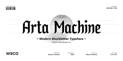 Introducing "Arta Machine" font, a modern blackletter typeface that skillfully combines classic elegance with contemporary flair. This versatile font family offers two unique styles: 'clean' for a sleek and refined appearance, and 'stamp' for a bold and rugged aesthetic. This font is perfect for use as poster designs, branding, logos, apparel, cards, packaging, quote, web, headline, tattoo, or other design needs. Features : Multilanguage Alternates PUA Encoded Ligatures Thank you.
 - Lockdown Christmas by Kaer,
$19.00 Are you ready for Christmas and New Year 2022? Have you prepared gifts for your loved ones and colleagues? Are all the cards, T-shirts, and souvenirs printed? Lockdown Christmas is a knitted fonts family in regular and icons styles. All letters are inspired by sweater designs made of bold round knits. Just take a try! Please feel free to request to add characters you need: kaer.pro@gmail.com *Best wishes, Roman!*