10,000 search results
(0.029 seconds)
- Ginder by Craft Supply Co,
$20.00 Ginder – Bold Serif Font: Striking and Versatile Bold and Commanding Presence: Ginder – Bold Serif Font stands out with its strong, bold character. It’s perfect for titles and posters needing a powerful impact. This font captures attention effortlessly. Ideal for Titles and Posters: With its robust design, Ginder excels in creating striking titles and posters. It enhances visibility and readability. This font is a top choice for impactful visual designs. Adaptable Across Mediums: Despite its boldness, Ginder is surprisingly adaptable. It works well in both digital and print formats. This versatility makes it a valuable tool for various design projects. User-Friendly for Designers: Ginder is designed for ease of use, suitable for all skill levels. Its compatibility with multiple design platforms adds to its appeal. It’s a favorite among graphic designers for its simplicity and impact.
 - Statos - Personal use only

- Wrenn Initials - Unknown license

- Zebron by Fontron,
$35.00A bold, decorative, striped font for display and headlines. - Gothic Leavenworth by Wooden Type Fonts,
$20.00 Gothic Leavenworth, a display type, very bold, sans serif.
 - Triron by Fontron,
$35.00A bold, decorative, striped font for display and headlines. - Journal Sans New by ParaType,
$40.00 The Journal Sans typeface was developed in the Type Design Department of SPA of Printing Machinery in Moscow in 1940–1956 by the group of designers under Anatoly Schukin. It was based on Erbar Grotesk by Jacob Erbar and Metro Sans by William A. Dwiggins, the geometric sans-serifs of the 1920s with the pronounced industrial spirit. Journal Sans, Rublenaya (Sans-Serif), and Textbook typefaces were the main Soviet sans-serifs. So no wonder that it was digitized quite early, in the first half of 1990s. Until recently, Journal Sans consisted of three faces and retained all the problems of early digitization, such as inaccurate curves or side-bearings copied straight from metal-type version. The years of 2013 and 2014 made «irregular» geometric sans-serifs trendy, and that fact affected Journal Sans. In the old version curves were corrected and the character set was expanded by Olexa Volochay. In the new release, besides minor improvements, a substantial work has been carried out to make the old typeface work better in digital typography and contemporary design practice. Maria Selezeneva significantly worked over the design of some glyphs, expanded the character set, added some alternatives, completely changed the side-bearings and kerning. Also, the Journal Sans New has several new faces, such as true italic (the older font had slanted version for the italic), an Inline face based on the Bold, and the Display face with proportions close to the original Erbar Grotesk. The new version of Journal Sans, while keeping all peculiarities and the industrial spirit of 1920s-1950s, is indeed fully adapted to the modern digital reality. It can be useful either for bringing historical spirit into design or for modern and trendy typography, both in print and on screen. Designed by Maria Selezeneva with the participation of Alexandra Korolkova. Released by ParaType in 2014.
 - Enchatty by Gassstype,
$23.00 Hello Everyone, introduce our new product Font Enchatty it is Handwritten Font.This is a Textured Natural Style and classy style with a clear style and dramatic movement. You can activate 13 Ligatures glyphs and 4 Alternate glyphs OpenType panel.
 - Cassella by Gassstype,
$29.00 Hello Everyone, introduce our new product Font Cassella This Is Quick Brush Font.This is a Textured Natural Style and classy style with a clear style and dramatic movement. You can activate 28 Ligatures and 22 Alternate glyphs OpenType panel.
 - Babitta by Gassstype,
$27.00 Hello Everyone, introduce our new product Font Babitta This Is Fun Brush Font.This is a Textured Natural Style and classy style with a clear style and dramatic movement. You can activate 23 Ligatures and 4 Alternate glyphs OpenType panel.
 - Montass by Gassstype,
$29.00 Hello Everyone, introduce our new product Font Montass This Is Quick Brush Font.This is a Textured Natural Style and classy style with a clear style and dramatic movement. You can activate 30 Ligatures and 18 Alternate glyphs OpenType panel.
 - Doubtless by Gassstype,
$29.00 Hello Everyone, introduce our new product Font Doubtless This Is Hand Drawn Font.This is a Textured Natural Style and classy style with a clear style and dramatic movement. You can activate 8 Ligatures and 31 Alternate glyphs OpenType panel.
 - Duos Pro by Underware,
$50.00 Duos Pro, a script for illusionists, comes in 10 styles. Whatever style you pick: apply this speedy monolinear handwriting font in large sizes, because it is made for catching the attention. Take Duos Sharp, which comes with speedy strokes and sharp endings in light, regular and black weights. Or pick Duos Round, and its 3 styles with a softer voice and round endings. Some people call those endings “funky ball noses“, an odd but appropriate description. Round styles look more like round tip speedball lettering, but contrary to most speedball letterings they're written with a very high speed. Especially Duos Round Black is more cuddlesome than its sharper counterpart. For an even more intuitive feel, we added two more sets: Duos Brush & Duos Paint. Duos Brush combines monoline strokes with brush beginnings and endings, for that graphical, freshly lettered touch. A closer look will reveal how its brushed tails vary all the time. Duos Paint is made up out of rough & artistic painted strokes, with all its accompanying shortcomings. In contradiction to the finesses of lighter weights, Duos Paint Black scores in being the most nonchalant and impressionistic. Poésie brutale! As well as having the option to choose between (or mix) these 10 styles, Duos Pro has additional hidden functionalities. For example, every style has many alternate lettershapes and ligatures, offering various different results and lengths to display every single word. Or manually add one of the swashes for more emphasis. A bonus font, Duos Tools, includes tool icons, strokes and banners. If that ain’t enough, throw in some polysemic letters for smart, ambiguous communication if you like. Want to become a signpainter? Then be a signpainter. Always wanted to be an artist? This is your chance! Duos Pro boosts your look. Make your visual vocabulary as grandiose, dramatic, sensitive or picturesque as you want. But whatever you do, don't hesitate to apply Duos Pro “short & big”!
 - Captain Tall Ship by Alphabet Agency,
$20.00 Captain Tall Ship is the clean version of Captain Tall Shipwreck. The font can be used in many project themes, from birthday party invitations to beer labels. The font could be potentially used is a number of design themes including bars, pubs, pirate, navy, seafarer, alcohol products, western/cowboy, card game/gambling, biker gang, tattoos, emblems and crests, old military & hunting to name a few.
 - Hokkien by AdultHumanMale,
$12.00 HOKKIEN is an all caps sister to my other font Penang. It was inspired by some old pieces of Art Deco signage I had discovered in Penang Malaysia, The font is available in one weight for now. The font is loaded with plenty of foreign extras and currency symbols. I have also included an alternate cap S which works better visually in blocks of copy.
 - Agafia by ParaType,
$25.00 Agafia handwriting script is based on the hand of Agafia Karpovna Lykova - the last member of the Old Believer family lived like an hermit in the Khakass taiga. The face is developed for the new book on the history of Lykov's family by Lev Cherepanov. It's built in OpenType format with a contextual substitution of letterforms and specific ligatures. Designer - Gennady Fridman. Released by ParaType in 2009.
 - Tobu by Hanoded,
$15.00 Tobu means 'to jump' in Japanese. I came across a haiku by Matsuo Bashô wich reads: The old pond… a frog jumps in… the sound of water (Furu ike ya… kawazu tobikomu… mizu no oto). The font is named Tobu because of its jumpy character: it doesn't have a real baseline, which makes it playful and fun to use. Tobu comes with a pond full of diacritics.
 - Calendar Blocks JNL by Jeff Levine,
$29.00Calendar Blocks JNL was inspired by old-fashioned wood type used to assemble calendar pages in the days of letterpress printing. The A-Z keystrokes contain the dates 1-26. The lower case a-z keystrokes have the remaining dates 27-31, along with the split dates 23/30 and 24/31 and blank boxes. The days of the week are located on the 1-7 keys. - Greissler by Markus Fetz,
$21.00 GREISSLER is a Retro Display Font inspired by old letterings on store fronts and building facades in Vienna. "Greißler" is a term used in the east of Austria and means small grocer. In Vienna you can still see some of the letterings "Lebensmittel", "Feinkost", etc. on the storefronts of mostly abandoned shops. Similar letters can be found on "Gemeindebauten" (council housing) from the 1920s.
 - Theater Alley JNL by Jeff Levine,
$29.00 Found within the pages of the 1927 edition of the “Welo Studio Handbook - Letter and Design for Artist and Advertisers” is an elegant Art Deco multi-line alphabet. Digitally redrawn as Theater Alley JNL, it is available in both regular and oblique versions. The font takes its name from that of a street in New York, although the street’s name uses the old-fashioned spelling of “theatre”.
 - Thick Fun by PizzaDude.dk,
$17.00 This is not a brush font! This is an imitation of brushstrokes, done by pen. But I guess you've already noticed that - the brushstrokes are way too obvious, to have been made by brush. Although being a "fake", the letters leaves you with quite a good impression. Letters were inspired by an old horror movie poster, but is very useful for something less terrifying!
 - Fairfield by Linotype,
$41.99 Rudolph Ruzicka designed his font Fairfield as a legible text font. His philosophy: The reader expects optical assistance with reading. He does not want to be distracted while interpreting and understanding the ideas of a text." Fairfield font is based on the forms of Venecian Old Face fonts as well as on the designs and details of Art Deco, giving the font a distinctive appearance"
 - Caslon Antique by Linotype,
$40.99 Caslon Antique was designed by Berne Nadall and brought out by the American type foundry Barnhart Bros & Spindler in 1896 to 1898. It doesn’t bear any resemblance to Caslon, but has the quaint crudeness of what people imagine type looked like in the eighteenth century. Use Caslon Antique for that “old-timey” effect in graphic designs. It looks best in large sizes for titles or initials.
 - Ironwood by Adobe,
$29.00Ironwood is an Adobe Originals typeface designed by Joy Redick in 1990. Ironwood font is a homage to the old woodtypes made popular by the wanted posters in Western films. Adrian Frutiger designed his typeface Westside with the same idea in mind. Ironwood font is reminiscent of the Wild West and its shoot-out heroes, and its robust figures are particularly good for headlines. - Fordier by Jehansyah,
$15.00 Fordier is a type of serif display font that is very charming, elegant and stylish, with alternate characters that are tailored to the user, very suitable for all types of designs, titles, book covers, invitations, movie titles, social media, stickers, old and classic looks combined in greetings, and this font is also encoded with PUA which means you can easily use all the letters on all glyphs,
 - KT Higer by Kotivoro Lab,
$18.00 KT Higer is a display font inspired by old design archives. This font Designed by Wahyu Ichsan Fauzi & Fikri Maulana Ikhfa. they focused develop Higer to a Display Headline font. This font have total 381 Glyphs and the families is still under development to be super family typeface. This font suitable with your projects such as poster, user interface, magazine, logo, apparel design, etc.
 - Veneribe by Greater Albion Typefounders,
$10.95 Veneribe -the Venerable face- is an experiment in what many today might call 'grunge', though we at Greater Albion would probably prefer to talk of rustic (or if we're feeling really old-fashioned rustick) charm. It's a derivative of our Clementhorpe family, and aims to combine a battered antique look with the charm of that decorative Roman family. Regular and oblique forms are offered.
 - RM Almanack by Ray Meadows,
$19.00 Based on William Caslon’s design (c1720) which was itself based on Dutch Baroque typefaces. The old saying “when in doubt, use Caslon.” can now be updated ... “use RM Almanack instead!” Includes: Western European, Central European, Baltic & Turkish sets Due to the modular nature of this design there may be a slight lack of smoothness to the curves at very large point sizes (around 100 pt and above).
 - PAG Sottoterra by Prop-a-ganda,
$19.99Prop-a-ganda offers retro-flavored fonts inspired by lettering on retro propaganda posters, retro advertising posters, retro packages all the world over. This is perfect font for your retrospective project. PAG Sottoterra is heavy and high-contrast font, and you can see triangles in some letters. This font reminds us of old posters of science fiction movie. It works best for for display or titling. - Beckinslade by Greater Albion Typefounders,
$15.95 Beckinslade is a lovely elaborate blackletter face, released just in time for Christmas, but useable at any time of the year. It is in the best traditions of Victorian Gothic revival, drawing inspiration from a range of sources and marrying them into one homogenous whole. The emphasis is on aesthetics rather than historical accuracy. Great fun though for anywhere ‘ye olde’ look is desired.
 - Ornata D by Wiescher Design,
$39.50 Ornata D is the fourth of a series of old ornaments that I am trying to save from oblivion. I am completely redesigning the ornaments from scratch, trying in this one to keep the rough "letterpress" character. These ornaments have been first designed by Auriol around 1910. This set is perfect to design a great number of frames. Your digitizing type-designing savior, Gert Wiescher
 - Press Grotesk by Studio Vachement,
$19.99 Press Grotesk is a handmade sans serif, condensed font that takes inspiration from old letterpress printing processes & handcrafting. The font's slightly imperfect, uneven appearance works perfectly for surfing, skating, motorcycling, coffee shops, health, wellness, adventure brands, and much more. Press Grotesk features 2 weights (fat and skinny), upper- and lowercase, many advanced characters and illustrations in order to achieve a truly hand painted look.
 - Squirrely Shirley NF by Nick's Fonts,
$10.00Another entry in the trusty old "Schriftatlas" named Phoenix—original source and designer unknown—provided the inspiration for this bouncy bit of alphabetical tomfoolery. Its animated typeforms, definitely retro chic, will put some bounce in the step of any headline it graces. Both versions of the font include complete Latin 1252, Central European 1250 and Turkish 1524 character sets, with localization for Moldovan, Romanian and Turkish - Obsypac by Fontdation,
$18.00 Introducing Obsypac, our latest vintage serif. Inspired by the old lettering/signpainting, refined to make it relevant in this modern era. This all-caps font will give a strong and clean look on your design, make it work perfectly for headlines, logos/logotypes, labels and packagings, t-shirt designs, etc. If you're a fan of classic typography, make sure you add this font to your design toolbox.
 - New Boston NF by Nick's Fonts,
$10.00Another addition to the Whiz-Bang Woodtype series, this offering is patterned after a typeface issued by the old Boston firm of Baker & Greele in 1826. Named after a small town in Texas just a hop, skip and a jump from the Red River and Arkansas. Both versions of this font include the complete Latin 1252 and CE 1250 character sets, with localization for Romanian and Moldovan. - Sign Kit JNL by Jeff Levine,
$29.00During trips to the Miami Beach Public Library as a youth, Jeff Levine first caught sight of the signs made with a product called the Webway Sign Cabinet, manufactured by the Holes- Webway company of St. Cloud, MN. Having purchased an old set, Jeff has carefully re-drawn the alphabet and unique contrasting numbers from the original assortment, adding in an extended character set to his font. - Cranach by profonts,
$41.99 This picturesque, beautiful German Blackletter typeface was originally released by Benjamin Becker Succ, Frankfurt am Main, then named ?K�nstlergotisch?. Ralph M. Unger redesigned, digitally remastered and completed the font based on old catalogues/specimen. In honor of the famous Cranach family, German artists in medieval times, we renamed the font after them. The shadowed version was added for even more eye-catching purposes, e.g. in headlines.
 - Fundevogel by Hanoded,
$15.00 Fundevogel is a Brothers Grimm fairytale about a boy who was found in a tree. The story, of course, has all the obligatory characters in it: a fair maiden, a wicked cook, an old forester and lots and lots of shapeshifting. And, yes, a happy end! Fundevogel font is a handmade fairytale font. It comes with extensive language support and all the cuteness you could wish for.
 - Foreman by Anthony Prudente,
$15.00 This typeface is inspired from the old display fonts that used to decorate the world around us, but just because we don't see such beautiful signage these days, doesn't mean we should lose the great typefaces used. Foreman is a condensed serif display typeface, with hard geometric lines inspired from fonts used in the 1930s and 1940s, and very much used by the American Art Deco movement.
 - Obligately by UICreative,
$23.00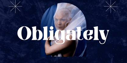 Introducing our new product the name Obligately Old Display Serif Font. Modern Serif font that beautiful classy, elegant, and modern. This font is perfectly suited for a wide variety of projects, such as signature, stationery, logo, wedding, typography quotes, magazine or book covers, website headers, clothing, branding, packaging design, and more. Also for fashion-related branding or editorial design and displays both masculine and feminine qualities.

