10,000 search results
(0.03 seconds)
- Throw My Hands Up in the Air - Personal use only

- Covington Cond - Unknown license

- Covington Exp - Unknown license

- Covington SC - Unknown license

- Plasmatica Rev - Unknown license

- Covington Rev - Unknown license

- CREATOR PERSONAL USE - Personal use only

- DAMAS PERSONAL USE - Personal use only

- WATCHER PERSONAL USE - Personal use only

- Arti sejati by Sulthan Studio,
$12.00 A stunning bold script font that is perfect for adding a touch of elegance and sophistication to your designs. With bold and expressive strokes, this font gives a bold impression and attracts attention. Our bold script fonts are carefully crafted to mimic the fluidity and beauty of handwriting. They feature bold, bold lines that create a strong visual impact, yet retain the graceful and flowing nature of traditional script fonts. Whether you're designing wedding invitations, logos, branding materials or other creative projects, our bold script fonts will add a touch of charm and personality. This font is versatile and can be used for both formal and casual designs, making it suitable for a variety of applications.
 - Silent Film JNL by Jeff Levine,
$29.00 Built in 1928 in Wichita, Kansas, the Uptown Theater started out as a movie house, but today still exists as a dinner theater. Online images of this vintage venue’s perpendicular wall sign show the theater’s name in an Art Nouveau influenced angular style with rounded terminals – similar to that of pen drawn sign lettering of the era. Adapted as a digital type font, Silent Film JNL is available in both regular and oblique versions.
 - Histeagin by Yahya Type,
$22.00 Histeagin – A New Serif Font with Fancy Curves, More Alternative Character, and Multilingual Support. Histeagin – this style works well for branding projects, logo, wedding designs, social media posts, advertisements, product packaging, product designs, label, photography, watermark, invitation, or whatever project you’re working on. WHAT’S INCLUDED? Uppercase & lowercase letters Numbers, punctuation Ligature & Huge Stylistic alternate Multilingual support. Still got a question? Send me a message and I’ll be happy to answer! qura.yahya@gmail.com
 - The New Elegance by Great Studio,
$18.00 The New Elegance is a new editorial serif with all clean and soft lines, tight curves, and a trendy elegant look! The New Elegance has two versions of the font, namely serif & Sans Serif which are equipped with an italic version style, very suitable for your design needs such as very suitable for creating nostalgic designs but still clean and elegant such as headlines, magazines, logos, packaging, editorial, and much more. Thank you, Great Studio
 - Mitreba by Yahya Type,
$18.00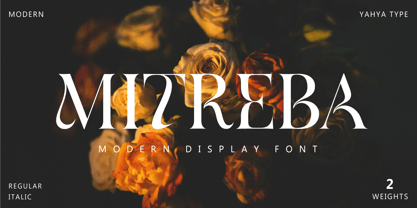 Mitreba – is an elegant classic serif font with Fancy Curves, More Alternative Characters, and Multilingual Support. Mitreba – this style works well for branding projects, logo, wedding designs, social media posts, advertisements, product packaging, product designs, label, photography, watermark, invitation, or whatever project you’re working on. WHAT’S INCLUDED? Uppercase & lowercase letters Numbers, punctuation Ligature & Huge Stylistic alternate Multilingual support. Still got a question? Send me a message and I’ll be happy to answer! qura.yahya@gmail.com
 - French Art Initials JNL by Jeff Levine,
$29.00The source for these hand-drawn initials was an early 20th Century French alphabet book whose pages were displayed online at an image sharing site. This style typifies the Art Nouveau period, and makes a wonderful paragraph starter or "drop cap" for your printed projects. Some users may still want to compose headlines with this font, but be aware there are no punctuation marks, accents or kerning - just the twenty-six initials. - Picayune Intelligence BT by Bitstream,
$50.99The unusual name for this Deco style typeface comes from the playful and pun-laden 1960s Rocky & Bullwinkle TV show. It is the name of the newspaper in the mythical town of Frostbite Falls, MN, home of the two cartoon stars. The name, Picayune Intelligence, literally means “pretty dumb”, but we don’t think that describes Nick’s competent design at all. It is comforting to know that someone is still watching quality television. - Soapy by PintassilgoPrints,
$20.00 Soapy is a decorative font family, naturally scented and dermatologically tested. With extended language coverage, Soapy fonts are all-caps with 2 design options for each letter. There are also stylistic alternates with bouncy baselines – simply turn on the feature to instantly put your words to float. Or to dance, depending on your point of view. Stack styles for easily add colors to your compositions. Put a smile in your headline! Get Soapy!
 - Benalline Signature by IRF Lab Studio,
$14.00 Hello I'm back with a new product, this is Benalline Signature, this is a classic Calligraphy style font, vintage and retro but still looks elegant, luxurious and beautiful. Benalline Signature is a little different from some of the existing fonts, I made a slightly different shape and added an alternative character with a more decorative shape and also I added a special Ornament and swash made especially for the Benalline Signature. Thank you!
 - Komika Text Kaps - Unknown license

- Potter Alaska by Aldedesign,
$18.00 Potter Alaska is Nice Bold Script Font - A stylish and quirky new bold script. Potter Alaska font was created to look as close to a readable bold script as possible by including a couple ligatures.
 - Moontok by Ardyanatypes,
$15.00 Hello, Let's play with Moontok! a handmade font with a fun, sweet, also playful type character that gave extra cuteness and perky at once. Like how it named, the cheerful shape bring imaginations to fluffiness, sweetness, cuties, cookies, coffee latte smells, cheesecake, happy kids, even refresh summer trip Moontok has an OpenType feature that will automatically change each character into stunning ligatures, easy! The alternates tail bring cheerful accent to your wondrous display composition, both make more flexible exploring your needs and also including sexy punctuations Even the font shape has a fun impression, the clear bold line still fit to represent something cool and fresh also making it very easy to read and applied in various design styles such as crunchy poster designs, snacks packaging, logos, promotional artworks, storybooks, business cards, website header, and many more design projects. Moontook has its own charm of cheerfulness itself moreover combined with sharp and funny color. It will so easy to remember, catchy and flawless. wanna play more? jump up to try your words Happy summer times!
 - Averica by Letteralle,
$23.00 Introducing my latest creation, Averica! a playful and friendly display font that is sure to add a touch of personality to any project. Averica is handmade with love and attention to detail, ensuring that each character is unique and full of charm. Whether you're looking to create eye-catching headlines, playful graphics, or fun social media posts, title, branding, merchandise, ads, poster, Averica is the perfect choice. With its bold and distinctive style, it will help your message stand out and capture the attention of your audience. Crafted with precision and care, Averica boasts smooth curves, clean lines, and just the right amount of quirkiness. It's playful and approachable, yet still maintains a professional feel, making it ideal for a variety of projects. So why settle for a bland and boring font, when you can add a touch of fun and personality to your work with carefully fashioned display font? Try it out today and see the difference it can make! Any Questions? Just Ask! I hope you enjoy! Thank You. Letteralle Studios
 - Ocean Beach by LLW Studio,
$22.00 Ocean Beach is a fun, retro, all-caps Nautical Art Deco headline font. It sports geometric letterforms, perfect circles and highly stylized crossbars with waves on several letters—think the beach, flags rippling in the breeze and Fred and Ginger tap-dancing merrily on the deck of a ship! The inspiration for this font are the many whimsical nautical-themed buildings still to be found dotting the landscapes of America, from South Beach in Miami to hidden gems tucked away in industrial areas of southern California. I was fascinated by some of them when I was growing up, and in doing research on Art Deco styles I found many images of these wonderful buildings sporting portholes, streamlined moderne details and even faux rivets. Ocean Beach is created with a 3-stroke detail, and the complexity of the design will be appreciated better in larger sizes of type (36 pts or larger). Use this font for any application that needs a bold, decorative or Art Deco look; great for signage, magazine layout, illustration, posters and packaging.
 - Hostilica by Heypentype,
$20.00 Hostilica is a semi-serif family designed by mixing classic serifs in the age of romanticism era with contemporary modern shape and curves. It gives a warm, friendly, and inviting feeling without losing a formality of text fonts. Every weight was designed carefully to provide a unique look while maintained the unity of the type family. A thin weight gives your content an elegant, luxurious design feel. While the regular weight, designed for body text, gives your content a warm and friendly design feel. The bold weight will make your headlines stand-out with its fat counters and curves. Therefore, Hostilica will accomodate all your design needs, from text to display, from catchy to luxury. The italics of each weight will spice up your design project especially with letter 'f,s,r,k, and y'. Those italic versions paired with alternate and discretional ligatures will add an organic feeling to your designs. The italic styles are designed by emulating a handwriting stroke, and will give a more personal feel while still maintained a formal sense.
 - We The People by K-Type,
$20.00 This typeface is extrapolated from the ‘We the People’ calligraphy of the handwritten US Constitution Preamble which employed a style based on German Text and Square Text exemplars from George Bickham’s penmanship copy-books, the most celebrated being The Universal Penman published in 1743. The original Constitution document was transcribed onto parchment by Jacob Shallus, a Pennsylvania Assistant Clerk, over a weekend in 1787. Shallus’s biographer, Arthur Plotnik (The Man Behind the Quill, 1987), notes that he was paid $30, a modest monthly wage at the time. He also suggests that the calligraphic headings, ‘We the People’ and ‘Article’, may have been inserted by Shallus’s 14 year old trainee son, Francis, “The manner in which the ‘Article’ headings are squeezed into the space Shallus allowed for them suggests a second hand—and perhaps not a very experienced one.” The unconventional backslant of the headings would seem to support this contention, and at the end of the document there is perhaps a novice’s inconsistency in the structure of the letter n between that used for ‘done’ and those used for ‘In Witness’. However, one has to admire the elegant swagger of the wavy t, h and l which the K-Type font extends to the b, f and k. Also, the simpler, Schwabacher-style W, an enlarged version of the lowercase w, is a little less flamboyant than the capital W from the German and Square texts in Bickham’s manuals. For designers using OpenType-aware applications, the typeface includes some Alternates, including a Bickham-style W, the letters t, h and n with added flourishes, two simpler forms of the A, and a few roman numerals for numbering articles. Also some ornamental flourishes and a round middle dot/decimal point. Punctuation marks are drawn in square, calligraphic style, but an alternative round period/full stop, for use with currency and numerals, is available at the period centered position (though placed on the baseline), accessed by Shift Option 9 on a Mac, or Alt 0183 on Windows. The full phrase, ‘We the People’, has been placed at the trademark keystroke and can be accessed by Option 2 (or Shift Option 2) on a Mac, or Alt 0153 on Windows. For designers who find the backslant awkward or unpleasant, the licensed typeface also includes two additional fonts which have a vertical aspect that may be more conducive to graphic design layouts. ‘We The People Upright’ and ‘We The People Upright Bold’ both retain the distinctive style, and the heavier weight is only slightly emboldened, just enough to add some punch.
 - Main Street by FontMesa,
$25.00 Main Street is a revival of the old font Soutache, the original version of this decorative alphabet was created in 1873 by Julius Herriet, a type designer active during the period marked by the Western expansion. Main Street with its split serifs and ornate scrollwork reflects the romantic splendor of the old west from fancy garb and Cowboy Saddles to Ice Cream Parlors and painted window signage. Main Street goes one step further by creating a base fill font which can be placed behind the regular Main Street font giving this font more of an inline appearance. You will need an application that allows layering of your fonts in order to take advantage of FontMesa Fill fonts.
 - FP København Sans by Fontpartners,
$35.00 Copenhagen has been in need of a typeface that unites the city’s many visual expressions. The three designers Morten Rostgaard Olsen, Henrik Birkvig and Ole Søndergaard have designed and developed the typeface FP København. Now available from MyFonts in 44 styles: Serif & sans serif, uprights & italics, small caps, pictos-characters, stencils, sprayed style, OT-features, ligatures, contextual alternates etc. The shapes of the letters are inspired by the city’s culture and the visual environment and design in Denmark in the 20th century. It is relatively low and wide as the city itself and with rounded corners that give it a warm visual mood.
 - Saginaw - Unknown license

- Laban - 100% free

- SF Foxboro Script - Unknown license

- SF Cartoonist Hand - Unknown license

- Rival Sans by Mostardesign,
$25.00 A sans serif with a dynamic look for complex typographic work. Rival Sans is a sans serif font family possessing many strengths. Its 32 fonts and 2 styles, make Rival Sans a very versatile family and suitable for many graphic design projects such as branding, signage, editorial creation, advertising, packaging, broadcasting or logo creation. With the endings cut at 10 degrees and sharp cuts on the top of the stems of certain characters (like the l, b or the d) Rival Sans gives dynamism and readability to the lengthiest of editorial content. This beveled font design also gives rhythm to a text's sentences as well as a very functional look. All these design details give this new font family a modern, energetic and humanistic look. Rival Sans also has many powerful OpenType features such as case sensitivite forms, small capitals, old style and tabular figures, slashed zero, ligatures, fractions,and alternative characters to give personality to graphic design projects. Designed also for complex editorial content, this typeface has a powerful home kerning system called "Pro Kerning". With more than 2500 pairs of glyphs and many languages, Pro Kerning optimizes headlines, subtitles, texts as well as long paragraphs in real time. In addition to these extended features, the italic styles of this fonts family have been drawn as fully-fledged styles with different designs from their regular version so that the italic texts look like calligraphic phrases. Rival Sans has an extended character set with over 930 glyphs. This family covers over 130 languages from Western Europe, Eastern Europe and Central Europe. In addition to all the features of its kind, Rival Sans is part of a very complete "type system" with style variants such as the serif version Rival Serif or the slab version Rival Slab. With all these typefaces, you have 62 styles to make your own vibrant and professional graphics or web creations while maintaining consistency in your creations.
 - FF Good by FontFont,
$72.99 FF Good is a straight-sided sans serif in the American Gothic tradition, designed by Warsaw-based Łukasz Dziedzic. Despite having something of an “old-fashioned” heritage, FF Good feels new. Many customers agree: the sturdy, legible forms of FF Good have been put to good use in the Polish-language magazine ‘Komputer Swiat,’ the German and Russian edition of the celebrity tabloid OK!, and the new corporate design for the Associated Press. Although initially released as a family of modest size, the typeface was fully overhauled in 2010, increasing it from nine styles to 30 styles, with an additional 30-style sibling for larger sizes, FF Good Headline. In 2014, the type system underwent additional expansion to become FontFont’s largest family ever with an incredible 196 total styles. This includes seven weights ranging from Light to Ultra, and an astonishing seven widths from Compressed to Extended for both FF Good and FF Good Headline, all with companion italics and small caps in both roman and italic. With its subtle weight and width graduation, it is the perfect companion for interface, editorial, and web designers. This allows the typographer to pick the style best suited to their layout. As a contemporary competitor to classic American Gothic style typefaces—like Franklin Gothic, News Gothic, or Trade Gothic—it was necessary that an expanded FF Good also offers customers both Text and Display versions. The base FF Good fonts are mastered for text use, while FF Good Headline aims for maximum compactness. Its low cap height together with trimmed ascenders and descenders give punch to headlines and larger-sized copy in publications such as newspapers, magazines, and blogs. There is even more good news about FF Good: it has something of a serif companion. Łukasz Dziedzic built FF Good to work together with FF More, creating in a powerhouse superfamily that is versatile in both its function and aesthetic.
 - ITC Officina Display by ITC,
$29.99When ITC Officina was first released in 1990, as a paired family of serif and sans serif faces in two weights with italics, it was intended as a workhorse typeface for business correspondence. But the typeface proved popular in many more areas than correspondence. Erik Spiekermann, ITC Officina's designer: Once ITC Officina got picked up by the trendsetters to denote 'coolness,' it had lost its innocence. No pretending anymore that it only needed two weights for office correspondence. As a face used in magazines and advertising, it needed proper headline weights and one more weight in between the original Book and Bold."" To add the new weights and small caps, Spiekermann collaborated with Ole Schaefer, director of typography and type design at MetaDesign. The extended ITC Officina family now includes Medium, Extra Bold, and Black weights with matching italics-all in both Sans and Serif -- as well as new small caps fonts for the original Book and Bold weights. - ITC Officina Sans by ITC,
$40.99When ITC Officina was first released in 1990, as a paired family of serif and sans serif faces in two weights with italics, it was intended as a workhorse typeface for business correspondence. But the typeface proved popular in many more areas than correspondence. Erik Spiekermann, ITC Officina's designer: Once ITC Officina got picked up by the trendsetters to denote 'coolness,' it had lost its innocence. No pretending anymore that it only needed two weights for office correspondence. As a face used in magazines and advertising, it needed proper headline weights and one more weight in between the original Book and Bold."" To add the new weights and small caps, Spiekermann collaborated with Ole Schaefer, director of typography and type design at MetaDesign. The extended ITC Officina family now includes Medium, Extra Bold, and Black weights with matching italics-all in both Sans and Serif -- as well as new small caps fonts for the original Book and Bold weights. - ITC Officina Serif by ITC,
$40.99 When ITC Officina was first released in 1990, as a paired family of serif and sans serif faces in two weights with italics, it was intended as a workhorse typeface for business correspondence. But the typeface proved popular in many more areas than correspondence. Erik Spiekermann, ITC Officina's designer: Once ITC Officina got picked up by the trendsetters to denote 'coolness,' it had lost its innocence. No pretending anymore that it only needed two weights for office correspondence. As a face used in magazines and advertising, it needed proper headline weights and one more weight in between the original Book and Bold." To add the new weights and small caps, Spiekermann collaborated with Ole Schaefer, director of typography and type design at MetaDesign. The extended ITC Officina family now includes Medium, Extra Bold, and Black weights with matching italics-all in both Sans and Serif -- as well as new small caps fonts for the original Book and Bold weights."
 - Geoffrey - Personal use only

- Topaz - Unknown license

- BLOODSTAIN PERSONAL USE - Personal use only

- Nadejda - Unknown license


