10,000 search results
(0.034 seconds)
- My Hands by Wiescher Design,
$49.50 The hands in this font are the pointing, counting, threatening, signaling, demonstrating and playing hands I use in my own design projects. I have drawn them all with a felt-tip marker, scanned and digitized for use in a font. This picture font is more user-friendly than having single ps-files. I usually convert the letter to paths once I have decided which one to use, because I might want to fill the lines or background with different colors. Yours very handy, Gert Wiescher.
 - Sideron by Fontron,
$35.00Sideron is a first release and has some minor similarities to Broadway in its thick and thin strokes but is much squarer. There is also an Italic version. - Radio Broadcast JNL by Jeff Levine,
$29.00 An interesting hand lettered sans serif type style with a “brush stroke” feel was used for various article headlines in the October, 1938 issue of “Radio Stars” magazine.
 - Metropolis by Monotype,
$29.99Metropolis was designed by W. Schwerdtner and released in 1928. The tapered strokes give the impression of height. The Metropolis font family shares an attractive, informal headline design. - Hectonoid JNL by Jeff Levine,
$29.00Hectonoid JNL is a more radical version of Oblogram JNL, with a jumbled alphabet and heavier stroke weights. Both fonts are derived from Jeff Levine's Yorso Square JNL. - Summer Display by Missin Glyphs,
$15.00 Inspired by the stroke movements of brush lettering ‘Summer Display’ is an energetic family featuring high-contrast and well-proportioned letter shapes suitable for large displays and headlines.
 - Song ASC Simplified by Ascender,
$523.99Song ASC is a Simplified Chinese font. Song ASC features a serif stroke style. The Song ASC font character set supports Latin-1, Simplified Chinese (code page 936). - Earth's Mightiest 3D - Unknown license

- Sidestroke by Ramen,
$9.00 The typeface is inspired by our love of old hand-painted signs in butchers, and based on some very quick sketches using a brush pen to find what shapes worked. There is quite a quirky element to the type, as we tried to create the original sketches by rotating the brush pen to reflect the strokes of a paint brush. This lead to a horizontal stressing, which is most noticeable in letters like C, G, S and J. Sidestroke comes in 2 styles, both a standard solid version, and a pre-shadowed outline version. This can be outlined and divided in Illustrator to quickly create an alternate coloured fill for your letters. The lowercase letters have been designed to automatically horizontally align with any uppercase letters, which is a great shortcut when creating logos or other unique type layouts.
 - Dynasty by Device,
$39.00 Dynasty is an extensive and versatile family that exploration and modernisation of the typographic quirks associated with the 'American Gothic' type school (in much the same way as English Grotesque was an exploration of Gill/Johnston idea-space) and adds chamfered elements to dots and tails to emphasise and extend the early machine-made aesthetic. Elegantly clean and readable at headline and small text settings, where (as with all fonts in small sizes) the introduction of tracking will improve legibility.
 - Behrensmeyer Vigesimals by Dharma Type,
$14.99 This 8-bit pixel font is designed with respect for 80s game designers and the pixel font pioneers in middle 90s. And for the calligrapher H.P. Behrensmeyer & Charles Paxton Zaner. Use at size 20 pixels or multiples of 20 and anti-alias off is recommended. List of our Pixel Font Project. ·Flat10 Antique ·Flat10 Artdeco ·Flat10 Arts&Crafts ·Flat10 fraktur ·Flat10 Holy ·Flat10 Holly ·Flat10 Segments ·Flat10 Stencil ·Flat20 Gothic ·Flat20 Headline ·Flat20 Hippies ·Flat20 Streamer ·Behrensmeyer Vigesimals ·Civilite Vigesimals
 - Magdelin by Adam Ladd,
$24.00 Magdelin is a minimal yet warm gothic sans with normal and alternate families. At its core, the design has simple forms and low contrast, yet it takes some qualities from the humanist class with its calligraphy or cursive-inspired details found in the italics and the bowl shapes of characters like b and d. The small x-height, longer ascenders and descenders, and semi-condensed proportions give it a bit of a vintage or classic feel while still appearing contemporary and modern.
 - Stervella by Tatiana Nazarova,
$50.00 Elegant and prickly; smooth and sharp; beautiful, but evil - Stervella - display typeface. Its serifs resemble the twisting branches and thorny thorns of a blackthorn, trying to prick neighboring letters. This font is inspired by the forms of ancient Uncial, combining antique with pointed gothic writing. Изящная и колючая; плавная и острая; красивая, но злая - акцидентная Стервелла. Ее засечки напоминают извилистые ветви и колючие шипы терновника, стремящиеся уколоть соседние буквы. Этот шрифт вдохновлен формами старинного Унциала, совмещая в себе антикву с остроконечным готическим письмом.
 - Civilite Vigesimals by Dharma Type,
$14.99 The Civilite is a historic script in the sixteenth century. This 8-bit pixel font is designed with respect for 80s game designers and the pixel font pioneers in middle 90s. Use at size 20 pixels or multiplies of 20 and anti-alias off is recommended. List of our Pixel Font Project. ·Flat10 Antique ·Flat10 Artdeco ·Flat10 Arts&Crafts ·Flat10 fraktur ·Flat10 Holy ·Flat10 Holly ·Flat10 Segments ·Flat10 Stencil ·Flat20 Gothic ·Flat20 Headline ·Flat20 Hippies ·Flat20 Streamer ·Behrensmeyer Vigesimals ·Civilite Vigesimals
 - HUBlueocean by Heummdesign,
$15.00 HU Blueocean is a headline typeface created by imagining waves in a square glass tube. It iis designed to be used in various environments by adding decorative elements, the swaying form of waves, to the Gothic style of a full square module. There is 1 weight of HU Blueocean : Black Features : Uppercase & lowercase Numbers and punctuation Multilanguage (Basic Latin, Western European, Euro, Catalan, Baltic, Turkish, Central European, Romanian, Pan African Latin, Dutch, Afrikaans, Basic Greek, Basic Cyrillic, Mathematical Operators) 882 Glyphs
 - Basecoat by Jonathan Ball,
$19.00 Basecoat is a handcrafted, geometric sans serif inspired by sign painting and influenced by modern gothics. It has a subtle organic feel without sacrificing legibility. The design of the uppercase began with chalk marker lettering for a side project and eventually grew into a small type family. Basecoat comes in three weights and includes more than 500 glyphs with European language support. It has popular OpenType features plus catchwords in multiple languages and arrows for all your sign making needs.
 - Magnitudes Variable by DuoType,
$90.00 Magnitude is a font inspired by classics like Eurostyle and Bank Gothic, with geometric characteristics and dynamics style. Designed to be used in a wide variety of applications such as advertising, corporate projects, branding and retail product design. The font is well-suited for headings, display use and short text. The Magnitudes family is available in 36 weights, ranging from light to heavy, to condensed and expanded with matching italics. The font contains a character set of 401 characters supporting 206 different languages.
 - Herkaloya by Ekahermawan,
$12.00 Herkaloya are Blackletter font with a full set of capital and lowercase letters, alternate, ligature, multilingual support, currency figures, numerals and punctuation. Herkaloya is perfect for Tattoo Logo, Barbershop Logo, Clothing, Music Events, Branding, and many more projects with Gothic theme. Herkaloya also provided Herkaloya Ornament to make your projects more sweet and stunning. If you need support or more information about this item please kindly contact me : ekahermawanputu@gmail.com Thank you so much I really hope you enjoy using it!
 - Bluenote Demi by Wiescher Design,
$39.50 Bluenote is a font based on Franklin Gothic condensed. In the 60s and 70s the record label Blue Note published all those classic jazz records of my youth. Someone at their arts department cut letters to ribbons and designed wonderful record covers with those fragmented glyphs. I recently had a look at my music collection and rediscovered these letters. Being a hard-working type designer I couldn't resist the challenge, here is the result from your dilligent designer Gert Wiescher
 - Flat10 Stencil by Dharma Type,
$14.99 Stencil pixel font which has rough, tough and masculine impressions. This 8-bit pixel font is designed with respect for 80s game designers and the pixel font pioneers in middle 90s. Use at size 10 pixels or multiples of 10 and anti-alias off is recommended. List of our Pixel Font Project. ·Flat10 Antique ·Flat10 Artdeco ·Flat10 Arts&Crafts ·Flat10 fraktur ·Flat10 Holy ·Flat10 Holly ·Flat10 Segments ·Flat10 Stencil ·Flat20 Gothic ·Flat20 Headline ·Flat20 Hippies ·Flat20 Streamer ·Behrensmeyer Vigesimals ·Civilite Vigesimals
 - MSung PRC by Monotype HK,
$523.99 Song style typefaces originated in the age of woodblock printing in Song Dynasty. Being an essential Chinese type style for printing and publishing all since Ming Dynasty. Based on the Kaishu calligraphic script, its structure has evolved, regularised and standardised with thick stems (豎), thin horizontal strokes (橫) and triangular finials. Dots (點), hooks (勾) and downstrokes retained some features of calligraphy, hence an appropriate choice for continuous reading. The typeface is equipped with a variety of stroke weights, all highly legible .
 - ALS Kraft by Art. Lebedev Studio,
$63.00 A simple rough font. Kraft is a rough techno-style sans serif meant for setting text in all capitals. Instead of lowercase letters there are capitals of smaller height but with the same stroke width. They make tighter type. Characters are pressed really close together which creates the visual rhythm of very narrow and very wide openings. The wide strokes allow free use of graphics. This font is designed for putting on coarse surfaces, for breaking, crumbing, scratching, or making stencils on concrete.
 - MC Omnys by Maulana Creative,
$17.00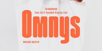 Omnys is a common sans serif with round soft edges stroke font. Bold stroke, fun character with a bit of ligatures and alternates. To give you an extra creative work. Omnys font support multilingual more than 100+ language. This font is good for logo design, Social media, Movie Titles, Books Titles, a short text even a long text letter and good for your secondary text font with script or serif. Make a stunning work with Omnys font. Cheers, Maulana Creative
 - Maggiore by Mysterylab,
$17.00 Maggiore Font is a versatile and unique display typeface with a style all its own. The convex strokes and concave stroke ends set up a singular interplay of blade-like sharpness and plump softness. Maggiore can work very well in loads of different contexts and applications: product labeling and branding, cosmetics, fashion, social media banners, the performing arts, t-shirt logos, and even quaint vintage futurism. Combining the unique with the highly legible, Maggiore will be a great addition to any font menu.
 - Bellmounts by Maulana Creative,
$15.00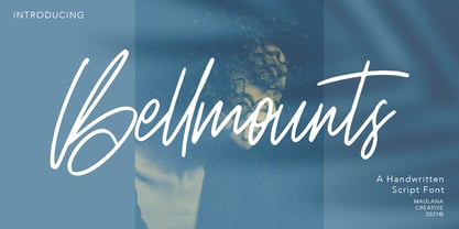 Bellmounts is a handwritten script font, with a rough stroke like a stamp effects, slanted and fun characters. It has Opentype features of ligatures, makes it a perfect choice for branding and digital designs. Use this font for logos, social media, websites, blogs, instagram, social media, business cards, branding, and more! Bellmounts font support multilingual more than 100+ language. and good pair for your secondary text font with sans or serif. Make a stunning work with Bellmounts rough stroke script font. Cheers, MaulanaCreative
 - Gopher Mono by Adam Ladd,
$25.00 Gopher Mono is a reverse contrast, monospace sans serif typeface ranging in weight from thin to black with italics. The design provides a unique look to the monospaced genre by using a contrast where the vertical strokes are a little thinner with horizontal strokes thicker. While monospaced fonts are typically used for smaller body text, the slightly unusual quirks of a reverse contrast design make it interesting enough to also use for display treatments so style and function are blended.
 - Rusthack by Arterfak Project,
$18.00 Rusthack is a friendly brush font, created with the playful feels of freestyle brush-lettering. This font comes from the manual brush stroke which has an informal stroke thickness that makes the font looks more natural. The versatile design, a combination of brush lettering, and handwriting that you can apply in many themes such as urban, apparel, youth, sports, holiday, food, fashion, vintage, you name it! Fonts featured : Uppercase Lowercase Numbers Punctuation Accented characters SS01 - SS02 Ligatures Thank you for watching
 - VVDS Praliner by Vintage Voyage Design Supply,
$15.00 PRALINER – New elegant font family with a lot of stylish alternates and ligatures. Really good looked for branding projects, packaging, headers, posters and signs. Playful and Stylish. Uppercase and lowercase initials. You can use it as for modern style typography and also it looks good in a vintage style projects. Especially when you combine strokes with shadow. A lot of alternates and ligatures give you a many unique variations for the same words. Comes with three widths with stroke styles.
 - Eloisa by StuArt,
$9.00 Eloisa is based on the penmanship of Andrea Stuart's eponymous aunt. The slow, meticulous strokes with which Eloisa writes is the result of formal (and meticulous) instruction in cursive writing back in her secondary education in an exclusive all-girls school. The interesting mix of smooth curves and sharp strokes combined with the slanted orientation make for an elegant yet dynamic visual appeal. Eloisa is perfect for branding, invitations, greetings, or any classy rendering of text you may imagine. Be classy!
 - Big Softie by HouseOfBurvo,
$24.99 A cute, fun, soft bubblegum font in one fatty flavor. Perfect for club posters, flyers and packaging, Big Softie is sure to tingle your clients' taste buds. The font was built on a geometric skeleton, and then rounded and softened, carefully adding character without kitsch. Designed in 2011.
 - Basilia by Linotype,
$29.99 Among the countless typefaces available today, the Modern Face style is relatively underrepresented. During the 19th century and then later with the competition from the mechanized hot metal types and film setting, a number of attractive headline types appeared in this style. For text, however, the available types were limited to those based on tried and true classics like Walbaum, Didot and Bodoni, which were created between 1780 and 1830, as well as a few variations from the end of the 19th and beginning of the 20th centuries. The demand for new Modern text types remained nonexistant until the 1960s. Such was the situation when the Haas'sche Schriftgiesserei (Haas Type Foundry) commissioned me to come up with a concept and sketches of a new hot metal type. I was able to convince the director of the foundry that there was a niche to be filled with contemporary Modern typography. Another reason for the production of a new type was of a technical nature: the introduction of a new setting technique should not be limited to existing typefaces, but instead should lead to innovative text types suited to the demands of the new applications. André Gürtler, Basilia's designer: I began to work on the concept and initial designs of the new text type in 1968. I wanted to give the type a classical look, expressed above all in the strong stroke contrast between the robust verticals and fine horizontal strokes and serifs. This is one of the main characteristics of Modern typography.""This new typeface, Basilia, is distinguished by its soft, open appearance as well as a number of details which together mark a departure from historical models. For example, it has nothing of Bodoni's round letters and their angular, narrow spacing, and displays instead round forms with a much softer stroke in the curves. It was very important to me to avoid the Modern characteristic of stiff, vertical, grid-like strokes and to create instead a lighter, more transparent type. I retained the Modern style by using straight horizontal serifs at right angles to the strokes to still give the type its sense of rigidity." Three sketches for Basilia (normal, italic, and bold) were finished in 1973. Only the 9-point size was produced at first. In the following years, basic weights were made and adapted to filmsetting."
 - Hologram by Kazer Studio,
$4.00 Hologram is a font inspired by a combination of the future and the past. The intention was to design a font that was most effective when applied to Largely Displayed text like Headings, rather than for smaller extended bodies of text. There are 3 distinctive styles offered in the Hologram font family. Each style contains over 350+ Glyphs per style with support for up to 26 Languages as well as specialised kerning & spacing. Display Sans: This style is the cleanest of the 3 fonts. There are no serifs attached to the ends of the strokes, although the stroke weight is varied from thick to thin depending on the letters. Display Serif: This style contains modern serifs at the ends of most character strokes that give more structure to the shapes. A majority of the serifs are horizontal in direction with few characters containing vertical serif details. Display Wedge: The most Bold of all is the Wedge Serif style offered. Featuring thick and thin triangular serifs at the ends of character strokes. This style is most effective in Large Displays & Titling uses. Designed by KAZER STUDIO
 - Garbancera by Rodrigo Navarro Bolado,
$30.00 Gothic fraktur inspired design, I wanted to resemble old german calligraphy but making it very geometric, so I used an isometric reticle during sketching. This is a display font, created for BIG sizes, non textual. I recommend it for branding, poster, logos or titles. Its very experimental -- it exists within the limits of legible and illegible reading. I choose the name “Garbancera” because gothic calligraphy has issues that are linked with dark, gloomy, lugubrious things or fear feelings, culturally in Mexico. I related this with death and for mexicans, death is something we celebrate and give us joy and happiness, annoying, the most representative Mexican characters, one of those is “La Calavera Garbancera” or better known as “La Catrina”, a clothes skeleton with only a hat. It was drawn this way to make a critic to all Mexicans at that time, that were poor but they wanted to represent a high lifestyle, “those that where to the bones, but with a French hat with ostrich feathers”. La Catrina was created by José Guadalupe Posada, a Mexican lithographer but also a newspaper illustrator. I think this is a beautiful font that can lead to great results, just use it wisely.
 - Lionheart by Canada Type,
$24.95Lionheart is the digitization and expansion of Saladin, a neo-gothic typeface designed by Friedrich Poppl, long after he established himself as one of the greatest German designers of all time with some of the most “ausgezeichnet” scripts and text faces to ever come out of Europe. This typeface, though lesser-known among Poppl’s other masterpieces, was one of the first in its genre to abandon blackletter influence and attempt letter variations based strictly on Roman alphabet shapes. Poppl’s idea spawned a whole generation of neo-gothics that can now be found on many a movie poster or book cover where the design must hint at secrets and dark sides. Lionheart succeeds with the idea of gradual curves leading to sharp concave or plano-concave terminals, to effectively build serious letter forms that speak of historical mystique and mystery. This font was was named after Richard I, King of England for a decade in the late 11th century. He reportedly exchanged many gifts of respect with Saladin, even though the two kings were on different sides of the Crusades. Lionheart comes in all popular font formats, with some alternates placed in accessible cells of the character set. - Monto Grotesk by Lucas Tillian,
$28.00 Monto is a superfamily — this is the Grotesk + Grotesk Display part of it. Monto Grotesk is a modern sans serif typeface that combines the strengths of the neo-grotesque and geometric genres. While maintaining an established and trusted look, the design is influenced by a contemporary geometric aesthetic, making it a modern yet timeless companion. The Grotesk is split into two sub-families (Monto Grotesk and Monto Grotesk Display). While Grotesk is intended to be used in long paragraphs and copy text, Grotesk Display is perfect for striking headlines. To achieve maximum legibility, Grotesk emphasizes its characters vertical strokes, focusing on a coherent rhythm and having more open counters in contrast to Display which features a reduced tracking and more geometric and round forms. Furthermore, individual characters change their entire shape to best suit their areas of operation.
 - Mortissimo by IbraCreative,
$17.00 Mortissimo – A Beauty Serif Typeface Mortissimo, a captivating beauty serif typeface, exudes timeless elegance and sophistication. With gracefully elongated serifs and finely crafted letterforms, Mortissimo strikes a harmonious balance between classic aesthetics and contemporary design. Its delicate strokes and subtle curves convey a sense of refinement, making it an ideal choice for projects that demand a touch of grace and charm. Whether used in print or digital media, Mortissimo’s intricate details and graceful proportions contribute to a distinct visual appeal, capturing the essence of beauty and timelessness in typography. Mortissimo is perfect for branding projects, logo, wedding designs, social media posts, advertisements, product packaging, product designs, label, photography, watermark, invitation, stationery, game, fashion and any projects. Fonts include multilingual support for; Afrikaans, Albanian, Czech, Danish, Dutch, English, Estonian, Finnish, French, German, Hungarian, Italian, Latvian, Lithuanian, Norwegian, Polish, Portuguese, Slovak, Slovenian, Spanish, Swedish.
 - Relaxation JNL by Jeff Levine,
$29.00 Amongst the pages of a 1946 foreign publication entitled "100 Alphabets Publicitaires" ("100 Advertising Alphabets") is the casual brush stroke sans that was the design basis for Relaxation JNL.
 - Nearly Brush by ARToni,
$17.00 Nearly Brush is bold, stylish and elegant handwritten font with distinctive strokes. Its round letters will add a luxury spark to any design project that you wish to create!
 - Jonah Brush by Jonahfonts,
$19.00 As once a sign-painter in my younger years I loved the quick brush strokes used to turn out quick 'Sale' posters. I tried to relive in this font.
 - The "New Gothic Style" font, while not directly associated with a specific existing typeface, can be interpreted through the lens of contemporary design trends and the historical context of Gothic ty...
