10,000 search results
(0.033 seconds)
- DejaVu Sans Condensed - Unknown license

- DejaVu Sans - Unknown license

- The HenryMorganHand font by Manfred Klein is a distinctive typeface that carries the essence of personality and flair, drawing its inspiration from the handwriting of historical and possibly mythical...
- Sindelar by Willerstorfer,
$95.00 Please note: Sindelar webfonts are exclusively available at willerstorfer.com Sindelar is a capable, contemporary text face addressing today’s news design requirements. Its large x-height, low contrast and robust serifs grant a high legibility in small sizes. The balanced, well chosen proportions make the typeface economic (i.e. space saving) without giving it a too narrow appearance. These characteristics make it the ideal choice for extensive text setting in newspapers and magazines – on paper and on screen. Named after famous Austrian football (soccer) player Matthias Sindelar (1903–1939), one of the best players of his time, the typeface shares two major qualities with its namesake: their technical brilliance and their way of performing aesthetically to the last detail. The football player’s nickname »Der Papierene« (the Paper-man) elegantly refers to the media too. Although optimised for small sizes, Sindelar’s low contrast and robust serifs give the typeface a strong impact and an unmistakable personality in larger sizes. Sindelar’s calligraphic influences can be noticed in the Italics best. The italic letters are inclined by slightly different angles, respecting the letters’ shapes and proportions and resulting in a balanced, yet vivid appearance. Sindelar comes in 18 styles – nine weights in Roman and Italic each. Each font is equipped with a huge character set of about 980 glyphs and various OpenType features.
 - Monlea by Awan Senja,
$14.00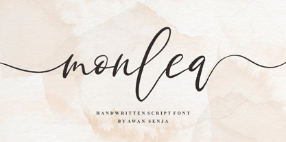 Monlea is a handwritten script font with an incredibly friendly feel. It features gorgeous swashes and ligatures that make this script incredibly versatile. This font is PUA encoded which means you can access all of the cute glyphs and swashes with ease! It also features a wealth of special features including alternate glyphs and ligatures.
 - Aesthetic by Figuree Studio,
$12.00 Aesthetic Typeface is a handmade vintage lettering, which is combining modern and classic typography with some awesome features. Aesthetic Features - Uppercase - Lowercase - Numerals & Punctuations - Accents (Multilingual characters) OpenType features -Ligatures - Stylistic Alternates - ss01 - ss02 - ss03 - swosh There are more than 310 glyphs in the font including Stylistic Alternates, Ligatures, Stylistic sets etc. OpenType features with Stylistic Alternates, Contextual Alternate in some characters that allow making an awesome vintage look. this is suit for: labeling, logo, classic shop, coffee shop, movie title, etc
 - Crania by Burghal Design,
$29.00Sick to death of buying an entire dingbat font just for the ONE symbol you really want? Are you a closet Goth? Do you think Halloween should be a national holiday? If so, then you need Crania, the all skull font. No poorly drawn bats, no gay pumpkins, no goofy looking Frankenstein monsters or grinning mummies, no lame-ass puns carved into headstones... JUST SKULLS. Crania contains 52 different skulls and a PDF guide so you know what the hell you're doing. - Zentenar Initialen by ARTypes,
$35.00Zentenar Initialen is based on the initials designed by Prof. F. H. E. Schneidler, c. 1937, for his Zentenar-Fraktur types. Alternative letters are contained in the AR font. Aa Bb Cc Dd Ee Ff Gg Hh Ii Jj Kk Ll Mm Nn Oo Pp Qq Rr Ss Tt Uu Vv Ww Xx Yy Zz - Oh, gather round, typography aficionados, design enthusiasts, and lovers of all things that speak in silent voices but with the presence of a medieval knight at a Renaissance fair! Today, we dive int...
- Olympus Mount, crafted by the creative minds at Imagex, is a font that embodies the grandeur and mystery of its namesake, Mount Olympus, the revered home of the Greek gods. This typeface captures the...
- CAL Bodoni Ferrara by California Type Foundry,
$47.00 Bodoni Ferrara™ Fashionable, Luxury Heritage: The Original Bodoni Ferrara Sculpted from hi-res photos and scans of Bodoni's original Ferrara Font—his 1818 Manuale Tipografico and 1768 specimens. It has never before been available. This cut of Bodoni specially selected by Dave Lawrence from rare book specimens. Part of the California Type Foundry Origin Series. 3 Display Fonts in One!! And 6+ style mixes. Bodoni's 1st Draft - Transitional Serif Bodoni was often inspired by French type designs. His first draft of Ferrara was inspired by Pierre Simon Fournier. But Bodoni added his own Italian sensibilities. Bododni’s first, transitional style can pair with humanist sans, and transitional fonts. Bodoni's Rework - Modern Serif Later, Bodoni reworked Ferrara to match the later neo-classic style or modern serif of Firmin Didot¹. Bodoni’s modern style can pair with geometric sans, grotesque sans, neo-grotesque sans, gothic sans, copperplate script, . Informal On™ - Informal Mode by CAL Type Foundry This can pair with “infant” fonts. Geometric sans, and other sans or serifs with one-storied a’s. + Bodoni’s Tivoli a for another option! Works great with Fournier¹ fonts and grotesques, since the terminals will match. Font Pairing Guide This font includes a 78 page Ferrara Pairing Guide. This book shows you 131 pairings with text fonts. 47 pairings with subheader fonts! We want to help you get more out of your font collection. Design Features • Subtle forward angle (0.5-1.5°) makes Ferrara more lively and engaging than most Bodoni or Didot fonts. • Round curves make this font feel letter-pressed. • Bodoni's original tall x-height and slightly condensed proportions: great for headlines, where space is at a premium. • Better uppercase. Uppercase punctuation for design apps. • Proportional oldstyle and lining figures, both modern style and transitional numbers. Every pair of numbers is kerned for display sizes: no unsightly gaps! • Multiple special symbols for whenever you need a design to pop, including 3 of Bodoni’s amazing ampersands. Language Features Latin standard for western European and other languages. +Advanced support for: German, French, Spanish, Portuguese, Italian, and French. Special, uppercase umlauts for titles! Compare to metal Bauer¹ Bodoni! Special context kerning for French, Spanish, Portuguese, Italian, and French, to allow better better words like L'Angelique & “¿Nosotros?”. This kerning gets rid of unsightly gaps between “¿ and other combinations. Can’t Find the Pairing Guide? Can't find the pairing guide? Google “California Type Foundry” and grab the pairing guide. Get another free pro font while you’re there! Ferrara: many sizes, styles, moods and situations. It's a classic, fashionable font for display, headlines, and titles. Grab Ferrara today! ----------- ¹Trademarks of their respective owners. Ferrara™ is a trademark of the California Type Foundry.
 - Gundrada ML by HiH,
$12.00 Gundrada ML was inspired by the lettering on the tomb of Gundrada de Warenne. She was buried at Southover Church at Lewes, Sussex, in the south of England in 1085. The Latin inscription on her tomb, STIRPS GUNDRADA DUCUM, meaning “Gundrada, descendant of the Duke” may have led to the speculation that she was the daughter of William, Duke of Normandy and bastard son of Robert the Devil of Normandy and Arletta, daughter of a tanner in Falaise. In 1066 William defeated Harold at the Battle of Hastings and was crowned William I of England. More commonly known as William the Conquerer, he commissioned a string of forts around the kingdom and charged trusted Norman Barons to control the contentious Anglo-Saxon population. William de Warenne, husband of Gundrada, was one of these Barons. There has also been the suggestion that Gundrada may have been the daughter of William’s wife, Matilda of Flanders, by a previous marriage. According to the Dictionary of National Biography (Oxford University Press, Oxford, England 1921-22), both of these contentions are in dispute. Searching the past of a thousand years ago is like wandering in a heavy fog: facts are only dimly in view. Regardless, I know that I found these letterforms immediately engaging in their simplicity. Unadorned and unsophisticated, they have a direct honesty that rests well in the company of humanistic sans serifs like Franklin Gothic or Gill Sans, appealing to a contemporary sensibility. The lettering on the tomb is in upper case only. Although Gundrada does not sound Norman French to me, her husband certainly and her father probably were Norman French. Nonetheless, the man that carved her tombstone was probably Anglo-Saxon, like most of the people. For that reason, we are quite comfortable with a fairly generic lower case from an Anglo-Saxon document of the time. The time was a time of transition, of contending language influences. This font reflects some of that tension. Features 1. Multi-Lingual Font with 389 glyphs and 698 Kerning Pairs. 2. OpenType GSUB layout features: onum, dlig, liga, salt & hist. 3. Tabular Figures and Alternate Old-Style Figures. 4. Alternate Ruled Caps (line above and below, matching to brackets). 5. Central Europe, Western Europe, Turkish and Baltic Code Pages. 6. Additional accents for Cornish and Old Gaelic. 7. Stylistic alternates A, E, y and #. 8. Ligatures ST, Th, fi and fl. 9. Historic alternate longs. The zip package includes two versions of the font at no extra charge. There is an OTF version which is in Open PS (Post Script Type 1) format and a TTF version which is in Open TT (True Type)format. Use whichever works best for your applications.
 - Geos by FineDisplayType,
$4.99 FDT Geos has re-invented airport signage. A stylish font with modern features display tech couldn't afford. FDT Geos features ligatures, fractions, numerals, stylistic sets, and even some symbols!
 - Mefirah by Awan Senja,
$14.00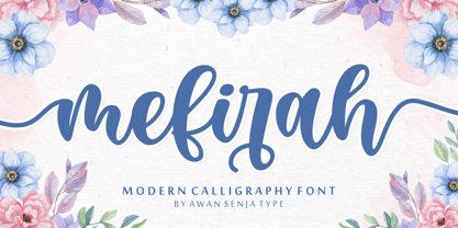 Mefirah is a cute and casual handwritten font with an incredibly friendly feel. It features gorgeous swashes and ligatures that make this script incredibly versatile. This font is PUA encoded which means you can access all of the cute glyphs and swashes with ease! It also features a wealth of special features including alternate glyphs and ligatures.
 - Gratinoli by Seventh Imperium,
$20.00 Gratinoli is a freehand typeface. It featured alternates characters which can easily be accessed by opentype feature. Great for branding, fashion, photography, and any business. This fonts has multilingual versions.
 - Bentalista by Zamjump,
$17.00 Introducing Bentalista a modern sans typeface with lots of alternative characters, multilingual support, and unique ligatures. Bentalista is a very versatile font, easy to work with and perfect for creating minimalist style logos, labels, package designs, text for t-shirts, hoodies and much more. Features: Uppercase + Lowercase letters Numbers + Punctuation Swash feature OpenType Features Multilingual support OpenType features (ligatures and alternatives) help make your writing more interesting. There are also alternating swashes Software for using this font: Adobe Illustrator, Adobe Photoshop, Adobe Indesign, Word, Corel draw, inkscape).
 - Sibling Goals by Piece of Cake Typework,
$17.00 Hello World, Introducing, Sibling Goals is a beauty duo font suitable for your design project needs, such as; wedding themes, Christmas themes, social media posts, quotes, overlays on images, tagline logos, posters, print needs, website banners, and more. Features A set of uppercase and lowercase glyphs Number, symbol, and punctuation Multilingual Support Some Swashes and Ligatures So Easy to Use Access Swashes by keyboard key parent left ' ( ' to feature beginning swash key plus ' + ' to feature middle swash 1 key equal ' = ' to feature middle swash 2 key paren right ' ) ' to feature ending swash For Example: type (goals) Thank you a million times for downloading and using this font for your projects. Enjoy this font and happy creating!
 - FE Blacking Out by Egor Stremousov,
$50.00 A bunch of OpenType features to blacking out of texts. The font does not contain glyphs. Only black blocks that replace your text with OpenType features. Watch demo: https://youtu.be/qUQgUV0PIT0
 - Serpentine by Image Club,
$29.99Dick Jensen (USA) designed Serpentine, is a contemporary-looking display font, for the Visual Graphics Corporation in 1972. With the rise of digital typesetting and desktop publishing, this typeface quickly became both popular and ubiquitous. This dynamic, wide, boxy design is identifiable via tiny triangular swellings at the stroke endings - what might be called semi-serifs. Serpentine is available in six different font styles: Light, Light Oblique, Medium, Medium Oblique, Bold, and Bold Oblique. Serpentine" is a greenish rock that sometimes resembles a serpent's skin, and is often used as a decorative stone in architecture. Though this font doesn't seem at all snaky or sinuous, it does have an architectural, stone-like solidity. The subtle, almost non-existent curves and semi-serifs keep it from being too stern or cold. Although the underlying strokes of each weight are similar, the six members of the Serpentine font family all present their own individual personalities. Serpentine Light lends itself well to text for onscreen displays, for instance, while the numbers from typeface's heavier weights are seen around the world on soccer jerseys! Additionally, the oblique styles convey a streamlined sense of speed, furthermore lending Serpentine well to sport and athletic applications (especially the faster, high-speed varieties). Because of its 1970s pedigree, Serpentine has come to be known as a genuine "retro" face. This makes the typeface even more appropriate for display usage, in applications such as logo design, magazine headlines, and party flyers. If you like Serpentine, check out the following similar fonts in the Linotype portfolio: Copperplate Gothic (similar serifs) Eurostile (similar width) Princetown (another "athletic" font) Insignia (similar "techno" feeling)" - Poligon by Halbfett,
$30.00 Poligon is a large family of geometric sans serif fonts. It is inspired by classic typefaces from the geometric-sans genre, like Futura and Avant Garde Gothic, whose shapes were constructed from circles and straight lines. Every character has been crafted to give it a distinct and individual feel. The family is an excellent choice for both corporate design and editorial design projects because of its range of weights, as well as its legibility in text. The typeface family ships in two different formats. Depending on your preference, you can install the typeface as two Variable Fonts or use the family’s eight static OpenType font files instead. Those weights run from Thin to Black. While the static-format fonts offer a good intermediary-step selection, users who install the Variable Fonts have vastly greater control over the stroke width in their upright and italic texts. The weight axes in Poligon’s Variable Fonts allow users to differentiate between almost 1,000 possible font weights. That enables you to fine-tune your text’s exact appearance on-screen or in print. But even the static fonts satisfy the need for flexibility, creating harmonious variations of texture and emphasis. Despite their rigid geometry, the fonts have a playful air to them. That playfulness and uniqueness can be dialed up by applying stylistic alternates via the fonts’ four Stylistic Sets. The first of these replaces “G”, “M”, and “&” with alternate, more outgoing shapes. Stylistic Set 2 has an alternate “ß”; Stylistic Set 3 has a “Q” with a longer tail and another “G”. Stylistic Set 3 has alternates for “A”, “K“, “Q”, “R”, “S”, “Y”, and “Z”.
 - Serpentine by Linotype,
$29.00Dick Jensen (USA) designed Serpentine, is a contemporary-looking display font, for the Visual Graphics Corporation in 1972. With the rise of digital typesetting and desktop publishing, this typeface quickly became both popular and ubiquitous. This dynamic, wide, boxy design is identifiable via tiny triangular swellings at the stroke endings - what might be called semi-serifs. Serpentine is available in six different font styles: Light, Light Oblique, Medium, Medium Oblique, Bold, and Bold Oblique. Serpentine" is a greenish rock that sometimes resembles a serpent's skin, and is often used as a decorative stone in architecture. Though this font doesn't seem at all snaky or sinuous, it does have an architectural, stone-like solidity. The subtle, almost non-existent curves and semi-serifs keep it from being too stern or cold. Although the underlying strokes of each weight are similar, the six members of the Serpentine font family all present their own individual personalities. Serpentine Light lends itself well to text for onscreen displays, for instance, while the numbers from typeface's heavier weights are seen around the world on soccer jerseys! Additionally, the oblique styles convey a streamlined sense of speed, furthermore lending Serpentine well to sport and athletic applications (especially the faster, high-speed varieties). Because of its 1970s pedigree, Serpentine has come to be known as a genuine "retro" face. This makes the typeface even more appropriate for display usage, in applications such as logo design, magazine headlines, and party flyers. If you like Serpentine, check out the following similar fonts in the Linotype portfolio: Copperplate Gothic (similar serifs) Eurostile (similar width) Princetown (another "athletic" font) Insignia (similar "techno" feeling)" - The font style known as "Metal," often associated with the heavy metal genre, embodies the raw energy, rebellious spirit, and distinctive intensity of the music it represents. This typographic style ...
- Fangtasia is a unique and captivating font that immediately grabs attention with its distinctive character. Created by SpideRaY, a designer known for crafting fonts with personality and depth, Fangta...
- Fiolex Mephisto is a distinctive and visually captivating font that effortlessly captures the essence of classic artistry with a touch of diabolical charm. This typeface is designed to evoke an atmos...
- Autherical by Seventh Imperium,
$18.00 Autherical is old and stylish display font, was inspired by old fraktur calligraphy. This typeface comes with two version regular and slant. Also comes with extra ornament and multilingual characters support. more than 400 glyph and lots of alternates, access the all alternates by PUA code, create you boldest old stylish on your designs with this typeface.
 - Le Kick by Resistenza,
$46.00 Introducing LeKick. Inspired by Fraktur script with a contemporary flare, LeKick is a blackletter display face. This font has been designed with a flat brush and ink, choose between two styles; Brush, which demonstrates the strokes and construction of each letterform, or Regular. The perfect typeface for typographic creations such as book covers, headlines, and banners.
 - Yanson by Younestype,
$99.00 This Arabic typeface family was created by Younes Alaboudi. Yanson proudly incorporates a timeless geometric style with humanistic nuances. Featuring three weights from Light to Bold, Yanson supports OpenType features for Arabic.
 - Nevan by Dasukreation,
$10.00 Nevan is a geometric display font. It features all caps, stylistic alternates feature, plus supports multilingual languages. It's perfect for logos, book covers, movie posters, games, and much more! Caps Only Fonts.
 - CF Nixt by CozyFonts,
$20.00 The Nixt Font Family is a new font with currently seven styles. As an alternative to Helvetica, Arial, Gill Sans, Futura, & Gotham, Nixt has a similar design aesthetic to those aforementioned in that its design, structure, and feel crosses decades of appeal. From Mid-Century, through the stark '60s, decades of succeeding modern architecture through the turn of the 21st Century, Nixt's glyphs are timeless, clear, ultra-legible in all styles and weights. Best use in Advertising, Branding, Signage, Architecture, Fashion, Posters, Headlines, and By-Lines, Print & Digital, and of course Labels. There are currently, at first release, 7 Styles: Extra Light, Light, Regular, Italic, Book, Bold, & Extra Bold. There are more in process and will be added when completed. The inspiration behind the Nixt Fonts is the Bauhaus, Mid Century Industrial Design, Art Deco through Moderne Era Architecture, American Pottery and American Design of The Twentieth Century.
 - Boomolla by Stefani Letter,
$12.00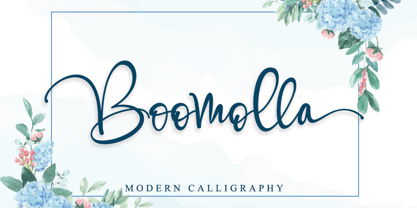 Boomolla is a beautiful handwritten font with a modern look. It features gorgeous swashes and ligatures that make this script incredibly versatile. Boomolla will add a decorative touch in an instant. This font is PUA encoded which means you can access all of the amazing glyphs and swashes with ease! It also features a wealth of special features including alternate glyphs and ligatures.
 - Enchantee by Creativework Studio,
$12.00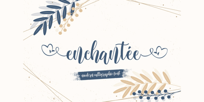 Enchantee feels equally charming and elegant. This stunning script font is a stylish homage to classic calligraphy. It features a varying baseline, smooth lines, gorgeous glyphs and stunning alternates. This font is PUA encoded which means you can access all of the hearty glyphs and swashes with ease It also features a wealth of special features including alternate glyphs and ligatures.
 - Nerd Maze by Gleb Guralnyk,
$14.00 Hello! Introducing a trendy geometric typeface - Nerd Maze. It's an original modern and simultaneously simple font. Several letters variations, using OpenType feature (contextual alternates) automatically creates a seamless words shape. Note: Make sure that “Contextual Alternates” feature is supported & enabled in your software. Please consider that this feature is available only for English alphabet. Thank you and wish you a peaceful sky!
 - Displace Serif by Serebryakov,
$35.00 Displace Serif is a continuation of my Displace fonts. Adding serifs allows you to see the font in a new way. There is a more pronounced charm of Italian monumental fonts, but in an expressive way. The appearance of the serifs allowed the font to move to the antiqua class, but this is purely a formal matter. The proportion of serifs changes markedly from weight to weight, allowing the font to retain its decorative character. In the Light drawing the serifs are barely visible and delicate, while in the Black they are in superposition. The font is catchy, noticeable, which makes it suitable for graphics requiring instantaneous spectator emotions. Displace Serif is suitable for editorial design, as despite the modern image it retains the classic concept.
 - Foot Print by Bureau Bunk,
$14.95 While Walking along the shore of our Main Port to Europe in Rotterdam, The Netherlands, my 14 year old son Jules first hardly dared to step in the mud for he was wearing his brand new sneakers. Concentrating in where he put his feet, he noticed he made a character! The FootPrint-Regular was born! The FootPrint-Regular is a powerful header-typeface, but funny enough it's usable as small copy too! Blaze your Trail! Anything you can imagine on Police investigations, Bloodhound Thrillers, Trails, Tracks and Traces, anything about Outdoor Stores, Tracking or even maybe Pedestrian Clubs, or things like Survival Sports, Walking Events or Hiking Gear; Blaze'm your FootPrint-Regular Trail on all Banners, Blimps, Ads and Doormats!
 - Nyfors by Linotype,
$29.99Nyfors was a sudden idea. I noticed an ad in a magazine, with some handtexted words. I don't recall what the ad was about, neither the words. When I later on tried to remember how the single characters looked like and began to draw them, the result wasn't bad at all. I am not longer sure that they resemble the characters in the ad, but it doesn't matter. Nyfors is a nice handtexted typeface, whatever its origin. There is a small stream in Tyresö where I live and work, called Nyfors. During some centuries there was a center of small scale industries along it, and they used its water to run their machinery. The typeface has its name from that stream. Nyfors was released in 1995. - Ottanio Pack by Fontscafe,
$39.00 As the most classic and traditional style pack of the Fonts Café, the Ottanio family take a place of honor in the list of the Fonts Café handmade Vintage style fonts. Clearly born for being noticed, the boldness and the almost imperceptible, but present to the eyes of subconscious mind, irregularities of the Ottanio Family has been well balanced to create a set of handmade Serif fonts that can be used as “jack of all trades” where traditions, origins and a touch of Vintage style are required. From the integrity of the Ottanio Regular, the stronger style of the Shaded version and the scraped look of the Stamp option, the whole Ottanio Pack will be the perpetual solution always useful to have on hand!
 - Sansmatica by Fontop,
$14.00 Sansmatica is a clean and modern sans serif typeface. It has 28 fonts that work as a multi-purpose design solution. It consists of regular and condensed fonts that can be used for different cases: regular fonts are perfect for copy while Sansmatica condensed fonts are more specific - they make emotional associations and are perfect when you want your headlines or advertising to be noticeable. Also suite great for greeting cards, posters, branding, name card, stationary, design title, blog header, art quote, typography. Sansmatica has 7 weights with light looking more modern, fashionable and the bold giving a more rugged impression is perfect for headlines, logos, quotes, and more! It is interesting to use bold condensed fonts – both vertical lines and weight draw attention.
 - Cleveden by Greater Albion Typefounders,
$9.50 Cleveden was inspired by some lettering sighted on a neglected and somewhat tarnished brass plaque, affixed to an elderly office building. The elegance and character (somehow playful and formal at the same time) of the letterforms shone through the tarnished state of the plaque. As an aside the brass plaque in question was on the former business premises of a long established firm of accountants. We suspect the ethics of that profession would preclude us identifying which one. Our efforts to identify their engraver have proven unavailing. Cleveden is a family of four typefaces, Regular, Bold, Capitals and Capitals Bold. They are ideal for designs that call for distinctive formality and especially lend themselves to signage, certificates, and -dare it be said- engraved plaques!
 - Good Castyll by Twinletter,
$15.00 Good Castyll is our newest display font, and it has a laid-back, unique feel to it. It was created with a genuine hand touch, so it seems natural when viewed. This font is ideal for adding a touch of class to your creative work. Start creating fantastic projects with this font, and you’ll notice a distinct difference in the way it’s used. This font is perfect for games, sporting events, branding, banners, posters, movie titles, book titles, quotes, logotypes, and more. of course, your various design projects will be perfect and extraordinary if you use this font because this font is equipped with a complimentary font family, both for titles and subtitles and sentence text, start using our fonts for your amazing projects.
 - Castle On The Hill by Hanoded,
$15.00 When I started working on this font, I had the radio on. Ed Sheeran was singing his song ‘Castle On The Hill’ and when I looked at this new font of mine, I couldn’t help but notice it had a bit of a medieval look. So I named it Castle On The Hill. COTH is a very lively, messy handpainted serif. It was made with a Japanese brush pen. I actually had a different look in mind, but this is what came out of the pen and I quite liked its looks. It is especially useful for children’s book covers, apps and posters, but be my guest and use it as you like. All it needs is a designers’ touch, a nice tune and a sunset.

