10,000 search results
(0.037 seconds)
- Great Squater Graffiti by Sipanji21,
$10.00 "Great Squater" is a graffiti font with two layers: solid and shadow. By using both of these layers in your design, you can create a three-dimensional (3D) effect on your text. Fonts like this are often used in street art, posters, or other designs that aim to add depth and dimension to their typography. With "Great Squater," you have the flexibility to make your text appear more dynamic and three-dimensional by using different layers. This allows you to customize the text's appearance to fit your design concept.
 - Mondice by Flawlessandco,
$9.00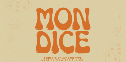 Mondice is a Groovy Retro Font that made with an additional shiny mode in each character, so it's fitted for some retro project. There's some connected letters and some alternates that suitable for any graphic designs such as branding materials, t-shirt, print, business cards, logo, poster, t-shirt, photography, quotes .etc This font support for some multilingual. Also contains uppercase A-Z and lowercase a-z, alternate character, numbers 0-9, and some punctuation. If you need help, just write me! Thanks so much for checking out my shop!
 - Dominic by Flawlessandco,
$9.00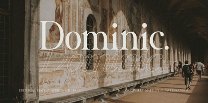 Dominic is a Serif Italic Font with a classy and elegant style in each character, so it's fitted for some wedding invitation display. There's some connected letters and some alternates that suitable for any graphic designs such as branding materials, t-shirt, print, business cards, logo, poster, t-shirt, photography, quotes .etc This font support for some multilingual. Also contains uppercase A-Z and lowercase a-z, alternate character, numbers 0-9, and some punctuation. If you need help, just write me! Thanks so much for checking out my shop!
 - Mothern by Flawlessandco,
$9.00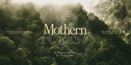 Mothern is a Serif Italic Font with a classy and elegant style in each character, so it's fitted for some wedding invitation display. There's some connected letters and some alternates that suitable for any graphic designs such as branding materials, t-shirt, print, business cards, logo, poster, t-shirt, photography, quotes .etc This font support for some multilingual. Also contains uppercase A-Z and lowercase a-z, alternate character, numbers 0-9, and some punctuation. If you need help, just write me! Thanks so much for checking out my shop!
 - Benogi by Flawlessandco,
$9.00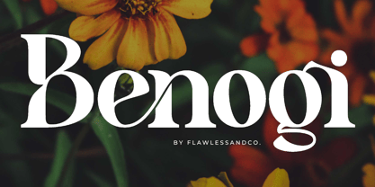 Benogi is a Modern Retro Font with a classy and unique style in each character, so it's fitted for some wedding invitation display. There's some connected letters and some alternates that suitable for any graphic designs such as branding materials, t-shirt, print, business cards, logo, poster, t-shirt, photography, quotes .etc This font support for some multilingual. Also contains uppercase A-Z and lowercase a-z, alternate character, numbers 0-9, and some punctuation. If you need help, just write me! Thanks so much for checking out my shop!
 - Mattire by Ahmad Jamaludin,
$15.00 I'm present to you for new serif, Mattire! Mattire is a stylish font that is both classic and minimal. A bold, high contrast font that is perfect for header magazine, web, feminine logo marks & editorial design. It's a mix between a classic serif and a futuristic sans serif. Mattire fits perfectly into those modern moodboards. It come with a unique lower and uppercase plus numbers, punctuation & multilingual letters. Features : OTF Letters, numbers, punctuation, multilingual support, accent Ligature If there is a problem feel free to message or contact at : dharmasahestya@gmail.com Thank you and enjoy!
 - Shirens by Zealab Fonts Division,
$12.00 Shirens is a font inspired by Emo/metal/harcore music scene and the hype street wear/apparel. It includes uppercase and lowercase, ligatures and alternate styles ,and also multi-lingual support, Shirens is fit for Band album covers, video tittles, stickers, clothing brand names, tshirt designs, badges designs, banner, flyer and more. Just look how it performs on the preview that I have provided, you will see its capabilities. But it will also work well with other themes. I can’t wait to see what you guys will come up with with using this font!
 - Anji by MC Creative,
$15.00 Anji is a font with a modern Calligrapy look and energetic. With extra attention to quick strokes and sharp details, is ready and perfectly fit for your logo designs, music projects & social media posts, event poster, brand imagery, product packaging, handwritten quotes, merchandise, etc. What’s Included : Standard glyphs Ligature Works on PC & Mac Simple installations Accessible in the Adobe Illustrator, Adobe Photoshop, Adobe InDesign, even work on Microsoft Word. PUA Encoded Characters – Fully accessible without additional design software. Fonts include multilingual support for; ä ö ü Ä Ö Ü ß ¿ ¡
 - Nadier by Flawlessandco,
$9.00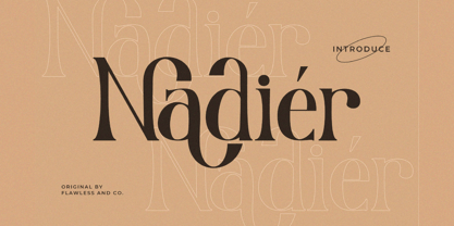 Nadier is a Modern Serif Font that made with a classic style in each character, so it's fitted for some wedding invitation display. There's some connected letters and some alternates that suitable for any graphic designs such as branding materials, t-shirt, print, business cards, logo, poster, t-shirt, photography, quotes .etc This font support for some multilingual. Also contains uppercase A-Z and lowercase a-z, alternate character, numbers 0-9, and some punctuation. If you need help, just write me! Thanks so much for checking out my shop!
 - Renaf by Flawlessandco,
$9.00 Renaf is a Groovy Retro Font that made with an additional shiny mode in each character, so it's fitted for some retro project. There's some connected letters and some alternates that suitable for any graphic designs such as branding materials, t-shirt, print, business cards, logo, poster, t-shirt, photography, quotes .etc This font support for some multilingual. Also contains uppercase A-Z and lowercase a-z, alternate character, numbers 0-9, and some punctuation. If you need help, just write me! Thanks so much for checking out my shop!
 - Kuniku by ArimaType,
$18.00 Kuniku is an unconventional sans serif font that sticks to the rules. These can easily fit into a very large set of projects, so add them to your creative ideas and see how they make them stand out. Each character is uniquely crafted and would be amazing to complement any project you're working on. Use it to create beautiful titles, beautiful invitations, stunning logos and more!! Perfect for displays, headers, invitations, save the date, weddings and more! This font is PUA encoded which means you can access all the glyphs and sweeps easily!
 - Urban Maxim 3d Graffiti by Sipanji21,
$15.00 Urban Maxim" is a graffiti font that features three different layers: solid, shadow, and inner shadow. By using this combination of layers in your design, you can create a three-dimensional (3D) effect on your text. Fonts like this are often used in street art, posters, or other designs that aim to add depth and dimension to their typography. With "Urban Maxim," you have the flexibility to create text that looks distinct and more pronounced by using the various layers. This allows you to customize the appearance of your text to fit your design aesthetics.
 - Galaktik by ExFour,
$19.00 Galaktik is a fresh embodiment of the monospace font. Born out of creative ideation, it attempts to pay homage to a long history of display fonts while exhibiting contemporary, playful accents. This balance of geometric shapes and creative expression allows Galaktik to feel both familiar and yet unique. Features Numerals Punctuations Special Characters Galaktik's freshness fits modern typographic schemes, futuristic logos, and even command-line consoles. The limits are boundless. Thank you for your purchase! Feel free to reach out for any issues or if need any assistance.
 - Anicon Sans by NREY,
$19.00 Anicon Sans font family consist of 18 weight: from Thin to Black, each weight paired by italic. Also including Latin & Cyrillic language support with more than 35 languages. Anicon is a superfamily, semi condensed sans serif and slab serif with humanistic forms in the characters. This font was crafted with the intention to present clean, legible, multipurpose characters that are easy to read wether it's on screen or print. Fit for all purposes; text, display, headline, print, corporate identity, logo, branding, product, infographic, photography and other applications and medium.
 - Taco by FontMesa,
$25.00 Taco is a new Mexican style font family based on our Tavern and Algerian Mesa type designs. When I finished the extra heavier weights for Tavern I decided to play around with a decorated version, the extra bold letters allowed for much more room to work with an inlay pattern. After experimenting with several designs I decided on a Mexican pattern because the original base font is very popular in Mexican restaurant logos and menus plus it's frequently used on Tequila bottle labels. I originally planned three weights for the Taco font family, however, after completing the bold weight I've decided to release it now so you may put it to use while the regular and extra bold are being produced, sorry I can't estimate a release date for the two other weights. To use the fill font layers you'll need an application that allows you to work in layers such as Adobe Creative Suite products. The Taco Fill Uno font may be used as a stand alone font, however, we recommend searching for our Tavern font family where you'll find three different bold weights of this same design. Opentype features aware applications are also needed for accessing the many alternate glyphs in Taco, all the alternates that you love in our Tavern fonts are also available in Taco. While the fill font layers are in registration with one another some applications may throw them out of alignment by changing the spacing. Custom inter letter spacing in Adobe Creative Suite may also throw the fill fonts out of alignment. We recommend doing your custom spacing first then duplicate the type layer and change to the next fill font and color. The inspiration for the Taco name of this font family was from a homemade Taco dinner I made for a guest at my house, after dinner I searched to see if there was a commercial font named Taco. There was no such font named Taco and the rest is history. The old Stephenson Blake Algerian font has come a long way since 1908, and we're not done with it yet. We hope you enjoy our Taco font family, we're looking forward to see it in use.
 - Bit Player JNL by Jeff Levine,
$29.00 Bit Player JNL is the extra-condensed companion font to Cast and Crew JNL, and features an additional oblique version. Useful wherever a large block of copy text needs to fit into a constrained space, Bit Player JNL can be applied to movie title credits, disclaimers, warranty information, end user license agreements and similar projects.
 - Balcon by Tour De Force,
$25.00 Balcon is condensed sans family designed to be your first web font choice. Contains 5 weights: Light, Regular, Bold, ExtraBold and Black, it fits perfect into any project, from editorial editions to packages, labels, posters. If you're looking for a bit decorative version of this family, feel free to check Balcon Round sans family.
 - Diogenes Decorative by Ludwig Type,
$45.00 Diogenes Decorative is the swashy sister of Diogenes, an elegant and crisp text typeface. It comes in 5 weights, each containing 7 different fonts with lots of swash characters, alternates and separate swashes which fit on different characters. Diogenes Decorative can be used independently or in combination with Diogenes, e.g. for initials or headlines.
 - Baby Story by Sulthan Studio,
$12.00 Baby Story The script font with a handwritten style inspired by a very cute baby story fits well with this beautiful handwriting with a heart that can be connected or a heart on each end of the letter or also a middle letter that rises up or down. Baby Story comes with 567 glyphs.
 - Blauer by Larin Type Co,
$15.00 Blauer is a versatile, multi-purpose font that is perfect for vintage and modern design. It will perfectly fit into any project, with its help you can create beautiful logos, inscriptions, templates, signs, highlight text, use for outdoor advertising. Blauer contains alternates, ligatures and swashes that will help you make your design even more attractive.
 - Homade by Eko Bimantara,
$18.00 Homade is sans font family that created in a way that give an ease-looking, close to casual typeface. It's fit for branding, product, food or culinaire theme and various others. Its consist of 5 styles from regular to extra bold with each matching italics. Its contain 388 glyphs that covered broad latin languages.
 - Bleeding Heart by Romie Creative,
$15.00 Bleeding Heart is a smooth, elegant and flowing handwritten font. It has a beautifully balanced character and as a result, it fits into a wide set of designs. Bleeding Heart has a varied baseline, smooth lines, gorgeous glyphs and amazing alternatives. Add to your most creative ideas and watch how they bring them to life!
 - P22 Hedonic by IHOF,
$24.95This 12-font family employs several unique features including a 2-part Chisel set which allows for the look of stone incised lettering. Hedonic has just a hint of a slab serif and even that is used so sparingly that it almost feels like a sans serif font. Its design does appear to be painfully simple but there are many interesting features including a selection of weights, small caps with old style numerals and display weights that make it very useful. And legible. Old style numerals are included with the small caps and italics. Also for display purposes are two "Chisel" fonts. Used together, set one on top of the other, they create a stylish 3D effect—ideal for logos and headlines or anything that needs a strong graphic punch. Hedonic may not be as eccentric as many fonts out there, but overall it is clean and legible with a few extra flourishes to stand out from the crowd! - Cinema Moderne by The Rivertown Inkery,
$5.00 Cinema Moderne is created to pay homage to he fabulous small town theaters from 1930's and 40's America. This unique font plays off of the Art Moderne and art deco style of the day. Art Moderne some times called Streamline Moderne design architecture emphasized curving forms, long horizontal lines, and sometimes nautical elements. Many of these masterpiece buildings have been lost forever. Some have managed to find new life with a new function. Cinema Moderne was created to preserve a small piece of that history forever. This font is to encourage the appreciation of the neighborhood theater culture as well as the grand style of the buildings. Comes in 9 different weights for one low price, or as individual fonts. Perfect for logo creation, or any art deco style project. Previous projects have included event flyers, Gatsby themed party invites and digital marketing content. Give your images a unique effect with this one of a kind font.
 - Bodoni by Linotype,
$29.99 Giambattista Bodoni (1740–1813) was called the King of Printers and the Bodoni font owes its creation in 1767 to his masterful cutting techniques. Predecessors in a similar style were the typefaces of Pierre Simon Fournier (1712–1768) and the Didot family (1689-1836). The Bodoni font distinguishes itself through the strength of its characters and embodies the rational thinking of the Enlightenment. The new typefaces displaced the Old Face and Transitional styles and was the most popular typeface until the mid-19th century. Bodoni’s influence on typography was dominant until the end of the 19th century and, even today, inspires new creations. Working with this font requires care, as the strong emphasis of the vertical strokes and the marked contrast between the fine and thick lines lessens Bodoni’s legibility, and the font is therefore better in larger print with generous spacing. The Bodoni of Morris F. Benton appeared in 1911 with American Type Founders.
 - Distillery by Sudtipos,
$39.00 The Distillery Set is a collection of 5 fonts: Display, Strong, Script, Caps, and Icons. The fonts' influences are in lettering from different eras and styles. They reflect forms from the Arts & Crafts movement, the Roman majuscules, artistic printing, traditional tattoo lettering, sing painting and showcards from the early XX century and some typography trends started from 1970s America and being used today like chalkboard art or handmade labels in packaging. This is collection of fonts that strongly hints of the spontaneous ways of pencil on paper, the dynamic rebellion and simultaneous imperfection and elegance of DIY. This set contains a wide range of characters, including alternates, ligatures, variations on ascenders and descenders, initials and terminals, icons and ornaments, providing endless application possibilities. The different fonts can be used individually, but of course it is their combination in use that creates the magic. The Distillery Set was designed by young talent Carolina Marando. Alejandro Paul produced and expanded the digital work.
 - French Typewriter by Typorium,
$15.00 French Typewriter is a slab serif typeface created in 2019 by Jean-Renaud Cuaz. It takes roots in the typewriting font styles with a French flair. In the history of this font style, early typewriters were initially thought to be replacements for printing and so featured proportional fonts, before being replaced by monospaced typefaces. French Typewriter was created with proportional design, departing from the constraint of identical width and space. Designed for vintage and modern use with a script influenced italic, French Typewriter provides a large range of weights from Extra Light to Black with matching italics offering a large palette of styles for both vintage and modern design. A series of swash capitales has been created for all 6 italic weights along with ligatures and alternative a, g, y signs to provide opportunities for attractive text design. Fine tuned kerning has been implemented to make this slab serif font family greatly legible in small size. Condensed styles will be available in 2019.
 - Softrobo Pro by Koval TF,
$15.00 Softrobo Pro is the further development of Softrobo font provided by Koval Type Foundry in 2008. Provided in 3 most popular formats: OpenType PS, TrueType and Type1. Fine-built, straight but not official, with soft corners is suitable for short texts, placards and advertising. It was inspired by the 1970s when people were mad about robots, space and so on. I decided to create a font as if it were a progressive font of the 1970s. This font supports the Latin-based languages: Albanian, Basque, Bielorussian (Latin), Breton, Catalonian, Chamorro, Croatian, Czech, Danish, Dutch (with Flemish), English, Estonian & Setu, Faroese, Finnish, French, Frisian, Gaelic (Irish), Galician, German (incl. eszett), Hungarian, Icelandic, Indonesian, Italian, Latvian, Lithuanian, Maori, Norwegian, Occitan, Portuguese, Rhaeto-Romance, Romanian, Saami (Lule & South), Slovak, Slovene, Sorbian Lower, Sorbian Upper, Spanish, Swedish, Tswana, and Turkish. It also supports the Cyrillic-based languages: Belorussian, Bulgarian, Crimian Tatar (Cyrillic), Karachay-Balkar, Kumyk, Macedonian, Russian, Serbian, and Ukrainian, Also included: ligatures, superior & inferior numbers set.
 - Writable Story by Din Studio,
$29.00 Have you ever dreamed of belonging to an eye-catching design happily enjoyed by customers? Well, it is time to make your dream come true. Writable Story is a modern, handmade, aesthetic calligraphy font to fascinate your customers and increase your brandings. It is more than just a handwriting because each stroke expresses luxury and beauty. In addition to being visually esthetic, Writable Story is arranged to be eligible either in its bigger-sized or smaller-sized texts. Features: Ligatures Stylistic Set PUA Encoded Numerals and Punctuation Use Writable Story for various designs, such as posters, banners, logos, book covers, headings, printed products, merchandise, social media, and more. Find out more ways to use this font by taking a look at the font preview. Enjoy your experience with this font and feel free to contact us for further product information or trouble complaints. Thank you and wish you good luck with your designs.
 - Endless Sunrise by Wing's Art Studio,
$10.00 A hand-made retro script font duo inspired by 80s action movies! This hand-made, retro styled script font was born from a childhood watching countless 80s action movies. Stories of inspirational heroism and competition, all set against impossibly beautiful Summer sunsets. And no self-respecting 80s movie would be without the coolest title design, setting the stage with a seemingly spontaneous glide of the designer’s brush. Endless Sunrise aims to capture this spirit through it’s loose, hand-drawn design and complimentary sans-serif. It comes with a complete set of alternatives and underlines for true customisation, meaning you’ll never have to repeat an E or an I; the tale-tell signs that give away other script fonts. It also features uppercase and lowercase characters, along with numerals, punctuation and language support. An awesome font that will work equally well across film, sports, music, merch and more! Find more from The Video Store Collection at Wingsart Studio
 - RePublic by Suitcase Type Foundry,
$75.00In 1955 the Czech State Department of Culture, which was then in charge of all the publishing houses, organised a competition amongst printing houses and generally all book businesses for the design of a newspaper typeface. The motivation for this contest was obvious: the situation in the printing presses was appalling, with very little quality fonts existing and financial resources being too scarce to permit the purchase of type abroad. The conditions to be met by the typeface were strictly defined, and far more constrained than the ones applied to regular typefaces designed for books. A number of parameters needed to be considered, including the pressure of the printing presses and the quality of the thin newspaper ink that would have smothered any delicate strokes. Rough drafts of type designs for the competition were submitted by Vratislav Hejzl, Stanislav Marso, Frantisek Novak, Frantisek Panek, Jiri Petr, Jindrich Posekany, and the team of Stanislav Duda, Karel Misek and Josef Tyfa. The committee published its comments and corrections of the designs, and asked the designers to draw the final drafts. The winner was unambiguous — the members of the committee unanimously agreed to award Stanislav Marso’s design the first prize. His typeface was cast by Grafotechna (a state-owned enterprise) for setting with line-composing machines and also in larger sizes for hand-setting. Regular, bold, and bold condensed cuts were produced, and the face was named Public. In 2003 we decided to digitise the typeface. Drawings of the regular and italic cuts at the size of approximatively 3,5 cicero (43 pt) were used as templates for scanning. Those originals covered the complete set of caps except for the U, the lowercase, numerals, and sloped ampersand. The bold and condensed bold cuts were found in an original specimen book of the Rude Pravo newspaper printing press. These specimens included a dot, acute, colon, semicolon, hyphens, exclamation and question marks, asterisk, parentheses, square brackets, cross, section sign, and ampersand. After the regular cut was drafted, we began to modify it. All the uppercase letters were fine-tuned, the crossbar of the A was raised, E, F, and H were narrowed, L and R were significantly broadened, and the angle of the leg and arm of the K were adjusted. The vertex of the M now rests on the baseline, making the glyph broader. The apex of the N is narrower, resulting in a more regular glyph. The tail of Q was made more decorative; the uppercase S lost its implied serifs. The lowercase ascenders and descenders were slightly extended. Corrections on the lower case a were more significant, its waist being lowered in order to improve its colour and light. The top of the f was redrawn, the loop of lowercase g now has a squarer character. The diagonals of the lowercase k were harmonised with the uppercase K. The t has a more open and longer terminal, and the tail of the y matches its overall construction. Numerals are generally better proportioned. Italics have been thoroughly redrawn, and in general their slope is lessened by approximatively 2–3 degrees. The italic upper case is more consistent with the regular cut. Unlike the original, the tail of the K is not curved, and the Z is not calligraphic. The italic lower case is even further removed from the original. This concerns specifically the bottom finials of the c and e, the top of the f, the descender of the j, the serif of the k, a heavier ear on the r, a more open t, a broader v and w, a different x, and, again, a non-calligraphic z. Originally the bold cut conformed even more to the superellipse shape than the regular one, since all the glyphs had to be fitted to the same width. We have redrawn the bold cut to provide a better match with the regular. This means its shapes have become generally broader, also noticeably darker. Medium and Semibold weights were also interpolated, with a colour similar to the original bold cut. The condensed variants’ width is 85 percent of the original. The design of the Bold Condensed weights was optimised for the setting of headlines, while the lighter ones are suited for normal condensed settings. All the OpenType fonts include small caps, numerals, fractions, ligatures, and expert glyphs, conforming to the Suitcase Standard set. Over half a century of consistent quality ensures perfect legibility even in adverse printing conditions and on poor quality paper. RePublic is an exquisite newspaper and magazine type, which is equally well suited as a contemporary book face. - Miss AmyLynn by Chank,
$49.00Miss AmyLynn is the Southern scrawl of Former Miss Kentucky, Amy Lynn Brown. Like Chank's other popular handwriting fonts Wordy Diva and Skippy Sharp, Miss AmyLynn reflects a casual, intelligent, and creative personality. This font has a concise supply of alternate lowercase characters so you can create a more organic handwriting display in your designs. You can access these stylistic alternates when you use the OpenType version of the font in Adobe's Creative Suite programs. Amy is co-owner of Chowgirls, an up-and-coming catering company that she started with Chank's business manager. With the ambition to publish a cookbook, she created special characters that are essential for recipes, such as tsp, tbl and oz. Have a closer look and you'll find more exciting and humanifying OpenType features. - Sista Planteria by Invasi Studio,
$15.00 Meet the delightful duo that brings an organic twist to your designs! Introducing Sista Planteria, the charming pairing of an all-caps serif and a playful script font. Whether diving into illustrative creations, crafting whimsical greetings, adding charm to book covers, designing delightful quotes, or creating enchanting packaging, Sista Planteria is your go-to choice for an organic touch. With its alternates and ligatures, this font duo offers a signature handwriting style that adds a hint of natural elegance to your projects. And don't worry about language barriers – Sista Planteria supports multilingual Latin characters, ensuring your creativity knows no bounds. Get ready to infuse your designs with a dash of organic taste that will captivate hearts and bring smiles. Elevate your creations with the Sista Planteria font duo and let your imagination bloom!
 - Majorelle by S&C Type,
$14.00 Majorelle is a textured script font designed by Fanny Coulez and Julien Saurin in Paris. This finely balanced font was designed to be easy to read, and because it’s just as important, easy to use. Majorelle includes alternates and OpenType ligatures that you can use to improve your designs and make them look natural and friendly. With a lot of extras like swashes, keywords, or splatters, this organic script could be used for any project that needs a warm and informal touch. We hope you will enjoy our work :) You could follow us on our Instagram: instagram.com/sc.type Merci beaucoup! Note: You could perfectly combine Majorelle with other S&C Type’s fonts, such as Naïve or The Hand for example. Just click on our foundry name to check them out!
 - Golden Stanbury by HansCo,
$15.00 Golden Stanbury is an elegant and classy font duo with a modern touch. The signature ballpoint style gives you a sleek, elegant look for your logos, business card, wedding invitations, quotes, advertisements, and more. I made this Golden Stanbury Font Duo for the needs of the logo and branding market where fonts that are combined with modern and clean concepts are still very rare and hard to find. Hopefully Golden Standbury can provide choices for designers. Highly recommended to use it in OpenType capable software - there are plenty out there nowadays as technology catches up with design. The OpenType features can be accessed by using programs such as Adobe Illustrator, Adobe InDesign, Adobe Photoshop Corel Draw X version, Afinity and more. Let's create something beautiful today with Golden Stanbury. Enjoy!
 - Albireo by Cory Maylett Design,
$25.00 Albireo is a typeface for those times when you have more to say than space to say it. It also looks fantastic spread out across the page as though space doesn’t matter. Expertly crafted with a high level of attention to detail, Albireo is an immensely practical and flexible typeface that’s neutral enough to be used almost anywhere a highly condensed, sans-serif face is needed. Despite its down-to-earth functionality, this is a typeface that definitely isn’t lacking in style. It really shines when used for headlines or subheadings in magazines, brochures, posters, newspapers, flyers or on the web. With 42 weights, widths and italics, there’s enough flexibility to make every word fit perfectly. You may buy one font at a time or save money by purchasing packages consisting of the 14 fonts in each width (Extra Condensed, Condensed or Semi Condensed). Save even more by purchasing the entire collection and, in addition to the 42 separate fonts, you'll receive two variable fonts (upright and italic) that cover all the weights, widths and everything in between. So where does the name come from? Well, look upwards at night. Albireo is a binary star in the constellation Cygnus. Through a backyard telescope, Albireo (the star) resolves into two brilliant component stars — one orange and one blue. The beginnings of the typeface were the result of me needing a newspaper feature headline about space exploration. I couldn’t find the right typeface, so I drew my own letters and eventually expanded it out into an entire mega-family. Given its origins, naming it after my favorite star seemed totally appropriate. Check it out. I think you’ll love it. Albireo deserves its place as a shining star in everyone’s font collection. It’s that good — really.
 - Stonetype by Kustomtype,
$20.00 Stonetype is a typeface that was used by stonemasons in the 70s & 80s of the last century. When I was starting as a stonemason, these were the first characters I had to draw, by hand, back then on grave monuments and memorial plaques. The idea was born to digitize all the material, to be saved for eternity. By digitizing all and fine tuning, plus the addition of some main characters, Stonetype has now grown into a user-friendly typeface that can, now still, be used by stonemasons, to improve their creation process times. But Stonetype can also easily be used in modern and contemporary designs. Stonetype is the perfect fit for graphic design, editorial design, magazines, posters, logotypes, brands and corporate design. Stonetype is designed by Coert De Decker in 2019 and published by Kustomtype Font Foundry.
 - !Disc Inferno® BASIC - Unknown license

- Wood Sans by TypoGraphicDesign,
$19.00 The typeface Wood Sans is designed from 2021 for the font foundry Typo Graphic Design by Manuel Viergutz. The display typeface is a digital version of original wood letters from a german flea market find. 8 font-styles (Clean, Clean Invest, Clean Mix, Rough, Rough Misprint, Rough Alt, Rough Dark & Icons) with 450 glyphs (Adobe Latin 2) incl. 100+ decorative extras like icons, arrows, German Capital Sharp S, dingbats, emojis, symbols, geometric shapes, catchwords, decorative ligatures (type the word #LOVE for ♥︎or #SMILE for ☺ as OpenType-Feature dlig) and stylistic alternates (3 stylistic sets). For use in logos, magazines, posters, advertisement plus as webfont for decorative headlines. The font works best for display size. Have fun with this font & use the DEMO-FONT (with reduced glyph-set) FOR FREE! ■ Font Name: Wood Sans ■ Font Styles: 8 font-styles (Clean, Clean Invert, Clean Mix, Rough, Rough Misprint, Rough Alt, Rough Dark & Icons) + DEMO (with reduced glyph-set) ■ Font Category: Display for headline size ■ Font Format:.off (for Print) + .woff (for Web) ■ Glyph Set: 450 glyphs (Latin 2 incl. decorative extras like icons) ■ Language Support: 69 languages: Afrikaans, Albanian, Asu, Basque, Bemba, Bena ,Breton ,Catalan ,Chiga ,Cornish ,Danish ,Dutch ,English ,Estonian ,Faroese ,Filipino ,Finnish ,French ,Friulian ,Galician ,German ,Gusii ,Indonesian ,Irish ,Italian ,Kabuverdianu ,Kalenjin ,Kinyarwanda ,Luo ,Luxembourgish ,Luyia ,Machame ,Makhuwa-Meetto ,Makonde ,Malagasy ,Manx ,Morisyen ,North Ndebele ,Norwegian Bokmål ,Norwegian Nynorsk ,Nyankole ,Oromo ,Portuguese ,Quechua ,Romansh ,Rombo ,Rundi ,Rwa ,Samburu ,Sango ,Sangu ,Scottish Gaelic ,Sena ,Shambala ,Shona ,Soga ,Somali ,Spanish ,Swahili ,Swedish ,Swiss German ,Taita ,Teso ,Uzbek (Latin) ,Volapük ,Vunjo ,Welsh ,Western Frisian ,Zulu ■ Design Date: 2021 ■ Type Designer: Manuel Viergutz
 - Neon Street by Ditatype,
$29.00 Neon Street is a captivating display font that takes inspiration from the dazzling glow of neon lights found on vibrant city streets. With its bold uppercase letterforms and neon-style inline elements, this typeface exudes energy and creates a visually stunning experience. Each letter is meticulously crafted with neon-inspired strokes that run through the center, adding a dynamic and luminous effect. This inline style brings a sense of urban excitement and nostalgia, evoking the vibrant atmosphere of neon-lit cityscapes. Inspired by the enchanting allure of neon signs, Neon Street infuses a sense of liveliness and modernity into each character. The font captures the captivating glow of neon lights, casting a radiant and vibrant hue that is both eye-catching and mesmerizing. This neon style adds a touch of urban energy, making the font truly stand out with its electrifying charm. The uppercase letter forms of Neon Street are bold and assertive, commanding attention with their distinctive design. Enjoy the various features available in this font. Features: Alternates Multilingual Supports PUA Encoded Numerals and Punctuations Neon Street is perfect for headlines, signage, logos, and any design that aims to make a bold statement with a touch of neon-inspired flair. This font will also inject your project with a vibrant and captivating element, whether you're creating posters, branding materials, digital artwork, or anything in between. Find out more ways to use this font by taking a look at the font preview. Thanks for purchasing our fonts. Hopefully, you have a great time using our font. Feel free to contact us anytime for further information or when you have trouble with the font. Thanks a lot and happy designing.
