10,000 search results
(0.152 seconds)
- TOY_SOLDIERS - Personal use only

- FLUID - Personal use only

- Bad Situation by Intellecta Design,
$24.90 The historical source to Bad Situation comes from "EXAMPLES OF MODERN ALPHABETS, PLAIN and ORNAMENTAL; including German, Old English, Saxon, Italic, Perspective, Greek, Hebrew, Court Hand, Engrossing, Tuscan, Riband, Gothic, Rustic, and Arabesque, etc." Collected and engraved by F. Delamotte, and first published in 1864. The original alphabet was called "Example Alphabet" (plate 48), by Delamotte.
 - Rhapsody by profonts,
$39.99Rhapsody is clearly showing Unger's love with Blackletters and Gothics. Other than many of the existing Blackletters, Rhapsody is really easy to read. The calligraphic forms of the upper case in connexion with its lower case appear very special, very unique. Rhapsody, having its origins in the 50ies, was redesigned, completed and expanded by Unger for the URW++ FontForum. - Taurus Sense by Hatftype,
$17.00 Is a blackletter typeface font that is inspired by gothic and horror style because it's shape is very unique and is perfect for any project that you will use with this theme. Features : Symbol Number Multilingual support Uppercase & Lowercase Support in Mac and Windows OS Support in design application (photoshop, illustrator, and more) I really hope you enjoy it.
 - Bandiera Del Legno NF by Nick's Fonts,
$10.00 This typeface appeared in the William H. Page Woodtype specimen book as Gothic Tuscan Condensed Reversed—quite a mouthful. Banner elements appear in the brace and bracket positions, and reversed spaces can be found in the underscore and bar positions. Both versions of this font support the Latin 1252, Central European 1250, Turkish 1254 and Baltic 1257 codepages.
 - Old Skull by Gleb Guralnyk,
$14.00 Hi, presenting a blackletter font named Old Skull. This vintage gothic look typeface was originally made using a flat calligraphic pen what makes it more organic and natural. Old Skull typeface suits the best for original t-shirt prints and tattoo designs. This font supports most of the European languages, please check out the screenshot with all available characters.
 - Columnist JNL by Jeff Levine,
$29.00 “News Gothic” has been a reliable workhorse of a font since it was created by Morris Fuller Benton and first offered for sale in 1908 by American Type Founders. A clean, legible design used for text copy, it can also double as a light headline face. This reinterpretation (named Columnist JNL) is available in both regular and oblique versions.
 - Samosata NF by Nick's Fonts,
$10.00Samosata NF is based on Lucian Bernhard’s eponymous Gothic, but it employs all of the alternate characters seldom seen today. The result is an elegant, classical typeface with subtle Art Deco shadings. Available in two weights, all versions of this font include the Unicode 1250 Central European character set in addition to the standard Unicode 1252 Latin set. - Startup by Serebryakov,
$30.00Startup is a nine style type famaly. It combines the aesthetics of gothic sans and Neo-grotesques. Created specifically for the creation of startup identity. When you need something that doesn't scream, but has personality. This type family can be used in the design of the logo, as well as apply it to headlines and secondary texts. - Caxtonian Black by URW Type Foundry,
$49.99 Coen Hofmann has rediscovered Blackletter font design and enriches URW’s FontForum with two new and very beautiful fonts: Caxtonian Black and Holland Gothic. Caxtonian Black is a remarkable classical Fraktur inspriced inspired from the fonts used by the famous first English printer William Caxton. Coen Hofmann digitally re-mastered and completed the font for usage with modern technology.
 - Mordova by Holis.Mjd,
$14.00 The font is done with a minimalist touch of gothic and blackletter, inspired by several music and bands that I was currently enjoying and often listened to throughout the day, where the music depicts a little visually in the form of font characters like this Mordova font, feels loud, vibrant , dark but simple and easy to read.
 - Inked Bones by Mans Greback,
$59.00 Inked Bones is a hand painted blackletter typeface, created by Måns Grebäck during 2019. It works perfectly in Medieval contexts as well as in modern Gothic style typesetting. Use the typeface for a tattoo graphic or for your Middle Age project. The font supports all Latin-based European languages, contains numbers and all symbols you'll ever need.
 - HU Mymyoh KR by Heummdesign,
$25.00 HU Mymyoh KR is contains KOREAN words and Latin alphabets. HU Mymyoh KR adds a gothic feel to the Gulim-based typeface. The grapheme 'ㅎ' and 'ㅊ' are shaped into an acorn shape, and the shape of the grapheme is made in a large trapezoidal shape, so it is a typeface that feels both individuality and readability.
 - Blackstone by Chris Costello,
$28.75 Dragons, pirates, magic, and all that is gothic was the inspiration for this design. Blackstone was one of ten winners in The 1988 Chartpak Typeface Design Competition and is now available in two styles with additional characters, alternates and dingbats. Several alternate caps can be found using alt keystrokes, so try using different combinations of all caps.
 - Skie by Adam Ladd,
$25.00 Skie is a simple gothic sans serif with normal, condensed, and wide widths. Its distinguishing characteristics are the small x-height with tall ascenders and a minimal amount of contrast, while the apertures are semi-open to help in readability. The simple design keeps the appearance fairly neutral and presents a blend of modern and vintage qualities.
 - Bassun by Twinletter,
$15.00 The new classic Arabic typeface “Bassun” is brought to you by our expert designers. The letters have a beautiful aspect thanks to using a digital flat pen and a gothic font approach. This typeface can be used in a wide range of Middle Eastern-themed projects, including advertising, packaging, posters, invitations, and any other graphic design.
 - Schoonheid by Fauzistudio,
$12.00 Schoonheid is based on the thick and thin Gothic typeface that was popular in the US during the first half of the 20th century. Schoonheid Contextual Capitals has more than 100 ligatures, alternatives, and special characters consisting of uppercase letters. Implementing alternative Contextual features makes it easier for all people to use. Hope you enjoy. Intuisi Creative
 - Demonic Rhapsody by Hun Liszt,
$50.00 Demonic Rhapsody is a unique typeface inspired by Codex Gigas, featuring Gothic, handwritten glyphs. Perfect for adding mystique to projects such as book covers, album artwork, or unique branding. It's part of the Demonic Rhapsody NFT project, symbolizing marginalized voices. A narrative tool, it pairs well with minimalist typefaces for contrast or textured fonts for an immersive experience.
 - Dark Blades by Tadiar,
$19.00 Dark Blades is an authentic gothic vintage font family of 4 fonts created for headers and text. Multilingual support (Latin Extended). Designed for: - Vintage branding (Clothes, Alcohol, Bikes, Games) - Horror - Music branding - Myth: Vampires, Zombie, Halloween, Werevolves, Magic, Fantasy - Medieval style Well use in vintage labels, headers & titles, Posters, Street Signs and other Outdoor, Package Design.
 - Tintern Abbey NF by Nick's Fonts,
$10.00A 1905 poster for the Austrian National Highway by artist Gustav Jahn inspired the letterforms for this typeface. In the spirit of comity, Barnhart Brothers & Spindler's Publicity Gothic Initial Caps inspired the uppercase treatment. Both versions of this font contain the Unicode 1252 (Latin) and Unicode 1250 (Central European) character sets, with localization for Romanian and Moldovan. - Squared Off JNL by Jeff Levine,
$29.00 In an 1896 specimen catalog for American Type Founders there is a design called Geometric Gothic. The lettering style looks as if it’s ahead of its time; foreseeing the 1980s. With its squared characters, some pointed overhangs and modified character shapes, this type design is now available as Squared Off JNL, in both regular and oblique versions.
 - onakite - Unknown license

- BPmono - Unknown license

- Dokument Pro by Canada Type,
$29.95 Jim Rimmer aptly described his Dokument family as a sans serif in the vein of News Gothic that takes nothing from News Gothic. Building on that internal analysis, Dokument Pro is the thoroughly reworked and expanded of the original main set released in 2005, with different widths still in the pipeline. This new version updates Jim’s work to six Pro weights and their italic counterparts, each of which takes advantage of OpenType stylistic sets to introduce different degrees of graduation from gothic to humanist. Dokument Pro is now a unique text sans family, with an adaptable personality suitable for the kind of edgy, uncompromising corporate and media typography that just tells it like it is, instead of having to resort to the common contemporary luring and baiting tactics. Dokument Pro’s range of weights, styles and features (over 775 glyphs per font, built-in small caps, alternates galore, and support for over 45 Latin languages) allows for multi-application versatility and clear, precise emotional delivery. This is the kind of straight-shooter sans that should be in every designer’s toolbelt. For more details on the fonts' features, text and display specimens and print tests, consult the Dokument Pro PDF availabe in the Gallery section of this page. 20% of Dokument Pro’s revenues will be donated to the Canada Type Scholarship Fund, supporting higher typography education in Canada.
 - Weiss Rundgotisch by Linotype,
$67.99The German designer Emil Rudolf Weiss originally created Weiss Rundgotisch for the Bauer typefoundry in 1937. In their catalog for the typeface, Bauer began with this quote from Leonhard Wagner: The round gothic (rundgotisch) script is the most beautiful kind of script; she is called the mother and the queen of all the rest." While designing Weiss Rundgotisch, Weiss was inspired by Renaissance types cut by the Augsberg printer Erhard Ratdolt. Ratdolt had spent some time in Venice, which is most likely where he became familiar with round gothic letters. This sort of letterform was never as popular in Germany as Fraktur or Gotisch may have been, but round gothic types were used there for centuries to represent arts and craft feelings, as well as old-fashioned handwork. For a blackletter typeface, Weiss Rundgotisch is very similar to normal serif and sans serif designs, especially its uppercase letters, which seem to have some uncial influence in them as well. Therefore, Weiss Rundgotisch is more legible for contemporary readers, making this an excellent choice for anyone looking to set text, logos, or headlines with in blackletter. Weiss Rundgotisch was apparently quite a difficult typeface to design, even for a master designer like Weiss. He began work on the face in 1915; Weiss Rundgotisch's development took over 20 years to complete." - WC_AquaBlues_Bta - Unknown license

- Covington - Unknown license

- Plasmatica - Unknown license

- SF Junk Culture - Unknown license

- Babyhome by Haksen,
$14.00 Babyhome Elegant Script If you are needing a touch of casual chic calligraphy for your designs, this font was created for you! Babyhome was built with OpenType features and includes beginning and ending swashes alternate characters for both lowercase letters, loads of different swash alternates for lowercase letters, numbers, punctuation, alternates, ligatures and it also supports other languages :) Accessing the swashes / opentype features / glyphs: This font works best in a program that supports OpenType features such as Adobe Indesign, Adobe Illustrator CS, or Adobe Photoshop CC. You can access the swashes and alternates from the 'Glyphs Panel' in these programs. More Questions? Here are some (potential) answers! You are not permitted to resell this font in any way. Multilingual Support is included for Western European Languages Also, the sans-serif font used in the preview images is Gotham :)
 - Tanach - Personal use only

- Rediviva - Unknown license

- Fraenkisch - Unknown license

- Rainy Candy by Illushvara,
$14.00 Hello, We are so excited to announce our new fonts "Rainy Candy" is unique display font. Use it to make your ideas even more realistic like a kids, sweet packaging, merchandise and create spectacular the Christmas designs! Features : Uppercase and lowercase Numbers Symbols Multilingual Accent What you get : Rainy Candy. OTF If you have any question, don’t hesitate to contact me. Happy Designing !!! Thank You, Bayu Suwirya
 - Sabyan by Bluestudio,
$15.00 Introducing our newest product Sabyan. Sabyan is a modern and clean handwriting script font. Sabyan is suitable for all your design project needs such as: logo design, branding, covers, posters, magazines, wedding invitations, greeting cards, quotes and more. What's included: - Sabyan OTF - Titling - Swashes - Stylistic Alternates: Sets 01, 02, 05 -Multilingual support: AÀÁÂÃÄÅCÇDÐEÈÉÌÍÎÏIÌÍÎÏNÑOØÒÓÔÕÖUÙÜÚÛWYÝŸÆßÞþ - Encoded PUA Characters Fonts are fully accessible without additional design software.
 - Ballpoint Rush by Motokiwo,
$17.00 Ballpoint Rush is an organic and classy handwritten script font that crafted from pen strokes. The font very simple as a real quick writing with a pen. It's great for chic and elegant projects such as fashion branding, casual notes text, signature, song lyric, and many more. Features & Files: OTF Uppercase letters Lowercase letters Numbers & Punctuation Ligatures Standard Latin Multilingual Support Easy to use in any software
 - Roicamonta by Aga Silva,
$24.99 Roicamonta font looks very feminine and delicate. Perfect fit for invitations, greeting cards and other printing where soft and elegant writitng is required. The design stems from Copperplate calligraphy and comes in two styles - upright and italic. This family consists of six font files overall, each file contains over 1200 glyphs. Complete with variety of swashes and fancy ligatures. All engineered and included in handy otf format.
 - The Bronkids by Bluestudio,
$15.00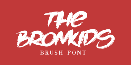 Introducing our newest product: The Bronkids. The Bronkids is a strong brush font, making it suitable for your design projects such as: logo design, clothing design, posters, magazines, quotes and more. Made with a natural touch, this font is the best choice for all your design projects. Includes: - The Bronkids TTF - Multilingual support: AÀÁÂÃÄÅCÇDÐEÈÉÊËIÌÍÎÏNÑOØÒÓÔÕÖUÙÜÚÛWYÝŸÆßÞþ - PUA Encoded Characters: Fully accessible fonts without additional design software.
 - Century Expanded by Bitstream,
$29.99Shortly after the preparation of the original Century, the two Bentons (father Linn Boyd and son Morris Fuller) prepared a wider version for De Vinne’s press and called it Century Broadface. In 1900 ATF released the design for general use as Century Expanded, one of the most popular and effective of typefaces, to this day the text face of the New York Daily News.


