10,000 search results
(0.03 seconds)
- Generis Slab by Linotype,
$29.00The idea for the Generis type system came to Erik Faulhaber while he was traveling in the USA. Seeing typefaces mixed together in a business district motivated him to create a new type system with interrelated forms. The first design scheme came about in 1997, following the space saving model of these American Gothics. Faulhaber then examined the demands of legibility and various communications media before finally developing the plan behind this type system. Generis’s design includes two individually designed styles; each of with is available with and without serifs, giving the type system four separate families. Each includes at least four basic weights: Light, Regular, Medium, and Bold. Further weights, small caps, old style figures, and true italics were added to each family where needed. The Generis type system is designed to meet both optical criteria and the highest possible measure of technical precision. Harmony, rhythm, legibility, and formal restraint make up the foreground. Generis combines aesthetic, technical, and economic advantages, which purposefully and efficiently cover the whole range of corporate communication needs. The unified basic form and the individual peculiarity of the styles lead to Generis’ systematic, total-package concept. The clear formal language of the Generis type system resides beneath the information, bringing appropriate typographic expression to high-level corporate identity systems, both in print and on screen. The condensed and aspiring nature of the letterforms allows for the efficient setting of body copy, and the economic use of the page. A range of accented characters allows text to be set in 48 Latin-based languages, offering maximal typographic free range. This previously unknown level of technical and design execution helps create higher quality typography in all areas of corporate communication. Optimal combinations within the type system: Generis Serif or Generis Slab with Generis Sans or Generis Simple. - Palmona Plus by Ingo,
$46.00 A rustic black letter from the 1930ies — with stylistic alternates. The high degree of abstraction of this typeface allows it to appear modern, even though its shapes clearly show an origin from Fraktur and Gothic. The letters present the effect of woodcarving or silhouette cuttings as they are defined exclusively with straight lines and sharp corners. By doing without any bowls, the typeface becomes a stylistic entity with a decorative effect. Palmona is especially appealing in combination with bold illustrations. Some of the characters of Palmona are available in one or more alternate forms which can be accessed manually or automatically. Use of these alternates is most easily operated with OpenType-Functions Standard-Ligatures and Discretional Ligatures in the user program. With Standard Ligatures activated, problematic letter compositions are substituted with appropriate ligatures. Likewise, in certain letter combinations the alternates are inserted. The Discretional Ligatures include additional alternatives. Configuration of the characters of the Palmona font is according to Unicode ISO 8859-1 (Latin1). Consequently all characters for all European languages with Latin type are covered — including Turkish, the Baltic languages, East European and Scandinavian languages. Congruent with the time of its origin and typical for black letter typefaces, Palmona also includes a long s as well as — uncommon but definitely reasonable — a capital ß. Both characters are automatically applied with the activation of Discretional Ligatures, and the associated ligatures appear automatically as well. When using ”long s,“ you must ensure the correct use of the rules for the Fraktur font: ”round s“ is always at the end of the word, also in compound words. For those of you who want to be even more correct, read the corresponding >> article in Wikipedia.
 - Generis Serif by Linotype,
$29.00The idea for the Generis type system came to Erik Faulhaber while he was traveling in the USA. Seeing typefaces mixed together in a business district motivated him to create a new type system with interrelated forms. The first design scheme came about in 1997, following the space saving model of these American Gothics. Faulhaber then examined the demands of legibility and various communications media before finally developing the plan behind this type system. Generis’s design includes two individually designed styles; each of with is available with and without serifs, giving the type system four separate families. Each includes at least four basic weights: Light, Regular, Medium, and Bold. Further weights, small caps, old style figures, and true italics were added to each family where needed. The Generis type system is designed to meet both optical criteria and the highest possible measure of technical precision. Harmony, rhythm, legibility, and formal restraint make up the foreground. Generis combines aesthetic, technical, and economic advantages, which purposefully and efficiently cover the whole range of corporate communication needs. The unified basic form and the individual peculiarity of the styles lead to Generis’ systematic, total-package concept. The clear formal language of the Generis type system resides beneath the information, bringing appropriate typographic expression to high-level corporate identity systems, both in print and on screen. The condensed and aspiring nature of the letterforms allows for the efficient setting of body copy, and the economic use of the page. A range of accented characters allows text to be set in 48 Latin-based languages, offering maximal typographic free range. This previously unknown level of technical and design execution helps create higher quality typography in all areas of corporate communication. Optimal combinations within the type system: Generis Serif or Generis Slab with Generis Sans or Generis Simple. - Leroy by Andinistas,
$39.95 Leroy is a font family of 5 members designed from geometrizing Roman and Gothic skeletons. Its purpose is to provide optimal reading of titles and paragraphs with strong mechanical flavor. Because of this, its variables are designed to sort information in media such as labels, signs and industrial atmosphere packaging related with the Soviet Union’s fonts in 1920. This idea matured white horizontal lines superimposed on alphabets drawn with an ancient architectural team known as “Leroy K & E Controlled Lettering System”. Then that evolved into a family concept unifying its proportion to the same X height for its members, resulting in a versatile type system. Therefore, Regular and Bold variables have low contrast between thick and thin strokes. Its upstream and downstream are extremely short, generating a suitable interline that clogs the vertical area. Its overall width equal to its X height, supports its tight spacing that compacts the horizontal area. Therefore, the variant with black caliber has plenty of contrast between thick and thin strokes. The light variable has a “blind” effect radiating light halos, ideal to propose hierarchies and combinations with orthogonal projection. In that sense, Leroy’s modular character reminds constructivist ideology merged with typographical variants suitable for graphic design with geometric look. To achieve this, I studied the softening of forms and counter blocks into a typographical system specially designed for composing useful information to attract attention. In that sense, the dingbats were obtained through a careful process of research and testings done with drawings that provided full and empty visual strategies that with the passage of time helped to forge the major decisions of a metamorphosis from industrial tools, birds and humans from pictogram mixing various genres.
 - Generis Simple by Linotype,
$39.00The idea for the Generis type system came to Erik Faulhaber while he was traveling in the USA. Seeing typefaces mixed together in a business district motivated him to create a new type system with interrelated forms. The first design scheme came about in 1997, following the space saving model of these American Gothics. Faulhaber then examined the demands of legibility and various communications media before finally developing the plan behind this type system. Generis’s design includes two individually designed styles; each of with is available with and without serifs, giving the type system four separate families. Each includes at least four basic weights: Light, Regular, Medium, and Bold. Further weights, small caps, old style figures, and true italics were added to each family where needed. The Generis type system is designed to meet both optical criteria and the highest possible measure of technical precision. Harmony, rhythm, legibility, and formal restraint make up the foreground. Generis combines aesthetic, technical, and economic advantages, which purposefully and efficiently cover the whole range of corporate communication needs. The unified basic form and the individual peculiarity of the styles lead to Generis’ systematic, total-package concept. The clear formal language of the Generis type system resides beneath the information, bringing appropriate typographic expression to high-level corporate identity systems, both in print and on screen. The condensed and aspiring nature of the letterforms allows for the efficient setting of body copy, and the economic use of the page. A range of accented characters allows text to be set in 48 Latin-based languages, offering maximal typographic free range. This previously unknown level of technical and design execution helps create higher quality typography in all areas of corporate communication. Optimal combinations within the type system: Generis Serif or Generis Slab with Generis Sans or Generis Simple. - Generis Sans by Linotype,
$29.00The idea for the Generis type system came to Erik Faulhaber while he was traveling in the USA. Seeing typefaces mixed together in a business district motivated him to create a new type system with interrelated forms. The first design scheme came about in 1997, following the space saving model of these American Gothics. Faulhaber then examined the demands of legibility and various communications media before finally developing the plan behind this type system. Generis’s design includes two individually designed styles; each of with is available with and without serifs, giving the type system four separate families. Each includes at least four basic weights: Light, Regular, Medium, and Bold. Further weights, small caps, old style figures, and true italics were added to each family where needed. The Generis type system is designed to meet both optical criteria and the highest possible measure of technical precision. Harmony, rhythm, legibility, and formal restraint make up the foreground. Generis combines aesthetic, technical, and economic advantages, which purposefully and efficiently cover the whole range of corporate communication needs. The unified basic form and the individual peculiarity of the styles lead to Generis’ systematic, total-package concept. The clear formal language of the Generis type system resides beneath the information, bringing appropriate typographic expression to high-level corporate identity systems, both in print and on screen. The condensed and aspiring nature of the letterforms allows for the efficient setting of body copy, and the economic use of the page. A range of accented characters allows text to be set in 48 Latin-based languages, offering maximal typographic free range. This previously unknown level of technical and design execution helps create higher quality typography in all areas of corporate communication. Optimal combinations within the type system: Generis Serif or Generis Slab with Generis Sans or Generis Simple. - As of my last update in April 2023, I should note that specific details about a font named "Melbylon" by Graham H. Freeman may not be widely documented or recognized in popular font directories or am...
- Qimzy by Gleb Guralnyk,
$14.00 Hello! Introducing a decorative font — Qimzy. It's a smooth shape bold typeface with seamless sticky effect. This font includes lots of multilingual characters (check out a screenshot with available letters and signs). Thank you and wish you a peaceful sky!
 - Nafise by Sulthan Studio,
$10.00 A modern font with a Typeface display style, very attractive, coupled with several lowercase ligatures. This font is available in 3 thickness styles such as regular, Bold, and Out line . This font has uppercase, lowercase, numbers, punctuation, and language support.
 - Fidelma by Patricia Lillie,
$29.00Can't decide whether you're feeling archaic or modern today? Try Fidelma. Fidelma is drawn entirely with straight lines, no curves, giving it a rough but still readable look.Includes four fonts: Regular, Bold, ExtraBold, and a nifty set of Drop Caps. - Cybernaut by Studio K,
$45.00 Cybernaut is a bold, distinctive display font with a futuristic feel. It is ideal for all branding, advertising and publishing projects, and particularly well suited to science and science-fiction based applications. It boldly goes where no font has gone before!
 - Cinzeled Victorian Alphabet by Intellecta Design,
$28.90 Cinzeled Victorian Alphabets is a bold and imposing display font. Add it to your creative ideas and notice how it makes them stand out! Letters crafted to obtain the cinzeled style from the press works from XVIII and XIX centurys.
 - Cloverdale JNL by Jeff Levine,
$29.00Cloverdale JNL is another addition to Jeff Levine's revivals of classic wood type fonts from the 1800s. Bold, broad and in the "cowboy" style, this typeface goes well with projects featuring the Old West, Victorian times or old-fashioned nostalgia. - Bohemian Hunter by Hustle Supply Co,
$14.00 Bohemian Hunter Bohemian Hunter is an All-Caps contemporary display / spur serif typeface. It comes packed with 9 different font files including 3 weights. What's included? 9 Font Files Light, Regular, Bold Clean, Rough, Stamp Versions Western European Characters Included
 - Goodbees by ZetDesign,
$15.00 Goodbees is built from a bold base, unique combinations, smooth curves, and sharp edges. Goodbees is best uses for headings, Logo types, quotes, apparel design, invitations, flyers, posters, greeting cards, product packaging, book covers, printed quotes, album covers, movies and more.
 - Radens by Almarkha Type,
$33.00 Introducing Radens Vintage Bold Script, Inspired by Modern Vintage & Retro style and combination with old american traditional style. that will fulfill your design needs for quotes,sporty theme, logotype, wordmark, etc. This has many opentype features and support multi language.
 - Hushy by Fargun Studio,
$16.00 Hushy is a Rounded Bold and modern display typeface featuring characters that stand out from every background. It has multilingual language, it useful for your a cool and coolest project up next. Suitable for logos, posters, packaging, branding, cool invitations, etc.
 - Blink Urgent Display by Tebaltipis Studio,
$15.00 Blink Urgent - Modern Bold Serif Font is a stylish font It has both modern and retro look. Comes with alternatives and ligatures, helps to create stunning logos, quotes, posts, blog posts. branding projects, magazine imagery, wedding invitations, and much more.
 - Silk Display by Luhop Creative,
$18.00 Silk Display is a serif retro and bold display font. This font is PUA encoded which means you can access all of the glyphs and alternates with ease! It would look great on headlines, magazines, logos, branding and so much more!
 - Polythem by Haksen,
$13.00 "Polythem" is a beautiful high bold script font that makes for gorgeous logos, posters, wedding invitations, blog posts, social media, and more! Polythem Script includes ligatures to make everything look totally hand-done, and alternates for each letter. Thanks for visited
 - Paletone by Bale Type,
$15.00 Paletone is hand lettered sans in two style, Regular & Bold. With the organic and handmade feels, you can use this font for any project. This minimalist font also suitable for the project with earth tone color. Also good for quotes.
 - Brogado JNL by Jeff Levine,
$29.00Make room for Brogado JNL! This bold, yet squat slab serif font takes command when set into headlines. Although not thoroughly in the Western mold, Brogado JNL can still exude enough macho appeal to make its point strongly, yet clearly. - Hurley 1967 by Tyfomono,
$16.00 Hurley 1967 is a bold script, with clean lines and smooth curve combined with beautiful features! Simply amazing fonts, comes with 7 styles. Hurley 1967 has a bunch of styles as a families to designed lettering style logotype using the fonts.
 - Hendrix Bubble by Letterena Studios,
$17.00 Hendrix bubble is a modern and classic display font with its own unique style and modern looks. This typeface is perfect for an elegant & bold logo, book or movie title design, fashion brand, magazine, clothes, lettering, quotes, and so much more.
 - Mad Rascal by Get Studio,
$10.00 Mad Rascal is an Extra Bold display serif with large and soft inktrap. It comes with 24 styles and Variable support. It’s ready to make a lasting impression on your merchandise, quote designs, header text, logos & branding, advertisements, and much more.
 - NT Tonight Show by Nurrontype,
$21.00 I was watching last episode of Tonight Show with Letterman when I develop NT Tonight Show. My idea, I want to make a font that represent showbiz industry. Voila, here's Tonight Show. A contrast, bold, versatile. With swash and alternate option.
 - Hujan by Ezzazebra,
$15.00 A sans-serif font that I created when long raining in my city. The shape is clean with a dynamic semi-bold stroke. It's suitable for a minimalistic, "less is more" design and useful for display and larger body text.
 - Maxigo by RahagitaType,
$18.00 A bold and dynamic typeface that exudes energy and creativity. With its expressive brush strokes and commanding uppercase characters, Maxigo brings a distinctive and modern feel to your design projects, making it perfect for headings, titles, brandings, packagings, flyers and logos.”
 - Torino by URW Type Foundry,
$35.99 The Torino font family was designed by Alessandro Butti in 1908 for the Nebiolo foundry in Turin. Torino is a narrow face in the Bold weight; the condensed weight is so narrow that it should be used in over 14pt.
 - Alonga by Tour De Force,
$25.00 Alonga is modern serif family that comes in 3 weights: Light, Regular and Bold. Characterized with high contrasted stems and sharp triangular serifs ñ all wrapped in elegant geometric letter shapes. Contains Tabular and OldStyle Numerals, Ligatures, Numerator, Denominator and Fractions.
 - Jelly Billy by Illushvara,
$14.00 Jelly Billy is a fun handwritten font featuring a quirky, bold, and modern style! It will work perfectly with packaging products, merchandise or pretty much any design of spring or summer season that requires a touch of happiness and joy.
 - PlainPensle by Ingrimayne Type,
$14.95 As its name suggests, PlainPensle is a handwriting font that emulates printing and writing with a pencil or ballpoint pen. The plain and bold styles have hand printing that is ordinary and nondescript. The italics and bolditalics contain simple handwritten cursive.
 - CA Rough Rider by Cape Arcona Type Foundry,
$29.00 Rough Rider is a handcrafted bold italic typeface. Intended as a rough display style typeface it’s perfect for illustrative titles, logotypes and small texts. Initially developed for a logo design, Rough Rider was expanded to a full Central European character set.
 - Dusky Rough by Gleb Guralnyk,
$14.00 Hi there! Introducing a vintage font with rough textured effect. It's a bold western style font with slab serifs and decorative spikes. Dusky Rough supports most of west european and cyrillic languages (please check out a screenshoit with all available characters).
 - Express by ParaType,
$30.00 Express® is based on the lettershapes of Express typeface designed for Ludwig & Mayer in 1957 by Walter Hoehnisch. A tall, bold script with even inclination. Cyrillic version developed in 2001 by Natalia Vasilyeva. For use in advertising and display typography.
 - MAISY by Cultivated Mind,
$29.00 A chic and simple geometric hand font. Maisy comes with a set of icons and is perfect for fashion, marketing, books, websites, magazines, film and television. Maisy comes in two font styles (basic/wide) and four weights (light/regular/bold/black).
 - Public Transportation JNL by Jeff Levine,
$29.00On the sides of freight cars, passenger trains, trolleys, buses and cable cars was once found identifying letters and numbers with a bold, yet quaint hand-painted look. Public Transportation JNL emulates the old-style look of those bygone years. - Sweet Barbrown by TM Type,
$20.00 Sweet Barbrown is a cute and bold script font with an incredibly friendly feel. Whether you’re looking for fonts for Instagram or calligraphy scripts for DIY projects, this font will turn any creative idea into a true piece of art!
 - Slimeha by ahweproject,
$9.00 Slimeha is a bold and modern handwritten font capable of taking any creation to the highest levels! Try it on advertisements, posters, branding materials, logos, etc. Slimeha is PUA encoded, which means you can access all glyphs and swashes with ease!
 - Wingfead by Letterena Studios,
$17.00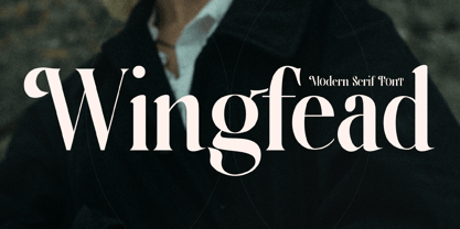 Wingfead is a bold and thick lettered serif font. It is perfect for any branding project such as logos, t-shirt printing, creative products, and more. Wingfead is PUA encoded which means you can access all glyphs and swashes with ease!