10,000 search results
(0.037 seconds)
- Gambling Resort JNL by Jeff Levine,
$29.00 Sheet music for the song "Beyond the Blue Horizon" from the motion picture "Monte Carlo" had the movie title in hand-lettering reminiscent of the Futura Black style, but with an inline stripe through each character. These few letter examples were the basis for Gambling Resort JNL and conjure up the Nouveau Riche spending their nights in Monte Carlo packing the roulette wheels, blackjack tables and slot machines.
 - Deco Revisited JNL by Jeff Levine,
$29.00 Inspired by a retro Art Deco poster as well as many of the true classic Art Deco type designs of the 1930s and 1940s, Deco Revisited JNL is a bold, black, stencil-influenced design with no counters. Although being a contemporary design, its use in any retro project will truly evoke a feeling for the “streamline” era. Deco Revisited JNL is available in both regular and oblique versions.
 - Hands on Albrecht by URW Type Foundry,
$39.99 This typeface is based on Albrecht Dürer’s work “Die Underweysung der Messung” (Institutiones Geometricae, Instruction in Measurement). Please note that this font needs special treatment when typesetting text. If you need black text, you need to type just capital letters separated by spaces. If you need coloured text, type both lower case and upper case (with the lower case character first), and then assign a colour to the lowercase letters only.
 - Belle Story by Creativemedialab,
$19.00 Belle Story is a beauty serif family. This hi-contrast display font Consists of 2 styles Display & Regular and each style has 10 weights from thin to black with fine lines and smooth curves to make this font perfect for luxury, classy, high-end branding, logo, and many more. Belle Story also includes a Variable style as well as multilingual support, numbers, and currency symbols, and dozens of alternates.
 - Kairos by Monotype,
$50.99 The Kairos™ family from Terrance Weinzierl is that rare form of typeface that successfully melds design distinction and ease of use. While based on 19th century Grecian wood type forms, it performs admirably in a variety of applications, both in print and on screen. Kairos Variables are font files which are featuring two axis and have a preset instance from Thin to Black and Condensed to Extended
 - Acosta by Zane Studio,
$18.00 Acosta is a serif typeface with high contrast and a refreshing look. From sheer to black with italics, Acosta offers many possibilities for application in many graphic or editorial projects. The lighter weight is suitable for short paragraphs, and the heavier weight is suitable for headlines, perfect for display purposes such as branding, book covers, and web titles. Acosta is also available latin character set which supports latin based languages.
 - Boldoni by Forte Type,
$4.90 Boldoni is like a caricature: it brings with itself exaggerated elements of the modern typefaces, that has as main names Giambattista Bodoni and François-Ambroise Didot. Boldoni takes to the limit its width and serifs, causing a ultra fat type feeling, and its styles causes a monochromatic effect that remember the colors Black, Gray and White. Boldoni is good for titles, initials, drop caps, lettering, posters and vertical writing.
 - Scootchy by Typogama,
$19.00 Scootchy is a high contrast, narrow typeface destined for use in both large and small point sizes. Blending an industrial and humanist approach, this typeface includes four weights ranging from a slender, regular style to a dark and contrasted Black weight. With an Extended Latin character set and a wide range of Opentype features, Scootchy aims to provide a versatile solution that can be applied to a wide range of layouts.
 - Bentley Floyd by Differentialtype,
$10.00 Bentley Floyd is a display font family designed to enhance the appearance of any document or presentation you create. This font can also be used for logo fonts, brochures, pamphlets, billboards, book covers, magazine covers, or product promotions. This font will support the appearance of every product promotion that you make. This font consists of 18 styles from thin to black, which will add more options to your mix.
 - Jungle Fever Shaded NF by Nick's Fonts,
$10.00Here’s a different take on my face Jungle Fever, patterned after Neuland Black, originally designed by Rudolph Koch for Gebr. Klingspor in 1923. A “sunrise” shading pattern has been employed to add visual impact and warmth to headlines. Best used in sizes of 48 point and above. All versions of this font include the Unicode 1250 Central European character set in addition to the standard Unicode 1252 Latin set. - Krazy Kracks NF by Nick's Fonts,
$10.00This playful offering, suggestive of Cooper Black on some serious drugs, is based on the so-called “California” style of lettering used extensively in travel posters of the 30s to the 50s. This version is based on its interpretation by Carl Holmes in a Walter T. Foster artbook entitled ABC of Lettering. Both versions of this font include the complete Unicode Latin 1252 and Central European 1250 character sets. - Levy by Lithographe,
$36.00 Good for typography, good for close paragraphs, good for titles logo, markers, use with numbers, Capitals and Cases. use Special symbols as design elements. One can be used for others. Good for closed groups. Limbos, good to go with Serif, Sans serif or old english. use it with variety and any design light or heavy. the weight is black, so it wont matter. hope you enjoy the font and use it.
 - Quiche Flare by Adam Ladd,
$25.00 Quiche Flare is a high-contrast, flared serif typeface featuring foxtail ball terminals, swash capitals, and geometric proportions. With weights ranging from Thin to Black with matching italics, it’s useful for a variety of display applications across products, packaging, labels, invitations, stationery, fashion, etc. The design exhibits both elegance and a touch of whimsy with the foxtail terminals and the flared serifs add more interest, beauty, and movement to the characters.
 - Molecula by Northeast Type Foundry,
$22.99 Molecula is grotesque sans serif of slightly condensed proportions and humanist-grotesk features. The family features 9 weights from Thin to Black, each of which has an italic. The character set is robust, covering extended latin. All completely equipped with opentype features, alternative glyphs, fractions, lining numbers, small caps, subscript and superscript. Molecula has been designed for advertising, branding, packaging or anywhere a clean and contemporary voice is needed.
 - Firelli by Typejockeys,
$60.00 Firelli is an original family of 14 styles including 7 weights and Italics. Delighting from thin to black, Italic swash caps, ligatures, and neat alternate characters. Big headlines will love Firelli’s incorruptible details. Longer texts will benefit from a wide-ranging family with its solid posture. Go, use everything Firelli has to offer, to design your contentful magazines, powerful annual reports, or even bedtime stories and fairy tales.
 - Modet by Plau,
$30.00 Modet is a versatile and friendly humanist sans-serif prepared for all typographic tasks. It is quite readable in smaller sizes and shows its character in larger sizes. You can change the face of Modet through its many alternate characters and OpenType features. This versatility makes it a great performer in editorial and branding projects. Modet comes in 10 roman styles, from thin to 'ultra black' and speaks 289 languages.
 - Scamps by Spark Creative,
$39.00 I designed this font because it didn't exist - it’s based on hand rendered type created for black and white line marker scamps used in the advertising industry. I use it that way and it’s saved me a LOT of hand-rendering time over the years. Of course, Scamps works as an informal marker script in its own right too. I’ll be interested to see what you do with it.
 - TT Prosto Sans by TypeType,
$29.00 Prosto Sans - this font family for any occasion. You can use these fonts almost everywhere. The modern open grotesque forms and classic font family formula: Thin, Light, Regular, Bold, Black and Italics. Prosto Sans is the assistant to work for any projects. Optimized for the websites, mobile applications, and printing materials. We offer you to have a look at this font’s narrow version, which is called TT Prosto Sans Condensed.
 - Soul Leo by Otto Maurer,
$16.00 Soul Leo ist a special Version of my font „Soul“ (soul ultra black). For a long Time i want to make a Font like this. Before FL6 that was impossible. I know it is a big File Size for a Font with all the Graphics but i need a Font like this for a LadyProjekt. And so i did it myself. I hope you like it as i do!
 - Blauth by Latinotype,
$29.00 Blauth—a versatile and contemporary sans serif typeface—comes in 8 weights, ranging from Thin to Black, with matching italics and contains a set of alternate characters. Its small x-height gives it an elegant feel that reminds us of classic typefaces. Blauth is well-suited to continuous text and its uppercase set is ideal for high-impact headlines while its softened corners give your designs a warm and contemporary look.
 - Retroguard by Mevstory Studio,
$15.00 Retroguard is a typeface that was inspired by classic movies and frequently makes people nostalgic for the height of cinema. This typeface is distinguished by its strong, dramatic letterforms, which frequently evoke the early 20th-century Art Deco and Art Nouveau movements. Images that enhance boldness and drama, including black-and-white photos, antique movie posters, or pictures of film reels, are frequently used in conjunction with this font.
 - Souses by Piñata,
$8.00 Souses — original fontfamily, which are made by hand. Universal typefaces formula of 10 fonts: Thin, Light, Regular, Bold, Black and Italics. Souses ideal for use in themes: ecology, village, natural, handmade & toys. Handmade style of the fonts — an advantage that will create loyalty to your products & company. Scope: animation, packaging, logotypes, movie titles, children's products, ecology, cafes, menus, posters, interiors, outdoor advertising. Optimized for the websites, mobile applications and printing materials.
 - Eligra by Eliezer Grawe,
$- Eligra is a modern and elegant sans-serif typeface family inspired by old and new classics like Helvetica and Gotham. Its geometric and precise strokes create a versatile and timeless font. However, Eligra has unique features, like its subtle swirls and curves, that add a dash of personality while still maintaining the font's simplicity and clarity. Eligra has more than 800 glyphs, with a large set of Latin, Cyrillic and Greek characters, several alternates, and different styles of numerals. It is clean, clear, stable, and contemporary, making it a perfect choice for branding projects, websites, advertisements, documents, presentations or any other occasion where you want to convey evenness while maintaining a contemporary and innovative look.
 - Apparel by Latinotype,
$35.00 Inspired by the MacFarland series in the 1912 ATF catalog, Apparel is a typeface that shares similar functional characteristics with Times New Roman and Caslon fonts yet it has its own personality: A great choice for high-impact design. Apparel is a contemporary, classy and fresh serif typeface with a laid-back attitude that best suits your design needs. Its medium-large x-height makes it ideal for headlines and brand identity design. Apparel also includes a version, with a greater contrast between thick and thin strokes, for use in even larger sizes. The font comes with italic styles which can be used individually or in combination with the upright variant. Moderately slanted italics are also available as OpenType Stylistic Alternates. Each font style supports more than 200 Latin-based languages, as you would expect from Latinotype fonts. Apparel also includes a basic Cyrillic set, old style & lining figures, fractions and alternates, among other OpenType features.
 - NorB Architect CF by NorFonts,
$32.00 NorB Architect Condensed fonts are the condensed and the extra-condensed version of my NorB Architect font. It comes with 12 weights from Light to Condensed to Extra Condensed along with their Bold and Felt version. These Architectural fonts will add a beautiful architectural hand-lettering style to all your CAD project drawings. Architects have always wanted their CAD drawings to look more like they were drawn by hand, rather than by a CAD program. These AutoCAD fonts are the first step in bringing back that “artistic hand-drawn” feel to your CAD drawings or any graphic design project that can use true type fonts. They also can be used with any word processing program for text and display use, print and web projects, apps and ePub, Comics, graphic identities, branding, editorial, advertising, scrapbooking, cards and invitations … or even just for fun! NOTE: For more variations of 'NorB Architect CF' font please visit click on this link.
 - Bleqcki by Twinletter,
$17.00 Welcome to the nostalgic world of typography! Bleqcki is a retro serif display font that brings the strength and beauty of a classic look to your projects. If you are looking for the perfect solution to bring a classic and vintage look to various visual branding design projects, then Bleqcki is an unmatched choice. What makes Bleqcki so interesting? This font not only brings a strong classic feel but also comes with several features that allow you to express your creativity. With families that include regular, shadow, outline, and slant, as well as alternate ligatures and characters. You have various options to create a look that suits your brand identity. We understand that branding and design projects can be very diverse and reach different audiences worldwide. That's why Bleqcki supports multiple languages, allowing you to communicate with your audience without restrictions. So, make each branding project an enchanting trip back in time. Get Bleqcki now and enjoy the nostalgic feel it brings to your projects.
 - Blinkford by Nathatype,
$29.00 Step back in time and embrace the nostalgic allure of Blinkford, a captivating uppercase display font that transports you to a vintage charm. The characters are bold and robust, evoking a sense of grandeur and prominence that harks back to a bygone era. The open layout enhances legibility and imparts a sense of spaciousness that is characteristic of vintage typography. As a special bonus, this font includes ornaments. Blinkford fits in headlines, logos, branding materials, and many more.
 - Green Grove by True Story Letterworks,
$12.00 Green Grove is a display typeface with low contrast and compressed proportions. It works good in headlines for posters, key visuals, corporate identity and package design.
 - Cad by NicolassFonts,
$- CAD is brilliantly suited for graphic design and display use and perfect for logotypes, t-shirts, packaging, brand identity, books, magazines, newspapers, posters, billboards, and advertising.
 - Kenzomaru by Almarkha Type,
$29.00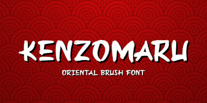 Kenzomaru is a Oriental Brush font that will make your designs look modern, unique and fun. It’s perfect for labels, quotes, posters, DIY projects, branding, packaging, greeting cards, websites, photos, photography overlays, signs, window art, scrapbooking, tags and so much more!
 - Comtype by Octopi,
$7.00 Ridiculously wide, mathematical and angular, and yet, looks good in vast blocks of text. Comtype is a cross and exaggeration between vintage computer text and old-school typewriter text. Five weights for your typesetting pleasure.
 - Silent Comedy JNL by Jeff Levine,
$29.00 A poster for the 1917 Charlie Chaplin comedy “Easy Street” had Chaplin’s name hand lettered in thick, round cornered block characters. This inspired Silent Comedy JNL, which is available in both regular and oblique versions.
 - Fairplex by Emigre,
$49.00 Zuzana Licko's goal for Fairplex was to create a text face which would achieve legibility by avoiding contrast, especially in the Book weight. As a result of its low contrast, the Fairplex Book weight is somewhat reminiscent of a sans serif, yet the slight serifs preserve the recognition of serif letterforms. When creating the accompanying weights, the challenge was to balance the contrast and stem weight with the serifs. To provide a comprehensive family, Licko wanted the boldest weight to be quite heavy. This meant that the "Black" weight would need more contrast than the Book weight in order to avoid clogging up. But harmonizing the serifs proved difficult. The initial serif treatments she tried didn't stand up to the robust character of the Black weight. Several months passed without much progress, and then one evening she attended a talk by Alastair Johnston on his book "Alphabets to Order," a survey of nineteenth century type specimens. Johnston pointed out that slab serifs (also known as "Egyptians") are really more of a variation on sans serifs than on serif designs. In other words, slab serif type is more akin to sans-serif type with serifs added on than it is to a version of serif type. This sparked the idea that the solution to her serif problem for Fairplex Black might be a slab serif treatment. After all, the Book weight already shared features of sans-serif types. Shortly after this came the idea to angle the serifs. This was suggested by her husband, and was probably conjured up from his years of subconscious assimilation of the S. F. Giants logo while watching baseball, and reinforced by a similar serif treatment in John Downer's recent Council typeface design. The angled serifs added visual interest to the otherwise austere slab serifs. The intermediate weights were then derived by interpolating the Book and Black, with the exception of several characters, such as the "n," which required specially designed features to avoid collisions of serifs, and to yield a pleasing weight balance. A range of weights was interpolated before deciding on the Medium and Bold weights.
 - FF Meta Variable by FontFont,
$344.99The FF Meta® design is a sans serif, humanist-style typeface that was designed by Erik Spiekermann for the West German Post Office (Deutsche Bundespost). It was subsequently released in 1991 by Spiekermann's company FontFont The FF Meta family, initially released as a commercial font in 1991, now comprises over sixty fonts. The FF Meta 2 family was released in 1992, the FF Meta Plus family in 1993, and in 1998 a facelift of the complete font family reclassified the FF Meta series and combined them into family-sets named FF Meta Normal, FF Meta Book, FF Meta Medium, FF Meta Bold and FF Meta Black. These are all available in Roman, italic, small caps and italic small caps. Between 1998 and 2005, further light stroke weights and a condensed family were introduced by Tagir Safayev and Olga Chayeva and were named: FF Meta Light and FF Meta Hairline. The last addition to the growing FF Meta font family is FF Meta Serif released by FSI in 2007. FF Meta Variable Roman is a single font file that features two axes: Weight and Width. For your convenience, the Weight and Width axes have preset instances. The Weight axis has a range from Hairline to Black. The Width axis provides a range of condensed values. This Roman (upright) font is provided as an option to customers who do not need Italics, and want to keep file sizes to a minimum. FF Meta Variable Italic is a single font file that features an italic design with two axes: Weight and Width. For your convenience, the Weight and Width axes have preset instances. The Weight axis has a range from Hairline to Black. The Width axis provides a range of condensed values. This Italic font is provided as an option to customers who do not need Roman (uprights), and want to keep file sizes to a minimum. FF Meta Variable Set is a single font file that features three axes: Weight, Width and Italic. For your convenience, the Weight and Width axes have preset instances. The Weight axis has a range from Hairline to Black. The Width axis provides a range of condensed values. The Italic axis is a switch between upright and italic - P22 Canterbury by IHOF,
$49.95 Canterbury is a late Medieval Gothic font with a rough edge. This blackletter face is available with four different types of Capital initial letters or combined into one Opentype Pro font with all variations plus historic ligatures, alternates and even a few ornaments.
 - Cabaret by Solotype,
$19.95We've always liked Art Gothic (you've seen it on the titles and credits for TV's Murder She Wrote) but felt it was far too animated for most uses. Here is our super-simplified version, a calmer font that will fit many display uses. - Vafthrudnir by Scriptorium,
$18.00Vafthrudnir is an original font design which draws on the tradition of Germanic uncial and early gothic calligraphy. It is designed to be extra bold and somewhat rough-hewn, for use in title design, and features variant versions of many of the characters. - Tinderbox by Device,
$29.00 16th and 17th century formal handwriting forms the basis for Tinderbox, an antique script. Preserving the rough impression of a quill pen on parchment, Tinderbox evokes old manuscripts, ecclesiastical texts, gothic inscriptions, faded tattoos and horror literature; spooky calligraphy for the digital age.
 - GrottoGoth by Grey Fortress Ent,
$20.00 GrottoGoth is a sans serif created to expand the availability of fonts used in creating Gothic, Halloween, and overall spooky designs. This is the first font designed by Grey Fortress Enterprises. Additional variations are planned and other original fonts are in the works.
 - Larrikin by HeadFirst,
$17.99 The distressed letterforms hark back to early printing process using hand carved wood cut letters. The typeface is available in 6 weight with both Rough & Solid variations.