10,000 search results
(0.063 seconds)
- KG I And Love And You by Kimberly Geswein,
$5.00 Conversation hearts! Use ALL CAPS for even lettering. For bouncy letters, alternate uPpEr and LoWeR cases to make the letters bounce up and down.
 - Proteron - Unknown license

- Tuesday - Unknown license

- Yorka by Huruforia,
$5.00 Yorka is a mecha style display sans serif font, this font only consists of Uppercase Letters & multilingual support. Yorka is perfect for Logotype, Print Design, Label, Product, and more. OTF format fonts are also easy to install and support for Mac or Windows. Hopefully, our work is useful for you.
 - Fruit Syrup by Olivetype,
$18.00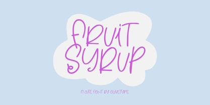 Fruit Syrup is a playful handwritten font with a dancing baseline!. This font is suitable for children craft, teaching material, or any other design that needs a splash of cuteness. So what’s included: Fruit Syrup (OTF) Basic Latin A-Z, a-z, numbers, symbols, and punctuations International Characters. Thank You
 - Gamerock by Din Studio,
$29.00 Gamerock is a classic sport font. Made for any professional project especially that related to the sports. Beside that, this font can be used for printing, branding and quotes. Includes: Gamerock (OTF) Features: Alternates PUA Encoded Multilingual Support Numerals and Punctuation Thank you for downloading premium fonts from Din Studio
 - Telegraph by Solotype,
$19.95Charles Beeler Jr. designed this in 1895 for Mackellar, Smiths and Jordan, which was part of the American Type Founders combine. The font had a short life because five years later ATF began an "off with the old, on with the new" program, and this font was an early victim. - Strap Monogram by MonogramBros,
$12.00 Strap Monogram Font is a perfect shaped monogram font consisting of 52 letters and 1 basic frame. Octagon Monogram Font comes with font files in OTF format. With just a single font file you will be able to create beautiful strap monograms in just a matter of minutes after the purchase!
 - Mertalion by Din Studio,
$29.00 Mertalion is a Vintage Serif Font. Create inspiring from the vintage logotype. the fonts are suitable for any vintage project like branding, vintage logotype, quote, and t-shirt print. Included : - Mertalion (OTF) Featured : - Accents (Multilingual characters) - PUA encoded - Numerals and Punctuation (OpenType Standard) Thanks for visiting and downloading my font!
 - Milky Rainbow by Abo Daniel,
$16.00 introducing MILKY RAINBOW - Bold and Bouncy Handwritten Font - MILKY RAINBOW is natural handwritten font. come with a bold style, it is very eye-catching. It is great for packaging, branding, quotes, cards, banner, book, cutting, silhouette, social media content, and anything of your craft project. I created some ligatures to make it look so natural. Features: - Uppercase - Lowercase - Number & punctuations - Multilingual - PUA encoded I hope you love it. regards, Abo Daniel Studio
 - Servus Slab by Dada Studio,
$29.00 This family is very special to me. I started working on it right after my first son was born. I decided to name the typeface "Servus" which means "Hello" in my country. The whole idea of the family symbolizes a child’s growth. It starts with Thin and Narrow weights - just like a newborn baby - then it slowly grows to Black and Wide. As You can guess, my son is quite chubby now! And I can assure You that I put all my love into details. Servus consists of 9 weights which gives us 18 fonts with matching italics. Lights and Bolds, due to their strong personality, are perfect for display uses. At the same time, Regulars create a harmonious structure that provides good legibility in long texts. Servus covers all latin languages. It contains a wide set of numerals, small capitals, fractions, ligatures and other OpenType goodies.
 - Addictive by Studio&Story,
$19.00 Addictive font duo is a sophisticated & contemporary, hand-made script font. With personal charms and character. allow you to create flowing hand-lettering.Addictive fonts are designed to be a winning combination. this font will perfect for many different project, Designed to feel comfortable with variety projects including advertising, campaigns, poster design, wedding, branding, logo, fashion, magazines, social media. Here is what you get in the Addictive package: 1. Addictive • A hand-made High quality script font containing upper & lowercase characters, numerals and a large range of punctuation + OpenType features (Ligatures&Alternates). 2. Addictive Caps • A bold hand-made brush font containing upper & lowercase characters, numerals and a large range of punctuation. Creates a perfect pairing contrast with the Addictive Script Both fonts Include multilingual support: English, Italian, French, Polish, German, Swedish, Spanish, Danish, Dutch, Portuguese, Norwegian, Malaya, Indonesian, Finnish, Filipino. Malaya. TTF and OTF files are included for both fonts. Access all OpenType features alternates&Ligatures, you need a program that supports OpenType features such as Adobe Illustrator, Adobe Photoshop, Microsoft word and Etc.. Thanks for looking If you have any questions about license or anything else,feel free to leave a comment or send me a message. I'm always more than happy to help:) hope you enjoy! Michael
 - Aptifer Sans by Linotype,
$29.00 Aptifer Sans and Aptifer Slab are two 21st century typeface families created by Mårten Thavenius. Each family has seven weights, in roman and italic respectively, making 28 font styles in total. A heritage from two design traditions can be seen in Aptifer. One is the robust American gothic typefaces, like M. F. Benton’s, from around 1900. This is combined with the openness and legibility that comes from the humanist tradition. The sans serif part of the family, Aptifer Sans, is designed without excessive details disturbing the reading. Its sibling, Aptifer Slab, with its wedge slab serifs is more eye-catching but still suited for text settings. The italics fit well into the text flow of the roman. They are a bit narrower than the roman and have cursive characteristics. Both Aptifer Sans and Aptifer Slab are highly legible typefaces and can be used both in print and on screen.
 - Jack Pirate by Mans Greback,
$59.00 Jack Pirate is a hand-drawn blackletter typeface, created by Måns Grebäck during 2019. It is a genuine medieval font with fraktur-inspired letter forms, Gothic decorations and a mysterious undertone. Use it for projects relating to the Middle Ages, or in modern contexts such as tattoo or storefront graphics. It contains an alternate alphabet, to be used as a stand-alone font or to give decoration and variation to the regular style. The font is multilingual and has an extensive range of glyphs; it supports all Latin-based European languages, contains numbers as well as all symbols and characters you'll ever need.
 - Pirates Rum by Fractal Font Factory,
$13.00 Hi! Introducing a vintage layered typeface set named "Pirates Rum". This is an experiment of combining pirate motives with a touch of Gothic. It is a multi-layered decorative font containing a base layer, a layer with internal decorative elements, a layer with a shadow, and a separate aged font. It contains basic uppercase and lowercase glyphs, punctuation, numbers as well as multilingual characters for all kinds of layers. Pirates font, great for labels, logos, headers, and illustrations. Thank you & have a great day!
 - Jessen-Schrift by profonts,
$41.99 The original Jessen typeface, named in reminiscence of the great supporter of the printing art at the end of the 19th century, Peter Jessen, was designed in the years of 1924 until 1930. Bible Gothic was created by the famous German designer Rudolf Koch. Ralph M. Unger digitized this font exclusively for profonts in 2005, keeping his digitization as close as possible to the original design of Koch in order to preserve the distinguished character and the partly unconventional, original forms. The concept of a Bible Gothic was developing for years in Koch's mind and drove the direction of his work, but only after the experience with his Neuland design could he start the creation of his Peter Jessen typeface. Produced quite like Neuland, Jessen, however, is much more refined and more accurate in detail than Neuland. At first glance, it seems to look plain and simple, but if you look closer, the richness of its distinguished upper case forms unfold to a perfectly clear flow of text
 - Displace 2.0 by Serebryakov,
$35.00 Displace 2.0 is a display sans-serif font family. Displace 2.0 is a humanistic sans-serif based on the calligraphic shapes with a pronounced handwriting contrast and open forms typeface. It has a natural thick-thin swelling and shrinking of the strokes as if it were draw calligraphicaly. Displace font family includes five weights with italics: Light, Regular, Medium, Bold and Black. Try it!
 - Yella Delisa by Aqeela Studio,
$25.00 With the help of the distinctive decorative typeface Yella Delisa, you may create the appearance of handmade lettering. Greek (of course), a Latin character set, and diacritics are all included in the multilingual lettering font Yella Delisa. Your modern graphic design requirements are best served by this distinctive style. If you want to add some flair to long text, choose this font because it has a really good flow. It can be applied to packaging, branding, and social media content. Additionally, Yella Delisa is the best typeface for branding and packaging organic products. Additionally, you can design invitations for weddings and baby showers using this typeface's romantic emotions. This typeface is perfect for you, especially if you're seeking one for Instagram quote posts or any other social media content!
 - Quirky by Fine Fonts,
$29.00 The origin of Quirky lay in the Duke Ellington number It don't mean a thing if it ain't got that swing. For some time I had wanted to create a font from expanded stroked lines. I wanted to produce a light-hearted font, but with some classic touches. One day, whilst doodling in Adobe Illustrator, Quirky’s letterforms just appeared on screen as if from nowhere. First I drew the test word ‘hamburgefonts’ and then just kept going, unable to stop. Character after character appeared as if by magic. From the start, Quirky had a life of its own. The letterforms are rather more sophisticated than merely outlined stroked lines. Subtle adjustments to compensate for optical effects have been been incorporated. For example, horizontal stems have thicknesses slightly less than vertical stems and where stems join together, the thickening effect has been reduced by cutting into the joint. Being almost monoline, Quirky works well reversed out of a solid background and for TV credits. The Quirky fonts are fun fonts, so set, laugh and enjoy! I hope Quirky will give you as much pleasure in using it as I got in creating it! Shortly after the roman version was born, an italic version and then a thin version were created to form a family of three fonts.
 - Charmini by Luxfont,
$18.00 Charmini is an exquisite font with a soft and at the same time confident serifs, modern and with a touch of retro. Font lines are strict with smooth, perfect transitions. Charmini family includes 2 types of uppercase letters and has 9 font thickness options - from the lightest weights, suitable for large amounts of text to the heaviest weights, intended for headlines. Tech Specs: 36 fonts in family UPPERCASE and 2 versions of lowercase letters ligature fi ff fl Numbers & basic Punctuation Serif Typeface 9 variants of width + italic OTF font format ld.luxfont@gmail.com
 - Schuss Sans CG Poster Extrabold by typic schuss,
$33.00 Schuss Sans CG Poster Extrabold 1 upright OTF Font Latin extended, Cyrillic and Greek. Specially developed for headline poster display sizes. A Sans Serif Extrabold Headline-Font in addition to the Schuss superfamily. The heights are optimized for big sizes, different to the text fonts of the Superfamily Schuss. The character set is slightly different to the non poster styles too, but comparable to Schuss Sans CG Poster Black. No italic, no additional figures, no tabular figures, no small Caps. But with maximum manual kerning. Ligatures: fi, fl, ff, ffi, ffl. No special OpenType features.
 - Bulbia by Typogama,
$25.00 Bulbia is a single weight, display typeface inspired by the teardrop shape featured in some middle eastern design. With a bold stroke and high contrast, this font conveys a strong, unique voice that can be further enhanced through the use of it’s extensive Opentype features. Through Swash letters, decorative Titling forms or even a range of precomposed word marks, this single weight font expands into a complete design toolkit with multiple applications and possibilities. Bulbia includes an extended Latin character set and is available as an OTF font.
 - Anultra Slab by Eclectotype,
$40.00 Anultra Slab is, you guessed it... An ultra bold slab serif! Anultra Slab is a hard hitting headliner, designed to be set LARGE. Because it's a single weight typeface, no compromises were necessary to get it interpolatable with other weights, so it is as bold and tight as I intended. Features include automatic fractions, case-sensitive forms, ligatures, stylistic alternates for non-descending J and Q, and a 3D 'xtrude' style, which can be layered behind the regular to create two colour, photo-lettering style text. Very seventies. Very cool. A companion typeface, Alight Slab , is available at the other end of the weight scale, but there are no weights in between. You're no middle-weight designer, so why use middle-weight fonts?!
 - Arlette by TypeTogether,
$49.00 Pilar and Ferran based Arlette on the fast stroke of one letter from a Roger Excoffon family, but along the way they abandoned that starting point in favour of experimentation. Many sans serifs are like a svelte black dress: functional, beautiful, and the unfussy outfit for a nice evening get together. The Arlette family isn’t like this. It’s a stunner — an incandescent reimagining of what defines a sans and how it can look. Arlette explores the boundaries of the sans serif landscape and returns with forms developed from gestural vigour. Thinking of it as “painterly” may at first seem to fit, but it underestimates Arlette’s ability to master an unseen world of countless emotions and physical applications: magazines, branding, editorial, teen and young adult works, book covers, and a host of products and packaging whose content will be amplified with Arlette’s voice. Not only does Arlette use its eight weights plus italics to speak in Latin-based scripts, it is also fluent in Thai and has six weights (hairline through bold) with which it meets that challenge, whether in text or display. Arlette Thai’s modern nature is seen in two features for the script. One is the decorative Thai characters that are based on original palm leaf manuscripts. Another is a version of the Latin numerals adapted to the height of the script due to their wide use in Thailand. Arlette Thai has been meticulously developed, including contextual kerning to avoid mark clashes. Arlette’s OpenType capabilities include mathematic and scientific figures, positional forms, pointers, arrows, and oldstyle, lining, and tabular lining numerals. In addition to all this, it’s packed with swashes and swash ligatures in both scripts for enthusiastic typesetting. Because it pushes experimentation without compromising readability, both Arlette Thai and Latin are surprisingly legible in small sizes and arrestingly beautiful when their details can be seen.
 - PykesPeakZero - 100% free

- Mahalini by Putracetol,
$28.00 Mahalini - Serif Font Mahalini is a luxurious serif font that adds a touch of elegance and sophistication to any project. Its timeless and classic design makes it a perfect choice for high-end fashion, beauty, and luxury branding. Mahalini was created with the idea of a sophisticated and versatile typeface that can be used in various design projects. For those who are looking for a font that will elevate their design and branding, Mahalini is the perfect choice. It is ideal for logos, book covers, posters, flyers, digital design, and any other projects that require a touch of luxury and elegance. The font's stylish and sophisticated look will make any product stand out and create a lasting impression on the audience. Mahalini comes with various features that make it a versatile and reliable choice for designers. The font includes uppercase and lowercase letters, as well as opentype alternates and ligatures. Additionally, it supports multiple languages and includes number, punctuation, and symbols. These features make it easy to create a professional and elegant design with ease. The Mahalini font package comes with three different file formats to ensure compatibility with various design software. The package includes the otf, ttf, and woff file formats. These files can be easily installed and used with Adobe Creative Suite, Microsoft Office, or any other design software. If you are looking for a font that will add elegance and luxury to your design, Mahalini is the perfect choice. Its timeless and classic design, combined with its versatility and sophistication, makes it a reliable and valuable addition to any designer's toolkit. In summary, Mahalini is a luxurious serif font that is perfect for high-end fashion, beauty, and luxury branding. Its classic design and versatile features make it a reliable choice for any design project. With its multiple file formats and multilanguage support, Mahalini is the perfect choice for any designer looking for an elegant and sophisticated font.
 - Roxic by Thinkdust,
$10.00 Roxic doesn’t push boundaries, or break them; Roxic doesn’t recognise your pedestrian concept of boundaries. It doesn’t so much laugh in the face of convention as much as it refuses to acknowledge its very existence. Roxic is a font for the modern day, but without the layers of pretension so often associated with modernism. Elegantly conveying your message with its uniquely delicate sturdiness, Roxic is a font that people haven’t met before, but they can’t help but trust it.
 - Goodwater by Fenotype,
$19.00 Goodwater is an original collection of a Brush, three weights of a monoline Script and four weights of condensed Sans typeface. Goodwater also has a “Print” version with rugged outline and worn-out texture of each font. Goodwater is a great pack for any display use from online to logo and from headline to packaging. All the styles are designed using the same proportions and soft corners so that they’ll place nice together. All Print versions have the same texture style and size too so that they’ll fit smooth together. Goodwater Script and Brush fonts are equipped with automatic Standard Ligatures and Contextual Alternates to keep the flow smooth and it’s best to keep those features on.
 - Buyan by Yu Type,
$12.00 Meet Buyan, a unique typeface family that draws inspiration from the iconic Mongolian film title "Nugel Buyan" 1963. Buyan is your go-to All Caps and Sans-Serif typeface, crafted with a sleek Condensed design that effortlessly blends style with readability. Elevate your projects with this versatile display font, adding a cool and contemporary touch to your text. This font family boasts a comprehensive range with 6 distinct weight styles and italics, allowing you to play with contrast and customize your text to suit your creative vision. Whether you're working on branding, headlines, or any display application, Buyan is the perfect choice to bring a modern and impactful aesthetic to your work. Elevate your design game with Buyan!
 - Buyan Variable by Yu Type,
$50.00 Meet Buyan, a unique typeface family that draws inspiration from the iconic Mongolian film title "Nugel Buyan" 1963. Buyan is your go-to All Caps and Sans-Serif typeface, crafted with a sleek Condensed design that effortlessly blends style with readability. Elevate your projects with this versatile display font, adding a cool and contemporary touch to your text. This font family boasts a comprehensive range with 6 distinct weight styles and italics, allowing you to play with contrast and customize your text to suit your creative vision. Whether you're working on branding, headlines, or any display application, Buyan is the perfect choice to bring a modern and impactful aesthetic to your work. Elevate your design game with Buyan!
 - Cora by TypeTogether,
$49.00 Cora is a sans serif with an experimental bent, offering a large x-height, some contrast of stroke weight, and capitals inspired by classical lettering. The large x-height gives it a voice with a little more volume so that those in the back of the room have no trouble hearing. Because the letters seem slightly large, Cora remains clear at smaller point sizes. It is a typeface intended to perform well on screen without losing its attraction in print and the nature of its shapes allows for condensation or expansion without becoming severely distorted. The uppercase exhibits classical proportions found in ancient Roman inscriptions, which provides opportunities for setting titles in all caps. Cora Opentype Pro has a full range of numerals for every use, small caps, the most common open type features and supports many languages that use the latin extended alphabet. It is available in a range of three weights plus Italics. CoraBasic is a reduced version of Cora. It is still an OT-font but without any particular features except of a set of ligatures, class-kerning and language support including CE and Baltic.
 - Stuph by Tail Spin Studio,
$25.00Stuph Light is a collection of drawings pulled from one of the many sketch books Steve Zafarana is always doodling in. Because they are in a font, the drawings can be used in font format or opened and manipulated in vector programs like Freehand or Illustrator. Stuph Light continues to inflict upon an unsuspecting public Steves’ cockeyed outlook on the world that was started with ITC Fontoonies, ITC Gargoonies and ITC Backyard Beasties. Will this lunacy ever end? - Oxford Street by K-Type,
$20.00 Oxford Street is a signage font that began as a redrawing of the capital letters used for street nameplates in the borough of Westminster in Central London. The nameplates were designed in 1967 by the Design Research Unit using custom lettering based on Adrian Frutiger’s Univers typeface, a curious combination of Univers 69 Bold Ultra Condensed, a weight that doesn’t seem to exist but which would flatten the long curves of glyphs such as O, C and D, and Universe 67 Bold Condensed with its more rounded lobes on glyphs like B, P and R. Letters were then remodelled to improve their use on street signs. Thin strokes like the inner diagonals of M and N were thickened to create a more monolinear alphabet; the high interior apexes were lowered and the wide joins thinned. The crossbar of the A was lowered, the K was made double junction, and the tail of the Q was given a baseline curve. K-Type Oxford Street continues the process of impertinent improvement and includes myriad minor adjustments and several more conspicuous amendments. The stroke junctions of M and N are further narrowed and their interior apexes modified. The middle apex of the W is narrowed and the glyph is a little more condensed. The C and S are drawn more open, terminals slightly shortened. The K-Type font adds a new lowercase which is also made more monolinear so better suited to signage, loosely based on Univers but also taking inspiration from the Transport typeface both in a taller x-height and character formation. The lowercase L has a curled foot, the k is double junctioned to match the uppercase, and terminals of a, c, e, g and s are drawn shorter for openness and clarity. A full repertoire of Latin Extended-A characters features low-rise diacritics that keep congestion to a minimum in multiple lines of text. The font tips the hat to signage history by including stylistic alternates for M, W and w that have the pointed middles of the earlier MOT street sign typeface. Incidentally, Alistair Hall (‘London Street Signs’, Batsford, 2020) notes that when the manufacturer of signs was changed in 2007, Helvetica Bold Condensed was substituted in place of the custom design, “an unfortunate case of an off-the-peg suit replacing a tailored one” and a blunder that has happily since been rectified, though offending nameplates can still be spotted by discerning font fans.
 - Quire Sans by Monotype,
$155.99 My goal was to make a design that might fit in anywhere,” says Jim Ford about his Quire Sans™ typeface. “I wanted it to be highly functional and sexy at the same time.” With one foot comfortably in the realm of oldstyle design and traditional book typography, and the other in evolving electronic media, the Quire Sans family does, indeed, fit in just about anywhere. As for sexy, someone once quotably wrote, “A great figure or physique is nice, but it's self-confidence that makes someone really sexy.” Yes, Quire Sans is sexy, performing confidently in virtually any setting. 2014-06-26 00:00:00.000 57.9900 F43063-S193385 42831 Neue Frutiger World Monotype https://www.myfonts.com/collections/neue-frutiger-world-font-monotype-imaging https://cdn.myfonts.net/cdn-cgi/image/width=417,height=208,fit=contain,format=auto/images/pim/10000/279026_ed8c8093fe1ac59ebe9e3ee1d9262c8e.png Neue Frutiger World is designed for global use with an impressive range of 10 weights, from Ultra Light to Extra Black, with matching italics. It embodies the same warmth and clarity as Adrian Frutiger’s original design, but allows brands to maintain their visual identity, and communicate with a consistent tone of voice, regardless of the language. Neue Frutiger World supports more than 150 languages and scripts including Latin, Greek, Cyrillic, Georgian, Armenian, Hebrew, Arabic, Thai and Vietnamese. “Before Neue Frutiger World it was not an easy task for western brands to find families in Arabic, Hebrew, Thai and Vietnamese which match with their Latin,” says Monotype type director Akira Kobayashi, who led the Neue Frutiger World project. “They may find a type with closer expression, but there was no guarantee if the bold version in the non-Latin family matches the bold in their Latin. Neue Frutiger World offers a better solution.” In addition to Neue Frutiger World’s linguistic versatility, it works hard across environments – suited to branding and corporate identity, advertising, signage, wayfinding, print, and digital environments. The Neue Frutiger World fonts can be paired with Monotype’s CJK fonts: M XiangHe Hei (Chinese), Tazugane Gothic (Japanese), Tazugane Info (Japanese), and Seol Sans (Korean). These were all designed to address brands’ needs to expand into Asian cultures and solve for global typographic challenges.
 - Caldina by Artegra,
$29.00 Caldina is a delicious font family that adds a great taste to any given project. From light to bold, it comes with 10 fonts with matching true italics. Each font contains 659 glyphs which offers a great amount of language support including the Greek, Russian and other languages using the Cyrillic alphabet. Each glyph has been designed to perfection and kerned with countless amount of kerning pairs. When it comes to Opentype features it has oldstyle figures, tabular lining, tabular oldstyle, ligatures, subscript and superscript, fractions and language localizations (such as the Polish kreska). It’s great for display purposes but also its high legibility makes it a great text font as well. Although not limited to, it’s perfect for food, beverage and coffee brands as well as the cos- metic brands. Let it be branding, advertising, packaging or posters, Caldina is there to add that special flavor that you’re looking for.
 - Gunec by Twinletter,
$17.00 Introducing Gunec, a cutting-edge and futuristic font ideal for technology- and science-related designs. Gunec is the ideal choice for anyone looking to add a touch of futurism to their work thanks to its distinctive letterforms and svelte lines. The versatile font Gunec can be used for a variety of tasks, such as branding, packaging design, book covers, and more. However, Gunec is more than just a pretty face. This font is ideal for all of your design projects, from print to digital, as it is made to be highly legible and simple to read. Additionally, Gunec has all the elements required to produce a comprehensive and professional design, including a full set of upper- and lowercase letters, punctuation, and numerals. With Gunec font, you’ll be able to create designs that are both stylish and professional, with a futuristic look that’s sure to stand out. This font is perfect for those who want to be ahead of the curve in design, and for those who want to add a touch of innovation to their work. So don’t wait, make Gunec your font of choice today, and take your designs to the next level! What’s Included : - File font OTF, TTF, WOFF, WOFF2, CSS, HTML - All glyphs Iso Latin 1 - Alternate - Simple installations - We highly recommend using a program that supports OpenType features and Glyphs panels like many Adobe apps and Corel Draw so that you can see and access all Glyph variations. - PUA Encoded Characters – Fully accessible without additional design software. - Fonts include Multilingual support
 - Sanctum Island by Skinny Type,
$19.00 Introducing Sanctum Island an handwritten font with a high detailed dry brush texture. Sanctum Island has been designed to fit a wide range of projects from urban style to classic branding with a characters set to completely change the look of your design. You can use it for business branding, Instagram quotes, blog headers, fashion apparel, stationery and more... Please note that Sanctum Island includes both standard and alphabets. Sanctum Island includes: Sanctum Island • A dry brush script font with uppercase and lowercase characters, ligatures, numerals and punctuation. Kingston Extras • A full set of brushed elements : 52 hand-drawn swashes, doodles and paint drips. How to use Sanctum Island Extras To use the Sanctum Island Extras characters simply install the Sanctum Island Extras.otf file, select it from your font menu and type any letter from uppercase A to lowercase z to have a swash or a paint splat. You can refer to the Sanctum Island Extras Map Character included in the folder to see which letter correspond to which element. Multilingual support Sanctum Island supports multilingual characters for western, central and south-east European languages. Feel free to message me if you're unsure of any language support. More Sanctum Island is compatible with any software that can read a standard font, though ligatures require a software that is Opentype capable. Most programs now are compatible with Opentype features. Fonts are provided in OTF and TTF. Any question? Feel free to contact me i’ll be glad to help you :) Enjoy!
 - Polias by Esintype,
$23.00 Polias is an all-caps uniwidth typeface inspired by an ancient inscription carved on a monoblock stone in hybrid characters — between no-contrast linear sans to low-contrast flared serif. The inspiring inscription is the dedication by Alexander the Great, discovered in the Temple of Athena Polias in the ancient Ionian city of Priene. Stanley Morison mentioned this inscription in one of his lectures: “The distinctive feature of this inscription consists of a consistent thickening towards the ends of perpendiculars and horizontals.” … “We have not the right to say that the serif was invented for Alexander the Great's inscription, only that this is its first datable appearance.” The letter proportions are almost identical to the original, but the stroke features have been reinterpreted and characterized. Serif-like nodes at the end of the strokes are subtle extensions that serve to accentuate rather than break its monoline elegance. With an analogy, they are not flowers, but like blooming buds. Polias is a flared sans typeface which is closer to sans-serif forms on the spectrum between sans and serif. It’s especially light looking by design to convey rather thin and white typographic color of its original monumental look. It comes in eight weights and a variable font, scaled from Thin to Bold. It is multiplexed, so the weights do not affect text lengths. Light weights are closely based on the actual carving of the inscription. Thicker weights can be used on smaller typesettings to compensate for the weight difference of larger letters’ strokes, and to keeping the monoline appearance of the entire text block intact. This method can be used for any purpose, such as setting a hierarchy between the lines or to justify their lengths. Some of the original letterforms have been preserved and stylistic alternatives such as Ionic four-bar Sigma, dotted Theta, palm Y are provided as open type feature. Some of the other ancient forms, such as the three-bar Sigma (S), the pointed U, were also added for both the Greek and Latin scripts. Polias is preferable for big type settings such as logos and headlines as a modern representation of perennial classical forms. Its a fine fit for product branding, movie posters, book covers, packaging materials, and more, which require an epic look to attracting attention with a distinctive elegance. Polias can be considered for distinctiveness wherever Roman Capitals work. As a noun, Polias is one of the epithets of Athena / Minerva, and in this case referring to her role as the protector of the city of Priene. Polias is one of the seven typeface designs in Esintype's ancient scripts of Anatolia project, Tituli Anatolian series.
 - Polias Varia by Esintype,
$140.00 Polias Varia is an all-caps uniwidth variable weight typeface inspired by an ancient inscription carved on a monoblock stone in hybrid characters — between no-contrast linear sans to low-contrast flared serif. The inspiring inscription is the dedication by Alexander the Great, discovered in the Temple of Athena Polias in the ancient Ionian city of Priene. Stanley Morison mentioned this inscription in one of his lectures: “The distinctive feature of this inscription consists of a consistent thickening towards the ends of perpendiculars and horizontals.” … “We have not the right to say that the serif was invented for Alexander the Great’s inscription, only that this is its first datable appearance.” In Polias Varia, the letter proportions are almost identical to the original, but the stroke features have been reinterpreted and characterized. Serif-like nodes at the end of the strokes are subtle extensions that serve to accentuate rather than break its monoline elegance. With an analogy, they are not flowers, but like blooming buds. Polias Varia is a flared sans typeface which is closer to sans-serif forms on the spectrum between sans and serif. It’s especially light looking by design to convey rather thin and white typographic color of its original monumental look. It comes in eight weights and a variable font, scaled from Thin to Bold. It is multiplexed, so the weights do not affect text lengths. Light weights are closely based on the actual carving of the inscription. Thicker weights can be used on smaller typesettings to compensate for the weight difference of larger letters’ strokes, and to keeping the monoline appearance of the entire text block intact. This method can be used for any purpose, such as setting a hierarchy between the lines or to justify their lengths. Some of the original letterforms have been preserved and stylistic alternatives such as Ionic four-bar Sigma, dotted Theta, palm Y are provided as open type feature. Some of the other ancient forms, such as the three-bar Sigma (S), the pointed U, were also added for both the Greek and Latin scripts. Polias Varia is preferable for big type settings such as logos and headlines as a modern representation of perennial classical forms. Its a fine fit for product branding, movie posters, book covers, packaging materials, and more, which require an epic look to attracting attention with a distinctive elegance. Polias Varia can be considered for distinctiveness wherever Roman Capitals work. As a noun, Polias is one of the epithets of Athena / Minerva, and in this case referring to her role as the protector of the city of Priene. Polias (family) is one of the seven typeface designs in Esintype’s ancient scripts of Anatolia project, Tituli Anatolian series.
 - Synth2 by Pasternak,
$15.00 The font has a truly futuristic nature. It perfectly conveys the atmosphere of technology and futurism and it's the best choice for sci-fi and hi-tech topics and pictures. The font letters are unrounded, it's build is very simple and straight. The font includes 7 styles: thin, extra light, light, regular, medium, bold, and black. With the variety of font widths, there is the ability to make different combinations in graphic or web design projects as well. Carefully kerned letters look well in paragraphs and titles. Special attention to uppercase headings. The font counts 477 glyphs for each style. The thin style is free to use.


