10,000 search results
(0.13 seconds)
- Times New Roman WGL by Monotype,
$67.99 In 1931, The Times of London commissioned a new text type design from Stanley Morison and the Monotype Corporation, after Morison had written an article criticizing The Times for being badly printed and typographically behind the times. The new design was supervised by Stanley Morison and drawn by Victor Lardent, an artist from the advertising department of The Times. Morison used an older typeface, Plantin, as the basis for his design, but made revisions for legibility and economy of space (always important concerns for newspapers). As the old type used by the newspaper had been called Times Old Roman," Morison's revision became "Times New Roman." The Times of London debuted the new typeface in October 1932, and after one year the design was released for commercial sale. The Linotype version, called simply "Times," was optimized for line-casting technology, though the differences in the basic design are subtle. The typeface was very successful for the Times of London, which used a higher grade of newsprint than most newspapers. The better, whiter paper enhanced the new typeface's high degree of contrast and sharp serifs, and created a sparkling, modern look. In 1972, Walter Tracy designed Times Europa for The Times of London. This was a sturdier version, and it was needed to hold up to the newest demands of newspaper printing: faster presses and cheaper paper. In the United States, the Times font family has enjoyed popularity as a magazine and book type since the 1940s. Times continues to be very popular around the world because of its versatility and readability. And because it is a standard font on most computers and digital printers, it has become universally familiar as the office workhorse. Times?, Times? Europa, and Times New Roman? are sure bets for proposals, annual reports, office correspondence, magazines, and newspapers. Linotype offers many versions of this font: Times? is the universal version of Times, used formerly as the matrices for the Linotype hot metal line-casting machines. The basic four weights of roman, italic, bold and bold italic are standard fonts on most printers. There are also small caps, Old style Figures, phonetic characters, and Central European characters. Times? Ten is the version specially designed for smaller text (12 point and below); its characters are wider and the hairlines are a little stronger. Times Ten has many weights for Latin typography, as well as several weights for Central European, Cyrillic, and Greek typesetting. Times? Eighteen is the headline version, ideal for point sizes of 18 and larger. The characters are subtly condensed and the hairlines are finer."
 - Times New Roman by Monotype,
$67.99 In 1931, The Times of London commissioned a new text type design from Stanley Morison and the Monotype Corporation, after Morison had written an article criticizing The Times for being badly printed and typographically behind the times. The new design was supervised by Stanley Morison and drawn by Victor Lardent, an artist from the advertising department of The Times. Morison used an older typeface, Plantin, as the basis for his design, but made revisions for legibility and economy of space (always important concerns for newspapers). As the old type used by the newspaper had been called Times Old Roman," Morison's revision became "Times New Roman." The Times of London debuted the new typeface in October 1932, and after one year the design was released for commercial sale. The Linotype version, called simply "Times," was optimized for line-casting technology, though the differences in the basic design are subtle. The typeface was very successful for the Times of London, which used a higher grade of newsprint than most newspapers. The better, whiter paper enhanced the new typeface's high degree of contrast and sharp serifs, and created a sparkling, modern look. In 1972, Walter Tracy designed Times Europa for The Times of London. This was a sturdier version, and it was needed to hold up to the newest demands of newspaper printing: faster presses and cheaper paper. In the United States, the Times font family has enjoyed popularity as a magazine and book type since the 1940s. Times continues to be very popular around the world because of its versatility and readability. And because it is a standard font on most computers and digital printers, it has become universally familiar as the office workhorse. Times?, Times? Europa, and Times New Roman? are sure bets for proposals, annual reports, office correspondence, magazines, and newspapers. Linotype offers many versions of this font: Times? is the universal version of Times, used formerly as the matrices for the Linotype hot metal line-casting machines. The basic four weights of roman, italic, bold and bold italic are standard fonts on most printers. There are also small caps, Old style Figures, phonetic characters, and Central European characters. Times? Ten is the version specially designed for smaller text (12 point and below); its characters are wider and the hairlines are a little stronger. Times Ten has many weights for Latin typography, as well as several weights for Central European, Cyrillic, and Greek typesetting. Times? Eighteen is the headline version, ideal for point sizes of 18 and larger. The characters are subtly condensed and the hairlines are finer."
 - Times New Roman Small Text by Monotype,
$67.99In 1931, The Times of London commissioned a new text type design from Stanley Morison and the Monotype Corporation, after Morison had written an article criticizing The Times for being badly printed and typographically behind the times. The new design was supervised by Stanley Morison and drawn by Victor Lardent, an artist from the advertising department of The Times. Morison used an older typeface, Plantin, as the basis for his design, but made revisions for legibility and economy of space (always important concerns for newspapers). As the old type used by the newspaper had been called Times Old Roman," Morison's revision became "Times New Roman." The Times of London debuted the new typeface in October 1932, and after one year the design was released for commercial sale. The Linotype version, called simply "Times," was optimized for line-casting technology, though the differences in the basic design are subtle. The typeface was very successful for the Times of London, which used a higher grade of newsprint than most newspapers. The better, whiter paper enhanced the new typeface's high degree of contrast and sharp serifs, and created a sparkling, modern look. In 1972, Walter Tracy designed Times Europa for The Times of London. This was a sturdier version, and it was needed to hold up to the newest demands of newspaper printing: faster presses and cheaper paper. In the United States, the Times font family has enjoyed popularity as a magazine and book type since the 1940s. Times continues to be very popular around the world because of its versatility and readability. And because it is a standard font on most computers and digital printers, it has become universally familiar as the office workhorse. Times?, Times? Europa, and Times New Roman? are sure bets for proposals, annual reports, office correspondence, magazines, and newspapers. Linotype offers many versions of this font: Times? is the universal version of Times, used formerly as the matrices for the Linotype hot metal line-casting machines. The basic four weights of roman, italic, bold and bold italic are standard fonts on most printers. There are also small caps, Old style Figures, phonetic characters, and Central European characters. Times? Ten is the version specially designed for smaller text (12 point and below); its characters are wider and the hairlines are a little stronger. Times Ten has many weights for Latin typography, as well as several weights for Central European, Cyrillic, and Greek typesetting. Times? Eighteen is the headline version, ideal for point sizes of 18 and larger. The characters are subtly condensed and the hairlines are finer." - Times New Roman PS Greek by Monotype,
$67.99In 1931, The Times of London commissioned a new text type design from Stanley Morison and the Monotype Corporation, after Morison had written an article criticizing The Times for being badly printed and typographically behind the times. The new design was supervised by Stanley Morison and drawn by Victor Lardent, an artist from the advertising department of The Times. Morison used an older typeface, Plantin, as the basis for his design, but made revisions for legibility and economy of space (always important concerns for newspapers). As the old type used by the newspaper had been called Times Old Roman," Morison's revision became "Times New Roman." The Times of London debuted the new typeface in October 1932, and after one year the design was released for commercial sale. The Linotype version, called simply "Times," was optimized for line-casting technology, though the differences in the basic design are subtle. The typeface was very successful for the Times of London, which used a higher grade of newsprint than most newspapers. The better, whiter paper enhanced the new typeface's high degree of contrast and sharp serifs, and created a sparkling, modern look. In 1972, Walter Tracy designed Times Europa for The Times of London. This was a sturdier version, and it was needed to hold up to the newest demands of newspaper printing: faster presses and cheaper paper. In the United States, the Times font family has enjoyed popularity as a magazine and book type since the 1940s. Times continues to be very popular around the world because of its versatility and readability. And because it is a standard font on most computers and digital printers, it has become universally familiar as the office workhorse. Times?, Times? Europa, and Times New Roman? are sure bets for proposals, annual reports, office correspondence, magazines, and newspapers. Linotype offers many versions of this font: Times? is the universal version of Times, used formerly as the matrices for the Linotype hot metal line-casting machines. The basic four weights of roman, italic, bold and bold italic are standard fonts on most printers. There are also small caps, Old style Figures, phonetic characters, and Central European characters. Times? Ten is the version specially designed for smaller text (12 point and below); its characters are wider and the hairlines are a little stronger. Times Ten has many weights for Latin typography, as well as several weights for Central European, Cyrillic, and Greek typesetting. Times? Eighteen is the headline version, ideal for point sizes of 18 and larger. The characters are subtly condensed and the hairlines are finer." - Times New Roman PS by Monotype,
$67.99In 1931, The Times of London commissioned a new text type design from Stanley Morison and the Monotype Corporation, after Morison had written an article criticizing The Times for being badly printed and typographically behind the times. The new design was supervised by Stanley Morison and drawn by Victor Lardent, an artist from the advertising department of The Times. Morison used an older typeface, Plantin, as the basis for his design, but made revisions for legibility and economy of space (always important concerns for newspapers). As the old type used by the newspaper had been called Times Old Roman," Morison's revision became "Times New Roman." The Times of London debuted the new typeface in October 1932, and after one year the design was released for commercial sale. The Linotype version, called simply "Times," was optimized for line-casting technology, though the differences in the basic design are subtle. The typeface was very successful for the Times of London, which used a higher grade of newsprint than most newspapers. The better, whiter paper enhanced the new typeface's high degree of contrast and sharp serifs, and created a sparkling, modern look. In 1972, Walter Tracy designed Times Europa for The Times of London. This was a sturdier version, and it was needed to hold up to the newest demands of newspaper printing: faster presses and cheaper paper. In the United States, the Times font family has enjoyed popularity as a magazine and book type since the 1940s. Times continues to be very popular around the world because of its versatility and readability. And because it is a standard font on most computers and digital printers, it has become universally familiar as the office workhorse. Times?, Times? Europa, and Times New Roman? are sure bets for proposals, annual reports, office correspondence, magazines, and newspapers. Linotype offers many versions of this font: Times? is the universal version of Times, used formerly as the matrices for the Linotype hot metal line-casting machines. The basic four weights of roman, italic, bold and bold italic are standard fonts on most printers. There are also small caps, Old style Figures, phonetic characters, and Central European characters. Times? Ten is the version specially designed for smaller text (12 point and below); its characters are wider and the hairlines are a little stronger. Times Ten has many weights for Latin typography, as well as several weights for Central European, Cyrillic, and Greek typesetting. Times? Eighteen is the headline version, ideal for point sizes of 18 and larger. The characters are subtly condensed and the hairlines are finer." - Cutmark by J Foundry,
$25.00 INDUSTRIAL-STRENGTH UTILITY. Designed for function. Cutmark fonts features common 45˚ chamfered corners, flattened ink traps and wide apex forms. Customize the look with alternates including an Angled Set, Straight Set, Beam I, single-story a, and hooked l. The OpenType version includes 10 weights in 3 widths with matching italics. Variable Font Cutmark Variable contains the full family of styles in a single file! Select variations along width, weight and slant axes. Test and explore at jfoundry.com. Cutmark Variable is included in the complete package at no additional cost. Use which ever font format you prefer! Please email hello@jfoundry.com for any questions. Variable Fonts require MacOS 10.14 or higher. For browser and software support visit: v-fonts.com/support
 - Tag Hand Graffiti Trash by TypoGraphicDesign,
$1.00 CHARACTERISTICS The fresh and unique character of the typeface are awesome BOOM! The letter-forms are associated urban graffiti tags and pieces. Many Dingbat symbols like microphone, tape deck, ghetto blaster, vinyl, etc. make this font really fresh n HOT! APPLICATION AREA The handwritten, sloppy, square, shaky and fresh urban script font »Tag Hand Graffiti Trash« BANG! would look good at display size for headlines in magazines or websites, movie posters, music covers artworks or music webbanner. TECHNICAL SPECIFICATIONS Headline Font | Display Font | Fancy Font – Tag Hand Graffiti Trash OpenType Font with 393 glyphs - alternative letters and ligatures like Mr, Mrs, Ltd, Co, Dr, Mc, Dj etc. (with accents & €) & 2 styles (regular & fat) + dingbats like diamant, tape deck, microphone, vinyl etc.
 - Big Welly by Inclusive Fonts,
$19.95 Big Welly …in the United Kingdom we have a very British phrase which is ‘Give it some Welly (Wellie)’ this is often shouted to a person as encouragement or criticism, it asks for more effort to be put into whatever he or she is doing. The saying comes from an informal name for Wellington Boots; Wellies - named after The Duke of Wellington. Hence, ‘Big Welly’ the font, this font is bold and big on the one hand and handwritten on the other. These two attributes make this font ideal as a poster font or t-shirt font for instance to make your message really stand out. So, if you need a bit of added oomph in your design – look no further than ‘Big Welly’.
 - Hunterland by Aminmario Studio,
$20.00 Hunterland is a modern signature font. This font was created to look as close to a natural handwritten as possible by including some alternates lowercase, ligature and underlines. Perfect for any awesome projects that need hand writing taste. Comes with regular and italic. Built in Opentype features, this script comes to life as if you were writing it yourself. Also support multilingual. It's highly recommended to use it in opentype capable software - there are plenty out there nowadays as technology catches up with design ... Other than Photoshop, Illustrator and Indesign, many standard simple programs now come with Opentype capabilities - even the most basic ones such as Apple's Text Edit, Pages, Keynote, iBooks Author, etc. Even Word has found ways to incorporate it. AminMario
 - SF Espresso Shack Condensed by ShyFoundry is a distinctive font that captures the essence of modern café culture with a nod to vintage aesthetics. This typeface embodies a unique blend of casual char...
- 13_Roshi - Personal use only

- 13_Fletcher - Personal use only

- 13_Ghosts - Unknown license

- 13_Misa - Unknown license

- Galeiya by Craft Supply Co,
$20.00 Introducing Galeiya – Cute Script Font Adorable Playfulness Step into the enchanting world of Galeiya – Cute Script Font, where adorable playfulness takes center stage. This font is the embodiment of girly charm and fun. Joyful Whimsy Galeiya’s joyful whimsy adds a delightful and whimsical touch to your projects, making it the perfect choice for a wide range of creative endeavors. Versatile Delight Beyond its cute appearance, this font is exceptionally versatile. It effortlessly adapts to various design contexts, from invitations to branding, infusing each project with a joyful spirit. Expressive Typography Galeiya is more than just cute; it’s incredibly expressive. Its lovely script style injects character and a sense of fun into your content, ensuring it leaves a memorable impression. In Conclusion In summary, Galeiya – Cute Script Font is the font that seamlessly combines girly charm with a sense of playfulness. Its versatility and expressive nature ensure your content is not only cute but also highly engaging. Whether it’s invitations, branding, or an array of creative projects, Galeiya brings a unique, expressive touch that appeals to a broad audience, leaving behind a lasting and delightful impression.
 - Midelyne by Craft Supply Co,
$20.00 Introducing Midelyne – Lovely Script Adorable Elegance Step into the enchanting world of Midelyne – Lovely Script, where adorable elegance reigns supreme. This font is the epitome of cute and girly, perfect for adding a touch of charm to your designs. Playful Charm Midelyne’s playful charm sets the stage for a delightful and whimsical journey. It’s an excellent choice for a myriad of creative endeavors, infusing each project with a joyful spirit. Versatile Usage Beyond its cute facade, this font is incredibly versatile. It effortlessly adapts to various design contexts, from invitations to branding, enhancing the visual appeal of every project. Expressive Typography Midelyne doesn’t just stop at being cute; it’s also wonderfully expressive. Its lovely script style adds character and warmth to your content, leaving an unforgettable impression. In Conclusion In a nutshell, Midelyne – Lovely Script is the font that seamlessly marries girly charm with understated elegance. Its playful yet versatile nature ensures your content is not only cute but also highly engaging. Whether it’s invitations, branding, or a diverse array of creative projects, Midelyne infuses them with a unique, expressive touch that appeals to a wide audience, leaving behind a lasting and lovely impression.
 - Cladey by Craft Supply Co,
$20.00 Introducing Cladey – Display Typeface A Striking Serif Display Cladey is a remarkable Display Typeface with a unique twist that sets it apart. Its central serif feature is the key to its stunning appearance. Captivating in Display Cladey is not just visually stunning; it’s also perfectly tailored for attention-grabbing displays. Its distinctive serif at the center adds an extra layer of elegance that captivates the eye. Versatile for Various Designs Going beyond its captivating display prowess, Cladey also boasts versatility. It seamlessly harmonizes with a wide range of creative projects, making it a font of choice for designers seeking flexibility. A Display Typeface with Impact Cladey ensures that your content exudes an aura of elegance and leaves a significant impact on your audience. It commands attention and resonates with viewers, ensuring a memorable experience. In Conclusion In summary, Cladey – Display Typeface is a font that truly stands out in the world of display typography. Its unique central serif feature adds stunning elegance to your projects. Whether it’s for branding, posters, or various creative endeavors, Cladey’s versatile and impactful design caters to a broad readership, ensuring your content leaves a lasting and striking impression.
 - TOMO Joseph by TOMO Fonts,
$12.00 Joseph is a slab-serif face designed by TOMO. With a wood type look - letterpress print, this fatty comes in handy when is time to design an informal —yet strong—looking communication piece. Imagine this typeface on a T-shirt, even a mug! Sweet.
 - Goombah by Cool Fonts,
$24.00 Goombah is a cosmic journey to those cheezey cartoons of the early 60's. It can be used for a modern look or a retro look. It comes in 3 styles: regular, outline and generator (which has a filled outline with a space between).
 - Ballpoint Marker by Crumphand,
$18.00 Introducing the new handwriting font Ballpoint Marker. Ballpoint Marker is made 100% ballpoint. Still looks fun, cute. make your design looks better. What's Included Inside The Font ? Uppercase Lowercase Numbers Symbols European Multilingual Stylistic Alternates 1 Stylistic Alternates 2 PUA Encoded Thank You, Regards!
 - MedicineShelf by Ingrimayne Type,
$7.95 MedicineShelf has old-fashioned looking letters on old-fashioned looking bottles. The letters are taken from the typeface NeuAltisch . The MedicineShelf-Blank and MedicineShelf-Outline styles can be used in layers with the base MedicineShelf font to increase the coloring possible with this typeface.
 - Local Goods by HRDR,
$10.00 Local Goods is a font combinations with a three different style, these font can include a modern vintage look and elegant look. Local Goods It is perfect for product logo, signage, branding projects, headlines, posters, packaging, clothing brand logos, Vintage design and much more.
 - Pendraw JNL by Jeff Levine,
$29.00The look and feel of pen lettering is captured in this nostalgically-styled font from Jeff Levine. Add a touch of the 1920's or 1930's to your projects with Pendraw JNL to evoke the look of old-time show cards and signs. - FG Typical by YOFF,
$14.95FG Typical is inspired by typewriting. But the letters got skewed in processing making it look a bit corny, but it looks great at small sizes as well as large. the characters all have the same height except for the i, å, ä etc. - Cosmic Lager by Vozzy,
$5.00 A vintage look label font named "Cosmic Lager".Typeface includes four styles for clean version and four styles for rough version, for sample look at 4th preview. This font will good viewed on any retro design like poster, t-shirt, label, logo etc. Thank you!
 - Kursk 105 by Talbot Type,
$19.50 A text and display font with square proportions, inspired by the type styles of soviet-era Russia. Very shallow ascenders and descenders and a large relative x-height, exaggerate the compact and geometric look. Related to Kursk 205 , its cousin with a rounder look.
 - Karine by Mightyfire,
$10.00 If you're looking for a simple, clean and modern font, here is Karine. We have three styles that can be used in any writings. The looks of the font is feminine yet tough since it has neat and clean style. Enjoy in using Karine! :)
 - Jerky Tash by PizzaDude.dk,
$20.00Jerky Tash is supposed to look somewhat handwritten, that’s why it has got jumpy letters, different sized serifs and a loose kerning. The font is spaced to look okay when used without kerning, but the font definitely deserves to be viewed using the kerning pairs! - Imagine stepping back in time to the bustling streets of a Renaissance-era German marketplace, where the air is filled with the sound of craftsmen at work and the aroma of fresh parchment and ink. Th...
- VVDS Sunshine Bridge by Vintage Voyage Design Supply,
$12.00 Sunshine Bridge is a retro modern font family, featuring a retro brush script with an artistic modern bold sans serif. They complement each other perfectly. You can use the Sans as main and Script as additional, or vice versa. This family gives you a modern look with a vintage mood. So, you can use it both as in vintage-look projects - Beer bar or Brewery logo etc, or as Modern magazine headline or any modern print. It includes a lot of OpenType Features in Script with Swashes and Alternates to give you a little more hand-touch look. The family includes: Clean and Pressed versions Well Kerned Multilingual Support OpenType Features Modern / Vintage look
 - Huskeseddel by Bogstav,
$17.00 Huskeseddel is to-do list or memo in English. If you not already guessed it, the font is based upon my own handwriting. Actually not my everyday handwriting, but the kind I use when I make my to-do lists. But it wouldn't look right with a simple font with the same letters repeating all the time, and that's why I added 12 different hastily written versions of each letter. These 12 different versions cycle as you type, making your text look...well, like hastily written letters...you'll have to take a real close look to find out that you are looking at a font, and not a genuine hastily written to-do list! :)
 - Belluga by Nicky Laatz,
$20.00 Slip into something a little more sophisticated with Belluga - A stylish, fresh new handwritten brush script. Oozing with Opentype Features, this script comes to life as if you are hand-brushing it yourself. Belluga Script was created to look as close to a natural handwritten script as possible by including over 80 natural-looking opentype ligatures, and a full set of lowercase alternates. From the Glyph Palette you’ll also find 11 swashes that can be used as underlines and for emphasis. Perfect for bold statements and sophisticated branding , Belluga helps set your designs apart by adding a custom-lettered look. A smooth , solid version of the font is also available for those who require a less textured look.
 - Ashemore Softened by insigne,
$32.00 Following the success of the Ashemore family, it became clear that a rounded version of Ashemore would be a great addition to the product line that would allow designers even more design choices. Ashemore Softened’s rounder forms compliment the face well as the original font eschewed straight lines. The rounded terminators give the face a sense of friendliness that is unsurpassed. The distinct and flamboyant style of Art Nouveau and the Arts and Crafts style remain, but the blunted terminators give the face a more technological and contemporary look and feel. The Ashemore Softened family has a full range of six weights from thin to black and includes condensed and extended options for a total of 36 fonts. The typeface also includes some unique OpenType alternates that make the superfamily even more versatile. Ashemore Softened is equipped for complex professional typography, including alternates, small caps and many alternate characters. The face also has a number of numeral sets, including tabular figures, fractions, old-style, lining figures and superiors and inferiors. OpenType-capable applications such as Quark or the Adobe Suite can take full advantage of automatic ligatures and alternates. You can find these features demonstrated in the .pdf brochure. Ashemore Softened also includes the glyphs to support a wide range of languages, including Central, Eastern and Western European languages. In all, Ashemore Softened supports over 40 languages that use the extended Latin script, making the new addition a great choice for multi-lingual publications and packaging. The original Ashemore was designed by Jeremy Dooley with production assistance from Lucas Azevedo and Marcelo Magalhaes. Kerning assistance from iKern.
 - Mono Spec Stencil by Halbfett,
$30.00 Mono-Spec Stencil is a monospaced family of sans-serif type. At least in default settings, all characters across the typeface share a common width, which is immediately noticeable for its condensed nature. Mono-Spec Stencil is a sibling of a non-stencil family, simply named Mono-Spec. Characters in each are just as wide, allowing Mono-Spec Stencil to be used together with Mono-Spec, as a secondary typeface. As a typeface whose characters are stencil-shaped, this design channels the spirit of resistance and street culture. When you look at the family, remember that it ships in two different formats. Depending on your preference, you can install the typeface as a single Variable Font or use the family’s five static OpenType font files instead. Those weights run from Light through Bold. While the static-format fonts offer a good intermediary-step selection, users who install the Variable Font have vastly greater control over their text’s stroke width. The Mono-Spec Stencil Variable Font’s weight axis allows users to differentiate between almost 1,000 possible font weights. That enables you to fine-tune your text’s exact appearance on-screen or in print. Whatever format you choose, the Mono-Spec Stencil fonts are equipped with several OpenType features. The most striking of these can be activated via a Stylistic Set. That will replace several letters – like “B”, “E”, “F”, “H”, and “I” with double-width alternates. Those alternates take up as much space as two characters placed next to each other otherwise word. The effect of Mono-Spec Stencil’s double-width alternates is striking, and their use strikes a strong chord in any display typography applying them.
 - FS Truman by Fontsmith,
$80.00 Beyond broadcast Like Truman Burbank, the star of The Truman Show, FS Truman was born for TV. You’ll know it from Sky One’s on-screen trails and announcements, but it’s just as at home in other media. Its starting point was the skeleton of a highly legible, space-saving, corporate font with some of FS Dillon’s geometric discipline built in. Its distinctive tone of voice and “ownability” are in its boxy but friendly shapes, and characters with hybrid features. FS Truman’s weights and widths were honed to work at TV screen resolutions. A face for TV it may have been, but this is a font that works on every level, on screen, in print, in headlines, in listings, in longer text, in tight corners and open spaces. The space-saver Compact, condensed but crystal clear, FS Truman comes into its own where a lot needs to be said in not a lot of space. Its letter spacing allows the type room to breathe, even at small sizes, while its fulsome x-height and diminutive descenders pave the way for tighter leading. A natural for headlines and titles over three or four lines. “Hybrid” features With every font, Fontsmith look for crafty new ways to imbue letterforms with a consistent character. The idea with FS Truman was to introduce “hybrid” features. In open letters such as “c” and “s”, for example, the top terminals have straight, vertical cuts while their lower terminals have a more angular, cursive finish. Boxy, spacious forms with unusual curves and angles create not just highly legible and efficient letters but strongly distinctive ones, too.
 - Evanston Alehouse by Kimmy Design,
$10.00 Evanston Alehouse is the first font in a larger collection of typefaces inspired by years leading up to the American prohibition. For the past two years I was living in Evanston, IL, a suburb of Chicago. After learning it was one of the birthplaces of the prohibition movement, I set out to learn more about it, and decided to develop a type collection that captures the dynamic era in our nation’s history. In the century that prefaced the ratification of the 18th amendment, saloons, taverns and alehouses boomed as the American working class enjoyed beer and discovered whiskey and gin. At the same time, the Temperance League was forming and gaining strength. By the turn of the century, these temperance societies were common in the culture of the country, with individual towns and states already on the move to abolish alcohol consumption. However, it was undeniable that by this time in history, America loved to drink. This font is inspired by the signage seen outside such drinking establishments. Back to the modern era, Evanston Alehouse is a 25 font family that includes 3 weights, 4 widths and 3 heights. It has special features that add depth to the font, with discretionary ligatures and stylistic alternatives. It also includes a complementary set of ornaments, including line breaks, frames, borders, and laurels. Here’s a snapshot of what you get with Evanston Alehouse: 2 Styles/Postions: Sharp (regular) and Round 3 Weights: Light, Medium and Black 4 Widths: 1826 (condensed), 1858 (narrow), 1893 (wide) and 1919 (expanded) 3 Heights: Capitals, lowercase and small caps 2 Alternatives: Discretionary Ligatures and Stylistic Alternatives 1 Ornament font with over 100 graphic extras
 - Cornhusker by Section Type,
$22.00 Standing tall as an Illinois cornfield in September, Cornhusker Regular is a strapping condensed sans designed by a champion cornhusker. Inspired by 1940s Midwestern signage, it's warm & charming characters are perfectly at home in logos, beverage bottles and food packaging, restaurant menus, travel advertisements, websites, stationery, handmade product packaging and so much more. If you're looking for a hand-crafted typeface with punch (who can fit into tight spaces!) then Cornhusker Regular is the font for you. This inspired revival excels in both retro & modern designs. Cornhusker Regular includes capital letters, small caps, and alternate cuts (with diacritics) of A, E, F, J, X, Y, ᴀ, ᴇ, ғ, ᴊ, x, ʏ, 0, 1, 2, 3, 4, 5, 7 and a sharp German double s in both cap and smallcap. This font is not affiliated with or endorsed by the University of Nebraska. WHAT'S INCLUDED Cornhusker Regular includes an installable digital Opentype Font file in a single weight. This file contains a basic Latin character set with a full set of uppercase and small caps, multilingual diacritics, numbers, international currency figures, punctuation and pagination symbols. The font also includes alternate cuts for select uppercase and smallcap letters (located in stylistic sets). It is compatible with Adobe CS and CC, Microsoft Word and other type editing apps. SUPPORTED LANGUAGES Afrikaans, Alsatian, Basque, Bislama, Breton, Catalan, Chamorro, Danish, Dutch, English, Faroese, Finnish, Flemish, Franco-Provencal, French, Frisian, Friulian, Galician, German, Greenlandic, Icelandic, Indonesian, Irish, Italian, Ladin, Latin, Luxembourgish, Malay, Manx Gaelic, Northern Sotho, Norwegian (Bokmål), Norwegian (Nynorsk), Occitan, Portuguese, Rhaeto-Romance, Romansh, Sami (Inari), Sami (Lule), Sami (Northern), Sami (Skolt), Sami (Southern), Scottish Gaelic, Spanish, Swahili, Swedish, Tagalog, Walloon and Welsh.
 - The font League of Ages, crafted by the talented Jonathan Harris of Tattoo Woo, is a distinctive typeface that embodies a dynamic blend of gothic charm and contemporary flair. It's a font that seems ...
- LD Hazard by Illustration Ink,
$3.00LD Hazard is a great handwritten looking font with bold strokes. - Cobblestones by Funk King,
$5.00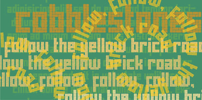 Cobblestones is inspired by the look of cobblestone streets and pavers.


