10,000 search results
(0.049 seconds)
- Monster Blood by Yoga Letter,
$16.00 "Monster Blood" is a unique horror font with a blood-like melt in every letter. This font is perfect for Halloween moments, movie titles, logos, book covers, horror stories and more. "Monster Blood" comes with lowercase, uppercase, multilingual support, numerals, and punctuations.
 - Radio Show JNL by Jeff Levine,
$29.00 The 1933 sheet music compilation entitled "Kate Smith Memories Song Book" had the singer's name hand lettered in a bold, spurred serif typeface. This lettering design became the basis for Radio Show JNL, which is available in both regular and oblique versions.
 - As of my last update, ThamesCondensed might not be a widely recognized or established font within notable typographic repositories or among mainstream font databases. However, we can explore the esse...
- Bagusih by Twinletter,
$15.00 Bagusih is the perfect font for anyone who wants to bring their designs to life with a bold, unique look that’s sure to stand out from the crowd. With its retro-inspired design, this font is perfect for those who want to create a 60s-inspired aesthetic, or who want to give their designs a retro feel. And with its bold and geometric design, Bagusih is also perfect for those who want to create a geometric look with lots of impacts. So whether you’re looking for a retro or geometric look, Bagusih is the perfect font for you.
 - Disposition by PizzaDude.dk,
$15.00 You may not know it, but you've been looking for a font like DISPOSITION! Yeah, it's a font...but it doesn't act or look like one! Why?! Because there are 6 different versions of each letter! Yes, SIX different versions! Enough to make your design look soooo cool and handmade! The font uses "contextual alternates" which makes the font cycle the different versions as you type! What can you use DISPOSITION for? There are almost no limits, but I would suggest designs such as invitations, headlines, posters, signs and other cases where a dry brush look is required.
 - Tavern by FontMesa,
$25.00 Tavern is a super font family based on our Algerian Mesa design, with Tavern we've greatly expanded the usability by creating light and bold weights plus all new for 2020 with the introduction of extra bold and black weights Tavern is now a five weight family. The addition of the bold weight made it possible to go further with the design by adding open faced shadowed, outline and fill versions. Please note, the fill fonts are aligned to go with the open faced versions, they may work with the outline versions, however you will have to apply them one letter at a time. The Tavern Fill fonts may also be used a stand alone font, however, the spacing is much wider than the regular solid black weights of Tavern. In the old days of printing, fill fonts rarely lined up perfect with the open or outline font, this created a misprinted look that's much in style today. To create that misprinted look using two different colors, try layering the outline fonts offset over the top of the solid black versions. Next we come to the small caps and X versions, for a font that's mostly seen used in all caps we felt a small caps would come in handy. The X in Tavern X stands for higher X-height, we've taken our standard lowercase and raised it for greater visibility in small text and for signage where you want the look of a lowercase but it needs to be readable from the street. In August of 2016 I started the project of expanding this font into more weights after seeing the font in use where someone tried creating a bold version by adding a stroke fill around the letters. The result didn't look very good, the stroke fill also caused the shadow line to merge with the serifs on some letters. This lead me to experiment to see if a new bold weight was possible for this font and I'm pleased to say that it was. After the bold weight was finished I decided to type the regular and bold weights together in a first word thin second word bold combination, however the weight difference between the two wasn't enough contrast. This lead me to wonder if a lighter weight was possible for this font, as you can see yes it was, so now for the first time in the history of this old 1908 type design you can type a first word thin second word bold combination. So why the name change from Algerian to Tavern? Since the original font was designed in England by the Stephenson Blake type foundry I decided to give this font a name that reminded you of the country it came from, however, there were other more technical reasons. During the creation of the bold weight the engraved shadow line was sticking out too far horizontally on the bottom right of the serifs dramatically throwing the whole font off balance. The original font encountered this problem on the uppercase E, L and Z, their solution was a diagonal cut corner which was now needed across any glyph in the new bold weight with a serif on the bottom right side. In order to make the light and regular weights blend well with the bold weight diagonal cut offs were needed and added as well. This changed the look of the font from the original and why I decided to change the name, additional concerns were, if you're designing a period piece where the font needs to be authentic then this font would be too new. Regular vs. Alt version? The alternate version came about after seeing the regular version used as a logo and secondary text on a major product label. I felt that some of the features of the regular version didn't look good as smaller secondary text, this gave me the idea to create an alternate version that would work well for secondary text in an advertising layout. But don't stop there, the alternate version can be used as a logo too and feel free to exchange letters between both regular and alternate versions. Where are the original alternates from Algerian? Original alternates from Algerian are built into the regular versions of Tavern plus new alternates have been created. We're excited to introduce, for the first time, all new swash capitals for this classic font, you're going to love the way they look in your ad layout, sign or logo. The best way to access alternate letters in Tavern is with the glyph map in Adobe Illustrator and Adobe InDesign products, from Adobe Illustrator you can copy and paste into Photoshop as a smart object and take advantage of all the text layer style features Photoshop has to offer. There may be third party character maps available for accessing alternate glyphs but we can't advise you in that area. I know what you're thinking, will there be a Tavern Condensed? It takes a lot of hours to produce a large font family such as this, a future condensed version will depend on how popular this standard version is. If you love Tavern we're happy to introduce the first weathered edge version of this font called Bay Tavern available in February 2020.
 - Mardi Gras by BA Graphics,
$45.00A Festive look creates that happy feeling! - Bombay MF by Masterfont,
$59.00 Smell and looks like Indian food - really...
 - Tastebud by Bogstav,
$17.00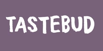 Brushy brushed font, made to look organic!
 - Bandidas by Vozzy,
$5.00 Introducing a vintage look label font named "Bandidas".Typeface includes five styles plus aged version, for sample look at 4th preview. This font will good viewed on any retro design like poster, t-shirt, label, logo etc.
 - Smitta Bali by Beary,
$14.00 Smitta Bali is an amazing hand lettering, looking attractive and natural! Every single letter has been carefully crafted to make your text look beautiful. This font is suitable for invitation, branding, advertising, classic design, poster design etc.
 - Z-Rex by Cool Fonts,
$24.00 Z-Rex looks like the copies I was getting from a lousy copier before I threw it out. You might think it has been eaten by a T-Rex, or maybe it looks like swiss cheese blech.
 - Ashgabat by GlyphStyle,
$16.00 Ashgabat is a signature style font that looks natural with a pen stroke-like texture. A bold and elegant looking font like the original signature style. Font feature Uppercase, Lowercase, Numerals & Punctuations, Stylistic Alt, Swash Ligature, Multilanguage
 - Block Head by TypoGraphicDesign,
$15.00 The half-round and smooth character of the typeface looks sporty and fresh. The sans-serif monoline letter-forms looks very modern, clean, fresh and fancy. From slim (regular) athletes till heavy (fat) bodybuilder or football player.
 - New Way by Khalid Jassim,
$27.00 This font is good to use for any modern style magazine/posters etc. The letters in this font will give writing a nice look. It will be a perfect use for anything that needs to look fancy.
 - Gleamore by GlyphStyle,
$17.00 Gleamore is a decorative display font, looks stylish. The bold shape combined with the unique curve shape makes this font easy to read and looks beautiful. - Font feature Uppercase, Lowercase, Numerals & Punctuations, Stylistic Alt, Swash Ligature, Multilanguage
 - Peitago Goulya by Herry92,
$13.00 I like the letters on the Peitago goulya because each letter is curved and rounded at the edges, it looks unique and has characteristics. Peitago goulya is handwritten, intentionally made with indentations. This font looks very pleasant.. !
 - Spedora by Fromletterel,
$12.00 Spedora is a curly and cute display font. Expertly designed to make your creation look out of this world, this font will look gorgeous on a variety of ideas such as posters, stickers, social media materials, etc.
 - Neue Aachen by ITC,
$40.99 Impressed by the quality of the Aachen typeface that was originally designed for Letraset in 1969 and extended to include Aachen Medium in 1977, Jim Wasco of Monotype Imaging has extended this robust display design to create an entire family. Derived from the serif-accented Egyptienne fonts dating to the early 20th century, Aachen has serifs that are very solid but considerably shorter than those of its precursor. The incorporated geometrical elements, such as right angles and straight lines, provide the slender letters of Aachen with a slightly technological, stencil-like quality. Despite this, the effect of Aachen is by no means static; its dynamism means that this typeface, originally designed for use in headlines, has come to be used with particular frequency in sport- and fitness-related contexts. Jim Wasco, for many years a type designer at Monotype Imaging, recognized the potential of Aachen and decided to extend the typeface to create an entire typeface family. He appropriated the existing Aachen Bold in unchanged form and first created the less heavy cuts, Thin and Regular. Wasco admits that he found designing the forms for Thin a particular challenge. It took him several attempts before he was able to achieve consistency within the glyphs for Thin and, at the same time, retain sufficient affinity with the original Aachen Bold. But he finally managed to adapt the short serifs and the condensed and slightly geometrical quality of the letters to the needs of Thin. The weights Light, Book, Medium and Semibold were generated by means of interpolation. Supplemented by Extralight and Extrabold, the new Neue Aachen can now boast a total of nine different weights. Wasco initially relied on his predilection for genuine cursives in his designs for the Italic cuts. But it became apparent with these first trial runs that the soft curves of cursives did not suit Aachen and led to the loss of too much of its original character. Wasco thus decided to compromise by using both inclined and cursive letters. Neue Aachen Italic is somewhat narrower than its upright counterparts; the lower case 'a' has a closed form while the 'f' has been given a descender, but the letters have otherwise not been given additional adornments. The range of glyphs available for Neue Aachen has been significantly extended, so that the typeface can now be used to set texts not only in Western but also Central European languages. Wasco has also added a double-counter lowercase 'g' while relying on the availability of alternative letters in the format sets for the enhancement of the legibility of Neue Aachen when used to set texts. The seven new weights and completely new Italic variants have enormously increased the potential applications of Aachen and the range of creative options for the designer. While the Bold weights have proved their worth as display fonts, the new Book and Regular cuts are ideal for setting text. And the subtlety of Ultra Light will provide your projects with a quite unique flair. The new possibilities and opportunities in terms of design and applications that Neue Aachen offers you are not restricted to print production; you can also create internet pages thanks to its availability as a web font.
 - MidnightKernboy - Unknown license

- Galleds Stars by Yukita Creative,
$14.00 Galleds Stars Display Typeface is a single font with a minimalistic but standout style for any work from movie titles, music album covers, magazines, beauty ads, and even wedding invitations. --- Minimalist type design has been a success for professional designers worldwide. - Galleds Stars Display Typeface is legible from much larger distances than typical fonts - Elegant letterforms give the feeling of luxury - Smooth curves for elegant typography This font has several alternative characters as in ( A,N,O,R,S,a,c,e,o,t,y ) Tips for using fonts in projects. Use this font with a simple background, not too busy so that you can highlight your branding This font file OTF
 - Patron by Vesturbær,
$45.00 Patron is a modern, mono-linear, sans-serif font family with large x-height and softened edges containing 12 fonts. This typeface was born as a corporate font design for non-profit sector and today it is available for public. At the moment Patron is offered as a PostScript-flavored OTF, but its construction is tuned to display well on screen as well. Works on a TrueType version with individual glyph hinting are being carried out. In addition, Patron has alternative family (Patron Alt) with enhanced personality, suitable mainly for headlines. Patron is graduation work of Matěj Hlaváček at AAAD in Prague, Studio Of Typography. Supervised by František Štorm, Tomáš Brousil and Karel Haloun.
 - Nimbus Sans Arabic by URW Type Foundry,
$35.99 Nimbus Sans ME is the expansion within the Nimbus Sans family for the Middle East range: Arabic (incl. Farsi) and Hebrew. Volker Schnebel has designed both scripts, which each include five upright and five cursive styles. The design is contemporary and fits the Latin Nimbus Sans. Besides the basis characters, the Arabic also includes the presentation forms: the variations for initial, medial and final letters. The correspondent OTF features are included in the fonts. All three scripts are perfectly combinable. Nimbus Sans is one of the best supported and most favored URW fonts ever. It is available as a Global Font in 4 weights and contains up to 65.000 characters per font.
 - Patron Alt by Vesturbær,
$45.00 Patron is a modern, mono-linear, sans-serif font family with large x-height and softened edges containing 12 fonts. This typeface was born as a corporate font design for non-profit sector and today it is available for public. At the moment Patron is offered as a PostScript-flavored OTF, but its construction is tuned to display well on screen as well. Works on a TrueType version with individual glyph hinting are being carried out. In addition, Patron has alternative family (Patron Alt) with enhanced personality, suitable mainly for headlines. Patron is graduation work of Matěj Hlaváček at AAAD in Prague, Studio Of Typography. Supervised by František Štorm, Tomáš Brousil and Karel Haloun.
 - The font Inked, crafted by GemFonts | Graham Meade, carries with it an unmistakable air of creativity and artistic flair. This font seems to channel the spirit of traditional tattoo design, merging i...
- Jarohy by Twinletter,
$15.00 This is a JAROHY gothic font that you should use to design Labels, Retro, Stamp, Badge, Oktoberfest Poster or others, Packaging, Headline, Beer, Logo, barbershops, Whiskey, tattoo, Music, Movie, certificate, Quotes, This is a font that is perfect for making any type of design. Whether you are creating a label for a beer bottle, a certificate for a whiskey bottle, a tattoo for your arm, or a headline for a poster, this font is what you need to make it happen. It is bold and masculine, making it perfect for any design that calls for a strong and memorable impression. You can choose the one that best suits your needs.
 - ITC Angryhog by ITC,
$29.00The name Angryhog came out of nowhere out of free association. "When you're working on a typeface on the Mac it demands a name from you which I find a bit confrontational" says Donaldson. ITC Angryhog brings together Roman and Gothic influences in a quirky and sophisticated display face. Characteristic of this typeface are its sharp, pointed forms, especially noticeable in the serifs, which give ITC Angryhog a restless, almost aggressive feel. It is as though the letters have a mind of their own and ignore all rules and regulations. ITC Angryhog is a perfect typeface for comics or satire, best suited to short to middle length texts and headlines. - RyuGothic by StudioJASO,
$42.00 RyuGothic Family is a humanistic interpretation of the Hangul Gothic style. It delivers messages in a soft, calm tone that does not overpower. The narrow counter design of consonants in Hangul and the narrow counter of the Latin lowercase letters are connected to create a sense of structural unity between the two sets of characters. This enables you to read long lines and works well in a variety of media and situations. Each font includes: 2,350 Hangul syllables, the smallest unit for expressing modern Korean; Latin Basic; punctuation; symbols for Korean codepage. Cyrillic, Greek, and Kana alphabets were excluded. The punctuation is designed in the preferred location for Korean typesetting.
 - Agatha by Underground,
$25.00 2015 First Prize TipoType award. Agatha is a new typeface for titles and short texts in big sizes. It can be use both in editorial publishing and brand design. From gothic geometric bases, the letters resemble the Nordic style in order to be more feminine, rhythmical and vertical. The two versions, Regular & Outline, let the designer choose between two contrasts: one heavy version that emphasize the rhythm and a lighter one that intensifies the subtlety. The third version, Blossom, combines light and color with ornaments that highlight the style. The three fonts have in addition a ligature set and some decorative glyphs that increase the possibilities of use.
 - Fette Fraktur by Linotype,
$29.99 This font is one of the most used broken letter fonts today. Fette Fraktur is used to invoke a nostalgic or rustic feeling and found often on restaurants with hearty homemade food’ or breweries who use the good old recipes’ of the founder. The font was designed in the 19th century and from the beginning intended as an advertisement typeface. The lower case letters have a gothic character with only the ornamental flourishes making them broken letters, while the capital letters are more characteristic of broken letter typefaces. One could say Fette Fraktur is a true mix of styles, not unusual for typefaces created at the turn of the 19th century.
 - Firehell by Zamjump,
$21.00 Introducing Fire Hell – a fiery font inspired by the intensity of death metal. With flames dancing within each letter, this font is tailor-made for death metal, black metal, gothic, horror, and other heavy music genres. The sharp, angular design adds a touch of darkness, making it the perfect visual companion for bands seeking a fierce and impactful typographic identity. Unleash the power of Fire Hell to set your artwork ablaze and embody the relentless spirit of heavy music. Ignite the darkness with this visually striking font! Fire Hell features: Allcaps Beginning Uppercase alternate Ending Uppercase alternate Numbers and punctuation PUA Encoded Characters OpenType Features
 - Agatha by TipoType,
$25.00 2015 First Prize TipoType award. Agatha is a new typeface for titles and short texts in big sizes. It can be use both in editorial publishing and brand design. From gothic geometric bases, the letters resemble the Nordic style in order to be more feminine, rhythmical and vertical. The two versions, Regular & Outline, let the designer choose between two contrasts: one heavy version that emphasize the rhythm and a lighter one that intensifies the subtlety. The third version, Blossom, combines light and color with ornaments that highlight the style. The three fonts have in addition a ligature set and some decorative glyphs that increase the possibilities of use.
 - Empire State Deco by Comicraft,
$19.00 Every face tells a story but this font is 77 stories high (1,046 feet with antenna included)! A lofty companion to Empire State Gothic , Empire State Deco is a tall, stately font containing four different styles, sometimes contradictory, united by the desire to be modern. Those familiar with the Exposition Internationale des Arts Décoratifs et Industriels Modernes will notice a post-postmodernism combined with the fine craftsmanship and rich materials for which those awfully nice chaps at Comicraft are known. During its Art Deco heyday, Comicraft represented luxury, glamour, exuberance, and faith in social and technological progress -- this new font recaptures those halcyon days in letter form.
 - Mokgech by Alit Design,
$15.00 The Mokgech typeface is inspired by cool old style blackletter letters. Mokgech typeface has many alternative characters such as swash, ligature and a choice of several characters from uppercase or lowercase letters. In addition, the Mokgech font is also equipped with an italic version. It is suitable for gothic, tattoo, serious and horror themed designs. Can be used for the design of alcoholic beverage packaging, tattoo, pomade designs, barbershops and so on with the Victorian classic concept. Apart from that this font is very easy to use in both design and non-design programs because all alternates and glyphs are supported by Unicode (PUA).
 - Tatline by Groteskly Yours,
$15.00 Tatline was intended to be a fun side project that developed into something cool and rather unprecedented. It's bold, it's chunky —and it just looks good whether it's a mock movie poster or a key element in a brand identity for a business. With serifs thicker than stems, it looks more down to earth, solid, reliable and firm. And yet there's an almost imperceptible playfulness in the way it looks and behaved on the screen and paper. Tatline would look great on posters and flyers. We've tried creating a coffee brand identity with it —and surprise, looks great again. Maybe it's magic, but we like to think it's just a result of tough work put into creation of Tatline. Try it yourself and let us know what you think!
 - Grand Heist by Palmer Type Company,
$30.00 Grand Heist is a bold and unique display typeface, fully equipped with basic and Western European Latin characters, numbers, punctuation, some symbols and special characters. Now we don't condone robbing banks here, but if you do, we can't deny that you'll have way more street credibility if you have this font in your handy fontbook. Just sayin'. Aa-Zz Numbers Multi-language support Symbols Special Characters
 - Non Block by Liartgraphic,
$15.00 Hi guys! How are you guys? I bet it's great! Introducing our latest product, we call this product the Non Blok font Non Blok hight is a display type font With a unique and firm touch Non Blok hight font is great to use on: fashion magazines, logos, photography, landing pages, flyers, social media and so on What's included - multilingual support - alternatives - ligatures Thank you, best regards Liarttyype
 - Brush Of Zeuxis by nasirbaradari,
$15.00 Brush of Zeuxis is a font inspired by the ancient painter Zeuxis, this really cool-looking brush stroke font is here to make your designs look way better and cooler. This font can be used for as many things as you want, it can be used on a thriller poster or a music album, this font will look very cool in a rock album, and many, many more!
 - Kinghorn 105 by Talbot Type,
$19.50 Kinghorn 105 is an Egyptian style slab-serif. The strokes are all of a roughly equal weight for an even, geometric look. Although original Egyptian slabs date from the early 19th century, the even look gives the font a balanced, contemporary look. It's intended mainly as a display font, but it's even strokes mean it remains legible even at smaller sizes. It's also available with some character variations as Kinghorn 205.
 - Phantasm by Partnrz,
$15.00 Beware of the Phantasm! Just in time for Halloween, Phantasm is perfect for your creepiest projects. It has great legibility and boasts a much larger character set than most display fonts. It can look wispy and vaporous, or you can make it look like it has been scratched into a surface by hand. All letterforms use a minimum of strokes and the gentle curves reinforce the hand-etched look.
