10,000 search results
(0.054 seconds)
- Kajiro by Maulana Creative,
$13.00 Kajiro is a fancy modern condensed all Caps sans serif font. With bold tall and sharp stroke, fun character with a bit of ligatures and alternates. To give you an extra creative work. Kajiro font support multilingual more than 100+ language. This font is good for logo design, Social media, Movie Titles, Books Titles, a short text even a long text letter and good for your secondary text font with sans or serif. Make a stunning work with Kajiro font. Cheers, Maulana Creative
 - Fever Coaster by Maulana Creative,
$12.00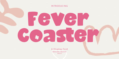 Fever Coaster Display Font is a casual handwritten font. With rough stroke, Condensed and fun character with a bit of ligatures. To give you an extra creative work. Fever Coaster font support multilingual more than 100+ language. This font is good for logo design, Social media, Movie Titles, Books Titles, a short text even a long text letter and good for your secondary text font with sans or serif. Make a stunning work with Fever Coaster font. Cheers, Maulana Creative
 - Farloxy by Maulana Creative,
$14.00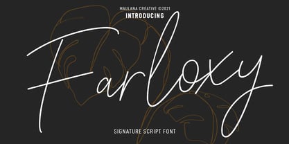 Farloxy is a Casual Signature script font. With light mono-line stroke, slant, Condensed and fun character with a bit of ligatures and lowercase alternate. To give you an extra creative work. Farloxy font support multilingual more than 100+ language. This font is good for logo design, Social media, Movie Titles, Books Titles, a short text even a long text letter and good for your secondary text font with sans or serif. Make a stunning work with Farloxy font. Cheers, MaulanaCreative
 - Beauty Snowy by Maulana Creative,
$14.00 Beauty Snowy is an expressive super slanted signature script font. With high contrast contrast stroke, condensed and fun character with a bit of ligatures. To give you an extra creative work. Beauty Snowy font support multilingual more than 100+ language. This font is good for logo design, Social media, Movie Titles, Books Titles, a short text even a long text letter and good for your secondary text font with sans or serif. Make a stunning work with Beauty Snowy font. Cheers, MaulanaCreative
 - Nameh by Naghi Naghachian,
$105.00 Nameh is a single weight sans-serif headline font designed by Naghi Naghashian. It is a condensed big title font. This font is a contribution to modernize the Arabic typography, gives the font design of Arabic letters real typographic arrangement and provides more typographic flexibility. Nameh supports Arabic, Persian (Farsi) and Urdu. It also includes proportional and tabular numerals for the supported languages. Nameh design fulfills the following needs: A Explicitly crafted for use in electronic media fulfills the demands of electronic communication. B Suitability for multiple applications. Gives the widest potential acceptability. C Extreme legibility not only in small sizes, but also when the type is filtered or skewed, e.g., in Photoshop or Illustrator. Nima’s simplified forms may be artificial oblilqued in InDesign or Illustrator, without any loss in quality for the effected text. D An attractive typographic image. Nameh was developed for multiple languages and writing conventions. Nameh supports Arabic, Persian and Urdu. It also includes proportional and tabular numerals for the supported languages. E The highest degree of calligraphic grace and the clarity of geometric typography.
 - Chizz - Unknown license

- LaBrit - Unknown license

- Chizz Wide High - Unknown license

- DS Dots - Unknown license

- TypographerFraktur - Unknown license

- 360 by Wilton Foundry,
$29.00Distorted fonts are great but are mostly not very practical - 360 is an attempt to create a simple distorted font that can be used far beyond a few logos or headlines. Each 360 character averages roughly half the number of sharp angles of a regular sans serif. This gives it an unusually fresh and timeless appeal and creates a dynamic presence across body text that is very legible and compact without looking overly condensed. 360 was chosen as a name because it can be used as an everyday font, all year round, and because 360 has so many unusual angles that don't conform to normal font conventions. 360 also happens to be a cool number: 360 makes a highly composite number. 360 is also a superior highly composite number and a colossally abundant number. A circle is divided into 360 degrees for the purpose of angular measurement. 360° is also called round angle. 360 is a convenient standard since, 360 being highly composite, it allows a circle to be divided into equal segments with each segment measured in integer degrees rather than fractional degrees. 360 is the sum of a twin prime (179 + 181). A year is roughly calculated as 360 days. - Avenir Next Variable by Linotype,
$328.99 The Avenir Next Variable Set font is a single font file that features three axes: Weight, Width and Italic. For your convenience, the Weight and Width axes have preset instances. The Weight axis has a range from Ultra Light to Heavy. The Width axis provides a range from condensed to regular width. The Italic axis is a switch between upright and italic. Variable fonts act as a complete family of fonts in a single file. The new Variation font feature is supported by a growing number of desktop design applications, and more importantly by all the major web browsers. Variable fonts provide a variety of benefits to web and print designers and developers including flexible, responsive typography.
 - Da Bronx Sans by Good Gravy Type Co,
$9.00 DaBronx is an downright nifty condensed grotesque font family. It comes with 12 righteous weights. DaBronx is ready for a wide range of uses. It would look great scrolling across a screen and would give extra presence to titles and headlines in a number of different applications. DaBronx is like a finely tailored suit for your content, upright, spiffy and slick. It has been painstakingly tweaked to perfection in the Good Gravy lab to make it so easy on the eyes. It looks stellar in an ad campaign, logo design, apparel, or anything else that requires a sleek modern look. DaBronx would pair well with Koozie Script, another one-of-a-kind Good Gravy font!
 - Bamdad by Naghi Naghachian,
$95.00 Bamdad Extra Bold Condensed is designed by Naghi Naghashian. This Headline Font is developed on the basis of specific research and analysis on Arabic characters and definition of their structure. This innovation is a contribution to modernisation of Arabic typography, gives the font design of Arabic letters real typographic arrangement and provides more typographic flexibility. This step was necessary after more than two hundred years of relative stagnation in Arabic font design. Bamdad supports Arabic, Persian, and Urdu. It also includes proportional and tabular numerals for the supported languages. Bamdad Font is available in Extra Bold Condensed. This font is designed to be used as advertising and newspaper headlines. Bamdad design fulfills the following needs: A Explicitly crafted for use in electronic media fulfills the demands of electronic communication. Bamdad is not based on any pre-digital typefaces. It is not a revival. Rather, its forms were created with today’s technology in mind. B Suitability for multiple applications. Gives the widest potential acceptability. C Extreme legibility not only in small sizes, but also when the type is filtered or skewed, e.g., in Photoshop or Illustrator. Bamdad's simplified forms may be artificial 'obliqued' in InDesign or Illustrator, without any loss in quality for the effected text. D An attractive typographic image. Bamdad was developed for multiple languages and writing conventions. E The highest degree of geometric clarity and the necessary amount of calligraphic references. This typeface offers a fine balance between calligraphic tradition and the contemporary sans serif aesthetic now common in Latin typography.
 - Xwisth by Allouse Studio,
$16.00 Proudly Presenting, Xwisth a Gothic Handwritten Font that will bring an a classical type. Xwisth is perfect for any titles, logo, product packaging, branding project, megazine, social media, wedding, or just used to express words above the background. Xwisth also come with Multi-Lingual Support. Enjoy the font, feel free to comment or feedback, send me PM or email. Thank You!
 - Livia - Unknown license

- Bughouse - Unknown license

- Neuropol - Unknown license

- Chizz High - Unknown license

- Chizz Wide - Unknown license

- Futurex Narrow - Unknown license

- Kandide - Unknown license

- Leothric by Intellecta Design,
$24.90 a gothic family
 - JulianaJoy by Lebbad Design,
$24.95 JulianaJoy is a condensed elegant sharp serif typeface for headline display and text use. Several alternate characters are included with this original font design.
 - Display Roman JNL by Jeff Levine,
$29.00 Display Roman JNL is derived from examples of some vintage sign letters, and features a condensed style with somewhat square letterforms and slab serifs.
 - Grecian Bold Expanded by Wooden Type Fonts,
$15.00 A revival of one of the popular wooden type fonts of the 19th century, suitable for display, geometric slab serifs unbracketed, short descenders,condensed.
 - Auxilia by Typomancer,
$20.00 Auxilia is a geometric sans serif font with a bit of humanist feeling, comes with various weights and condensed width for all purpose design.
 - Framingham JNL by Jeff Levine,
$29.00Framingham JNL is a widened version of Nostrand JNL that takes on a new look quite different from the original condensed wood type design. - Paperclip Reg - Unknown license

- PT Sans Pro by ParaType,
$50.00PT Sans Pro is a comprehensive type family intended for a wide range of applications. It consists of 32 styles: 6 weights (from light to black) with corresponding italics of normal proportions; 6 narrow styles; 6 condensed styles; 6 extra condensed styles and 2 caption styles (regular and bold). The design combines traditional conservative appearance with modern trends of humanistic sans serif and possess enhanced legibility especially in caption styles. These features, besides conventional use in business applications and printed materials, make the fonts usable for direction and guide signs, schemes, screens of information kiosks, and other objects of urban visual communications. The fonts have extended Latin and Cyrillic character sets serving alphabets of all title languages of the national republics of Russian Federation and supporting the most of the languages of neighboring countries. Each font contains about 1400 characters including small caps for all alphabetic characters, 4 sets of figures with lining and old style variations, stressed Cyrillic vowels, indices, fractions and so on. Design -- Alexandra Korolkova with assistance of Olga Umpeleva and supervision of Vladimir Yefimov. The fonts released by ParaType in 2010. - Generis Slab by Linotype,
$29.00The idea for the Generis type system came to Erik Faulhaber while he was traveling in the USA. Seeing typefaces mixed together in a business district motivated him to create a new type system with interrelated forms. The first design scheme came about in 1997, following the space saving model of these American Gothics. Faulhaber then examined the demands of legibility and various communications media before finally developing the plan behind this type system. Generis’s design includes two individually designed styles; each of with is available with and without serifs, giving the type system four separate families. Each includes at least four basic weights: Light, Regular, Medium, and Bold. Further weights, small caps, old style figures, and true italics were added to each family where needed. The Generis type system is designed to meet both optical criteria and the highest possible measure of technical precision. Harmony, rhythm, legibility, and formal restraint make up the foreground. Generis combines aesthetic, technical, and economic advantages, which purposefully and efficiently cover the whole range of corporate communication needs. The unified basic form and the individual peculiarity of the styles lead to Generis’ systematic, total-package concept. The clear formal language of the Generis type system resides beneath the information, bringing appropriate typographic expression to high-level corporate identity systems, both in print and on screen. The condensed and aspiring nature of the letterforms allows for the efficient setting of body copy, and the economic use of the page. A range of accented characters allows text to be set in 48 Latin-based languages, offering maximal typographic free range. This previously unknown level of technical and design execution helps create higher quality typography in all areas of corporate communication. Optimal combinations within the type system: Generis Serif or Generis Slab with Generis Sans or Generis Simple. - Generis Serif by Linotype,
$29.00The idea for the Generis type system came to Erik Faulhaber while he was traveling in the USA. Seeing typefaces mixed together in a business district motivated him to create a new type system with interrelated forms. The first design scheme came about in 1997, following the space saving model of these American Gothics. Faulhaber then examined the demands of legibility and various communications media before finally developing the plan behind this type system. Generis’s design includes two individually designed styles; each of with is available with and without serifs, giving the type system four separate families. Each includes at least four basic weights: Light, Regular, Medium, and Bold. Further weights, small caps, old style figures, and true italics were added to each family where needed. The Generis type system is designed to meet both optical criteria and the highest possible measure of technical precision. Harmony, rhythm, legibility, and formal restraint make up the foreground. Generis combines aesthetic, technical, and economic advantages, which purposefully and efficiently cover the whole range of corporate communication needs. The unified basic form and the individual peculiarity of the styles lead to Generis’ systematic, total-package concept. The clear formal language of the Generis type system resides beneath the information, bringing appropriate typographic expression to high-level corporate identity systems, both in print and on screen. The condensed and aspiring nature of the letterforms allows for the efficient setting of body copy, and the economic use of the page. A range of accented characters allows text to be set in 48 Latin-based languages, offering maximal typographic free range. This previously unknown level of technical and design execution helps create higher quality typography in all areas of corporate communication. Optimal combinations within the type system: Generis Serif or Generis Slab with Generis Sans or Generis Simple. - Generis Simple by Linotype,
$39.00The idea for the Generis type system came to Erik Faulhaber while he was traveling in the USA. Seeing typefaces mixed together in a business district motivated him to create a new type system with interrelated forms. The first design scheme came about in 1997, following the space saving model of these American Gothics. Faulhaber then examined the demands of legibility and various communications media before finally developing the plan behind this type system. Generis’s design includes two individually designed styles; each of with is available with and without serifs, giving the type system four separate families. Each includes at least four basic weights: Light, Regular, Medium, and Bold. Further weights, small caps, old style figures, and true italics were added to each family where needed. The Generis type system is designed to meet both optical criteria and the highest possible measure of technical precision. Harmony, rhythm, legibility, and formal restraint make up the foreground. Generis combines aesthetic, technical, and economic advantages, which purposefully and efficiently cover the whole range of corporate communication needs. The unified basic form and the individual peculiarity of the styles lead to Generis’ systematic, total-package concept. The clear formal language of the Generis type system resides beneath the information, bringing appropriate typographic expression to high-level corporate identity systems, both in print and on screen. The condensed and aspiring nature of the letterforms allows for the efficient setting of body copy, and the economic use of the page. A range of accented characters allows text to be set in 48 Latin-based languages, offering maximal typographic free range. This previously unknown level of technical and design execution helps create higher quality typography in all areas of corporate communication. Optimal combinations within the type system: Generis Serif or Generis Slab with Generis Sans or Generis Simple. - Generis Sans by Linotype,
$29.00The idea for the Generis type system came to Erik Faulhaber while he was traveling in the USA. Seeing typefaces mixed together in a business district motivated him to create a new type system with interrelated forms. The first design scheme came about in 1997, following the space saving model of these American Gothics. Faulhaber then examined the demands of legibility and various communications media before finally developing the plan behind this type system. Generis’s design includes two individually designed styles; each of with is available with and without serifs, giving the type system four separate families. Each includes at least four basic weights: Light, Regular, Medium, and Bold. Further weights, small caps, old style figures, and true italics were added to each family where needed. The Generis type system is designed to meet both optical criteria and the highest possible measure of technical precision. Harmony, rhythm, legibility, and formal restraint make up the foreground. Generis combines aesthetic, technical, and economic advantages, which purposefully and efficiently cover the whole range of corporate communication needs. The unified basic form and the individual peculiarity of the styles lead to Generis’ systematic, total-package concept. The clear formal language of the Generis type system resides beneath the information, bringing appropriate typographic expression to high-level corporate identity systems, both in print and on screen. The condensed and aspiring nature of the letterforms allows for the efficient setting of body copy, and the economic use of the page. A range of accented characters allows text to be set in 48 Latin-based languages, offering maximal typographic free range. This previously unknown level of technical and design execution helps create higher quality typography in all areas of corporate communication. Optimal combinations within the type system: Generis Serif or Generis Slab with Generis Sans or Generis Simple. - Lady Ice - Extra Light - Unknown license

- Lady Ice - Light - Unknown license

- Lady Ice - Expanded - Unknown license

- Bilokos by AukimVisuel,
$9.00 Bilokos is a cool and modern display font. Expertly designed to make your creation look out of this world, this font has the potential to take your creative ideas far further. This is a condensed sans serif display font. On the one hand, it has rounded curves with very open terminals that make this font family elegant, user-friendly and contemporary and on the other hand very useful for writing titles in any medium. It also comes with stylistic alternates of 0-9, A-Z and a-z to satisfy the most demanding professionals. With its large character set, it meets the needs of professionals because it will support several languages of Western Europe, Eastern Europe, Central Europe, Greek and Cyrillic for international communication.
 - Longshanks by Mysterylab,
$21.00 Longshanks is a condensed serif display font with a low waist, blade-like strokes, and other unusual detailing. This font features a medium-low x-height and works very well at larger display sizes. It's an excellent choice for any headline, banner, or title that would benefit from an old-world, historical, fantasy, magic, or sword & sorcery vibe. It also harks back to the metallic foil stamped type treatments from 1980s – 1990s romance novel book cover design. The offbeat features are subtle enough to leave this font with a very high degree of legibility in spite of its strong and dynamic treatment of certain serifs and finials. The namesake for this typeface is King Edward I of England, whose nickname was Edward the Longshanks.
 - Banigar by Azzam Ridhamalik,
$14.00 Looking for a modern and experimental font to make your designs stand out? Look no further than Banigar font family! Comes with 4 styles including regular, italic, rounded, and rounded italic. Also available in 7 Weights (Light, Regular, Medium, Semi-Bold, Bold, Extra-Bold, Black) and 3 Widths (Condensed, Normal, Expanded) on each style with total 84 fonts. Banigar is perfect for creating designs that are both modern and confident. With consistent letter width and a high contrast between thick and thin strokes, Banigar is sure to grab your audience's attention. Whether you're looking to create something fresh and bold or something experimental and daring, Banigar has got you covered. Don't settle for an ordinary font, upgrade to Banigar today! All Caps font.


