7,769 search results
(0.031 seconds)
- Omerta by Anomali Creative,
$15.00 Omerta Blackletter Font Blackletter fonts have letters that are very bold and ornate. It is a Western calligraphy style that was used in Europe from 1100s to the 1600s. Blackletter is also known as Old English or Gothic script. During the 20th century, blackletter type styles were adopted by new audiences and came to be associated with punk, street art, and heavy metal. Omerta Blackletter Font Specifically developed to be suitable for perfect for tattoos clothing, labels and packaging, branding, or any Gothic-themed projects. Omerta Blackletter Font are great for Classic Calligraphic type projects and convey a sense of what’s to come. This font can be used with all software that can read standard fonts.
 - Serif Medium - Unknown license

- Ruthless AOE by Astigmatic,
$19.95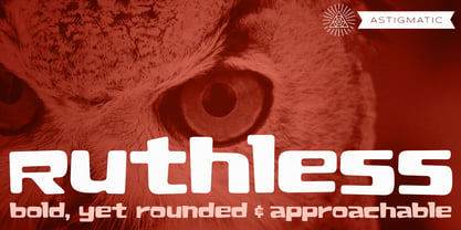 A plush and heavy unicase font.
 - Voussoir by Sylvestre Studios,
$25.00Voussoir, the perfect heavy display font. - PL Modern by Monotype,
$29.99PL Modern Heavy Condensed is based on a design by R.H. Middleton (1936). It has Bodoni-style letterforms, typical of Modern Serif faces. Use the PL Modern Heavy Condensed font for headlines in narrow settings. - Nerone by The Ampersand Forest,
$20.00 Nerone is a quasi-unicase display type family in four weights, from light to black. In its lighter versions, it's reminiscent of dignified flared serifs like Albertus. In its black version, it's comparable to display faces like Serif Gothic, with a hint of Mostra-like despotism... Inspired by ancient Roman capitals, Nerone takes a whimsical look at how they might turn into a black fatface, and how a matching lowercase might give the whole affair a whimsical feel — specifically when applied to fun branding and marketing uses. Part of The Ampersand Forest's Sondheim Series.
 - VVDS Organum by Vintage Voyage Design Supply,
$10.00 Elegant and easy to use serif font family with contrast in vertical and horizontal strokes. Its variety of weights provides a range of choices that will help you to find the best typographic look. Use all caps to get the classic serif look, like Didones, or use it normally for a playful serif look. Normal and Medium widths are good for text blocks and Thin and Light, or Bold and Black are perfect for Headliners. Every letter in a word looks like as if written specially next to each other, as in hand lettering. You can use it in gentle and minimal projects, and also in projects with bold and heavy typographic base. Also, for more individuality, Organum comes with discretionary ligatures and few stylistic alternates for every caps and some lowercase letters.
 - Bruna by Antonio Lechuga,
$35.00 Its open counters and large x height give it excellent performance in small sizes. On the other hand, its curved diagonals, generous width and soft shapes give it a friendly but functional personality for a wide range of messages and voices. We recommend the four most extreme weights (Thin, ExtraLight, Black, and Heavy) for large sizes starting at 18 points, and the five intermediate weights (Light, Book, Regular, Medium, and Bold) for small sizes starting at 7 points.
 - Roadkill by Device,
$39.00 Derived from a photograph Rian Hughes took in Hong Kong, the Roadkill family of typefaces is a literal interpretation of rough and worn road lettering. The original provided almost all of the key character shapes, with the others being designed to keep the unique hand painted feel intact. Most of the letters have alternate versions provided. This font works equally well at wider letterspacing settings. Roadkill Alternates provides curved versions of the 2 and the S, a G with higher crossbar, and less worn versions of several other characters. The heavy version packs even more gritty wallop in a non-condensed and blacker weight. Roadkill Heavy packs even more gritty wallop in a non-condensed and blacker weight. Use in conjuction with the original Roadkill and Roadkill Alternates. A set of arrows and other road symbols again taken directly from tarmac to Mac, thus preserving the worn and eroded appearance of the original characters is also part of the Roadkill family.
 - Magnitudes Variable by DuoType,
$90.00 Magnitude is a font inspired by classics like Eurostyle and Bank Gothic, with geometric characteristics and dynamics style. Designed to be used in a wide variety of applications such as advertising, corporate projects, branding and retail product design. The font is well-suited for headings, display use and short text. The Magnitudes family is available in 36 weights, ranging from light to heavy, to condensed and expanded with matching italics. The font contains a character set of 401 characters supporting 206 different languages.
 - San Angelo NF by Nick's Fonts,
$10.00A heavy unnamed Gothic typeface from the 1890 William H. Page Foundry woodtype specimen book provided the template for this bold, brash, no-nonsense face. It's designed to set tight, so your headlines will definitely get noticed. Named for a town in West Central Texas which is noted for being the home of the Buffalo Soliders in the late 1800s. Both versions of this font contain the Unicode 1252 (Latin) and Unicode 1250 (Central European) character sets, with localization for Romanian and Moldovan. - Midnight Hour - Personal use only

- Front Page Pro by Jonahfonts,
$45.00 A heavy slab face for many applications.
 - Elefont Emboss by Emboss,
$13.45 Designed to be fat, loud and heavy.
 - Rappica by Aah Yes,
$4.95Rappica is a degraded and distorted heavy font. - Splinter2 - Personal use only

- Mermer by Jana Orsolic,
$35.00 Mermer font family is a contemporary take on Roman capitals in six weights. The font name is the Serbian word for marble, and the inspiration for its creation comes from chiseled street signs in Istria. With lowercase and Cyrillic added, it gets a broader range of usages. Mermer is bold and versatile, can be both sporty and high fashion, looking sharp in more than 40 languages. Thin is thorny and Heavy feels like a block of concrete. Make it LOUD by setting it in large sizes and choosing Mermer Heavy for posters, magazine headings or logos, or you can make it cosy and friendly setting it smaller in Mermer Regular for menus, book covers, invitations or business cards.
 - Avenir Next by Linotype,
$97.99 Avenir Next Pro is a new take on a classic face—it’s the result of a project whose goal was to take a beautifully designed sans and update it so that its technical standards surpass the status quo, leaving us with a truly superior sans family. This family is not only an update though, in fact it is the expansion of the original concept that takes the Avenir Next design to the next level. In addition to the standard styles ranging from UltraLight to Heavy, this 32-font collection offers condensed faces that rival any other sans on the market in on and off—screen readability at any size alongside heavy weights that would make excellent display faces in their own right and have the ability to pair well with so many contemporary serif body types. Overall, the family’s design is clean, straightforward and works brilliantly for blocks of copy and headlines alike. Akira Kobayashi worked alongside Avenir’s esteemed creator Adrian Frutiger to bring Avenir Next Pro to life. It was Akira’s ability to bring his own finesse and ideas for expansion into the project while remaining true to Frutiger’s original intent, that makes this not just a modern typeface, but one ahead of its time. Complete your designs with these perfect pairings: Dante™, Joanna® Nova, Kairos™, Menhart™, Soho® and ITC New Veljovic®. Avenir Next Variables are font files which are featuring two axis, weight and width. They have a preset instance from UltraLight to Heavy and Condensed to Roman width. The preset instances are: Condensed UltraLight, Condensed UltraLight Italic, Condensed Thin, Condensed Thin Italic, Condensed Light, Condensed Light Italic, Condensed, Condensed Italic, Condensed Demi, Condensed Demi Italic, Condensed Medium, Condensed Medium Italic, Condensed Bold, Condensed Bold Italic, Condensed Heavy, Condensed Heavy Italic, UltraLight, UltraLight Italic, Thin, Thin Italic, Light, Light Italic, Regular, Italic, Demi, Demi Italic, Medium, Medium Italic, Bold, Bold Italic, Heavy, Heavy Italic. Featured in: Best Fonts for PowerPoints
 - Barranco by W Type Foundry,
$20.00 Barranco is a 3d layered fontfamily of 3 weights (thin, medium, black), plus shadows and one inline effect layer. It’s inspired by the caps neo-humanist typefaces of the 80’s with a mix of new trends such as the new layered typefaces and super heavy font families. Each font also comes with a set of Stylistic Alternatives for letters A I K W Q, and extensive language support. Barranco is really nice for magazines design, trademarks, logos and posters.
 - KG Belfort by Krismagraph,
$19.00 Belfort is a modern sans serif family font with a neo-Grotesk touch, it is a sans serif typeface that tends to be easily accepted by readers, has wide usage possibilities, and shows a simple, bold, and strong personality. The Belfort font contains 2 basic shapes: upright and round. Each has 10 different weights (Thin, Extra Light, Light, Regular, Medium, Semibold, Thick, Extrabold, Black, and Heavy). with ligatures and alternating in several letters. and is equipped with a multilingual accent.
 - Linotype Gotharda by Linotype,
$29.99Linotype Gotharda is part of the Take Type Library, chosen from contestants of Linotype’s International Digital Type Design Contests of 1994 and 1997. This display font started as an experiment of the Croatian-German designer Milo Dominik Ivir. He wanted to design a font with characteristics of both sans serif and Gothic faces. From the Gothic he took the heavy strokes, the narrow letters, the exaggerated overmatter and the high x-height. The modern standard forms of the letters s, a, x and z, the clear capitals and the lack of serifs are the characteristics taken from sans serif faces. The result is a font with a constructed, old German feel. Linotype Gotharda is intended exclusivley for headlines in large point sizes. - GirderSuper by Wooden Type Fonts,
$15.00 A heavy slab serif font very useful for display.
 - Antique 7 by Wooden Type Fonts,
$15.00 An Egyptian unbracketed heavy serif font, largely for display.
 - Magnitudes by DuoType,
$29.00 Magnitude is a font inspired by classics like Eurostyle and Bank Gothic, with geometric characteristics and dynamics style. Designed to be used in a wide variety of applications such as advertising, corporate projects, branding and retail product design. The font is well-suited for headings, display use and short text. The Magnitudes family is available in 36 weights, ranging from Extra light to heavy, to condensed and expanded with matching italics . The font contains a character set of 401 characters supporting 206 different languages.
 - FT Tantor by Fenotype,
$9.95 FT Tantor is a heavy weight font from Fenotypes basement.
 - Meruba MF by Masterfont,
$59.00 Square and serif font - perfect for heavy headlines and signage.
 - UltraGotica by Omine Type,
$24.00UltraGotica is a heavy companion to the Gotica Lumina typeface. - MC Filine Qiqah by Maulana Creative,
$13.00 Filine Qiqah heavy sans serif font. With bold stroke, fun character with a bit of ligatures. To give you an extra creative work. Filine Qiqah heavy sans serif font support multilingual more than 100+ language. This font is good for logo design, Social media, Movie Titles, Books Titles, a short text even a long text letter and good for your secondary text font with script. Make a stunning work with Filine Qiqah heavy sans serif font. Cheers, Maulana Creative
 - Interweave by K-Type,
$20.00 Interweave is a square display face with rounded corners, inspired by beefy fonts from the 60s and 70s such as Bullion and Deutsch Black. An alternating criss-cross effect is borrowed from Hunyady Gothic, the opposing lowercase a, e and s providing a basket weave or parquet floor appearance.
 - 3-DSalter - Unknown license

- Pungen - Unknown license

- Maus by Sentinel Type,
$10.00A heavy duty block-shadow font derived from Sentinel Sten Type, Maus' inflexible, near-featureless block-like shapes give the impression of great mass and solidity. Maus is an example of minimalism in type design, using a minimum of sculpting to elicit the essence of familiar Latin forms. Two sets of complimentary letters allow designers to pick and choose combinations for letter fit, for their symmetric values, or to create a particular look or feel to suit the subject. Obviously Maus has great potential for signage, posters and billboards, and screen-printed garments. - Champ Ultra by BA Graphics,
$45.00 A real powerful look great for headlines, a true heavy weight.
 - vtks alcalina - 100% free

- Hangbord DSG - Unknown license

- Trium - Personal use only

- Humato Broken - Personal use only

- Chipping by Greater Albion Typefounders,
$13.95 Chipping is a brand new face inspired by Edwardian and 1920s letterforms. It's good for clear and legible headings which need a gentle and unobtrusive period touch, and is the latest is Greater Albion's line of faces to explore the 'small capitals' idea. You will see a broad similarity with our Chipperly family, and the two work well together in combined projects. Four faces are offered: regular and bold, as well as Black with a heavy drop shadow and white which explores the idea of 'whitespace' design.
 - Chalfont Roman by Alan Meeks,
$45.00 Some years ago I designed Chalfont as a sans face. All the characters have a top heavy look when viewed straight on, however, as most type is read at an angle with the top further away than the bottom, this top heavy look is diminished. Chalfont Roman, although re-drawn with some alterations, is still basically the same face but with a top left serif giving more emphasis to the top heavy characteristics. I have also added a set of non ranging numerals.
 - Drawn by WingBuk Studio,
$25.00 Drawn is a heavy metal font made with a touch of darkness, featuring a heavy metal feel to compliment your design. Drawn is very easy to use in any variation or writing combination, also perfect for metal band logos, merchandise, clothing, apparel, or anything else that calls for a heavy metal feel. Here is video Tutorial how to use it on Adobe Photoshop, Adobe Illustrator, and CorelDRAW https://youtu.be/rGfSWmztRT0 Recomended Software to use: Corel Draw Adobe Photoshop Adobe Illustrator Clip Studio Paint


