6,421 search results
(0.026 seconds)
- Dylan Condensed by Wiescher Design,
$29.00 Dylan is a Sans typeface in the best American tradition. In order to keep corners open and to make the font more readable in small sizes it has deep cuts where curves join straights. I designed 8 finely tuned weights with fitting italic sets. The fonts includes full smallcaps, language support for most European languages plus Turkish, many fractions, nominator and denominators, Greek mathematical signs and many currency symbols. It is a versatile font that is well suited for many occasions, even for signage.
 - Din Condensed by ParaType,
$30.00 Designed at ParaType (ParaGraph) in 1997 by Tagir Safayev. Based on a condensed style of DIN type family (Linotype Staff designers). That is a group of sans serif faces made to conform to the German Industrial Standard. Based on geometric style, they vary in width but not in weight. Light style was added in 2014 by Manvel Schmavonyan. Demi Bold style was added in 2020 by Isabella Chaeva.
 - Quebra Condensed by Vanarchiv,
$55.00 Quebra Cond is an extend display sans-serif font family, available with four widths (Extra Condensed, Condensed, Normal and Expanded) and ten weights, italics versions are available. The main strokes contain small breaks simulating modulated variations on the letterforms, these details are more present on large body sizes. All font versions contain Latin and Cyrillic encoding characters and also ligatures, case-sensitive forms, fractions, oldstyle and finally tabular figures.
 - Obvia Condensed by Typefolio,
$29.00 'Obvia' appeared as a result of direct observation on typefaces classified as geometric and the plan to explore for the first time width axes Expanded, Wide, Normal, Narrow and Condensed The idea behind 'Obvia's design was to create a distancing from geometrically pure shapes, in this case, square shapes. Then some details were added, such as subtle inktraps, concave endings of the stems and carefully drawn alternate characters, giving a 'geohumanist' tone to the font. This first family of 'Obvia' has 9 weights ranging from Thin to Black, delivering a strong typographic identity, from the paper to the pixel.
 - Manchester Condensed by Vástago Studio,
$23.90 Every day we are faced with designing on small screens and new formats; This is where condensed fonts have great potential, as they make the most of tight spaces in big headlines. Manchester Condensed is a typeface family designed by Vástago to be applied in large headlines in different formats, such as web, editorial or packaging. Just to mention a few. Different Manchester weights enhance performance at large type sizes, providing hierarchy and imposing style with its elongated shapes. Its use in capital letters is remarkable and fits perfectly into very precise diagramming spaces.
 - Americane Condensed by HVD Fonts,
$40.00 “It’s all about Soul!” – Strong, decided and edgy. The Americane super family is inspired by the old wood type specimen books. Delivering some glorious vibes of the handcrafted values from the pioneers AND keeping one eye on todays demands and technology, Americane is made for high professional use. Americane Condensed & Americane is a super family of 24 fonts in total – a normal and a condensed width in six weights with matching italics. Made for complex, professional typography, the OpenType fonts feature five variations of numerals, alternate letters, arrows and an extended character set to support Central and Eastern European as well as Western European languages.
 - Moderna Condensed by Los Andes,
$16.00 Moderna Condensed is a modern condensed Sans-serif font, simple and neutral, especially for short texts, headlines, and sub-headlines, logos, posters and branding, includes some alternate characters, arrows and labels.
 - Van Condensed by Vanarchiv,
$30.00
- Keiss Condensed by DSType,
$50.00 The Keiss type family is our interpretation of the popular nineteen century Scotch Roman typefaces. We intended to keep a very classic approach while introducing a couple of new elements that differentiate this type family from it’s ancestors. This design, with short descenders and ascenders, along with three very distinct optical sizes makes this type family well suited for contemporary newspapers. The Title and Big versions range from Thin to Heavy, with matching italics, in order to be used in big sizes and stand out in the design. The Text ranges from Thin to ExtraBold and is a standalone type family for text usage, with narrow proportions and wider and open italics for improved text setting. The Condensed versions, ranging from Thin to Bold, don’t have italics, although they can be matched with the italics of the Title and Big versions, due to the fact they are very condensed.
 - Sanchez Condensed by Latinotype,
$- Sánchez, designed by Daniel Hernández, is a serif typeface belonging to the classification slab serif, or Egyptian, that bears a strong resemblance to the iconic Rockwell, but with rounded edges— offering contrast and balance to the square structure. Sánchez & Sánchez Condensed comprises 12 variants, ranging from extra light to black, each of the same x-height. Regular and Italic variants are available for free.
 - Rehn Condensed by moretype,
$40.00 With all the features of its wider relative, Rehn Condensed has been specifically designed for those situations where space is a premium. Rehn and Rehn Condensed together offer a complete package suitable for a wide range typographic applications.
 - Wasabi Condensed by Positype,
$20.00 Remastered in 2019. Wasabi is the re-imagining of my very first release, Iru. Like Iru, Wasabi was heavily influenced by the monument lettering style, Vermarco. The simple, geometric forms allowed for small lettering sizes to be sandblasted cleanly and has been a monument lettering workhorse for decades… the only issue centered around the lack of a lowercase or any other letters beyond the 26 uppercase glyphs and the numerals. Wasabi solves this with the same simple, efficient line reminiscent of the old Vermarco while bringing it into the 21st century. Visual and optical incongruities of the original uppercase were replaced with new interpretations for the capital letters, a new lowercase and small caps were produced and the original single weight alphabet was replaced with six new weights. Wasabi has several ‘lighter’ weights primarily because the thin lines and simple transitions produce very elegant relationships… and I wanted to make sure those relationships could be explored regardless of the scale of letter. Stylistic Alternates show up through the upper, lowercase and small cap glyphs that attempt to simplify these shapes even more when the opportunity arises. Wasabi is as much a utilitarian typeface as it is a headline face. This realization led to the decision to produce a companion Condensed version shortly after the initial regular weights were developed and tested; so, try them all!
 - Homage Condensed by GarageFonts,
$49.00 Paying homage to the 1960s and 1970s designs of Tom Carnase and Herb Lubalin, Homage Condensed is a digital revival and recutting of LSC Condensed in two weights along with italics and numerous stylistic alternate characters.
 - Magallanes Condensed by Latinotype,
$29.00 Say hello to the new Magallanes Condensed Family, a contemporary neo-humanist sans serif font designed by Daniel Hernández. Its strokes and terminals are related to the calligraphic strokes from humanist typefaces. It comes with 8 styles, from Ultra Light to Black, each with its true italics. Every weight comes with alternative glyphs for a more dynamic use. Magallanes is the perfect titling font to complement text faces in magazines, logotypes, etc. Languages supported include Basic Latin, Western European, Euro, Catalan, Baltic, Turkish, Central European, Romanian, Pan African Latin.
 - Avancar Condensed by Brenners Template,
$19.00 Avancar Condensed Font Family showcases the exquisite pairing of modern grotesque style and soft sans-serif design. These conjunctions provide the effect of owning two subfamily typefaces and are an amazing solution for designers. The main feature of this font family is a semi-condensed design with a slightly higher x-height. And, while having the same skeleton design and stem width, they provide a completely different look and feel.
 - Aragon Condensed by Canada Type,
$24.95The condensed version of Hans van Maanen's Aragon is a headline star. The elements that made Aragon a popular "Dutch Garamond" text repeat here, with the slight stress shifts and tapering stems optimized for headline use. Aragon Condensed also comes in bold and italic variations. All three fonts contain extended language support, superiors and inferiors, and class-based kerning. - Queulat Condensed by Latinotype,
$- This font is the condensed version of Queulat, but keeping the same features as the original typeface. Queulat Cnd is a hybrid typeface that combines different styles, reflecting charm, freshness and, especially, a strong personality.. Since it is a condensed font, it is well-suited for publishing and subheadings. The font is inspired by Modern and Grotesk styles. The former is shown in some characteristic features such as teardrop terminals, which give the typeface an attractive unique look, making it an ideal choice for logotypes and labelling. The latter, with its rationality, makes Queulat Cnd a stable and strong face for headings and subheadings. The combination of styles can be clearly seen by comparing the Regular with the Alt version. The Regular version is more simple than the Alt one. Differently, the alternative version possesses more features of the Modern style, like teardrop terminals in ‘k’ and ‘v’.
 - Prelo Condensed by DSType,
$55.00Prelo was designed to be a neutral, highly readable typeface, for identity, editorial and information design. With nine weights and nine true italics, from Hairline to Black, Prelo is a workhorse typeface, full of OpenType features such as Small Caps, Tabular Figures, Central Europe characters and Historical Figures, among others. Like other DSType fonts, most of the diacritics were designed to fit the gap between the x-height and the caps height, avoiding some common problems with the accented characters. The curves are soft and smooth, providing legibility, even in very poor conditions and the neutrality allows this typeface to be used with any serif companion. - Blitz Condensed by Wiescher Design,
$20.00 A very glitzy Blitz! Blitz-Condensed is an addition to my normal Blitz family. Both are topheavy fonts and are meant to be used together. The font gets a special shine because of this effect. And it stays readable despite its special design. Your designer of surprising typefaces, Gert Wiescher
 - Candide Condensed by Hoftype,
$49.00 Candide Condensed is the complement for Candide and widens greatly the possible applications of the Candide family. Through Its moderately condensed proportions, it also works superbly as a discrete space saving text face. Candide Condensed comes with the same character layout and features as Candide. Candide Condensed consists of 16 styles. It comes in OpenType format and provides an extended language support. All weights contain standard and discretionary ligatures, proportional lining figures, tabular lining figures, proportional old style figures, lining old style figures, matching currency symbols, fraction- and scientific numerals, matching arrows and alternative characters.
 - Breuer Condensed by TypeTrust,
$30.00 Breuer Condensed is a mechanical sans ideal for captions and headline settings, and may also be suitable for moderate lengths of body copy with its comprehensive offering of OpenType features. The italics are optically adjusted obliques with a selection of augmented lowercase glyphs to provide a warmer read. The overall design ensures a distinct aura of technical precision in a personable tone. This family of eight fonts is designed to accompany the Breuer Text and Breuer Headline sets released in 2007. Breuer Condensed offers a 76% narrower footprint compared to Breuer Text and is fine-tuned to render typographic color equivalent to each sibling Text weight.
 - Cadence by Elemeno,
$25.00Cadence was designed for a computer consulting company called Shamrock Solutions. The logo needed a Celtic font for the word "shamrock" that complimented the tech font used for the word "solutions." Most Celtic fonts didn't hold up well next to the tech font, which led to the creation of Cadence. Although inspired by Irish designs, Cadence is a sharp departure from traditional Celtic typefaces and in most contexts the inspiration isn't immediately obvious. - Cadency by NREY,
$25.00 Cadency is a cool and modern script font, monolinear with cut sharp ends. Can be used for your various design projects such as logotype, poster, digital lettering arts, clean design, branding design, signs, and more. Features: - Uppercase - Lowercase - Numeral & Punctuation - Standard Ligatures - Stylistic Alternates - PUA Encoded - Multilingual Support To enable the OpenType Stylistic alternates, you need a program that supports OpenType features such as Adobe Illustrator CS, Photoshop, Indesign & CorelDraw X6-X7 and more.
 - Canden by Struggle Studio,
$17.00 Canden – Display Handwritten Font serif look with simple, clean, visual elegance with subtle curves and beautiful bindings, An incredibly versatile font that works both large and small. This font is suitable for a wide variety of projects such as: headlines, logos, labels, branding projects, magazines, home appliance designs, product packaging, mugs, quotes, posters and many more. It can also be more expressive and playful, thanks to the many alternatives and binders that blend harmoniously in this font and make it more attractive and versatile. Try to change alternatives, fasteners and you will get a lot of options for your project that will make it Vintage & Unique.
 - Monden by Tour De Force,
$29.00 If you'd like to scream, but you have no self esteem, or you'd love to start a fight, but you're scared of the night, I made this font for you all, whether you're short or tall. Monden is wide, gentle and fun, but it wasn't born under the Sun, it was my intention to make it unique, I surely hope I didn't make some freak, it looks a bit classical, in moments maybe here and there radical, but it surely is really graphical with a dose of something magical. Want a logo, poster or any other design, but you'd rather cry and then run, even this description sounds lousy, at least it isn't so drowsy, so meet Monden family from our hood and keep your spirit in good mood, and do the things on any way you think they should.
 - Gottar by Intellecta Design,
$22.90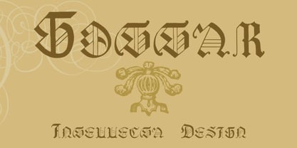
- Kocham by Intellecta Design,
$22.90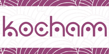
- Gothix by GlyphStyle,
$19.00 Gothic is a stylized script style, with a wide selection of characters. A bold script font that looks cool. Gothic is perfect for branding projects. You can access swash by changing numbers 0-9 -Features of fonts Lowercase, Uppercase, Numbers & Punctuation, Lowercase alternatives, swash variant ligature Stylistic set 1 (for the end of the word) Stylistic set 2 (for the middle of the word) Stylistic set 3 (for the beginning of the word) Stylistic set 4 (for the end of the word) multilanguage
 - Gothic by Red Rooster Collection,
$45.00Digitally engineered by Steve Jackaman. Ludlow, circa 1939. - Mothem by Gerobuck,
$23.00 MOTHEM font family with three modes, Black, ItalicBlack, and ThinOutline and supported by multiligual features. The shape has a sporty, strong, and futuristic impression, very perfect for classy designs.
 - Jocham by Hubert Jocham Type,
$39.00 Since I have my new logotype people are asking me about the typeface it is based on. But it did not exist and I did not believe that it would actually work. I still love my logotype and so I went on to try to make it work as a font. After many different versions and some doubts I am glad to present Jocham. It is the first typeface with my name. For an obvious reason. There is only one weight with an italic. I tried different weight, but they were all not as strong as the final.
 - Gossamer by Scholtz Fonts,
$19.95 Gossamer is a delicate, wispy font, with extravagant caps and controlled, softly curved lower case characters. It is reminiscent of fantasy and fairy lore, and wonderfully evokes the magic of childhood. Use Gossamer for Christmas cards, for wedding stationery, for cosmetics and clothing, for romance and enchantment. Gossamer has standard OpenType features, and language support includes all European character sets.
 - Gothic by Wooden Type Fonts,
$15.00 Gothic Bold Condensed, first shown in 1889 by Hamilton wooden type founders. With lowercase. Gothic Bold Expanded.
 - Gotcha by Nicky Laatz,
$15.00 Say hello to GOTCHA! A versatile new marker font with bounce and vigor and a a super-sexy-casual vibe! The Gotcha fonts are incredibly versatile , from street urban, to styled fashionista, to hearty food branding - whatever the weather, Gotcha! has you covered :) Gotcha! comes with a set of alternate upper and lower case letters, and a second set of lowercase letters - this way you can write one word in a million different ways - and keep things ultra natural looking. A comprehensive set of double letter ligatures are also included. Gotcha! also comes with an “Extras Font” which include textured swashes and splatters/grit to add some pizazz to your design.
 - Gothiks by Blackletra,
$50.00 Gothiks is a powerfull 6-weight display sanserif influenced by Texturas. The rithm and verticality of Texturas can be easily identified on the letters with diagonal strokes like A N M K k V v W w X x Y y Z z: here they are all vertical. This kind of morphology was chosen because it accepts condensation in a very natural way, giving to this compact sanserif a very unique personality. The intermediate weights can be used for short texts while extreme weights are excellent for big sizes. It has an extensive character set — with extensive language support — and many OpenType features like fractions, small capitals and different figure sets. Default figures align with lowercase.
 - Botham Grotesque by Aiquitype,
$15.00 Introducing Botham Grotesque, a versatile typeface meticulously crafted to embody the essence of modernity and sophistication. This exquisite font, classified under the renowned Grotesque category, boasts four distinct styles that seamlessly blend form and function. Its clean lines and balanced proportions lend a professional, making it an ideal choice for a myriad of applications, from corporate branding to editorial design. What’s Include ? 1. Uppercase, Lowercase, Number and Punctutation 2. Ready 4 Style : Condensed, Semi Condensed, Reguler and Semi Ektended 3. Multilingual Support 4. Ligature and Alternate 5. Installed on Mac and Windows 6. PUA Encode Enjoy our Font.
 - Rotham Industria by Greater Albion Typefounders,
$18.00 Rotham Industrial. Stylised lettering for industrial flavoured projects. Imagine, if you will letters shaped from metal tube, or perhaps from a solid rod, or perhaps made from brass handrails? You get the idea. A stylised and fun typeface for those occasions where you want to suggest an engineering influence.
 - Winter in Gotham - Unknown license

- P22 Gothic Gothic by IHOF,
$24.95 The name says it all. Gothic from the old literary style and/or current subculture genre. And Gothic meaning a block or sans serif style of lettering. The concept was to take the classic German style lettering and create a contemporary extended block letter typeface. The result is a fusion of old and new.
 - mohammed - Unknown license


