10,000 search results
(0.017 seconds)
- Churchward Samoa by BluHead Studio,
$25.00Churchward Samoa is the seventh OpenType font family released by BluHead Studio, LLC from the exciting and unique type design library of Joseph Churchward. This five-weight family exhibits playful diversity in expressing your messages in both text and display. - Hungarian Nouveau JNL by Jeff Levine,
$29.00 A piece of sheet music from Hungary (circa1921) entitled “Praerie Trott” offered up some playfully rounded hand lettering in a cartoon-like style. This was the visual model for Hungarian Nouveau JNL, which is available in both regular and oblique versions.
 - Digitalika by PizzaDude.dk,
$15.00 Inspired by some scribbles I made as a young kid in the 80'ies at school - when I should have paid attention to the teacher! Comes with a complete multilingual set of letters with alternate versions of both upper- and lowercase
 - Basic Monoline JNL by Jeff Levine,
$29.00 On page 34 of the 1930 Samuel Welo publication “Lettering - Practical and Foreign” is a simple, basic Art Deco monoline design. This hand lettered type style is now digitally available as Basic Monoline JNL in both regular and oblique versions.
 - French Film JNL by Jeff Levine,
$29.00 Hand lettering found in the September, 1936 issue of the French film publication “La Cinématographie Française” is rendered in a lovely Art Nouveau serif type style. This is now available digitally as French Film JNL, in both regular and oblique versions.
 - Reform School JNL by Jeff Levine,
$29.00 The extra bold sans serif stencil lettering on movie posters and lobby cards for “Reform School Girl” (a 1957 film by American International Pictures) was the basis of Reform School JNL, which is available in both regular and oblique versions.
 - Trading Hoss NF by Nick's Fonts,
$10.00 Speedball pen master Ross George presented this face as D-nib Display. Its wide stance and quaint attitude make for some unavoidable whimsy. Both versions of this font support the Latin 1262, Central European 1250, Turkish 1254 and Baltic 1257 codepages.
 - Casemark Stencil JNL by Jeff Levine,
$29.00 Casemark Stencil JNL is a bold sans serif design modeled after an image of a hand made antique shipping stencil used by the Bridgeport Brass Company of Bridgeport, Connecticut. The type design is available in both regular and oblique versions.
 - Sentingo by Matra Creative,
$14.00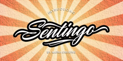 Santiago is both charming and elegant. This stunning script font is a stylish homage to classic calligraphy. This will elevate a variety of design projects to the highest level, be it branding, headings, wedding designs, invitations, signatures, logos, labels, and more!
 - Uplift by Fontop,
$11.00Uplift is a modern serif typeface with its own character and charisma. Works cool both when used in headlines, magazines, pull quotes and also in branding, unique logos, etc. Uplift comes with multilingual support also and also feature stylistic alternates. - Coffee Bar JNL by Jeff Levine,
$29.00 An image of the wide, Art Deco influenced lettering of a sign over a coffee bar inside a Jacksonville, Florida Lovett’s Supermarket (a predecessor to Winn-Dixie) inspired the namesake font Coffee Bar JNL – available in both regular and oblique versions.
 - Inkie by Turtle Arts,
$20.00Inkie is a hand drawn pen and ink alphabet with scratchy embellishments, and works great whenever you want a handwritten look to your art, but with a bit of extra flair. Inkie looks great both as text and as headlines. - Nouveau Song JNL by Jeff Levine,
$29.00 The Art Nouveau free-form, hand lettered title on the cover of the 1912 sheet music for Irving Berlin’s “Wait Until Your Daddy Comes Home” formed the basis for Nouveau Song JNL, which is available in both regular and oblique versions.
 - Indoxine by PizzaDude.dk,
$20.00Indoxine is a scribbled font, simulating hasty written letters with occasional inkblobs. Comes with ligatures for both double upper/lower letters and numbers, in regular and black versions! You will need to use OpenType supporting applications to use the autoligatures. - Goudy Heavyface by Bitstream,
$29.99This face was designed in 1925 as the Monotype answer to the very popular Cooper Black. Goudy is also quite similar in appearance to Ludlow Black and Pabst Extra Bold, both of which were also done in response to Cooper Black. - Nouveau Formal JNL by Jeff Levine,
$29.00 Lettering found on the cover of 1915 textbook pamphlets from the Woman’s Institute of Domestic Arts and Sciences, Inc. [of Scranton, PA] inspired the creation of Nouveau Formal JNL. This attractive serif typeface is available in both regular and oblique versions.
 - Dawnora by Typomancer,
$24.00 Inspired by aurora, one of the most impressive phenomenon. Dawnora is a spirited serif font comes with various weights and many opentype features, suitable for both simple text and elegant lettering. Especially, Initials style for drop cap and special usage.
 - Okra Cubo by Cool Fonts,
$24.00 OkraCubo in a distressed font with a cubist bent. This font work nicely for both grunge and modern styles. Used at large point sizes the cubist look really comes out. This font is as strange as Okra is a vegetable????
 - Nouveau Lettering JNL by Jeff Levine,
$29.00 A 1916 lettering book provided an example of a slab serif alphabet with Art Nouveau influence designed by Thomas Wood Stevens. This alphabet served as the model for Nouveau Lettering JNL, which is available in both regular and oblique versions.
 - Deukalion NF by Nick's Fonts,
$10.00Lettering specimens from 1910 by an unnamed Dutch calligrapher provided the inspiration for this quirky and somewhat mischievous Art Nouveau font. Both versions of the font include the 1252 Latin and 1250 CE character sets (with localization for Romanian and Moldovan). - Government Stencil JNL by Jeff Levine,
$29.00 A poster for the 1952 film “Diplomatic Courier” featured the title hand lettered in a bold serif stencil design. With some modifications, this served as the model for Government Stencil JNL, which is available in both regular and oblique versions.
 - Bricoleur NF by Nick's Fonts,
$10.00 This naïve script was discovered in a French printers' magazine from 1927. Its total lack of pretension makes it warm and inviting. Both versions of this font support the Latin 1252, Central European 1250, Turkish 1254 and Baltic 1257 codepages.
 - Augustin by Ludwig Type,
$45.00 Augustin is an elegant and legible typeface inspired by the classic letter forms of the renaissance, namely the type of Nicolas Jenson made in Venice in 1470. The style-linked family includes oldstyle and lining figures both tabular and proportional.
 - Argentina Cursive NF by Nick's Fonts,
$10.00 Here's an elegant addition to Argentina NF, carefully crafted after the pattern provided by master type designer Morris Fuller Benton in 1919. Both versions of this font support the Latin 1252, Central European 1250, Turkish 1254 and Baltic 1257 codepages.
 - Office Work JNL by Jeff Levine,
$29.00 The 1965 film “Mirage” had its titles and credits hand lettered in a simple, thin sans serif with rounded corners and an overall square design. This is now available digitally as Office Work JNL, in both regular and oblique versions.
 - Inlet JNL by Jeff Levine,
$29.00 An interesting bit of Art Deco influenced serif hand lettering was found on the cover of the sheet music for 1938's "Boatman's Serenade". This became the model for the digital font Inlet JNL; available in both regular and oblique versions.
 - Marquee by Pelavin Fonts,
$15.00 Marquee is a family of two fonts, containing both faceted and solid characters which can be layered to effect 3D, dimensional and translucent marquee-style typography, allowing for the creation of headlines reminiscent of classic theater and motion picture marquee signage.
 - Daikon by Pepper Type,
$30.00 Daikon is a semi-closed geometric grotesque featuring rich language support including Cyrillic, various OpenType features and multiple sets of figures. This family’s clean and legible feel makes it useable as both display and body type in any font size.
 - Wine Vat Stencil JNL by Jeff Levine,
$29.00 An image of a vintage metal stencil for the French wine region Côteaux du Tricastin [now Grignan-Les Adhemar] served as the inspiration for Wine Vat Stencil JNL. This condensed sans serif design is available in both regular and oblique versions.
 - Loopy Loo NF by Nick's Fonts,
$10.00 The Hunt Brothers, penmen extraordinaire, presented the pattern for this face as Upright Ornamental, it's a little loopy and a whole lotta fun. Both versions of this font support the Latin 1252, Central European 1250, Turkish 1254 and Baltic 1257 codepages.
 - County Clerk JNL by Jeff Levine,
$29.00 County Clerk JNL was modeled after the vintage Hamilton wood type design Gothic Special, and is available in both regular and oblique versions. An early grotesk font, this condensed sans serif lends itself well to short headlines and brief body copy.
 - Reliable by PizzaDude.dk,
$20.00 Reliable was drawn with a somewhat dry brush, and then carefully made into a font. Reliable differs from other brush fonts, because it has got 8 different versions of each letter!!! 8 different letters that cycle while you type! Not really random, but enough to make it look very random! And, of course Reliable has got a full load of diacritics So, the conclusion must be: if you need a cool brush font, use Reliable!
 - 99 Names of ALLAH Subhanahu by Islamic Calligraphy75,
$12.00 We have transformed the “99 names of ALLAH” into a font. That means each key on your keyboard represents 1 of the 99 names of ALLAH Aaza Wajal. The fonts work with both the English and Arabic Keyboards. We call this Calligraphy "Subhanahu Wa Ta'ala" because we have added "Subhanahu Wa Ta'ala" to each and every name. The first "Alef" has a "hamzit wasel", this indicates that the name can be pronounced both as "AR-RAHMAAN" or "R-RAHMAN" (in the zip file you will find a pdf file explaining the differences in the "harakat", pronunciation and spelling according to the Holy Quran). The calligraphy is rectangular shaped, and the "fatha" is big and covers almost the entire name, in most of the names. Decorative letters used in this calligraphy: "Mim, Aain, Sin, HHe, He, Ta, Kaf & Saad". Purpose & use: - Writers: Highlight the names in your texts in beautiful Islamic calligraphy. - Editors: Use with kinetic typography templates (AE) & editing software. - Designers: The very small details in the names does not affect the quality. Rest assured it is flawless. The MOST IMPORTANT THING about this list is that all the names are 100% ERROR FREE, and you can USE THEM WITH YOUR EYES CLOSED. All the “Tachkilat” are 100% ERROR FREE, all the "Spelling" is 100% ERROR FREE, and they all have been written in accordance with the Holy Quran. No names are missing and no names are duplicated. The list is complete "99 names +1". The +1 is the name “ALLAH” 'Aza wajal. Another important thing is how we use the decorative letters. In every font you will see small decorative letters, these letters are used only in accordance with their respective letters to indicate pronunciation & we don't include them randomly. That means "mim" on top or below the letter "mim", "sin" on top or below the letter "sin", and so on and so forth. Included: Pdf file telling you which key is associated with which name. In that same file we have included the transliteration and explication of all 99 names. Pdf file explaining the differences in the harakat and pronunciation according to the Holy Quran.
 - 99 Names of ALLAH Kids by Islamic Calligraphy75,
$12.00 We have transformed the “99 names of ALLAH” into a font. That means each key on your keyboard represents 1 of the 99 names of ALLAH Aaza Wajal. The fonts work with both the English and Arabic Keyboards. We call this Calligraphy "Kids" because it looks as if a child is writing the names. The first "Alef" has a "hamzit wasel", this indicates that the name can be pronounced both as "AR-RAHMAAN" or "R-RAHMAN" (in the zip file you will find a pdf file explaining the differences in the "harakat", pronunciation and spelling according to the Holy Quran). Some of the letters in the calligraphy are unusually big, they look as a child is writing them. No decorative letters are used in this calligraphy. Purpose & use: - Writers: Highlight the names in your texts in beautiful Islamic calligraphy. - Editors: Use with kinetic typography templates (AE) & editing software. - Designers: The very small details in the names does not affect the quality. Rest assured it is flawless. The MOST IMPORTANT THING about this list is that all the names are 100% ERROR FREE, and you can USE THEM WITH YOUR EYES CLOSED. All the “Tachkilat” are 100% ERROR FREE, all the "Spelling" is 100% ERROR FREE, and they all have been written in accordance with the Holy Quran. No names are missing and no names are duplicated. The list is complete "99 names +1". The +1 is the name “ALLAH” 'Aza wajal. Another important thing is how we use the decorative letters. In every font you will see small decorative letters, these letters are used only in accordance with their respective letters to indicate pronunciation & we don't include them randomly. That means "mim" on top or below the letter "mim", "sin" on top or below the letter "sin", and so on and so forth. Included: Pdf file telling you which key is associated with which name. In that same file we have included the transliteration and explication of all 99 names. Pdf file explaining the differences in the harakat and pronunciation according to the Holy Quran.
 - Magpie by Elster Fonts,
$24.00 Magpie is a font family consisting of three sub-families with both regular and italic styles. Originally designed on squared paper, over time it has moved further and further away from this rigid grid, although its appearance is still based on it, so it can easily be used for logotypes or headlines with strict grid-based layouts. While Magpie Text is suitable for headlines and short texts, Magpie Display is ideal for logotypes or more playful headlines. Finally, Magpie Mix is a combination of both families. Magpie Text Regular represents stability, Magpie Display Italic is ideal for dynamic logos or headlines. To cover more languages, cyrillic and greek letters were added and Magpie can be used for nearly a hundred languages. In addition to the four common numeral variants, special numerals, punctuations and symbols for all-caps (c2sc) are included. Furthermore case-sensitive punctuations and symbols are available. To expand the typographic possibilities, four stylistic sets, different symbols, forms and standard- and discretionary ligatures have been added. Each Magpie-font contains more than 880 glyphs.
 - Switched On by Type Innovations,
$39.00 Switched On and Switched Off where two fonts developed by placing points on a pre-defined square grid template. The experiment was to explore all the variations possible by just using straight connecting lines on a grid. I stumbled on the final concept, almost accidentally, and was amazed by the numerous possibilities. Both designs where created to work together. By adjusting the stroke and inline proportions between the two fonts, I was able to achieve a good overall color balance between 'Switched On' (dark letters on a light background), and the 'Switched Off' design as a knockout treatment (light letters on a dark background). Used in this way, both fonts visually appear similar in overall weight and proportion. They harmonize well together. Used separately, they make for some interesting visual effects and headline treatments. The fonts are best used at large point sizes, but they are still legible in a variety of smaller sizes. I think that by experimenting with these two fonts one can achieve some stunning visual effects. Explore and have fun.
 - Lust Pro by Positype,
$50.00 Confident and versatile, Lust Pro™ is an exercise in indulgence—an attempt to create something over the top and vastly useful. If Lust Pro seems both new and familiar, that’s because it is. The series unapologetically channels Herb Lubalin, but produced with a deliberate, contemporary twist. There is an intentional slyness infused in the letterforms—the extreme thick and thin lines flow effortlessly without becoming gratuitous. It’s always just enough, not too much. What makes the type series so appealing? The curves. When asked to describe the letterforms, most people unwittingly allude to the human form, using adjectives usually reserved for describing physical traits… creating all-too-familiar comparisons. Summerour has grown to accept this as unavoidable and reasonable given his acknowledgement of its influences and has provided nuances within the letterforms to accentuate that. Intended to be set large, the typeface boasts 3 widths and 5 weights and matching italics for both the Regular and Didone variants (that’s 60 fonts in total), making it perfect for editorial use and a highly flexible solution for any display need.
 - Arise by Monotype,
$30.00 Arise is a humanist typeface designed for both text and display purposes. Its an understated type family with enough subtle nuances and personality to add distinction to your own typographic compositions. As can be seen in the /a/c/f/g/r/y/ glyphs, hooked terminals are a key feature of this typeface. These terminals are blade-like in appearance, defining a distinctive character that is unusual, yet balanced and refined. Practical features include 38 capital swash alternates for intial and final forms that can be particularly effective when used in titling and branding situations. Small caps are also included (along with matching diacritics) – these are designed to harmonise with regular lowercase forms so that you may easily achieve unicase-style typography. There are 18 fonts altogether, with 9 weights from ExtraLight to Ultra in both roman and italic. Arise has an extensive character set that covers all Latin European languages. Key features: 9 Weights Roman & Italic Small Caps 38 Alternates Old Style Figures European Language Support (Latin) 700+ Glyphs per font.
 - Entendre by Wordshape,
$30.00 Entendre is a stately, commanding and handsome sans serif typeface family that pulls reference from Trajan capitals, the history of English calligraphy, and a variety of other sources to summon a sense of warmth, consideration, trust and authority. Entendre spans 22 weights and styles including Regular and Condensed versions. The large x-height and refined characteristics of the family lend the family a sober and sophisticated appearance that is suitable for both print design and on-screen use. Entendre includes Central and Eastern European language support as well as Western European language support, including Greek and Cyrillic. Entendre’s generous x-height and medium-length ascenders and descenders offer pronounced readability, making the family useful for text typesetting both in print and on screen. Within, humanist elements are tempered with monumental construction, making the heavier weights go-tos for display design work. All of the Entendre family of typefaces feature Western, Eastern and Central European language support alongside nuanced Greek and Cyrillic. Entendre pairs well with our rounded sans serif family Elpy, sharing similar proportions and spacing.
 - Lust Pro Didone by Positype,
$50.00 Confident and versatile, Lust Pro™ is an exercise in indulgence—an attempt to create something over the top and vastly useful. If Lust Pro seems both new and familiar, that’s because it is. The series unapologetically channels Herb Lubalin, but produced with a deliberate, contemporary twist. There is an intentional slyness infused in the letterforms—the extreme thick and thin lines flow effortlessly without becoming gratuitous. It’s always just enough, not too much. What makes the type series so appealing? The curves. When asked to describe the letterforms, most people unwittingly allude to the human form, using adjectives usually reserved for describing physical traits… creating all-too-familiar comparisons. Summerour has grown to accept this as unavoidable and reasonable given his acknowledgement of its influences and has provided nuances within the letterforms to accentuate that. Intended to be set large, the typeface boasts 3 widths and 5 weights and matching italics for both the Regular and Didone variants (that’s 60 fonts in total), making it perfect for editorial use and a highly flexible solution for any display need.