10,000 search results
(0.024 seconds)
- Redrail Superfast by astroluxtype,
$20.00 Bold mutant typography. Retro-futuristic. Sixties meets 1990’s comic book inspired, superfast for your superhero? The pencil tissue was dragged out from the very back of the file cabinet, stuck in the metal rail, it was lost then found- to bring a unique look to your project. A companion font to astroluxtype’s Spacepod, both fine ways to mark and identify your spacecraft. Note the lowercase letterforms that make connectors such as g, j, y, b, d and g. See the posters at myfonts.com for examples of how to you might use this feature. Redrail Superfast is a minimal glyph set which can be used at various sizes, we consider it a headline/display font and best applied larger than 36 points in size.
 - Weaving by Ingrimayne Type,
$9.00 Weaving is a family in which the letters fit together so that wavy lines separate them both horizontally and vertically. It creates this effect by alternating letters on upper-case keys with those on lower-case letters and this alternating is done automatically in applications that support the OpenType feature of contextual alternatives (calt). (The upper-case can be used alone but it unlikely that the lower-case characters could be used by themselves.) The family is a thinner and condensed version of the typeface Woven, but in condensing it, the tessellation properties that a were in Woven are lost. It is a decorative display face but because there are few typefaces similar to it, it is hard to predict what uses it may have. Be creative!
 - Privilege Sign JNL by Jeff Levine,
$29.00 The above-the-store signage for many newspaper stands, soda shops, candy stores, luncheonettes and pharmacies of the 1950s and early 1960s were what was referred to as “privilege signs” provided by one of the major cola brands. Consisting of the brand’s emblems on the left and right, the remainder of the sign would carry the desired message of the storekeeper (such as “Candy – Soda – Newspapers”) in prismatic, embossed metal letters. Inspired by these vintage signs, Privilege Sign JNL recreates the condensed sans serif lettering style in both regular and oblique versions. The typefaces are solid black, but adding a selected color and a prismatic effect from your favorite graphics program can reproduce the look and feel of those old businesses.
 - VLNL Agitka by VetteLetters,
$30.00 As a font designer for films Henning Brehm delivers fonts with a whip-sharp eye for precision. His latest Vette Letters release, VLNL Agitka is a Cyrillic-inspired (and including) alphabet with both feet rooted in Soviet Union-era propaganda posters. Its design is constructivist (look Mom, no curves!) geometric and strong. Like Russian vodka. Aside from the Regular, Light, Bold and Black weights, Agitka comes in four Neon styles as well. For a dazzling design effect, layer those neons over a regular weight for a star struck embossed-letter effect. We would also like to point out the usage of VLNL Agitka in the Bourne Ultimatum movie, for which Brehm designed neon signage for a scene at a Russian supermarket. За здоровье – Za Zdarovje!
 - Paradigm Pro by Shinntype,
$59.00 Originally released in 1995 as a three font family, Paradigm forcefully addressed the emaciating effect that digitization was then exerting upon traditional serifed typography. Investigating the new media of a much previous era, Nick Shinn deconstructed the first roman type, designed by Sweynheym and Pannartz in 1467, and gleaned, from its minuscules, the low contrast and discreet serif treatment (portrayed by a novel convex effect), which he subsequently applied to both capitals and lower case of a classically proportioned Venetian invention. In 2008 the glyphs, metrics and hinting of the 1995 fonts were refined, Extra Bold and Light weights added, a full range of OpenType features instituted, and the number of characters per style increased almost threefold. A major upgrade to a unique typeface.
 - Cita Pro by XdCreative,
$29.00 About Cita Pro Hi there please say hello to "Cita Pro" the latest collection from @faldykudo, Cita Pro is a serif typeface with a taste of old style, its very beautiful with a timeless aesthetic and has a very wide range for various design situations. Cita Pro is perfect for both display and body text because it has a very good readability. Cita Pro has 14 style and 7 weights, - from Thin to Bold and Matching calligraphic italic. Cita Pro also has special alternate characters in complete uppercase from A-Z . it is to give a different look for your display design. thanks, hope you would like and accept "Cita Pro" as part of your family. thank you in advance
 - Praktika by Fenotype,
$25.00 Praktika Modern grotesk super family Praktika is a multifunctional super family of 40 fonts. It consists of three distinct widths and weights from extra light to extra bold. Conceptually, it is a rendition of the familiar early 20th century European grotesque styles, used in road signage – reimagined to meet the needs of contemporary world. Its design language, however, has been kept decidedly rough and bulky, to achieve a unique-yet-familiar look and feel. Praktika comes with more than a few features, accessible in any open type savvy program. • Built-in small capitals • Both lining and old style numerals, in tabular or proportional form • Superscript and subscript numerals • Many alternate characters For the best experience, purchase the whole family which is available for a good bargain price.
 - Coast by Blackmoon Foundry,
$42.00 The Coast is a Sans Serif type family inspired by enamel signs from the 1920s. The Coast has a large x-height which gives the font a friendly look and guarantees great performance in very small sizes. The Coast family also works great in huge sizes since it has some very special and highly elaborated characters like the small “e” and “g” which distinguishes it from an ordinary Sans Serif. The family includes real small caps, small capital figures, medieval and monospaced lining figures for information in tables. Coast and Coast Wide both come with a variety of special characters, alternates, mathematical symbols and the unusual ligature “rt”. Also on board: the german capital letter “sharp s” = ẞ. That’s about it.
 - Decora One by Naghi Naghachian,
$82.00 Decora one is a typographic innovation. It is the first of a series of typeface that gives the typographer and other graphic artists the possibility to use modern initials. It enables, moreover, the use of this typeface for decorative headlines and is suitable for manipulations in both vector-based and pixel-based graphic programs. Typographies in countries worldwide, whose alphabets derive from the Roman one, are dependent on such innovations in order to meet the increasing demands of modern communication. This typeface implies at the same time an enrichment of the possibilities for typographical design, which in turn increases the delight in such design. It gives me great pleasure to present this series of new typefaces to my creative colleagues worldwide.
 - ITC Luna by ITC,
$40.99 ITC Luna is the work of Japanese designer Akira Kobayashi. He turned to the designs of the 1930s for his inspiration for both ITC Luna and ITC Silvermoon. Luna is designed to fill the gap between a pure Art Deco display face and an ordinary text face," says Kobayashi. "It has an Art Deco style but is still fairly easy to read. It can be used in short passages of text. As for individual characters, I especially liked the distinctive O, shaded only on one side. Lowercase a and g are also unusual, but they are somehow legible enough in text matter." And for a finishing touch on his Luna, Kobayashi added the charming moon face as an extra character.
 - Divided Highway JNL by Jeff Levine,
$29.00 The Narsinh Series (from the 1940 Gujarati Type Foundry of Bombay, India) is a modular metal font comprised of 32 basic shape pieces which would be assembled into any configuration to form various letters and numbers. Examples of the alphabet and numerals were set in an Art Deco, condensed sans serif and were the basis for this type revival. Strongly resembling a stencil design, the typeface was named after the revered 15th-century poet-saint of Gujarat, India Narsinh Mehta, and the foundry itself gets its name from the language and script of Gujarati [spoken by the Indo-Aryan residents of the Indian state of Gujarat]. Divided Highway JNL is the digital version of this design, and is available in both regular and oblique versions.
 - Transitore by PintassilgoPrints,
$- Transitore is a lively hand-drawn font with loads of alternates and ligatures which, managed by advanced OpenType features, help create a convincing handcrafted look. The contextual alternates feature automagically substitute glyphs, providing a cool random effect, while the discretionary ligatures feature bring on witty interlocks and curly elements. Turn on both and multiply the possibilities! But wait; there's more! This font also brings a handy set of swashes for adding that extra special touch. And yet, there are three supplementary fonts: Transitore Color A and Transitore Color B work as stackable layers for easily adding colors, while Transitore Splashes generate irresistible splashes of ink. This family is a smart and complete toolbox that offers endless ways to style your text compositions. Enjoy!
 - Seraphina by Muksal Creatives,
$15.00 Seraphina is a variable serif font that boasts beauty across 18 distinct styles, ranging from the delicate "Thin" to the boldest "Black". Each style offers italic capabilities, enriching the spectrum of your design possibilities. The elegance encapsulated within each letter creates a captivating impression, making it ideal for branding seeking prominence and fashion styles aiming to convey an elegant and exclusive message. Seraphina beckons to be applied across various design mediums, leaving a distinctive mark on logos, posters, and other design products. With a bestowment of grace and luxury within each character, Seraphina unlocks doors to captivating creations and consistent impressions. It stands as an outstanding choice for design projects that demand a touch of both refined classicism and modernity.
 - Sansmatica by Fontop,
$14.00 Sansmatica is a clean and modern sans serif typeface. It has 28 fonts that work as a multi-purpose design solution. It consists of regular and condensed fonts that can be used for different cases: regular fonts are perfect for copy while Sansmatica condensed fonts are more specific - they make emotional associations and are perfect when you want your headlines or advertising to be noticeable. Also suite great for greeting cards, posters, branding, name card, stationary, design title, blog header, art quote, typography. Sansmatica has 7 weights with light looking more modern, fashionable and the bold giving a more rugged impression is perfect for headlines, logos, quotes, and more! It is interesting to use bold condensed fonts – both vertical lines and weight draw attention.
 - Possible by K-Type,
$20.00 POSSIBLE is both sans and serif, either is possible. The typeface is a sans-serif impersonating a spur serif, or it’s a glyphic with the look and feel of a sans. This clean, contemporary family is inspired by Percy J Smith’s ’Petit Serif’ from 1928, and similarly takes inspiration from Johnston’s Underground, though more recent influences provide geometric and humanist elements that, together with the tiny micro-serifs, improve clarity and legibility. Spur serifs such as Petit Serif, Copperplate and Liberty are often caps-only fonts, but Possible contains a lowercase, as well as a full Latin Extended-A character set. Possible is available in five weights – Thin, Light, Regular, Medium and Bold – each supplied with a corresponding, optically-corrected italic.
 - Lifeform by Supremat,
$12.00 Lifeform is a modern display font created as a result of my experiments on the forms of letters. While working on the font, I had ambivalent feelings, on the one hand I liked the individual curved lines, on the other hand they seemed very strange, alien and illogical. It was like looking into a microscope and seeing something strange. I wanted to develop and study these forms as something new, because I had never seen anything similar before. The result is a contrasting font that has both curves and sharp, and smooth lines that resemble some kind of organic matter. The font is well suited for large headlines, posters and covers. Its strange design catches the eye and will not leave the viewer indifferent.
 - Takox by John Moore Type Foundry,
$7.00 Takox is a display typeface based on a synthesis of righteousness extreme, futuristic spirit leads us to a way of plotting the words in a new way and in line with trends and technology synthesis century. Extreme music. Takox is provided with style forms to small caps, in both Regular and Italic. What was the inspiration for designing the font? Takox is the result of my own research in finding straight shapes of great simplicity. What are its main characteristics and features? Display font witn straight shapes of great simplicity. Usage recommendations: This letter design is ideal for use 3D extrusions, ideal to represent natural forms of cristals, metal or mechanical things. Fits indiustriales representations and aerospace, also for extreme music and avant garde.
 - YR Qaf by Alrefaiy,
$20.00 YR Qaf is a clean, modern, and highly legible font. Featuring clear, easy-to-read letterforms with a focus on legibility. The font is carefully crafted with balanced proportions and an emphasis on vertical lines, resulting in a harmonious and streamlined appearance. YR Qaf offers a sleek and modern aesthetic, with exceptional legibility and versatility. Its clean lines and balanced proportions make it a perfect choice for a variety of design projects where clarity and readability are essential. YR Qaf is ideal for a wide range of applications, including branding, web design, editorial design, and more. With a comprehensive set of glyphs, including both upper and lowercase letters, numerals, and symbols, this font can adapt to diverse design needs with ease.
 - Araldo by Hackberry Font Foundry,
$14.95 My latest book production group is quite conservative. I discovered my need for a pair of headline fonts with the same vertical metrics which are looser and more lively. Since the serif family is Biblia Serif, and the Sans family is Draetha [which is Welch for preach], Araldo [which is Italian for herald] makes sense to me. Narrow has my normal set of Opentype features with small caps, small cap figures, and the rest of the figure sets. Bold is too heavy for small caps, without messing with the metrics. So, it has the normal figure sets, plus a decent set of discretionary ligatures. They both work well, and are meeting my need for a headline family to add to the book production group.
 - Baldufa Cyrillic by Letterjuice,
$66.00 Baldufa is a charming typeface with strong personality, which looks very comfortable in text. There is a search to obtain complicated curves and detailed features, which gives the typeface a touch of beauty and elegance. However, this is also a self-conscious design that claims through the rounded serifs and irregular vertical stems appreciation for quirkiness and human imperfection. The letterforms are inspired by the slight distortions and idiosyncrasies that came with old printing methods. It has distinct, features such as rounded serifs, irregular vertical streams, ink traps and extremely thin junctions. In the Italic, serifs have been removed to enhance movement and expressivity. These experiments in form have not come at the cost of legibility: The typeface remains suitable for both small and display text.
 - MB Grotesk by NWRS KHRS,
$28.50 While uniqueness might be considered the main goal among type designers, our goal in this project was to be as far away from that uniqueness as possible. We designed MB Grotesk with strictest typography standards, holding fast to the type axioms long understood from the beginning of modern typography. After more than 600 hours of work — creation, production & release — the whole typeface family the MB Grotesk is a flawless branching away from the original Grotesque category. Included are 351 standard glyphs designed with geometric rules and grotesque type theories. MB Grotesk has 7 weights & their italics. It supports many languages including most languages which use both Latin and Cyrillic alphabets. We are looking toward extending this family to include condensed, extended & Arabic versions as soon as possible.
 - Yongley by Canden Meutuah,
$15.00 Yongle Serif is a modern serif font packaged in a modern and classy style, complete with access to your OpenType feature to access a large selection of alternative letters and ligatures, the choice of letters you like from various uppercase and lowercase letters for a luxurious impression and elegant appearance. A new elegant serif font that will add a touch of luxury and style to your projects. This is a very versatile font that works well in both large and small sizes. This font is Perfect for branding projects, logo design, clothing branding, packaging, magazine titles, advertisements, t-shirts, postcards, editorials, magazine headlines, product packaging, and displaying masculine and feminine qualities. This is equipped with full uppercase, lowercase, numbers and punctuation + Multi-language support
 - Good Castyll by Twinletter,
$15.00 Good Castyll is our newest display font, and it has a laid-back, unique feel to it. It was created with a genuine hand touch, so it seems natural when viewed. This font is ideal for adding a touch of class to your creative work. Start creating fantastic projects with this font, and you’ll notice a distinct difference in the way it’s used. This font is perfect for games, sporting events, branding, banners, posters, movie titles, book titles, quotes, logotypes, and more. of course, your various design projects will be perfect and extraordinary if you use this font because this font is equipped with a complimentary font family, both for titles and subtitles and sentence text, start using our fonts for your amazing projects.
 - Kamerik 205 by Talbot Type,
$19.50 Kamerik 205 is inspired by the classic, geometric sans-serifs such as Futura and Avant Garde, but has shallower ascenders and descenders for a more compact look, and features a traditional double-storey lower case a and g. It's a versatile, modern sans, highly legible as a text font and with a clean, elegant look as a display font at larger sizes. It includes old style non-aligning (lower case) numbers, both proportional and tabular as well as accented characters for Central European languages. The Kamerik 205 family comprises of six weights, and is closely related to Kamerik 105. The most notable differences between the two variations, are the two-storey lower case a and g in Kamerik 205, where they are single-storey in Kamerik 105.
 - Camber by Emtype Foundry,
$69.00 Camber is the last in a personal series of squarish sans. It is a noiseless typeface with a geometric base, it has a synthetic and clean design, but with a human sensitivity where the geometry fails. It tries to be more versatile and simpler than its predecessors, with a pragmatic approach, having less visual noise and virtually removing the disturbing elements. The family is generous in width meeting a certain shortage of wider fonts. Camber works well in both display and text, it is a multipurpose font suited for magazine, branding and web. The type family consists of 14 styles, 7 weights (Thin, UltraLight, Light, Regular, Medium, SemiBold and Bold) plus italics and it’s available in Open Type format. For more details please see the Camber PDF.
 - Mariam by Linotype,
$187.99Mariam is a traditional-style Arabic headline face designed by the famous Arabic type designer Ismet Chanbour, who also designed Al Harf Al Jadid - another highly successful typeface from Linotype. Mariam is characterised by certain design features which contribute to its stylistically lively, yet graceful appearance: downward-pointing tails combining with the swinging finial strokes of certain characters, and the various cut-away" effects. This headline face successfully offers a wide range of applications, from very large, bold poster-size work to use at 18 point for emphasis in text work. Available as in the OpenType format, Miriam incorporates the Arabic codepage (CP 1256), and supports Arabic and Persian. It also includes both tabular Arabic and Persian numerals, as well as Latin figures and complete punctuation." - Hicked by Craft Supply Co,
$20.00 Introduction to Hicked – Slab Serif Font Hicked is a bold, slab serif font, ideal for impactful design work. Its masculine appearance gives it a strong presence. This font stands out in headings, logos, and posters. It’s perfect for anyone seeking a robust typeface. Design Features Hicked features thick, block-like serifs that command attention. Its balanced letterforms ensure readability at various sizes. The font has a uniform stroke width, offering a cohesive look. Each character is carefully crafted for visual harmony. Usability and Versatility Hicked excels in both print and digital media. Its clarity makes it readable even in smaller sizes. This font is versatile, suitable for branding, advertising, and editorial design. It can adapt to a wide range of design projects effortlessly.
 - Convexion by Typogama,
$19.00 Designed as a versatile and functional family, Convexion is the result of a personal exploration into the use of convex forms in serif designs. Its humanist form is inspired by a fusion of classical serif forms with the more expressive forms found in script lettering, to create a legible yet original typeface family. Consisting of 3 weights, with accompanying cursive inspired italics, this family is suited for a wide range of applications such as branding that will expose its defined personality or editorial design were it can be used for both display titles or text. This family supports a range of Opentype features, offering multiple numeral styles, ligatures and other alternate glyphs. With an extended Latin glyph set, it will support most Latin based languages.
 - School Age by Jeff Levine,
$29.00 The “Trixy Toy Educator” was a 1930s-era set of letters and numbers (along with a few animal shapes) for teaching children, and was manufactured by the Durrel Company of Gardner, Massachusetts. Die cut from thick cardboard, the 40 piece set also included a rack to display the characters, presumably for little ones to practice the correct order of the alphabet and basic numerals or to spell simple words like ‘dog’ or ‘cat’. Whomever came up with the idea, they used the most rudimentary and unusual ‘type design’ shapes in the A-Z and 0-9, but they were just odd enough to inspire a digital type version of them. School Age JNL is available in both regular and oblique versions.
 - Poblano by Niche,
$26.99 Poblano is a masterfully designed flared typeface, inspired by Gothic Tuscan that incorporates an aura of modern fun and classic southwest whimsy. With serifs that embody the beautiful, natural curve of the Poblano Pepper, it captures the pepper’s essence and attitude of having the perfect amount of piquant heat. Perfectly suited for menus, headlines, and logos, Poblano will be the ideal garnish to complete and elevate your food, rustic, grunge and hipster themed designs. The Poblano menu includes: • A range of styles from elegantly thin to boastful black • Over 400 glyphs per weight • More than 50 stylistic alternatives • Upper and lowercase characters • Uniquely stylized to elevate your design and add that finishing touch This is the ultimate niche solution to both display and functional Tuscan serif fonts.
 - Lina sans Arabic by Zaza type,
$24.00 Lina sans is an Arabic typeface from Lina type family, it expresses modern vigor based on simplicity and clarity. It's Strong, Bold, legible, clear, simple, Modern. With a handful set of OpenType features and alternatives. Lina type family consists of Lina soft, Lina sans, Lina round. the design is inspired by the Kufic calligraphic style and influenced by the Naskh style. Lina sans was highly crafted in order to perform well both on screen and in print. The large x-height and open counters make it function well even on small font sizes. It has a wide range of use possibilities headlines, logotypes, branding, books, magazines, motion graphics, and use on the web and Tv. Lina sans consists of 7-weight versions from thin to bold.
 - Baldufa Greek by Letterjuice,
$47.00 Baldufa is a charming typeface with strong personality, which looks very comfortable in text. There is a search to obtain complicated curves and detailed features, which gives the typeface a touch of beauty and elegance. However, this is also a self-conscious design that claims through the rounded serifs and irregular vertical stems appreciation for quirkiness and human imperfection. The letterforms are inspired by the slight distortions and idiosyncrasies that came with old printing methods. It has distinct, features such as rounded serifs, irregular vertical streams, ink traps and extremely thin junctions. In the Italic, serifs have been removed to enhance movement and expressivity. These experiments in form have not come at the cost of legibility: The typeface remains suitable for both small and display text.
 - Grange Rough by Device,
$39.00 Grange Rough is an inky, distressed version of Grange that mimics the effects of vintage hot-metal type on rougher paper. Grange is the Device interpretation of the classic “Grot” thick/thin sans style. Unlike the traditional models on which it is based, Grange takes a rational, consistent approach across wide range of weights and widths for contemporary use. The font includes alternative curved and straighter versions of key characters, most obviously the lower-case ‘g' and capital ‘R', allowing the font to take on either a sharper or warmer, more playful appearance. These can be toggled on or off using the ‘Alts' feature in Illustrator, or ‘Stylistc Sets’ in Indesign. Contains proportional, lining and tabular numerals. Perfect for both headline and text.
 - Weroth by Twinletter,
$15.00 Weroth is a lovely, eye-catching display typeface that will keep onlookers looking at your work. This font is a lot of fun; you can use it for informal or formal occasions, and it’s still adaptable. This font is still great for perfecting any creative project, whether it’s a child, teenager, or adult theme. Don’t wait, start utilizing this font immediately. This font is perfect for games, sporting events, branding, banners, posters, movie titles, book titles, quotes, logotypes, and more. of course, your various design projects will be perfect and extraordinary if you use this font because this font is equipped with a complimentary font family, both for titles and subtitles and sentence text, start using our fonts for your amazing projects.
 - Tooting Sans by HamburgerFonts,
$39.95 Tooting Sans is a well-crafted, contemporary humanist sans. Designed for the needs of editorial, advertising and signage, Tooting Sans is not only suitable for setting large amounts of text at small sizes, it also has a presence and robustness for powerful headlines. Tooting Sans has slightly condensed letters with clean lines, open forms and predominantly straight terminals, although some vertical strokes have angled terminals for variation. This helps to keep the flow of the copy alive whilst being economical with space and legible in both text and headline usage. Released as an OpenType font, Tooting Sans expands upon the standard sans serif character set to include Greek and Cyrillic glyphs, small caps, oldstyle figures, proportional figures, ligatures and improved support for Latin-based languages.
 - Rocklie by Canden Meutuah,
$20.00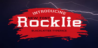 is a modern font packaged in a modern and classy style, complete with access to your OpenType feature to access a large selection of alternative letters and ligatures, the choice of letters you like from various uppercase and lowercase letters for a luxurious impression and elegant appearance. A new elegant serif font that will add a touch of luxury and style to your projects. This is a very versatile font that works well in both large and small sizes. This font is Perfect for branding projects, logo design, clothing branding, packaging, magazine titles, advertisements, t-shirts, postcards, editorials, magazine headlines, product packaging, and displaying masculine and feminine qualities. this is equipped with full uppercase, lowercase, numbers and punctuation + Multi-language support
 - Sunkist Agness by Alit Design,
$15.00 Introducing Sunkist Agness Typeface The Sunkist Agness inspired by chill and playful street font combined with stencil font style. this font have rough and distorted shape which is become its own characteristic and uniqueness. Designed with 3 characters: Slab Serif, Sans Serif, and Serif, Sunkist Agness font is suitable to be combined into a playful and interesting combinations, not to mention the alternates from each characters that will add more uniqueness to your design! The "Sunkist Agness" are very easy to apply to any design, especially those with an retro and classic, army, playful and retro concept, besides that this font is very easy to use both in design and non-design programs because everything changes and glyphs are supported by Unicode (PUA).
 - Nebula Swirl by Hipfonts,
$17.00 Introducing Nebula Swirl, a modern and elegant font that mesmerizes with its captivating wavy shapes and smooth edges. This typeface is a true embodiment of expressiveness and boasts a strong personality that demands attention. Nebula Swirl's unique design merges fluidity with precision, resulting in a font that effortlessly balances grace and strength. Its dynamic and swirling curves create a sense of movement, as if the letters are gracefully dancing across the page. Perfect for creative and eye-catching designs, Nebula Swirl adds a touch of intrigue and sophistication to any project. Whether used in headlines, logos, or editorial layouts, this font commands a presence that is both bold and alluring. Let Nebula Swirl unleash its magnetic charm and elevate your designs to new celestial heights.
 - Allay by Twinletter,
$15.00 Allay is a display font with a distinctive and appealing shape that may be used in a wide range of creative design projects. Each letter shape is created using a variety of combinations that provide a one-of-a-kind, innovative, entertaining, and unmistakably aesthetic impression when used. This typeface also comes with typical ligatures and can be used in other languages. This font is perfect for games, sporting events, branding, banners, posters, movie titles, book titles, quotes, logotypes, and more. of course, your various design projects will be perfect and extraordinary if you use this font because this font is equipped with a complimentary font family, both for titles and subtitles and sentence text, start using our fonts for your amazing projects.
 - Lina Soft Arabic by Zaza type,
$24.00 Lina soft is an Arabic typeface from Lina-type family, with a warm and humane feeling. It's legible, soft, clear, flexible, simple, and contemporary. With a handful set of OpenType features and alternatives. Lina type family consists of Lina soft, Lina sans, Lina round. The design is inspired by the Kufic calligraphic style and influenced by the Naskh style. Lina soft was highly crafted in order to perform well both on screen and in print. The large x-height and open counters make it function well even on small font sizes. It has a wide range of use possibilities headlines, logotypes, branding, books, magazines, motion graphics, and use on the web and Tv. Lina Soft consists of 7-weight versions from thin to bold.