10,000 search results
(0.022 seconds)
- Decennie JY Pro by JY&A,
$45.00 JY Décennie has been designed for both the web and print. Essentially applying the principles of newspaper typefaces, attention has been paid to the Windows versions of the family to ensure clarity when used in web browsers. It was originally conceived with an Australian broadsheet newspaper in mind, and ultimately launched to commemorate JY&A’s 10th anniversary. The design itself is based on Australian and New Zealand wood type, which was used widely by European settlers during the nineteenth century.
 - Zuume Soft by Adam Ladd,
$24.00 Zuume Soft is a high-impact, condensed sans serif family with a soft touch. A sister to Zuume, this version features round corners for a friendlier appearance. The lighter weights give a sharp, technical feel while the bold, blacker weights can be tightly spaced and stacked for a strong visual punch. The notched and extended ink traps add both function and aesthetic interest. The strong and sturdy design makes it ideal for eye-catching headlines, branding, packaging, sports, logos, and more.
 - Possum Saltare NF by Nick's Fonts,
$10.00Lewis F. Day, in his Alphabets Old and New, presented these letters as examples of rustic Roman lettering of the first through third centuries, AD. An uppercase-only typeface, most of the lowercase positions are occupied by letterform variants. It should be noted that the name does not refer to a savory dish made from a nocturnal American marsupial; it’s Latin for “I can dance”. Both versions of the font include 1252 Latin, 1250 CE (with localization for Romanian and Moldovan). - Kathie Mikayla by RCKY Studio,
$15.00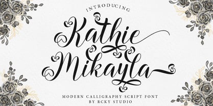 Kathie Mikayla is a light, beautiful and modern calligraphy font with a sophisticated flow. This is a very versatile font that works in both large and small sizes. Perfect for editorial projects, Logo design, Apparel Branding, product packaging, magazine headers or simply as a stylish text overlay onto any background image. Kathie Mikayla includes a full set of Uppercase and Lowercase Basic Characters, Numbers and Punctuation. This font has multilingual support, Also contains many alternative styles to recreate natural calligraphy perfectly.
 - Santerini Initials by Celebrity Fontz,
$24.99Elaborate high-quality three-dimensional initials, with shadows, in various styles including numerous exotic letters, incorporating vignettes, flourishes, stems, flowers, vines, and other decorative elements. These masterpieces of typographic art were inspired by Italian hand-etched designs dating back to 1839. Includes one set of A-Z ornamental initials conveniently assigned to both the upper and lower case alphabet characters. Perfect for starting off the beginning of paragraphs in artistic publications, storybooks, fairy tales, and texts conveying the feel of the 1800s. - Linotype Dummy by Linotype,
$29.00Linotype Dummy is a part of the Take Type Library, chosen from the contestants of Linotype’s International Digital Type Design Contests of 1994 and 1997. The Canadian artist Tad Biernot based the design of his font on optical illusions like those of M. C. Escher. The reader cannot always exactly decide if a character is twisting toward or away or both. Linotype Dummy is available in black and outline weights and is suited exclusively to short headlines in large point sizes. - Hisberg by Craft Supply Co,
$20.00 Cultural Richness Hisberg unfolds as a vintage serif font, deeply inspired by the wealth of past cultural richness. Each letter breathes historical elegance, enveloping designs in an aura of the past. Timeless Appeal Moreover, Hisberg crafts a bridge between eras. It brings the nostalgic charm of yesteryears into modern design, ensuring a timeless aesthetic that captivates and endures. Artistic Flourishes Additionally, this font features artistic flourishes. The subtle embellishments enhance its appeal, allowing for a presentation that is both sophisticated and compelling.
 - Chalk And Cheese NF by Nick's Fonts,
$10.00The name comes from a British expression about two things that couldn't be more different, and it suits this offering to a tee. The uppercase of this typeface is based on 1930s lettering by French poster artist Charles Loupot, and the lowercase is based on 1910s lettering by German plakatmeister Ludwig Hohlwein. Oddly, the two seem to play together well. Both versions of the font include the 1252 Latin and 1250 CE character sets (with localization for Romanian and Moldovan). - Pen Nib Square JNL by Jeff Levine,
$29.00 The idea started with the 1934 sheet music of “Mazurka Amabile”. Its hand drawn title had most of the letters rendered in a rectangular shape [‘square’ in the sign trade] that featured rounded corners and terminals made by the shape of the lettering pen nib. A few letters were rounder in design than others, so those were scrapped in favor of a more consistent character shape throughout the font. Pen Nib Square JNL is available in both regular and oblique versions.
 - Bozue by Lithographe,
$30.00 Bozue is an alternate between textual simplicity and display complexity. It is a Slab-Serif typeface meant for versatility and differentiation. It can be used as a title case it can be used as a text font. Its readability does not compromise its display ability. It's both bold enough to effect the tone of the message yet sensual enough to carry it through. The bi-linear efficiency of this tonal-mapping through visual comprehension make it a "must have" font for any designer.
 - Bronkoh by Brink,
$30.00 Bronkoh: A Subtly Softened Sans. Bronkoh aims to give a friendly face and soft touch to type both on screen and in print. Humanist forms and generous apertures make this a sturdy and legible face while its softened curves and terminals give it an approachable and welcoming spirit. The large character set and extensive latin language support make Bronkoh a highly functional font; This in conjunction with eight weights from thin to heavy, and matching italics add to its versatility.
 - Sisco by Tipo Pèpel,
$21.00 Sisco is a complete font family of 18 weights intended for editorial use and brand identity. Open counterforms give it a touch of modernity and technological. Sisco is designed to be legible in small sizes in both paper and display devices. It contains a set of authentic Small Caps and various sets of numerals, fractions, ligatures, and an extensive map of suitable characters for most languages based on Latin characters. Sisco is a typeface that will bring the future to your graphic projects.
 - Office Visit JNL by Jeff Levine,
$29.00 Dan Hardie, a Miami-based graphic artist and creative consultant at Mutiny, Inc. shared an image he’d spotted online of some interesting signage formerly on the front of the Miami Medical Building. Comprised of hand-cut metal characters (with a thoroughly avant-garde “Art Deco meets Modernist” approach), this instantly became a font design idea unusual and quirky enough to develop as a digital typeface. The end result is Office Visit JNL, which is available in both regular and oblique versions.
 - Pacardo by Luxfont,
$18.00 Introducing a clean geometric font family in Modernism style. Neat and at the same time provocative font attracts attention with its forms. New-fashioned font with original letters will perfectly complement both trendy abstract designs and designs in a retro style. Constructing letters with a bias towards heavier weights and contrast. Versatility of the typeface works well with designs in different styles. Features: Geometric and Modern 6 fonts in family: - Thin, Thin Italic - Regular, Italic - Bold, Bold Italic Kerning ld.luxfont@gmail.com
 - Sungar by Twinletter,
$12.00 Introducing Sungar sans serif font. Your customers will be captivated by the unique combination of inspiration, craftsmanship, and style that comes with this new typeface. You’ll get the full power of professional design without the hard work or hefty price tag. Of course, your various design projects will be perfect and extraordinary if you use this font because this font comes with a font family, both for titles and subtitles and sentence text, start using our fonts for your extraordinary projects.
 - Deco Francois JNL by Jeff Levine,
$29.00 The 1930s-era French alphabet collection entitled “La Lettre Dans le Decor & La Publicite Modernes” (which somewhat translates to “The Letter in Modern Decor and Advertising”) has page after page of attractive and unusual type interpretations. One particular Art Deco design puts an entirely different spin on the classic “rounded terminals and geometric design”. Unusual character shapes add a fresh new/old take to the “Streamline Movement”. The aptly-named Deco Francois JNL is available in both regular and oblique versions.
 - Plasto by Eko Bimantara,
$19.00 Plasto is a complete grotesk sans serif family. The quirky letterforms and its slight width variation characterized the typeface as fun and playful as "plastic" in a graphic layout, fit for various design spaces, fit for both informal or functional purposes, fit for large display and also small text. Plasto complete family contains 54 styles with two axes; Weight and Width. The weight consists of 18 styles from Thin to Black, and the width consists of 3 styles, condensed, normal and expanded.
 - Free Form Deco by Jeff Levine,
$29.00 Toward the end of the 1920s, Art Deco influences were starting to creep into modern design. The hand lettered title on the cover of the1928 sheet music for “Fascinatin’ Vamp” not only embraced the new Deco movement, but sent it on a wild typographic ride. Letters of mixed thicknesses and stylings made up the two word title, and this unusual group of letter shapes became the inspiration for Free Form Deco JNL, which is available in both regular and oblique versions.
 - Marlos by Sronstudio,
$23.00 "Introducing 'Marlos,' a serif font that marries the elements of grace and boldness seamlessly. With its graceful serifs and commanding letterforms, 'Marlos' leaves a bold and lasting impression. Ideal for projects that demand a perfect balance between sophistication and impact, this font brings a touch of timeless elegance to your designs, making it a go-to choice for creating a powerful visual presence." Features: - Ligatures - Alternate - PUA Encoded - Multilingual support - Simple Installation - Work both on Mac and Windows Thank you very much :)
 - Aquinas by ITC,
$29.00Aquinas is distinguished by the contrast between its upright, generous capitals and its narrow, slanted lower case letters which look almost like italics. The combination of these so different alphabets creates an opportunity to give texts an unusual yet elegant look. Aquinas is suitable for both running text and headlines and should be used in point sizes of 10 or larger. The lyrical and sophisticated feel of Aquinas makes it a particularly good typeface for poems, songs and other artistic texts. - Pamedarsih by Mazkicibe,
$10.00 Pamedarsih, a handwritten script font inspired by handwriting with an aesthetic touch. Pamedarsih is versatile enough for both web and print and can be used in a variety of projects such as stationery, packaging, apparel, wedding stationery, prints, quotes, social media graphics, planners, greeting cards, logos, branding, and much much more. The script includes a set of uppercase characters, numerals, symbols, two lowercase letter sets. Full Set of standard alphabet and punctuation Extra set of ending stylistic set lowercase Handwritten ligatures
 - Taurus Retro by Rachel McBride Creative,
$9.00 Taurus Retro is an AWESOME swash typeface with its swashes built in as character alternates, instead of being a pesky, separate typeface. This typeface is great for any project that needs both boldness and femininity. It comes with eight font styles. Great for any projects needing a retro or throwback feel, restaurant menus, along with book, movie, and album covers. It has a feminine and juvenile feel simultaneously, and is layerable for cool effects. It has 480+ glyphs, supporting a variety of languages!
 - Hughes by Larin Type Co,
$12.00 Hughes is a stylish and original multi-functional font, made in 6 styles (regular, rough, pressed, bold, bold rough, bold pressed), he fits perfectly for both modern and vintage design. With it, you can create beautiful logos, labels, templates, signs, highlight text, use it for outdoor advertising, branding, and much more. Also in this font there are stylistic alternates and swashes that will make your design even more attractive and interesting. It is easy to use and has OpenType features.
 - Xander by Monotype,
$29.99Based on the handwriting of the eminent Dutch typographer Alexander Verberne, Julius de Goede's Xander typeface manages to be both sophisticated and whimsical. This monoline connecting script dances across the page with the grace of a ballerina. An accomplished graphic designer and writer of more than 20 books on calligraphy, de Goede's lettering skills are evident in this careful translation of casual handwriting into a lighthearted, affable typeface family. Like a warm breeze on a spring day, Xander is fresh and welcome. - Casual Signage JNL by Jeff Levine,
$29.00 Alf Becker was a talented sign writer and a prolific contributor of unique alphabets to Signs of the Times magazine. More than one hundred of his designs were showcased in monthly installments with each new issue of the publication. One in particular is a casual, free form sans serif design which has been recreated digitally as Casual Signage JNL, and is available in both regular and oblique versions. Thanks to Tod Swormstedt of ST Publications for providing the reference material for this font.
 - Nouveau Signage JNL by Jeff Levine,
$29.00 Occasionally a type design is started - then set aside for whatever reason - before eventually being completed. More often than not, the original source material is forgotten, so proper attribution cannot be made. Such is the case for a hand lettered Art Nouveau alphabet likely found within the pages of an early Speedball lettering book from around the 1920s. This playful and casual design is now digitally reproduced as Nouveau Signage JNL, and is available in both regular and oblique versions.
 - San Angelo NF by Nick's Fonts,
$10.00A heavy unnamed Gothic typeface from the 1890 William H. Page Foundry woodtype specimen book provided the template for this bold, brash, no-nonsense face. It's designed to set tight, so your headlines will definitely get noticed. Named for a town in West Central Texas which is noted for being the home of the Buffalo Soliders in the late 1800s. Both versions of this font contain the Unicode 1252 (Latin) and Unicode 1250 (Central European) character sets, with localization for Romanian and Moldovan. - Fady Lingers by PizzaDude.dk,
$20.00 Fady Lingers is a mispronunciation of that famous Italian cookie - nevertheless, there is nothing awkward or wrong with the font! It is handmade using a thin marker, leaving an uneven edge. I did spend some time cleaning up each letter, but was carefully observant to keep the original handmade and organic look. I've added 4 slightly different versions of each lowercase letter. and they automatically changes as you type - a really great way to make your design stand out as organic and lively!
 - Love And Peace by Fenotype,
$25.00 What's so funny 'bout peace love & understanding? Nothing really. Love and Peace is an Art Nouveau style typeface inspired by Eckmann-Schrift by Otto Eckmann in 1900. Love and Peace is filled with ethereal elegance and it's great for posters, magazines and psychedelic LP covers. Love and Peace is equipped with few Contextual Alternates and Standard Ligatures to prevent characters from colliding. In addition it has Stylistic Alternates for lowercase a, k, r and s, and Swash Alternates for ampersand and dollar sign.
 - Zagolovochnaya by ParaType,
$30.00 Zagolovochnaya was based on the letterforms of Zagolovochnaya gazetnaya (Newspaper Display) type family of Polygraphmash in 1962 by Iraida Chepil et al. The face was a revival of Cyrillic version of Caslon designed in the late 1930s. The artworks of Zagolovochnaya gazetnaya were redrawn by Isay Slutsker (1924-2002) in the late 1990s. In spite of its name the font is useful both for display and text matter. The digital version was developed for ParaType in 2002 by Manvel Shmavonyan.
 - Nicolaus Kesler by Proportional Lime,
$12.99 Nicolus Kessler was a printer of Incunabula in Basel, Switzerland. He produced numerous ecclesiastical works, Bibles, and an edition of the Golden Legend. This particular font is derived from one of his many typefaces. It has the virtue of both being at once fancy and elegant yet retaining a surprisingly easy to read property to it. This font has over 900 glyphs for modern usage and also includes a few of the more common historical abbreviations that were then present in printing.
 - Taconic by Kellie Jayne Studio,
$10.00 Taconic Font is a quirky handwritten font with a playful feel. It was inspired by a hiking trip by the Taconic mountain range. To keep your designs fresh, Taconic features a set of stylistic alternates for both uppercase and lowercase letters, plus over 50 discretionary ligatures. It is easy to achieve a totally handwritten look with natural variations in the letterforms. This font works great for editorial designs, marketing materials, blogs, or whatever you'd like to add some handwritten pizzazz to!
 - Guest Invitation JNL by Jeff Levine,
$29.00 Samuel Welo was a sign painter who had published in the 1920s and again in 1960 editions of his “Studio Handbook – Letter and Design for Artists and Advertisers”. In-between, in 1930 Welo also published “Lettering - Practical and Foreign”. Within the pages is an Art Deco outline slab serif design using multiple thin lines to create an “incised” or “engraved” look within the characters. This intriguing type style is now available as Guest Invitation JNL, in both regular and oblique versions.
 - EB Humboldt by Fenotype,
$9.95 Humboldt is an ultra fat headline face. How bold can you go? Humboldt is an experiment to push the boundaries of character recognition: Its forms are extremely bloated yet highly distinctive. Open type savvy features provide an unexpected embellishment: small capitals, both lower case and upper case figures and several alternate glyphs are intrinsic in the design. Humboldt makes nice headlines and striking poster typography or logotypes. It can to some extent be used for setting even short phrases of text.
 - Crystal by Cuda Wianki,
$30.00 Crystal is a very trendy two font system that could be layered to give You multiple possibilities in designing. When You use it with gradient it gives a faceted 3-D effect. What is more it can be outlined that gives an additional industrial look. Both fonts contains the same metricts so using them is so simple-just copy & paste in place in different layers and then play with colors, gradients, outlines as You like :) Crystal is great for headlines and logotypes.
 - Road Picture JNL by Jeff Levine,
$29.00 Road Picture JNL was modeled after the hand lettered title and credits for the 1940 Bob Hope-Bing Crosby semi-musical comedy “Road to Singapore”, and is available in both regular and oblique versions. Although the lettering design doesn’t resemble anything that was probably used in Singapore at the time, its faux “exotic” look still makes for an interesting revival. Bob Hope and Bing Crosby made a total of seven “road” pictures, hence the homage in the name of this type font.
 - Hiroko by Thinkdust,
$10.00 Hiroko is a remix of the multi-functional Hiruko typeface, with a bigger, bolder look and extra textured surface. Hiroko takes the functionality of its predecessor and turns it towards making an impact, so it does more than pass the message along, it makes it stand out and ensures that people read it. Hiroko comes with support for a number of languages, and has a finely crafted set of both upper and lowercase characters, round and friendly for a positive tone.
 - Ciribiribin JNL by Jeff Levine,
$29.00 Ciribiribin is an Italian ballad composed by Alberto Pestalozza in 1898. Many versions with different sets of lyrics have been recorded over the years. The hand lettering on the sheet music for one such popular version of the song was comprised of bold characters with a "semi-serif" treatment; that is, characters with partial or no serifs on certain strokes of the letters. Ciribiribin JNL extends this unique design into a complete digital typeface. Available in both regular and oblique versions.
 - Roundica by Fontease,
$20.00 Roundica is a modern geometric typeface inspired by both classic typefaces of the 20th century like Avantgarde, Bauhaus, Futura, Helvetica and some modern fonts such as Abeat By Kai, Comfortaa, Gotham. Started in 2018 Roundica is the main reason for the appearance of Fontease Type Foundry. With its 834 glyphs Roundica includes extended Latin language support, but also Cyrillic and Greek. Designed with OpenType features like ligatures, fractions, small capitals etc., Roundica is perfectly suited for graphic design and any display use.
 - DT Skiart by Dragon Tongue Foundry,
$30.00 Looking for something between a Serif and Sans Serif font? Try the DT Skiart font. This high quality, versatile font has the professional feel of a Serif, but has the open readability of a Sans Serif. A smart crisp font with smooth simple lines. It has a medium to strong stroke contrast, with the vertical line being heavier than the horizontal line, and no serifs. The DT Skiart family is made up of 5 weights in both italic and normal.