10,000 search results
(0.313 seconds)
- American Presidents by Celebrity Fontz,
$19.99The American Presidents font is a collection of the signatures of all 44 U.S. Presidents. A must-have for autograph collectors, desktop publishers, lovers of history, or anyone who has ever dreamed of sending a letter, card, or e-mail to a friend or family member “signed” as if by one of America’s Presidents. This unique font puts the signatures of America’s Presidents at your fingertips in the form of a high-quality Open Type font. Our fonts behave exactly like any other font on your system and are installed and selected the same way. No special software is needed. Just as with any True Type or Open Type font, you can resize the signature, change its color, etc. Each signature contained in our fonts is mapped to a regular character on your keyboard. Open any Windows application, select the installed font, and type a letter, and you will see the President’s signature appear right there on your page where you placed your cursor. Painstaking craftsmanship and an incredible collection of hard-to-find signatures go into this one-of-a-kind font. We're confident you will enjoy it. Please note that this font is intended for entertainment purposes only. - DNP Shueitai by DNP,
$225.00 Shueitai is a typeface that has been undergoing development for more than a century, starting from the days when Dai Nippon Printing Co., Ltd. (DNP) was still known as Shueisha. As Japan underwent rapid modernization during the early years of the Meiji era, Shueisha, believing that printing was a business befitting a modern civilized society, began operations with a focus on letterpress. Before long the company expanded into developing its own typefaces. In 1912 it completed a full range of Mincho type, in sizes from Sho-go (#0 size, 42pt) through Hachi-go (#8, 4pt), which it called "Shueitai" a new style that came to form one of the two mainstreams of Japanese typefaces and continues to have a significant influence on font design even today. The Shueitai typeface is distinguished by abundant variations matching the size of type and the changing demands of the times. Whether it is the spirited and powerful Sho-go, the delicate and flowing San-go (#3, 16pt), or the bright and solidly reassuring Shuei-Mincho L, all Shueitai typefaces share a vibrant brushwork that adds an expression of eloquence and a burst of brilliance to every printed word. Currently, Shueitai is composed of 17 kinds of fonts useful for various purposes. The world has witnessed vast changes in the environment surrounding the printed world, with the tran-sition first from letterpress to Desktop Publishing, and most recently to e-books. But no matter how this environment might evolve, the written word remains the basis of communication, and the importance of beautiful and readable typefaces stays unchanged. In preparation for the changes that will inevitably come during the future, DNP will continue to evolve the Shueitai designs from now on. Through its continual reinvention, Shueitai, a typeface consistently adopted at the vanguard of the industry, perhaps represents Japanese innovation at its very best.
 - P22 Tyndale by IHOF,
$24.95Quill-formed roman/gothic with an olde-worlde flavor. Some background in the designer's own words: "A series of fonts came to mind which would be rooted in the medieval era -for me, a period of intense interest. Prior to Gutenberg's development of commercial printing with type on paper in the mid-1400s, books were still being written out by hand, on vellum. At that time, a Bible cost more than a common workman could hope to earn in his entire lifetime. Men like William Tyndale devoted their energies to translating the Scriptures for the benefit of ordinary people in their own language, and were burned to death at the stake for doing so. Those in authority correctly recognized a terminal threat to the fabric of feudal society, which revolved around the church. "This religious metamorphosis was reflected in letterforms: which, like buildings, reflect the mood of the period in which they take shape. The medieval era produced the Gothic cathedrals; their strong vertical emphasis was expressive of the vertical relationship then existing between man and God. The rich tracery to be seen in the interstices and vaulted ceilings typified the complex social dynamics of feudalism. Parallels could be clearly seen in Gothic type, with its vertical strokes and decorated capitals. Taken as a whole, Gothicism represented a mystical approach to life, filled with symbolism and imagery. To the common man, letters and words were like other sacred icons: too high for his own understanding, but belonging to God, and worthy of respect. "Roman type, soon adopted in preference to Gothic by contemporary printer-publishers (whose primary market was the scholarly class) represented a more democratic, urbane approach to life, where the words were merely the vehicle for the idea, and letters merely a necessary convenience for making words. The common man could read, consider and debate what was printed, without having the least reverence for the image. In fact, the less the medium interfered with the message, the better. The most successful typefaces were like the Roman legions of old; machine-like in their ordered functionality and anonymity. Meanwhile, Gutenberg's Gothic letterform, in which the greatest technological revolution of history had first been clothed, soon became relegated to a Germanic anachronism, limited to a declining sphere of influence. "An interesting Bible in my possession dating from 1610 perfectly illustrates this duality of function and form. The text is set in Gothic black-letter type, while the side-notes appear in Roman. Thus the complex pattern of the text retains the mystical, sacred quality of the hand-scripted manuscript (often rendered in Latin, which a cleric would read aloud to others), while the clear, open side-notes are designed to supplement a personal Bible study. "Tyndale is one of a series of fonts in process which explore the transition between Gothic and Roman forms. The hybrid letters have more of the idiosyncrasies of the pen (and thus, the human hand) about them, rather than the anonymity imbued by the engraving machine. They are an attempt to achieve the mystery and wonder of the Gothic era while retaining the legibility and clarity best revealed in the Roman form. "Reformers such as Tyndale were consumed with a passion to make the gospel available and understood to the masses of pilgrims who, in search of a religious experience, thronged into the soaring, gilded cathedrals. Centuries later, our need for communion with God remains the same, in spite of all our technology and sophistication. How can our finite minds, our human logic, comprehend the transcendent mystery of God's great sacrifice, his love beyond understanding? Tyndale suffered martyrdom that the Bible, through the medium of printing, might be brought to our hands, our hearts and our minds. It is a privilege for me to dedicate my typeface in his memory." - Ekberg by Scriptorium,
$12.00Ekberg is based on a sample of poster lettering by Samuel Welo. It's got a spare but stylish and rather modern look. It's a bit of a change from our usual fare, but a gap we need to fill. Ekberg features more than one version of a lot of the characters. - Metroblack #2 by Linotype,
$29.00American graphic designer William Addison Dwiggins' (W.A.D. for short) first typefaces were the Metro family, designed from 1927 onward. The project grew out of Dwiggins' dissatisfaction with the new European sans serif typefaces of the day, such as Futura, Erbar, and Kabel, a feeling he expressed in his seminal book Layout in Advertising. Urged by Mergenthaler Linotype to create a solution for the problem, Dwiggins began a professional relationship that would span over the next few decades. The first Metro family typeface to be released was Metroblack, brought to market by Linotype in 1929 (Metroblack #2™ the only one of the two versions that Mergenthaler Linotype eventually put into production which is available in digital form). With more of a humanist quality than the geometric styles popular in Europe at the time, Dwiggins drew what he believed to be the ideal sans serif for headlines and advertising copy. Metroblack has a warmer character than the Modernists' achievements, and the type is full of mannered curves and angled terminals (Metroblack also has an astoundingly beautiful Q). The weights of the Metro family, Metromedium #2™ and Metrolite #2™, were each designed by Mergenthaler Linotype's design office under Dwiggins' supervision. In 2012 Toshi Omagari reworked the Metro family as "Metro Nova" with many weights into a modern type family that even contains the alternate characters from the origin Metro family from Dwiggins. Despite having been created more than three-quarters of a century ago, the Metro family types have aged well, and remain a popular sans serif family. Although spec'd less often than other bestsellers, like Futura, Metro continues to find many diverse uses. The typeface has appeared throughout Europe and the North America for decades in newspapers and magazines, and can even help create a great brand image when used in logos and corporate identity. Dwiggins ranks among the most influential graphic designers and typeface designers of the 20th Century. He has several other quality fonts in the Linotype portfolio, including the serif text faces Electra™ and New Caledonia™, as well as Caravan™, a font of typographic ornaments. - Xtra Sans by Typolar,
$58.00 In its characteristics Xtra Sans is a combination of modern grotesks/grotesques and traditional calligraphy. Its upright and compact letterforms generate a sturdy effect as in the early 20th century grotesks Nobel, Kabel or Erbar. On the contrary, dynamic inside forms (counters) give the characters a fluent appearance. As a result, Xtra Sans stands out in large size, while remaining highly legible in small and long text. In 2007 Xtra Sans received a Certificate of Excellence in Type Design from Type Directors Club, New York. In 2002, still unpublished, it was awarded a bronze prize at the Morisawa Awards, Tokyo.
 - Stat Text Pro by Jure Kožuh,
$45.00 www.Stat-Type.com Complementary Type Family Stat Display Pro Stat Text Pro is an information design sans serif type family which was developed as a complementary to Stat Display Pro. Stat Text Pro retains many characteristics of its display counterpart, while giving readability a greater importance. It has simpler letter shape details which enable it to accomplish a constant rhythm whiles being read. Its main intended use is to accompany Stat Display Pro in places where longer passages of text are needed. In this way the visual character of the composition is retained and at the same time readability of text is given attention. As its display counterpart it has a large character set with multiple weights, which are defined by optimal size ratio, wide aperture and balanced counters. It contains nearly 700 glyphs, including diacritics, ligatures, small caps, old–style figures, arrows and more. This enables it to achieve wide language support. It consists of four weights (Light, Regular, Medium, Bold) which are accompanied by their corresponding obliques. Stat Text Pro type family has higher than average x height (72% of cap height) which is accompanied by matching ascender and descender size ratios. The development of the type family was based on research in legibility to achieve highly legible letter shapes, while not diminishing their visual character. A detailed description of Stat Pro type family is available at Stat-Type.com where a DEMO font can be downloaded.
 - Blackoak by Adobe,
$29.00Joy Redick designed Blackoak, a big and heavy Egyptienne-sytle titling slab serif face, in 1990. The extremely robust style of the characters in this typeface was consciously distorted; creating letterforms that appear flattened and stretched, like a rubber band. Blackoak is drawn in the style of old wood tpes, just like those that one envisions when one thinks of the large, decorative posters that once filled Wild West America. The wood type collection of the Smithsonian Institute in Washington, DC acted as a primary source of inspiration for this design. True to its rooks, Blackoak is meant for use exclusively in headlines in very large point sizes, or for logos and other corporate advertising purposes. - Solido Condensed by DSType,
$40.00 Solido is a very versatile and usable type system with five widths: Solido, Solido Constricted, Solido Condensed, Solido Compressed and Solido Compact, in a total of 35 fonts with many of alternate characters.
 - Solido Compressed by DSType,
$40.00 Solido is a very versatile and usable type system with five widths: Solido, Solido Constricted, Solido Condensed, Solido Compressed and Solido Compact, in a total of 35 fonts with many of alternate characters.
 - Solido by DSType,
$40.00 Solido is a very versatile and usable type system with five widths: Solido, Solido Constricted, Solido Condensed, Solido Compressed and Solido Compact, in a total of 35 fonts with many of alternate characters.
 - Gothic Tuscan 9 by Wooden Type Fonts,
$15.00A revival of one of the popular wooden type fonts of the 19th century, a very useful design for display, lowercase missing, very narrow, unusual splayed serifs at top and bottom of strokes. - Solido Constricted by DSType,
$40.00 Solido is a very versatile and usable type system with five widths: Solido, Solido Constricted, Solido Condensed, Solido Compressed and Solido Compact, in a total of 35 fonts with many of alternate characters.
 - Velourist by Fargun Studio,
$15.00 Velourist is a bold display type that’s absolutely perfect for editorial headlines with retro looks. It’s unique, bold, and slim figure make it a great fit for t-shirts, posters, and magazine covers.
 - Solido Compact by DSType,
$40.00 Solido is a very versatile and usable type system with five widths: Solido, Solido Constricted, Solido Condensed, Solido Compressed and Solido Compact, in a total of 35 fonts with many of alternate characters.
 - Ninth Race JNL by Jeff Levine,
$29.00 A 1930s poster advertising horse racing at Havana, Cuba’s Oriental Park inspired Ninth Race JNL – a condensed Art Deco sans serif type face with rounded corners; available in both regular and oblique versions.
 - Oddly Nouveau JNL by Jeff Levine,
$29.00 Oddly Nouveau JNL is a charming Art Nouveau design based on “Eccentric”, a metal typeface issued by American Type Founders (circa 1898). This digital version is available in both regular and oblique versions.
 - ALS Mirta by Art. Lebedev Studio,
$63.00 ALS Mirta is a clean text type well-suited for use in typesetting of smart volumes and kids’ books. A fine and well-balanced antiqua face is complemented by surprisingly vigorous sophisticated italics.
 - News Event JNL by Jeff Levine,
$29.00 A vintage newspaper front page from June 6, 1944 proclaimed “France Invaded” in a bold, condensed wood type that has been revived as News Event JNL – available in both regular and oblique versions.
 - Syl by Intellecta Design,
$28.90 A classic and antique font design remastered by the type foundry Intellecta Design. Great display face for headers and antique-like projects. Contains a limited amount of letter designs, all uppercase letter designs.
 - Brondi by System B,
$14.00 Brondi is based on a wood type specimen from a french foundry, featuring a weird grotesque with inverted contrast and extremely tight spacing. It was used for large displays mainly in advertising. The font is a caps version only.
 - Oak Street by Three Islands Press,
$39.00 There's a little restaurant in an old house on a sidestreet in town (Rockland, Maine, USA) called Cafe Miranda. The staff is friendly, the setting intimate, and the appetizer a basket of hot bread fresh from a brick oven. Its ample menu features such entries as "Quasi-Cassoulet" and "Gentle Sole." It's among my favorite local places to dine out. But the menu got photocopied once too often, and Cindy's personable handlettering got faded and broken. So I took matters into my own hands. And here's what I delivered to the newly computerized folks at the little restaurant on Oak Street. You, too, can travel in rather heavy felt-tip style.
 - BookCover by Tipo Pèpel,
$32.00 BookCover is a typeface designed with extreme spot to hit when used in headlines. The contrast of the outer curved shapes with internal rectangular counterforms that bring freshness to the results and a contemporary look. Contains an extensive character map for use in most Latin-based languages. BookCover will help you create eye-catching headlines, posters or book covers to name a few.
 - Paper Sign by Arukidzfl,
$12.00 Paper Sign is a new, modern, and fresh script with a handwritten and style making this font look elegant, natural, stylish and perfect for any awesome project that need a handwritten taste. Paper Sign would perfect for photography, watermark, social media posts, advertisements, logos & branding, invitation, product designs, label, stationery, wedding designs, product packaging, special events or anything that need handwriting taste.
 - Balpoine by Krntype Studio,
$18.00 Introducing Balpoine! a wonderful Handwritten, monoline font display. made with a unique and high curve style that makes it look different Balpoine is an eye-catching, and clean handwritten font. balpoine comes with an accent language and ligatures. This font is suitable for handwriting logos, Wedding invitation cards, T-shirts, merchandise, quotes, social media posts, advertising, and a lot more!
 - Riveruta by Andfonts,
$14.00 Working as a graphic designer for a long time, I realized importance of alternates. Riveruta is a modern typeface designed especially for those who like to experiment with letters. Lots of alternative letters help in creating logos or names. Create your own unique combination using different options. Suitable for any business, this font is gender neutral and should appeal to most people.
 - Jathafa by JprintStudio,
$15.00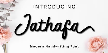 Jathafa is a cute and casual handwritten font with a very friendly feel. Whether you’re looking for fonts to make beautiful wedding invitations, beautiful artwork, interesting social media posts, and funny greeting cards. Jathafa also has several alternative letters that can make your project look modern, luxurious and classy. This font will turn any creative idea into a true work of art!
 - Amillina by AEN Creative Studio,
$12.00 Amillina is a delicate, elegant and flowing handwritten font. It has beautiful and well balanced characters and as a result, it matches a wide pool of designs. Add it to your most creative ideas and notice how it makes them come alive! This font is PUA encoded which means you can access all of the glyphs and swashes with ease!
 - Stepback by We Make Font,
$16.00 Our new font family is modern and exclusive, designed for the most varied uses. With sober and sporty lines, it offers a rounded finish with a lot of sophistication. It ranges from ExtraLight to Black, offering 8 weight options, with regular and italic variations. With 499 glyphs, it can be used in over 90 languages, with a crisp layout and strong contours.
 - Light Bearer by Letterara,
$12.00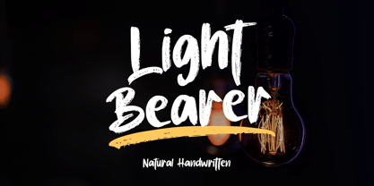 Light Bearer is a cool handwritten font. It's ideal for branding and decorate your projects. The Light Bearer font has a classy and modern look that can be used for logos, branding, posters, advertisements, stationery, movies, social media posts, youtube channels, and much more! This is a PUA code which means you can access all the glyphs and sweeps easily!
 - Awkward Gothic JNL by Jeff Levine,
$29.00Awkward Gothic JNL gets its name from the fact that it's a non-conformist alphabet - as if rendered by hand by a school child or an amateur lettering artist. Although there is a relative symmetry to most of the letter forms, some unconventional widths and the shape of many of its characters adds to the hand-made look of this alphabet. - Bazinga by Tipo Pèpel,
$22.00 Bazinga is a fun and uncomplicated typeface, thanks to the rectilinear counterforms that accompany it, it is ideal to use in our most cheerful works, where fun, humor or childish naivety, is the essence of what is to be transmitted. It also has a set of decorative initials to personalize our beloved words, and a set of dingbats to decorate our works.
 - Night Still Comes by Ana's Fonts,
$16.00 Night Still Comes is a serif font in 4 weights, including italics, and includes over 550 glyphs for each font, including: - A-Z | a-z | 0-9 | Punctuation marks | Accents - Small caps - Ligatures - Old style & lining numbers - Superscript & subscript numbers and letters - Fractions - Swashes With classic and elegant lines, Night Still Comes is perfect for branding, magazines, resumes, and social media posts.
 - Maryland Bawlmer by Cititype,
$17.00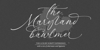 Maryland Bawlmer is a modern and luxurious calligraphy with a natural look. perfect for wedding invitations, calligraphy logos for branding, elegant websites, personalized gifts, social media posts, photography and more! Featuring 81 ligatures, 7 Alternate Set Styles (SS01-SS07) and Supports Western European, Central/Eastern European, Baltic, Turkish, Romanian Language Elegant, modern, luxurious, stylish and a natural touch blended in Maryland Bawlmer
 - Good Vibes by Mysterylab,
$17.00 Good Vibes is a three-variation font family with a groovy retro vibe. This lettering style conjures up the early 1970s and the whimsical post-psychedelic graphic era. Stack the three styles to build different combinations of shaded and outlined layers. Good Vibes, as it's name suggests, has a charming and lively funkiness that will add splash and pizzazz to your designs.
 - Watchmaker by Ingrimayne Type,
$5.95 Watchmaker was designed with the limitations imposed by a simple LCD that is meant only to display numbers. Most LCD typefaces use some diagonals to make the letters look better. This one does not and from it you can see why a few diagonals are needed to display letters on a LCD. Watchmaker is monospaced and comes in plain and bold weights.
 - Gustavo Eastwood by Balpirick,
$15.00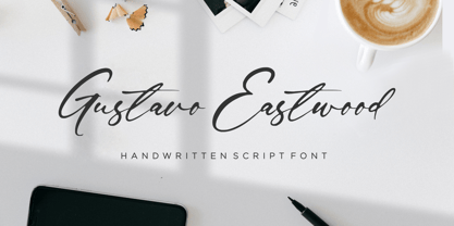 Gustavo Eastwood is a Handwritten Script Font. Gustavo Eastwood is a beautiful and refined script font. It has a classy, elegant and modern look that can be used for logos, branding, invitations, stationery, wedding designs, social media posts, and much more! Gustavo Eastwood also multilingual support. Enjoy the font, feel free to comment or feedback, send me PM or email. Thank you!
 - Rocksider by Balpirick,
$15.00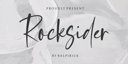 Rocksider is a Modern Handwritten Font. Rocksider is a stylish, cool and casual looking handwritten font. It has a classy, elegant and modern look that can be used for logos, branding, invitations, stationery, wedding designs, social media posts, and much more! Rocksider also multilingual support. Enjoy the font, feel free to comment or feedback, send me PM or email. Thank you!
 - Rewalt by NicolassFonts,
$25.00 Rewalt family is perfectly suited to headlines, logotypes, books, magazines, motion graphics, and use on the web and TV. Rewalt is an OpenType font family that converts any text – including the most complex layouts – into an expressive design. This font is a modern rounded sans serif typeface that can be used as a headline or as a body copy typeface.
 - Mohawcs Note by Galapagos,
$39.00Friendly. Open. Self-confident. Generous and inclusive. Intellect and libido guided by the measured tension and release patterns of a well-validated ego. So might a graphologist characterize the handwriting reflected in this useful script typeface. Designed for penning short notes and other informal correspondence, this attractive design could easily become one's most-used font, regardless of how large a library is available.