10,000 search results
(1.458 seconds)
- Furius by Typogama,
$29.00 Furius is a display typeface inspired by the split serif style of woodcut or chiseled letters found in roman inscriptions and later popularized by the western genre in the United States. Created as a display typeface, Furius combines a host of Opentype features and equally incoporates a full extended latin and cyrillic character set to provide a versatile and complete design solution for titles or display settings.
 - Bintaro by Rhd Studio,
$24.00 BINTARO is a clean and powerful serif font with a bold, rounded shape. It comes with two regular styles, and outline. BINTARO is a good choice for a variety of projects such as logos & branding, invitations, stationery, social media posts, clothing, advertising, product packaging, product design, labels, photography, watermarks, special events or whatever. WHAT IS INCLUDED: Multilingual support Alternatives A, B, E, F, P, R PUA Encoded
 - Palm Canyon Drive by RetroSupply Co.,
$19.00 Mid-century California was a magical place. Post-war optimism fueled the popularity of everything from Hollywood to roadside diners. Palm Canyon Drive is a monoline script inspired by retro matchbook covers, travel postcards, Tiki bars and Hollywood. With a classy yet unpretentious tone Palm Canyon Drive is as comfortable on a Tiki bar matchbook cover as it is on a Hollywood movie poster.
 - Mottelnight by ahweproject,
$10.00 Mottelnight feels playfully nostalgic and delivers an incredible vintage aesthetic. Use this serif font to add that special retro touch to any design idea you can think of! This font is perfect for logos, quotes, poster, headline, blog posts, instagram post – stories, magazine, branding projects, and much more. This font is PUA encoded which means you can access all of the glyphs and swashes with ease!
 - Architype Stedelijk by The Foundry,
$99.00 Architype Crouwel is a collection of typefaces created in collaboration with Wim Crouwel, following his agreement with The Foundry, to recreate his experimental alphabets as digital fonts. Crouwel's most recognized work was for the Van Abbe and Stedelijk museums (1954 –72) where he established his reputation for radical, grid-based design. Stedelijk first appeared in the seminal Vormgevers poster, commissioned by the Stedelijk Museum, Amsterdam in 1968. Crouwel created a rigid grid system across the poster of 57 vertical by 41 horizontal lines, also forming the basis for the construction of the letterforms. Although all hand drawn, the resulting typeface had a machine-made appearance. This striking black and white poster with its visible grid became one of Crouwel's most iconic designs. Architype Stedelijk now re-creates these letterforms as a single alphabet typeface in a digital font.
 - Zawlbuk by Richard Khuptong,
$20.00 Zawlbuk is a type inspired by Blackletter (sometimes black letter), also known as Gothic script, Gothic minuscule, or Textura. The Letters are drawn using a flat nib pen on a paper, scanned and drawn into a vector format.
 - Mixed Messages JNL by Jeff Levine,
$29.00Mixed Messages JNL brings back a favorite old theme... mixing up various letters and numbers from different fonts to create a printed message that resembles a ransom note or a collage of type with many styles of lettering. - Lokanova by limitype,
$11.00 Lokanova is a display font with a sans serif type designed in a bold and unique style to give the impression of a firm but still playful design. Lokanova is available with uppercase, lowercase, number, symbol and multilingual
 - Aerle by Hackberry Font Foundry,
$24.95 My first font for 2009 was Aerle. It is a new dark sans serif font in my continuing objective of designing book fonts that I can really use. It made a little ripple in the industry, but more than that I found that I loved it with Aramus and Artimas — my latest book font family with the same proportions. In many ways, Aerle is a very different direction for me built on what I have learned on Aramus and other recent developments in my style. The concept came to me while using Bitstream's Mister Earl on a site online—though there is no direct reference. I wanted a more playful heavy sans with a much smaller x-height than I have been using lately, plus taller ascenders. As I was using Aerle, I constantly needed a light and bold version. The new direction I am taking is a result of a decision that my fonts, though I loved the character shapes, produced an even type color that is too dark or a little dense. Aerle was an attempt to get away from that look even though the letterspacing is quite tight. For Aerle Thin I pushed a little further in that direction and increased the letterspacing. The hand-drawn shapes vary a lot, many pushing the boundaries of the normal character. This gives a little looseness and helps the lightness in feel I am looking for. It will be interesting to see where this all goes. Most new type around the world is far too perfect for my taste. While the shapes are exquisite, the feel is not human but digital mechanical. I find myself wanting to draw fonts that feel human — as if a person crafted them. In most ways this is a normal font for me in that it has caps, lowercase, small caps with the appropriate figures for each case. These small caps were very small (x-height as is proper). So Aerle's small caps are a little oversize because they plugged up too bad at x-height size. The bold is halfway between. These size variations seem important and work well in the text. This font has all the OpenType features in the set for 2009. There are several ligatures for your fun and enjoyment: bb gg sh sp st ch ck ff fi fl ffi ffl ffy fj ft tt ty Wh Th and more. Like all of my fonts, there are: caps, lowercase, & small caps; proportional lining figures, proportional oldstyle figures, & small cap figures; plus numerators, denominators, superiors, inferiors, and a complete set of ordinals 1st through infinity. Enjoy!
 - Business Helpers JNL by Jeff Levine,
$29.00 Duluth, Minnesota's Horace P. Brouillet Syndicate (later known as Syndicuts, Inc.) was one of a number of stock cuts providers to the letterpress trade in the decades preceding paper, then electronic clip art. Brouillet's "Typeps" catalogs offered a wide range of images covering numerous subjects, as well as cartoons, catch words and automotive logos. Many of these images have been reproduced in a number of royalty-free clip art publications over the years. Twenty-Six of these newly-redrawn catch words are found within Business Helpers JNL in two styles. On the capital keys are the original white-on-black designs, modeled from the vintage source material. The lower case keys have the phrases separated from the decorative ovals and are in black type.
 - Kallinsha by Sibelumpagi,
$18.00 Kallinsha is a classy signature typeface. Kallinsha has a natural & modern handwritten style for any purpose, it comes with ligatures and alternates for ending swashes. Kallinsha is perfect for many different projects such as logos & branding, invitation, stationery, wedding designs, social media posts, advertisements, product packaging, product designs, label, photography, watermark, special events or anything.
 - Perfect Island by Balpirick,
$15.00 Perfect Island is a Modern Handwritten Font. Perfect Island is a lovely script font featuring charming, playful characters that seem to dance along the baseline. Add this font to your most creative ideas, and notice how it makes them stand out! Perfect Island also multilingual support. Enjoy the font, feel free to email. Thank you!
 - Hyperwave by Set Sail Studios,
$14.00 Crank up the intensity with HYPERWAVE! An energetic set of brush fonts with a sharp attitude. With THREE sets of each letter, each equipped with distinctive fast brush strokes, HYPERWAVE is ready and raring to make a big statement on your logo designs, brand imagery, handwritten quotes, product packaging, merchandise, music projects & social media posts.
 - Gluy by Ndiscover,
$29.00 Gluy is geometric humanist hybrid. It blends the two categories into one design. Mixing geometric rational shapes with a touch of organic calligraphic forms. Comprises a total of 20 styles and supports most Latin languages and Cyrillic. Ideal for branding but very versatile. It can be used in many contexts from print to web.
 - Bucinta by Goodigital13,
$20.00 It easily cooperating together For Magazine, Movies, or Book Titles. For Photography, Wedding Invitation, Restaurant Menu or T-shirt Design. For Flyers, Banner Ads, web and printing. From Food and Fashion to a Cosmetics product beautiful typographic harmony for a diversity of design projects, including logos & branding, wedding designs, social media posts, advertisements & product designs.
 - Beauty Handwriting by Nirmana Visual,
$22.00 Beauty Handwriting is a Natural handwriting modern calligraphy font. full set of lowercase and uppercase letters, numerals and punctuation, multilingual symbols, lowercase beginning and ending swashes. 80 ligatures giving realistic hand-lettered style. Beauty Handwriting offers beautiful typographic harmony for a diversity of design projects, including logos & branding, social media posts, advertisements & product designs.
 - Jungle Land by Garisman Studio,
$20.00 Jungle Land combines attractive curves with a fresh urban edge; delivering a stylish display script which is guaranteed to add an eye-catching appeal to your logo designs, brand imagery, quotes, product packaging, merchandise & social media posts. Features: - Uppercase & Lowercase letters - Numbers & Punctuation - Ligature - Simple installation Work for PC and MAC - PUA Encoded Open
 - Amourette by Lunas Type,
$19.00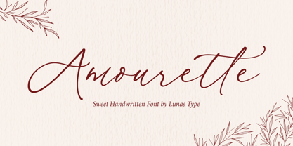 Amourette is a sweet and modern handwritten font. This sweet handwritten font invokes a feeling of nostalgia and warmth. Amourette comes with begining swashes, ending swashes and also love swashes connection. Amourette is perfect for many design needs such as merch, T-shirts, titles, wedding, book covers, social media posts, websites, events, and many more.
 - Neue Konstrukteur Round by HouseOfBurvo,
$15.00 Neue Konstrukteur Round is an engineered, mechanical typewriter font with a hint of heritage blackletter. Inspired by a trip to Germany this font has five weights from Thin to Black with accompanying italics. That makes 10 font files in total, enough for the most demanding projects. Also check out its sister font Neue Konstrukteur Square.
 - Basis by MADType,
$19.00 Basis is a bitmap font family which is happy being used at both small and large sizes. Designed as a 9 point bitmap face for the web, it offers different styles than most normal bitmaps. The stencil style can be used for display purposes, while the SmallCaps lowercase is great for website navigation menus.
 - Hudsson Romano by Letterafandi Studio,
$16.00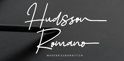 Hudsson Romano is a simple and quirky looking Signature handwritten font. It has a classy, elegant, and modern look that you can use for logos, branding, invitations, stationery, wedding designs, social media posts, and much more! This font is PUA encoded, which means you can access all of the glyphs and swashes with ease!
 - Hasibuan by Letterhanna Studio,
$19.00 Hasibuan is a font with Signature style, but with the vibe of real hand lettering, with a lot of swashes, ligatures and stylistic alternate, Hasibuan Font is perfect for many different project such as logos & branding, invitation, wedding designs, social media posts, advertisements, product packaging, product designs, label, photography, watermark, special events or anything.
 - Neue Konstrukteur Square by HouseOfBurvo,
$15.00 Neue Konstrukteur Square is an engineered, mechanical typewriter font with a hint of heritage blackletter. Inspired by a trip to Germany this font has five weights from Thin to Black with accompanying italics. That makes 10 font files in total, enough for the most demanding projects. Also check out its sister font Neue Konstrukteur Round.
 - Horizone Survive by Multype Studio,
$23.00 Horizone Survive is a brush style font. With a very detailed brush style that looks more authentic. This font makes your designs look natural. This font would perfect for logos, branding, product designs, product packaging, photography, watermark, social media posts, advertisements, invitation, stationery, labels, logos, magazines, books, greeting / wedding cards, fashion, make up, and etc.
 - Berlindah Monoline by Juncreative,
$15.00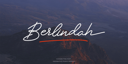 Berlindah Monoline is a new modern and fresh script with a handwritten style that makes this font looks elegant, natural, stylish and ideal for any awesome project that needs handwriting feel. Berlindah is perfect for branding projects, logos, wedding designs, social media posts, advertisements, product packaging, product designs, labels, photography, watermarks, invitations, stationery and more.
 - Emphasize by SSI.Scraps,
$28.00 Emphasize is a unique textured brush font. it is an incredibly versatile handwritten brush font. With its neat and beautiful arrangement of letters, this typeface will look outstanding in both formal and non-formal designs. It deliveries a strong feel and it’s the perfect choice for logos, branding, social media posts, magazines and much more!
 - Kids Toys by Hatftype,
$15.00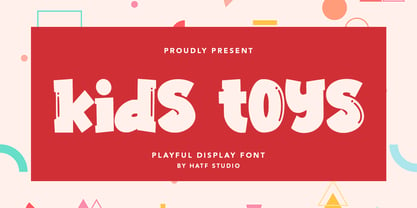 Is a simple display font with distinctive handwritten characters perfect for branding projects, logos, wedding designs, media posts, advertisements, product packaging, product designs, labels, photography, watermarks, invitations, stationery, and any project who need handwritten dishes. Features : • Character Set A-Z • Numerals & Punctuations (OpenType Standard) • Accents (Multilingual characters) • Ligature I really hope you enjoy it.
 - Grape Feud by PizzaDude.dk,
$17.00 The name Grape Feud is obviously a wordplay, and is derived of the, sometimes, mistaken of the orange and the (often) purple fruits. But Grape Feud is also a playful and charming no-nonsense comic style font. The x-height is quite unpredictable, and I've added ligature for the most common double letter combinations.
 - Kaos by Wiescher Design,
$39.50 On a huge garbage bin in Lisbon I saw the sentence, “Perdidos no kaos”, which means lost in chaos and I really liked the rough stenciled lettering. Back home I designed a typeface that wasn't quite as chaotic as the lettering on the garbage container. Yours – always on the lookout for great typefaces – Gert Wiescher
 - The White Moon by Just Lett,
$15.00 The White Moon feels equally charming and elegant. This stunning script font is a stylish homage to classic calligraphy. It features a varying baseline, smooth lines, and gorgeous glyphs. Get inspired by its authentic feel and use it to create gorgeous wedding invitations, beautiful stationary art, eye-catching social media posts, and cute greeting cards.
 - Bright Cherry by Sibelumpagi,
$16.00 Bright Cherry is a handwritten calligraphy typeface with a natural style of brush lettering. It comes with the alternates glyph and multilingual support. Bright Cherry is perfect for many different projects such as logos & branding, invitation, stationery, wedding designs, social media posts, advertisements, product packaging, product designs, label, photography, watermark, special events or anything.
 - Bingkisan by Letterhanna Studio,
$19.00 Bingkisan is a font with Signature style, but with the vibe of real hand lettering, with a lot of swashes, ligatures and stylistic alternate, Bingkisan Font is perfect for many different project such as logos & branding, invitation, wedding designs, social media posts, advertisements, product packaging, product designs, label, photography, watermark, special events or anything.
 - Sweet Sans by Sweet,
$59.00 The engraver’s sans serif—strikingly similar to drafting alphabets of the early 1900s—has been one of the most widely used stationer’s lettering styles since about 1900. Its open, simple forms offer legibility at very small sizes. While there are digital fonts based on this style (such as Burin Sans™ and Sackers Gothic™, among others), few offer the range of styles and weights possible, with the versatility designers perhaps expect from digital type families. Sweet Sans fills that void. The family is based on antique engraver’s lettering templates called “masterplates.” Professional stationers use a pantograph to manually transfer letters from these masterplates to a piece of copper or steel that is then etched to serve as a plate or die. This demanding technique is rare today given that most engravers now use a photographic process to make plates, where just about any font will do. But the lettering styles engravers popularized during the first half of the twentieth century—especially the engraver’s sans—are still quite familiar and appealing. Referencing various masterplates—which typically offer the alphabet, figures, an ampersand, and little else—Mark van Bronkhorst has drawn a comprehensive toolkit of nine weights, each offering upper- and lowercase forms, small caps, true italics, arbitrary fractions, and various figure sets designed to harmonize with text, small caps, and all-caps. The fonts are available as basic, Standard character sets, and as Pro character sets offering a variety of typographic features and full support for Western and Central European languages. Though rich in history, Sweet Sans is made for contemporary use. It is a handsome and functional tribute to the spirit of unsung craftsmanship. Burin Sans and Sackers Gothic are trademarks of Monotype Imaging.
 - Sweet Sans Pro by Sweet,
$79.00 The engraver’s sans serif—strikingly similar to drafting alphabets of the early 1900s—has been one of the most widely used stationer’s lettering styles since about 1900. Its open, simple forms offer legibility at very small sizes. While there are digital fonts based on this style (such as Burin Sans™ and Sackers Gothic™, among others), few offer the range of styles and weights possible, with the versatility designers perhaps expect from digital type families. Sweet Sans fills that void. The family is based on antique engraver’s lettering templates called “masterplates.” Professional stationers use a pantograph to manually transfer letters from these masterplates to a piece of copper or steel that is then etched to serve as a plate or die. This demanding technique is rare today given that most engravers now use a photographic process to make plates, where just about any font will do. But the lettering styles engravers popularized during the first half of the twentieth century—especially the engraver’s sans—are still quite familiar and appealing. Referencing various masterplates—which typically offer the alphabet, figures, an ampersand, and little else—Mark van Bronkhorst has drawn a comprehensive toolkit of nine weights, each offering upper- and lowercase forms, small caps, true italics, arbitrary fractions, and various figure sets designed to harmonize with text, small caps, and all-caps. The fonts are available as basic, Standard character sets, and as Pro character sets offering a variety of typographic features and full support for Western and Central European languages. Though rich in history, Sweet Sans is made for contemporary use. It is a handsome and functional tribute to the spirit of unsung craftsmanship. Burin Sans and Sackers Gothic are trademarks of Monotype Imaging.
 - Gambler by Fenotype,
$25.00 Gambler is a characteristic display type collection of 7 font styles with both clean and textured -making it total 14 fonts designed to play together. Gambler strikes with witty and elegant appeal combining vintage and modern elements. Gambler is an effective set for creating identities for branding, posters, book covers, headlines, logotypes, prints on garments, restaurant menus, beer labels and so on, both offline and online. Gambler Script is a smooth contrasted script that comes in two weights and it is packed with plenty of OpenType features: Standard Ligatures and Contextual Alternates are automatically on and they help to keep the flow and connections smooth. From Stylistic Alternates you’ll find characters with pointed endings and some other small variations. For extra flair try Swash or Titling Alternates. Gambler Script is PUA encoded so you can access the extra characters in most graphic design softwares. Gambler Brush is a soft brush script with low contrast and large x-height. Gambler Brush comes with following OpenType features: Standard Ligatures and Contextual Alternates that are automatically on and that keep the connections smooth. For less uneven word picture try Stylistic or Swash Alternates. Gambler Brush is PUA encoded so you can access the extra characters in most graphic design softwares. Gambler Flare is a flared serif with sharp edges and wide characters Gambler Flare comes in two weights. Gambler Gothic is a rigid condensed sans serif that comes in two styles: Regular and Shadow. Gambler Gothic Shadow has a narrow lining giving a three dimensional expression to the font. Gambler fonts are designed to play together, in pairs, or all together but they also work great as themselves or combined with other Fenotype Fonts.
 - Ultraproxi by Typodermic,
$11.95 Looking for a typeface that conveys a technical and austere vibe without sacrificing design flexibility? Look no further than Ultraproxi, the cutting-edge typeface that draws inspiration from the high-speed computer printers of the mid-20th century. Designed with the precision and clarity required for high-speed printing, Ultraproxi captures the essence of the IBM 1403 chain printer, with its metal type slugs linked in a chain that whirled rapidly over an ink ribbon. The result is a typeface that conveys both speed and accuracy, perfect for modern design applications. But Ultraproxi is more than just a nostalgic homage to a bygone era of computing. Its semi-monospaced design is uniquely suited to the needs of modern graphic designers, allowing for a technical demeanor without the drawbacks of traditional monospaced typefaces. With six weights and italics, Ultraproxi offers unparalleled versatility and flexibility. Whether you’re designing a sleek and streamlined UI or a complex data visualization, Ultraproxi is the typeface of choice for designers who demand both style and substance. So why settle for a boring, generic typeface when you can have Ultraproxi? With its unique blend of technical precision and design flexibility, this typeface is sure to impress even the most discerning design enthusiasts. Most Latin-based European, Vietnamese, Greek, and most Cyrillic-based writing systems are supported, including the following languages. Afaan Oromo, Afar, Afrikaans, Albanian, Alsatian, Aromanian, Aymara, Azerbaijani, Bashkir, Bashkir (Latin), Basque, Belarusian, Belarusian (Latin), Bemba, Bikol, Bosnian, Breton, Bulgarian, Buryat, Cape Verdean, Creole, Catalan, Cebuano, Chamorro, Chavacano, Chichewa, Crimean Tatar (Latin), Croatian, Czech, Danish, Dawan, Dholuo, Dungan, Dutch, English, Estonian, Faroese, Fijian, Filipino, Finnish, French, Frisian, Friulian, Gagauz (Latin), Galician, Ganda, Genoese, German, Gikuyu, Greenlandic, Guadeloupean Creole, Haitian Creole, Hawaiian, Hiligaynon, Hungarian, Icelandic, Igbo, Ilocano, Indonesian, Irish, Italian, Jamaican, Kaingang, Khalkha, Kalmyk, Kanuri, Kaqchikel, Karakalpak (Latin), Kashubian, Kazakh, Kikongo, Kinyarwanda, Kirundi, Komi-Permyak, Kurdish, Kurdish (Latin), Kyrgyz, Latvian, Lithuanian, Lombard, Low Saxon, Luxembourgish, Maasai, Macedonian, Makhuwa, Malay, Maltese, Māori, Moldovan, Montenegrin, Nahuatl, Ndebele, Neapolitan, Norwegian, Novial, Occitan, Ossetian, Ossetian (Latin), Papiamento, Piedmontese, Polish, Portuguese, Quechua, Rarotongan, Romanian, Romansh, Russian, Rusyn, Sami, Sango, Saramaccan, Sardinian, Scottish Gaelic, Serbian, Serbian (Latin), Shona, Sicilian, Silesian, Slovak, Slovenian, Somali, Sorbian, Sotho, Spanish, Swahili, Swazi, Swedish, Tagalog, Tahitian, Tajik, Tatar, Tetum, Tongan, Tshiluba, Tsonga, Tswana, Tumbuka, Turkish, Turkmen (Latin), Tuvaluan, Ukrainian, Uzbek, Uzbek (Latin), Venda, Venetian, Vepsian, Vietnamese, Võro, Walloon, Waray-Waray, Wayuu, Welsh, Wolof, Xavante, Xhosa, Yapese, Zapotec, Zarma, Zazaki, Zulu and Zuni.
 - Telegraph by ParaType,
$25.00 Telegraph font family was developed on the base of scanned images of telegraph printing machines. It consists of 4 styles: Natural is the most close to original scans with all defects of positioning and dirty print on the rough telegraph paper tape; Clean style uses cleaned contours, but keeps disorder in positioning; Straight is straightened along base line; Clean Straight style has self-explaining name. The fonts can be used for imitation of wire texts and in advertising and display typography. Upgraded version with extended character set was released in 2011 by ParaType. Designer Gennady Fridman.
 - OBO Classic by Juri Zaech,
$19.00 OBO Classic is the second installment of the OBO series, a type collection based on a square. Every character is mapped on a 1x1 ratio which allows for horizontal and vertical settings alike. Or mixed, like crosswords. OBO Classic is a display interpretation of a traditional Old-style Serif. The “distortion” which maps each character to a square creates unusual proportions to what we are used to from classic serif typefaces. The result is a monospaced font. While each individual letter feels conventional on its own, when brought together in words the result feels contemporary. Thanks to the square base vertical and horizontal – and mixed – settings are possible and easy to apply. There are a few exceptions for certain punctuation and special characters that are half the width for better spacing; and the word space’s width can easily be adjusted through OpenType stylistic sets. Talking about spacing, for strictly horizontal typesetting there is the option to turn on kerning for a number of characters to create a cleaner texture across words and phrases. OBO Classic is best set in large sizes and is most comfortable in editorial and display settings. A series of icons complete the character set. A selection comes as pixel graphics which adds further contrast to the traditional legacy of the typeface.
 - Mirfak by Herofonts,
$25.00 Mirfak™ is a new take on a work from Adrian Frutiger made in 1964. In the first place, it was a specific alphabet made for only one book. Only lowercases, capitals, numbers and a few mathematical signs where created. Covering only English language, used only once and unknown by most, we considered this Slab Serif as an hidden gem that needed a modernization. Mirfak™ is a result of a project whose goal was to take a beautifully designed Slab Serif and update it so that its technical standards surpass the status quo, leaving us with a truly superior slab serif family. Entirely coded from scratch with Metafont™, this family is not only an update but an expansion of the original concept, covering now most used languages on earth. Modernized and unique, Mirfak’s 3 weights, light to bold, can give a full range of expression for interfaces and corporate design; in print, on screen and in multiple languages.
 - Emporia JNL by Jeff Levine,
$29.00 Emporia JNL is a wonderfully decorative and vintage wood type named for a city in Kansas, and modeled from just a dozen images of individual type blocks spotted for auction online. The release of this typeface is also a milestone for Jeff Levine Fonts. The foundry started in January, 2006 with only ten releases, and has now grown to be an impressive library of unique lettering designs from the past. The collection also contains numerous original and novelty creations. Emporia JNL is proudly released as the 500th font design to join this extensive library.