10,000 search results
(0.031 seconds)
- Ollie by Eclectotype,
$40.00 Meet Ollie, a casual signage script whose friendly, bouncy exterior belies a heart of sophisticated OpenType programming. This font is designed to make the most of OpenType savvy applications, and as such is recommended for professional design use. Or to put it another way: Make sure that contextual alternates and ligatures are always turned on! Ollie includes about 900 glyphs, many of which are automagical substitutions to keep the text flowing smoothly, and to pseudo-randomly pick different glyphs to avoid repetition. With contextual alternates turned on (as they should be by default), most lowercase letters will alternate between at least two different forms. The powerful OpenType programming makes the font itself ‘look back’ (up to eight characters) on previously used letters; typing “banana” will give you three different a’s and two different n’s (the last a is a special ‘end form’ character). The calt feature controls many other ‘special effects’ which all add together to give a smooth-flowing, hand-lettered look. These effects include start and end forms (and indeed, ‘loner’ forms) of many letters, which are automatically substituted in at beginnings or ends of words, or when the previous or next letter doesn't connect. Another special feature tests to see if there is room for the crossbar of t (or tt ligature) to extend further over the previous or next letter, or both, as is often the case. The last main effect of the calt feature is to substitute certain letters typed before any ‘e’ character, to make for a more natural connection (see the pe combination in ‘Eclectotype’ in the first poster). Ligatures should be on by default, for a much nicer looking tt combination, and a few others besides. The swash feature should be used sparingly (one glyph at a time, really) to apply a more extravagant look to g,j and y in the lower case, and quite a few of the upper case too. Oldstyle figures are included, as well as the lining defaults. Now to delve into the stylistic alternates... These are all included in the salt feature, or for uses of applications that support them, separated into stylistic sets thus: ss01 - (with swash feature on) L and G swashes get even swashier. ss02 - standard s changes to a connected script s form. ss03 - r takes on a script form. ss04 - z also gets a scriptier look. [the previous three sets also change any versions of s, r or z with diacritics] ss05 - a useful underline function. When enabled, typing two or more underscores will extend a cool underline under the previous letters. More underscores = longer underline. ss06 - the Polish script lslash changes to its more standard form. ss07 - E, S and B change to a more top-heavy alternate form. ss08 - An alternate form for A characters. ss09 - Alterative rounder forms of M and N. ss10 - An alternate ampersand. That about wraps up the features. Now all that’s left is for you to license the font and get experimenting!
 - Auberge Script by Sudtipos,
$79.00 It took me a long time, but I think I now understand why people of my generation and older feel the need to frame current events in an historical context or precedents, while most of the young couldn't care less about what happened ten years ago, let alone centuries back. After living for a few decades, you get to a point when time seems to be moving quite fast, and it’s humbling to see that your entire existence so far can be summed up in a paragraph or two which may or may not be useful to whoever ends up reading the stuff anyhow. I suppose one way to cope with the serenity of aging is trying to convince yourself that your life and work are really an extension of millenia of a species striving to accept, adapt to, and improve the human condition through advancing the many facets of civilization -- basically making things more understandable and comfortable for ourselves and each other while we go about doing whatever it is we are trying to do. And when you do finally convince yourself of that, history becomes a source of much solace and even a little premonition, so you end up spending more time there. Going far back into the history of what I do, one can easily see that for the most part it was ruled by the quill. Western civilization’s writing was done with quill pens for more than thirteen centuries and with newer instruments for about two. By the mid-18th century, the height of the quill experience, various calligraphy techniques could be discerned and writing styles were arranged in distinct categories. There are many old books that showcase the history of it all. I recommend looking at some whenever the urge comes calling and you have to get away from backlit worlds. Multiple sources usually help me get a better perspective on the range of a specific script genre, so many books served as reference to this quill font of mine. Late 17th century French and Spanish professional calligraphy guides were great aides in understanding the ornamental scope of what the scribes were doing back then. The French books, with their showings of the Ronde, Bâtarde and Coulée alphabets, were the ones I referenced the most. So I decided to name the font Auberge, a French word for hotel or inn, because I really felt like a guest in different French locales (and times) when I going through all that stuff. Because it is multi-sourced, Auberge does not strictly fit in a distinct quill pen category. Instead, it shows strong hints of both Bâtarde and Coulée alphabets. And like most of my fonts, it is an exercise in going overboard with alternates, swashes, and ornamental devices. Having worked with it for a while, I find it most suitable for display calligraphic setting in general, but it works especially well for things like wine labels and event invitations. It also shines in the original quill pen application purpose, which of course was stationery. Also, as it just occurred to me, if you find yourself in a situation where you have to describe your entire life in 50 words or less, you may as well make it look good and swashy, so Auberge would probably be a good fit there as well. This is one quill script that no large bird had to die for. A few technical notes The Auberge Script Pro version includes 1800 glyphs, everything is included there. Also latin language support. We recommend you to use the latest design application to have full access to alternates, swashes, small caps, ornaments, etc. The images from the gallery uses this version. For better results use the fonts with “liga” feature on. Awards During 2014 the early develop of Auberge Script was chosen to be part of Tipos Latinos, the most important type exhibition in South America.
 - Sakura by MKGD,
$13.00 Early in my career as a graphic designer I purchased a book on Japanese packaging. With it, I came to notice that Japanese characters used mostly a modicum of strokes. This font was my attempt at trying to balance the familiarity of a Latin alphabet with the unfamiliarity of Kanji and Kana. It was more of a typographical challenge than usual; since going too much in either direction would defeat the purpose. I would like to think that, for the most part, I got the balance right. Sakura has a glyph count of 389 and supports the following languages Afrikaans, Albanian, Asu, Basque, Bemba, Bena, Bosnian, Catalan, Chiga, Colognian, Cornish, Croatian, Czech, Danish, Embu, English, Esperanto, Estonian, Faroese, Filipino, Finnish, French, Friulian, Galician, German, Gusii, Hungarian, Icelandic, Indonesian, Irish, Italian, Kabuverdianu, Kalaallisut, Kalenjin, Kamba, Kikuyu, Kinyarwanda, Latvian, Lithuanian, Low German, Lower Sorbian, Luo, Luxembourgish, Luyia, Machame, Makhuwa-Meetto, Makonde, Malagasy, Malay, Maltese, Manx, Meru, Morisyen, North Ndebele, Norwegian Bokmål, Norwegian Nynorsk, Nyankole, Oromo, Polish, Portuguese, Romanian, Romansh, Rombo, Rundi, Rwa, Samburu, Sango, Sangu, Scottish Gaelic, Sena, Shambala, Shona, Slovak, Slovenian, Soga, Somali, Spanish, Swahili, Swedish, Swiss German, Taita, Teso, Turkmen, Upper Sorbian, Vunjo, Walser, Zulu
 - Mencken Std by Typofonderie,
$59.00 An American Scotch remixed in 27 fonts Mencken has twenty seven styles, divided into three widths, three optical sizes, romans and italics. Generally, optical size typeface families belong to a same common construction. It falls into the same category of type classification, while presenting different x-heights or contrasts. Mencken is unique because it is designed according to different axis and optical sizes. Firstly, Mencken Text is a low-contrast transitional typeface, designed on an oblique axis, asserting horizontal with featuring open counters. Its capitals follow Didots to better harmonize the rest of the family. On the other side of the spectrum, Mencken Head (and narrow variations) is designed on a vertical axis, high contrast, in a contemporary Didot style. The Mencken is therefore a typeface answering to different sorts of uses, whose design is different according to its uses: from oblique axis in small size to vertical axis in large sizes. Vertical proportions (x-height, capitals height, etc.) were calibrated to be compatible with many Typofonderie typeface families. Lucie Lacava and I followed the idea launched by Matthew Carter few years ago for some of his typefaces intended for publications. From Baltimore Sun’s project to Typofonderie’s Mencken It is a bespoke typeface for American newspaper The Baltimore Sun started at the end of 2004 which marks the beginning of this project. The story started with a simple email exchange with Lucie Lacava then in charge of redesigning the American East Coast newspaper. As usual, she was looking for new typeface options in order to distinguish the redesign that she had started. At the time of its implementation, a survey of the newspaper’s readers has revealed that its previous typeface, drawn in the mid-1990s, was unsatisfactory. The Mencken was well received, some reader responses was particularly enjoyable: “It’s easier to read with the new type even though the type is designed by a French.” Why it is called Mencken? The name Mencken is a tribute to H. L. Mencken’s journalistic contributions to The Sun. According to the London Daily Mail, Mencken ventured beyond the typewriter into the world of typography. Because he felt Americans did not recognize irony when they read it, he proposed the creation of a special typeface to be called Ironics, with the text slanting in the opposite direction from italic types, to indicate the author’s humour. Affirming his irreverence, the Mencken typeface does not offer these typographic gadgets. Henry Louis Mencken (1880 — 1956) was an American journalist, satirist, cultural critic and scholar of American English. Known as the “Sage of Baltimore”, he is regarded as one of the most influential American writers and prose stylists of the first half of the twentieth century. He commented widely on the social scene, literature, music, prominent politicians and contemporary movements. Creative Review Type Annual 2006 Tokyo TDC 2018
 - Ametrine by Tanincreate,
$16.00 Ametrine is a beautiful super-casual style font with an authentic handcrafted feel. It is great for signature logos, posters, social media, wedding invitations, blog posts, headlines and more. Ametrine includes 2 styles (Regular & Italic), 203 glyphs with numbers, punctuation, ligatures, multilingual support.
 - Cabaret by Solotype,
$19.95We've always liked Art Gothic (you've seen it on the titles and credits for TV's Murder She Wrote) but felt it was far too animated for most uses. Here is our super-simplified version, a calmer font that will fit many display uses. - Black Manta Brush by Creaditive Design,
$12.00 Black Manta is a strong charactered, brushed display font. It looks fierce and urban and it will most certainly make each of your designs stand out. Add it confidently to your favorite creations and let yourself be amazed by the outcome generated.
 - Cherry Lime by Fikryal,
$15.00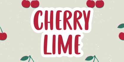 Cherry Lime is a fancy font perfect for crafting, branding, invitation, stationery, wedding designs, social media posts, advertisements, product packaging, product designs, label, photography, watermark, special events or anything. Cherry Lime with full set of uppercase letters, multilingual symbols, numerals and punctuation.
 - Jumpis by Fitrah Type,
$19.00 Jumpis is the newest typeface with a tagging graffiti style. The entire typography has been designed to work on large sizes. This font ideal for designing merchandise, social media, marketing posts, product packaging & branding projects. Jumpis supports uppercase, lowercase, numerals and punctuation.
 - Stuart Collins by Goodigital13,
$20.00 It looks stunning on wedding invitations, thank you cards, quotes, greeting cards, logos, business cards and every other design which needs a handwritten touch. add an eye-catching appeal to your logo designs, brand imagery, handwritten quotes, product packaging, merchandise & social media posts
 - Atakana Script by Afkari Studio,
$15.00 Atakana Scipt is a New Handwriting Font script that make with love. This font is suitable for any branding of your design needs, wedding invitation, romantic project, studio brand, logo, invitations, social media posts, clothing, invitation, poster, cafe/resto sign and others.
 - Marchey Signature by Typebae,
$12.00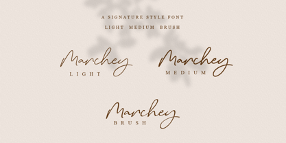 Marchey Signature is a versatile script font. Be mesmerized by its ravishing style and use it to create gorgeous wedding invitations, beautiful stationary art, eye-catching social media posts and more! What's Included? Uppercase & Lowercase Numbers & Punctuation Alternatives & Ligatures Multilingual Support PUA encoded
 - Docherty by Good Java Studio,
$20.00 Docherty - Casual Handwritten Font is a modern signature font. Perfect for logo, invitation, stationery, wedding designs, social media posts, advertisements, product packaging, product designs, label, photography, watermark, special events or anything. This font include more than 50+ Ligatures, and also Multilingual support.
 - Carnelian Antique by Tanincreate,
$16.00 Carnelian Antique, a contemporary, flowing style script. This elegant font it is perfect for branding, logos, invitation, headlines, texts and more. Carnelian Antique features: multi language support (for most of Western Europe), ligatures, alternates for low case letters (including multi language letters).
 - Olasthy Script by Prioritype,
$14.00 Introducing. Say hello to the new typeface. "Olasthy Script" is a monoline script font with hand strokes. Simple but very beautiful. Perfect for branding designs, creative posts, business cards, logos and more. Features: Uppercase Lowercase Numeral Punctuation Multilingual Ligatures PUA Encoded. Thanks!
 - Black Madness by Mirco Zett,
$12.00 Black Madness is a font inspired by blackletter typography, but instead of clean and accurate lines I gave it an more abstract and intuitive look. Like most of my fonts, Black Madness is made for logos, headlines and other typography related work.
 - Lemon Tea by Fikryal,
$18.00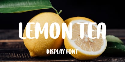 Lemon Tea is a fancy font perfect for crafting, branding, invitation, stationery, wedding designs, social media posts, advertisements, product packaging, product designs, label, photography, watermark, special events or anything. Lemon Tea with full set of uppercase letters, multilingual symbols, numerals and punctuation.
 - Lickos by Fitrah Type,
$12.00 Lickos is the newest typeface with a tagging graffiti style. The entire typography has been designed to work on large sizes. This font ideal for designing merchandise, social media, marketing posts, product packaging & branding projects. Lickos supports uppercase, lowercase, numerals and punctuation.
 - Bruzh by Garisman Studio,
$20.00 BRUZH combines attractive and natural hand-brushed letters with swinging curves and fresh urban edges; delivering a stylish brush which is guaranteed to add an eye-catching appeal to your logo designs, brand imagery, handwritten quotes, product packaging, merchandise & social media posts.
 - Yournotes by Garisman Studio,
$18.00 Yournotes typeface born from original and natural handwritten in the paper with boldpoint and pen; delivering a stylish typeface which is guaranteed to add naturality styles and taste appeal to your logo designs, brand imagery, quotes, product packaging, merchandise & social media posts.
 - Evening Sans by cm5dzyne,
$12.00Evening Sans is a slightly more formal, upright version of sibling font Morning Sans, most effectively used in small-to-medium sizes for print material. Its semi-condensed width and large x-height add to its legibility, particularly in long blocks of text. - Historina by MJB Letters,
$17.00 Say hi to Historina elegant classy handwritten font which have a unique shape of each character and has ligature options. this font is perfect for wedding design, logo design, signature, packaging, posters, social media posts, business card design, quotes, branding and others.
 - Dopamine by Luke Thompson,
$30.00 Dopamine is a friendly, flowing sans serif typeface. It works best for large headlines, particularly in packaging or editorial projects. Its most interesting feature is the flowing line across the top of many of the characters, creating smooth waves from one to another.
 - Dash Grid by Gleb Guralnyk,
$13.00 Hi there, introducing an abstract font named Dash Grid. At's a geometric display typeface made of square dashed blocks. Dash Grid font supports most of the european latin languages and includes ukrainian cyrillic alphabet (check out all available characters on the last screenshot).
 - Grasted Rosta by Ergibi Studio,
$20.00 Grasted Rosta is a modern and elegant handcrafted signature font perfect for branding, photography, invitations, quotes, watermarks, advertisements, product designs, social media posts, stationery, labels, and more! Grasted Rosta includes Multilingual Options to make your branding globally acceptable. Thank you by Ergibi Studio
 - Enjoyable by Invasi Studio,
$16.00 Enjoyable born from hand-lettered style combines fun and playful glyph with all-caps font; delivering a fancy hand draw that is guaranteed to add an eye-catching suitable for your quotes, logo designs, brand imagery, product packaging, merchandise & social media posts.
 - Gilded Majestic by Letterhend,
$17.00 Introducing, Gilded Majestic- a high contrast bold script with a touch of quirky looks. This type of font perfectly made to be applied especially in logo, headline, signage and the other various formal forms such as invitations, labels, logos, magazines, books, greeting / wedding cards, packaging, fashion, make up, stationery, novels, labels or any type of advertising purpose. Features : Uppercase & lowercase Numbers and punctuation Alternates & Ligatures Multilingual PUA encoded
 - Incus by VladB,
$20.00 Incus is a modern sans serif geometric font, includes upper and lower case characters, Latin, Cyrillic, Latin Eastern Europe, Turkish, Baltic and other. The Incus family consists of 6 fonts, divided into 2 subgroups (according to the type of style - St, Cut), and have the 3 types of thickness in each subgroup. Incus fonts will be useful in developing a brand, creating posters and other graphic products, and for word processing
 - Lazycat by VladB,
$28.00 Lazycat is a modern sans serif geometric font, includes upper and lower case characters, Latin, Cyrillic, Latin Eastern Europe, Turkish, Baltic and other. The Lazycat family consists of 8 fonts, divided into 2 subgroups (according to the type of style - St, Rg), and have the 4 types of thickness in each subgroup. Lazycat fonts will be useful in developing a brand, creating posters and other graphic products, and for word processing.
 - Collect Em All BB by Blambot,
$12.00 Blambot’s first font featuring Contextual Alternates: COLLECT EM ALL BB! As you type, you'll discover six versions of every letter, three versions of every number, three versions of the exclamation point and question mark, auto-correction of serif-I per standard American comic book tradition, and if you type from three to six of any letter, you'll get a bouncy baseline! All this, plus a hefty set of European characters.
 - Tecnica Slab Stencil by Graviton,
$20.00 Tecnica Slab Stencil font family is the stencil version of Tecnica Slab font family, it has been designed for Graviton Font Foundry by Pablo Balcells in 2014. Tecnica Slab Stencil consists of 8 styles. The 4 “Stencil 1” styles contain a narrow stem for big sizes type and/or rigid materials printing, and the 4 “Stencil 2” styles contain a wide stem for small sizes type and/or light materials printing.
 - Lokko by VladB,
$20.00 Lokko is a modern sans serif geometric font, includes upper and lower case characters, Latin, Cyrillic, Latin Extended symbols and other. The Lokko family consists of 8 fonts, divided into 2 subgroups (according to the type of style - St, Cut), and have the 4 types of thickness in each subgroup. Lokko fonts will be useful in developing a brand, creating posters and other graphic products, and for word processing.
 - Library Book Initials JNL by Jeff Levine,
$29.00 Library Book Initials JNL was modeled from examples of Sidney Gaunt's Publicity Initials; originally sold in metal type by Barnhart Brothers and Spindler as a companion to the Publicity Gothic typeface. The smoothed-down lines of the original characters allow for these initials to balace better when set against complementary type faces. A regular version is on the upper case keys, with an oblique version on the lower case keys.
 - Tecnica Stencil by Graviton,
$20.00 Tecnica Stencil font family is the stencil version of Tecnica font family, it has been designed for Graviton Font Foundry by Pablo Balcells in 2014. Tecnica Stencil consists of 8 styles. The 4 “Stencil 1” styles contain a narrow stem for big sizes type and/or rigid materials printing, and the 4 “Stencil 2” styles contain a wide stem for small sizes type and/or light materials printing.
 - Wood Rounded JNL by Jeff Levine,
$29.00 This reinterpretation of Caslon Rounded showcases one of the early attempts of type foundries to create a novelty ‘rounded’ typeface for general use. While the lettering might easily convey a more modern look of 1960s or 1970s pop typography, its roots definitely lay in the later part of the 19th Century and the heyday of wood type design. Wood Rounded JNL is available in both regular and oblique versions.
 - Barnum by Victory Type,
$9.00 Victory Type is proud to present the release of another classic American typeface. Originally a wood-type, Barnum evokes circus wagons and wanted posters from the wild west. Rugged, rustic, old-fashioned and full of character, Barnum is a charming blast from the past and great for headlines and signage. This chunky slab-serif alphabet was digitized and expanded to include full punctuation and European characters by Noah Rothschild.
 - Beer Joint JNL by Jeff Levine,
$29.00 A vintage photograph of the Man at the Wheel Saloon in San Pedro, CA [circa 1895] provided an excellent type design source with the unusual lettering on the bar’s sign. Basically a spurred serif design, the unusual characteristic of the type style is the ‘bumps’ or ‘dots’ on the tops of each letter. This has been redrawn digitally as Beer Joint JNL, and is available in both regular and oblique versions.
 - Pleasantwood JNL by Jeff Levine,
$29.00 Although wood types were at their peak of use during the letterpress era of the late 19th and early 20th centuries, there is a growing revival movement of "boutique" print shops who have embraced the look and texture of this form of printing. More modern in design that many of its counterparts, Pleasantwood JNL is still a nice addition to the wood type library re-drawn digitally by Jeff Levine Fonts.
 - Urbancat by VladB,
$20.00 Urbancat is a modern sans serif geometric font, includes upper and lower case characters, Latin, Cyrillic, Latin Eastern Europe, Turkish, Baltic and other. The Urbancat family consists of 8 fonts, divided into 4 subgroups (according to the type of style - St, Rg), and have the 4 types of thickness in each subgroup. Urbancat fonts will be useful in developing a brand, creating posters and other graphic products, and for word processing.
 - Fozzy by VladB,
$24.00 Fozzy is a modern sans serif geometric font, includes upper and lower case characters, Latin, Cyrillic, Latin Eastern Europe, Turkish, Baltic and other. Fozzy family consists of 9 fonts, divided into 3 subgroups (according to the type of style - St, Rg, Op), and have the 3 types of thickness in each subgroup. Fozzy fonts will be useful in developing a brand, creating posters and other graphic products, and for word processing.