10,000 search results
(0.027 seconds)
- EFCO Fairley by Ephemera Fonts,
$35.00 EFCO Fairley Font Collection includes 11 fonts that have different styles in sans, serif and script, which are all works great together or in their own. The script version also combined with ending swashes, use stylistic alternates from 0 to 9 to work with them. The Inspiration for this collection comes from today's graphic design trends. EFCO Fairley Font Collection was designed carefully to create dozens of font combinations and get really unique typographic for your project. It would be a perfect choice for posters, logos, t-shirt and magazine prints, eye-pleasing typographic designs and more.
 - Vageli by Valentino Vergan,
$14.00 Vageli is a unique font duo that combines a beautiful nostalgic uppercase and a wavy vintage lowercase, this combination gives the typeface a distinctive and trendy appearance. The typeface is very creative, this makes it perfect for creating projects that will really standout. Vageli comes with elegant ligatures, alternative characters and multi-language support. Vageli is perfect for making creative designs such as posters, brand packages, logos, social media designs and much more. If you are looking for something modern and unique for your next project, Vageli is the font for you. I hope you enjoy using the Vageli typeface.
 - Gluon by Harvester Type,
$10.00 Gluon is a font that is perfect for headlines, logos, posters, and much more. This font combines the minimalism, the futurism and aesthetics. We wanted you to feel the cosmos and its beauty when you look at the font. Three weights will help you choose the perfect combination with your design. Initially, the font was developed for the company's logo, but later the idea was slightly revised. The idea of the font is to convey the spirit of the future, but leave the beauty that we are used to seeing. The design was developed by Eugene Bunin and Beginskaya Christine.
 - Godger by Craft Supply Co,
$20.00 Godger Condensed Sans Serif: Boldness Redefined Step into the bold world of Godger, where strength and simplicity converge. This bold, masculine font is a powerhouse, built for strong, memorable branding. Its condensed form is not only space-efficient but also packs a punch, perfect for headlines that demand attention. Masculine and Commanding Godger’s bold, condensed letters exude a sense of command, making it a go-to for titles needing a masculine touch. Each letter is crafted for high impact, ensuring your words aren’t just read, but felt. This font doesn’t whisper; it shouts with a clear, authoritative voice.
 - Orlando Smith by Meutuwah,
$20.00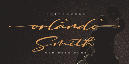 Hello Font Lovers... Orlando Smith is another lovely modern calligraphy typefaces, which is combining the style of classic calligraphy with an modern style. combines from copperplate to contemporary typeface with a dancing baseline, modern and elegant touch. including initial and terminal letters, alternates, and ligatures. Can be used for various purposes.such as headings, logos, wedding invitation, t-shirt, letterhead, signage, lable, news, posters, badges etc. To enable the OpenType Stylistic alternates, you need a program that supports OpenType features such as Adobe Photoshop, Adobe Illustrator, Adobe Indesign, Corel Draw, and More!!! Thank you for your purchase...
 - Agentic by Artisticandunique,
$55.00 Agentic Serif font family has 18 styles and multi-language support. It is ideal for creating your articles thanks to its easy readability. The combination of sharp corners and soft turns in the characters offers alternatives to create different moods in your projects. You can create creative and stylish designs with combinations of upper and lowercase letters in the title and text. This font helps you discover the best mood for your projects, from body text to big headlines, classic to modern and bold looks. Well suited for books and magazines, magazine covers, editorials, headlines, websites, logos, invitations, branding, advertisements and more.
 - Sanuroemi by Azetype,
$19.00 Presenting Sanuroemi Font! A Display San Serif with more alternates. This font is made with the perfect combination of each character. You can type by Mix & Match to get a unique combination. It looks original and can be used for all your project needs. Each glyph has its own uniqueness and when meeting with others will provide dynamic and pleasing proximity. This font can be used at any time and on any project. So, Sanuroemi Font can't wait to give its touch to all your design projects such as quotes, poster design, personal branding, promotional materials, logotype, product packaging, etc. Happy Creating! www.azetypestudios.com
 - Local Groceries by Invasi Studio,
$15.00 Inspired by the hand-painted paper signs typically seen in grocery stores during the 1920s to 1970s. This is now available in a digital format that still has the appearance and feel of hand-painted letters. Take a look at a few samples in the thumbnails to see what you can do with them. Local Groceries comes with a combination pairing font. It combines both regular and script fonts. Local Groceries is suitable for vintage and contemporary marketing, branding, merchandise, and packaging designs. Features: Uppercase & Lowercase Numerals & Punctuation Alternates and Ligatures Multilanguage Supports 60+ Latin based languages
 - Linotype Cutter by Linotype,
$29.99Linotype Cutter was designed by Georg John in 1997. As the name suggests, the font looks like it was cut out of black cardboard pieces. Each letter has a irregular rectangle black background and they combine to form heavy rows of letter elements. The strong contrasts of the font make it good for short headlines or initials in larger point sizes and combines well with almost any text font. Georg John made a second version of this theme called Linotype Schere (scissors) it is a companion typeface where the conturs of the letters are even rougher in its form. - Kaelorin by RagamKata,
$14.00 Say hello to new serif font, Kaelorin! Introducing Rosalind, a stunning modern retro serif font that effortlessly combines aesthetic charm with captivating alternate characters. This typeface falls into the category of modern retro serif fonts and is designed to bring a touch of nostalgia and elegance to your design projects. What sets Rosalind apart are its intriguing alternate characters. These alternates offer a wealth of creative possibilities, allowing you to experiment with various letter combinations and create unique and eye-catching typographic compositions. Each alternate has been thoughtfully designed to ensure visual coherence and seamless integration within the font.
 - LHF Broadway Panels 3 by Letterhead Fonts,
$53.0036 expertly-crafted and unique panels from Golden Era Studios. Typing each letter generates a different design. Special Note: Due to the large file size of these fonts, they will not convert for use in Gerber Omega. Instead, Omega users may wish to use an alternate program to type the characters and import them into Omega as .eps files. CorelDraw users should use the "Weld" command rather than "Convert to Curves" command to convert these fonts to vector outlines. Otherwise, the program may crash due to the sheer number of points in some of the panels. - Aronia by Struvictory.art,
$14.00 Aronia is a thin line uppercase font with floral motives. The typeface includes a Decorative and a Symbol version. To get an elegant and unique design, combine letters with elements. The font is easy to use in various design programs or without any program. Aronia is suitable for feminine business branding, eco-friendly and minimalistic art, social media design. The font works great for craft products branding and packaging (organic cosmetics and food, jewelry, handmade soap ect.) Also use individual letters and symbols to create logos and monograms. Aronia combines well with modern graphics: abstract shapes and line art.
 - Tibet Museum by Designpiraten,
$30.00 The Tibet Museum fonts are designed for harmonic layouts of multilingual texts, especially for the combination with asian fonts such as Tibetan or Devangari. Tibet Museum is a family of four fonts – Regular, Bold, Regular Italic and Bold Italic – that combines the shapes of Tibetan letters with a contemporary western font. The result is a unique set of characters that allows the design of multilingual applications and adds to an outstanding identity. It is perfect for branding projects as well as editorial and exhibition designs. The fonts contain a set of more than 400 glyphs to support 207 languages.
 - Monabelia by Arterfak Project,
$12.00 Greetings. Introducing our new font "Monabelia". The elegant playfully font which made with a combination of sans serif and brush script style. Almost all of the letters have sans serif taste at the top and script taste at the bottom of the shapes, also the tails/flourishing. You can feel the freestyle with combine the stylistic, contextual alternate and the ligatures but still elegant with the neat layout of the shapes. There are 100+ additional glyphs in this font that you can use it for your design, especially for your headline, display (recommended), subheadline and quotes!
 - Beauties by Meutuwah,
$20.00 Hello Font Lovers... Beauties Script is another lovely modern calligraphy typefaces, which is combining the style of classic calligraphy with an modern style. combines from copperplate to contemporary typeface with a dancing baseline, modern and elegant touch. including initial and terminal letters, alternates, and ligatures. Can be used for various purposes.such as headings, logos, wedding invitation, t-shirt, letterhead, signage, lable, news, posters, badges etc. To enable the OpenType Stylistic alternates, you need a program that supports OpenType features such as Adobe Photoshop, Adobe Illustrator, Adobe Indesign, Corel Draw, and More!!! Thank you for your purchase...
 - Zrnic by Typodermic,
$11.95 Looking for a typeface that perfectly captures the essence of industrial precision and futuristic design? Look no further than Zrnic. With its unique blend of boxy, plastic letterforms and strategically placed gaps, Zrnic delivers a stark, high-tech look that’s perfect for conveying your message with clarity and impact. Zrnic’s six weights and italics give you a range of options to choose from, allowing you to fine-tune the look and feel of your designs to perfectly match your needs. Whether you’re creating technical documentation, product manuals, or other materials that require a precise, professional look, Zrnic has got you covered. With Zrnic, you don’t have to worry about your message getting lost in the noise. Our unique design allows your text to stand out with crystal-clear precision, ensuring that your audience can quickly and easily understand your message. Zrnic’s gaps are strategically placed to reduce overall weight, giving you a clean, minimalistic look that’s perfect for modern designs. These gaps also provide increased impact, allowing your text to stand out and capture your audience’s attention. Zrnic is the ultimate tool for designers who want to convey the notion of technological precision with their designs. With its high-tech, industrial look and range of weights and italics, Zrnic is the perfect choice for technical documentation, product manuals, and other materials that demand a precise, professional look. Most Latin-based European writing systems are supported, including the following languages. Afaan Oromo, Afar, Afrikaans, Albanian, Alsatian, Aromanian, Aymara, Bashkir (Latin), Basque, Belarusian (Latin), Bemba, Bikol, Bosnian, Breton, Cape Verdean, Creole, Catalan, Cebuano, Chamorro, Chavacano, Chichewa, Crimean Tatar (Latin), Croatian, Czech, Danish, Dawan, Dholuo, Dutch, English, Estonian, Faroese, Fijian, Filipino, Finnish, French, Frisian, Friulian, Gagauz (Latin), Galician, Ganda, Genoese, German, Greenlandic, Guadeloupean Creole, Haitian Creole, Hawaiian, Hiligaynon, Hungarian, Icelandic, Ilocano, Indonesian, Irish, Italian, Jamaican, Kaqchikel, Karakalpak (Latin), Kashubian, Kikongo, Kinyarwanda, Kirundi, Kurdish (Latin), Latvian, Lithuanian, Lombard, Low Saxon, Luxembourgish, Maasai, Makhuwa, Malay, Maltese, Māori, Moldovan, Montenegrin, Ndebele, Neapolitan, Norwegian, Novial, Occitan, Ossetian (Latin), Papiamento, Piedmontese, Polish, Portuguese, Quechua, Rarotongan, Romanian, Romansh, Sami, Sango, Saramaccan, Sardinian, Scottish Gaelic, Serbian (Latin), Shona, Sicilian, Silesian, Slovak, Slovenian, Somali, Sorbian, Sotho, Spanish, Swahili, Swazi, Swedish, Tagalog, Tahitian, Tetum, Tongan, Tshiluba, Tsonga, Tswana, Tumbuka, Turkish, Turkmen (Latin), Tuvaluan, Uzbek (Latin), Venetian, Vepsian, Võro, Walloon, Waray-Waray, Wayuu, Welsh, Wolof, Xhosa, Yapese, Zapotec Zulu and Zuni.
 - Valley of Winter by Colllab Studio,
$15.00 Presenting Valley of Winter! A Calligraphy Font. This font made with the perfect combination of each character. You can combine with Extra to get a unique combination. It looks original and can be used for all your project needs. Each glyph has its own uniqueness and when meeting with others will provide dynamic and pleasing proximity. This font can be used at any time and in any project. You can see in the presentation picture above, Valley of Winter looks versatile on design projects. So, Valley of Winter can't wait to give its touch to all your design projects such as quotes, poster design, personal branding, promotional materials, website, logotype, product packaging, etc. Besides that, Valley of Winter also has some ligature that gives a surprise when you type certain characters combining. The ligatures are tt, ll, rr, ss, ee, and cc. WHAT'S INCLUDED? 1. Valley of Winter • It comes with uppercase, lowercase, ligatures, numeral, punctuation, symbols, and Standard Latin Multilingual Support (Afrikaans, Albanian, Catalan, Danish, Dutch, English, French, German, Icelandic, Indonesian, Italian, Malay, Norwegian, Portuguese, Spanisch, Swedish, Zulu, and More). Also included some alternates for ending glyphs; a, e, d, g, h, i, j, k, l, m, n, q, r, t, and u. 2. Extra Swash • You can feature all with typing c_1 until c_4 A Million Thanks Colllab Studio
 - Congratulatory by Dmitriy Shchetinskiy,
$19.00 Congratulatory consist of 36 Cyrillic calligraphic greetings for different events. Greetings are original and handwritten. This font makes it possible to use high quality calligraphy in your projects - greeting cards, certificates, invitation cards, letters of commendation etc.
 - Congratulatory Happy Birthday by Dmitriy Shchetinskiy,
$19.00 Congratulatory Happy Birthday font consist of 36 calligraphic greetings letterings. Letterings are original and handwritten. This font makes it possible to use high quality calligraphy in your projects - greeting cards, certificates, invitation cards, letters of commendation etc.
 - HU Blackout by Heummdesign,
$15.00 HU Blackout is a typeface for titles that feels like letters are trapped in a square and has a constant and very narrow inner space. It is composed of three types of family typeface to increase usability.
 - Cutterlakes Script by Fortunes Co,
$15.00 Proudly presents our latest product Cutterlakes & Camp Press fonts. these combine font with differente style between script & sans. insipired from nature, adventure and vintage typeface, its very great for logo, clothing brand, vintage looks, wedding, and more.
 - Lisa's Hand by Matthias Luh,
$15.00 Lisa's Hand is a well-formed handwritten Font. The letters are not connected which combines the style of both handwritten and computer fonts. Lisa's Hand is offered in Regular, Bold, Italic, Bold Italic, Condensed and Condensed Italic.
 - Choir by Linecreative,
$16.00 Choir is a modern sans serif font. Each letter consists of three combined lines that connect together like a maze. This font is suitable for logos, business cards, magazines header, Flyer Titles, or large-scale oven artworks.
 - Changing by PintassilgoPrints,
$24.90 Changing is a lively font, loaded with many automatic interlock pairs that do their magic in OpenType aware applications. Its peculiar design and such choices for letter combinations make this a very dynamic, spirited and useful typeface.
 - Coreopsis by Andrew Harper Fonts,
$19.00 Coreopsis is a family of fonts that combines mathematical precision with a hand-drawn feel. Versatile enough to be applied to an attention-grabbing headline, or to blocks of paragraph text. Coreopsis is available in three weights.
 - Coppola by Palmer Type Company,
$45.00 Coppola is a brand new typeface that combines a little bit of Didot, a pinch of Art Nouveau, and a dash of Italian mafia. A-Z, a-z Numbers Alternates Ligatures Multi-language support Symbols Special characters
 - Gleamore by GlyphStyle,
$17.00 Gleamore is a decorative display font, looks stylish. The bold shape combined with the unique curve shape makes this font easy to read and looks beautiful. - Font feature Uppercase, Lowercase, Numerals & Punctuations, Stylistic Alt, Swash Ligature, Multilanguage
 - Gans Rasgos Escritura by Intellecta Design,
$20.90 Gans Rasgos Escritura shapes (108 tails) was selected and freely interpreted from the vignettes catalog by Fundicion Gans published in 1920. You can combine these ornaments with your favorite fonts. We suggests the use of Pretoria Gross.
 - Zeogari by Phoenix Group,
$13.00 Zeogari is a classic style font that has a combination of serif and sans-serif forms, this font depicts a sense of love and loneliness, in addition, the Zeogari font has a bold shape with strong characters.
 - NTF Tout by Noble Type Foundry,
$10.00 A new experimental display typeface from Noble Type Foundry. Inspired by the hard 45 degree cuts of traditional blackletter type but simplified for a digital age, this unique evolution commands a strong geometric presence in any design.
 - Congratulatory Womens Day by Dmitriy Shchetinskiy,
$19.00 Congratulatory Womens Day font consist of 36 calligraphic greetings letterings. Letterings are original and handwritten. This font makes it possible to use high quality calligraphy in your projects - greeting cards, certificates, invitation cards, letters of commendation etc.
 - Katigert by Oleg Gert,
$20.00 Katigert – is a rather friendly italic with a touch of measured severity, combines very sharp angles and bold shapes. The font works best for display. The font includes extended Cyrillic and Latin alphabets, punctuation marks and currencies.
 - Danger Girl Hex by Comicraft,
$19.00 A dangerous charm. A death hex. A summoning. An Invocation. An enchantment. An incantation to raise the dead. A supernatural chant. Be careful what you spell out with this font, you might get what you wish for...
 - Public Safety JNL by Jeff Levine,
$29.00 Public Safety JNL was inspired by a 1940s-era health poster issued through the WPA (Works Progress Administration). The font’s bold, blockish sans lettering commands attention and has been made available in both regular and oblique versions.
 - Portfolio by Wilton Foundry,
$29.00 In spite of the fact that Portfolio's capitals are highly ornate, it is still very legible. Portfolio, in combination with its elegant lowercase, creates a prestigious presentation useful for Certificates, Wedding Invitations, Corporate Identities, Brochures, and Headlines.
 - 3 Prong Tree - Unknown license

- Sutro Shaded by Parkinson,
$25.00 My affection for Slab Serifs began in the early 1960s in Kansas City when Rob Roy Kelly was at the Kansas City Art Institute, teaching and writing his book on American Wood Type. I got to know him just well enough to gain access to his fabulous collection of wood type and wood type catalogs. Later, in the1970s, I tried to re-create a Nebiolo Egiziano for Roger Black at New West magazine. And again for Roger, in the 1980s, I designed a Slab Serif logo for Newsweek Magazine. Finally, in 2003, designed the Sutro Family. There were things I didn't like about it, so, over time, I’ve been adding some things and dressing it up a little. Sutro Shaded has existed for a few years as a one color, outlined, drop-shadowed display font. It seemed like it was just dying for a little color. I added five more fonts: Fill, Gradient, Hatching, Rules and HiLite. These fonts can be used in different combinations to achieve various effects. There is a downloadable SUTRO SHADED USER MANUAL PDF in the Gallery section for this family.
 - Sagittarius by Hoefler & Co.,
$51.99 A typeface with lightly-worn futurism, Sagittarius is equally at home among the beauty and wellness aisles, or the coils of the warp core. The Sagittarius typeface was designed by Jonathan Hoefler in 2021. A decorative adaptation of Hoefler’s Peristyle typeface (2017), Sagittarius’s rounded corners and streamlined shapes recall the digital aesthetic of the first alphabets designed for machine reading, a style that survives as a cheeky Space Age invocation of futurism. Sagittarius was created for The Historical Dictionary of Science Fiction, where it first appeared in 2021. From the desk of the designer: Typeface designers spend a lot of time chasing down strange valences. We try to figure out what’s producing that whiff of Art Deco, or that vaguely militaristic air, or what’s making a once solemn typeface suddenly feel tongue-in-cheek. If we can identify the source of these qualities, we can cultivate them, and change the direction of the design; more often, we just extinguish them without mercy. Sometimes, we get the chance to follow a third path, which is how we arrived at Sagittarius. During the development of Peristyle, our family of compact, high-contrast sans serifs, I often found myself unwittingly humming space-age pop songs. Nothing about Peristyle’s chic and elegant letterforms suggested the deadpan romp of “The Planet Plan” by United Future Organization, let alone “Music To Watch Space Girls By” from the ill-advised (but delicious) Leonard Nimoy Presents Mr. Spock’s Music from Outer Space, but there they were. Something in the fonts was provoking an afterimage of the otherworldly, as if the typeface was sliding in and out of a parallel universe of high-tech spycraft and low-tech brawls with rubber-masked aliens. It might have had something to do with a new eyeglass prescription. But I liked the effect, and started thinking about creating an alternate, space-age version of the typeface, one with a little more funk, and a lot more fun. I wondered if softer edges, a measured dose of seventies retrofuturism, and some proper draftsmanship might produce a typeface not only suitable for sci-fi potboilers, but for more serious projects, too: why not a line of skin care products, a fitness system, a high-end digital camera, or a music festival? I put a pin in the idea, wondering if there’d ever be a project that called for equal parts sobriety and fantasy. And almost immediately, exactly such a project appeared. The Historical Dictionary of Science Fiction Jesse Sheidlower is a lexicographer, a former Editor at Large for the Oxford English Dictionary, and a longtime friend. He’s someone who takes equal pleasure in the words ‘usufructuary’ and ‘megaboss,’ and therefore a welcome collaborator for the typeface designer whose love of the Flemish baroque is matched by a fondness for alphabets made of logs. Jesse was preparing to launch The Historical Dictionary of Science Fiction, a comprehensive online resource dedicated to the terminology of the genre, whose combination of scholarship and joy was a perfect fit for the typeface I imagined. For linguists, there’d be well-researched citations to explain how the hitherto uninvented ‘force field’ and ‘warp speed’ came to enter the lexicon. For science fiction fans, there’d be definitive (and sometimes surprising) histories of the argot of Stars both Trek and Wars. And for everyone, there’d be the pleasure of discovering science fiction’s less enduring contributions, from ‘saucerman’ to ‘braintape,’ each ripe for a comeback. A moderated, crowdsourced project, the dictionary is now online and growing every day. You’ll find it dressed in three font families from H&Co: Whitney ScreenSmart for its text, Decimal for its navigational icons, and Sagittarius for its headlines — with some of the font’s more fantastical alternate characters turned on. The New Typeface Sagittarius is a typeface whose rounded corners and streamlined forms give it a romantically scientific voice. In the interest of versatility, its letterforms make only oblique references to specific technologies, helping the typeface remain open to interpretation. But for projects that need the full-throated voice of science fiction, a few sets of digital accessories are included, which designers can introduce at their own discretion. There are alternate letters with futuristic pedigrees, from the barless A popularized by Danne & Blackburn’s 1975 ‘worm’ logo for NASA, to a disconnected K recalling the 1968 RCA logo by Lippincott & Margulies. A collection of digitally-inspired symbols are included for decorative use, from the evocative MICR symbols of electronic banking, to the obligatory barcodes that forever haunt human–machine interactions. More widely applicable are the font’s arrows and manicules, and the automatic substitutions that resolve thirty-four awkward combinations of letters with streamlined ligatures. About the Name Sagittarius is one of thirteen constellations of the zodiac, and home to some of astronomy’s most inspiring discoveries. In 1977, a powerful radio signal originating in the Sagittarius constellation was considered by many to be the most compelling recorded evidence of extraterrestrial life. Thanks to an astronomer’s enthusiastically penned comment, the 72-second transmission became known as the Wow! signal, and it galvanized support for one of science’s most affecting projects, the Search for Extraterrestrial Intelligence (SETI). More recently, Sagittarius has been identified as the location of a staggering celestial discovery: a supermassive black hole, some 44 million kilometers in diameter, in the Galactic Center of the Milky Way. <
 - Wilke Kursiv by Canada Type,
$24.95 Martin Wilke’s underrated yet influential deco classic from 1932 has both feet firmly planted in the high traditions of Western European calligraphy while carefully and subtly introducing some traits from the sweeping geometric/minimalist vision of the time. In a way, it was one of the representatives of the European anti-type typefaces of that era, when print media was searching for the elusive aesthetic balance between humanism and geometry. This typeface enjoyed some popularity in Germany for a few years, and went on to influence further type designs in Holland and Italy. After the second World War, the black hole that swallowed a big chunk of Europe’s print culture, new influences and technologies overtook the scene, and selective historical emphasis ensued, highlighting some of the era’s designs and overlooking others. Further selective picking in the digital era all but buried Wilke’s body of work - unfairly so, because he was just as important in German type history as Bernhard, Post, Schneidler, Tiemann and Trump. The original metal Wilke Kursiv came in one weight. This digital version goes a long way in expanding on that original offering. Now Wilke’s masterpiece comes in three weights, and with a full Pro treatment including swash caps, small capitals, five types of figures, automatic fractions, and plenty of other OpenType niceties. Each of the Wilke Kursiv Pro fonts comes with over 700 characters, and contains support for most Latin-based languages. Also available are three non-Pro fonts in each weight.
 - Allerlei Zierat by Intellecta Design,
$14.90 Ornaments family with four different sets plus a decorative capitals font from the rare, valuable and amazing Allerlei Zierat book from Schelter & Gieseck (1902). A research and free interpretation by Intellecta Design. This encyclopedic specimen book of the Leipzig, Germany type foundry and printing supply house J.G. Schelter & Giesecke features, as the title indicates, all kinds of decoration for supplying printing of every type. On the title page, the firm boasts winning grand prize in 1900 in Paris (presumably at the Exposition Universelle). It is hard to do justice in a short description to the variety of styles (traditional, Jugenstil, etc.) and categories (certificates, letterheads, borders, ornaments, exotic motifs, flowers, animals, silhouettes, menus, greeting cards, vignettes humorous and otherwise, images of bicyclists, occupational symbols, portraits, Classical figures, religious art, heraldry, ships, trains, athletes, etc., etc.) offered in this volume. Some of the examples are printed in color, most are in black-and-white. The Jugenstil cover of this copy shows minor wear and soiling. The plate of “Gust. Carlsson & Co., Stockholm” is attached to the front pastedown. A small fraction of pages show minor soiling, a pencil notation or a short closed tear. Two of the fold-outs at the back have a little more damage-one is missing a 1x2 inch piece along the margin, the other has a 3-inch closed tear and an edge which is crumpled. A rare specimen from the Intellecta rare books library.
