10,000 search results
(0.012 seconds)
- Times New Roman Seven by Monotype,
$67.99In 1931, The Times of London commissioned a new text type design from Stanley Morison and the Monotype Corporation, after Morison had written an article criticizing The Times for being badly printed and typographically behind the times. The new design was supervised by Stanley Morison and drawn by Victor Lardent, an artist from the advertising department of The Times. Morison used an older typeface, Plantin, as the basis for his design, but made revisions for legibility and economy of space (always important concerns for newspapers). As the old type used by the newspaper had been called Times Old Roman," Morison's revision became "Times New Roman." The Times of London debuted the new typeface in October 1932, and after one year the design was released for commercial sale. The Linotype version, called simply "Times," was optimized for line-casting technology, though the differences in the basic design are subtle. The typeface was very successful for the Times of London, which used a higher grade of newsprint than most newspapers. The better, whiter paper enhanced the new typeface's high degree of contrast and sharp serifs, and created a sparkling, modern look. In 1972, Walter Tracy designed Times Europa for The Times of London. This was a sturdier version, and it was needed to hold up to the newest demands of newspaper printing: faster presses and cheaper paper. In the United States, the Times font family has enjoyed popularity as a magazine and book type since the 1940s. Times continues to be very popular around the world because of its versatility and readability. And because it is a standard font on most computers and digital printers, it has become universally familiar as the office workhorse. Times?, Times? Europa, and Times New Roman? are sure bets for proposals, annual reports, office correspondence, magazines, and newspapers. Linotype offers many versions of this font: Times? is the universal version of Times, used formerly as the matrices for the Linotype hot metal line-casting machines. The basic four weights of roman, italic, bold and bold italic are standard fonts on most printers. There are also small caps, Old style Figures, phonetic characters, and Central European characters. Times? Ten is the version specially designed for smaller text (12 point and below); its characters are wider and the hairlines are a little stronger. Times Ten has many weights for Latin typography, as well as several weights for Central European, Cyrillic, and Greek typesetting. Times? Eighteen is the headline version, ideal for point sizes of 18 and larger. The characters are subtly condensed and the hairlines are finer." - ITC Seven Treasures Ornaments by ITC,
$29.99Akira Kobayashi's ITC Seven Treasures is a symbol font for use in patterns and textures. The interlocking patterns, usually circular or oval, are taken primarily from motifs used in Japanese textiles. Most of these designs are known as komon, or tiny patterns," and they are often applied to kimono and other textiles, although their use is not limited to fabrics. They also appear carved in wood in traditional architecture, and painted in pictures as background patterns. Each of the individual designs in ITC Seven Treasures Ornaments is carefully sized and spaced so that it will fit together into a continuous pattern. Most overlap slightly but precisely, so that when you type a row of them you can't tell where one leaves off and the next begins. They may be combined or alternated to vary the texture of a background pattern." - ICR Ever East Serif by Nocturnal Workspace,
$15.00 Ever East is a stylish font that is both classic and minimal. Ever East has a regular version plus multilingual support. Includes: Letters, numbers, punctuation, multilingual support. Regular versions
 - Hand of God - 100% free

- Gods of War - Unknown license

- Inked God Pro by CheapProFonts,
$10.00 This font has that grungy, gritty look, and combines it with some elegant swirls. Weird and wonderful. I have added swirls and decorations to ALL the uppercase letters that did not have them, so there are now wider possibilities to add interesting decorations to your composition. In addition to the expanded language support, of course. ALL fonts from CheapProFonts have very extensive language support: They contain some unusual diacritic letters (some of which are contained in the Latin Extended-B Unicode block) supporting: Cornish, Filipino (Tagalog), Guarani, Luxembourgian, Malagasy, Romanian, Ulithian and Welsh. They also contain all glyphs in the Latin Extended-A Unicode block (which among others cover the Central European and Baltic areas) supporting: Afrikaans, Belarusian (Lacinka), Bosnian, Catalan, Chichewa, Croatian, Czech, Dutch, Esperanto, Greenlandic, Hungarian, Kashubian, Kurdish (Kurmanji), Latvian, Lithuanian, Maltese, Maori, Polish, Saami (Inari), Saami (North), Serbian (latin), Slovak(ian), Slovene, Sorbian (Lower), Sorbian (Upper), Turkish and Turkmen. And they of course contain all the usual "western" glyphs supporting: Albanian, Basque, Breton, Chamorro, Danish, Estonian, Faroese, Finnish, French, Frisian, Galican, German, Icelandic, Indonesian, Irish (Gaelic), Italian, Northern Sotho, Norwegian, Occitan, Portuguese, Rhaeto-Romance, Sami (Lule), Sami (South), Scots (Gaelic), Spanish, Swedish, Tswana, Walloon and Yapese.
 - Cure- Wild Mood Swings - Unknown license

- Wood Type Grotesk JNL by Jeff Levine,
$29.00 Wood Type Grotesk JNL was re-drawn from a set of vintage wood type purchased from a closed rubber stamp shop. Although the style of lettering is referred to in old type catalogs as a "grotesk" face, in truth the lettering has charm and effectively gets the printed point across to the reader. This typeface is available in both regular and oblique versions.
 - Wood Condensed Grotesk JNL by Jeff Levine,
$29.00 Wood Condensed Grotesk JNL is a more condensed version of the type style found in Wood Type Grotesk JNL. The font was a popular sans used for large posters or broadsheets as well as newspaper titles where more copy needed to be fit into limited space.
 - Wood Fancy Reverse JNL by Jeff Levine,
$29.00 Amongst some pages scanned and posted online of old wood type alphabets comes this lovely, ornamental design in a reversed style of white lettering on black rectangular boxes. This classic set of wood type is now available digitally as Wood Fancy Reverse JNL. There is a narrow blank box on the “less than” key for use as an end cap, and a wider blank box on the “greater than” key to use between words as a blank space if so desired.
 - Wood Sans Narrow JNL by Jeff Levine,
$29.00 Wood Sans Narrow JNL is based on examples of an extra condensed Hamilton Wood Type. The design was cleaned up a bit to provide more uniform stroke widths, but still retains the nostalgic feel of a tall, narrow type face found on broadsides and posters of the late 1800s. It is available in both regular and oblique versions.
 - Wood Type Bodoni JNL by Jeff Levine,
$29.00 Wood Type Bodoni JNL is a variant of the popular ultra bold version of the classic Bodoni design, with variants in character widths and shapes. Based on a vintage set of wood type, the "hairline" strokes of the 4 and 8 have been made ever-so-slightly thicker in spots to add a modest amount of additional contrast.
 - Wood Serif Poster JNL by Jeff Levine,
$29.00 A type foundry example showcasing some letters from a narrow slab serif wood type design served as the inspiration for Wood Serif Poster JNL. This condensed typeface is available in both regular and oblique versions, and digitally recreates the kind of lettering found on flyers, broadsides and newspaper headlines of the mid-to-late 1800s.
 - Wood Poster Display JNL by Jeff Levine,
$29.00 Wood Poster Display JNL is a more casual sans wood type, with a bold and friendly appeal. This font offers a pleasant design which lends itself perfectly to titling, price cards, event notices and any print or web design that prefers a less formal structure to its typography.
 - PR Bramble Wood 1 by PR Fonts,
$15.00 This font is a collection of spiraling vines with thorns. This can be suitable for themes where beauty is combined with suffering. Adjacent letters will provide left and right versions of the same design, and shift will access the inverted version. Combines well with: PR Bramble Wood 2, PR Hallow Doodles 01, PR Hallow Doodles 02, PR Cauldron, PR Swirlies 01, PR Swirlies 05.
 - Roman Wood Type JNL by Jeff Levine,
$29.00 Roman Wood Type JNL is based on a partial set of wood type in the style of Clarendon Condensed that was seen in an online auction.
 - Eccentric Wood Type JNL by Jeff Levine,
$29.00 An online display of pages from a book on wood type fonts provided an example of a bold, eccentric slab serif design with unusual curves and letter shapes. This font’s eccentricities became the basis for its name, Eccentric Wood Type JNL – which is available in both regular and oblique versions.
 - Western Wood Type JNL by Jeff Levine,
$29.00 Inspired by a sample of a vintage wood type supplied by a fan of Jeff Levine fonts, Western Wood Type JNL is a traditional Clarendon-style condensed typeface from the era of letterpress and the Old West.
 - HKF Gold Queen DLC by Harry Kasyanov,
$5.00 Gold Queen is a vintage font family with features opentype with extension svg. Perfect for the vintage tattoo studio logos, barbershops, alcohol labels and many other. Includes a full set of character A-Z, numerals, and punctuation. Product content: HKF Gold Queen Regular - (OTF) HKF Gold Queen Drop line - (OTF) HKF Gold Queen Drop shadow (B&W) - (OTF) Color fonts (available only with Adobe illustrator CC 2018 and Photoshop CC from 2017) HKF Gold Queen Drop line (color) - (OTF SVG) HKF Gold Queen Drop shadow (color) - (OTF SVG)
 - M Gothic Gold HK by Monotype HK,
$523.99 M Gothic Gold HK is a modulated style Traditional Chinese typeface. Modulated font designs have apparent thick-thin contrast at the strokes, and often include special design characteristics at entry, finial and transitional points of the strokes. Modulated Traditional Chinese font design category includes traditional Song, Ming or Fang Song style typefaces which are popular for continuous reading.
 - Wood Type Calendar JNL by Jeff Levine,
$29.00 Wood Type Calendar JNL is a set of components for making monthly calendar pages. Based on a set of vintage wood type numbers, the dates 1 through 31 are found on the "A-Z" and "a-e" keys; the 23/30 and 24/31 ligatures are on the "f" and "g" keys. On the "h" and "i" keys are blank outline and solid blocks for balancing the calendar layout. The "j" through "u" keys have the names of the months, and the "1" through "7" keys contain the days of the week.
 - Deco Wood Type JNL by Jeff Levine,
$29.00 When people usually think of wood type, images of bold and ornate designs reminiscent of the Old West or the Victorian Era come to mind. In truth, wood type was manufactured well into the late 20th century, and only fell out of favor when the letterpress was replaced by the offset press and computerized typesetting. Although there are hard-core collectors who have started a small resurgence in the preservation and use of wood type, it's the digital interpretations of these classic faces that see the most use in today's electronic layout work. Deco Wood Type JNL reinterprets one of these later designs, a bold sans with a decidedly Art Deco influence.
 - Wood Heinz No. 2 by astype,
$50.00 Wood Heinz No.2 - the close friend of Wood Heinz No.4 The Regular font style offers up to four »printed look« variations of all the Latin base letters and figures. An OpenType letter rotator is build into the font to emulate the randomness of wood type printing. You can switch manually to the alternate letters by using the Stylistic Sets 1–4. Stylistic Set 5 will activate the more common look of the capital letter R with a straight leg. The New font style has clean outlines and of course the alternate letter R. Wood Heinz No.2 and No.4 working seamlessly with each other. You can both mix them easily. PDF Specimen
 - PR Bramble Wood 2 by PR Fonts,
$15.00 This font is a collection of spiraling vines with thorns. This set is heavier than BrambleWood 1, more like the thorns that encased Sleeping Beauty’s castle. Adjacent letters will provide left and right versions of the same design, and shift will access the inverted version. Combines well with: PR Bramble Wood 1, PR Hallow Doodles 01, PR Hallow Doodles 02, PR Cauldron, PR Swirlies 01, PR Swirlies 05.
 - Square Line Icons Food by Howcolour,
$17.00 The square icons focus on maximizing the meaning by minimizing the symbols. Let your viewers understand your data without disorientation. Use a metaphorical icon library, designed for fast, intuitive human recognition.
 - M Gothic Gold PRC by Monotype HK,
$523.99 M Gothic Gold PRC is a modulated style Simplified Chinese typeface. Modulated font designs have apparent thick-thin contrast at the strokes, and often include special design characteristics at entry, finial and transitional points of the strokes. Modulated Simplified Chinese font design category includes traditional Song, Ming or Fang Song style typefaces which are popular for continuous reading.
 - Wood Heinz No. 4 by astype,
$50.00 Just Wood Heinz No.4 - the cool display font. Wood Heinz No.4 offering up to four "printed look" variations of all the Latin base letters and figures. An OpenType letter rotator is programmed into the fonts to emulate the randomness of wood type printing. You can switch manually to the alternate letters by using the Stylistic Sets 1 – 4. Stylistic Set 5 will activate the more common look of the capital letter R with a straight leg. PDF Specimen
 - Rounded Sans Wood JNL by Jeff Levine,
$29.00 Examples of a wood type alphabet for letterpress are the basis for Rounded Sans Wood JNL. Clean and bold, the rounded ends give a softer, more informal look to any display copy.
 - Page Wood Borders NF by Nick's Fonts,
$10.00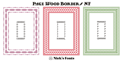
- Gold Year Personal Use - Personal use only

- KG Flavor And Frames Seven by Kimberly Geswein,
$5.00 Decayed and stamped highly textured frames and decorations. Perfect for chalkboard art.
 - Hells Kittchen Devil God by TypoGraphicDesign,
$19.00 CHARACTERISTICS The font name is a pun on the German word "Kittchen" (English prison/jail) and the English "Hell’s Kitchen". The character of the font looks as though the scum here — the guilty and innocent prisoners carved/scratched their signs and messages at the prison walls of their jail cell. The cold, creepy and scratchy character of the handwritten typeface is a very unique gloomy atmosphere. APPLICATION AREA The scary, dark, horror, trash, handwritten script font "Hells Kittchen Devil God" with many symbols/dingbats would look creepy good at rusty display size for headlines. Magazines or websites, movie posters, music covers or webbanner. TECHNICAL SPECIFICATIONS Headline Font / Display Font / Trash Script "Hells Kittchen Devil God" OpenType Font with 375 glyphs — many symbols/dingbats, alternative letters and ligatures (with accents &€) & 2 style (regular, bold)
 - Wood Bonnet Grotesque No.4 by astype,
$46.00 After release of Wood Bonnet Antique No.7 some of my clients asked for a sans serif version. So I printed my second batch of old wood type. I transferred these wood type into a digital font and tried to preserve the warm vintage look. » pdf specimen « The font offers up to four glyph variations of all the Latin base letters, figures and some additional letters - It has an build in letter randomizer. Please check you have turned on contextual alternates in your application. If you prefer a more common look and need more weights or to use the font in smaller text sizes I have done clean and sharp font family called Bonnet Grotesque Nr. It’s the preferred version for all the usages on websites, apps or ebooks. Have fun!
 - Wood Bonnet Antique No.7 by astype,
$41.00 Wood Bonnet Antique No.7 is based on real vintage wood type blocks from Switzerland. The very distressed letters give a warm analogue vintage charm on printing. These kind of wood type letters were very common and often named by generic names like Roman, French or Antique followed by a catalog number. But these letters have some very quirky details hard to find else were. » pdf specimen « The font offers up to five glyph variations of all the Latin base letters, figures and some additional letters. An OpenType glyph-rotator is programmed to emulate the randomness of old school printing on live typing. All dingbats of the specimen file are included in the font data too.
 - Wooden Log - Personal use only

- KG God Gave Me You - Personal use only

- KG God Gave Me You by Kimberly Geswein,
$5.00 This font is reminiscent of teen girl handwriting, with very round letters and a mixed-print-cursive style.
 - KG By The Grace Of God by Kimberly Geswein,
$5.00 Inspired by the decayed lettering on the signs at Siesta Key beach painted on weather-worn old wood in Florida, these letters are made to look like peeling paint.
 - Rydero by Maulana Creative,
$14.00 Rydero is softest sans serif font ever character with a bit of ligatures and alternates. To give you an extra creative work. Rydero font support multilingual more than 100+ language. This font is good for logo design, Social media, Movie Titles, Books Titles, a short text even a long text letter and good for your secondary text font with sans or serif. Make a stunning work with Rydero font. Cheers, Maulana Creative
 - LT Eat - Personal use only


