10,000 search results
(0.037 seconds)
- Print Helpers JNL by Jeff Levine,
$29.00 Print Helpers JNL is a compact little assortment of vintage cartoons, ornaments, arrows, words, phrases and other decorative illustrations used to enhance ads, print projects and fliers.
 - Gentry by Device,
$29.00 With its strong diagonal emphasis, Gentry is a humanised techno face that manages to also incorporate some strong calligraphic touches. Powerful in short and single-word settings.
 - TC Europa by Monotype,
$29.99Europa gives a rectangular appearance to words. Strokes have lightly flaired terminals to give the effect of serifs. The Europa font is excellent for headlines in journals. - Almondlatte by Essentials Studio,
$16.00 Almondlatte Is a Cute Display Font Almondlatte is perfect for product packaging, branding project, megazine, social media, wedding, or just used to express words above the background.
 - Katz Pajamas JNL by Jeff Levine,
$29.00 According to Wiktionary, "the cat's pajamas" was a slang phrase coined by Thomas A. Dorgan, the well-known journalist, cartoonist and sportswriter of that era. The phrase became popular in the U.S. in the 1920s, as the word "cat" was used as a term to describe the unconventional flappers from the jazz era. This was combined with the word pyjamas (a relatively new women's fashion during that time) to form a phrase used to describe something that is the best at what it does, thus making it highly sought and desirable. Wikipedia adds that Dorgan was the first to use the terms "twenty-three, skidoo", and "yes, we have no bananas", "apple sauce" and "solid ivory", which also became part of the slang of the "Roaring Twenties". Katz Pajamas JNL is a condensed slab serif typeface based on the title lettering for the 1944 sheet music "Pretty Kitty Blue Eyes", hence the pun-laden font name paying homage to this bit of verbal Americana as well as making the pajamas a pair owned by Mr. Katz instead of the fashionable feline. Available in both regular and oblique versions.
 - Narony by Alit Design,
$22.00 Introducing "Narony" – where sophistication meets nature in a harmonious dance of elegant typography and organic inspiration. This unique font seamlessly blends the timeless allure of serif with the dynamic fluidity of script, creating a typographic masterpiece that is both refined and enchanting. Serif Elegance: Embrace the classic charm of serif letterforms that exude sophistication and readability. Narony's serif elements add a touch of timelessness to your text, making it perfect for both formal and creative contexts. Dynamic Script: The script elements in Narony bring a sense of movement and fluidity to your words. The dynamic script flows effortlessly, adding a touch of personality and modernity to your designs. Whether used for headings or accents, Narony's script component elevates your text with grace. Natural Harmony: Immerse your designs in the serenity of nature with Narony's natural concept. Adorned with elegant leaf illustrations, each character is delicately intertwined with botanical elements, creating a seamless blend of man-made artistry and the beauty of the natural world. Versatility in Design: Narony is designed for versatility, making it suitable for a wide range of applications. From branding and logo design to wedding invitations and editorial layouts, this font effortlessly adapts to various design needs. Distinctive and Memorable: Set your projects apart with a font that is both distinctive and memorable. Narony leaves a lasting impression on your audience, ensuring that your message is not just read but experienced. Ideal Usage: Branding and Logo Design Editorial Layouts Wedding Invitations Packaging Design Social Media Graphics Nature-themed Projects Elevate your designs with the perfect blend of sophistication and nature – Narony. Let your words flourish in the graceful strokes of this font, where each character is a work of art and each design tells a story of elegance and harmony. Experience the beauty of Narony and redefine your typographic expression.
 - Raymod Colin Family by ijemrockart,
$13.00 Introducing Raymod Colin Font Duo & Free 30 Logos Raymod Colin Font a new fresh & modern script with a handmade calligraphy style, decorative characters and a dancing baseline! So beautiful on invitation like greeting cards, branding materials, business cards, quotes, posters, and more!! Raymod Colin Font come with 330 glyphs+. The alternative characters were divided into several Open Type features such as Swash, Stylistic Sets, Stylistic Alternates, and Ligature. The Open Type features can be accessed by using Open Type savvy programs such as Adobe Illustrator, Adobe InDesign, Adobe Photoshop Corel Draw X version, And Microsoft Word. And this Font has given PUA unicode (specially coded fonts). so that all the alternate characters can easily be accessed in full by a craftsman or designer. If you have any question, do not hesitate to contact me by email ijemrealmad54@gmail.com Thanks and happy designing :)
 - Octynaz by Typodermic,
$11.95 The world has ended, and all that remains is chaos and destruction. The remnants of civilization are scattered, and the once-great cities are now nothing more than ruins. In this post-apocalyptic wasteland, communication is more critical than ever. Your message needs to cut through the noise and grab attention, but how can you do that when everything around you is broken and damaged? Enter Octynaz—a typeface that perfectly captures the desperate spirit of this new world. With its severe damage and broken counters, Octynaz embodies the shattered landscape of the post-apocalypse. But it’s not just a broken typeface—in fact, it’s even more powerful because of its flaws. OpenType-aware programs will automatically substitute bespoke pairs to produce a grungy, realistic appearance that will make your message stand out. When you use Octynaz, you infuse your words with frantic authority and shattered vigor. You’re not just communicating—you’re commanding attention. Your message becomes a rallying cry for those who remain, a beacon of hope amidst the darkness. Most Latin-based European writing systems are supported, including the following languages. Afaan Oromo, Afar, Afrikaans, Albanian, Alsatian, Aromanian, Aymara, Bashkir (Latin), Basque, Belarusian (Latin), Bemba, Bikol, Bosnian, Breton, Cape Verdean, Creole, Catalan, Cebuano, Chamorro, Chavacano, Chichewa, Crimean Tatar (Latin), Croatian, Czech, Danish, Dawan, Dholuo, Dutch, English, Estonian, Faroese, Fijian, Filipino, Finnish, French, Frisian, Friulian, Gagauz (Latin), Galician, Ganda, Genoese, German, Greenlandic, Guadeloupean Creole, Haitian Creole, Hawaiian, Hiligaynon, Hungarian, Icelandic, Ilocano, Indonesian, Irish, Italian, Jamaican, Kaqchikel, Karakalpak (Latin), Kashubian, Kikongo, Kinyarwanda, Kirundi, Kurdish (Latin), Latvian, Lithuanian, Lombard, Low Saxon, Luxembourgish, Maasai, Makhuwa, Malay, Maltese, Māori, Moldovan, Montenegrin, Ndebele, Neapolitan, Norwegian, Novial, Occitan, Ossetian (Latin), Papiamento, Piedmontese, Polish, Portuguese, Quechua, Rarotongan, Romanian, Romansh, Sami, Sango, Saramaccan, Sardinian, Scottish Gaelic, Serbian (Latin), Shona, Sicilian, Silesian, Slovak, Slovenian, Somali, Sorbian, Sotho, Spanish, Swahili, Swazi, Swedish, Tagalog, Tahitian, Tetum, Tongan, Tshiluba, Tsonga, Tswana, Tumbuka, Turkish, Turkmen (Latin), Tuvaluan, Uzbek (Latin), Venetian, Vepsian, Võro, Walloon, Waray-Waray, Wayuu, Welsh, Wolof, Xhosa, Yapese, Zapotec Zulu and Zuni.
 - Simplesky by Timurtype,
$14.00 Introducing by Timur type Proudly Present, Simplesky Simplesky A Handwritten Script Font, which was created with great care and specially created for you ✨ Simplesky is perfect for product packaging, branding project, megazine, social media, wedding, or just used to express words above the background. Simplesky also multilingual support. Embelish your designs with our original fonts. Enjoy the font 😉 Thank you!
 - Requista by Timurtype,
$14.00 Introducing by Timur type Proudly Present, Requista Requista A Handwritten Script Font Requista is perfect for product packaging, branding project, megazine, social media, wedding, or just used to express words above the background. This Claritty font includes: -Full Set of standard alphabet and punctuation & symbol -Extra set Ligature -multilingual support. Embelish your designs with our original fonts.Enjoy the font,Thank you!
 - Vantagram by TEKNIKE,
$69.00 Vantagram is a modern display font. The typeface is made from basic square geometry. It is inspired by blackletter typefaces of the medieval period in Europe. The Vantagram name is a combination of two words derived from “vanta” French for boast and “gram” Greek for letter or that which is drawn. Vantagram is great for display work, quotes, titles, headings and posters.
 - Bethanien by Rezastudio,
$9.00 Bethanien is beautiful sweet calligraphy font. It is fresh, modern, and maintaining its elegance. This font is so perfect for many designs, from wedding invation, greeting card, social media quotes, branding, logo, and many more. Features: +Tons of Glyphs, including beautiful alternate glyphs. +Can be used in any software, like Adobe Photoshop, Illustrator, even Microsoft Word, PowerPoint and others. +Multilingual glyphs.
 - Roundwell by Javanice Studio,
$16.00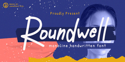 Introducing Roundwell by Javanice Studio Roundwell is A Moniline Handwritten Font Roundwell is perfect for branding project, apparel, labels, magazines, books, greeting / wedding cards, packaging, fashion, make up, stationery, and any type of advertising purpose or just used to express words above the background. This font includes multilingual support. Enjoy the font, feel free to comment or feedback, send me PM or email.
 - Bs Landscope by Feliciano,
$37.92That’s what people call ‘an experimental typeface’. Yes it is! It consists in letterforms designed in very strict geometrical parameters. I was not thinking about ‘reading’ when I’ve drawn this typeface — rather on different way of projecting our mental image of the words. Do not try to set a book with this type, please! One single version, one single font designed in 2000. - Pony Tale Pro by Jonahfonts,
$45.00 Pony Tale Pro is a handwritten unconnected script face in eight styles: Light, Regular, Bold and Outline with Italics and Small-Caps. Very suitable for Packaging, Greeting cards, Magazines, Posters and Advertising Ads. A space after any lower-case glyph will produce the word terminal, invoking the OpenType/CONTEXTUAL ALTERNATIVE variant. (Opentype variants may only be accessible via Opentype-Aware applications.)
 - Bazinga by Tipo Pèpel,
$22.00 Bazinga is a fun and uncomplicated typeface, thanks to the rectilinear counterforms that accompany it, it is ideal to use in our most cheerful works, where fun, humor or childish naivety, is the essence of what is to be transmitted. It also has a set of decorative initials to personalize our beloved words, and a set of dingbats to decorate our works.
 - Rainbow Marbles by Aestherica Studio,
$14.00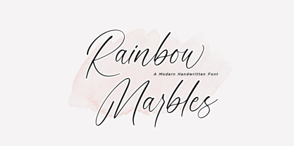 This is Rainbow Marbles by Aestherica Studio. Rainbow Marbles is a minimalist and elegant with unique curves and flowing modern script font. Rainbow Marbles is perfect for product packaging, branding project, megazine, social media, wedding, or just used to express words above the background. Rainbow Marbles also multilingual support. Enjoy the font, feel free to comment or feedback, send me PM or email.
 - Gamboge by Hanoded,
$15.00 Gamboge is a deep saffron to mustard yellow pigment which is extracted from a tree. Its name comes from gambogium, the latin word for the pigment. Gambogia font is a beautiful all caps typeface with a pre-war feeling to it. Upper and lower case differ and can be mixed freely. Use Gamboge for your product packaging, book covers and websites.
 - Comic Toon 3 D by Adita Fonts,
$20.00 Comic Toon 3D is a cool and fun Color font 3D Style. It is the perfect font for titles or words needing a more dramatic emphasis. Whatever the topic, this font will be a wonderful asset to your font library, as it has the potential to enhance any creation. COMPATIBILITY Windows Apple/Mac Linux Easily convert to webfont Silhouette Other cutting machines
 - NorB Scribe by NorFonts,
$28.00 NorB Scribe is a handwritten text font witch can be used with any word processing program for text and display use, print and web projects, apps and ePub, comic books, graphic identities, branding, editorial, advertising, scrapbooking, cards and invitations and any casual lettering purpose… or even just for fun! It comes with 6 weights featuring Light, Normal, Bold with their Italic version.
 - Relate by Panritype Studio,
$20.00 Relate is modern, elegant, beautiful script. it is made by real pen brush, and shaping carefully. It's perfect for logotype project, wedding invitation, social media headlines, birthday card, quotes, t-shirt and also match with other design project. Relate comes with natural handwriting ligatures and extra final word alternates and swashes that can make your project more beautiful and elegant.
 - Toddler JNL by Jeff Levine,
$29.00The fun, lighthearted appeal of Toddler JNL will bring out the inner child in you. Perfect for any layout or project that has to do with newborns, toddlers, preschool, playtime or anything related to little ones. There's a fairly complete character set - and two different width blank boxes on the brace keys - which can be used as spaces between words. - NorPen Script by NorFonts,
$15.00 NorPen Script is a handwritten Text Font made with an arabic calligraphy pen (my favorite pens) witch can be used with any word processing program for text and display use, print and web projects, apps and ePub, Comic Books, graphic identities, branding, editorial, advertising, scrapbooking, cards and invitations … or even just for fun! It comes with 2 weights: Regular and Italic.
 - Baileyone by Timurtype,
$14.00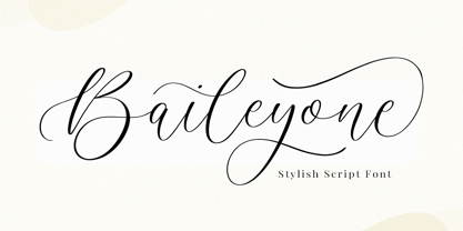 Introducing by Timur type Baileyone, a handwritten script font Baileyone is perfect for product packaging, branding project, magazines, social media, wedding, or just used to express words above the background. This Baileyone font includes: -Full Set of standard alphabet and punctuation & symbol -Extra set Alternate ending lowercase -multilingual support. Embelish your designs with our original fonts. Enjoy the font, thank you!
 - Bit Part JNL by Jeff Levine,
$29.00 Bit Part JNL is an extra condensed monoline sans serif typeface that's well suited for movie credits, disclaimers and other forms of tight-fit word copy. Inspired by just the numbers "65" on the cover of a 1965 high school yearbook, this retro font will fit a lot of copy into a small area. The typeface is available in regular and oblique versions.
 - Plop by Gleb Guralnyk,
$14.00 Presenting a decorative liquid font Plop. It's a splashing funny typeface perfect for authentique lettering composition. To use a bigger splash letter just type a capital letter. Same way the last letter in word will be automatically replaced to correct glyph using OpenType features. Both sides splashes are available for all letters including multilingual characters. Thank you and have a nice day!
 - Roseglow by Timurtype,
$14.00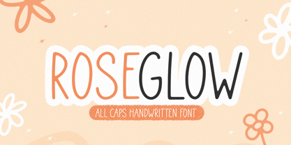 Introducing by Timur type Proudly Present, Roseglow Roseglow A fun Handwritten Font Roseglow is perfect for product packaging, branding project, megazine, social media, wedding, or just used to express words above the background. This Roseglow font includes: -Full Set of standard alphabet and punctuation & symbol -Extra set doodles -multilingual support. Embelish your designs with our original fonts.Enjoy the font,Thank you!
 - Rocksoldier by Timurtype,
$14.00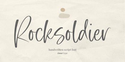 Introducing by Timur type Proudly Present, Rocksoldier ✨ Rocksoldier A Handwritten Script Font, which was created with great care and specially created for you 😊 Rocksoldier is perfect for product packaging, branding project, megazine, social media, wedding, or just used to express words above the background. Simplesky also multilingual support. Embelish your designs with our original fonts. Enjoy the font 😉 Thank you!
 - MardiParty AOE by Astigmatic,
$19.95 MardiParty is a totally wild latin typestyle with inlines that grow out of it. Inspired by hand-lettering from a 1950's Haiti travel brochure, where the original lettering was just the word "Haiti", this font proved a fun challenge to flesh out. The end result, a funktastical tribute to its origins, perfect for any celebration themed invitations, logotypes, or outlandish branding.
 - Williesh by Almarkha Type,
$25.00 Introducing Williesh - Unique font that uses ligatures to smoothly link letters. inspired by the famous minimalist logo, perfect for the purposes of designing templates, brochures, videos, advertising branding, logos and more. Perfect for adding a unique twist to word-mark logos, monograms or pull quotes. Kavaloora has 18 unique ligatures and Alternate Glyphs as well as numbers and punctuation making it super fantastic.
 - Tanseek Sans by Monotype,
$29.99The Tanseek™ Sans family provides interactive and print designers with a suite of powerful and versatile communication tools. Square shoulders, open counters and distinctive character shapes also ensure high levels of legibility. Designed by Dave Farey and Richard Dawson, the lower case has a subtle calligraphic emphasis, creating an inviting rhythm and typographic flow when letters combine into words and sentences. - Ballistone by Timurtype,
$14.00 Introducing by Timur type Proudly Present, Ballistone Ballistone A Handwritten Script Font Ballistone is perfect for product packaging, branding project, megazine, social media, wedding, or just used to express words above the background. This Ballistone font includes: -Full Set of standard alphabet and punctuation & symbol -Extra set ligature & underline -multilingual support. Embelish your designs with our original fonts.Enjoy the font,Thank you!
 - Bold Marker by Timurtype,
$14.00 Introducing by Timur type Proudly Present, Bold Marker Bold Marker A Handwritten Font Bold Marker is perfect for product packaging, branding project, megazine, social media, wedding, or just used to express words above the background. This Bold Marker font includes: -Full Set of standard alphabet and punctuation & symbol -multilingual support. Embelish your designs with our original fonts.Enjoy the font,Thank you!
 - As of my last update in early 2023, "New Wishes" by Fontles stands as a beautiful testament to creativity and elegant design in the world of typography. While I can't pull direct visuals or the lates...
- Vagabundo by Juraj Chrastina,
$39.00 Vagabundo is a hand brushed family with three styles and some extra goodies. You can combine different weights with icons, ornaments and banners to get a nice original design. You can download the instruction PDF here.
 - Longbranch by Solotype,
$19.95A modern cutting designed to give the appearance of an old wood type. The letters were cut as linoleum blocks about 2 inches high, then duplicated as copper electrotypes. Used for some Ringling Bros. circus work. - Vivala Coffee House Icons by Johannes Hoffmann,
$19.00 73 icons on the topic »coffee house.« The extensive kit includes the category’s coffee, drinks, food, coffee makers, roasted coffee and tea. The clear design is adapted to mobile interfaces and suitable for print, as well.
 - PL Behemoth by Monotype,
$29.99Dave West released the Behemoth Semi-Condensed font in 1960. With nineteenth-century wood-cut influence PL Behemoth Semi-Condensed is an example of the revival of slab serif styles, popular in the sixties and seventies. - Street Legal by LetterBalm,
$17.99 Hard core street scrawl, for tough graffiti urban hood, laid back and tough, lots of attitude and tons of muscle, for automotive, motorcycles, urban settings and back alleys. Gives your designs some serious five o'clock shadow.
 - Antique by Storm Type Foundry,
$26.00The concept of the Baroque Roman type face is something which is remote from us. Ungrateful theorists gave Baroque type faces the ill-sounding attribute "Transitional", as if the Baroque Roman type face wilfully diverted from the tradition and at the same time did not manage to mature. This "transition" was originally meant as an intermediate stage between the Aldine/Garamond Roman face of the Renaissance, and its modern counterpart, as represented by Bodoni or Didot. Otherwise there was also a "transition" from a slanted axis of the shadow to a perpendicular one. What a petty detail led to the pejorative designation of Baroque type faces! If a bookseller were to tell his customers that they are about to choose a book which is set in some sort of transitional type face, he would probably go bust. After all, a reader, for his money, would not put up with some typographical experimentation. He wants to read a book without losing his eyesight while doing so. Nevertheless, it was Baroque typography which gave the world the most legible type faces. In those days the craft of punch-cutting was gradually separating itself from that of book-printing, but also from publishing and bookselling. Previously all these activities could be performed by a single person. The punch-cutter, who at that time was already fully occupied with the production of letters, achieved better results than he would have achieved if his creative talents were to be diffused in a printing office or a bookseller's shop. Thus it was possible that for example the printer John Baskerville did not cut a single letter in his entire lifetime, for he used the services of the accomplished punch-cutter John Handy. It became the custom that one type founder supplied type to multiple printing offices, so that the same type faces appeared in various parts of the world. The type face was losing its national character. In the Renaissance period it is still quite easy to distinguish for example a French Roman type face from a Venetian one; in the Baroque period this could be achieved only with great difficulties. Imagination and variety of shapes, which so far have been reserved only to the fine arts, now come into play. Thanks to technological progress, book printers are now able to reproduce hairstrokes and imitate calligraphic type faces. Scripts and elaborate ornaments are no longer the privilege of copper-engravers. Also the appearance of the basic, body design is slowly undergoing a change. The Renaissance canonical stiffness is now replaced with colour and contrast. The page of the book is suddenly darker, its lay-out more varied and its lines more compact. For Baroque type designers made a simple, yet ingenious discovery - they enlarged the x-height and reduced the ascenders to the cap-height. The type face thus became seemingly larger, and hence more legible, but at the same time more economical in composition; the type area was increasing to the detriment of the margins. Paper was expensive, and the aim of all the publishers was, therefore, to sell as many ideas in as small a book block as possible. A narrowed, bold majuscule, designed for use on the title page, appeared for the first time in the Late Baroque period. Also the title page was laid out with the highest possible economy. It comprised as a rule the brief contents of the book and the address of the bookseller, i.e. roughly that which is now placed on the flaps and in the imprint lines. Bold upper-case letters in the first line dramatically give way to the more subtle italics, the third line is highlighted with vermilion; a few words set in lower-case letters are scattered in-between, and then vermilion appears again. Somewhere in the middle there is an ornament, a monogram or an engraving as a kind of climax of the drama, while at the foot of the title-page all this din is quietened by a line with the name of the printer and the year expressed in Roman numerals, set in 8-point body size. Every Baroque title-page could well pass muster as a striking poster. The pride of every book printer was the publication of a type specimen book - a typographical manual. Among these manuals the one published by Fournier stands out - also as regards the selection of the texts for the specimen type matter. It reveals the scope of knowledge and education of the master typographers of that period. The same Fournier established a system of typographical measurement which, revised by Didot, is still used today. Baskerville introduced the smoothing of paper by a hot steel roller, in order that he could print astonishingly sharp letters, etc. ... In other words - Baroque typography deserves anything else but the attribute "transitional". In the first half of the 18th century, besides persons whose names are prominent and well-known up to the present, as was Caslon, there were many type founders who did not manage to publish their manuals or forgot to become famous in some other way. They often imitated the type faces of their more experienced contemporaries, but many of them arrived at a quite strange, even weird originality, which ran completely outside the mainstream of typographical art. The prints from which we have drawn inspiration for these six digital designs come from Paris, Vienna and Prague, from the period around 1750. The transcription of letters in their intact form is our firm principle. Does it mean, therefore, that the task of the digital restorer is to copy meticulously the outline of the letter with all inadequacies of the particular imprint? No. The type face should not to evoke the rustic atmosphere of letterpress after printing, but to analyze the appearance of the punches before they are imprinted. It is also necessary to take account of the size of the type face and to avoid excessive enlargement or reduction. Let us keep in mind that every size requires its own design. The longer we work on the computer where a change in size is child's play, the more we are convinced that the appearance of a letter is tied to its proportions, and therefore, to a fixed size. We are also aware of the fact that the computer is a straightjacket of the type face and that the dictate of mathematical vectors effectively kills any hint of naturalness. That is why we strive to preserve in these six alphabets the numerous anomalies to which later no type designer ever returned due to their obvious eccentricity. Please accept this PostScript study as an attempt (possibly futile, possibly inspirational) to brush up the warm magic of Baroque prints. Hopefully it will give pleasure in today's modern type designer's nihilism.