3,073 search results
(0.031 seconds)
- M Hei HK by Monotype HK,
$523.99HK series fonts are in Unicode encoding and consists of BIG 5 character set and HKSCS characters. The character glyphs are based on the regular Traditional Chinese writing form and style. It is generally used in Taiwan ROC, Hong Kong and Macau. - MSung HK by Monotype HK,
$523.99HK series fonts are in Unicode encoding and consists of BIG 5 character set and HKSCS characters. The character glyphs are based on the regular Traditional Chinese writing form and style. It is generally used in Taiwan ROC, Hong Kong and Macau. - MHeiSung HK by Monotype HK,
$523.99HK series fonts are in Unicode encoding and consists of BIG 5 character set and HKSCS characters. The character glyphs are based on the regular Traditional Chinese writing form and style. It is generally used in Taiwan ROC, Hong Kong and Macau. - M Windy HK by Monotype HK,
$523.99HK series fonts are in Unicode encoding and consists of BIG 5 character set and HKSCS characters. The character glyphs are based on the regular Traditional Chinese writing form and style. It is generally used in Taiwan ROC, Hong Kong and Macau. - M HG Reithic T HK by Monotype HK,
$523.99HK series fonts are in Unicode encoding and consists of BIG 5 character set and HKSCS characters. The character glyphs are based on the regular Traditional Chinese writing form and style. It is generally used in Taiwan ROC, Hong Kong and Macau. - KG Two Is Better Than One by Kimberly Geswein,
$5.00 This font was created in honor of my husband for our 12th wedding anniversary. 14 years ago, I met this tall, skinny guy from Indiana in the lobby of a hotel in Hong Kong. We talked. The next day, we had lunch together. And that night we had dinner together. And the next day. And the next. We met just before my 19th birthday, and on my birthday he took me to the top of Victoria Peak, where we looked out over the city of Hong Kong- such a beautiful place to begin a lifetime of love! We spent 4 months together in Hong Kong, falling in love with each other and with the beautiful city we were privileged to call home for that short time. We married the next year. We've lived in Indiana, Texas, China, Kentucky, and Florida over those 12 years of marriage and have welcomed 2 daughters into our lives. I know beyond a shadow of a doubt that he completes my life in a way I didn't know was possible. And I know that I'm blessed beyond words to have a supportive, wonderful, encouraging husband who is also a loving, involved, caring dad to our daughters. This font is for you, Keith!
 - Valerie by Solotype,
$19.95Here is another attempt to create a font for invitation work unlike any already out in the world. In casting about for a name, I decided to call it Valerie after Valerie Hope, a mindreader of days long gone, who played California theatres in the 1930s and 1940s. And who, incidentally, was my mother. - M Comic 2 HK by Monotype HK,
$523.99 Stripy strokes with more open to curves, designed for Young Urban Professionals! HK series fonts are in Unicode encoding and consists of BIG 5 character set and HKSCS characters. The character glyphs are based on the regular Traditional Chinese writing form and style. It is generally used in Taiwan ROC, Hong Kong and Macau.
 - Casual Deco JNL by Jeff Levine,
$29.00 The hand lettered sans serif title on the1931 sheet music for “(Potatoes are Cheaper-Tomatoes are Cheaper) Now’s the Time to Fall in Love” presented another opportunity to create a typeface from the wealth of unusual alphabets found on the covers of vintage and antique song sheets. However, it seems that even as late as the 1930s, song writers had the urge to pen long-worded titles for their musical compositions. This thirteen word verbal excursion became the model for Casual Deco JNL, which is available in both regular and oblique versions.
 - Brookside JNL by Jeff Levine,
$29.00 The 1920s were part of an era in songwriting where snappy wordplay and clever (if not long) titles prevailed. The lettering on one such piece of sheet music with the song title "In A Shady Nook by A Babbling Brook" offered up a bold, condensed sans serif design which is now available digitally as Brookside JNL. Available in both regular and oblique versions.
 - Pardesi by Hanoded,
$15.00 Pardesi font is named after a song from Raja Hindustani, a 1996 Bollywood movie directed by Dharmesh Darshan. The lead roles were played by Aamir Khan and Karisma Kapoor. Together they sing: 'Pardesi, pardesi, jaana nahi', meaning so much as: 'Foreigner, foreigner, don't go'. I remember this song very well, as I was backpacking through India and Nepal at the time and it was played over and over again on all long distance buses I took. Pardesi font is a fat, rounded, marker-pen font, ideal for books and posters. It comes with extensive language support.
 - Kolkata Hotelroom by Hanoded,
$10.00 Hotel rooms in Kolkata don't top the list of 'luxurious habitations'. They are dingy, fly-ridden, dirty and noisy. But if you look really hard, you will find traces of long gone grandeur. This font is all of the above and more: it is sloppy and messy, it spikes and sags, but it does give your designs that extra oomph you are looking for.
 - Gradl Highstep by HiH,
$8.00 Gradl Highstep is an archetypical Art Nouveau face by the prolific and mysterious Max Joseph Gradl. It epitomizes the visual language of elegance and sophistication. It seems strange that so little information is available today about Max Gradl: He seems to have been well known in his day. In addition to his jewelry design, he did advertising work for customers in Naples, London and New York in addition to customers in cities all over Germany. Gradl Highstep is an all-cap font with a wide range of ligatures: 094=SA, 123=CH, 125=CK, 126=TS, 167=FA, 172=PA, 177=TA, 188=WA and 190=YA. In addtion, 137=Gradl’s dated monogram “MJG 1903,” 175=LLC abbreviation, 181=alternate S. This is a subtle font with thin, variable strokes. It is best used at 28 points and larger to give it the presence it needs to be be appreciated. Gradl Highstep Initials is a companion font, incorporating a deft line drawing of a fashionable woman of the period who is every bit as elegant as the underlying font.
 - Debacle by Reserves,
$39.99 Debacle is a super bold contrastive display face built upon pure geometric shapes. Sharp, angular lines are countered against obtuse rounded forms creating a striking visual discord. Select inner corners are rounded, giving characters dual attributes, while linear round-end counters simultaneously contrast and compliment the square-ended punctuation and symbols. Stylistically, Debacle’s prominent letterforms effortlessly create type-as-image text settings. Its style relates to the lush display typefaces from the seventies, yet is highly contemporary in its refinement and finish. Features include: Precision kerning Basic Ligature set including ‘f’ ligatures (ae, oe, fi, fl, ffi, ffl, ff, fh, fj, ft, tt, th, ct, st, la, aj, fa, ls, es, ev, ew, tz, lv, lw, ti, it, ea, kv, ka, ky, yx, xy, yy, km, yw, wy, yv, vy, kw) Alternate characters (O, Q, _, $, ®, •) Slashed zero Full set of numerators/denominators Automatic fraction feature (supports any fraction combination) Extended language support (Latin-1 and Latin Extended-A) *Requires an application with OpenType and/or Unicode support.
 - Smooth Sailing JNL by Jeff Levine,
$29.00 Songs of the early 1900s were anything but the status quo in topic or style. Excessively long titles, novelty tunes and "foreign themes" permeated the piles of sheet music in the local music shops. 1916's "Oh How She Could Yacki Hacki Wicki Wacki Woo (That's Love in Honolu)" covered a number of these quirks within one publication. This Hawaiian-tinged song evoked the mysterious ways of the South Seas islands, despite the abridging of Honolulu to "Honolu". Nonetheless, the hand lettered title of this particular piece of sheet music featured an Art Nouveau-influenced bold block letter with rounded corners. It's now available digitally as Smooth Sailing JNL, in both regular and oblique versions.
 - Dip Pen JNL by Jeff Levine,
$29.00 Answer Songs have been around for [probably] just as long as there have been songs. 1917's "If I Catch the Guy Who Wrote Poor Butterfly" was the answer to the 1916 hit "Poor Butterfly" [by Raymond Hubbell and John Golden], which in turn was inspired by the Puccini opera "Madame Butterfly". "Poor Butterfly" was so popular that this "answer" tune had as part of its lyrics "That melody haunts me in my sleep; it seems to creep." Nonetheless, the sheet music for William Jerome and Arthur Green's comic lament had the title hand lettered with an oval nib lettering pen and is now availably as a digital type face called Dip Pen JNL.
 - ITC Mona Lisa by ITC,
$29.99ITC Mona Lisa was designed by Pat Hickson, a stark and elegant typeface originally drawn in the 1930s by Albert Auspurg. The original drawings were long gone and the surviving metal type was already severely worn when Hickson studied Auspurg's design for his recreation. The result is a typeface which melds the flavor of the 1930s with current design standards. ITC Mona Lisa displays all the suave sophistication of Fred Astaire and Greta Garbo. - Type Master by VP Creative Shop,
$39.00 NOTE : If you want any specific ligature included, just write me a message and I will add it with next update :) Type Master is a sophisticated and delicate serif font that exudes elegance in every aspect. With its extensive collection of over 100 ligatures and alternate glyphs, this font offers endless possibilities for creative expression. Additionally, its support for 87 languages ensures that it is versatile enough to meet the needs of any project. Whether you are designing a logo, creating marketing materials, or crafting an editorial layout, Type Master is the perfect choice for adding a touch of refinement to your work. Language Support : Afrikaans, Albanian, Asu, Basque, Bemba, Bena, Breton, Chiga, Colognian, Cornish, Czech, Danish, Dutch, Embu, English, Estonian, Faroese, Filipino, Finnish, French, Friulian, Galician, Ganda, German, Gusi,i Hungarian, Indonesian, Irish, Italian, Jola-Fonyi, Kabuverdianu, Kalenjin, Kamba, Kikuyu, Kinyarwanda, Latvian, Lithuanian, Lower Sorbian, Luo, Luxembourgish, Luyia, Machame, Makhuwa-Meetto, Makonde, Malagasy, Maltese, Manx, Meru, Morisyen, North Ndebele, Norwegian, Bokmål, Norwegian, Nynorsk, Nyankole, Oromo, Polish, Portuguese, Quechua, Romanian, Romansh, Rombo, Rundi, Rwa, Samburu, Sango, Sangu, Scottish, Gaelic, Sena, Shambala, Shona, Slovak, Soga, Somali, Spanish, Swahili, Swedish, Swiss, German, Taita, Teso, Turkish, Upper, Sorbian, Uzbek (Latin), Volapük, Vunjo, Walser, Welsh, Western Frisian, Zulu Ligatures : IS, FO, OD, FA, TY, EX, NN, PI, EY, AY, SS, LL, FU, US, UT, AS, AN, AM, CI, LO, ES, RO, ET, TE, CK, OH, OO, OE, OC, KO, KE, KC, CH, SE, EA, UR, RS, KS, TH, TU, TT, TK, TL, HE, RG, EP, ER, RE, RC, LE, ND, ED, OF, HA, EN, CT, ST, NT, ON, ME, MO, NG, NC, UG, UC, OU, GH, OR, OP, EE, YO, VE, IT, WE, TI, FAS, FAST, CKS, OOD, FOOD, FOO, THEY, HEY, HYP, TYP, OUT, UST, URS, WAS, THE, WES, EST, WEST, ERS, EAST, EAS, LES, ENT, FOR, OUG, OUGH, ERE, TER, YOU, VER, HER, THER, THA, AND, ITH, THI, MENT, WERE, WER, ROM, THE How to access alternate glyphs? To access alternate glyphs in Adobe InDesign or Illustrator, choose Window Type & Tables Glyphs In Photoshop, choose Window Glyphs. In the panel that opens, click the Show menu and choose Alternates for Selection. Double-click an alternate's thumbnail to swap them out. UPDATES : COMING SOON Mock ups and backgrounds used are not included. Thank you! Enjoy!
 - Mina by Resistenza,
$39.00 Go back to a time when the Mediterranean coastline was truly glamorous, when stylish women and men in wire-framed glasses listened to Domenico Modugno songs on the radio while sipping wine in sidewalk cafes. A relaxing summer’s day, a gentle sea breeze, taking the time to write a postcard to your loved ones in your best handwriting. The 1950’s may have come and gone, but the elegance and simplicity of that classic style has not, Mina keeps the feel of calligraphy, the long connections between letters is elastic, the clean, thin lines, it is a relaxed cursive ideal for logotypes, titles, and lettering. There are eleven Mina font styles and many loops to choose from to customize any letter. Bring the seaside glamour of a bygone era to your projects of today with Mina. Ranging from light to heavy, Mina Calligraphic, and Mina Shadow, this family of fonts work perfectly separately but you can also achieve beautiful results when combining them. Check out also Mina Chic We recommend to combine Mina with: PestoFresco Turquoise
 - Konga Next by RodrigoTypo,
$25.00 Konga has gone through different changes, the first idea was born in 2014 with the help of Andrey Kudryavtsev, then some time passed and the Rough version was developed, and a long time passed and in 2022 the idea of redesigning was taken with Bruno Jara, in addition to making many styles such as Rough, Inline, Shadow, as well as dingbats which was based on Stefania Ahumada's graphics, which results in a family of 6 styles, with different Alternatives, perfect for informal titles.
 - Baby Coffee - Personal use only

- Changing Times JNL by Jeff Levine,
$29.00 Changing Times JNL was inspired by the hand lettering on the cover of the 1929 sheet music for "Wedding Bells (Are Breaking Up that Old Gang of Mine)". While the font’s name is an extremely vague reference to the subject of the song itself, it also represents the fact that the lettering style (still reflecting some Art Nouveau influence) welcomes the dawning of the Art Deco movement with the thick-and-thin line letter forms. The type design is available in both regular and oblique versions.
 - FDI Tierra Nueva by FDI,
$25.00 Four fonts — found on a map of America, created by the spanish cartographer Diego Gutiérrez and the dutch engraver Hieronymus Cock anno 1562. From the start of the digitization by Sebastian Nagel in 2005, Tierra Nueva has gone a long way. On its journey of exploration it has grown to four members of a family (regular, bold, italic and script) with an overall count of almost 3.700 characters for different languages and purposes, extensively featured with useful typographic options. Over six years after the start of the expedition, it shall be launched. Land ahoy!
 - Saeta Pro by DBSV,
$90.00 About family “SaetaPro” Wind games… The name is taken from an old paper toy made by someone who makes paper planes with teasing messages. But there are also songs with a strong feeling in flamenco style. It is also a way of expression in order to give way to emotion and interpersonal communication. They are wind games that people have been playing for a long time ago!!! This series is composed and includes twelve fonts with 632 glyphs each, with true italics, true Sloping and supports of course: Latin, Greek & Cyrillic.
 - Idiom by Reserves,
$39.99 Idiom is an extra-condensed, tightly spaced display face with congruent forms exuding a strong sense of rhythm and elevation. The basic stenciled geometric shapes are reminiscent of the decorative style found with P22 Albers and Futura Black. Careful consideration of each letter's construction, relative to all characters, lends Idiom a decided sense of cohesion and sophistication. The included non-traditional 'weights' (Medium and Bold) are completely blacked out, creating entirely new letterforms that exhibit a very stark, contemporary sense. Increasing the versatility of the Idiom family, a selection of OpenType features allow access to a set of contrasting linear punctuation forms, unconventional ligatures, case-sensitive punctuation and more. Features include: Basic Ligature set including 'f' ligatures (ae, oe, fi, fl, ff, fh, fj, ft, fa, ct, st, rt, ot, ta, sa, mi, si, vi, su, oc, oo, ru, ib) Alternate characters (M, W, T, ß, _, $, @, (), {}, [], /, \, |, -, –, —, +, -, ±, ≤, ≥, , «, », and more) Case forms (shifts various punctuation marks vertically to a position that works better with all-capital sequences, in this case the numerals or letters with ascenders) Slashed zero Full set of numerators/denominators and superscript/subscript Automatic fraction feature (supports any fraction combination) Extended language support (Latin-1 and Latin Extended-A) *Requires an application with OpenType and/or Unicode support.
 - Type Maestro by VP Creative Shop,
$39.00 Type Maestro is an exquisite ligature serif font that exudes creativity and elegance. With over 100 meticulously crafted ligatures, this font is the perfect choice for designers looking to elevate their projects to new heights. One of the key features of Type Maestro is its extensive language support, boasting compatibility with 87 different languages. This makes it an incredibly versatile font that can be used for a wide range of projects, no matter where your audience is located. But what truly sets Type Maestro apart are its alternate glyphs. These unique characters add a touch of individuality and personality to your text, allowing you to create truly one-of-a-kind designs. Whether you're designing a logo, a website, or a social media post, Type Maestro has the flexibility and style to help you stand out from the crowd. Language Support : Afrikaans, Albanian, Asu, Basque, Bemba, Bena, Breton, Chiga, Colognian, Cornish, Czech, Danish, Dutch, Embu, English, Estonian, Faroese, Filipino, Finnish, French, Friulian, Galician, Ganda, German, Gusi,i Hungarian, Indonesian, Irish, Italian, Jola-Fonyi, Kabuverdianu, Kalenjin, Kamba, Kikuyu, Kinyarwanda, Latvian, Lithuanian, Lower Sorbian, Luo, Luxembourgish, Luyia, Machame, Makhuwa-Meetto, Makonde, Malagasy, Maltese, Manx, Meru, Morisyen, North Ndebele, Norwegian, Bokmål, Norwegian, Nynorsk, Nyankole, Oromo, Polish, Portuguese, Quechua, Romanian, Romansh, Rombo, Rundi, Rwa, Samburu, Sango, Sangu, Scottish, Gaelic, Sena, Shambala, Shona, Slovak, Soga, Somali, Spanish, Swahili, Swedish, Swiss, German, Taita, Teso, Turkish, Upper, Sorbian, Uzbek (Latin), Volapük, Vunjo, Walser, Welsh, Western Frisian, Zulu Ligatures : IS, FO, OD, FA, TY, EX, NN, EY, SS, LL, FU, US, UT, AS, AN, AM, CI, LO, ES, RO, ET, TE, CK, OH, OO, OE, OC, KO, KE, KC, CH, SE, EA, UR, RS, KS, TH, TU, TT, TK, TL, HE, RG, EP, ER, RE, RC, LE, ND, ED, OF, HA, EN, CT, ST, NT, ON, ME, MO, NG, NC, UG, UC, OU, GH, OR, OP, EE, YO, VE, IT, WE, TI, VO, WO, SA, MA, OL, VA, YP, YR, OX, XO, BA, OT, TO, BE, RU, KU, TW, EN, NT, FAS, FAST, CKS, OOD, FOOD, FOO, TEE, TOR, TOP, TWE, NTY, TYP, OUT, UST, URS, WAS, THE, WES, EST, EEN, ERS, EAS, LES, ENT, FOR, OUG, ERE, TER, YOU, VER, HER, THER, THA, AND, ITH, THI, MENT, WERE, WER, ROM, THE, ERG, ERE, ERC, ERU, ERO, NTH, FOU, HRO, HRE, HRC, HRU, TWO, GHT, OUR, OUP, STO, VEN, ORT, MEN How to access alternate glyphs? To access alternate glyphs in Adobe InDesign or Illustrator, choose Window Type & Tables Glyphs In Photoshop, choose Window Glyphs. In the panel that opens, click the Show menu and choose Alternates for Selection. Double-click an alternate's thumbnail to swap them out. Mock ups and backgrounds used are not included. Thank you! Enjoy!
 - Weekday Mornings by Bogstav,
$17.00 "Weekday Mornings" are the 2 first words from the song "Nancy" by Prefab Sprout. Just like the song, the font has a romantic theme and could be considered as "easy listening". Well, I've added 7 slightly different versions of each letter, enough to make the font look like the real handwriting which was the base of the font. Fun fact: I had this song on repeat when finishing the font. I still do love that song! :)
 - South Central by Loshaj Foundry,
$9.00 "To us it ain't vandalism. It's just letting the people know: We grew up here. This is our neighborhood. And as they pass by they know where we're at." – Los Angeles gang member Graffiti is equivalent to local news, its intended purpose is to inform general populace where gang members are, where they operate, as far as territory lines, and which neighborhoods are at war. Gang Graffiti can be used for: – Marking territory with graffiti. – It's a form of gang advertisement. – Letting people know who's in the gang, living, dead, or in prison. – Which neighborhoods they are at war with. – Who are their allies. Graffiti has along history, specifically Los Angeles gang graffiti, which has has been around since the 1930s. South Central typeface includes uppercase letters, numbers, and select punctuation glyphs.
 - Luxurious by Bogstav,
$17.00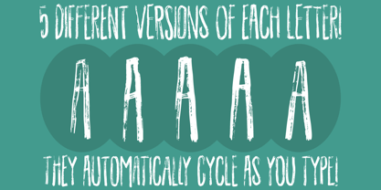 Dry brush gone wild!
 - You're Gone is an evocative typeface designed by the prolific Canadian type designer Ray Larabie, famous for his wide-ranging and impactful contributions to the typography world. This particular font...
- Nouveau Theme JNL by Jeff Levine,
$29.00 As long as there’s been movie theaters, those establishments became the perfect hideaway for couples who wanted to kiss, hug and snuggle without the watchful eyes of disapproving parents or the pesky attention of younger siblings. Such was evident in the [13 word] title of the 1919 composition “Take Your Girlie to the Movies (If You Can’t Make Love at Home)”. On the sheet music for this song, it is hand lettered in the Art Nouveau fashion of the time by a round nib pen, and made a perfect candidate to be redrawn as a digital typeface. The end result is Nouveau Theme JNL, which is available in both regular and oblique versions.
 - Istoria by Hooper Type,
$12.00 New foundry on the block, Hooper Type, kicks off it's catalogue with a versatile, story-telling serif font. With a love of the magical and a yearning for adventure, Istoria pushes away from the static, drawing in whisps and whirls that entice and excite, without distracting. Unassuming in it's long form, with delicate strokes that draw the eye, it commands attention when used in short punchy titles, or set in caps. Istoria (meaing both history and story in Greek) delights in having unusual curves, curvy straights and twisty feet which emulate those adventures and myths from days gone by. Type shouldn't interfere with the content, but it absolutely can enhance it. Hope you enjoy it!
 - Gemstone JNL by Jeff Levine,
$29.00 A late-19th Century song book entitled "Gems of Scotland - A Beautiful Collection of Scottish Songs" had the words "Gems of Scotland" hand lettered in an ornate, condensed type style now reproduced digitally as Gemstone JNL.
 - Saturday Light by Bogstav,
$15.00 This font was made while listening to The Cure, and taking a trip down memory lane. However, the particular song I had in mind naming the font after, was already taken. But perhaps you can figure out which song I had in mind?
 - Hopeful Giraffe by JBFoundry,
$18.00 Long legs, long neck, low x-height, it’s Hopeful giraffe. Each of both styles of this family of font contains two stylistic sets. With its ornamental capitals and its varied numerals, you can modulate the aspect of your texts as you want it.
 - Natural Blues by PizzaDude.dk,
$17.00 Natural Blues is my laid back handwriting font, and it is also the name of a song by Moby. Maybe I was inspired by that song … I can’t tell. But what I can tell is that having the blues is a natural thing!
 - Kato by Autographis,
$39.50 Kato is a handwritten mostly-joining script with long, but not overly long ascenders and descenders, that make it a very elegant font. Scanned and finished carefully by hand on screen, with that little bit of extra effort to keep the "rough" touch.
 - Hebrew Torah Sans by Samtype,
$39.00 Beautiful caligraphic font and can be used with long texts.
 - Alt Sake by ALT,
$20.00 Sake is long handwritten display font and I love it .
 - Square Beat by Hanoded,
$15.00 After a lot of time sitting at my desk, creating fonts and trying to figure out how my new software works, I really like to work out a bit. The only thing that I do not like is the music they play at the gym; it is usually a selection of poppy tunes that appeals to a large audience. But not to me. I prefer my death metal - and eighties music, as it brings back a lot of good memories. So, I bought myself some ear buds and installed a music streaming app on my phone. Yes, I know, I am probably the last person on earth who discovered streaming... One day, during a workout session, I listened to a list of eighties music and one song that I had forgotten about started playing: Rappers Delight by The Sugarhill Gang. When I started working on the font, I had to think about the song and named it Square Beat. Square Beat font, other than the name implies, is a rounded, handmade font, ideally suited for books and magazines aimed at a young audience, toy packaging or posters. It comes with great language support, including Vietnamese.
