10,000 search results
(0.375 seconds)
- Keyden Drop Caps JNL by Jeff Levine,
$29.00 A set of slab serif framed capitals is displayed in the 1906 edition of the Keystone Type Foundry specimen book as “John Alden Initials”. Digitally redrawn as Keyden Drop Caps JNL, regular and reverse versions are available in one font file. Upper case keys contain the regular version, lower case keys have the reverse version. Blanks frames for each are on the parenthesis keys. The font’s name is a hybrid of both ‘Keystone’ and ‘Alden’. These vintage letters can easily be used as drop caps, monogram initials or for short novelty titles or headlines. Choose from either regular or oblique for your next print project.
 - Have A Great Day by Roland Hüse Design,
$10.00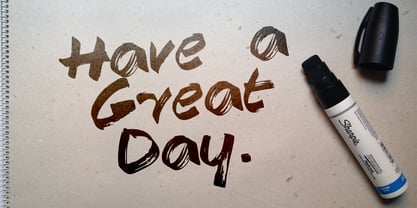
- Beautiful Day Script Duo by Letterfreshstudio,
$12.00 Beautiful Day Script Font DUO is a new modern script font with an irregular base line. Trendy and feminine style. Beautiful Day Script looks beautiful in wedding invitations, thank-you cards, quotes, greeting cards, logos, business cards, and more. Perfect for use in ink or watercolors. Including initial letters and terminals, alternatives and support for many languages. To activate the OpenType Stylistic alternative, you need a program that supports OpenType features such as Adobe Illustrator CS, Adobe Indesign & CorelDraw X6-X7, Microsoft Word 2010 or newer versions. There are additional ways to access alternatives / swash, using Character Map (Windows), Nexus Fonts (Windows), Font Books (Mac) or software programs such as PopChar (for Windows and Mac). How to access all alternative characters: https: //www.youtube.com/watch? v = Go9vacoYmBw https: //www.youtube.com/watch? v = XzwjMkbB-wQ Need help or have questions, let me know. I am happy to help :) Thank you & Congratulations on the Design!
 - M Ling Wai SC by Monotype HK,
$523.99 - American Way Of Life by Intellecta Design,
$19.90
- Mac Key Caps Pi by Linotype,
$29.00 - Celebrate The Day Pro by CheapProFonts,
$10.00 The freeflowing and quite feminine style of this script appealed to me, but it needed a bit of taming. Quite a few of the letterforms have been normalized - to better accommodate the diacritics. :) All fonts from CheapProFonts have very extensive language support: They contain some unusual diacritic letters (some of which are contained in the Latin Extended-B Unicode block) supporting: Cornish, Filipino (Tagalog), Guarani, Luxembourgian, Malagasy, Romanian, Ulithian and Welsh. They also contain all glyphs in the Latin Extended-A Unicode block (which among others cover the Central European and Baltic areas) supporting: Afrikaans, Belarusian (Lacinka), Bosnian, Catalan, Chichewa, Croatian, Czech, Dutch, Esperanto, Greenlandic, Hungarian, Kashubian, Kurdish (Kurmanji), Latvian, Lithuanian, Maltese, Maori, Polish, Saami (Inari), Saami (North), Serbian (latin), Slovak(ian), Slovene, Sorbian (Lower), Sorbian (Upper), Turkish and Turkmen. And they of course contain all the usual "western" glyphs supporting: Albanian, Basque, Breton, Chamorro, Danish, Estonian, Faroese, Finnish, French, Frisian, Galican, German, Icelandic, Indonesian, Irish (Gaelic), Italian, Northern Sotho, Norwegian, Occitan, Portuguese, Rhaeto-Romance, Sami (Lule), Sami (South), Scots (Gaelic), Spanish, Swedish, Tswana, Walloon and Yapese.
 - Patrol Car Stencil JNL by Jeff Levine,
$29.00 Comic books based on popular characters have been around pretty much since the advent of comic books themselves. An edition of the "Car 54 Where Are You?" series published by Dell (and based on the hit TV show created by Nat Hiken) displayed "Car 54" in a bold hand lettered stencil design on the cover. These few characters became the inspiration for Patrol Car Stencil JNL, which is available in both regular and oblique versions.
 - Deco Drop Caps JNL by Jeff Levine,
$29.00 From the pages of the 1939 French lettering book “Modèles de lettres modernes par Georges Léculier” (“Models of Modern Lettering”) comes an attractive and unusual set of initial drop caps made from square letters adorned with multiple vertical lines. Originally designed as white letters on black backgrounds, an additional set with black letters on white backgrounds comprise Deco Drop Caps JNL; available in both regular and oblique versions.
 - Bigplace Caps ExtBd ExtCond - Personal use only

- Janda As Long As You Love Me - Personal use only

- Janda As Long As You Love Me by Kimberly Geswein,
$5.00 This calligraphy script used a Japanese calligraphy brush to create its unique texture.
 - OCR-A AI by Apply Interactive,
$90.00OCR-A AI Text is the version for normal use when the text will be read by humans. OCR-A AI is the version to use for machine reading. - CA Slalom Condensed by Cape Arcona Type Foundry,
$40.00 The starting point for CA Slalom was the aspiration to create a contemporary interpretation of classics like Gill and Antique Olive in terms of aesthetics, flexibility and usefulness. The outstanding S soon became the visual hook and starting from the extra bold extended weight, CA Slalom evolved into a huge family with four widths. It’s rather round instead of squarely with stroke-ends pulled deep and a relatively low x-height. This gives CA Slalom a taste of its own, and although it is clearly contemporary, it has the potential to become a classic.
 - CA No Dr. by Cape Arcona Type Foundry,
$30.00 No Dr. was inspired by an old movieposter lettering for the 1962 movie "James Bond: Dr. No". Just like the original Dr. No, No Dr. has a diabolical charm. It was developed into a font family that combines distinctiveness with versatility. It has a good readibility as a textfont but also looks great as a Headline. The two widths and the two weights give you a big choice. Intended to become an interesting alternative to the much used DIN Schrift, it has now developed into a highly functional family of it's own.
 - CA Magic Hour by Cape Arcona Type Foundry,
$19.00 You remember the time when the Concorde was the fastest passenger plane on earth? When it was possible to travel from Paris to New York in 3 3/4 hours? Those were cool times. Times when cocktails tasted good and you didn’t think of an eventual headache afterwards. Times when you didn’t have to think how to dress because there was only one way. Straight from that time comes CA Magic Hour. A vintage font from a time from which we could learn a lot today. Optimistic and straight forward, it will speed up your designs.
 - CA Saygon Text by Cape Arcona Type Foundry,
$40.00 CA Saygon Text is the logic consequence of CA Saygon. It is much calmer and therefore also suitable for reading texts and everyday’s editorial tasks. Basic shapes and proportions were adopted from Saygon and continued in such a way that a font family from Thin to Extrabold resulted. A fundamental inspiration were early static grotesque typefaces such as Akzidenz Grotesk. Nevertheless, the typeface was by no means intended to have a historical look. Thus, a relatively high x-height was chosen, which makes the typeface quite economical in type-setting, since the letters appear visually larger. A relatively small line spacing with good legibility can be achieved due to the small ascenders and the low cap height. Letters like f and t, which otherwise tend to end in curves, were given right angles, which on the one hand meets certain design elements of the original Saygon, but on the other hand also refers to contemporary trends in typeface design. A special feature are the five styles in which CA Saygon Text can be used. The default setting is the Helvetica style, with two-storey a and g. The Futura style has a single-storey a and a two-storey g accordingly. The third style with two-storey a and three-storey g is called the Franklin style. But the real highlight is the Cape style with single-storey a and three-storey g – a real rarity up to now. Let yourself be inspired by this unusual typeface. If you like it even more progressive, you should try the flat style, which continues the right angles in a, g, and y as well. Thanks to the Cyrillic and Latin Extended character sets, a huge linguistic area is covered that even extends to Vietnam! Even the exotic German capital-double-s is available and appears automatically when typed between other capital letters. Numerous OpenType features make life easier for the professional typographer: there are fractions, superscript and subscript numbers, as well as proportional and tabular capitals.
 - CA Slalom Extended by Cape Arcona Type Foundry,
$40.00 The starting point for CA Slalom was the aspiration to create a contemporary interpretation of classics like Gill and Antique Olive in terms of aesthetics, flexibility and usefulness. The outstanding S soon became the visual hook and starting from the extra bold extended weight, CA Slalom evolved into a huge family with four widths. It’s rather round instead of squarely with stroke-ends pulled deep and a relatively low x-height. This gives CA Slalom a taste of its own, and although it is clearly contemporary, it has the potential to become a classic.
 - CA Rough Rider by Cape Arcona Type Foundry,
$29.00 Rough Rider is a handcrafted bold italic typeface. Intended as a rough display style typeface it’s perfect for illustrative titles, logotypes and small texts. Initially developed for a logo design, Rough Rider was expanded to a full Central European character set.
 - CA El Amor by Cape Arcona Type Foundry,
$19.00 This typeface has the most important ingredient of all: love. So it’s not surprising that the font is called El Amor. It is a reversed oblique all-caps headline font that consists of two styles, “Regular” and “Fill”. Feel free to experiment with them, together or alone. Write something with “Regular”, copy paste it to another layer and switch to “Fill”. Give it a little offset if you like or place it straight on top, both works fine. You can also use the “Fill”. style for body text, but do so at your own risk, spacing and kerning is optimized for the use with the “Regular” style, so be generous if the result looks not as even as text-font. Maybe you’ll discover the charm of a more dynamic spacing that fit perfectly with the vivid and crispy outlines. Unlike other display fonts CA El Amor features a huge character set covering most languages that you can write with a Latin alphabet.
 - CA Normal Serif by Cape Arcona Type Foundry,
$40.00 CA Normal Serif is the perfect companion to its grotesque brother CA Normal. But it is not just a serifed equivalent. It has a character of its own while preserving the principal proportions and the idea of quirkiness. It was not the aim to build a typeface that can immediately be identified as a relative of CA Normal. The intention was to create a matching typeface in aspects of aesthetic and concept. Whereas commonly serif-companions to grotesques are old-style or slab-serif, CA Normal Serif is situated between modern and slab-serif typefaces. CA Normal Serif is a little bit of an uncomfortable typeface. Nothing is smooth and cozy. It picks up elements of classic newspaper type as brought to us by Chauncey H. Griffith's legibility group, sharing the flavor of abrasive details and "slabbish" serifs. But the proportions are more condensed than the ones of its predecessors giving it a bit more elegance, which moves it closer to the aesthetic of "Scotch Romans".
 - CA BND Trash by Cape Arcona Type Foundry,
$39.00 Based upon CA BND (the clean version) CA BND Trash is a rough and dirty version of our favorite DIN-like font. We recommend it for use in zombie movies title design, headlines for ads of a soft-drink manufacturer (who hopes to be cooler, if he uses rough typefaces), or for emocore, hardcore, softcore or "whatever-core" bands. Uhhh, its the time for the living dead.
 - CA Cape Rock by Cape Arcona Type Foundry,
$39.00 CA Cape Rock, first released in 2007 and now reissued and expanded, is an impressive display typeface. Designed with a fat Clarendon and wood type in mind, the typeface’s bold and distinctive forms add spice and personality to any design that requires a strong display aesthetic. CA Cape Rock is particularly enjoyable for use in headlines and ideal for highlighted text. With already two dozen existing ligatures and many OpenType swashes, the new edition also received letters for use in the Central European and South Eastern European area. Cleaned and harmonized paths, a completely new kerning as well as a newly added Italic (Slanted) style are also among the new features.
 - CA Slalom Compressed by Cape Arcona Type Foundry,
$40.00 The starting point for CA Slalom was the aspiration to create a contemporary interpretation of classics like Gill and Antique Olive in terms of aesthetics, flexibility and usefulness. The outstanding S soon became the visual hook and starting from the extra bold extended weight, CA Slalom evolved into a huge family with four widths. It’s rather round instead of squarely with stroke-ends pulled deep and a relatively low x-height. This gives CA Slalom a taste of its own, and although it is clearly contemporary, it has the potential to become a classic.
 - CA Fourty Open by Cape Arcona Type Foundry,
$29.00 CA Fourty Open is another take on the idea of a double-line font. It reminds us of neon-sings, but lifts the 50s aesthetics to a contemporary level. Although it’s an all-caps font, upper and lower cases differ a little bit. The upper cases are more open. CA Forty Open has a full Central European letterset.
 - CA Spy Royal by Cape Arcona Type Foundry,
$19.00 Spy Royal is a junctionless script typeface and comes in 6 styles. It’s a hybrid between script and so called streamline fonts. The origins are based on an advertising by Japan Airlines, dated around 1954, offering flights to San Francisco, Honolulu and Okinawa in the new DC-6B “Pacific Courier” airplane. Only the letters for the words “JAPAN AIR LINES” were used, so that the creative part was to reimagine a full font out of just a handful of uppercase letters. Originally released in 2004, Spy Royal was now undergoing a major rework and is now republished with additional styles like shadow-lines and 3D-shadow. Its charm is manifold, we think everything related to cars, racing, hot rod, vintage, cocktails, retro, restaurants, gasoline and of course airlines will look great in Spy Royal. Spy Royal includes alternate characters, ligatures and West European diacritics.
 - CA Gothique Superfat by Cape Arcona Type Foundry,
$44.00 The name says it all. It is aesthetically located between American Gothics and European Grotesques and features small caps, a Central European character set and four number formats plus small caps numerals. This makes it not only a heartbreaking headline font, but also extremely versatile.
 - CA Mystery Girl by Cape Arcona Type Foundry,
$29.00 Elegance meets accident. A sturdy distressed all caps typeface that gives you the feeling of the happy little incidents that may happen when you print with silkscreen or letterpress. A whole bunch of alternative letters embedded in a pseudo-random OpenType feature does the magic. Get yourself surprised CA Mystery Girl speaks a lot of languages, at least all those covered by the extended Latin character set. Which means you can travel to Iceland, Turkey, France or Poland, this girl will always be your interpreter.
 - CA Cula Superfat by Cape Arcona Type Foundry,
$40.00 CA Cula Superfat is a distinctive fatty typeface, mainly intended for display purposes. You will find out that it looks best in extremely large sizes, or in very small ones. Whatever you do, avoid the ordinary and expectable. It’s not only beautifully fat, it’s also useful. A central European character set, loads of ligatures, oldstyle and lining figures make it a versatile companion in the daily struggle for outstanding typography.
 - CA Weird Stories by Cape Arcona Type Foundry,
$19.00 A font from outer space, CA Weird Stories - the perfect font for science fiction novels or to create a spooky atmosphere. A bit too weird and a bit too slanted for this world. Treat yourself with the ability to stack the two styles on top of each other to create great special FX. You may even consider to use the "fill" style on its own, it might look a bit uneven, as it was actually designed to be used in combination with the "shadow/regular" style, but hey – that's what this font is all about!
 - CA Rusty Nail by Cape Arcona Type Foundry,
$19.00 Rusty Nail is a carefully hand-made uppercase only typeface with a full Central European character set which comes in two styles, Regular & Bold. It was created for a liquor company where hand-made letters were part of the corporate design. It’s perfect for labels or lettering with a "used look".
 - Dawning of a New Day - Personal use only

- Just The Way You Are - Personal use only

- CSAR PARADE DRESS (Display Caps - 100% free

- Alpha Flight Solid Small Caps - Unknown license

- KR St Patricks Day Dings - Unknown license

- KR Careful What You Say! - Unknown license

- Three the Hard way shadowed - Unknown license

- ABTS Day Of The Dead by Albatross,
$19.95 ABTS day of the dead is a highly detailed and meticulously designed symbol font. It’s design is inspired by the Day of the Dead celebration, honoring the deceased. I think The Day of the Dead is one of the greatest reasons anyone should celebrate life, so I decided to make a font honoring that tradition. I'm not even sure If I got all of it right, (traditional symbols and such) but it was a joy to create. There are 2 fonts. The first is the Skulls. This includes uppercase and lowercase A-Z, a-z. There you will find the decorated skulls, blank skulls, and negatives. The second font is the symbols. If you wish to design your own Day of the Dead skull, you should purchase the symbols, as they are designed specifically for adorning the blanks. Purchasing both fonts will give you a discount. Please note, the symbol font will show up in your application of choice as “ABTS Day of the Dead Bold.” This is to avoid software problems with naming the font itself "Symbols." Skulls are awesome!!!
 - M Ling Wai F HK by Monotype HK,
$523.99 M Ling Wai is a humanistic script based on a real handwritten style. It has a feminine, urban and lively character filled with literate finesse. M Ling Wai was written with a thin ball pen by a young woman in a unique, personal, running writing style, such that it is real, natural and feminine. Contrast of strokes is low and the text is visible and eye-catching. Its light to medium stems (豎) make it suitable for small text and subheading with little conglutination. All strokes are highly irregular, inconsistent, irregularly oriented and tightly coupled or connected. Spatial distribution, positioning, size and relative proportion of radicals fully reflect a natural and personal favor. It is one of the first proportional width font in a full scale. It is best suited for casual lively text, illustrations, set upright (non-slanted), non-condensed.


