10,000 search results
(0.042 seconds)
- Something New by wearecolt,
$16.00 Something New has been designed with logo designers and typographers firmly in mind. This feature-packed display font is a perfect addition to your design arsenal, ready for your next logotype, heavy heading or beer label. "A stylish mix of serif and blackletter" Great for; logos, branding materials, business cards, gift cards, t-shirt, print, posters, quotes, etc.
 - Goldenlife by Putracetol,
$22.00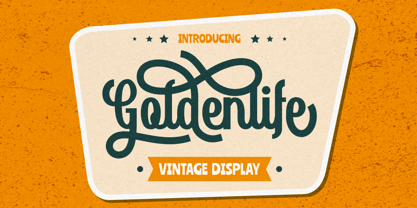 Goldenlife is a vintage display typeface. This font was inspired by classic vintage signs. It come with uppercase, lowercase, various alternates, numbers, punctuation and multi-lingual support. Goldenlife is great for any kind of display purpose from logos, t shirts, apparel, handwritten quotes, product packaging, tittle headers, posters, merchandise, social media, labels, branding and greeting cards.
 - Silver Thunder by Olivetype,
$18.00 Looking for a unique and badass font to add some edge to your designs? Look no further than Silver Thunder. This graffiti-inspired font is a good option for apparel, posters, headlines, magazines, and more. With its cool black metal aesthetic, Silver Thunder will give your work a truly one-of-a-kind look. Thank You!
 - Mood Boosters by Bluestudio,
$10.00 Mood Boosters Handwritten Font Duo is a perfectly font duo for all your design project needs. Create your perfect design with Mood Boosters Handwritten Font Duo. Try this font for all kinds of your business projects like: logo design, business card, mood board, greeting card, magazine ,headline, social media design, watermark and more, and it will all look perfect.
 - Adoreles by Nathatype,
$29.00 Adoreles is a distinctive sans-serif display font that stands out with its elegance and unconventional charm. Crafted with a delicate touch, this font creates a visual experience that is both refined and uniquely artistic. With Adoreles, you have a sans-serif display font that redefines the expected. The characters in Adoreles are presented in uppercase, each possessing a subtle sophistication. By eschewing boldness, the font embraces a refined simplicity. The true magic of Adoreles lies in its inlines—irregular, yet meticulously designed to add a touch of unpredictability and individuality to each letter. Enjoy the features here. Features: Multilingual Supports PUA Encoded Numerals and Punctuations Adoreles fits in headlines, logos, posters, flyers, branding materials, greeting cards, print media, editorial layouts, and many more designs. Find out more ways to use this font by taking a look at the font preview. Thanks for purchasing our fonts. Hopefully, you have a great time using our font. Feel free to contact us anytime for further information or when you have trouble with the font. Thanks a lot and happy designing.
 - Daily Smiles by Nathatype,
$29.00 Are you looking for a font that speaks beauty? Do you dream of creating headings that stand out and inspire creativity, imagination, and endless fun? Wait no more, we will give you the best choice. Daily Smiles-A Signature Font Inspired by the recent print design trend, the look of the script typeface is elegant and beautiful. Everything’s well with cursive! Show your opulence and decadence with this fancy font and blow your audience’s mind away as you put these cursive letters in your projects. Every detail of this beautiful font making it easy to present your brand or project in the best light. Go ahead and use it on your website, your social media branding, Pinterest banners, printed invitations, and more! Features: Ligatures Stylistic Sets PUA Encoded Numerals and Punctuation Thank you for downloading premium fonts from Nathatype
 - Arboretum by Joe Hewitt Design,
$12.00 Inspired by a number of Green and forward thinking ventures, Arboretum is designed to be an Eco-friendly typeface. Perfect for use with recycled products, environmental advertising and anything nature themed. However, its clean and modern appearance works beautifully for a large range of projects. The typeface contains lower and uppercases, the latter having two complete sets of alternatives, each with differing levels of flourish! You will also find a selection of leafy glyphs to help personalise and decorate your Arboretum lettering. The glyph set includes all languages covered in Basic Latin, Latin-1 Supplement and Latin Extended-A scripts.
 - Rapsodia by Andinistas,
$59.00 @andinistas presents Rapsodia, an uncommon roman caps font with serif and high contrast, designed by #carlosfabiancg. Rapsodia was inspired by Stunt Roman, Speedball Textbook for Pen & Brush Lettering by Ross F. George. Rapsodia has a high and sweetened amount of contrast between thin and thick with drop-shaped finishes, reminiscent of Didot, Baskerville and Bodoni. Its artistic accent translates into Tuscan letters drawn with a flexible tip pen. In that order, Rapsodia combines the visual theatricality of an art nouveau corset, with creative historical classics such as Liza Minnelli, Gene Simmons and Freddie Mercury. Its calligraphic curlers full of Mannerist virtuosity are unnatural in Roman caps typefaces with serif. That is why its internal vein in ascending and descending flourishes protrudes with Chicano circus details like triangular diamonds located in vertical strokes. Rapsodia serves to design words and phrases in fine publications, for this reason most of its upper and lower case letters communicate feelings with classic and luxurious sensation through substitutes, ligatures and alternatives for beginning, middle or end of word, functioning as initials and terminals.
 - Hush Hush by Comicraft,
$49.00 If you thought you heard someone callin' your name just now, you might have caught the firm but soft spoken tones of Comicraft's classy balloon lettering font, HushHush. Created in the style of the newspaper strips of the 30s and 40s, HushHush captures the slick movements of the skilled hand letterers of that era. Gracing the pages of Jeph Loeb and Jim Lee's chart-topping BATMAN storyline -- which by a staggering coincidence was also called "Hush" -- these characters have brought to life the words of Two Face, The Joker, Scarecrow, Catwoman, Batman and Robin -- from every whisper to every scream.
 - Smack by ITC,
$29.99Smack, from American designer Jill Bell, is oriented toward a young generation who does not want to mind the rules. The font invites unconventional and playful use. The figures seem to be almost coincidentally shaped. Letters alternate between thin and thick strokes alternate and are accompanied by fine dots which almost look like accidental drops of ink on the paper. Smack is an illustrative font with unmistakable handwriting character and is perfect for cartoons, comics and anything else which is not supposed to take life too seriously. - DM PopCap by DM Founts,
$20.00 DM PopCap is the third typeface released by DM Founts. It was created to accompany a 2013 LEGO-based project, which itself was inspired by the music video for Scream by Michael and Janet Jackson. I had to create the typeface in order to make title cards, as no such typeface appeared to exist. Although the resulting typeface looks similar to the text appearing in the music video, I also set myself the challenge of creating the remaining characters of the alphabet, as well as others that some would find useful. As suggested by the music video, the typeface would be ideal for a futuristic or technological setting, particularly concerning space travel. In the project I had paired this typeface with Myriad Pro. As with my other offerings, this font is intended for use heading or standalone title use - but it also appears to work on its own for small paragraphs of text.
 - Simply Harmony by Pen Culture,
$14.00 Proudly present "Simply Harmony -Vintage Monoline Font" Simply Harmony comes with 2 styles that have their own characteristics. Simply Harmony Regular : has a clean and elegant style. This font has a more modern feel, so you can apply it to modern-themed projects. Simply Harmony stamp: this font has a rough style both in the middle and the edges of each letter, this font has a vintage feel and can be applied to various needs. This font has 114 awesome alternates and has 311 total glyphs, there are various kinds of alternates that you can use as you wish. I really hope you enjoy it – please do let me know what you think, comments & likes are always hugely welcomed and appreciated. More importantly, please don’t hesitate to drop me a message if you have any issues or queries. Thank you
 - Neustade by Twenty-Six Types,
$3.00 Neustade is a layered typeface based on a simple grid, taking inspiration from the work of Wim Crouwel and Foundry Types. I challenged myself to create a typeface where words and letters can appear within or outside of other words and letters with the help of layering. Neustades grid also applies to the spacing and kerning of individual letters or words, ensuring that every layer will line up and allowing different weights to interact with each other. Individually each weight within the Neustade family has been designed with legibility at small sizes in mind, allowing for smooth and uninterrupted reading. Neustade in large sizes feels both modern and retro, especially when mixing weights and colors.
 - Rudal by Twinletter,
$15.00 Rudal is a unique graffiti font that we present to those of you who enjoy the unusual shape of graffiti. By utilizing this typeface, all of your projects will be beautiful and natural, awe-inspiring to everyone who sees them. This graffiti font is great for product logos, poster titles, headlines, packaging, film titles, logotypes, gorgeous writing, and trendy graffiti designs, among other things. Of course, if you utilize this font in your numerous creative projects, they will be perfect and outstanding. Use this typeface right away for your one-of-a-kind and remarkable projects.
 - Cosmic Pattern by Okaycat,
$29.95 Cosmic Pattern is clean, cool & charming. Designed with constellation in mind with bright and dim stars connected together in alphabetical pattern. Cosmic Pattern features extended characters, and contains West European diacritics & ligatures. Highly suitable for international environments & publications. For more universe inspired fonts please check our Star Cursive and Arco Star.
 - Blond by Tour De Force,
$25.00 Blond is modern sans serif family with 22 members - 11 weights from Thin to Heavy with matching Italics. Distinctive, recognizable and uniform, Blonde family is well balanced typeface that will find appliance in any situation - from editorial design to web design. Contains extended Latin character map and small Stylistic set.
 - Sefund Ragat by Product Type,
$13.00 Introducing Sefund Ragat Bold Serif Font – a font that exudes strength and boldness with its thick and powerful serif design. Perfect for making a statement and standing out from the crowd, this font is sure to make an impact on any project. With its versatility and multilingual support, Sefund Ragat is suitable for various applications such as branding, headlines, packaging, and more. The font comes in various weights to provide more options and flexibility to match the desired tone and mood of the design. Incorporating Sefund Ragat into your design will elevate it to the next level, conveying a sense of authority and confidence to your audience. Don’t settle for ordinary, choose Sefund Ragat Bold Serif Font for your next project and make a bold statement. What’s Included : - File font - All glyphs Iso Latin 1 - We highly recommend using a program that supports OpenType features and Glyphs panels like many Adobe apps and Corel Draw, so you can see and access all Glyph variations. - PUA Encoded Characters – Fully accessible without additional design software. - Fonts include Multilingual support
 - Samy by Soda,
$20.00 Samy is pure warm in a rational world. Yet its features cover uses of any kind. From very thin to chubby weights, this typeface offers a wide range of styles. This work is composed of two subfamilies: Samy, which gives a more conventional font looking, and the Alt version, conveying more fun and joy.
 - Slate by Monotype,
$34.99 A typeface of grace, power and exceptional versatility, the Slate collection is a truly beautiful design that achieves stellar levels of readability, both in print and on screen. Created by the award winning type designer Rod McDonald, this six-weight sans serif family is a rare example of sublime aesthetics meeting world-class functionality. The typeface’s legible letterforms embody an amalgam of the best traits of both humanistic and grotesque letterforms. “I didn’t want a face with an ‘engineered’ look, or with any noticeable design gimmicks or devices,” admits designer McDonald. “I wanted a pure design. I confess that I was ruthless with any character that wanted to stand out from the rest.” The Slate collection is available in six weights with complementary italics, with slight changes in structure from the light to the black weights. Its light weight is reminiscent of early American sans. Whether for use in display work or in longer-form settings, few typefaces possess the beauty and power of this design, leaving the Slate family an excellent addition to any designer’s typographic quiver.
 - VVDS Organum by Vintage Voyage Design Supply,
$10.00 Elegant and easy to use serif font family with contrast in vertical and horizontal strokes. Its variety of weights provides a range of choices that will help you to find the best typographic look. Use all caps to get the classic serif look, like Didones, or use it normally for a playful serif look. Normal and Medium widths are good for text blocks and Thin and Light, or Bold and Black are perfect for Headliners. Every letter in a word looks like as if written specially next to each other, as in hand lettering. You can use it in gentle and minimal projects, and also in projects with bold and heavy typographic base. Also, for more individuality, Organum comes with discretionary ligatures and few stylistic alternates for every caps and some lowercase letters.
 - KG Primary Penmanship by Kimberly Geswein,
$5.00 I come from a family of educators- my mom, husband, stepmom, brother-in-law, and sister are all currently teaching and I have taught in the past. This font was created after speaking to several elementary school teachers who were struggling to find just the right font to use on worksheets and projects in their classroom. They liked many features of other fonts, but needed small things altered in order to make a "perfect fit" for their class. Hand-drawn by me, this font hopefully addresses several of those issues. As penmanship styles vary across the globe, I am sure this font will not work in every classroom. But hopefully this style will work for many teachers to give their early readers a highly legible, neat, accurate font. It is best used with kerning turned on to allow for accurate letter spacing.
 - Classification JNL by Jeff Levine,
$29.00 Sometimes it's easy to find a name to fit a font design, other times it's a struggle because of the sheer number of digital fonts available and the number of names already taken. Classification JNL stretches a point to arrive at its name. The attractive sans design was found as a hand-lettered title on a piece of vintage sheet music called "My Hawaiian Souvenirs". During the 1940s, the popular mode of travel to other countries was by steamship. Steamship passengers were assigned their accommodations by the type of passage they booked (such as First Class and Tourist), thus they were in various levels of classification. This aside, Classification JNL is a nice alternative to "standard" condensed fonts for design projects.
 - Canden by Struggle Studio,
$17.00 Canden – Display Handwritten Font serif look with simple, clean, visual elegance with subtle curves and beautiful bindings, An incredibly versatile font that works both large and small. This font is suitable for a wide variety of projects such as: headlines, logos, labels, branding projects, magazines, home appliance designs, product packaging, mugs, quotes, posters and many more. It can also be more expressive and playful, thanks to the many alternatives and binders that blend harmoniously in this font and make it more attractive and versatile. Try to change alternatives, fasteners and you will get a lot of options for your project that will make it Vintage & Unique.
 - Bejita by Twinletter,
$15.00 Do you require a distinctive and eye-catching font for your company’s logo, social media posts, or other purposes? You’ll love the Bejita San Serif font family. It has been designed to assist and make it simple for you to create stunning graphic design projects of any kind: logos, posters, signs, packaging, font art, and so on, with 18 different styles to choose from. of course, your various design projects will be perfect and extraordinary if you use this font because this font is equipped with a font family, both for titles and subtitles and sentence text, start using our fonts for your extraordinary projects.
 - Kewl Script by Sudtipos,
$59.00 Kewl is the result of being caught in the afterimage of one design project while conceptualizing another one. Just before finishing the final tests on Mrs Blackfort, the first of what became a long series of Charles Bluemlein fonts, some of the letters began morphing differently in my mind. The idea was to go on the heavier and more playful side, but with a South American sign letterer’s twist, rather than just good handwriting. I did some sketching, took some notes, then got busy with other projects. Some of that stuff eventually seeped into Candy Script and, to a lesser extent, the Whomp font. But it was only a matter of time before I got back to the original concept and finished it. Kewl is ideal for food packaging, book and music covers, magazines, and window splashes. Illustrations by Catriel Martinez.
 - Dimitrina by Evolutionfonts,
$- Dimitrina was created with a simple premise: Can there exist a typeface which features a minimum of sharp angles? And a readable typeface, as well? With these strict rules in mind, the development started. At first the typeface looked more like a script, and some characters ( M G or R, to name a few) still hold traces of a handwritten style which spices the overall taste of Dimitrina. Since the first draft every character was redrawn, and edited several times, for the purpose of making the typeface readable, and distinct at the same time. Estimate for yourself if our goals are achieved, while you observe the three weights which are available exclusively in MyFonts. All of them feature a full set of characters plus cyrillic support. You can also try the regular weight which is offered free.
 - Ms Kitty NB by No Bodoni,
$35.00Some scribbles on a bar napkin, a note from a cute girl passed in history class, what is there to say but why not a typeface? Actually it's that late night, �let's get this typeface done� madness that causes these flights of fancy. Anything to relieve the boredom of doing all those kerning pairs. Or maybe it's sunspots? Ms Kitty is all uppercase letterforms so there are two versions of each letter, one in the cap position, another in the lowercase position. Besides the regular weight and bold, there�s a bolder and much bolder in the works. And perhaps there will be a "too bold to be believed" version. Depends on the sunspots. - FS Hackney by Fontsmith,
$80.00 Elliptical The squareness of curves. That was the elliptical – in more than one sense – notion being explored in the making of FS Hackney. The squareness of curves and vertical terminals to create a gentle, soft sans serif, with a little bit of magic. A momentary thought – “It doesn’t have to be like this” – provided the spur to explore the verticals and skeletons of letterforms beyond conventional type design limits. A 12-month gestation period gave rise to a font with a larger-than-usual character set, including non-lining figures, small caps and superior and inferior numbers. It’s a collection that speaks confidently for itself. Assertive It was the Hackney carriage – the black London cab – that gave this font its name, not the north London neighbourhood. Solid, dependable, effective and built to last, FS Hackney was honed to perform in all conditions. Cool, compelling lines and a satisfying overall simplicity lend FS Hackney its assertive air. Assured, versatile and effective; just like a black cab (but without the grumbling). Machined Over a string of meetings, Jason Smith and FS Hackney designer Nick Job worked out how to infuse Nick’s sketched letterforms with Fontsmith’s familiar geniality. “Nick is very meticulous and produces very clean design work,” says Jason. “Hackney is ideal for branding as it’s very clear and its quirks are sensible ones, not odd ones, that don’t distract from the message.”
 - Bargain Hunter by Hanoded,
$15.00 I am somewhat of a bargain hunter. Not at all cost, mind you, but I like a discount! Having said that, I guess I am not a true bargain hunter, because I only buy stuff I need; not because it is a bargain. I also refuse to buy fake items or products that are unsustainably produced. Bargain Hunter is a font I made with a cheap pencil (a bargain!) and my trusted Chinese Ink (environment friendly). It comes with a set of alternates and all the accents you need. And at this price, it is a genuine bargain!
 - Ardiland by Dora Typefoundry,
$17.00 Introducing, Ardiland - a stylish serif with beautiful binders and substitutes! Ardiland is a modern serif font to apply to many graphic or editorial design projects. A classy, unique high contrast, and light binding style for your upcoming projects. for feminine logo signs, fashion & editorial design heads, branding projects, Apparel Branding, packaging, magazine titles, advertisements, T-shirts, postcards and other special occasions. Here's what's included: Alternatives & Ligatures Numbers & punctuation Character with accent Support Multiple Languages PUA encoded This type of family has become the work of true love, making it as easy and fun as possible. I really hope you enjoy it! Thank you
 - Claudio by Motokiwo,
$17.00 Smooth but crazy wilder, say hello to Claudio! The coolest display font with more than 40 stylish ligatures. As an all caps sans serif, Claudio has different vertical size between uppercase and lowercase. You can mix them to create something wild and eye- catching typography on your work. Claudio is flexible font that can be used for classic retro or vintage project and also great for another modern projects with fresh and colorful design. It's give you all control to use Claudio in any style you need. Features: Uppercase (a taller version) Lowercase Numeral and Punctuations 44 Ligatures Multilingual Supports (AÀÁÂÃÄÅÇEÈÉÊËIÌÍÎÏNÑOØÒÓÔÕÖŠUÙÜÚÛÝŸŽÆŒß) PUA Encoded
 - Conga Brava by Adobe,
$29.00Conga Brava is the work of type designer Michael Harvey, a combination of the high-minded, purist letterforms of revivalist, modern calligraphers with the mundane, even crude, lettering of warehouse stenciling. The resulting lyrical yet utilitarian forms have a visually exciting graphic effect, which Harvey has frequently used in his book jacket designs. Like his other typefaces, Ellington, Strayhorn, and Mezz, Harvey named his design after a jazz classic, Conga Brava", by Duke Ellington and his trombonist Juan Tizol. The rolling rhythm, polished swing, and stacatto brass treatment of the tune suits the look of this sassy roman design and even more so, its stencil mate. When you need a typeface that radiates sound and motion, think Conga Brava." - Toiban by Sealoung,
$20.00 Toiban is a classy modern sans serif font. Each Toiban glyph has been modernly drawn and designed for this expansive new edition, which maintains the Swiss mantra of clarity, simplicity and neutrality for the demands of contemporary design and branding. The larger View version is drawn to show off Toiban's subtlety and is spaced with the headline in mind, while the Text size focuses on readability, using strong strokes and comfortable loose spaces. The Toiban struggles to be legible at a small size because of its compactness and closed aperture. The Toiban Micro's design is simplified and exaggerated to maintain impression in small, loosely spaced type, providing excellent legibility at microscopic sizes and in low-resolution environments.
 - Ni Serif by DSType,
$40.00 Ni is a kind of typographic love letter, revealed in three distinct, yet close, type formulas. Ni Serif is a contemporary serif typeface with slight diagonal modulation, amazingly legible, and with a very steady rhythm that allows a wonderful performance, especially in long passages of text. Ni Sans closely match the design characteristics and proportions of the serif counterpart. Ni Sans undeniably shows the strong calligraphic influence that comes from Ni Serif, resulting in a very comfortable humanistic typeface, suited both for print and digital environments. Ni Slab is not a simple Sans with serifs attached. Despite the thick and strong serifs, Ni Slab is a gentle mixture of the DNA of the Serif and Sans counterpart and does not intend to reflect any mechanic approach.
 - Ni Slab by DSType,
$40.00 Ni is a kind of typographic love letter, revealed in three distinct, yet close, type formulas. Ni Serif is a contemporary serif typeface with slight diagonal modulation, amazingly legible, and with a very steady rhythm that allows a wonderful performance, especially in long passages of text. Ni Sans closely match the design characteristics and proportions of the serif counterpart. Ni Sans undeniably shows the strong calligraphic influence that comes from Ni Serif, resulting in a very comfortable humanistic typeface, suited both for print and digital environments. Ni Slab is not a simple Sans with serifs attached. Despite the thick and strong serifs, Ni Slab is a gentle mixture of the DNA of the Serif and Sans counterpart and does not intend to reflect any mechanic approach.
 - Ni Sans by DSType,
$40.00 Ni is a kind of typographic love letter, revealed in three distinct, yet close, type formulas. Ni Serif is a contemporary serif typeface with slight diagonal modulation, amazingly legible, and with a very steady rhythm that allows a wonderful performance, especially in long passages of text. Ni Sans closely match the design characteristics and proportions of the serif counterpart. Ni Sans undeniably shows the strong calligraphic influence that comes from Ni Serif, resulting in a very comfortable humanistic typeface, suited both for print and digital environments. Ni Slab is not a simple Sans with serifs attached. Despite the thick and strong serifs, Ni Slab is a gentle mixture of the DNA of the Serif and Sans counterpart and does not intend to reflect any mechanic approach.
 - Honey Vineyard by PeachCreme,
$23.00 Hey guys! Meet our new font "Honey Vineyard"! It's time to pick up on the wedding trend of script-style fonts, and Honey Vineyard's sophisticated and stylish design is perfect for announcing your elegant wedding. A unique wedding font featuring flourishes of creativity and a graceful design won't leave anyone indifferent. This font includes stunning swashes and ligatures that will make your design even more attractive! Some commonly used letters have multiple swashes, while some rarely used letters have none at all. We also would like to note that when creating this font, a purely calligraphic approach was used. This means that all the letters are not the same: some letters are much thicker and some are thinner, as is the case in real calligraphy! The font also includes the Cyrillic version.
 - Dream Big by Positype,
$15.00 Ever sit up late at night and dream in letters—big, expressive, swash letters. Dream Big carries those grandiose thoughts and captures them as natural brush lettering on paper. Nothing manufactured here… each letter is derived from Summerour’s own hand and translated to this typeface—lofty, expressive, and joyful. Each typeface comes with an additional set of stylistic alternates (upper AND lowercase) that harmonize wonderfully when you have the Opentype Ligature feature active. Additionally, special double-letter ligatures have been produced for specific combinations in need of more expressive flair, as well as a few swashes that work with the economical strokes originally produced from the sumi brush. Rather than limit the personality of this script, various styles have been produced to complement the original Regular—a Wide and Narrow cut are included in hopes of helping you find the perfect variation needed for your composition. Dream Big is the fourth release of the Positype Relaxed Script Collection of typefaces—all focused on fluid, effortless script fonts for simple use.
 - Finest Romance by Din Studio,
$25.00 Be a trendsetter and get prominent with the best style from the Finest Romance. Finest Romance is a duo font from mixtures of serif and script fonts. This harmonic duo font work hand in hand to produce marvelous designs because it expresses modernity, elegance and a little romance. Additionally, the geometric serif font’s letters are simple and consistent for a great legibility purpose. On the other hand, the script font’s letters are designed to be similar to a handwriting by adding more variations to the letters with curves and final swinging wipes. You can use this font together or separately based on your necessity. With this font’s amazing features, you can enhance your design products. Features: Stylistic Sets Ligatures Multilingual Supports PUA Encoded Numerals and Punctuations Finest Romance fits for various design projects, such as posters, banners, logos, magazine covers, quotes, name cards, invitations, headings, printed products, merchandise, social media, etc. Find out more ways to use this font by taking a look at the font preview. Hopefully, you have a great experience using our font. Feel free to contact us if you require more information when you are dealing with a problem. Thank you. Happy designing.
 - Diesel Rudolf by Ingo,
$82.00 Write like the inventor of the diesel engine — it’s possible with the Diesel Rudolf Script (patterned after the original handwriting of Rudolf Diesel)... In 2008 the city of Augsburg and the MAN Group celebrated the 150th birthday of Rudolf Diesel, inventor of the diesel engine which was named after him. With the help of a few preserved original letters, it was possible to create a convincing digital version of Rudolf Diesel’s personal handwriting. The engineer and inventor Rudolf Diesel was born in Paris in 1858 and also went to school there. In1870 his family moved to England and Rudolf was sent to relatives in Augsburg where he continued going to school. Later, after completing his studies in Munich, he began working as an engineer in the machine factory Linde. Alone this part of his life makes clear why Rudolf Diesel’s handwriting was so ”jerky,“ hesitant and inconsistent. He learned to write according to the French style, that is, Latin cursive — completely different from the very correct and neat German handwriting taught at that time which he had to learn at 13 years of age. These circumstances explain why his handwriting is ”messy“ (especially for those days) with its mixtures of letter forms within a text, even within individual words. Plus, he obviously did not attach much importance to ”pretty writing.“ Sometimes the characters are wide, then narrow, sometimes large and clear and then again crammed and primitive. The individuality is emphasized with characteristics derived from quill and ink. The diversified images of the font Diesel Rudolf Script make more than 80 ligatures and stylistic alternates possible which can be selected with help from the OpenType functions Ligatures and Discretional Ligatures.