10,000 search results
(0.041 seconds)
- Samplex by Tipo Pèpel,
$22.00 Neutral and universal are two words that could describe a kind of perfection. The search for neutrality and universality is part of history in type design; it was specially important in the so-called Swiss Style. Samplex is a typeface that joins this particular search. The design gets rid of unnecessary elements and stays away from style conflicts. The large and slightly condensed body of lowercase letters makes Samplex a good choice for long paragraphs, and especially appropriate for screen devices. Letters with a blocky appearance give shape to a text in perfect order, ideal for grid lovers and layouts with a strict structure. The design of Samplex is clean and efficient. The diagonal cuts are reserved to the italic letterforms, setting some distance between the solid upright characters and the dynamic oblique forms.
 - Delaware Pro AOE by Astigmatic,
$24.95 Constructivist flavor typography goes pro enters the digital era with Delaware Pro AOE. Delaware Pro AOE is the revival and elaboration of a limited lettering specimen from a series of old loose book pages. What began as just Capitals & Lowercase was expanded to a rich pro glyphset including numerals, punctuation, small caps, small caps scaled figures, unlimited fractionals, superiors & inferiors, ordinals, tabular & proportional figures, and an expanded language glyph set. From titling to nightclub posters, fashion spreads to stencil play, the Constructivist Era is built up and out, waiting for you to put it to use.
 - Portada by TypeTogether,
$35.00 For everyone wishing for a modern serif that’s as clear and readable as a sans in restrictive digital environments, meet Portada by Veronika Burian and José Scaglione. Sans serifs are commonly used on small screens to save space and carry a modern tone. Serifs may appear fickle and unsteady, pixel grids change from one product to another, and space is at a premium. Portada now provides a serif option for these restrictive digital environments, putting that old trope to rest. The screen has met its serif match. Portada was created from and for the digital world — from e-ink or harsh grids to Retina capability — making it one of the few serifs of its kind. Portada’s text and titling styles were engineered for superlative performance, making great use of sturdy serifs, wide proportions, ample x-height, clear interior negative space, and its subservient personality. After all, words always take priority in text. It’s not all business, though. Portada’s italics contain an artefact of calligraphy in which the directionality of the instrokes and the returning curves of the outstrokes give the family a little unexpected brio. Yet even the terminals are stopped short of flourished self-absorption to retain their digital clarity. When printed these details are downright comforting. Portada’s titling styles enact slight changes while reducing the individual width of each character and keeping the internal space clear. Titling italics have increased expressiveness across a few characters rather than maxing out the personality in each individual glyph. Digital magazines, newspapers, your favourite novel, and all forms of continuous screen reading benefit from Portada’s features. This family can also cover many of the needs developers have: user interface, showing data intensive apps on screen, even one-word directives and dialogs. And, as a free download, an exhaustive set of dark and light icons is included to maintain Portada’s consistent presence, whether as a word or an image. The complete Portada family (eight text styles, ten titling styles, and one icon set) is designed for extensive, clear screen use — a rare serif on equal footing with a sans.
 - Aviano Contrast by insigne,
$22.00 The Aviano series returns, refined and sophisticated with an extended, high-contrast sans-serif family. Aviano Contrast is a contemporary typeface radiating with luxury. It's classic elegance makes it perfect for high-end applications such as cosmetic, jewelry or fashion brands. Aviano Contrast's extended forms give the face a smart look, and the curves are carefully honed to be sinuous and seductive. This high-contrast face is in a class of its own, composed in the style of a classic Didone but lacking the typical serifs. Aviano Contrast comes in six different weights and is packed with OpenType features. Need swash forms? Ball terminals? Art Deco alternates inspired by the inscriptions and signage of the '20s and '30s? Aviano Contrast includes 230 alternate characters. Twelve style sets are available, including four complete sets of art deco-inspired alternates, small forms, swash, titling and a wide array of other alternates to make your designs unique. As a complement to these characters, Aviano Contrast also includes 40 discretionary ligatures for artistic typographic compositions. Please see the informative .pdf brochure to see these features in action. OpenType capable applications such as Quark or the Adobe Creative suite can take full advantage of the automatically replacing ligatures and alternates. This family also includes the glyphs to support a wide range of languages. The rest of the Aviano series pairs very well with this face. These include Aviano, Aviano Serif, Aviano Sans, Aviano Didone, Aviano Flare, Aviano Future and Aviano Slab.
 - Celesse by SG Type,
$16.00 Celesse - A classic serif font, perfect for creating bold & gorgeous designs. Pour yourself a glass of your finest wine and get classy with Celesse. This font is great for designing elegant logos, quotes, magazine covers, wedding cards, invitations, and brandings. Its stark contrasting lines are best used in headlines and projects with big type. Celesse adds timeless beauty, heavenly curves and a classic appearance to any project.
 - Tachyon by Galaxa,
$10.00 Tachyon font family combines design simplicity of modern sans serifs with a futuristic feel based on a condensed character concept. Its clean lines can bring unusual spark to logo designs, headlines, magazine designs, quotes, documentaries, advertisements or similar projects. This font will find its use also in larger text blocks where simplicity, clean lines and well applied kerning are a must. Create something spectacular with Tachyon.
 - Radical Brush by Hanoded,
$15.00 Radical Brush is a rather radical font: I made it with a really wild brush and Chinese Ink. I’d probably use it for revolutionary posters, packaging design for extreme products or for R-rated movie posters.
 - Brounde by Ahmet Altun,
$17.00 Brounde font comes in four weights from extra light to medium. Legible texts can be created with its rounded slab serif configuration. Also it can be used in posters and every kind of graphic design works.
 - Ful • Fruitful & Universal Labels by S P I C I O,
$88.88 What is ful? ful is a useful and universal language of symbols for food products. Why use ful? ful is a simple visual system. With ful, you’ll never have to read the entire label to know the basic information. With ful, you have access to the basic information much faster. Answering the questions: • What kind of diet is it? [Diet] • How to store, prepare, and use? [Use] • Can I eat it? [Warnings] Why create ful? • To have the basic information quickly, anywhere in the world. • To create a more homogeneous design. • To solve some of the basic problems with the old designs. • To accelerate the process of consumer choice. • To provide as much information as possible in the least possible space. http://ful.graphics/
 - Fruitella by Zamjump,
$17.00 Fruitella is a geometric sans serif look. Designed with powerful opentype features in mind. equipped with ligature standards that are different from ligatures in general. Perfect for graphic design and any display use. It can easily work for web, signage, corporate, and also for editorial design.
 - Amrys by Monotype,
$65.00 There's an appealing quirkiness about Amrys, which offers a confidently unusual alternative to more conventional designs. Its charm lies in its tapering tips, flexing stems, and unexpected notches, which combine to suggest something of the chiseller's tool at work. As a modulated serif, its letter shapes live between serif and sans serif, lending the design a sense of pleasing irregularity – something that's really highlighted at larger sizes. However this is also a typeface that works for text, injecting rhythm and texture into reading. “It's distinctive, idiosyncratic, and weird,” says its designer, Ben Jones. He started designing Amrys while studying an MA at Reading University, creating it in response to a brief for a magazine typeface. Amrys features an extensive and impressive character set. In addition to Latin, Amrys covers several scripts including Cyrillic, Greek, Arabic and Armenian. The family consists of 8 weights, from Light to Black, with matching italics.
 - Ratilla Script by Krafted,
$10.00 Be yourself; everyone else is already taken -- Oscar Wilde Being a human being often means fulfilling who you really are. It’s about fulfilling your potential and living to the best of your abilities. And the Ratilla Script will help you show the world who you are! The Ratilla Script paves the way for you to write the information you need to send out to your audience. Make your projects to works of art, conveying your intentions clearly with the font! Maximize your designs with this urban and wavy font. It surely fits anywhere you want them to, giving them a place perfectly tucked in between your designs. Connect with your audience and stand out in the crowd as these fonts will show you that you and your works deserve their attention. Show your boldness as you make the world see of the elegant details put together in your projects! The Ratilla Script will be the perfect addition to aid you in your journey to be who you really are. Let the world see your beauty, bring it out through your handiwork and give your viewers a new perspective!
 - Vasetters by Ingrimayne Type,
$9.00 In Vasetters the letters are cut from the shape of a tessellating vase. To get the tessellating effect, the two sets of letters (and numbers and some symbols) must alternate, and this is done automatically in applications that support the OpenType feature of Contextual Alternatives (calt). Vasetters is monospaced and comes in two weights. The regular weight is tightly spaced, which should not be a problem at large point sizes. At small point sizes adjacent letters can be colored differently or the character spacing can be increased. The lighter weight can be used alone or layered above the regular weight to create the effect of hollow lettering. Vasetters is is fun, bizarre, weird, and obviously a decorative display font.
 - Paul Grotesk Stencil by artill,
$29.00 Paul Grotesk Stencil is a new Version of the modern, clean, minimalist grotesque typeface Paul Grotesk, with delicious detail. Created and published in collaboration by Fargus Meiser and Lukas Bischoff. It comes in 8 stylish weights and 3 are free to try. Designed with powerful opentype features in mind. Each weight includes extended language support, fractions, arrows, special numbers and more. It fits perfect for graphic design, editorial, corporate and any display use. Also check the webfont to create a nice responsive interface design!
 - Boys on mopeds by PizzaDude.dk,
$20.00 Sometimes you just want to have fun, and "Boys on mopeds" will take you there! Boys on mopeds are a simple-minded serif font with a fun and loose twist. I've added several versions of each lowercase letter: you have 4 different versions to choose from. Enough to make your invitations, diary, posters, postcards, novels, stickers ... ahhh ... the list is long - and the use of Boys on mopeds is almost endless! Comes with a bunch of international letters, so fun is available in many languages! :)
 - Fonia by Locomotype,
$15.00 Fonia is a calligraphic art deco font with feminine touch, unique and exotic. It is designed to be more simple, so it keeps the legibility in different font sizes. You will get a semi-classical typography that does not eliminate the modern concept. Opentype features allow you to mix and match to create a rich and beautiful design. With Fonia, you can create an attractive packaging design, wedding invitations, wine labels or great packaging of beauty products. That will be a really cool design.
 - BASEHEAD - Unknown license

- Buddy Smile by Create Big Supply,
$15.00 Introducing Buddy Smile, a unique handwritten font that adds a splash of color, cheerfulness, and playfulness to your designs. With its charming and lively style, this font is perfect for enhancing your brand identity, book covers, children's events, quotes, and more. Buddy Smile brings a touch of personality to your projects with its combination of uppercase and lowercase letters. The fluid and organic strokes create a friendly and approachable feel, making your text feel warm and inviting. Whether you're designing a logo or crafting a heartfelt message, this font will leave a lasting impression. With its extensive language support, Buddy Smile ensures that your message can reach a diverse audience. Express yourself in different languages and connect with people from around the world. The font also includes numbers and punctuation marks, allowing you to maintain consistency throughout your designs. Experience the convenience of PUA (Private Use Area) Encoding, which provides access to special characters and glyphs. Customize your typography and add extra flair to your compositions, making them truly one-of-a-kind.
 - Classic Clips JNL by Jeff Levine,
$29.00 During the years of physically doing camera-ready paste-up work before the advent of the digital age, clip art books dominated the way stock art was added to a print project. Clip art books were eventually replaced by clip art CDs, DVDs and online download sites, just as the books themselves had replaced the stock photo engravings of the letterpress era. With the kind permission of Graphic Products Corporation, Jeff Levine Fonts offers up a sampling of images found within the pages of Graphic Source clip art books; aptly entitled Classic Clips JNL.
 - Andaluz by Storm Type Foundry,
$38.00 The land of beauteous angels, Andalucia, connects different cultures with a curved arch. Almond trees bloom there in February, and orange trees grow in the heavenly courtyards of Gothic churches. A Catholic cathedral stands in a mosque, Moorish fountains gush with water, and ornate arcades are reflected in the mirrors of the Alhambra pools. Fishing villages have long been busy with tourism, but there are remote pubs where only locals go for fresh fish. Beer is served in wine glasses, and with each one you get a piece of cheese, shrimp, or a few slices of specially smoked ham, sitting on the bar counter. Here, in the off-season, it is possible to gaze into the distance towards the African shores and sketch watercolors for the diary completely undisturbed.
 - Strange Agent by Dumadi,
$35.00 Strange Agent – Casual Brush is a font that goes well with procreate a relaxed, fun and friendly atmosphere. Strange Agent perfect for designs, logos, social media, brands, content, advertisements, product designs, quotes, product packaging, headers, posters, merchandise, and other designs. What’s Included : + Standard glyphs + Ligature + Web Font + Multilingual Accent + Works on PC & Mac, Simple installations Accessible in Adobe Illustrator, Adobe Photoshop, Adobe InDesign, even work on Microsoft Word. PUA Encoded Characters – Fully accessible without additional design software. Fonts include multilingual support + Image used: All photographs/pictures/vectors used in the preview are not included, they are intended for illustration purposes only. Thanks
 - Martyric by Mans Greback,
$59.00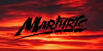 Wild trash style typeface.
 - World Madly by Putracetol,
$16.00 World Madly - Display Font is a delightful and quirky typeface designed with an environmental theme in mind. This font exudes a sense of fun and playfulness with its rounded and condensed letterforms, making it a perfect choice for projects related to nature and the Earth. Featuring a remarkable array of ten alternative font versions, each inspired by elements of the Earth and plant life such as tree trunks, leaves, globes, roots, and trees, World Madly is purposefully created for Earth Day-themed designs. It seamlessly integrates into projects with themes centered around nature, green initiatives, and the Earth. This font is an ideal choice for creating designs like Earth Day-themed invitations, birthday invites, party decorations, logos, stickers, clothing, packaging, children's books, magazines, and more. With its crafty and playful style, World Madly lets you express your love for the planet and the environment in your creative projects, adding a touch of eco-consciousness.
 - Bordeaux Nova by Designova,
$9.00 BORDEAUX - A custom handmade display typeface with unique design and hybrid lettering styles. This all caps typeface has two different nature: the uppercase is purely simple & minimal but the lowercase is defined by unique alternatives having special design. This typeface is perfectly suitable for anything that needs to stand out from crowd, be it some Ultra Modern Branding, Techno or Cosmic Themed Designs, Haunted Movie Posters, Mysterious Arts and even the Minimal Stuffs. BORDEAUX could be perfect choice for logo / logotype design, branding, marketing graphics, banners, posters, signage, corporate identities as well as for editorial design that can bring uniqueness. Please see the examples shown above to get an idea about the capability of this typeface. Handcrafted and designed with powerful OpenType features in mind, each weight includes extended language support including Western European & Central European sets.
 - Jazmo by URW Type Foundry,
$49.99 Jazmo is an offspring of an assignment I did for a Dutch architect. A classic building and coincidently the place of my studio in my hometown Zwolle, Netherlands, needed to be renovated. My job was to design the house numbers and signs for this building. This building I refer to was built in 1932 and designed according to the ‘New objectivity’ architecture. Now it accommodates several artist and craftsmen and also houses students. In my design I used elements of the Art Nouveau, which is related to the ‘New Objectivity’. Words as stately, angular, linear, stylish, artful, playful and frolic came to mind. It should be a design with a hint of the past and a flirt with the future. This house numbering is the root wherefrom Jazmo arises. The name Jazmo cites to the Jazz scene, which was a new and very popular artistic influence that time and age and is still a vibrant source of musical renewal. Mo stands for my Name Marit Otto. Together with my intern Arie Blok I created the missing characters and completed the font. Welcome Jazmo!
 - Arthury by HandletterYean,
$15.00 Arthury is a simple font with unique ligatures that makes you design more attractive and eye-catching. Feel free to use it on your creative projects such as quotations, decoration texts, prints, packaging, business cards, invitations, posters, labels, and any kind of design. Get this font now, have fun! This also includes multi-lingual support. To access the alternate glyphs, you need a program that supports OpenType features such as Adobe Illustrator CS, Adobe Photoshop CC, Adobe Indesign, and CorelDraw. More information about how to access alternate glyphs, check out this link: http://goo.gl/ZT7PqK
 - Randolph by Jukebox Collection,
$32.99 Randolph is a popular font family from Jukebox done in an old fashioned copperplate etching style that harkens back to the days of old leather-bound shop ledgers and hand painted window signs. The large and wide letterforms of Randolph make a bold statement that will add solidity and impact to any design. Jukebox fonts are available in OpenType format and downloadable packages contain both .otf and .ttf versions of the font. They are compatible on both Mac and Windows. All fonts contain basic OpenType features as well as support for Latin-based and most Eastern European languages.
 - MetroBots by Our House Graphics,
$- MetroBots is a fun loving, non-traditional but very functional family of 6 fonts made of big city skies, the long tropical morning shadows of ancient ziggurats and entire pueblo villages, nestled into the steep cliff-sides of sage-topped mesas in south western deserts. This is a good solid, but kind of whacky looking display type family borrowing from the heft of good old-fashioned children�s wooden building blocks and the look and feel of both modern and ancient pueblo architecture. With a bit of the not-so-subtle expressiveness of a comical robot on a WD-40 high on the side.
 - Giacinta by Okaycat,
$29.50Giacinta is developed as a fresh alternate take on the traditional black-letter style. Rather than simply reproducing the standard uncial or Old English style, Luke William Turvey followed the tradition of Bastarda, making up his own scripted style with the Latin standards in mind. This style was conjured purely from imagination, so while it bares a resemblance to the standards, keeps its own original flavor. Giacinta is extended, containing the full West European diacritics & a full set of ligatures, making it suitable for multilingual environments & publications. Use Giacinta for medieval themed projects, certificates, awards, diplomas, anything that you want to look old fashioned and stately. - Wildrace by Din Studio,
$29.00 Get ready to be bold and elegant at the same time. It’s time to see Wildrace, a display font created in capital letters with the racing theme. The font’s character is the thick letters formed similar to rectangles to give strong impressions. Therefore, it will be more noticeable and match the large-sized texts. Wildrace also provides interesting features to enjoy. Features: Multilingual Supports PUA Encoded Numerals and Punctuation Use Wildrace for any design projects such as posters, banners, logos, book covers, headings, printed products, merchandise, social media, etc. Find out more ways to use this font by taking a look at the font preview. Purchase now. Happy designing.
 - Classic Grotesque by Monotype,
$40.99 Classic Grotesque by Rod McDonald: a traditional font with a modern face. The growing popularity of grotesque typefaces meant that many new sans serif analogues were published in the early 20th century. Setting machines were not compatible with each other but all foundries wanted to offer up-to-date fonts, and as a result numerous different typeface families appeared that seem almost identical at first glance and yet go their separate ways with regard to details. One of the first fonts created with automatic typesetting in mind was Monotype Grotesque®. Although this typeface that was designed and published by Frank Hinman Pierpont in 1926 has since been digitalised, it has never achieved the status of other grotesque fonts of this period. But Monotype Grotesque was always one of designer Rod McDonald’s favourites, and he was overjoyed when he finally got the go-ahead from Monotype in 2008 to update this “hidden treasure”. The design process lasted four years, with regular interruptions due to the need to complete projects for other clients. In retrospect, McDonald admits that he had no idea at the beginning of just how challenging and complex a task it would be to create Classic Grotesque™. It took him considerable time before he found the right approach. In his initial drafts, he tried to develop Monotype Grotesque only to find that the result was almost identical with Arial®, a typeface that is also derived in many respects from Monotype Grotesque. It was only when he went back a stage, and incorporated elements of Bauer Font’s Venus™ and Ideal Grotesk by the Julius Klinkhardt foundry into the design process, that he found the way forward. Both these typefaces had served as the original inspiration for Monotype Grotesque. The name says it all: Classic Grotesque has all the attributes of the early grotesque fonts of the 20th century: The slightly artificial nature gives the characters a formal appearance. There are very few and only minor variations in line width. The tittles of the ‘i’ and ‘j’, the umlaut diacritic and other diacritic marks are rectangular. Interestingly, it is among the uppercase letters that certain variations from the standard pattern can be found, and it is these that enliven the typeface. Hence the horizontal bars of the “E”, “F” and “L” have bevelled terminals. The chamfered terminal of the bow of the “J” has a particular flamboyance, while the slightly curved descender of the “Q” provides for additional dynamism. The character alternatives available through the OpenType option provide the designer with a wealth of opportunities. These include a closed “a”, a double-counter “g” and an “e” in which the transverse bar deviates slightly from the horizontal. The seven different weights also extend the scope of uses of Classic Grotesque. These range from the delicate Light to the super thick Extrabold. There are genuine italic versions of each weight; these are not only slightly narrower than their counterparts, but also have variant shapes. The “a” is closed, the “f” has a semi-descender while the “e” is rounded. Its neutral appearance and excellent features mean that Classic Grotesque is suitable for use in nearly all imaginable applications. Even during the design phase, McDonald used his new font to set books and in promotional projects. However, he would be pleased to learn of possible applications that he himself has not yet considered. Classic Grotesque, which has its own individual character despite its neutral and restrained appearance, is the ideal partner for your print and web project.
 - Primitivus by PizzaDude.dk,
$18.00 It all started with making of a simple all-caps font. I drew the whole alphabet, numbers all else needed - but something wasn't quite right...the lettershapes were fine, but quite boring. Then I took a drastic decision: I started all over again ... meaning, I printed the whole thing, messed it up using a wet cloth and wrinkled the paper - then scanned it all again, and imported all the graphics yet again. A lot of work, yes - but personally I think it was worth it! But anyway, that's the story of how Primitivus was made ... well, almost, but not quite ... but that's another story! Use Primitivus for anything that needs that special kind of look were handdrawn letters meets grunge! Play around with the 4 different versions of each letter to make your text look even more random and natural!
 - Hyperdrive by Comicraft,
$19.00 If you're about to make the jump into hyperspace, buckle up and engage your R2 unit with our new font release, HYPERDRIVE! Ten years in the making, we've spent almost as much time developing these characters as George Lucas spent developing his! Co-created by Starkings & Roshell (HYPERDRIVE, not George), this font is guaranteed to keep TIE fighters off your tail and will always come in useful if you get menaced by phantoms or attacked by clones. So sit back, relax and enjoy the flight -- but don't forget; let the Wookiee win! Remastered Hyperdrive includes new letter shapes, 200+ connecting letter combos, improved spacing & kerning and support for Western & Central Europe.
 - P22 Klauss Kursiv by IHOF,
$29.95 P22 Klauss Kursiv is the first ever digital revival and expansion of the last face Karl Klauß designed for the Genzsch & Heyse foundry in Stuttgart before he died in 1956. Karl Klauß’s classical training in the graphic arts gave him solid chops to use as a springboard for design ideas that remained relevant among the countless trends fleeting around the turmoil of two world wars. By the mid-1950s, a kind of ornamental deco aesthetic was well on its way into mainstream design in post-war Europe, and demand was high for unique, lively and non-minimal ad faces. Klauß, a reliable designer with a proven track record of calligraphic faces, pushed the envelope on his own calligraphy and designed something that packages elegance in a boldness seldom seen before in luxury scripts. Quite a bit of talent is on display in Klauss Kursiv. In spite of the restraint this kind of design imposes on itself almost by default, the interplay between thick and thin never seems forced or challenging. Clear, natural strokes build a compact alphabet that demonstrates the wrist control of a veteran calligrapher. Creative nib angling segues into very clever start-and-stop constructs to make attractive forms that work quite well together, yet stand well to individual scrutiny. P22 Klauss Kursiv comes with a load of built-in alternates and ligatures in a font of over 470 glyphs, providing extended support for Latin languages.
 - Klainy by Identity Letters,
$29.00 An unadorned Grotesque with a refreshingly personal touch. If “Grotesque” mainly means “industrial, mechanical, anonymous typeface” to you, Klainy might redefine your image of the genre. Yes, it’s a Grotesque—but with a contemporary look and a lot of personality. Klainy’s apertures are more closed at the top and more open at the bottom, creating an informal rhythm that sets Klainy apart: a confident, optimistic voice with a clean appearance. Terminals are subtly back-bent: these quaint “hooks” make Klainy a bit more personal, a bit friendlier. (You can find them in the a, c, f, and r.) Just like its old-style Grotesque ancestors, Klainy is optimized for display sizes and short texts. There, its unobtrusive quirks can be wholly appreciated. However, the familiar Grotesque appearance makes sure that the typeface is comfortable to read in smaller sizes, as well. Use Klainy whenever a basically classic sans-serif typeface with a modern and individual twist is called for. This font family comes in eight weights ranging from Thin to Black, each with a matching italic style. More than 500 glyphs and a bunch of Open Type Features make it a reliable companion for all of your projects. You can fine-tune the flavor of Klainy with Stylistic Alternates such as a one-story a and a two-story g. Their simple construction blends perfectly with the design concept of this typeface. Klainy is a seasoned blue-collar worker that surprises you with wit and team spirit. It’ll be a great addition to your font library.
 - Comforting Sounds by PizzaDude.dk,
$17.00 Sometimes the way forward is simplicity. That goes for your personal life as well as designing. Sometimes what catches the eye is something simple. My Comforting Sounds font is a handmade sans serif font. It has a crunchy line, an organic look and legibility even at very small sizes. And in a charming way, it is quite simple!
 - Compendium by Sudtipos,
$99.00 Compendium is a sequel to my Burgues font from 2007. Actually it is more like a prequel to Burgues. Before Louis Madarasz awed the American Southeast with his disciplined corners and wild hairlines, Platt Rogers Spencer, up in Ohio, had laid down a style all his own, a style that would eventually become the groundwork for the veering calligraphic method that was later defined and developed by Madarasz. After I wrote the above paragraph, I was so surprised by it, particularly by the first two sentences, that I stopped and had to think about it for a week. Why a sequel/prequel? Am I subconsciously joining the ranks of typeface-as-brand designers? Are the tools I build finally taking control of me? Am I having to resort to “milking it” now? Not exactly. Even though the current trend of extending older popular typefaces can play tricks with a type designer’s mind, and maybe even send him into strange directions of planning, my purpose is not the extension of something popular. My purpose is presenting a more comprehensive picture as I keep coming to terms with my obsession with 19th century American penmanship. Those who already know my work probably have an idea about how obsessive I can be about presenting a complete and detailed image of the past through today’s eyes. So it is not hard to understand my need to expand on the Burgues concept in order to reach a fuller picture of how American calligraphy evolved in the 19th century. Burgues was really all about Madarasz, so much so that it bypasses the genius of those who came before him. Compendium seeks to put Madarasz’s work in a better chronological perspective, to show the rounds that led to the sharps, so to speak. And it is nearly criminal to ignore Spencer’s work, simply because it had a much wider influence on the scope of calligraphy in general. While Madarasz’s work managed to survive only through a handful of his students, Spencer’s work was disseminated throughout America by his children after he died in 1867. The Spencer sons were taught by their father and were great calligraphers themselves. They would pass the elegant Spencerian method on to thousands of American penmen and sign painters. Though Compendium has a naturally more normalized, Spencerian flow, its elegance, expressiveness, movement and precision are no less adventurous than Burgues. Nearing 700 glyphs, its character set contains plenty of variation in each letter, and many ornaments for letter beginnings, endings, and some that can even serve to envelope entire words with swashy calligraphic wonder. Those who love to explore typefaces in detail will be rewarded, thanks to OpenType. I am so in love with the technology now that it’s becoming harder for me to let go of a typeface and call it finished. You probably have noticed by now that my fascination with old calligraphy has not excluded my being influenced by modern design trends. This booklet is an example of this fusion of influences. I am living 150 years after the Spencers, so different contextualization and usage perspectives are inevitable. Here the photography of Gonzalo Aguilar join the digital branchings of Compendium to form visuals that dance and wave like the arms of humanity have been doing since time eternal. I hope you like Compendium and find it useful. I'm all Spencered out for now, but at one point, for history’s sake, I will make this a trilogy. When the hairline-and-swash bug visits me again, you will be the first to know. The PDF specimen was designed with the wonderful photography of Gonzalo Aguilar from Mexico. Please download it here http://new.myfonts.com/artwork?id=47049&subdir=original
 - AN Swish by Anonymous Typedesigners,
$10.00 An Swish is a unique handwritten font. Crafted in ink to become digital. Initially it was created as a kind of textural filling of spaces - walls, posters, clothes. In the process of creation, it became clear that it can solve different problems. It can become a logo or a great solution for identity. With the apparent density of the set and the negligence of the forms, it remains quite readable. It can work with different spacing options. There is a feature in the font that changes the second character when two identical letters meet. Also added icons (lightning, heart, eye) that can decorate your projects.
 - Tremendo by The Ampersand Forest,
$20.00 Tremendo is a gothic sans serif superfamily with a large number of widths and weights that make it a great choice for versatility, clarity, and dynamism. Built with both grotesque and geometric principles in mind, it's remarkably useful for everything from print copy to the largest display applications. If you're looking for a family that will serve your needs, and be noticed Tremendo is it! A note on the name: "Tremendo" is Italian for "too much, insufferable, awful." It's a tongue-in-cheek moniker for a family that's rather monstrous in size and forceful in impact. Give it a try and you'll see that it's much more of a workhorse than it may at first seem to be!
 - Sispany by Dora Typefoundry,
$19.00 Sispany is a sophisticated Sans Serif Font with a unique typeface that works well for your design projects and is carefully crafted to ensure premium quality and a luxurious feel. The shape of the letters makes this typography unique and stand out. It is suitable for logos, headlines, titles, and various other formal forms such as invitations, labels, logos, magazines, books, greeting/wedding cards, packaging, fashion, make up, stationery, novels, labels or all kinds of advertising purposes. Here's what's included: (uppercase & lowercase) Alternates & Ligatures Numbers & punctuation Characters with accents Supports Multiple Languages PUA Encoded This type of family has become the work of true love, making it as easy and fun as possible. I really hope you enjoy it! Thank you
