10,000 search results
(0.062 seconds)
- Aviano Sans by insigne,
$24.99 insigne returns to Aviano’s classically inspired forms with this sans serif variant. Wide and geometric, Aviano Sans is perfect for any job that calls for a chic and dignified sans serif as seen in this demonstration video. Aviano Sans has consistently topped insigne’s best-seller chart for more than seven years, earning its stripes as an expressive and versatile typeface that belongs in any designer’s tool chest. Aviano Sans' five weights of Regular, Thin, Light, Bold, and Black include 42 Art Deco-inspired alternate characters that can turn you and your project into a force to be reckoned with. The typeface family also includes 40 unique ligatures that add a bit of swagger to this serious sans. insigne released the first Aviano in early 2007. Its beautifully drawn extended letterforms were a hit with designers, and Aviano quickly became one of insigne’s most popular offerings. The simplified variant of Aviano Sans followed soon after, paring down the structure around the core concept. The Aviano series continues to develop further today with new variants on this classic form. Be sure to check out the rest of the Aviano series, including Aviano, Aviano Serif, Aviano Flare, and Aviano Contrast.
 - Sharpe Variable by Mans Greback,
$19.00 Sharpe Variable is a stylish serif typeface family. The original type was drawn between 2018 and 2019, and the variable font and its updated styles was created in 2020. It is clear, sharp and has brave, lively letter forms but with a conservative backbone. This font is provided as a Variable Font. It is only one font file, but this file contains multiple styles. Use the sliders in Illustrator, Photoshop or InDesign to manually set any weight and width. This gives you not only the 15 predefined styles, but instead more than half a million steps to customize the type to the exact look your project requires. Each style contains ligatures and support for a wide range of languages. More info about Variable Fonts: https://mansgreback.com/s/About_Variable_Fonts.pdf
 - Yorkten Slab by insigne,
$- The Yorkten family of fonts is back with another satisfying addition to its clean style. The rhythmic, new Yorkten Slab expands Yorkten’s basic, contemporary form of geometric and simple lines and adds a level of self-confidence and elegance to your work. Slab's basic structure is compact. It’s more condensed than most slabs, so you can save space yet still have clear, consistent readability. The added serifs create a fresh text color, too, that syncs well with the new font’s inherited features. Like its predecessor, Yorkten Slab offers its natural, simple structure with more than fifty fonts in the family and three different widths - extended, normal or condensed. Each group has eight weights from a lean thin to tough looking black, giving Yorkten Slab plenty of bragging rights among its peers. And like Yorkten, too, Yorkten Slab’s greatest value is the ability of its members to work easily and well together and with a variety of other fonts. Yorkten Slab ensures that you have the necessary tools for any challenge. In combination with its superior functionality and excellent readability, this versatile font can be effectively used for many print and screen operations: e-books, applications, headlines, banners, posters and websites to name a few options. Don’t wait any longer. Start tapping the possibilities that Yorkten Slab offers your work.
 - Warna by IKIIKOWRK,
$19.00 Proudly present Warna - Bohemian Font, created by ikiiko. With a design that is both fun and retro-inspired, Warna perfectly embodies that character. The font in question moves to the beat of your imagination. Each figure has a distinctive, hand-crafted quality, as though they were lovingly and enthusiastically created on a worn-out journal from the 1960s. "Warna" is more than simply a typeface; it's a lively storyteller who tells old tales with a contemporary twist. Its vibrant and youthful appeal makes it ideal for branding with a bohemian or retro aesthetic. The letters serve as your artistic friends, encouraging you to express your ideas with bold strokes that evoke the liberation of a joyful party. This font is very suitable for making a bohomian stuff, vintage boho brand, poster, magazine layout, fashion design, quotes, or simply as a stylish text overlay to any background image. What's Included? Uppercase & Lowercase Numbers & Punctuation Multilingual Support Works on PC & Mac
 - Murisa Bazka by Murisa Studio,
$10.00 Starting this month, we present our newest font, Murisa Bazka. Murisa Bazka is a blend of regular fonts with a distinctive texture on the body. This is unique considering that this is an additional value for you designers to display artistic design work. The Murisa Bazka font is made with a wide scope for everyone. Murisa Bazka, can be your first choice to be used in your designs and products.
 - ITC Kendo by ITC,
$29.99 ITC Kendo is the work of British designer Phill Grimshaw, suggesting the dash and verve of quick, sketchy calligraphy, complete with splatters of ink. Grimshaw says he worked deliberately against his own habits to create the forms, drawing the letters with slow deliberation" and a pointed pen. He overloaded the pen with ink and drew on rough paper, "applying a lot of pressure at the beginning of a stroke and easing off towards the terminals. Accidental splashes occurred frequently owing to the nib catching the 'tooth' of the paper." Those splashes were refined into features which enhance but do not overwhelm the characters and carefully worked so as not to leave an obvious white strip of unsplattered space between lines and letters. The initial capitals can be used alone or combined with the lowercase alphabet, and the font includes a full set of f-ligatures and some extra ligatures as well as decorative elements."
 - Island Life by Wing's Art Studio,
$24.00 Island Life is a font inspired by the loose, wavy style of the type associated with 1970s surf culture. Often found on lo-fi surf movie posters, t-shirts, and decals, it’s an aesthetic that promotes a laid-back, summer-loving style. With a zen “be like water” approach, this font has no straight edges. Behaving like letters inside a Lava Lamp, each individual character blends into a harmonious whole; perfect for groovy titles, logos and headers. The Island Life font features unique uppercase and lowercase characters, along with numerals, punctuation and language support, symbols and lots of custom ligatures for a truly hand-made look. All ligatures function automatically and can be turned on/off using the opentype features built into your software of choice. It’s the perfect font for the summer season and works great across posters, logos, t-shirts, menus and more. I recommend first laying out your text and then experimenting with warp, wave and bulge effects for some excellent results. Check out the visuals to see it in action. Enjoy!
 - Aqren by Product Type,
$17.00 Welcome to the world of Aqren, where the beauty of handwriting combines with the dynamics of display. This font comes with five graduated styles that include Regular for a classic look, Outline for a touch of clear contours, Blur for a soft effect, and Distort for an experimental feel. Aqren Specialty: Five Tiered Styles: Explore a variety of five Aqren style variants to create a unique and attractive design according to your wishes. A Touch of Handwritten Vulnerability: Every character in Aqren exudes a touch of handwritten vulnerability, creating an air of authenticity and humanity in every line. Aqren is the perfect choice for projects that want a beautiful handwritten touch and a variety of tiered styles. From promotional materials to greeting cards, this font brings an unmatched personal element. Do not miss this opportunity! Get Aqren Handwriting Font for Display now and watch how every word becomes a valuable work of art.
 - AccruedInterest by Ingrimayne Type,
$9.00 AccruedInterest is an all caps font with hollow letters, the outlines of which were roughly drawn with a calligraphic pen. The serifs are large and round. In a revision in 2019, the insides of the letters were separated out to allow easy bi-colored lettering when using layers. This inside style can also be used alone if one needs very sloppy and loosely-spaced text.
 - Fathir Script by Abo Daniel,
$15.00 Fathir is made with a true real handwritten style. The font comes with three style of titling and ending swash. It is very easy to access the swash characters even if you don't use pro software. The sample images show you the possibilities. Fathir is perfect for branding, quotes, logo, invitation, packaging, business card, and more. I hope you love this lovely font. Regards, Abo Daniel
 - Djibouti NF by Nick's Fonts,
$10.00An exuberant typeface named "African Queen", designed by Dave West for Photolettering in the 1960s, provided the inspiration for this exercise in typographic minimalism. The result is stark and somewhat raw, with a unique muscular energy...a natural choice for headlines that will attract attention. Both versions of the font include 1252 Latin and 1250 CE (with localization for Romanian and Moldovan) character sets. - Austellia by Garisman Studio,
$19.00 Austellia is made with natural handbrushes. With the unique Opentype in it and the ligature will add aesthetic value to your design product. Available in this file are Austellia Fonts and also Swash which you can unite into an amazing design. You can even use the Opentype feature without the help of any special software, whether it's in Adobe Illustrator, Corel Draw, or Photoshop.
 - Joane Pro by W Type Foundry,
$16.00 Joane Pro is a new typeface based on Joane (2018). This project has its roots in French typography from the 16th century, Dutch models from the 17th century, and English typography from the 18th century. The result is a high-contrast typeface with sharp features which provides an organic texture. Joane Pro is a contemporary typeface with 79 styles that work in display and small sizes.
 - Osgard by Anthony James,
$25.00 Osgard is a powerful luxurious Typeface, adopting the fluid curvaceous elements of Romanesque typography and combining them with the Gothic style of Blackletter. Forging the two creates a far softer, more versatile, fashion-based typeface; with beautifully distinct qualities. 1000 swashes, pre-made Conjunction Ligatures, Stylistic Alternates, Discretionary Ligatures, Contextual Alternates and all the OpenType features you need, make it perfect for any application.
 - Flashback by ArtyType,
$29.00 All three fonts - Dropout, Rough Diamond and Thorny, evolved from experimenting with a cubic template devised as the basis for a retro display type series titled ‘Flashback’. I experimented with numerous shapes initially to see which forms lent themselves best to the negative spaces forming the characters. Although many interesting variants are possible within this context, these three were resolved best out of the several options tried.
 - Salsiccia by Bech Type,
$19.00 Inspired by bold and rounded typefaces on signs from the 1970s, Salsiccia can promote both your hot dog stand and your international toy store enterprise. Its boldness and roundness is combined with classical proportions, with wide letters — like the O — next to little nubby ones — like the T. This not only looks nice, but helps us even out the white spaces across words and sentences.
 - Wahoobomex by Alit Design,
$22.00 Introducing the Wahoobomex Dynamic Blackletter Font - A Modern and Strong Typeface with 785 Characters, Ligatures, and Alternates! Are you looking for a font that combines the timeless charm of blackletter typefaces with a modern twist? Look no further than the Wahoobomex Dynamic Blackletter Font. This remarkable typeface strikes the perfect balance between tradition and contemporary design, making it ideal for a wide range of creative projects.
 - Calder by Inhouse Type,
$27.26 Calder is a display typeface collection. It incorporates 10 styles and offers two distinctive voices: a playful semi-connected script and a selection of subtle yet authentic sans serifs. Designed to complement each other, they offer a unique and engaging visual tool. Inspired by the pursuit of the outdoors, Calder began as a personal experience and endeavor to express and share the spirit of adventure connected with this renewed, growing movement.
 - Element 120 by Hanoded,
$15.00 Element 120 (Unbinilium) is a hypothetical chemical element in the periodic table. You can forget about that, I just thought it was a cool name for a font. Element 120 is a hand drawn Ultra Bodoni. I drew all the glyphs by hand, then gave them a good grunge makeover and the result is what you see before you. Comes with a periodic table of diacritics as well!
 - Big Cat by FontMesa,
$25.00 Released in 2006 under the name Flatrock this new 2020 version takes back the original name of Big Cat. Also new for 2020 are two solid black weights and Big Cat now has additional accented glyphs for eastern European countries. If you're looking to make an authentic 1800's broadside poster then Big Cat is perfect for the job, combine it with other woodtype fonts from our collection.
 - Kamenica by Tour De Force,
$25.00 “Kamenica” - named after a beautiful small mountain river in Serbia - is a font family containing 3 weights: Light, Regular and Bold. The Kamenica river is only a few meters wide. Mostly shallow and cold, clear and green, it was the direct inspiration source for the creation of this condensed typeface. As our other typefaces, “Kamenica” also combines traditional shapes with modern forms, tall x-height and a collection of more than 300 glyphs. Comparing the river with the font, we could say that letters are the fishes that lives in the Kamenica river and that the font weights are the seasons in which this river shows most of its own character.
 - Schuss Slab Pro by typic schuss,
$42.56 I was working about 10 years exclusively for a type company. Based on my experiences, I built this superfamily. Schuss™ Sans PCG is a humanistic sans-serif with a little contrast. Small Caps, greek and cyrillic are included. Also tab, prop, lining, old style and small cap figures. It's a typeface with clear and open characters. All complicated shapes are cleaned and simplified with a bit elegance. Schuss™ Slab Pro is a slab serif, based on the Schuss™ Sans. Schuss™ News Pro is the modeled style between Schuss™ Slab Pro and Schuss™ Serif Pro. Schuss™ Serif Pro is the antiqua shape. Additionally all serifs are cleaned up. There is just one-side-serif in the "n" for example. Tab figures (except small caps), mathematical signs and currency symbols have a width system accross all styles and weights.
 - Schuss Serif Pro by typic schuss,
$42.56 I was working about 10 years exclusively for a type company. Based on my experiences, I built this superfamily. Schuss™ Sans PCG is a humanistic sans-serif with a little contrast. Small Caps, greek and cyrillic are included. Also tab, prop, lining, old style and small cap figures. It's a typeface with clear and open characters. All complicated shapes are cleaned and simplified with a bit elegance. Schuss™ Slab Pro is a slab serif, based on the Schuss™ Sans. Schuss™ News Pro is the modeled style between Schuss™ Slab Pro and Schuss™ Serif Pro. Schuss™ Serif Pro is the antiqua shape. Additionally all serifs are cleaned up. There is just one-side-serif in the "n" for example. Tab figures (except small caps), mathematical signs and currency symbols have a width system accross all styles and weights.
 - Schuss News Pro by typic schuss,
$42.56 I was working about 10 years exclusively for a type company. Based on my experiences, I built this superfamily. Schuss™ Sans PCG is a humanistic sans-serif with a little contrast. Small Caps, greek and cyrillic are included. Also tab, prop, lining, old style and small cap figures. It's a typeface with clear and open characters. All complicated shapes are cleaned and simplified with a bit elegance. Schuss™ Slab Pro is a slab serif, based on the Schuss™ Sans. Schuss™ News Pro is the modeled style between Schuss™ Slab Pro and Schuss™ Serif Pro. Schuss™ Serif Pro is the antiqua shape. Additionally all serifs are cleaned up. There is just one-side-serif in the "n" for example. Tab figures (except small caps), mathematical signs and currency symbols have a width system accross all styles and weights.
 - Schuss Sans PCG by typic schuss,
$- I was working about 10 years exclusively for a type company. Based on my experiences, I built this superfamily. Schuss™ Sans PCG is a humanistic sans-serif with a little contrast. Small Caps, greek and cyrillic are included. Also tab, prop, lining, old style and small cap figures. It's a typeface with clear and open characters. All complicated shapes are cleaned and simplified with a bit elegance. Schuss™ Slab Pro is a slab serif, based on the Schuss™ Sans. Schuss™ News Pro is the modeled style between Schuss™ Slab Pro and Schuss™ Serif Pro. Schuss™ Serif Pro is the antiqua shape. Additionally all serifs are cleaned up. There is just one-side-serif in the "n" for example. Tab figures (except small caps), mathematical signs and currency symbols have a width system accross all styles and weights.
 - Pawl by The Ampersand Forest,
$20.00 Meet Pawl, an affordable 48-font squarish sans family with a little grotesque in him! Oh, you may think you’ve got him pegged at first glance, but he’ll surprise you with his versatility. AND he's just been totally refurbished from top to bottom and boy, did he need it! Pawl lives in the same visual landscape as fantastic modular superfamilies like Eurostile, Agency, Geogrotesque, Barlow, and even the great American Gothics. Unlike those faces, though, he's nimble enough to switch between looks effortlessly. Pawl is energetic, aggressive, strident, and structural. Depending on how you use him, his voice can be retro, futuristic, industrial, or sleek. He can be sober or splashy, techy or oldschool. Use his alternate characters and stylistic sets to create looks ranging from Streamline Moderne to Futurism to Brutalism to Swiss. He works from small paragraphs all the way up to monumental signage. This guy is smart and useful, with a lotta looks! How many times have you needed multiple weights, styles, and widths for your hierarchy, but standard type families were either shockingly expensive or couldn't deliver? Pawl delivers. Give him a shot!
 - Vintage King by Putracetol,
$25.00 Introducing Vintage King. A retro bold script style font, come with clean and rough font version. Inspired from retro typography and lettering in the 70's and 80's combine with bold typography style. Vintage King is perfect for vintage and retro design, badge, logos,t-shirt, poster, branding, packaging, signage, book coverand so much more! Come with Opentype feature with a lot of alternates, its help you to make great lettering. This font is also support multi language. The extrude and shadow in the preview are not included in the package, it is used only for presentation purposes.
 - ITC Lingo by ITC,
$29.99I've been obsessed with type since I was very young, says designer Pelle Piano. “In fact, when I was ten, I used to sneak into stores who sold Letraset sheets, and I actually stole their catalog with all the typefaces. They were perfect good-night stories for me - alphabet after alphabet!” In ITC Lingo, Piano tried out the effect of taking a very rigid underlying letter shape and representing it with “really sloppy outlines.” The underlying form is a condensed Bodoni-like alphabet, with high contrast between thick and thin strokes, but the effect of Lingo is sketchy and informal. - Bonbon by Fenotype,
$35.00 Bonbon is a delicious script family of three weights. With the total number of over 850 glyphs per font Bonbon is loaded with alternates: there are at least four alternates for each letter. Turn on Swash, Contextual, Stylistic or Titling Alternates to easily access the variants in any Open Type savvy program or manually select them from Glyph palette. Turn on Small Caps to activate a complete set of clear yet lively capital letters designed to go with the font. For the best results, combine Bonbon with Bonbon Ornaments, a set of 180 swooshes, swashes, ornaments and pictograms to complete your designs.
 - Arshila by Bykineks,
$12.00 Introducing Arshila Typeface the Modern Serif Bykineks, designed by Dede Kurniawan, the newest typeface family with 54 font styles! With over 700 glyph options and a multilingual, Cyrillic, Greek writing system, this typeface offers a complete typography. easily adaptable to designs in the fashion industry such as magazines, logotypes, wedding invitations, label tags, posters, and many more. gives you a modern, professional and unique style. with various features such as ligatures, alternative characters, numerator, and denominator. You can create a completely unique design that is sure to stand out from the rest. Get creative with arshila typeface, and bring your designs to life!
 - H-AND-S by AND,
$89.00 A common creation: (to pass from one hand to the other): For the first time, various hand-signs from diverse sources are unified into one single visual style. This compendium is the result of 15 years of incubation and 7 years of creation. In his travels throughout the world, graphic designer Jean-Benoit Levy, principal of the visual studio AND, has collected pictures of multiple hand signage. Uncertain what to do with those signs, he kept them year after year until the idea came to unify almost 200 handsigns into one single family. In accordance with this entire collection, the name of the typeface is a mix: "h-and-s". A global collection: (To put in good hands): We all have one thing in common: Hand-signs are an international language, they are meant to be understood by all of us. Each of us regularly comes in contact with modern hieroglyphs such as the hand-sign-codes that are so prevalent in our daily life. This way of communication belongs to no one in particular and to all of us in general. Even if the sense of certain signs varies from one culture to the other, there is a common hand-sign language. We are surrounded by this language of handsigns each time we step in a store, we eat, open a container of milk, we clean up, use package of wash-powder, by shaving, when we work, use tools, at home, by tearing the envelope of a condom, by traveling, etc. When we encounter these signs, we all understand them easily. A visual connection: (To go hand in hand): This typeface is a global visual statement. Collecting, ordering, redrawing, unifying. Reconstructed and assembled into one original alphabet, H-AND-S is a unique and complex signs program. Our choice is based on daily gestures and global hand-codes. Logically this typeface starts with the "American Sign Language" and expands on two type-variations, each on two levels of keyboard. The international team of H-AND-S would like to send his special thanks to all of the anonymous graphic designers throughout the world who designed different hand-signage and who influenced and inspired to create such a sign collection into one unified family. We, the global nomad team of AND, hope that you will enjoy our H-AND-S. Additional Credits Production: Studio AND. www.and.ch. Concept, Idea & Creative Direction: Jean-Benoît Lévy, Switzerland / USA. Research & Sketches: Eva Schubert, Germany. Illustration, Graphic Design & Visual Fusion: Diana Stoen, USA. Transfer, Adaptation & Refining: Moonkyung Choi, Korea. Finalization & Checking: Sylvestre Lucia, Switzerland. Coaching & Technical Advice: Mike Kohnke, USA. Creative Energy & Implementation: Joachim Müller-Lancé, Germany / USA.
 - Press Gothic by Canada Type,
$24.95 Press Gothic is a revival of Aldo Novarese's Metropol typeface, released by Nebiolo in 1967 as a competitor to Stephenson Blake's Impact (designed by Goeffrey Lee). Though Metropol enjoyed a few short months of popularity and use in Italy, Germany and France, Impact won the technological outlasting battle by moving on to film type then to computer outlines bundled with mainstream software, while Metropol never made it past the metal state until now. Too bad really, since this is one of the few faces that could have played well with all the horrendous stretch'n'squeezing of the 1970s. Just like its inspiration, Press Gothic aims to be a fresh alternative to big economical poster fonts with clear sans serif forms and an urgent, strong, yet elegant design appeal. In the summer of 2008, Press Gothic underwent a major linguistic and aesthetic reworking for an international publishing company. The result of this on the retail side are new small capitals and biform/unicase additions to the main font, as well as expanded language support that includes Cyrillic, Greek, Turkish, Baltic, Central and Eastern European, Maltese, and Esperanto. Press Gothic Pro, the OpenType version, combines all three fonts into one, taking advantage of the small caps feature, and the stylistic alternate feature for the biform shapes.
 - HWT Brylski by Hamilton Wood Type Collection,
$24.95 HWT Brylski is a typeface by Nick Sherman, named for retired wood type cutter Norb Brylski and designed to be cut as wood type at the Hamilton Wood Type & Printing Museum. This font is the digital counterpart to the wood type made as part of the Hamilton Legacy Project . It incorporates several themes that were common in 19th-century type design, including split tuscan serifs with angled mansard-style sides, heavy weight placement at the top and bottom of letters (traditionally referred to as French or Italian/Italienne, regardless of any actual relation to those countries), and an extended overall width. This digital version contains over 400 glyphs for full European language coverage.
 - Soulmate by Haksen,
$18.00 Introducing Soulmate - an elegant, luxurious and classy script. Soulmate comes with many alternates so you can create a luxury design. I recommend using Adobe to design with this font. The Glyphs menu contains all the alternates. If you have any questions, please contact me for support at : edhi.sarwo@gmail.com
 - Rutin Tutin NF by Nick's Fonts,
$10.00Schrifti Alphabeti, a delightful collection of Cyrillic typefaces for posters from the former Soviet Union, strikes again, this time with a way-out West (Vladivostok?) theme. Extrabold, extra wide and delightfully different! Both versions of the font include 1252 Latin, 1250 CE (with localization for Romanian and Moldovan). - Lost City by Tigade Std,
$15.00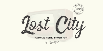 Lost City is a Natural Retro Brush Font. It is a handwritten which can beautifully enhance your design and product with the feel of retro. It's perfect for creating quotes, greeting cards, branding, promotion, advertisements (hello creative people!). This is a complete set comes with the International Characters. Enjoy!
 - Varmint PB by Pink Broccoli,
$14.00 Varmint is an offbeat flair serif font inspired by the titling of the early 1970's "Yosemite Sam & Bugs Bunny" comics from Gold Key. Playing up a Capitals and Alt-Capitals character set, with just a few ligatures, this wonderful typeface is funky and fun to type with.
 - Christmas Energy by Rashatype,
$10.00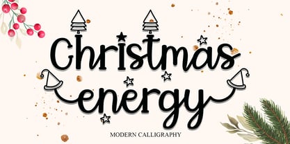 Christmas Energy is a whimsical script font with a relaxed theme, featuring a lovely style. This font is PUA encoded which means you can access all of the glyphs and swashes with ease! Add it confidently to your favorite creations and let yourself be amazed by the outcome generated.
 - Oyukis Ghost by Hanoded,
$10.00 Oyuki's Ghost is a scary typeface made with a steel pen and Chinese Ink. The name comes from a painting by Maruyama Okyo (1733–1795), which depicts his mistress who died young. Maruyama Okyo claimed she haunted him in his sleep. The font comes with extensive language support.
 - NorB Type Writer Roughen by NorFonts,
$25.00 NorB TypeWriter Roughen is the roughen version of my NorB TypeWriter typeface witch's my emulation of the IBM Selectric 'Light Italic' ball witch was used by my grand-brother for his correspondance during the 70’s and 80’s. It's however a slanted mono-spaced looking typewriter font. You may want to use this font with any word processing program for text and display use, print and web projects, apps and ePub, comic books, graphic identities, branding, editorial, advertising, scrapbooking, cards and invitations and any casual lettering purpose… or even just for fun! NorB TypeWriter Roughen features 677 glyphs, OpenType features and comes in 6 weights each with their matching italics and in a Light, Normal and Bold version.