10,000 search results
(0.017 seconds)
- Cheerful Day by Letterara,
$14.00 Cheerful Day is a cute and casual handwritten font with an incredibly friendly feel. It features gorgeous swashes and ligatures that make this script incredibly versatile. Whether you’re looking for fonts for Instagram or calligraphy scripts for DIY projects, Cheerful Day will turn any creative idea into a true piece of art! Fall in love with this font and bring your projects to the highest levels! This font is PUA encoded which means you can access all of the glyphs and swashes with ease! It features a varying baseline, gorgeous glyphs, and stunning alternates.
 - Executive Boss by Letterara,
$14.00 Executive Boss is a cool and versatile duo font (serif and script). The beautiful signature monoline-style font perfectly complements the elegant serif font. Combining these two fonts in your next design will give a modern and sophisticated feel, and it makes it a perfect addition to your font collection. Fall for its ravishing style and use it to create gorgeous wedding invitations, beautiful stationary art, eye-catching social media posts, logos, packaging, advertising, and much more! This font is PUA encoded which means you can access all the glyphs and swashes easily!
 - Romeo Juliet by Letterara,
$12.00 Romeo Juliet is a beautiful and romantic handwritten font. It features amazing sweet heart-shaped titling. These sweet handwritten fonts with connecting hearts are great for creating personalized items. This font is PUA encoded which means you can access all of the cute glyphs and swashes with ease! It also features a wealth of special features including alternate glyphs and ligatures. Fall in love with its authentic feel and use it to create gorgeous wedding invitations, beautiful stationary art, eye-catching social media posts, and cute greeting cards, and many more.
 - Kutilang by Allouse Studio,
$16.00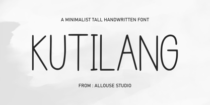 Proudly Present, Kutilang a Minimalist Tall Handwritten Font. Kutiling come along with Multi-Lingual Support to fulfill your need. We highly recommend using a program that supports OpenType features and Glyphs panels like many of Adobe apps and Corel Draw, so you can see and access all Glyph variations. Kutilang is perfect for any tittle, product packaging, branding project, megazine, social media, wedding, or just used to express words above the background. Enjoy the font, feel free to comment or feedback, send me PM or email. Thank You!
 - Frozenflare by Balpirick,
$15.00 FROZENFLARE is a Sweet and Soft Handbrushed Font. It is suitable for svg designs, mug decorations, pottery, shirts, hats, tote bags, card making, wall art, interior prints, and various other creations. Whatever the topic, this font will be a wonderful asset to your font library, as it has the potential to enhance any creation. This font only has all uppercase letters, but if accessed with lowercase letters it will automatically become uppercase. also multilingual support Enjoy the font, feel free to comment or feedback, send me PM or email. Thank you!
 - Sweet Macarons by Stefani Letter,
$14.00 Sweet Macarons is a playful display font that is easy to read. It’s perfect for Christmas cards, branding, stationery, blog design, custom art, custom stamps, custom embossers, book, apparel, packaging, headline, Crafting, Logo, or much more! It will add a unique feel and looks stunning to any design project! This font is PUA encoded which means you can access all of the cute glyphs with ease! It also features a wealth of including ligatures. Fall in love with its incredibly distinct and timeless style and use it to create spectacular designs!
 - Meuthia Beauty by Awan Senja,
$14.00 Meuthia is a beautiful and classy signature font. This is a beautiful combination of timeless elegance and authentic calligraphy. It features an incredibly classic style, while still keeping a friendly feel. Fall in love with its authentic feel and use it to create gorgeous wedding invitations, beautiful stationary art, eye-catching social media posts, and cute greeting cards. This font is PUA encoded which means you can access all of the amazing glyphs and swashes with ease! It also features a wealth of special features including alternate glyphs and ligatures.
 - Al Badlooking Brush by Aluyeah Studio,
$90.00 Badlooking Brush, the ugly duckling modern script font. Coming with 52 alternates, 9 stunning swash and super easy to use alternates. Very suitable for magazine, headline, website, ads, product package and all type of design project you have. Features: OpenType support Multilingual support (15 languages) PUA Encoded Super Easy to Use alternates - It's OpenType support but you can easily call alternates character using special combination like A.2 R.2 a.2 h.2 etc so you don't need a special software. To get results like the preview just type Badloo.2king B.2ru.2sh
 - VanderHand by JOEBOB graphics,
$29.00 The 'VanderHand' font is a friendly and easy to use handwritten font. It is so loaded with ligatures it could easily pass for actual handwriting. The font was created with a felt-tip brush pen and so there are natural thick and thin parts in the characters. All writing was done upright with tightly fit characters. As a result this font has a unique 'instant logo' quality. But you should really try this out for yourself. O, and the font was written by Jeroen van der Ham. It's his handwriting. That's why it's called VanderHand.
 - Plastic Fantastic by Hanoded,
$15.00 I have just returned from a trip to Malaysia, Java and Bali with my family: my wife had some family business there, so we turned it into a holiday. The last time I visited these places was 26 years ago and I knew things would have changed, but I wasn’t prepared for the ugly truth. Malaysia’s interior has been converted into one big oil palm plantation, Java is choked in plastic and Bali is one endless string of concrete hotels, restaurants and cheap tattoo parlours. Plastic Fantastic is not an ode to the many uses of plastic. It is a wake up call: we really need to stop using disposable plastic! You can start by implementing the Plastic Fantastic font family in your durable water bottle designs, the compostable bag holding your organic potato crisps or that big ole sign advertising your local food truck event. Or whatever it is you want to create. ;-)
 - Ongunkan Cypriot Linear C Sylla by Runic World Tamgacı,
$100.00 This font is an adaptation of the cyprus syllabic script to a Latin-based font. I tried to assign as many correct letters as possible, but there were too many characters so I had to fit them. Please review the alphabet table of Cypriot syllabic to use the Font. To see all the characters, you can see all the characters and add them to the text by selecting this font from the add character section on the word page. Cypriot syllabary The Cypriot syllabary was used in Cyprus from about 1500 and 300 BC and is thought to have developed from the Linear A. The earliest known inscriptions from between 1500 and 1200 BC are in an unknown language called 'Eteo-Cypriot', or 'True Cypriot', and the script in which they are written is called Cypro-Minoan. From around 1200 BC Cyprus began to be colonised by Mycenaean, Minoan and possibly Cretan Greek settlers, and they probably adapted the existing script to write their own language - the oldest known inscription in Greek dates from the 11th century BC. Cypriot Greek had much in common with Greek dialects of Arcadia and Pamphylia, which corresponds to the province of Antalya in Turkey.
 - KG Two Is Better Than One by Kimberly Geswein,
$5.00 This font was created in honor of my husband for our 12th wedding anniversary. 14 years ago, I met this tall, skinny guy from Indiana in the lobby of a hotel in Hong Kong. We talked. The next day, we had lunch together. And that night we had dinner together. And the next day. And the next. We met just before my 19th birthday, and on my birthday he took me to the top of Victoria Peak, where we looked out over the city of Hong Kong- such a beautiful place to begin a lifetime of love! We spent 4 months together in Hong Kong, falling in love with each other and with the beautiful city we were privileged to call home for that short time. We married the next year. We've lived in Indiana, Texas, China, Kentucky, and Florida over those 12 years of marriage and have welcomed 2 daughters into our lives. I know beyond a shadow of a doubt that he completes my life in a way I didn't know was possible. And I know that I'm blessed beyond words to have a supportive, wonderful, encouraging husband who is also a loving, involved, caring dad to our daughters. This font is for you, Keith!
 - Ballestro by Rex Face,
$19.99 Ballestro is a playful, versatile display font. Its name is a nod to the characters being constructed using a grid-like pattern of balls. Ballestro is great for headlines, signage, logos, packaging and more.
 - Daily Challenge by Hanoded,
$15.00 My daily challenge is how to get my kids out of bed, feed them breakfast, get them to dress, wash and pack their school bags and drop them off at school before the bell rings. The rest of the day, the challenge is to renovate our house, get my work done, pick up the kids from school (plus all of their friends, who want to come and play) and cook dinner. Of course, the word ‘challenge’ was misused by the internet. Not too long ago, there seemed to be and endless stream of crazy challenges that ended up hurting or even killing a few people. Daily Challenge font is none of the above: it is a clean cut, 100% handmade, all caps font. The only challenge here is how to adapt your design so it fits this font perfectly… ;-)
 - Whatchamacallit by Comicraft,
$19.00 We popped the Doohickey into the Framistat and out popped this Whatchamacallit! Is it fat? is it thin? Is it tall? Is it short? Is it light? Is it heavy? Is it condensed?! is it expanded?! Yes, yes, yes and yes -- It’s all of the above and more! Our resident mad scientist John “Mr. Fontastic” Roshell has developed a single contraption that can handle any design emergency, from crimelords to supervillain team-ups to alien invasions. Whatchamacallit is a friendly and readable sans-serif, inspired by some of our all-time favorites -- Gill Sans, Futura, Venus and Antique Olive. But, like its machinery-contraption namesakes Doohickey and Framistat, Whatchamacallit has a lively personality -- the strokes are a little wavy, the ends a bit bulbous, and the circles are like little loaves of bread, rising in the Whatchamacallit's oven... delicious!
 - Duhline by Edignwn Type,
$18.00 The font collection is called "Duhline", it is a display font for logotype. These collections contain serif and sans serif font. Every font comes with 4 style typefaces (regular, smooth, rough and texture). This texture style includes some different stamp for uppercase and lowercase. Extras 9 hand-drawn illustrations about beer. The Duhline matches apply in some designs such as the logo, poster, label, badge, packaging, t-shirt, branding, quotes and more custom design. Duhline features : 4 style typefaces (regular, smooth, rough and texture) All-caps, numeral, symbol and punctuation and ligature in serif font All-caps, numeral, symbol and punctuation in sans serif font Multilingual PUA Encoded Duhline includes : 2 fonts (serif and sans serif) 9 hand-drawn illustrations in dingbat If you have any questions, please contact : edignwn11@gmail.com Check out Derpache which is a great pair for Duhline.
 - Mashok by Twinletter,
$18.00 Mashok is a retro condensed font that exudes a vintage feel, perfect for adding a touch of nostalgia to your designs. This font features a tall and narrow letterform, making it ideal for creating eye-catching headlines and titles. With its unique stylistic alternates and ligatures, Mashok adds an extra level of charm and personality to your designs. Whether you’re creating posters, book covers, or other graphic design projects, Mashok is sure to make your text stand out. Give your designs a retro flair with Mashok today! What’s Included : - File font - All glyphs Iso Latin 1 - Alternate, Ligature - Simple installations - We highly recommend using a program that supports OpenType features and Glyphs panels like many Adobe apps and Corel Draw so that you can see and access all Glyph variations. - PUA Encoded Characters – Fully accessible without additional design software. - Fonts include Multilingual support
 - Larks Tongues by Hanoded,
$15.00 Larks' Tongues in Aspic is the fifth studio album (released in 1973) by the English progressive rock group King Crimson. I have always liked this name, as it reminded me of old stories in which witches threw all kinds of weird ingredients (larks’ tongues, bat wings and petrified dragon dung) into a big cauldron. When I created this font, it looked like the writing in an old book of spells, so I just had to call it Larks’ Tongues. Larks’ Tongues is a very lively headline font which would look good on (children’s) book covers, posters and product packaging. So, if you are about to write a book about witches, want to throw a halloween party or want to market your Larks’ Tongues in Aspic, then by all means, use this font! Comes with a magical amount of diacritics.
 - Vanitas by Reserves,
$49.00Vanitas is an elegant high contrast contemporary sans. It is rooted in the style of a classic didone, excluding the typical serifs and ball terminals as well as being designed with a cleaner, more reductionist appearance. Strict attention was given to the cohesiveness and balance between letterforms as well as the careful refinement of all curves. Stylistically, Vanitas’ alluring, sophisticated sensibility is directly inspired by high fashion. The upright styles are complimented by a pairing of optically adjusted true italics, which were purposefully adapted to retain the sharpness of their counterparts. Abandoning traditionally executed cursive italic letterforms retains Vanitas’ sharp characteristic through each style. Features include: Precision kerning Standard Ligatures set including ‘f’ ligatures (fb, ff, fh, fi, fj, fk, fl ffb, ffh, ffi, ffj, ffk, ffl, ffy, ae, oe, AE, OE) Discretionary Ligatures set including (st, ct, No) Alternate characters (H, A, AE, Q, $, h circumflex, ¶ and numero sign) Case forms (shifts various punctuation marks up to a position that works better with all-capital sequences) Capital Spacing (globally adjusts inter-glyph spacing for all-capital text) Slashed zero Full set of numerators/denominators Tabular Lining, Proportional Lining, Tabular Oldstyle and Proportional Oldstyle Figures Automatic fraction feature (supports any fraction combination) Extended language support (Latin-1 and Latin Extended-A) *Requires an application with OpenType and/or Unicode support. - All Over Again, a captivating font created by the talented David Kerkhoff, stands out as a distinguished member of the handwritten font family. David Kerkhoff, known for his ability to infuse persona...
- Shaded Spheres by Dingbatcave,
$15.00These Op-Art-looking little balls and gems appear 3-D without the help of any special graphic filters, which makes them perfect for use with flat colors or one-color print jobs. 72 characters. - Sequel Rounded by OGJ Type Design,
$35.00 Sequel Rounded is a post-Max Bill font, developed in close cooperation with the Max Bill Georges Vantongerloo foundation in Switzerland. MAX BILL Last universal scholar, most important design teacher of the 20th century: There are superlatives, always very enthusiastic, when the importance of Max Bill is discussed. The trained silversmith studied at the Bauhaus, with personalities such as Josef Albers, Paul Klee and Oskar Schlemmer. He worked as an architect, later as sculptor and designer.
 - Berkmire AOE by Astigmatic,
$19.95 1970’s Techno-typography finds its rebirth in Berkmire AOE. From its beefy weight to its narrow and sometimes unusual counter cuts, Berkmire AOE started as a digitization of a film typeface called Belden by LetterGraphics. This bulky techno typeface was taken from its limited character set and fleshed out to include an expanded language glyph set. The Capital letterforms seem to push the edge of readability, while the lowercase falls more in line. The letterforms of Berkmire AOE are easy to convert to paths and extend various stems, making this revival something you can really let your imagination run wild with for your designs.
 - Fan Script by Sudtipos,
$99.00 A friend of mine says that sports are the ultimate popular drug. One of his favorite things to say is, “The sun’s always shining on a game somewhere.” It’s hard to argue with that. But that perspective is now the privilege of a society where technology is so high and mighty that it all but shapes such perspectives. These days I can, if I so choose, subscribe to nothing but sports on over a hundred TV channels and a thousand browser bookmarks. But it wasn't always like that. When I was growing up, long before the super-commercialization of the sport, I and other kids spent more than every spare minute of our time memorizing the names and positions of players, collecting team shirts and paraphernalia, making up game scenarios, and just being our generation’s entirely devoted fans. Argentina is one of the nations most obsessed with sports, especially "fútbol" (or soccer to North Americans). The running American joke was that we're all born with a football. When the national team is playing a game, stores actually close their doors, and Buenos Aires looks like a ghost town. Even on the local level, River Plate, my favorite team where I grew up, didn't normally have to worry about empty seats in its home stadium, even though attendance is charged at a high premium. There are things our senses absorb when we are children, yet we don't notice them until much later on in life. A sport’s collage of aesthetics is one of those things. When I was a kid I loved the teams and players that I loved, but I never really stopped to think what solidified them in my memory and made them instantly recognizable to me. Now, thirty-some years later, and after having had the fortune to experience many cultures other than my own, I can safely deduce that a sport’s aesthetic depends on the local or national culture as much as it depends on the sport itself. And the way all that gets molded in a single team’s identity becomes so intricate it is difficult to see where each part comes from to shape the whole. Although “futbol” is still in my blood as an Argentinean, I'm old enough to afford a little cynicism about how extremely corporate most popular sports are. Of course, nothing can now take away the joy I got from football in my childhood and early teens. But over the past few years I've been trying to perceive the sport itself in a global context, even alongside other popular sports in different areas of the world. Being a type designer, I naturally focus in my comparisons on the alphabets used in designing different sports experiences. And from that I've come to a few conclusions about my own taste in sports aesthetic, some of which surprised me. I think I like the baseball and basketball aesthetic better than football, hockey, volleyball, tennis, golf, cricket, rugby, and other sports. This of course is a biased opinion. I'm a lettering guy, and hand lettering is seen much more in baseball and basketball. But there’s a bit more to it than that. Even though all sports can be reduced to a bare-bones series of purposes and goals to reach, the rules and arrangements of baseball and basketball, in spite of their obvious tempo differences, are more suited for overall artistic motion than other sports. So when an application of swashed handlettering is used as part of a team’s identity in baseball or basketball, it becomes a natural fit. The swashes can almost be visual representation of a basketball curving in the air on its way to the hoop, or a baseball on its way out of the park. This expression is invariably backed by and connected to bold, sleak lettering, representing the driving force and precision (arms, bat) behind the artistic motion. It’s a simple and natural connective analysis to a designer, but the normal naked eye still marvels inexplicably at the beauty of such logos and wordmarks. That analytical simplicity was the divining rod behind Fan Script. My own ambitious brief was to build a readable yet very artistic sports script that can be a perfect fit for baseball or basketball identities, but which can also be implemented for other sports. The result turned out to be quite beautiful to my eyes, and I hope you find it satisfactory in your own work. Sports scripts like this one are rooted in showcard lettering models from the late 19th and early 20th century, like Detroit’s lettering teacher C. Strong’s — the same models that continue to influence book designers and sign painters for more than a century now. So as you can see, American turn-of-the-century calligraphy and its long-term influences still remain a subject of fascination to me. This fascination has been the engine of most of my work, and it shows clearly in Fan Script. Fan Script is a lively heavy brush face suitable for sports identities. It includes a variety of swashes of different shapes, both connective and non-connective, and contains a whole range of letter alternates. Users of this font will find a lot of casual freedom in playing with different combinations - a freedom backed by a solid technological undercurrent, where OpenType features provide immediate and logical solutions to problems common to this kind of script. One final thing bears mentioning: After the font design and production were completed, it was surprisingly delightful for me to notice, in the testing stage, that my background as a packaging designer seems to have left a mark on the way the font works overall. The modern improvements I applied to the letter forms have managed to induce a somewhat retro packaging appearance to the totality of the typeface. So I expect Fan Script will be just as useful in packaging as it would be in sports identity, logotype and merchandizing. Ale Paul
 - Haboro by insigne,
$- Haboro is a powerful workhorse. It’s a neoclassical font developed for numerous uses, ranging from editorial and corporate to web pages and apps. This new face from insigne Design takes a modern twist on the high-contrast typeface genre known as the Didone. Recognized for their ability to convey clarity, the geometric simplification of the Didone genre adds a level-headed rationality to whichever work it’s applied. Didones are used to lend style and sophistication to a wide number of applications—everything from style or cosmetic labels to annual reports. With its unique take on this classic genre, Haboro—with its slight wedge-shaped serifs and unique terminals—is still defined by elegance, tradition and timelessness. Even more to its versatility, this multi-purpose text face features whimsical terminals, which liven up even the most serious texts. If you desire, you can also opt for the more usual ball terminals by activating OpenType alternates. The Haboro family consists of seven weights from a Thin to a Black along with matching italics. The contrast from the letters’ thick strokes and thin strokes draws the eye to your design, making Haboro a powerful visual tool for communicating your message. The typeface also contains numerous ligatures and alternates. Choose between serif variants such as ball terminals or standard serifs by utilizing OpenType alternates. We recommend using the default contextual alternates and discretionary ligatures in order to benefit from all members of this fantastic font family. In addition, Haboro has a sizable set of option glyphs and numerous other OpenType variables to give your text the unique touches it needs. Haboro has all of the attributes you need to undertake your next project. Use its modified elegance to shape and mold your next design, whether a web site, app, branding package, or magazine. You’ll find there’s no job Haboro can’t take on.
 - Zawiya by Eyad Al-Samman,
$3.00 The word Zawiya in Arabic language means Angle in English language. "Zawiya" is a Kufic modern square-shaped Arabic typeface. The typeface has only right-angled angles which makes it full of open and closed squares and free from any curves or arches. This font comes in two different weights. I am originally an engineer and I have liked to draw geometric shapes since my early childhood. I decided to design a typeface that embodies both of the technical and artistic human that I have inside me. The main characteristic of "Zawiya" Typeface is in its modern and attractive right-angled and square-shaped styles for its all-Arabic characters. The character "Faa" is one of its most distinguished characters that I myself adore it so much. "Zawiya" Typeface is suitable for books' covers, advertisement light boards, titles in magazines and newspapers, posters, greeting cards, cards, covers, satellite channels, exhibitions' signboards and external or internal walls of malls or metro's exits and entrances, geometric instruments and tools, technical devices, computers and laptops, IT and electric devices and also calculators. It is advisable to use the font in fields related to sciences such as geometry, mathematics, physics, chemistry, astronomy, industry, economy, and other fields. It can also decorate surfaces of calculators, geometric tools, rulers, pens, computers, cars, ships, trucks, and other related electric and electronic devices. It is sharp design qualifies it to be printed in public signs in streets, airports, hospitals, schools, malls, hotels, mosques, and other public places. It can also be used in titles for Arabic news and advertisements appeared in different Arabic and foreign satellite channels.
 - VLNL Melk by VetteLetters,
$29.99 At VetteLetters we like food but we also appreciate our drinks. Yes, of the non-alcoholic kind as well. Like milk. Contrary to what Arnold Schwartzenegger once said, Milk is not just for babies. It contains a whole lot of stuff that is genuinely good for you. Like proteins, carbohydrates, minerals (calcium a.o.) and many vitamins. One time visiting The Hague, Donald DBXL spotted a tile tableau on a brick wall, advertising a dairy factory called ‘De Sierkan’. Yellow sans serif letters on a bright blue background, dating back to the late 19th century, immediately grabbed DBXL’s attention. Especially because the tableau showed both regular and bold letters with some lovely peculiarities here and there. De Sierkan appeared to have been a milk factory solely operating in The Hague from 1879 until 1961. A number of these wall adverts are still to be seen in The Hague streets today. Photos were taken for later reference. Later is now, the lettering has been digitized, missing characters added, and VLNL Melk sees the light of day. VLNL Melk is an all-caps geometric display sans serif family of three weights, Regular, Bold and Black. The basic shape of the letters is a rectangle with rounded corners, leaving a sturdy no-nonsense look and feel. It has a distinct historic aura, but with both feet in this digital day and age. It can equally well be used for the logo of a hipster coffee place, as the cover of a historic novel. Actually, VLNL Melk kan be applied in a wide range of designs like logos, posters, flyers, book covers and magazine headlines.
 - Tripper Pro by Underware,
$50.00 Tripper is a rock-hard display font family. The six styles – from Light to Black – of this robust stencil typeface will assure your text grabs all the attention it can get. Instead of settings large amount of texts, just use this font for a small amount of words. Or even better: just one word. But most importantly: make it really, really, really big. The lightest weight is pretty condensed, and slowly expands when the weight increases. The bridges – essential to a stencil font – have the same width across all styles, so you can safely apply all styles in the same size without the risk of stencils falling apart. Due to the absence of curves throughout the whole family, Tripper is suitable for more limited, industrial applications too. Tripper comes in several flavours. Next to the basic flavour, there is a stencil family which automatically creates borders around every letter, word or line. Then there is Tripper Rough, a textured version with that intelligent random, grungy look. Together with the previously released multi-colour font Tripper Tricolor, the complete family consists of 24 styles. Tripper is equipped with a bunch of OpenType features, like different figure styles, fractions, superiors, etc. But if all the OpenType ding-dong is not enough for you, just try the ornaments. The separate ornament font comes with icons, indicators, manicules, banderoles and patterns.
 - Rex Stephane by Mans Greback,
$79.00 Rex Stephane, designed by Mans Greback, is a striking blackletter font that artfully blends medieval influences with modern geometric shapes. Inspired by the tall stature of Gothic architecture, merged with sharpened edges, this font captures the essence of strict ruling while having an elegance of the Middle Ages. First imagined while exploring an abandoned castle, the typeface is based on ancient manuscripts adorned with calligraphic lettering. These texts became the foundation for Rex Stephane, as Mans Greback aimed to recreate the rich history and grandeur of the medieval era while adding his own contemporary twist. The font is built with advanced OpenType functionality and has a guaranteed top-notch quality, containing stylistic and contextual alternates, ligatures, and more features; all to give you full control and customizability. It has extensive lingual support, covering all Latin-based languages, from Northern Europe to South Africa, from America to South-East Asia. It contains all characters and symbols you'll ever need, including all punctuation and numbers. Mans Greback is a Swedish typeface designer with a passion for creating unique and versatile fonts. With an extensive background in design and typography, Mans has built a reputation for his meticulous attention to detail and prolific craftsmanship. His many fonts are widely used by designers around the world, making his work synonymous with creativity and innovation.
 - Royal Serif - Personal use only

- Shelby by Laura Worthington,
$25.00 Shelby is friendly and casual; a monoline, semi-connected script typeface based on hand lettering. It has the natural appearance of handwriting, yet can be used to create appealing headlines, logos and eye catching call-outs. Shelby features ligatures, stylistic and contextual alternates, and 20 ornaments designed to complement its handwritten look. See what’s included! http://bit.ly/2bGS9S1 *NOTE* Basic versions DO NOT include swashes, alternates or ornaments These fonts have been specially coded for access of all the swashes, alternates and ornaments without the need for professional design software! Info and instructions here: http://lauraworthingtontype.com/faqs/
 - Durango Western by Sharkshock,
$100.00 This all caps display font is defined by its close spacing and thick serifs for a distinct appearance. Inspiration came from old movies set in the Wild West. The characters are tall in stature so works well in spots with limited space. Use Durango Western for a wanted poster, social media, or team logo. Basic/Extended Latin, European accents, punctuation, diacritics, kerning, and Cyrillic characters are included. The eroded version features varying levels of distress between the uppercase/lowercase and contains a few alternates. NOTE: Due to the level of detail in the eroded version temporary computer slowdown may occur.
 - Scott McCloud by Comicraft,
$39.00 Whether you're Making, Understanding or Reinventing comics, you'll need a comic book font that makes your comic book—or comic book about making, understanding or reinventing comic books—look like a, um, comic book. Yes, it's all very well writing about the Invisible Art of Making Comics, but if you can't read about the Storytelling Secrets of Comics, Manga and Graphic Novels, they'll still be secrets, won't they? That's why Scott McCloud came to us to create the official "Making Comics: Storytelling Secrets of Comics, Manga and Graphic Novels" comic book font, or as we like to call it: McComicBookFont.
 - Brasika Display by Nurrontype,
$14.00 Hello my name is Brasika Display, a fun, funk and swirly font. I was designed with versatility, easy to adapt to your needs. I'm playful enough to make you happy. Just look my styistic and anatomy, it's cool, isn't it ? You can put me in your logo project. Or your magazine title. In your Christmas greetings card, wedding invitation, perhaps use me in your Instagram feeds, Youtube title, and many more, you name it. All my friends called me Polyglat, because I'm speaking and understand many languages. I'm Brasika, buy me now, and I will help you to ignite your next project.
 - Bandleader JNL by Jeff Levine,
$29.00 How does one arrive at a font name? With the thousands of digital typefaces available, it's not an easy process. Bandleader JNL was modeled from the hand-lettered title on a piece of sheet music called "Largo", which means "slow tempo". Since the names "Largo" and "Tempo" were already taken, what other musical theme would fit? The lettering is in an Art Deco style, and Big Band was all the rage of the Art Deco period; therefore "Bandleader". Sometimes the road to naming a font takes on many twists and turns but the end result is always gratifying.
 - Juvelith by Keristyper Studio,
$14.00 Proudly present Juvelith a modern black letter font inspired by contemporary design and calls back to Old English Gothic Scriptures. This font is good for logo design, Social media, Movie Titles, Books Titles, short text even long text letters, and good for your secondary text font with sans or serif. **Featured:** * Standard Uppercase & Lowercase * Numeral & Punctuation * Multilingual : ä ö ü Ä Ö Ü ß ¿ ¡ * Alternate & Ligature * PUA encoded We recommend programs that support the OpenType feature and the Glyphs panel such as Adobe applications or Corel Draw. so you can use all the variations of the glyphs. Hope you enjoy our fonts!
 - Impecunious JNL by Jeff Levine,
$29.00 The type design for Impecunious JNL comes from the 1939 sheet music for "You Don't Know How Much You Can Suffer (Until You Fall in Love)". The name comes from another piece of sheet music, 1899's "Impecunious Davis" [a piece of late 19th century tripe demeaning Black Americans]. However, the word "impecunious" was intriguing. According to the website Merriam-Webster.com, the simple definition of impecunious means "having little or no money". Since we've all been in that spot at one time or another, it became a perfect font name. Impecunious JNL is available in both regular and oblique versions.
 - Neoland by Edignwn Type,
$18.00 The font collection is called "Neoland", it is a display font for logotype and badge. These collections contain script and serif font. This script font includes alternates and ligatures. The Neoland matches apply in some designs such as the logo, poster, label, badge, packaging, t-shirt, branding, quotes and more custom design. Neoland features : Uppercase, lowercase, numeral, symbol, punctuation, alternate (ss01-ss07), swash and ligature in script font All-caps, numeral, symbol and punctuation in serif font Multilingual PUA Encoded Neoland includes : 3 fonts (script, serif and dingbat) 12 hand-drawn illustrations in dingbat If you have any questions, please contact : edignwn11@gmail.com
 - Dimensions by Dharma Type,
$19.99 Dimensions is redesigned font family based on Blackout font released as free font in 2005. The original blackout has been used especially for company or brand logo of fashion and music label in the world. In 2011, Blackout had evolved into this Dimensions font family of seven weights with roman and italics. They are one of the most condensed, black and skinny font in the world. All weights and italics have upper and lower cases, accented characters and small capital glyphs that can be used with OpenType smcp feature. There is high contrast version called Speedometer.
 - Beautiful Scarlet by Tropical Sunlight Co.,
$16.00 The font is called "Beautiful Scarlet", it is font duo with fashionable themes. The font comes with two pairing typefaces (script and serif). Script font contains 2 set alternates and some ligatures. The Beautiful Scarlet matches apply in some designs such as the logotype, quotes, wedding invitation, business card, packaging, branding, and more custom design. Beautiful Scarlet includes : - Uppercase, lowercase, numeral, symbol and punctuation, alternates (ss01-ss02), ligature in script font - All-caps, numeral, symbol and punctuation in serif font - Multilingual - PUA Encoded - File format in .otf If you have any questions, please contact : tropicalsunlight.co@gmail.com
