10,000 search results
(0.024 seconds)
- Stuntman by Vozzy,
$10.00 Introducing a hand-crafted label font duo named Stuntman. All available characters you can see at the screenshots. This family have two fonts - Script and Stencil; and for each included two styles - Clean and Paint (dripping effect). This font will good viewed on any retro design like poster, t-shirt, label, logo etc.
 - Setter by Cão Fila,
$10.00 Setter is a type family that stands between geometric and humanist styles. Its unique features and large x-height gives it a modern look. Good for small text blocks, headlines and logos. Vast latin character set: Central, Southeastern and Western Europe. Vietnamese, Pinyin and Pan African Latin. Math and Currency. Enjoy it!
 - Fishman by Vozzy,
$10.00 Introducing vintage label font named Fishman. This font has a multilungual characters support (check out all available characters on previews). The font family has six styles: Regular, Shadow, Light, Shadow FX, Light FX, Aged. This font will look good on any vintage styled designs like a poster, T-shirt, label, logo, etc.
 - SA Tampico by Artcoast,
$9.00 Tampico Typeface is a new font with Rough version, which includes 80+ glyphs and alternative characters. The font looks great on various packages, goods with food. You can also use it to create logos, shortcuts and other design elements. Product Content: SA Tampico Rough SA Tampico Symbols Features: Accents (Multilingual characters) Stylistic Alternates
 - Stonekids by Blankids,
$17.00 Introducing a new Layered bold script called Stonekids. Stonekids inspired by handlettering, bold script logotype and kids fonts. Stonekids comes with open type features and multilingual accent good for logotype, poster, badge, book cover, t-shirt design, packaging and any more. Multilingual accents: ŽžŠŒšŸÀÁÂÃÄÅÆÇÈÉÊËÌÍÎÏÐÑÒÓÔÕÖØÙÚÛÜÝßàáâãäåæçèéêëìíîïðñòóôõöøùúûüýÿ Features: - Uppercase - Lowercase - Number - Punctuation - Multilingual - PUA Encode - Opentype
 - Estienne by Solotype,
$19.95Many fonts have carried this name. Ours goes back to just before 1900 in France. This general style had considerable popularity among job printers all over Europe. We have even seen it used for name imprints on medical school diplomas, which seems a bit grotesk. Surely you can do something better with it. - Koloss CT by CastleType,
$39.00 A well-designed bold art deco font. Very chunky. Uppercase, lowercase, numerals and punctuation. CastleType additions to the Koloss family include Koloss Bold Condensed and Koloss Bold Wave. The latter was used beautifully in the wonderful children's book The Leaf Men (and the Brave Good Bugs) written and illustrated by William Joyce.
 - Backstreet by Letterara,
$12.00 Backstreet is a purely handwritten typeface with its own unique characteristics. It has an elegant, feminine style with good readability. Perfect for Valentine day, neon design, signatures, invitations, titles, and much more! To stay up to date for my latest job, follow me and let’s be friends because there will be many promos.
 - Ice Creamery by FontMesa,
$29.00Ice Creamery is a new variation of our Saloon Girl font family complete with italics and fill fonts which may be used to layer different colors into the open parts of each glyph. We don’t recommend using the fill fonts for Ice Creamery as stand alone solid fonts, Ice Creamery Chocolate was designed as a the stand alone solid font for this font family. Fill fonts go back to the 1850's where they would design matched sets of printing blocks and the layering of colors took place on the printing press, they would print a page in black then on a second printing they would print a solid letter in red or blue over the letters with open spaces to fill them in. Most of the time the second printing didn't line up exactly to the open faced font and it created a misprinted look. With the fill fonts in Ice Creamery and other FontMesa fonts you have the option to perfectly align the fill fonts with the open faced fonts or shift it a little to create a misprinted look which looks pretty cool in some projects such as t-shirt designs. I have some ice cream making history in my family, my Grandfather Fred Hagemann was the manager of the ice cream plant for thirty years at Cock Robin Ice Cream and Burgers in Naperville IL. In the images above I've included an old 1960's photo of the Cock Robin Naperville location, the ice cream plant was behind the restaurant as seen by the chimney stack which was part of the plant. If you were to travel 2000 feet directly behind the Cock Robin sign in the photo, that's where I started the FontMesa type foundry at my home in Naperville. My favorite ice cream flavor was their green pistachio ice cream with black cherries, they called it Spumoni even though it wasn't a true Spumoni recipe. Their butter pecan ice cream was also incredibly good, the pecans were super fresh, their Tin Roof Sundae ice cream was chocolate fudge, caramel and peanuts swirled into vanilla ice cream. One unique thing about Cock Robin and Prince Castle was they used a square ice cream scoop for their sundaes. - Lady Dodo by Sudtipos,
$49.00 And the day in which I introduce my second typographic family has arrived. In order to do this, I borrowed several passages from this beautiful book by Maurice Maeterlinck, “Life and Flowers”. His poetic observation of Nature made me reflect about the small discoveries behind the flow of my pen on paper. About that quick, spontaneous, overwhelmed stroke, with some awkwardness as well as certainty in it. About the writing that looms line after line. About the mischievous stains of ink flooding my writing tool. Lady Dodó was born as a product of these drawings, pieces of writing and reflections. Following the steps of its ancestor and friend, Lady René, it takes advantage of the goodness of the Open Type technology to propose a systematized as well as a personalized writing font. Both friendly and challenging. Due to the large number of alternate characters (both for lower and upper case as well as for numbers) and to its precise programming, it proposes to design diverse and rich typographical sets with multiple strokes in a simple way. However, Lady Dodó is not just made of typographical signs; it also proposes a set of modules to make patterns and another one to design frames. From the combination of these modular signs, an infinite universe of possibilities for decoration arises. Here is Lady Dodó, ready to get started and write its destiny. July 2015.
 - PF Centro Serif Pro by Parachute,
$79.00 Centro Serif Pro is an award-winning typeface. It received a Gold Award from the European Design Awards 2008 and an Excellence Award from the International Type Design Competition 2009 as part of the Centro Pro type system. This large series of 40 fonts with 1519 glyphs each is composed of three superfamilies (serif, sans and slab), includes true italics and supports Latin, Greek and Cyrillic. According to the jury of the European Design Awards “...Centro Pro is an almost ‘invisible’ typeface with distinct personality, it has legibility as its main attribute and is ideal for a wide range of design works. It does not attract any unnecessary attention, but rather serves its purpose. A rare case of contemporary type family working across three alphabets. Centro Pro meets an ever-growing demand for such typefaces among pan-European companies and institutions”. Centro Pro has become very popular among printed media and is ideal choice for newspapers, magazines and corporate applications. Furthermore every font in this series has been completed with 270 copyright-free symbols, some of which have been proposed by several international organizations for packaging, public areas, environment, transportation, computers, fabric care and urban life.
 - Casira Script by Krafted,
$10.00 We live only to discover beauty, all else is a form of waiting. --- Khalil Gibran Wait no more, this beautiful font can be yours right now! This custom made font was specifically designed to fit whatever you need! The curvature of the Casira Script was fully thought out to easily meld inside your designs. These fonts make a good foundation of what you want it to be! Discover the beauty in your own imagination while this font gives you a quick kickstart to what it can be. Everything’s well with cursive! Show your opulence and decadence with this fancy font and blow your audience’s mind away as you put these cursive letters in your projects. Communicate the extent of your mind so that whoever views your designs understand not just what you write, but also the tone and feel of it! The Casira Script makes a perfect addition for your collection of fonts, show love and bring out the true you! Feel free to contact us if you need anything else! If you have a request on what kind of fonts you’d like to see, tell us that too!
 - Diamond Lady by Redy Studio,
$19.00 Diamond Lady is so gorgeous, she’ll steal your heart with her hand-lettering and handwritten font shapes, The idea of this font was to create as realistic as the possible texture of hand lettering and keep the style of Signature. Diamond Lady is a handwriting font with delicate curves and a unique blend of thick and thin lines. This font offers all the sophistication and beauty you could ask for in one package. It will help you to create an authentic modern signature or a stylish handwritten effect for your logotype and headlines. The font contains 94 ligatures, so it would be perfect for logos and branding with handwriting/sig logos look. She’s got all the real hand-lettered shine, loveliness, and romance attached to the art of hand lettering. Don’t hesitate, just get it! Diamond Lady features: A full set of upper & lowercase characters Numbers & punctuation 94 Gorgeous ligatures Multilingual symbols PUA Encoded Characters – Fully accessible without additional design software. Feel free to give me a message if you have a problem or question. Thank you so much for taking the time to look at one of our products.
 - Mimix by FSdesign-Salmina,
$39.00 Mimix is designed especially for comic fans and all typographers who like to play. It’s ideal to express spontaneity and the joy of life. Where Mimix is used, there’s life. The characters are lined in a row, a face looks out from the page. Big ears surround an oval head. A mouse moves without haste, but dynamic and modern through the lines. Mimix skillfully combines the elegance of a modern roman with the spontaneity of a casual handwriting. The mouse shows its versatile character in its broad range of use. Without exaggeration, it’s always delicate and elegant. The quiet form and good readability is a result of its moderate inclination. Well developed, Mimix includes ten weights from Ultrathin through Black. The free trial pack includes two weights with a reduced number of glyphs. If you like it you will be then be able to buy the fonts itself complete with ligatures, special characters for Eastern European languages, uppercase, lining and old style figures as well as fractions and different Opentype features. Declare war on desert lead – with Mimix, those with charm. Download a free trial version of Mimix with a reduced character set. Check it out!
 - PF Centro Slab Pro by Parachute,
$79.00 Centro Slab Pro is an award-winning typeface. It received a Gold Award from the European Design Awards 2008 and an Excellence Award from the International Type Design Competition 2009 as part of the Centro Pro type system. This large series of 40 fonts with 1519 glyphs each is composed of three superfamilies (serif, sans and slab), includes true italics and supports Latin, Greek and Cyrillic. According to the jury of the European Design Awards “...Centro Pro is an almost ‘invisible’ typeface with distinct personality, it has legibility as its main attribute and is ideal for a wide range of design works. It does not attract any unnecessary attention, but rather serves its purpose. A rare case of contemporary type family working across three alphabets. Centro Pro meets an ever-growing demand for such typefaces among pan-European companies and institutions”. Centro Pro has become very popular among printed media and is ideal choice for newspapers, magazines and corporate applications. Furthermore every font in this series has been completed with 270 copyright-free symbols, some of which have been proposed by several international organizations for packaging, public areas, environment, transportation, computers, fabric care and urban life.
 - PF Centro Sans Pro by Parachute,
$79.00 Centro Sans Pro is an award-winning typeface. It received a Gold Award from the European Design Awards 2008 and an Excellence Award from the International Type Design Competition 2009 as part of the Centro Pro type system. This large series of 40 fonts with 1519 glyphs each is composed of three superfamilies (serif, sans and slab), includes true italics and supports Latin, Greek and Cyrillic. According to the jury of the European Design Awards “...Centro Pro is an almost ‘invisible’ typeface with distinct personality, it has legibility as its main attribute and is ideal for a wide range of design works. It does not attract any unnecessary attention, but rather serves its purpose. A rare case of contemporary type family working across three alphabets. Centro Pro meets an ever-growing demand for such typefaces among pan-European companies and institutions”. Centro Pro has become very popular among printed media and is ideal choice for newspapers, magazines and corporate applications. Furthermore every font in this series has been completed with 270 copyright-free symbols, some of which have been proposed by several international organizations for packaging, public areas, environment, transportation, computers, fabric care and urban life.
 - Fibra by Los Andes,
$26.00 The font is actually not a revival of ‘Avant Garde’—by Herb Lubalin—but it takes its spirit. Fibra is a geometric sans serif, yet without the typical structural strictness of these kind of fonts, that represents experimental type design. This can be seen in the contrast between curves and straight lines in some characters such as ’n’ and ‘h’ unlike rounded ones such as ‘a’ and ‘d’; details of some display characters (e.g. three upper terminals in ‘W’ and projection off the stem in ‘A’); and exaggerated terminal in ‘R’. All these features give Fibra a strong personality—a sans serif typeface that ‘gives you the chills’. Fibra was specially designed for display use. The font has a very generous x-height that allows for use in corporate text, thanks to its good readability. Fibra comes with 2 subfamilies—a more ’normal’ Basic family, with a smaller amount of stylistic features, for use in subheadings or any other type of text that requires formality, and an Alt family that shows off the true potential of the font, making it the perfect choice for magazine headlines, posters and logotypes.
 - Lecturia by Ingo,
$42.00 Lecturia is a modern humanist sans serif typeface. Ascending dynamic movement characterizes the structure of it’s characters -- the stylistic alternates emphasize this impression. The family comprises eight weights from the most delicate "Hairline" to the strong "Bold" -- each upright and italic. Using the variable font, the intermediate levels can be controlled fluently. The forms and proportions of Lecturia have been selected to be very legible as body type for longer texts. Lecturia ist still legible from a great distance or under unfavorable conditions. In large sizes as a heading, the font is very eye-catching. The shapes of the individual characters follow the "humanistic" form language of modern faces. In addition to ligatures for problematic letter combinations, it contains stylistic alternates for some characters that make the appearance even livelier. Small caps provide a restrained opportunity for emphasis. In addition, Lecturia offers several sets of numerals: proportional standard figures, lining figures, proportional oldstyle figures, non-proportional tabular figures, superscripts and subscripts, numerator and denominator to represent fractions, circled numbers. The very good legibility of Lecturia makes it the ideal typeface for information systems -- a selection of directional arrows is included.
 - Beth Harmone by MotionTail,
$18.00 Based on our experience as a graphic designer who works for a lot of companies, we often are requested to design a logo in a unique style but with an elegant shape. So, we try to brainstorming and create this font to make the idea is going out. This is perfect for BRANDING and LOGO DESIGN. You will get classy, elegant, and certainly unique logos with this font. Beth Harmone is also included full set of: · uppercase letters · multilingual symbols · numerals · punctuation Wish you enjoy our font. :)
 - Osaca by Rosario Nocera,
$15.00 Osaca is a sans serif font family inspired by nature and it is composed of 6 weights, from extra light to heavy, including the matching italics. Osaca is a typeface that doesn't go unnoticed due to its particular design: its curves and lines mirror the typical motif of leaves. Osaca is ideal for large and medium headers and titles, but also perfectly suitable for short or large paragraphs as it creates an effect that is quite different from the classic sans-serif and definitely unique.
 - Jazz Beat Stencil JNL by Jeff Levine,
$29.00 The 1960 British film “Beat Girl” (released in the U.S. as “Wild for Kicks”) was a typical [for its time] story of a teenage girl looking to have some fun by hanging out with SoHo beatniks and going against parental authority. One of the posters for the film features the title in a condensed slab serif stencil form, with eroded edges. The basic letter forms were smoothed out and cleaned up resulting in Jazz Beat Stencil JNL, which is available as in both regular and oblique versions.
 - Look by insigne,
$25.00 Look, folks! From what may just be the vernacular sign capital of the world, Chattanooga, Tennessee, it’s a brand new hyperfamily from insigne! Look includes three different related fonts, with three weights each. That’s over 70 fonts! Imagine: you turn onto a stretch of open country road. On the distressed, red background of an old barn wall, a large block of crisp white letters shout out: “See Rock City.” You soon realize this barn is not alone in competing for the passing eye. Far from it, ladies and gentlemen. This is just one of the many pieces of historic, hand-painted advertisements dotting the great Southern United States. Yes, these are the pieces of true Americana--the barns, the roadside signs, the machinery, the soda fountains, and more--that now inspire this splendid new set of three font families. This new, easily readable type from insigne digs deep to capture the very heart and passion of this splendid country’s lettering of the post-war era. Look’s compact frame quickly draws the audience to your headline, logo, subheading, or pull quote, working well in those compact spots of text without overpowering your content. You'll easily put the feeling of those days gone by into every piece with the natural beauty and simple usefulness of the Look hyperfamily. Each of the individual sub-families incorporates a variety of font weights with distressed attributes. Think Woodtype. Jeans. Antiques, folks. That deep, ingrained texture--that quality that will stand the test of time. And Look is flexible, too. Take, for example, Look Script. This powerhouse of a font offers thinner weights to give your work an easy-going, down-to-earth design. But bring in those heavier weights, and you'll have a muscular, assertive font that will go the whole nine rounds. Combine any of the Look families with Ornaments to really give your layouts a zing. Build an extraordinary design as well with Look’s swashes and alternates. To activate any of these alternates, just click on Swash, Stylistic or Titling Alternates in any OpenType-savvy application, or choose from the Glyph Palette. Explore hundreds of included extras to find that “cherry on top” for your one-of-a-kind project. There are over 70 fonts to choose from, including subfamily sans, serif, script and ornament fonts! You can't go wrong. To get the most bang for your buck, order the whole Look family now! Note on SHADOWS: Increase depth and make your designs pop! Add shadows to any of the Look fonts by duplicating the text content layer in place and switching it to its corresponding shadow. Color and offset to taste. Look shadows are offset automatically. In Illustrator, you may need to turn on Em Box Top for proper shadow alignment.
 - Dream Cake by Typadelic,
$14.95 While I was developing this font, my mother kept feeding me something she calls "Dream Cake". This indescribably delicious confection fueled my inspiration (there's nothing like a constant sugar-high to keep you going!) and the result is this cute little font. Dream Cake is casual in nature and as with all of my fonts, you'll find some quirky little twists to make your type projects interesting.
 - Groovadelic NF by Nick's Fonts,
$10.00Break out the love beads and fire up the lava lamps, and make way for this hippy, dippy homage to the Sixties. Finely tuned letterforms and extensive, thoughtful hand-kerning means your headlines will ride with the tide and go with the flow. All versions of this font include the Unicode 1250 Central European character set in addition to the standard Unicode 1252 Latin set. - Hopeless Romantic Society by PeachCreme,
$23.00 An imperfectly charming handwritten font, "Hopeless Romantic Society", is here to liven up your design works. This carefree ligature-filled handwritten typeface was influenced by writings that were sloppily produced by hand. With these 55 ligatures, your designs will have that extra layer of authenticity. Whether you're looking to create a playful logo or send a handwritten letter, this typeface is the way to go.
 - Arcane Land by Fromletterel,
$12.00 This font will sparks childish energy which is cheerful and playful, but it still usable to any kind of design because its familiarity. Arcane Land is a neat casual handwritten. Despite its neatness, this font is still looked handmade because the stroke and the asymmetrical shape. Suitable for posters, logos, branding, and all designs that need natural text writing. Go get your ticket to the Arcane Land!
 - Staluco by Konstantine Studio,
$17.00 Jump back to the classics with Staluco - A bold sans-serif font inspired by vintage greeting cards and town signs in the 70s 80s era. This font captures the vibes and sense of going-home and childhood-like spirits from your grandparent's house. Perfectly fit for logo, a town sign, branding, poster, clothing, merchandise, music project, books, greeting cards, street, and urban culture concepts, you name it.
 - Spicy Hour by PizzaDude.dk,
$17.00 Spicy Hour can be used for all your dishes and designs that needs that extra seasoning. Just mix, and you are ready to go! The ingredients includes contextual alternates, which in this case means that every letter has 5 different versions, which automatically cycles as you type. In other words, it spices up your text! Multilingual support is also a part of the dish!
 - Kehunix by Twinletter,
$15.00 Introducing New font KEHUNIX This Halloween Font is the perfect way to create a fun Halloween invitation, party poster, or another type. Simply download and add it to your design using simple instructions and let your imagination go! Of course with this font your various design projects will be perfect and amazing, get a beautiful title and start using our font for your special project.
 - Hegarown by Rvandtype,
$12.00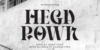 Introducing Hegarown Font, a captivating display font with a contemporary and cool aesthetic that makes it an ideal choice for a wide range of creative projects. Whether you're designing logos, establishing brand identities, crafting invitations, creating stunning stationery, shaping wedding designs, or producing eye-catching social media posts, Hegarown Font is your go-to solution. Features: Alternate Characters Numbers and punctuation Multilingual PUA encoded Thank You
 - Recepts NF by Nick's Fonts,
$10.00Here’s a futuristic face with a neo-retro twist, based on the logotype for the 1990s tank-warfare videogame for the Mac, Spectre. Whether you're going back to the future or resurrecting a blast from the past, this face will get you there in style. Both versions of this font include the complete Unicode Latin 1252, Central European 1250 and Turkish 1254 character sets. - Bonehead JNL by Jeff Levine,
$29.00 Thematic fonts aren't always big sellers, but they do serve a purpose for specialty projects and applications. Bonehead JNL is a novelty typeface that is constructed out of bones. Whether the need is for a pirate theme, Halloween, horror movies or for things that go bump in the night, this font will fill the bill – no bones about it. Oh, wait! Yes there are!
 - Mareka Japanese Style by Twinletter,
$15.00 Mareka, our newest font, is now released. Beautiful, tidy, and elegant font with a distinctive shape. If you employ this typeface, your once-good project will become something truly unique. This typeface is appropriate since the shape of each letter may be used in a variety of ways, including serious, relaxed, and natural. Because everyone does not necessarily understand Japanese letters, we supply fonts with letters that can be utilized for your project. We produced this display font with a Japanese theme or an Asian font, which we designed to fulfill the needs of your Japanese-themed project. Of sure, your initiative will be understood by people all around the world. Logotypes, food banners, branding, brochure, posters, movie titles, book titles, quotes, and more may all benefit from this font. Of course, using this font in your various design projects will make them excellent and outstanding; many viewers are drawn to the striking and unusual graphic display. Start utilizing this typeface in your projects to make them stand out.
 - PF Fuel Pro by Parachute,
$79.00 This typeface was inspired by the rough surroundings of a modern city and reflects the contradicting nature of an emerging global youth culture. Ever since its first release—back in late 1999— it is constantly on our ‘most wanted’ list and has been part of numerous product campaigns. Music, mobile telephony, food and beverages, politics, you name it. Coca-Cola used it, José Cuervo used it for about 3 years. The new ‘Pro’ version goes one step ahead. You may now capture the essence of the younger generation in every major European language. PF Fuel has been extended with the full array of Cyrillic characters as well as matching frames for this extra stamped look. Furthermore there more alternate characters than ever. Create a custom look, when same characters sit close, or one next to the other. You may find these useful—alternate characters either in the lowercase positions, or access them through the ‘stylistic alternates’ OpenType Pro feature. If you need some extra fuel, this is where to get it!
 - Stem by ParaType,
$40.00 The thing is that many sans-serif typefaces are usually intended for universal usage. But sometimes faces that work fine in body text look not so good in large point sizes for display purposes when all the contrast in non-contrast sans-serif, or ink traps, become visible to the naked eye. Every designer solves this problem in his own way. We offer a drastic solution in our Stem: a sans-serif with optical sizing. The first part of the type family, Stem Display, is for use in largest point sizes, from 36 pt indefinitely. Stem Display consists of 12 faces of widths from Hairline to Bold, and it has true italics. The development of Stem type family will include Stem Text for body text and “traditional”, universal use, and Stem Caption for small point sizes. Stem is a geometric sans-serif with semi-closed aperture, large x-height and modern proportions of uppercase letters, like in famous Avenir and Gotham. Its important feature is a professionally designed and carefully tested Cyrillic glyph set.
 - Yorklyn Stencil by House Industries,
$33.00 Yorklyn Stencil includes three fonts, each optimized for use at different size ranges. Grande has greater contrast and more delicate breaks designed to be used at larger sizes where finer details are more conspicuous. Medium and Petite are intended for smaller sizes where the breaks and contours must be more resilient. We embedded several OpenType layout features, including traditional fractions and nut fractions. We extensively tested Yorklyn Stencil in what might be the broadest range of media and conditions in the annals of Northwestern Delaware typefounding history. From the ceramic kilns of Heath Ceramics to our studio’s stucco facade, Yorklyn Stencil’s robust curves and deceptively delicate breaks will withstand a wide variety of harsh conditions with unprecedented aplomb. Whether you’re hand cutting a stencil to buzz your bespoke restaurant bar stools or simply looking for a practical yet illustrative display font, Yorklyn Stencil’s elegant efficacy will enhance any creative composition. Like all good subversives, House Industries hides in plain sight while amplifying the look, feel and style of the world’s most interesting brands, products and people. Based in Delaware, visually influencing the world.
 - ITC Eborg by ITC,
$29.99Designed by the highly regarded American designer George Ryan of the Galapagos Design Group. George is the veteran of a number of successful display fonts and there is no reason why ITC Eborg, with it's striking appearance, should not follow suit. Is it a bold casual sans serif or a disciplined brush script? Probably the former but only just. Whatever it's category though, ITC Eborg has the pedigree to become a highly successful and much sought after font. It has been carefully designed to maximize it's usage potential with conventional capitals combining well with a lowercase in which the x-height is just about right for both large display application whilst retaining good legibility at some of the smallish point sizes. ITC Eborg, with it's warm friendly qualities which are very much in evidence, and in a world where it has become so important to convey that casual approachable air," even in the most aggressive of advertising, be it product or service, it is definitely a style to fill the need." - Debugger by Dharma Type,
$9.99 Debugger is a futuristic, sicentific, digital family of next-generation monospaced fonts for developing, programming, coding, and table layout. Some desirable features in monospaced fonts are listed below. 1.Easy to distinguish 2.Easy to identify 3.Easy to read Debugger has very distinguishing letterforms for confusable letters such as Zero&Oh, One&I, and Two&Z. A lot of ingenuity makes this family very distinguishable. Italics have somewhat large inclination angle to be distinguished from their Roman. For the same reason, Italics are slightly lighter than Romans. Italic is not cursive Italic. It is near the slanted Roman. This is an intentional design to identify Italic letters. Cursive is not suitable for programming font. Octagonal and diagonal letterform is good for sci-fi, digital projects. Common elements for each letterform makes harmony and a sense of unity. Debugger supports almost all Latin languages. Try this all-new experiment.
 - Fresh Onion by Haksen,
$12.00 Hello Guys! I would like to present my new collection font with handmade style. Fresh Onion comes with natural taste of handwritten. with the real hand done I created them, also additional Extrude for a layered font to make good sensation feel. When you type with this font, I believe you will enjoy the sensation of the natural feel of this font, equipped with ligatures and extrude features make the display even stronger for your projects such as posters, logos, advertisements, book covers and all brands for your requirement. I recommend for you to use photoshop or illustrator to make design with this font and let see when you will say WOW :) So what include when You want to use them ? OTF Ligatures Numbers + Punctuation Non-English support Ligatures Extrude for a second layer font Please contact me if anything question,I'm glad to help :) Happy Designing, Haksen
 - Rabsy by D&K Project,
$15.00 Rabsy is a unique cartoon font with a doodles concept. The included dingbat doodles pattern makes it easy for you to make unique patterns, and make fun display tittle. A mixed-case font (Rabsy and Rabsy Pattern) with lots of combination possibilities, makes for great fun! It is good for logotype, stickers, fun kids signs, and other lettering projects. This fun is perfect combination uppercase and lowercase. Rabsy File Downloaded: - UPPERCASE and lowercase - Lots of doodles Rabsy Pattern 1-9, A-Z and a-z (more fun with lots of combination possibilities) - Punctuation and numeral - Extended Latin characters for language support. Please let me know in the comments what you think or if you have any issues or queries, If you have any questions about licensing, need help with a typeface, or would like to request a new feature, drop me a message. Thank you, D&K Project