10,000 search results
(0.036 seconds)
- Temeraire by TypeTogether,
$49.00 Quentin Schmerber’s Temeraire serif font family was not designed to be invisible. It is a typographic exploration meant to be seen — with its beauty, one could even say beheld. While some fonts aim to be as easily ignored as possible, Temeraire is offered as a gift to wide-eyed readers with its anything-but-boring character and its conspicuous inconsistency in styles. Most type families increase the weight of each character to expand the family. Instead, research into 17th century sources produced Temeraire’s wide range of letterforms, from the predictable to the odd and loosely related through time. Each style is designed to work alongside the others but are also standalone homages to specific parts of English lettering tradition: gravestone cutting, writing masters’ copperplates, Italiennes, and others. Temeraire’s Regular style is a contrast-loving Transitional Serif with vertical stress, making it great for period and classic works, ironic pieces, and modern throwbacks. The weight of the Bold squares off the ends of each glyph to give it stability, and the italic style rings true: flowing, contrasting, and purposefully inconsistent. Temeraire’s Display Black style is one salvaged from expressive gravestone artistry. The details most easily noticed are the ‘g’ with its descending bowl that has been pressed back up in the centre, and the additional serif on the ‘t’ crossbar that holds its neighbouring character at bay. (The ‘g’ and ‘Q’ have loopless alternates.) The final style is the Italienne, the horizontally stressed counterpoint to the family. By design its characters flow and bend in ways not in step with the rest of the family. All the weight has been pushed to either hemisphere within each glyph, resulting in a display style that demands space and peacefulness around it so its presence can impress. As with all TypeTogether families, Temeraire meets the current designer’s needs. Not only does its five styles shine in print work, it includes alternates for when the defaults are too boisterous and has been expertly crafted for screens. The Temeraire serif font family is resurrected from echoes in time and finds its family relation through impeccable taste.
 - Bloem by Eurotypo,
$24.00 Bloem, two new fonts with oodles of character designed by Carine de Wandeleer. Its slight bounce and intentional irregularity gives your words a wonderful flow. The thick and thin strokes in this typeface combine balance and harmony. This new font family includes a sans regular and a script font. The script has OpenType features such as Stylistics and Contextual alternates, Swashes, Ligatures, up to nine Stylistic sets by letter that allow you to mix and match pairs of letters and a Central European language support to fit your design. This will help your creativity and make it easier to make the impressive and elegant typographic work. All OpenType features may only be accessible via OpenType-aware applications, or the Character Map to view and copy any of the extra characters to paste into your favorite text editor/app. Bloem Sans is a complementary handmade font, that works in harmony with Bloem script to create accurate typographic designs quickly! Bloem looks lovely on wedding invitations, greeting cards, logos, business-cards, fashion, magazines, food packaging and menus, book covers and whatever your imagination holds!
 - Grindmore by LetterStock,
$25.00 **Grindmore Font** This pair was inspired by the vintage poster design that i saw on some coffee shop, It was crafted by hand specially to add natural handmade feeling in its brand identity than i make it clean with pentool. **Opentype features** Grindmore font has 222 character set included Cricket Font is very good looking in logo, labels, t-shirt prints, product packaging, invitations, advertising and others. * Multilingual support (Western European characters). This fonts works with folowing languages: English, Danish, Dutch, Estonian, Faroese, Filipino, Finnish, French, German, Hungarian, Icelandic, Irish, Italian, Norwegian, Polish, Portuguese, Spanish, Swedish. Thank you for using this font. LS
 - Bluewind by Nathatype,
$29.00 Bluewind is an elegant script font that is designed to replicate the beauty of a handwritten signature. Every letter in this font is crafted with a subtle and low-contrast approach creating an effortless appearance reminiscent of an artist's signature on paper. The calibrated spacing and graceful curves ensure that it remains not only visually captivating but also easy to read. You can use this font in headlines, logos, posters, invitations, name cards, branding materials, and many more.
 - Dutche by Craft Supply Co,
$20.00 Dutche: Boldly Defined Meet Dutche – Display Serif, where boldness takes center stage. This thick, low-contrast serif font stands out. Added serifs on stems enhance its masculine aura. It’s eye-catching, making a statement with every word. Masculine Appeal Dutche offers a sturdy, masculine look to your text. The extra serifs bring a unique toughness. Its bold nature catches the eye immediately. This font doesn’t just say; it declares. Furthermore, it works great for headlines and logos.
 - DeVinne by Linotype,
$29.99 DeVinne Ornamental is a display typeface from the famous Parisian typefoundry Deberny & Peignot, developed around 1900. Its style has become synonymous with the Art Noveau period, which was raging internationally when DeVinne Ornamental's letters were first drawn. The typeface is named after the renowned American printer Theodore Low DeVinne (1828-1914). Optimal uses for DeVinne Ornamental include headlines in magazines and newsletters.
 - Southern Belle by Angie Makes,
$12.00 Southern Belle, a cute little handdrawn font with a ton of character and a slow, southern drawl, was inspired by sweet tea and southern blossoms. Its uppercase letterforms would be a great fit for logos, envelope addresses, and more! This Southern Belle font features repeating borders, and a ton of cute little doodles. (try using + + +, = = = , and _ _ _ to see borders repeat). To access all of the characters in this font, we recommend using the glyphs panel in Adobe Illustrator. This font works best in open type aware software. Comes as an .otf font file. NOTE: To access all of the cute extras in this font that are not accessible from your keyboard, you will need software with open type glyph capabilities such as ADOBE ILLUSTRATOR or ADOBE INDESIGN.
 - Lovely Emily by Olivetype,
$18.00 Lovely Emily is a simple, quirky and adaptable handwritten font. Its informal style and casual vibe will make this font a go-to choice for each of the creations that require a relaxed touch. The font Lovely Emily contains 194 glyphs, supporting 66 languages, which include: Afrikaans Albanian Catalan Danish Dutch English Estonian Finnish French German Italian Norwegian Portuguese Spanish Swedish Zulu, and more. So what's included: Basic Latin A-Z & a-z. Numbers, symbols, and punctuations Multilingual Support. Accented Characters : ÀÁÂÃÄÅÆÇÈÉÊËÌÍÎÏÑÒÓÔÕÖØŒŠÙÚÛÜŸÝŽàáâãäåæçèéêëìíîïñòóôõöøœšùúûüýÿžß Thank You.
 - Fabiola by Lián Types,
$49.00 -Fabulous, beautiful, friendly, talkative, sweet, caring, a little on the odd side, very desirable by many, good at almost everything- That's the definition of Fabiola according to the slang dictionary of americans. If you were you looking for something delicious, a font that covers a really wide range of uses and always looks amazing, Fabiola should be your choice. Although it may look as another of my scripts with juicy swashes, this time I explored in depth the pairing and interaction with capital letters for more unique results. Why? We are going through some crazy days where the number of people interested in letters is only growing. We see lettering everywhere: I can say that finally our field is shouting out loud; letters are THE protagonist more than ever. Hence the need of combining and pairing different styles is booming. Fabiola Script and Fabiola Caps were done in a way that they seem to need each other. There's nothing better than the above images to prove this. But, how does it work? The big swashes of the Script style were designed so they can surround, wrap and mingle with the Caps styles. The smaller swashes are meant to be used when the Script is alone. Simple, right? I hope you find Fabiola useful on your projects and enjoy using it like I did when making the posters! Have a super fabulous day!
 - Bottle Fork by PizzaDude.dk,
$15.00 Here is my font with carved out letters, like a really bad stamp. Each lowercase letter has 3 different versions, and that makes your text more natural, organic and handmade. Normally I kern my fonts throughout, but this time there is no kerning at all...and that's odd, when we're not talking about monospaced fonts. Anyway, Bottle Fork has its flaws and jumpy x-height...but that's exactly the charm of it all! :)
 - Geomatrix by Type Innovations,
$39.00 The font Geomatrix is an original design by Alex Kaczun. It is a dynamic stencil interpretation based on his extremely successful Contax Pro family of geometric sans typefaces. Geomatrix is a contemporary stencil typeface based on generous proportions and clean, crisp lines.The stencil treatment is balanced visually with the stem weight of the font which creates a uniformity and harmony within the design. Geomatrix makes for easy reading and is ideal for long lines of copy. It exudes a strong sense of sophistication for a true stencil design. However, this is no ordinary stencil typeface. That's putting it mildly. Geomatrix is a font on STEROIDS! This unique OpenType font incorporates hundreds of CAPITAL alternate letter forms and glyph substitutions, automatically and on the fly, within InDesign and other Open Type applications. To turn this feature on, just typeset ALL CAPS and go into InDesign's OpenType>Stylistic Sets and select Set 1 from the menu. Turn character kerning from Metrics to Optical, adjust tracking to minus 20-30, and start typing to create some visually interesting letter substitutions and unique word combinations. Geomatrix was specifically designed to take advantage of the OpenType format, allowing the Graphic Designer a unique tool to achieve the desired degree of possible visual typographic effects. And finally, the character sets in Geomatrix have been expanded to include old-style figures and all Eastern European accented glyphs. Strap in and hold on to your seats. A revolution in new font technologies has begun! GEOMATRIX IMPORTANT PLEASE READ HOW TO ACCESS "ALTERNATE" STYLISTIC "SET 1" LETTER FORMS: Geomatrix is a unique OpenType font which incorporates hundreds of CAPITAL alternate letter forms and glyph substitutions, automatically and on the fly, within InDesign and other OpenType applications. To turn this feature on, just typeset ALL CAPS and go into InDesign\'d5s OpenType>Stylistic Sets and select "Set 1" from the menu. Turn character kerning from Metrics to Optical, adjust tracking to minus 20-30, and start typing to create some visually interesting letter substitutions and unique word combinations. This feature "stylistic set 1" can be toggled "on" or "off" anytime, allowing you to go back and forth, or select only the letters that you want to change. Geomatrix was specifically designed to take advantage of the OpenType format, allowing the Graphic Designer a unique tool to achieve the desired degree of possible visual typographic effects. And finally, the character sets in Geomatrix have been expanded to include old-style figures and all Eastern European accented glyphs. Strap in and hold on to your seats. A revolution in new font technologies has begun!
 - Odyssey Pro by Tim Rolands,
$29.00Odyssey Pro is an elegant and majestic face well suited for display work in books, magazines, posters, invitations, and more. Featuring an abundance of ligatures and alternates, as well as swash capitals. Its design was inspired by the letterforms of classical Roman inscriptions in stone but also strongly influenced by later calligraphic forms. The result is a chiseled authority and dignity tempered by a refined warmth and flow. - Agreable Modern Script Font by sizimon,
$20.00 Hello thanks for visiting our font Agreable Script! Since the font made it on the scent of luxury. Suitable to create beautiful hand-made typography in an instant. It is free-flowing & bouncy curves. Agreable is perfect for logos, printed quotes, invitations, cards, product packaging, headers and whatever your imagination holds. Agreable Includes: Uppercase,lowercase,numeral,punctuation & Symbol Multilingual support Stylistic alternates PUA Encoded Characters Fully accessible without additional design software.
 - Milonguita by Sudtipos,
$49.00 Milonga is one of the most characteristic dances of Argentina and it is usually compared to Tango. However, couples perform shorter and more energetic movements when dancing to the beat of Milonga. In addition, while Tango evokes the idea of nostalgia and reminiscence, Milonga conjures up more light-hearted memories in people's minds. Milonguita was designed so that readers can experience the passion and spontaneity of this dancing style through words. Users can play with the upwards and downwards patterns of the letters creating different images and textures and thus, making texts flow smoothly and naturally, just as a warm piece of Milonga would. The irregularity of the strokes conveys emotions and establishes a bond between the font and the sensitivity of the writer. The result will be a typographic combination of elegance, energy and rhythm which will surely reach the heart of the reader. Milonguita comes in all font formats, including a Opentype version plenty of built-in alternates and a simulated random code. Digitized by Alejandro Paul.
 - Love Song JNL by Jeff Levine,
$29.00 Love songs are the perennials of music, outlasting all other popular fads and styles that come and go. The 1920s through the 1940s is considered by some to be the Golden Age of the American love song. Thousands upon thousands of copies of popular sheet music sold, and the cover lettering and art on many titles were from some of the finest illustrators of their time. Love Song JNL recreates the Art Deco-flavored design found on one such piece of sheet music from the 1930s.
 - Hostrange by Ditatype,
$29.00 Hostrange is a captivating handwritten font that brings a touch of authenticity and personality to your designs. With its brush-style letterforms and varying brush stroke thicknesses, this typeface captures the essence of handcrafted charm. The special feature of this handwriting lies in its dynamic brush stroke variations, where each letter showcases a range of thicknesses. This adds a sense of organic movement and visual interest to the font, mimicking the natural variations found in hand-drawn brush calligraphy. The result is a font that feels alive and full of character. The brush strokes create a natural and flowing appearance, as if they were crafted by hand with a brush. The varying thicknesses add depth and dimension, enhancing the font's authenticity and handcrafted feel. The letterforms of Hostrange strike a balance between legibility and artistic expression. While each letter maintains its distinctive shape, the varying brush stroke thicknesses bring a sense of uniqueness to each character. Features: Alternates Ligatures Multilingual Supports PUA Encoded Numerals and Punctuations Hostrange fits in headlines, logos, posters, invitations, packaging, branding materials, or any project that calls for a handwritten aesthetic. Find out more ways to use this font by taking a look at the font preview. Thanks for purchasing our fonts. Hopefully, you have a great time using our font. Feel free to contact us anytime for further information or when you have trouble with the font. Thanks a lot and happy designing.
 - Riquet by Lipton Letter Design,
$20.00 In the nineteen-twenties and early thirties, all display typography flourished in Europe. This was especially true in Germany, where poster design set a high creative standard, stimulating the design of a fantastic group of dramatic display letterforms. Richard Lipton designed Riquet after being inspired by a handful of freehand capital and lowercase letters on posters designed by lettering and poster artist Ludwig Hohlwein. He expanded this small group of display letterforms into a variable family with a weight axis. Riquet is a low contrast, delightfully casual typeface with 6 weights and the perfect selection of alternates. All of which gives an expressive look of precisely inked letters perfect for any packaging or branding project.
 - Blue Goblet Florals by insigne,
$32.99 The designer-favorite Blue Goblet family has grown with the addition of Blue Goblet Florals. Blue Goblet Florals are flowing and abstract ornaments that resemble foliage or flowers rendered in Cory Godbey's unique illustration style. These fresh and lively foliage inspired ornaments can be resized easily without any loss of quality, and can easily be converted to outlines and modified. These floral ornaments can be combined to form unique compositions or inserted directly into layouts. Please see the sample .pdf to see all 55 floral ornaments in action, and be sure to check out the original Blue Goblet brush script and Blue Goblet ornaments, frames and vignettes. Blue Goblet Florals is a collaboration between insigne Design and Portland Studios.
 - Hummingbird by Laura Worthington,
$39.00 Hummingbird is reminiscent of old-fashioned cursive penmanship found in treasured letters bundled together by silken ribbons or in worn leather-bound ledgers. Hummingbird is graced with an impressive number of contextual alternates (214!) that bring a flowing randomness to the typeface, creating a more natural handwritten appearance. The font also has 266 swashes including an entire set of decorated uppercase letters that add personality, emphasis, and beauty. See what’s included! http://bit.ly/2cdVw4d *NOTE* Basic versions DO NOT include swashes, alternates or ornaments These fonts have been specially coded for access of all the swashes, alternates and ornaments without the need for professional design software! Info and instructions here: http://lauraworthingtontype.com/faqs/
 - Tavern by FontMesa,
$25.00 Tavern is a super font family based on our Algerian Mesa design, with Tavern we've greatly expanded the usability by creating light and bold weights plus all new for 2020 with the introduction of extra bold and black weights Tavern is now a five weight family. The addition of the bold weight made it possible to go further with the design by adding open faced shadowed, outline and fill versions. Please note, the fill fonts are aligned to go with the open faced versions, they may work with the outline versions, however you will have to apply them one letter at a time. The Tavern Fill fonts may also be used a stand alone font, however, the spacing is much wider than the regular solid black weights of Tavern. In the old days of printing, fill fonts rarely lined up perfect with the open or outline font, this created a misprinted look that's much in style today. To create that misprinted look using two different colors, try layering the outline fonts offset over the top of the solid black versions. Next we come to the small caps and X versions, for a font that's mostly seen used in all caps we felt a small caps would come in handy. The X in Tavern X stands for higher X-height, we've taken our standard lowercase and raised it for greater visibility in small text and for signage where you want the look of a lowercase but it needs to be readable from the street. In August of 2016 I started the project of expanding this font into more weights after seeing the font in use where someone tried creating a bold version by adding a stroke fill around the letters. The result didn't look very good, the stroke fill also caused the shadow line to merge with the serifs on some letters. This lead me to experiment to see if a new bold weight was possible for this font and I'm pleased to say that it was. After the bold weight was finished I decided to type the regular and bold weights together in a first word thin second word bold combination, however the weight difference between the two wasn't enough contrast. This lead me to wonder if a lighter weight was possible for this font, as you can see yes it was, so now for the first time in the history of this old 1908 type design you can type a first word thin second word bold combination. So why the name change from Algerian to Tavern? Since the original font was designed in England by the Stephenson Blake type foundry I decided to give this font a name that reminded you of the country it came from, however, there were other more technical reasons. During the creation of the bold weight the engraved shadow line was sticking out too far horizontally on the bottom right of the serifs dramatically throwing the whole font off balance. The original font encountered this problem on the uppercase E, L and Z, their solution was a diagonal cut corner which was now needed across any glyph in the new bold weight with a serif on the bottom right side. In order to make the light and regular weights blend well with the bold weight diagonal cut offs were needed and added as well. This changed the look of the font from the original and why I decided to change the name, additional concerns were, if you're designing a period piece where the font needs to be authentic then this font would be too new. Regular vs. Alt version? The alternate version came about after seeing the regular version used as a logo and secondary text on a major product label. I felt that some of the features of the regular version didn't look good as smaller secondary text, this gave me the idea to create an alternate version that would work well for secondary text in an advertising layout. But don't stop there, the alternate version can be used as a logo too and feel free to exchange letters between both regular and alternate versions. Where are the original alternates from Algerian? Original alternates from Algerian are built into the regular versions of Tavern plus new alternates have been created. We're excited to introduce, for the first time, all new swash capitals for this classic font, you're going to love the way they look in your ad layout, sign or logo. The best way to access alternate letters in Tavern is with the glyph map in Adobe Illustrator and Adobe InDesign products, from Adobe Illustrator you can copy and paste into Photoshop as a smart object and take advantage of all the text layer style features Photoshop has to offer. There may be third party character maps available for accessing alternate glyphs but we can't advise you in that area. I know what you're thinking, will there be a Tavern Condensed? It takes a lot of hours to produce a large font family such as this, a future condensed version will depend on how popular this standard version is. If you love Tavern we're happy to introduce the first weathered edge version of this font called Bay Tavern available in February 2020.
 - Code Monkey by Comicraft,
$19.00 Underpaid? Overworked? If you like Fritos, Jolt and Mountain Dew in your cubicle, your big warm fuzzy Donkey Kong heart is going to like these fonts a lot. Developed in conjunction with actual Code Monkeys*, this user-defined type IS defined -- it's loud and proud, and available in functional monospace for screen or elegant proportional spacing for print. When your pet project needs a soft, pretty face that's visible from across the office, sit down and pretend to work with CodeMonkeyVariable. Released from the captivity of monospacing, these lovely letters can convey even your wildest story ideas. When your syntax needs to line up on screen, get monospaced out with CodeMonkeyConstant. Copy from other sources and your screen captures will look so sweet you'll no longer have to pray your code complies to specs, because even your login page will look like dynamic rock star programming.
 - Neonrec by Ditatype,
$29.00 Neonrec is an innovative display font that merges futuristic aesthetics with the mesmerizing allure of neon lights. With its bold uppercase letterforms and a luminous neon backlight, this typeface commands attention, creating a visually stunning and forward-thinking experience. The special characteristic of this font lies in the sleek and cutting-edge design, embodying the essence of a futuristic world. Each letter is meticulously crafted with precision and sharp lines, exuding a sense of technological advancement and modernity. The neon backlight adds a striking visual element that elevates the font to new heights. Inspired by the captivating glow of neon lights, Neonrec infuses a sense of energy and innovation into each character. The luminous backlight creates a radiant glow that casts a captivating hue, reminiscent of the neon signs that adorn the streets of a futuristic metropolis. This futuristic neon effect adds depth and dimension to the font, creating an eye-catching visual impact. Features: Ligatures Multilingual Supports PUA Encoded Numerals and Punctuations Neonrec is perfect for attention-grabbing headlines, logos, and sleek branding applications that require a touch of futuristic sophistication. It is thrives in designs that embrace a forward-thinking and cutting-edge style. Whether you're creating posters, digital interfaces, sci-fi themed artwork, or anything in between, this font will add a captivating futuristic element that sets your project apart. It shines particularly bright in applications related to technology, gaming, science, and futuristic-themed designs. Find out more ways to use this font by taking a look at the font preview. Thanks for purchasing our fonts. Hopefully, you have a great time using our font. Feel free to contact us anytime for further information or when you have trouble with the font. Thanks a lot and happy designing.
 - Gutter Pigeon by PizzaDude.dk,
$17.00 Gutter Pigeon is not your every-day Ransom-kind-of-font! The prices of making it was really simple: I only used my phone and computer. I took pictures of letter from newspapers, magazines, bookcovers, candybars, movieposters, roadsigns, etc. In the beginning, It was easy to find new letters. But as I had the initial letters, it became quite a search for the missing letters. Not a hard job, you may think - but this font has 8 different versions of each letter! That's 26 lowercase glyphs and 26 uppercase glyphs...8 times! That's more than 400 glyphs! And on top of that comes numbers and punctuation! Go crazy with Gutter Pigeon! Actually, that is not very hard, because the font automatically cycles through the 8 different versions of each letter while you type! Upper- and lowercase in a wild mix!
 - MOO - Unknown license

- Omni Serif by ArtyType,
$29.00 Typefaces don't simply appear fully formed to a designer, even with a clear concept in mind, they evolve naturally during the design & development process. Out of the current 'Artytype' collection, Omni has evolved the most, being a stripped back off-spring from several exploratory exercises. At first glance and particularly at small scale, you'd be forgiven for thinking the basic characteristics have a conventional outlook; but on closer inspection, it's own distinctive, clean cut, subtle styling becomes apparent, revealing enough personality to stand alone or complement a wide variety of projects; subsequently, it's a font that won't go out of style quickly and may even become a modern classic in time. The Omni family has 2 distinct styles, sans and serif, each style being available in 4 weights; all 8 fonts have slanted options to match making a total of 16 fonts. Dictionary definition of OMNI: Combining form - Of all things, in all ways or places. Quite an apt name for a font with ubiquitous aspirations.
 - Omni by ArtyType,
$29.00 Typefaces don't simply appear fully formed to a designer, even with a clear concept in mind, they evolve naturally during the design & development process. Out of the current 'Artytype' collection, Omni has evolved the most, being a stripped back off-spring from several exploratory exercises. At first glance and particularly at small scale, you'd be forgiven for thinking the basic characteristics have a conventional outlook; but on closer inspection, it's own distinctive, clean cut, subtle styling becomes apparent, revealing enough personality to stand alone or complement a wide variety of projects; subsequently, it's a font that won't go out of style quickly and may even become a modern classic in time. The Omni family has 2 distinct styles, sans and serif, each style being available in 4 weights; all 8 fonts have slanted options to match making a total of 16 fonts. Dictionary definition of OMNI: Combining form - Of all things, in all ways or places. Quite an apt name for a font with ubiquitous aspirations.
 - Arabetics Aladdin by Arabetics,
$34.00 Arabetics Aladdin is a monoshape font family with a fixed single shape per each Arabic Unicode character. Glyphs are designed to incorporate the traditional Arabetic visual characteristics found in all four varying shapes, isolated, initial, medial, and final, for each letter. The overall design also emphasizes the line-like (khat) horizontal look and feel of the Arabetic scripts without sacrificing legibility. This font family supports all Arabetic scripts covered by Unicode 6.1, and the latest Arabic Supplement and Extended-A Unicode blocks, including support for Quranic texts. It includes two weights: regular and bold, each of which has normal and left-slanted (Italic) versions. The design of this font family follows the Arabetics Mutamathil style design principles utilizing varying x-heights and no glyph substitutions. The Mutamathil type style was introduced by the designer more than 18 years ago. The Arabetics Aladdin font family includes all required Lam-Alif ligatures in addition to all soft vowel diacritics (harakat), which are selectively positioned with most of them appearing on similar high and low levels—top left corner—to clearly distinguish them from the letters. The Tatweel or Kashida lengthening character is a zero-width glyph.
 - Code Next by Fontfabric,
$39.00 10 years later, one of the first geometric typefaces in our portfolio and a popular favorite of yours is rising to a whole new level! We’re revealing the stand-alone type family Code Next—a staggering evolution from Code Pro in functionality, versatility, and application. The transformation includes 6 new weights, 10 new Italics, full support of Extended Cyrillic and Greek, full redesign and glyphs refinement, 2 variable fonts, to name but a few. Going back to 2011, the grotesque-inspired Code Pro was designed to complement memorable pieces that make a statement. Balancing between stylization and simplification, it was encoded with the distinct voice of basic organic shapes to stand the test of time. Little did we know, it would expand and live up to the potential of a “font from the future” as the new Code Next. Today, a type family of 22 styles, this geometric sans solidifies its relevance and carries a strong constructive aesthetic through simplified forms with a twist. These fit any modern design in print, web, and display visualization. Developed to go above and beyond, Code Next comes prepared for multi-script projects with Extended Latin, Extended Cyrillic, and Greek. Explore Code Next’s versatility and switch things up with the help of 2 variable fonts, more than 1280 glyphs, and an extensive OpenType features set including small caps, standard and discretionary ligatures, contextual and stylistic alternates, stylistic sets, case sensitive forms, and much more. Overview: • Font family of 22 fonts • 10 weights • Languages - Full support of Extended Latin; Extended Cyrillic; Greek • Entirely refined design and metrics • Glyph count - 1288 • Variable fonts - 2 fonts OpenType features: • Small Caps • Standard Ligatures • Discretionary Ligatures • Contextual Alternates • Stylistic Alternates • Stylistic Sets • Case-Sensitive Forms • Ordinals • Localized Forms • Lining Figures • Proportional Figures • Tabular Figures • Oldstyle Figures • Subscripts • Scientific Inferiors • Superscripts • Numerators and Denominators • Fractions • Roman figures • Extensive mathematical support • Navigation symbols
 - Locked Puzzle by Linecreative,
$16.00 Introducing "Locked Puzzle," a captivating and bold font designed to elevate your creative endeavors with a playful twist. This unique typeface defies the conventional sharp angles, opting instead for a smooth and curvaceous form that seamlessly interlocks, embodying the essence of a puzzle waiting to be solved. Locked Puzzle's characters are imbued with a sense of whimsy and charm, making it a perfect choice for titles, posters, murals, and various works of art that demand attention. The absence of corners in this font contributes to its fluidity and friendly demeanor, creating a visual experience that is both engaging and approachable. What sets Locked Puzzle apart is its ingenious interlocking ligatures. These ligatures provide a dynamic and cohesive flow between letters, adding an element of surprise and coherence to your text. Whether used in digital or print media, PuzzleLock transforms ordinary words into visual puzzles, sparking curiosity and leaving a lasting impression on your audience. **Uppercase
 - ITC Kendo by ITC,
$29.99 ITC Kendo is the work of British designer Phill Grimshaw, suggesting the dash and verve of quick, sketchy calligraphy, complete with splatters of ink. Grimshaw says he worked deliberately against his own habits to create the forms, drawing the letters with slow deliberation" and a pointed pen. He overloaded the pen with ink and drew on rough paper, "applying a lot of pressure at the beginning of a stroke and easing off towards the terminals. Accidental splashes occurred frequently owing to the nib catching the 'tooth' of the paper." Those splashes were refined into features which enhance but do not overwhelm the characters and carefully worked so as not to leave an obvious white strip of unsplattered space between lines and letters. The initial capitals can be used alone or combined with the lowercase alphabet, and the font includes a full set of f-ligatures and some extra ligatures as well as decorative elements."
 - Bangkok Restless by Roland Hüse Design,
$25.00 I have been walking around the streets of Bangkok with my good old film camera taking photos the way like back in the day. I think there is something magical and authentic in it. Guess what, the first day I went out with that camera I stumbled upon a place is called Fotoclub BKK they develop film rolls how cool is that! I shoot all the 36 photos at the Silom area, taking random photos most came out off centred subject, wrong settings, blurry just like the way I wanted! Soon after I was working on a handwritten script that is a perfect match to the overall topic of my stay in Bangkok so I named it after this exceptional adventure I have had here. The font contains all European diacritics and special characters, some double letter ligatures and stylistic alternates for better flow and more organic and natural look. I hope you guys like it and it will add some spiciness to your next creative project! Any feedback or questions, character request please don't hesitate to contact me either in email or on social.
 - Neue June by Matt Chansky,
$21.00 Four years of development imbue Neue June with its uniquely crafted high x-height, enabling designers to literally and figuratively elevate layout designs. In today’s highly competitive brand marketplace, readability across communication platforms and memorability go hand in hand towards target audience retention. Neue June comes in six weights, from elegant thin to full-bodied emphatic bold, plus italics. You’ll find a robust selection of highly refined multilingual glyphs. In addition to a suite of ligatures, there are a number of extra characters, such as the estimated symbol, the number sign, and directional arrows. When the creative direction calls for sophisticated and memorable tactics—leverage the versatile 385 glyph count for big messages and easily consumable body copy.
 - Maisharah Script by FadeLine Studio,
$15.00 Maisharah a new Modern Script Calligraphy with its own unique flow and elegant personality :) With a style like this, this font will be suitable in use for logo's, branding projects, homeware designs, product packaging, mugs, quotes, posters, shopping bags, logo's, t-shirts, book covers, name card, invitation cards, greeting cards, and all your other lovely projects. You can use this font for your job very easily. Because there are many features in it. It contains a complete set of lower and uppercase letters, punctuation, numbers, web fonts, and multilingual support. This font also includes several ligatures and alternative style Stylistic Set For those of you who have software that is capable of working OpenType (Corel Draw / Photoshop / Illustrator / InDesign).
 - Altertypo by Popskraft,
$12.00 Altertypo, a font family on a never-ending quest for the "perfect" sans-serif style. Inspired by the early 20th-century pioneers like Gill Sans and Johnston Sans, Altertypo seamlessly blends their classic elegance with contemporary flair. This unique typeface is your passport to creative freedom in graphic design, serving a multitude of purposes from editorial and corporate to web and interaction design. This font allows you to craft compelling designs that transcend the ordinary, providing the versatility and innovation you seek. It invites you to explore a world of creative possibilities, where every character is thoughtfully placed to ensure a smooth, organic flow of words. Step into the realm of Altertypo, and leave behind the constraints of conventional fonts. It's your gateway to exceptional design, where each letter harmonizes effortlessly to deliver a captivating visual experience. Say goodbye to the limitations of standard fonts and embrace the boundless potential that Altertypo offers.
 - CCS Wakatobi by Creative Corner Studio,
$19.00 Introducing Wakatobi, our newest font creation that exudes power and beauty through its condensed sans serif display. With a distinctive character and unique form, Wakatobi is a formidable typeface designed to captivate attention. Ideal for magazine spreads, covers, and posters in large print, this massive font is tailored for titles and wide spaces. Specifically crafted for covers and posters, Wakatobi ensures it doesn't go unnoticed, making a bold impact without compromising style or legibility. Whether in large-scale designs or smaller point sizes, Wakatobi stands out, delivering a visual punch that resonates with both impact and elegance.
 - Diallome by MJB Letters,
$16.00 Diallome is a stylish signature font that has an elegant flow, this font will look very luxurious on wedding invitations, fashion logos, brand logos, thank you cards, business cards, watermarks, and any other design that wants to have a handwritten touch. Diallome Features - Uppercase and Lowercase - Numerical and Punctuation - PUA Encoded - Multilingual Language
 - Arthur Sans by SIAS,
$34.90 Arthur Sans is a new font design in the spirit of the Art Deco era, the age of elegance, stylishness and refinement. Use this unique typeface for distinctive personal stationary, outstanding business papers, captivating brochures and invitations; for marvellous posters, wonderful menus, hotel leaflets, exciting ads … for outstanding designs. You’ll find out that Arthur Sans is your friend for more than just fine typography. Five weights plus Italics – all equipped with a comprehensive Euro-Latin character set – will hardly leave anything to be desired. Additionally, the font Arthur Sans Regular contains an outstanding extra range of 70 ornamental characters, carefully designed to the very tone of the typeface, to give you a very special kick of extra value to enchant your designs. Alternatively, you can get this set of ornaments seperately, look at the Arthur Ornaments! Arthur Sans is but one part of a greater suite of exciting fonts: you may wish to also check out the sister fonts of the gorgeous Arthur Cabinet family, which will offer you another wonderful scope of fascinating typographic possibilities. For a matching Greek font go to Artemis. And finally, Arthur’s Irish friend is the fabulous Ardagh. __________________________________________________________________________________________
 - Zero_G by fontkingz,
$19.00Type/Usage: Technoid Display Font for spacecraft visual identification in high and low gravitation. Mixes well with all other kinds of GROTESKES. - Boromir by GRIN3 (Nowak),
$19.00 Boromir is a hand-drawn, serif, layered, vintage font family. Each font features over 440 Glyphs, 5 Stylistic Sets, Standard and Discretionary Ligatures. The flow and vintage style works perfectly on invitations, blog headers, branding, art quote, posters, book cover and so much more! Language support includes Western, Central and Eastern European character sets, as well as Baltic and Turkish languages.
 - Smoru by Lemonthe,
$12.00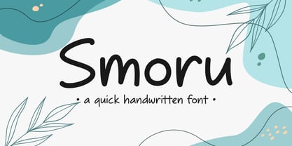 Smoru is a quick handwritten font. It is perfect for those who need to write quickly and efficiently. Its flowing strokes and consistent letterforms capture the natural rhythm and movement of handwriting, making it ideal for anything from taking notes to creating design projects. Suitable for any projects such as logos & branding, quotes, social media posts, product designs, label, and much more!
