10,000 search results
(0.05 seconds)
- Sikat Rusak by Azetype,
$59.00 Presenting Sikat Rusak! A Dry Brush Font with a stylish alternate and extra 9 swashes. This font made with the perfect combining of each character. You can type by Mix & Match with alternate version to get a unique combining. It looks original and can be used for all your project needs. Each glyph has its own uniqueness and when meeting with others will provide dynamic and pleasing proximity. This font can be used at any time and any project.
 - Galber by Craft Supply Co,
$20.00 Introducing Galber - Compressed Sans Serif: A commanding typeface that captures the eye with its bold, condensed design. With its impactful lines and modern allure, Galber adds a strong touch to your projects. Elevate your designs with Galber's assertive style, making a striking statement that simply can't be ignored. This typeface is ideal for greeting card, packaging, brand identity, poster, or any purpose to make your design project look eye catching and trendy. Feel free to play with this typeface!
 - Hess Gothic Round NF by Nick's Fonts,
$10.00 The family tree of this friendly face runs deep. Its primary inspiration is Twentieth Century, designed by Saul Hess as a monoline version of Paul Renner’s Futura. The design was reinterpreted by Herb Lubalin as Avant Garde in the 1970s. This version softens the harsh geometry of the original designs with rounded line endings: the result is a warm, inviting face that is elegant, confident and inviting. All versions of this font include the Unicode 1250 Central European character set in addition to the standard Unicode 1252 Latin set.
 - Cartoon Panel JNL by Jeff Levine,
$29.00 Charles W. "Plot" Plotner was a cartoonist who had developed a template-based cartooning set for kids circa 1952 called "Plot-O". A companion set was called "Plot-O the Clown". "Plot-O" consisted of two plastic templates with pre-cut and numbered cartoon shapes. By following the simple directions and tracing the corresponding parts, any youngster could create basic cartoons of people and finish them off with their own details. The hand-lettered instruction booklet provided the design inspiration for Cartoon Panel JNL.
 - Mexica by Sudtipos,
$39.00 Mexica is a typographic tribute to Nahuatl, the tongue of the Aztecs, but also the lingua franca of ancient Mexico. ‘Mexica’ is not only the feminized, latinized form of the word ‘Mexico’, but also the name of the inhabitants of this place: the Me-xic-cah. Nahuatl, when composed in the Latin alphabet, abounds in diagonal letter shapes: XYZ are ubiquitous in its classic orthography, just as KW are in its modern one. This visual feature is further enhanced by the absence of some rounded letters such as BDG that depict inexistent sounds in this millenarian tongue. Besides, Nahuatl is language with a tendency to form very long words that give the text quite a distinct appearance, unlike English, for instance, with its abundance of short words. Mexica was designed to look well in all these contexts, and to perform as well as a contemporary, daring, stylish serif type family, with several weights for text and display composition. Further, its terminals and general structure —devoid almost completely of straight lines—are inspired by the angled architecture and ornamentation of the ancient city of Mexico- Tenochtitlan. Mexica received an Award of Excellence at the Type Directors Club of New York annual competition.
 - Bulkr by Hackberry Font Foundry,
$24.95 Over the years, I've used Impact a lot. But, not because I liked it—rather because it was the only font I could find with the bulk I needed for a given title or whatever. I finally decided to make my own. It was originally built off Librum Sans Bold, but I quickly made a mask of Impact for the widths, bumped the x-height way up, made the horizontals much heavier, and on and on. You know how it is when you start designing. The result is a black sans with the bulk of Impact and much more interesting character shapes. I suspect I'll use it a lot. My hope is that you like it as much as I do. Have fun!
 - HWT Van Lanen by Hamilton Wood Type Collection,
$24.95 In 2002 Matthew Carter was commissioned to create a new design to be cut in wood by the then nascent Hamilton Wood Type Museum. This was significant in that this was the one format for which Carter had not yet designed type. The new design emerged as a two-part chromatic type to be cut specifically in wood. Originally called Carter Latin, the font was renamed Van Lanen after one of the Museum's founders. The first cutting and printing of the type took place in late 2009 and although it has been available through the Museum, contemporary wood-type production is expensive and few have acquired this font in wood. The digital version of the pair of Van Lanen fonts is now available. The design recalls Antique Latin wood type, but with a refined sensibility and intentional quirks (like the sideways ampersand). It is a wonderful addition to Carter's oeuvre, and to the ongoing history of wood type.
 - Twogether Sans by Sudtipos,
$39.00 Twogether Sans builds upon the achievements of Twogether Rounded, creating a more comprehensive system and positioning itself as a suitable choice for general text usage. By removing the rounded elements from each character, Twogether Sans gains increased flexibility and a broader range of possibilities for different types of projects. It retains the essential characteristics of its counterpart, such as proportions, x-height, small caps, ligatures, numerals, and the construction of the italic variant. This version also introduces distinctive alternate characters for "T," "Y," "y," and "a." However, in this case, the position of the "a" with an old-style eye has been adjusted to enhance legibility in this context. These details maintain consistency with the Rounded version while reinforcing Twogether Sans' unique personality. It remains an excellent choice for branding, editorial design, promotional materials, packaging, and digital applications.
 - HS Almisk by Hiba Studio,
$50.00 HS Almisk is a display typeface. It can be used for titles, logos and graphic projects, which support Arabic and. It has been created based on modern kufi style. It enjoys flexibility between sharp and curved lines in the structure of characters. This supports with a beautiful appearance and wonderful geometric structure. The sharp endings in the bottom of character also give an aesthetic addition to the character. (8) Weights has been created for this typeface between the Light weight and Black weight. Besides, those three additional weights which can be used in headline, has baseline parts are thicker than the vertical parts. One has a regular form and the others has a stencil form in the middle using various styles. This typeface with its diversity of (8) weights is intended to be an attempt for a good addition to Arabic typography.
 - Nouveau LX Expanded by Vanarchiv,
$31.00 The original design came from Berthold Herold typeface, designed by Hermann Hoffmann during 1913 (Art Nouveau style) in Germany. This project started from flyer printed during 1947 with movable type, the specimen was scanned as a source to development some of the uppercase letterforms. However the most unusual and tricky element from this sample is the leg from the uppercase (R) which is different from the original Herold design, until now I didn’t found where this version originally came from. This expanded version only contain the bold weight, however there are also stencil (Nouveau LX Stencil) and condensed version (Nouveau LX) available.
 - Nouveau LX by Vanarchiv,
$27.00 The original design came from Berthold Herold typeface, designed by Hermann Hoffmann during 1913 (Art Nouveau style) in Germany. This project started from flyer printed during 1947 with movable type, the specimen was scanned as a source to development some of the uppercase letterforms. However the most unusual and tricky element from this sample is the leg from the uppercase (R) which is different from the original Herold design, until now I didn’t found where this version originally came from. This font family only contain the bold weight, but there are also a stencil and expanded versions available.
 - Amido by Daily Studio,
$17.00 Amido is a gorgeous display typeface designed by Daily Studio. Make your design look exceptional with easy accessibility. Amido will pair beautifully with various fonts and function well with the project you are working on. Perfect for gorgeous logos and headers. This typeface includes full lowercase, uppercase, numbers, punctuation, and standard multilingual letters. With over 200 glyphs and file in OTF format.
 - Azsion by Okaycat,
$24.50 From Okaycat is the Azsion font, hand-lettered with loving hand in a distinctive style. This font is artistically textured with great detail, yet highly legible with a soft pleasant look. Azsion matches well with Okaycat font, Azsitra. Illustrated pen & ink, artistic typography for that hand drawing look. Azsion is extended, containing West European diacritics & ligatures, making it suitable for multilingual environments & publications.
 - Libertad Mono by ATK Studio,
$15.00 A new dynamic and industrial display font with octagonal shape and rounded inner contours. Constructed with a modular system. It includes a full set of letters (uppercase), numerals, and symbols. Libertad Mono family comes with 6 weights, from Thin to Black. Designed by Radinal Riki Mutaqin. This type features a Latin Pro character set, covering multiple languages written with the Latin script.
 - Gens De Baton by HiH,
$10.00 Gens De Baton is based on a charming lower case alphabet that appeared in the Almanach des Enfants pour 1886 (Paris 1886) under the heading “Amusing Grammar Lessons.” Gens De Baton means simply “Stick People.” The unknown designer turned the bare letter forms into drawings of people for the enjoyment of the children for whom the almanac was intended. The letter forms themselves were based on the French Romain du Roi (King’s Roman), except for the ‘g’ and the ‘j’ -- which were based on Baskerville. The letters ‘w’ and ‘y’ were not included, as they are seldom seen in French. We have left the letters somewhat rough, as they appeared in the Almanach des Enfants , resisting the temptation to clean up all the lines and render them with digital perfection. We have used our HiH Firmin Didot to supply an upper case and auxiliary characters, as Didot was originally a modified version of Romain du Roi. It is interesting to observe the contrast between the polished look of the Didot upper case and the rough, hand-drawn look of the lower case. Purchasers of this font have our permission to use it for the amusement of adults as well as children. We recommend setting Gens De Baton at 24 points or larger.
 - Meier Kapitalis by Elsner+Flake,
$39.00 As a late work the “Meier Kapitalis” forms an arch within the typographic creations of the Swiss type designer Hans Meier who died in 2014. The first sketches of this typeface can be found in the teaching manual “The Development of Script and Type” (German: “Die Schriftentwicklung”; French “Le développement des caractères”) which was published in 1994, however, under the title “Roman Lapidary, 1st Century”. The booklet was first published by the Syntax Press, Cham, Switzerland and contains an introduction by Max Caflisch in which he writes: „The present work, „The Development of Script and Type“ is a concise, authoritative textbook, concentrating on the essentials in a wide survey from ancient Greek inscriptions to the printer’s typefaces of the present day. His (Meier’s) 72 varieties of letterforms enable the student or general reader to understand the history of script and type, while more than 60 of his own calligraphic specimens provide excellent models for all who practice this art.“ Unfortunately, the “Meier Kapitalis” is one of the few typeface families in this publication which has been digitized. It was to be the last type project fully realized by Meier. In cooperation with Elsner+Flake, the typeface family was developed and expanded and now contains the four cuts: Roman, Medium, Demi Bold and Bold with either a complement of characters for 78 Latin-based languages (EL=EuropaPlus) or in West-Layout.
 - Ante Cf by Creative17studio,
$9.00 Introducing Ante Cf Fonts. A font that's modern, clean, and bold like the roman sans serif font. This font comes in many weights up to 18 weights. The contrasts between thick and thin make this font unique. This font is made with modern characteristics which can give a bold impression in each character, making this font suitable for corporate needs for larger business needs. For branding purposes? Sure. This font is also made for the needs of this field, so that your branding seems more modern. And this font is also useful for news editorial purposes. Coupled with serif types and scripts are also very suitable. You can see all the examples of using this font above. Ante cf also supports various languages, so that it can make it easier for all countries to use and language usage.
 - Linotype Laika by Linotype,
$29.99Linotype Laika is part of the Take Type Library, chosen from the entries of the Linotype-sponsored International Digital Type Design Contests of 1994 and 1997. This fun font was created by Dutch designer Mark van Wageningen, who based its forms on those of a sans serif font but gave them wavy, irregular contours. They look almost as though they lie just under the surface of a pool and the movement of the water gives them their undulating appearance. The dynamic Linotype Laika is especially good for headlines in larger point sizes or shorter texts in point sizes of 14 or larger. - Barbou by Besnowed,
$19.99 Barbou was originally cut in 1925 by Monotype as a counterpart to Fournier, siblings that were different in design but both based on the work of Pierre-Simon Fournier. Whether by choice, accident or oversight, Fournier was preserved digitally, and Barbou was lost to history. Barbou was notably used by Stanley Morrison, in particular as the face of The Fleuron. I fell in love with Barbou when I saw it, and knew that I wanted to bring it to a new generation of designers and readers. This is a revival of Barbou, a faithful recutting with new weights, characters and many of the best features that modern font technology brings. Particular attention was paid to the original Monotype Barbou 178 specimen sheet. Originally only available in a single weight, Barbou has been recut with a variable weight, providing a large degree of flexibility between Regular and Bold. Barbou excels as a comfortable reading face for books, and the variable weight allows you to fine tune the darkness and texture of the page in a way never before possible. Barbou has a distinctive softness, and this revival of Barbou preserves much of the effect the medium of metal type had on the letterforms. This results in a subtly rounded yet defined type, elegant not worn, with the utmost attention and respect to the smallest of details. Barbou was originally cut with disparate x-heights for roman and italic, and this revival of Barbou features both the original italic, as well as a new italic redesigned at the same height as the roman. In Fournier’s time, roman and italic would not be mixed on the same line, but the type must change to meet the needs of a new generation. Barbou also features unique ligatures and alternates, old style numbers, small caps and a full Greek alphabet. Barbou is perfect for books and anywhere a comfortable reading face is required, and excels in flexibility.
 - Fun Zone by Sakha Design,
$12.00 Fun Zone is a fun, fun display font. With its modern and bold character, this typeface will be the right choice for you to use.
 - Amelie by Typadelic,
$19.00This is a connected script font with a trendy flair. You can add little flourishes to the beginning or end letters for a whimsical touch. - Stencil PTX by Pedro Teixeira,
$12.00 Introducing the Stencil PTx font family. We created two styles, sprayed, to be used in display giving the idea of graffiti on the wall and the clean, to possibly be used in print. This is the idea We have of an old school stenciled typeface/look. This typographic masterpiece brings the raw energy and urban flair of stencil graffiti art to your fingertips. The Stencil PTx font family is tailored for designers seeking to infuse their projects with the rebellious spirit and visual impact of street art. Whether you're designing for urban-themed events, streetwear branding, social media graphics, or edgy advertising campaigns, this font family adds an authentic urban edge to your creations. At Pedro Teixeira Foundry we're passionate about bringing the raw and vibrant energy of street art into the realm of typography. Explore the Stencil PTx font family to unleash the bold, gritty, and dynamic essence of stencil graffiti, elevating your designs with an urban attitude that commands attention and amplifies your message.
 - ASTYPE Ornaments Accolades A by astype,
$28.00 The astype series Accolades A offers the designer a fine balanced set of calligraphic swashes, swirls and floral ornaments. The shapes are in systematic order and harmonize in contrast and detail. The shapes can be combined easily and the advanced designer can build hundreds of sophisticated compositions. No matter, whether packaging lables, invitations or greeting cards - every assignment with the need of a delightful appeal will be served well. Accolades A and A2 share the same base set of ornaments but differ in some of the major shapes. Despite these differences, the total width of the shapes will be always the same. If you are looking for some good companion fonts, give Gracia and Adana a try. Every classic high contrast stroke design like Didot or Bodoni works well. Note: To look perfect, adjust the size of the ornament font to fit in contrast the design of the companion font. So if you use a Bodoni font as companion, try to match the thickness of the thinnest part of a upper case Bodoni letter with the thinnest part of a shape from the ornament. Note 2: Each package comes with a technical documentation and an InDesign2 sample file.
 - Daft Script by Hanoded,
$15.00 I really like creating script fonts. Why, I hear you say? Well, creating script fonts lets me be me. I am not trying to create classy, connected fonts for you to write love letters with: there are already too many of those available and quite frankly, I just don't like them. I prefer the messy script fonts - uneven, no real baseline and with a bit of splatter or rough edges for good measure. Daft script is one of these messy script fonts: it was handmade and it comes with two alternates for the lower case glyphs that cycle as you type. This is an all-caps font, so that means you have 4 options per letter! I also love languages (I speak 6), so Daft Script comes with fantastic language support, including Vietnamese and Sami.
 - Exceptional by Studio&Story,
$16.00 Exceptional Is a super trendy Handwritten font, Elegant & modern with gentle brush texture , Exceptional comes with a complete set of lowercase and uppercase alternates(Uppercase letters can be used alone), It gives you the option to customize your text and to make it much more unique (It's very fun). And more great extra is the bonus Swash, this set come with 26 swashes, which allows you to add elegant & trendy finishing touches to your work. It's the perfect choice for personal branding projects, product packaging, social media, fashion, advertising and more!...
 - Wilberty by Timurtype,
$14.00 Introduced by Timurtype Studio! Wilberty is a Handbrushed Signature Script Font This font embrace the artistry of handwritten elegance with our handbrushed signature script font, where every stroke tells a story of timeless sophistication and personal style. Redefine your brand with a touch of bespoke authenticity Wilberty font is perfect for product packaging, branding project, megazine, social media, wedding, or just used to express words above the background. Wilberty Font also supports multilingualism. Enhance your designs with our original fonts, feel free to comment or provide feedback, Enjoy the fonts 😊 Thank You
 - Radiant Days by Prestige Artsy Studio,
$19.99 Spice up your designs with Radiant Days an elegant retro bold serif with its lovely rounded curves that will give a modern retro touch to your designs. Radiant Days with its alternates will provide your project. Whether you are a logo designer, or looking for a great bold header to your designs, retro quotes, Radiant Days will definitely make your work stand-out. To access the ligatures and the stylistic alternates make sure they are ON in the OpenType Feature option. Supported languages: Western European Central European South Eastern European South American Oceanian
 - Ribka by Craft Supply Co,
$20.00 Ribka - The Elegant Pointed Serif Font harmoniously blends the classic appeal of sharp serifs with an exquisite sense of sophistication. This typeface radiates timeless charm, making it an excellent choice for projects that seek a touch of enduring beauty and grace. Whether you're creating invitations, developing branding materials, or curating editorial content, Ribka seamlessly instills a sense of opulence and distinction into your work. With its precise and pointed serifs, Ribka stands as an emblem of timeless sophistication in the realm of typography, elevating any project with an essence of refinement and exclusivity
 - Joy River by Mightyfire,
$15.00 Introducing Joy River, a delightfully quirky handwritten font that adds a playful and charming touch to your designs. This whimsical typeface captures the essence of spontaneity and creativity, as if each character were penned by an imaginative hand with a penchant for the unconventional. Whether you're designing invitations, greeting cards, or adding a personal flair to your branding, Joy River ensures that your message is delivered with a unique and memorable charm. Its handcrafted feel brings a human touch to digital creations, inviting viewers to engage with the text on a more personal level.
 - Adelaila by Sikifonts,
$10.00 Adelaila is a simple handwritten script font that comes in two styles, brush and monoline. With the Contextual Alternate (OpenType) feature, if you type a word with double letters, as in 'sweet' 'mono' or 'creative', the next duplicate lowercase character will be automatically replaced by an alternate character. This will make the handwritten font appear more natural. Other features: Standard Ligatures Stylistic Set - Ending (ss01) Tabular Figure Discretionary Ligatures to access swash glyphs with combination symbols You will need OpenType-savvy programs such as Illustrator, InDesign, Publisher, Designer, CorelDraw etc. to access OpenType features.
 - Grims Acid by Figuree Studio,
$18.00 Grims Acid is a spine-chilling, liquid-inspired Halloween display font that oozes with eerie vibes. With its twisted, dripping letters and macabre aesthetics, this font is the perfect choice for adding a touch of horror and dark whimsy to your Halloween-themed designs. Whether you’re creating spooky party invitations, haunted house posters, or eerie social media graphics, Grims Acid will give your text a hauntingly memorable twist that sends shivers down the spine. Embrace the supernatural and let Grims Acid infuse your designs with a ghoulishly delightful atmosphere.
 - Bronzo by XO Type Co,
$39.00 This is a 2023 redesign of Bronzo, originally designed by Rick Valicenti and Mouli Marur in 1991. With this redesign, Bronzo now has 6 new weights, for a total of 9, and 587 more glyphs than it was able to in 1991. Bronzo appears to move forward, yet remain still, via a center stroke that only sticks out on the left, a tense curve that only happens on the right, and a width that sits uncomfortably between square and rectangle. Those three things, combined with a balanced light to dark ratio, are what makes Bronzo appear tense and ready. Bronzo accepts Modernist ideals of minimal, rational construction—but it also adopts luxuriant shapes over Modernism’s sandblasted neutrality. It’s almost an alternate reality, a “what if?” of Modernism. Modernism’s fun, interesting, cute reboot.
 - Stellie by Olivetype,
$18.00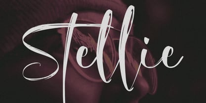 Stellie is a stylish script font with unique textures. Embrace this eye-catching script font to create something truly unique. With its versatility, you can use it on anything from logos, web design, and social media posts to branding material and more. Give your designs the wow factor with Stellie Script Font!
 - Argenta by Sudtipos,
$59.00 Argenta is handwritten and fresh. The casual spirit of this face is evident, but complemented by very specific typographic details. A playful script with an immensely useful array of alternate characters. Released in OpenType format to expand possibilities of use with lots of alternates when used with OpenType-aware applications such as AdobeCS.
 - Immensity by Innire,
$17.00 Immensity is a stylish font family with graceful ligature features and stylistic alternatives (for example, the letters i and j). Smooth and elegant lines combined with high contrast in bold lettering. All this, together with support for diacritical symbols and five different weight, makes it possible to use it widely in various projects
 - Barnstormer Script by Dear Alison,
$29.00 Have you ever wondered why sign painter scripts, even though they can sometimes be filled with unusual letterforms strike up such a personal connection of familiarity? Is it the weight of the brushstrokes, or is it the quick fluidity of the strokes? Whatever the reason, a sign painter script just has personality! Barnstormer Script taps into that association and brings a speedy sassiness reminiscent of retro travel brochures and appliance advertisements. But for whatever you might need this script for, you'll find it up for the task. Add a little flavor to your font collection and pick up Barnstormer Script today!
 - Linotype Cutter by Linotype,
$29.99Linotype Cutter was designed by Georg John in 1997. As the name suggests, the font looks like it was cut out of black cardboard pieces. Each letter has a irregular rectangle black background and they combine to form heavy rows of letter elements. The strong contrasts of the font make it good for short headlines or initials in larger point sizes and combines well with almost any text font. Georg John made a second version of this theme called Linotype Schere (scissors) it is a companion typeface where the conturs of the letters are even rougher in its form. - Strom by Lasse Strøm,
$35.00 STROM is а modern sans serif font with minimalistic and geometric characters. The rounded corners give the typeface a friendly look, yet it retains a professional quality. The attention to detail paid during its development means that this typeface offers a vast range of design possibilities – and helps users create eye-catching designs. The different font styles are built on the same foundation, so they can be mixed and matched while maintaining a harmonious look. The simple, clean lines make it noticeable and ideally suited in display settings, advertising, packaging, logo, branding, poster, billboards, film, television, web, screen and print design.
 - Montage by House Industries,
$33.00 Montage has played a weighty role in some of the most influential and enduring typography of the past few decades, from book jackets and album covers, to posters and logos…you name it. Exhibiting an uncommon ability to wield immense power while demonstrating extraordinary finesse, Montage’s commanding profile packs a hefty punch which is softened only by its lithe yet durable serifs. Originally designed for Photo-Lettering in the mid-1960s by type legend, Ed Benguiat, the fonts were given a jump start by Jess Collins before ultimately being shaped into five compatible widths by longtime House co-conspirator, Mitja Miklavčič. Under the guidance of Ben Kiel, along with some additional chin-stroking by Ken Barber, Montage has been fully developed into a robust family ready to tackle any challenge you can throw at it. FEATURES LIGATURES: In order to ensure that Montage maintains its bold presence in tricky text settings, we’ve added a handy set of pre-drawn letter combinations. When enabled, the Ligature feature identifies problem pairs like—fl, fi, ff, ffl, and of course, fyi—and substitutes them with glyphs optimized to enhance font performance. ALTERNATES: For fickle typographers, we’ve also added a handful of alternate characters to allow Montage to suit any number of mood Like all good subversives, House Industries hides in plain sight while amplifying the look, feel and style of the world’s most interesting brands, products and people. Based in Delaware, visually influencing the world.
 - Wyoming Macroni by Ingrimayne Type,
$14.95 Wyoming Macroni is the split-serif (or Tuscan) version of the Wyoming series. The Pegged version adds a horizontal spike through the middle of the stems, which has been a popular variation of this style. Included in the family are two shadowed versions. The ShadowedInside styles can be used in layers with the Shadowed styles to easily create two-colored letters.