10,000 search results
(0.04 seconds)
- Astrid Grotesk by Eclectotype,
$40.00 Astrid Grotesk is a normalized version of Schizotype Grotesk. Normalized; not neutralized. Where many neo-grotesks appear cold with their harsh neutrality, Astrid has a warmth, eminating from its (for want of a better word) clunkiness. With the latest update, it becomes a true workhorse, with a range of widths and italics for the normal widths. Astrid Grotesk, while being clearly a neo-grotesk in appearance, has a personality all of its own. Standout characters include the f and t, and the default binocular g, unusual in neo-grotesks. And the right angled terminals on c, e and s. Stylistic sets offer up alternate forms of a, g, y, I, @, dutch IJ, german eszett and l. A full complement of numerals is included: proportional and tabular, lining and oldstyle, plus fractions, subscript and superscript. Note also that the tabular figures are duplexed across weights - very useful when highlighting specific entries in tables. The tabular figures feature also substitutes in fixed width (across all weights) comma and period, so your decimals line up perfectly always. Lastly, case sensitive forms of certain glyphs are included for all-cap settings. This typeface will be useful for corporate identities and branding work. It’s spaced more for text settings in the normal width, and gets more display-optimized as the width decreases, but with careful tracking, all styles can sing at display sizes. Bored of those other Swiss style typefaces? Astrid Grotesk could be the face you need to breathe new life into your designs. Coupled with Schizotype Grotesk, its more eccentric cousin, you've got an unorthodox branding system ready to use straight out of the box.
 - Cantiga by Isaco Type,
$19.00 Cantiga is a monophonic song or melody, sometimes repetitive, often with unpretentious themes. In the same simplicity, this font family combines robustness with some very fine details, with 44 versions for various purposes. Choose thinner (or thicker) versions for titles, and intermediate versions (normal, medium, etc.) to small sizes. Explore the condensed versions when you need to save space. Use the light versions for special cases in huge sizes. Cantiga intended to be your new "Swiss army knife" sans typeface. The Cantiga family consists of 2 widths (normal and condensed) with 11 weights each, plus their respective italic versions. The fonts are available in OpenType PS format and have extended character set to support CE, Baltic, Turkish as well as Western European languages.
 - President by Linotype,
$29.99In 1952, Charles Peignot made a bold and fortuitous move: he invited a young Swiss designer to Paris to be the art director of the Deberny & Peignot type foundry. This started the professional type design career of Adrian Frutiger; and since then he has designed an astonishing range of masterful typefaces. One of the earliest for Deberny & Peignot was Président, a sharp-seriffed Latin titling face. Latin" is a typographic designation for roman typefaces with wedge or triangular-shaped serifs, a stylistic form that Frutiger would return to later with his beautiful typeface Méridien. Président™ has wide, solid shapes; very little contrast between thick and thin strokes; and an air of assurance. Use this titling font for business cards, announcements, or artistic signage." - Caroni by Franzi draws,
$- Caroni is a cute handmade typeface, which was originally created in 2018 as a free font. It has a simple and clean look, and works great for longer texts. Caroni has already been used in numerous children's books, so now it was time to extend Caroni's look, and add more styles. The Caroni Family at a glance If you like Caroni, you will love the Caroni font family! Caroni now comes in bold and italic, and it has nine awesome siblings: Avenue (all dressed up with stylish serif strokes) Lime (the skinny version of Caroni) Avenue Lime (the skinny version of Caroni Avenue) Tabanca (dark and heavy, this is Caroni's brush version) Doubles (enhanced with fine lines) Fete (with fun little dots) Coconut (Caroni's outline style) Soursop (Outline with dots, a great display font) Carnival (a quirky and fun all-caps version) Caroni was created while staying with a friend in Trinidad, hence the names :) Languages supported: Afrikaans, Albanian, Asu, Basque, Bemba, Bena, Bosnian, Catalan, Cebuano, Chiga, Colognian, Cornish, Corsican, Croatian, Czech, Danish, Dutch, English, Estonian, Faroese, Filipino, Finnish, French, Friulian, Galician, Ganda, German, Gusii, Hungarian, Icelandic, Ido, Inari Sami, Indonesian, Interlingua, Irish, Italian, Javanese, Jju, Jola-Fonyi, Kabuverdianu, Kalenjin, Kinyarwanda, Kurdish, Latvian, Lithuanian, Lojban, Low German, Lower Sorbian, Luo, Luxembourgish, Luyia, Machame, Makhuwa-Meetto, Makonde, Malagasy, Malay, Maltese, Manx, Maori, Morisyen, North Ndebele, Northern Sami, Northern Sotho, Norwegian Bokmål, Norwegian Nynorsk, Nyanja, Nyankole, Occitan, Oromo, Polish, Portuguese, Romanian, Romansh, Rombo, Rundi, Rwa, Samburu, Sango, Sangu, Sardinian, Scottish Gaelic, Sena, Shambala, Shona, Slovak, Slovenian, Soga, Somali, South Ndebele, Southern Sotho, Spanish, Swahili, Swati, Swedish, Swiss German, Taita, Taroko, Teso, Tsonga, Tswana, Turkish, Turkmen, Upper Sorbian, Vunjo, Walloon, Welsh, Western Frisian, Wolof, Xhosa, Zulu
 - Croasian by MKGD,
$13.00 The main reason I wanted to design this font was because I really didn’t like how poorly some fonts tried to mimic an Oriental appearance. Trying to make western words appear Asian with a font composed of brush strokes is almost always doomed to failure. However, I find Croasian works extremely well with one syllable words that are Asian sounding. A good font to have if you want to express an Asian name or business phonetically in a western alphabet while still retaining an Asiatic feel. Croasian has a glyph count of 397 and supports the following languages Afrikaans, Albanian, Asu, Basque, Bemba, Bena, Bosnian, Catalan, Chiga, Colognian, Cornish, Croatian, Czech, Danish, Embu, English, Esperanto, Estonian, Faroese, Filipino, Finnish, French, Friulian, Galician, German, Gusii, Hungarian, Icelandic, Indonesian, Irish, Italian, Kabuverdianu, Kalaallisut, Kalenjin, Kamba, Kikuyu, Kinyarwanda, Latvian, Lithuanian, Low German, Lower Sorbian, Luo, Luxembourgish, Luyia, Machame, Makhuwa-Meetto, Makonde, Malagasy, Malay, Maltese, Manx, Meru, Morisyen, North Ndebele, Norwegian Bokmål, Norwegian Nynorsk, Nyankole, Oromo, Polish, Portuguese, Romanian, Romansh, Rombo, Rundi, Rwa, Samburu, Sango, Sangu, Scottish Gaelic, Sena, Shambala, Shona, Slovak, Slovenian, Soga, Somali, Spanish, Swahili, Swedish, Swiss German, Taita, Teso, Turkmen, Upper Sorbian, Vunjo, Walser, Zulu
 - Strikt Sans by Nootype,
$40.00 The idea behind Strikt Sans was to made a grotesque family with exaggerated curves combined with low contrasted aspect. Letters such as G, S or C are completely closed in any styles. The italic has a very accentuated angle at 30°, which gives a stressed and interesting appearance. This family contains many OpenType features, such as Alternates, Proportional Figure, Tabular Figures, Old Styles Figures, Numerators, Superscript, Denominators, Scientific Inferiors, Subscript, Ordinals and Fractions, which make that typeface useful in various projects. Strikt Sans family supports Latin and Cyrillic, all these languages are covered: Latin language support: Afar, Afrikaans, Albanian, Asturian, Azeri, Basque, Bosnian, Breton, Bulgarian, Catalan, Cornish, Corsican, Croatian, Czech, Danish, Dutch, English, Esperanto, Estonian, Faroese, Filipino, Finnish, Flemish, French, Frisian, Friulian, Gaelic, Galician, German, Greenlandic, Hungarian, Icelandic, Indonesian, Irish, Italian, Kurdish, Latin, Latvian, Lithuanian, Luxembourgish, Malagasy, Malay, Maltese, Maori, Moldavian, Norwegian, Occitan, Polish, Portuguese, Provençal, Romanian, Romansch, Saami, Samoan, Scots, Scottish, Serbian, Slovak, Slovenian, Spanish, Swahili, Swedish, Tagalog, Turkish, Walloon, Welsh, Wolof Cyrillic language support: Adyghe, Avar, Belarusian, Bulgarian, Buryat, Chechen, Erzya, Ingush, Kabardian, Kalmyk, Karachay-Balkar, Karakalpak, Kazakh, Komi, Kyrgyz, Lak, Macedonian, Moldovan, Mongol, Permyak, Russian, Rusyn, Serbian, Tatar, Tofa, Tuvan, Ukrainian, Uzbek
 - Attic Antique by Three Islands Press,
$29.00 Attic Antique by Three Islands Press. Flipping through a friend’s old hardbound collection of John Burroughs nature essays a while back, I thought it'd be fun to try to develop a typeface with the same uneven, imperfect look to it. I picked and chose among various printed characters, enlarged them somewhat with a photocopier, then hand-rendered each. Had to custom-make some of the accents and symbols, then added a couple goofy dingbats just for the heck of it. The result: an amazingly legible serif family akin to the Century faces.
 - VLNL TpDuro by VetteLetters,
$30.00 VLNL TpDuro was designed by chef Martin Lorenz and Juanra ‘Wete’ Pastor. Its concept was inspired by an Albrecht Dürer design from 1525, which shows a system to construct a gothic lowercase letter. Following the logic of this lowercase construction, but not the traditional uppercase letters of regular fraktur (brokenscript) alphabets, some brand new upper case letters were designed. The 45 degree tilted square that forms the basis of the letters, is as square and hard as a cracker. And we love crackers. You can put cheese on them. The ‘pixel’ feeling of the downstroke was intensified by repeating the rotated square module as often as they could. All this resulted in a strong, dark typeface with a steady rhythm, with one foot in history and the other in modern times. It works well as a display typeface for short texts, headlines and logos. Music festivals and heavy metal bands should also pay attention. This is hard stuff.
 - Urge Text by Eclectotype,
$30.00 It started with an italic, or to be more precise, half an italic. The slanted styles of Urge Text exhibit a certain bipolarity, the tops of glyphs having a standard italic form, the bottoms of glyphs being more Roman in their construction. This sturdy footing really locks the italics to the baseline, making them very legible while still being distinct from the uprights. The same bipolar approach didn't work very well in upright styles, so the Romans are more toned down. Ranging from the almost monoline, Egyptian style light weights to higher contrast ‘Modern’ bolds, there is much potential for use in typographically demanding scenarios. The family consists of six weights, normal and condensed widths, all with italics, making a total of 24 fonts; it’s a highly usable text typeface with an array of OpenType features. All styles include small caps, multiple figure styles (proportional- and tabular-, oldstyle and lining, small cap proportional figures, numerators, denominators, superscript and subscript), standard ligatures, alternate forms (stylistic sets), automatic fractions, case sensitive forms, and a handy (perhaps!) ‘percent off’ ligature in the discretionary ligatures feature.
 - New Old English by K-Type,
$20.00 New Old English was prompted by two Victorian coins, the mid nineteenth century gothic crown and gothic florin, which featured a gothic script lowercase with quite modern looking, short ascenders and descenders enabling it to fit snugly around the queen’s head or heraldic motif. With thicker hairline strokes than normal Old English, a less sharp, warmer feel than lettering scripted with a pen, and circular instead of rhombic punctuation, this font is an attempt to capture the round-cornered softness of the die-struck lowercase blackletter. To increase harmony and homogeneity between the cases, the uppercase is narrower and simpler than is customary, without the excessive width or antiquated flamboyance of the traditional blackletter. It might even allow text set in capitals to look acceptable.
 - American Revolution by Celebrity Fontz,
$24.99American Revolution is a unique collection of signatures of 84 key personalities from both sides of the American Revolutionary War, one of the supreme dramas in history. A must-have for autograph collectors, desktop publishers, history buffs, or anyone who has ever dreamed of sending a letter, card, or e-mail “signed” as if by one of these famous Revolionary War figures. This font includes signatures from the following American Revolutionary War personalities, from both sides: Ethan Allen, Charles T. Armand, John Armstrong, Benedict Arnold, Pudhomme de Borre, John Cadwalader, George Rogers Clark, George Clinton, James Clinton, Thomas Conway, William Davidson, Philippe du Coudray, The Chevalier Louis Lebegue dePresle Duportail, Chistopher Gadsden, Horatio Gates, Moses Hazen, John Glover, Mordecai Gist, Nathaniel Greene, William Heath, Edward Hand, John E. Howard, Robert Howe, Isaac Huger, William Irvine, Henry Knox, Baron Johann de Kalb, Tadeusz Kosciuszko, Marquis de Lafayette, Charles Lee, Henry Lee, Andrew Lewis, William Maxwell, Benjamin Lincoln, Francis Marion, James Moore, Daniel Morgan, William Moultrie, Peter Muhlenberg, Alexander McDougall, Lewis Nicola, Lachlan McIntosh, John Nixon, Hugh Mercer, Samuel H. Parsons, Thomas Mifflin, John Paterson, Richard Montgomery, Andrew Pickens, Charles Cotesworth Pinckney, Enoch Poor, Count Casimir Pulaski, Israel Putnam, Joseph Reed, Elisha Sheldon, Arthur St. Clair, William Smallwood, Philip Schuyler, John Stark, Charles Scott, Adam Stephen, John Sullivan, Jethro Sumner, Thomas Sumter, James Varnum, Baron Friedrich Wilhelm August Heinrich Ferdinand von Steuben, Lord Stirling, Artemas Ward, Joseph Warren, George Washington, Anthony Wayne, James Wilkinson, Otho H. Williams, John Paul Jones, William Woodford, David Wooster, John Burgoyne, Sir Guy Carleton, Charles Cornwallis, Sir Henry Clinton, Sir Thomas Gage, Richard, Earl Howe, Sir William Howe, Sir Banastre Tarleton. This font behaves exactly like any other font. Each signature is mapped to a regular character on your keyboard. Open any Windows application, select the installed font, and type a letter, and the signature will appear at that point on the page. Painstaking craftsmanship and an incredible collection of hard-to-find signatures go into this one-of-a-kind font. Comes with a character map. - philson block by chris philson,
$25.00 Philson Block is a family with upright and oblique versions. The structure of each character is based on a square divided into simple fractions. Each letter has at least one variation, with angled corners, increased widths, or altered shapes. This font is recommended for display lettering, headlines, and blocks of type that mask images.
 - Zekton by Typodermic,
$11.95 Welcome to the world of Zekton. This typeface is not for the faint of heart. With its square letterforms and sharp edges, Zekton brings a brave, industrial look to your designs. The uniform line widths and smooth curves give this typeface a serious and professional feel, perfect for the world of consumer electronics. When you use the Zekton typeface, you’ll bring a fresh and modern AM/FM portable stereo fragrance to your designs. It’s like having a pocketful of transistors at your fingertips, ready to power up your creativity. And with a twinkle in its eye, Zekton promises to add a touch of excitement to every project. Zekton is available in seven weights, two widths, and italics for a total of 42 styles. This versatility makes it easy to find the perfect fit for your project. Whether you’re designing a sleek product brochure, a cutting-edge website, or a tech manual, Zekton has the style and range to help you stand out. So if you’re ready to take your designs to the next level, give Zekton a try. It’s the typeface that’s built to handle the toughest industrial challenges, and it’s ready to help you make a bold statement in the world of consumer electronics. Most Latin-based European, and some Cyrillic-based writing systems are supported, including the following languages. A Afaan Oromo, Afar, Afrikaans, Albanian, Alsatian, Aromanian, Aymara, Bashkir (Latin), Basque, Belarusian (Latin), Bemba, Bikol, Bosnian, Breton, Bulgarian, Cape Verdean, Creole, Catalan, Cebuano, Chamorro, Chavacano, Chichewa, Crimean Tatar (Latin), Croatian, Czech, Danish, Dawan, Dholuo, Dutch, English, Estonian, Faroese, Fijian, Filipino, Finnish, French, Frisian, Friulian, Gagauz (Latin), Galician, Ganda, Genoese, German, Greenlandic, Guadeloupean Creole, Haitian Creole, Hawaiian, Hiligaynon, Hungarian, Icelandic, Ilocano, Indonesian, Irish, Italian, Jamaican, Kaqchikel, Karakalpak (Latin), Kashubian, Kikongo, Kinyarwanda, Kirundi, Komi-Permyak, Kurdish (Latin), Latvian, Lithuanian, Lombard, Low Saxon, Luxembourgish, Maasai, Macedonian, Makhuwa, Malay, Maltese, Māori, Moldovan, Montenegrin, Ndebele, Neapolitan, Norwegian, Novial, Occitan, Ossetian, Ossetian (Latin), Papiamento, Piedmontese, Polish, Portuguese, Quechua, Rarotongan, Romanian, Romansh, Russian, Sami, Sango, Saramaccan, Sardinian, Scottish Gaelic, Serbian, Serbian (Latin), Shona, Sicilian, Silesian, Slovak, Slovenian, Somali, Sorbian, Sotho, Spanish, Swahili, Swazi, Swedish, Tagalog, Tahitian, Tetum, Tongan, Tshiluba, Tsonga, Tswana, Tumbuka, Turkish, Turkmen (Latin), Tuvaluan, Uzbek (Latin), Venetian, Vepsian, Võro, Walloon, Waray-Waray, Wayuu, Welsh, Wolof, Xhosa, Yapese, Zapotec Zulu and Zuni.
 - Machtwerk by Volcano Type,
$29.00Religions are filled with signs and symbols. Some of them, like the the star of David and the Swastika-Rune received other significance during the third Reich. The superimposition of these two shapes creates the basis for this font. Matchwerk is a font, that critically questions and recalls the darkest chapter of our history. - Presence by Présence Typo,
$36.00Présence is a modern sans serif with a light stroke contrast. The capitals are a bit narrow for a titling use which makes them space-economical without lack of legibility. The lower cases have a normal width for a fluid reading. Its wide range of weights allows it many uses. - Juwitha by Letterafandi Studio,
$14.00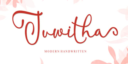 Juwitha is a modern handwitten font featuring charming, playful characters that seem to dance along the baseline. It will add a luxury spark to any design project that you wish to create! This font is PUA encoded which means you can access all of the glyphs and swashes with ease!
 - Febriella by Letterafandi Studio,
$12.00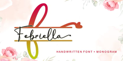 Febriella is a lovely script font featuring charming, playful characters that seem to dance along the baseline. It will add a luxury spark to any design project that you wish to create! This font is PUA encoded which means you can access all of the glyphs and swashes with ease!
 - Railway Gank by IKIIKOWRK,
$17.00 Proudly Present Railway Gank - Street Marker Type, created by ikiiko The free-spirited brush strokes of hand lettering and the strong, urban attitude of street markings combine electrifyingly to create Railway Gank. This font effortlessly jumps out and attracts attention because it embodies the fervor of the streets and the unvarnished reality of graffiti. Railway Gank's brush-style aesthetics give it a handcrafted, real charm. Its flaws and differences give it a unique personality and capture the actual spirit of street art, where each stroke is distinctive. Railway Gank uppercase letters exude confidence and flare, while the lowercase letters give off a more laid-back and welcoming vibe. It is a versatile option for numerous design concepts because of the contrast's ability to create a pleasing equilibrium. This typeface is perfect for an poster event, book cover, movie title, streetwear stuff, magazine layout, quotes, or simply as a stylish text overlay to any background image. What's Included? Uppercase & Lowercase Numbers & Punctuation Alternates Multilingual Support Works on PC & Mac Get also a good offer & FREEBIE at our site : www.ikiiko.com Enjoy our font and if you have any questions, you can contact us by email : ikiikowrk@gmail.com
 - Pitmaster by FontMesa,
$29.00 Pitmaster was designed with summertime barbecue in mind, with its straight pointed spurs Pitmaster is sure to get attention for any project western and BBQ related. Included in Pitmaster are a few alternates such as a half slab "A" and slab serif "I", also you'll find alternate "O, o" with spurs removed on one side or the other, this is useful when typing two O's together, you'll have the option of selecting one or both O's with the spurs removed between them for a closer fit on the letters. There's also alternate "D" with the right spur removed for a tighter fit with other letters if needed. Opentype case sensitive forms are also available. To all of you Pitmasters out there Keep On Smokin'
 - Asgard by Zetafonts,
$39.00 Francesco Canovaro designed Asgard as a way to mix his passion for the raw energy of extra bold sans serif typography with the expressivity of high contrast and calligraphy-inspired letterforms. He built the typeface around a strong geometric sans skeleton, to make the letters feel solid and powerful while using wood-type vernacular solutions to solve density through high contrast details. The typeface name was chosen as an homage to the mythical homeland of the Norse Gods, evoking a land of fierce warriors, power and strength - but also of divine, delicate beauty. Thanks to the help of Andrea Tartarelli and Mario de Libero the original design was extended along with the design space, expanding the number of weights and widths with a "workhorse typeface" approach, and adding also a slanted axis to experiment with italics. The result is a super-family of 9 styles of 8 weights for a total of 72 fonts, each coming with an extended set of 968 glyphs covering over 200 languages using Latin, Greek and Cyrillic scripts. The three variation axes (width, weight, slant) are also all accessible in a variable font version that is included with the whole family. This gives the designer a full range of options for typesetting, with the Roman and Fit widths providing basic display and text-sized alternatives, and the Wide width adding more display and titling options. The inclusion of backslant italic styles gives Asgard an extra chance to add its voice to the typographic palette. To complement this, all Asgard fonts have been given a full set of Open Type Features including standard and discretionary ligatures, stylistic sets, positional numerals and case sensitive forms. Dynamic and expressive, Asgard is a super-family that manages to look brutal and refined at the same time, quoting the vernacular typographic practices of letterpress print while expressing the contemporary zeitgeist. • Suggested uses: perfect for contemporary branding and logo design, bold editorial design, dynamic packaging and countless other projects. • 73 styles: 8 weights + 8 italics + 8 backslant italics, 3 different widths + 1 variable font. • 968 glyphs in each weight. • Useful OpenType features: Access All Alternates, Contextual Alternates, Case-Sensitive Forms, Glyph Composition / Decomposition, Discretionary Ligatures, Denominators, Fractions, Kerning, Standard Ligatures, Lining Figures, Localized Forms, Mark Positioning, Mark to Mark Positioning, Alternate Annotation Forms, Numerators, Oldstyle Figures, Ordinals, Scientific Inferiors, Stylistic Set 1, Stylistic Set 2, Stylistic Set 3, Subscript, Superscript, Slashed Zero • 219 languages supported (extended Latin, Greek and Cyrillic alphabets): English, Spanish, Portuguese, French, Russian, German, Javanese (Latin), Vietnamese, Turkish, Italian, Polish, Afaan Oromo, Azeri, Tagalog, Sundanese (Latin), Filipino, Moldovan, Romanian, Indonesian, Dutch, Cebuano, Igbo, Malay, Uzbek (Latin), Kurdish (Latin), Swahili, Greek, Hungarian, Czech, Haitian Creole, Hiligaynon, Afrikaans, Somali, Zulu, Serbian, Swedish, Bulgarian, Shona, Quechua, Albanian, Catalan, Chichewa, Ilocano, Kikongo, Kinyarwanda, Neapolitan, Xhosa, Tshiluba, Slovak, Danish, Gikuyu, Finnish, Norwegian, Sicilian, Sotho (Southern), Kirundi, Tswana, Sotho (Northern), Belarusian (Latin), Turkmen (Latin), Bemba, Lombard, Lithuanian, Tsonga, Wolof, Jamaican, Dholuo, Galician, Ganda, Low Saxon, Waray-Waray, Makhuwa, Bikol, Kapampangan (Latin), Aymara, Zarma, Ndebele, Slovenian, Tumbuka, Venetian, Genoese, Piedmontese, Swazi, Zazaki, Latvian, Nahuatl, Silesian, Bashkir (Latin), Sardinian, Estonian, Afar, Cape Verdean Creole, Maasai, Occitan, Tetum, Oshiwambo, Basque, Welsh, Chavacano, Dawan, Montenegrin, Walloon, Asturian, Kaqchikel, Ossetian (Latin), Zapotec, Frisian, Guadeloupean Creole, Q’eqchi’, Karakalpak (Latin), Crimean Tatar (Latin), Sango, Luxembourgish, Samoan, Maltese, Tzotzil, Fijian, Friulian, Icelandic, Sranan, Wayuu, Papiamento, Aromanian, Corsican, Breton, Amis, Gagauz (Latin), Māori, Tok Pisin, Tongan, Alsatian, Atayal, Kiribati, Seychellois Creole, Võro, Tahitian, Scottish Gaelic, Chamorro, Greenlandic (Kalaallisut), Kashubian, Faroese, Rarotongan, Sorbian (Upper Sorbian), Karelian (Latin), Romansh, Chickasaw, Arvanitic (Latin), Nagamese Creole, Saramaccan, Ladin, Kaingang, Palauan, Sami (Northern Sami), Sorbian (Lower Sorbian), Drehu, Wallisian, Aragonese, Mirandese, Tuvaluan, Xavante, Zuni, Montagnais, Hawaiian, Marquesan, Niuean, Yapese, Vepsian, Bislama, Hopi, Megleno-Romanian, Creek, Aranese, Rotokas, Tokelauan, Mohawk, Onĕipŏt, Warlpiri, Cimbrian, Sami (Lule Sami), Jèrriais, Arrernte, Murrinh-Patha, Kala Lagaw Ya, Cofán, Gwich’in, Seri, Sami (Southern Sami), Istro-Romanian, Wik-Mungkan, Anuta, Cornish, Sami (Inari Sami), Yindjibarndi, Noongar, Hotcąk (Latin), Meriam Mir, Manx, Shawnee, Gooniyandi, Ido, Wiradjuri, Hän, Ngiyambaa, Delaware, Potawatomi, Abenaki, Esperanto, Folkspraak, Interglossa, Interlingua, Latin, Latino sine Flexione, Lojban, Novial, Occidental, Old Icelandic, Old Norse, Slovio (Latin), Volapük.
 - Lydia Sans by Craceltype,
$35.00 Lydia Sans™ is an elegant geometric sans serif with a charming profile and organic flow. Inspired by the clean typography of the 1920s, it's character and legibility make it suitable for any kind of text applications, from brand design to extensive text layouts. Lydia Sans™ has 22 styles, variable font technology and its weight range spreads from hairline to ultra bold forms. Flexible and adaptable, it covers 230+ languages, including extended Latin, Cyrillic and Greek writing systems. With over 1300 glyphs per style, its Opentype features include alternative shapes, small caps, standard and discretionary ligatures, localised forms in Latin and Cyrillic, case sensitive forms, numerators and denominators, proportional and tabular figures, slashed zero, fractions and more. As a workhorse type system, Lydia Sans™ is a sans serif for everyday use and a great choice for a wide range of applications. • Suggested uses: perfect for brand design, editorial design, web design and packaging design; • 22 styles: 11 weights + 11 italics. • 2 variable fonts; • 1315 glyphs in each weight; • OpenType features: Access All Alternates, Small Capitals From Capitals, Contextual Alternates, Case-Sensitive forms, Glyph Composition, Discretionary Ligatures, Denominators, Fractions, Standard Ligatures, Lining Figures, Localised forms, Numerators, Oldstyle Figures, Scientific Inferiors, Small Capitals, Stylistic Alternates, Stylistic Set 1, Stylistic Set 2, Stylistic Set 3, Stylistic Set 4, Stylistic Set 5, Stylistic Set 6, Stylistic Set 7, Stylistic Set 8, Subscript, Superscript, Tabular Figures, Slashed Zero; • 220 languages supported (extended Latin, Cyrillic, Greek alphabets).
 - Esperanto by Linotype,
$29.99Franko Luin, Esperanto's designer, on this typeface: Esperanto has a lot in common with classic typefaces, and newer interpretations of the classics. The italic reminds of the lettering idea of the Renaissance and their manuscripts. This typeface's name refers to the international language Esperanto, of course. The font is not compatible with the character set of the Esperanto language - Coffin Secrets by Vozzy,
$14.00 Description: Step into the hauntingly nostalgic world of 80s horror films with 'Coffin Stories,' a meticulously handcrafted font that channels the chilling essence of vintage movie posters. This font will infuse your designs with the eerie charm and crafty appeal you've been seeking. What Awaits You: Unique Font: 'Coffin Stories' boasts meticulously designed letters, numbers, and additional characters inspired by the spine-tingling aesthetics of the 80s. Multilingual Mastery: Your audience knows no bounds with our font, offering complete multilingual support. Why 'Coffin Stories' is the Choice for You: Recreate the authentic atmosphere of vintage horror films with this unique font. Elevate your poster designs, t-shirt graphics, and logos with an unmistakable crafty touch. Seamlessly adapt to different projects with multilingual support and versatile font formats. Seize this opportunity to infuse your designs with the spirit of the 80s. Download 'Coffin Stories' now and start creating captivating visuals.
 - Burnt Dreams by Vozzy,
$14.00 Description: Step into the hauntingly nostalgic world of 80s horror films with 'Burnt Dreams,' a meticulously handcrafted font that channels the chilling essence of vintage movie posters. This font will infuse your designs with the eerie charm and crafty appeal you've been seeking. What Awaits You: Unique Font: 'Burnt Dreams' boasts meticulously designed letters, numbers, and additional characters inspired by the spine-tingling aesthetics of the 80s. Multilingual Mastery: Your audience knows no bounds with our font, offering complete multilingual support. Why 'Burnt Dreams' is the Choice for You: Recreate the authentic atmosphere of vintage horror films with this unique font. Elevate your poster designs, t-shirt graphics, and logos with an unmistakable crafty touch. Seamlessly adapt to different projects with multilingual support and versatile font formats. Seize this opportunity to infuse your designs with the spirit of the 80s. Download 'Burnt Dreams' now and start creating captivating visuals.
 - Graveyard Wind by Vozzy,
$14.00 Description: Step into the hauntingly nostalgic world of 80s horror films with 'Graveyard Wind' a meticulously handcrafted font that channels the chilling essence of vintage movie posters. This font will infuse your designs with the eerie charm and crafty appeal you've been seeking. What Awaits You: Unique Font: 'Graveyard Wind' boasts meticulously designed letters, numbers, and additional characters inspired by the spine-tingling aesthetics of the 80s. Multilingual Mastery: Your audience knows no bounds with our font, offering complete multilingual support. Why 'Graveyard Wind' is the Choice for You: Recreate the authentic atmosphere of vintage horror films with this unique font. Elevate your poster designs, t-shirt graphics, and logos with an unmistakable crafty touch. Seamlessly adapt to different projects with multilingual support and versatile font formats. Seize this opportunity to infuse your designs with the spirit of the 80s. Download 'Graveyard Wind' now and start creating captivating visuals.
 - Strapwork by 2D Typo,
$36.00 The Strapwork is a symbolic font with the ornaments from the 16th century Mannerism era. These type of ornaments are called Strapwork and are combined with the Moreske ornament. Together they create a rich and refine style. As a prototype for this font I took the tables of ornament examples by etcher Balthasar Bos (1554). The font contains high quality vector graphics with a special attention paid to details. This collection consists of many friezes (borders). There are more than ten basic motifs and a great number of combinations. The ribbon elements are easily laid out by typing the combination of letters. The four typefaces help to combine ornaments in various tones and colors. By overlaying plants elements with ribbon elements you can get a multicolor richness and combinations variety. The font comes with a detail documentation and examples in PDF format. The Strapwork ornaments will ideally suit your needs in graphic design, textile industry or various decorations. The Strapwork font can be easily used not only in traditional approach but also in grunge stylistics, which will enrich your compositions.
 - GungsuhChe by Microsoft Corporation,
$129.00GungsuhChe™ features a mincho (serif) stroke style with half-width Latin characters. This GungsuhChe font file is 6.9 MB in size. GungsuhChe is a trademark of the Microsoft Corporation. GungsuhChe Character Set: Latin 1, Korean code page 949 - Etrusco Now by Italiantype,
$39.00 Etrusco Now is the revival of a lead typeface originally cast in lead by Italian foundry Nebiolo in the early 1920s. Heavily inspired by the design of the Medium weight of Schelter & Giesecke's Grotesk, Etrusco was, like Cairoli, an early precursor of the modernist grotesque superfamilies: a solid, multi-purpose "work-horse" typeface family that could solve a wide range of design problems with its range of widths and weights. When designing the new incarnation of Nebiolo's Etrusco, the Italiantype team directed by Cosimo Lorenzo Pancini and Mario de Libero decided to extend the original weight and width range to keep this "superfamily" approach. Etrusco Now has twenty-one styles widths in three widths of seven weights each, with matching italics; the original weights for the typeface have been collected in the Etrusco Classic subfamily. Etrusco Now new widths allowed the team to include in the design many nods and homages to other vintage classics of Nebiolo. The lighter weights of the normal width have been heavily influenced by the modernist look of Recta, while the heavy condensed and compressed widths refer to the black vertical texture of Aldo Novarese's Metropol. This infuses the typeface with a slightly vintage mood, making Etrusco at the same time warmly familiar and unexpected to eyes accustomed to the formal and cold look of late modernist grotesques like Helvetica. Contemporary but rich in slight historical quirks, Etrusco Now is perfect for any editorial and branding project that aims to be different in a subtle way. Etrusco Now's deviations from the norm are small enough to give it personality without affecting readability, while its wide range of open type features (alternates, stylistic sets, positional numbers) and language coverage make it a problem solver for any situation. Like its cousin Cairoli, Etrusco is born out of love for lost letterforms and stands like its lead ancestor from a century ago, at the crossroads between artsy craftsmanship and industrial needs.
 - Easton by Typemotion,
$15.00 I wanted to combine a classical antiqua with corners and edges. I was convinced this combination would create a new, a fresh design of types. At the beginning I used the forms from "Goudy Old Style", later I modified the sizes, the widths of the letters, the x-height and their forms in general. At the moment the Easton Family consists of 3 styles called Easton Serif, Easton Semiserif and Easton Sans.
 - Jadey by Graphicfresh,
$14.00 Jadey - The Classical Serif Font We tried to make different fonts. With a touch of the ethnic past. So that this font looks more classic and modern. Measuring each letter reminds us of the past in some works in Indonesia. Although it looks classic, this font is perfect when combined with today's design styles. Have fun being creative with this font.
 - DT Serifia by Deveze Type,
$29.00 DT Serifia Sans is a modern grotesque with a playful character. The font family contains seven widths and one Variable Font. From extra thin to ultra bold, you will surely appreciate this font. Typography will take on its own mood with it. The vertical terminals give it a sense of sophistication even with all its playfulness. A wide range of weights allows using this typeface in a variety of projects, and a plethora of OpenType features will make your project look outstanding. A wonderful addition to your collection, it is perfect for branding, magazines, web, broadcasting, packaging, apparel prints, prints etc.
 - Alien Argonaut AOE by Astigmatic,
$19.95The Alien Argonaut typeface is an emaciated typeface made from the lettering of beings that have lived amongst us for centuries, evolving with humankind. Study your environment, all is not what it seems. Use this typeface to try and blend into their world within ours. Purchase Alien Argonaut today, for knowing the roots of others may help you learn to live in harmony with them. - Breakdance Reborn by Trustha,
$15.00 Breakdance is inspired by dance moves, the first font created with this concept is sans serif with a curved shape in one direction. Curves are made not too extreme, so that they maintain the shape balance. And now Breakdance comes in several styles and is divided into three typesface, namely script, sans and serif. Each typeface has several different styles and the total is 18 fonts.
 - Generic by More Etc,
$15.00 The Generic Typeface Collection is a series of sans-serif typefaces inspired by the craftsmanship of graphic design, typesetting, and printing in the analogue era – before Adobe, Macintosh computers and desktop publishing – when dinosaurs ruled the earth. With the use of various typesetting apparatuses or dry transfer type, photo copiers, and shooting layouts and paste-ups to film, the printed results was not as exact, precise and predictable as it is today. When examining old prints, it is difficult not to like the way that characters in over- or underexposed film have a special type of vibe to them that is often sadly lost in today’s pursuit of total perfection. Encouraged by this, I saw a need for a collection of typefaces that are non-clinical and non-conformist, and some that are coarse, rough and distorted – errors that might come from poor exposure when put on film, enlargements from small point texts, or maybe quality loss from successive generations of photocopies. Or all of the above. This is an attempt to incorporate spirit and personality into a set of typefaces without losing distinction. You might call it a homage to non-perfection. I call it human. The Generic Typeface Collection consists of 11 fonts divided into four series. The three standard series – the Formal Release series, the Coarse Copy series, and the Rough Display series – all contain three fonts each. The Extra Splendor series contains a couple of shadow fonts for that little extra sparkle. Formal Release – Handcrafted & Clean The Formal Release series features sans-serif typefaces for everyday use. They are handcrafted and clean, human and uncomplicated. The Formal Release series contains three typefaces that add tons of personality to any text. G10 FR ‘Slim’ – a slightly under-exposed and clean typeface in a regular weight (228 glyphs - 1 alternate) G20 FR ‘Classic’ – a properly exposed clean typeface in a bold weight (228 glyphs - 1 alternate) G30 FR ‘Bulky’ – a heavily over-exposed clean typeface in an ultra weight (228 glyphs - 1 alternate) Coarse Copy – Dirty & Rough The Coarse Copy series features non-conformist typefaces that are worn and rough, maybe after going through that bad copier a few times too much. The Coarse Copy series contains three sans-serif typefaces that add tons of spirit to any text without compromising too much on legibility. Try them on in poster-sizes and everyone will know that you mean business. G40 CC ‘Slender’ – an under-exposed coarse typeface in a regular weight (228 glyphs - 1 alternate) G50 CC ‘Typic’ – a properly exposed coarse typeface in a bold weight (228 glyphs - 1 alternate) G60 CC ‘Huge’ – a heavily over-exposed coarse typeface in an ultra weight (228 glyphs - 1 alternate) Rough Display – Faded & Decorative The Rough Display series features attention-seeking decorative typefaces in three feature-packed fonts. Faded and gritty like the image distortion and degradation from successive generations of photocopies, they are eye-catching typefaces intended to stand out in bigger point sizes. Use these typefaces for signage, headlines and similar situations were a strong typographic statement is desired. We have packed no less than 1,334 alternate characters and 212 discretionary ligatures into this series for a greater chance of not having characters that look exactly the same more than once. G70 RD ‘Slinky’ – an under-exposed rough and decorative typeface in a regular weight (741 glyphs – 448 alternates – 66 discretionary ligatures) G80 RD ‘Standard’ – a properly-exposed rough and decorative typeface in a bold weight (748 glyphs – 448 alternates – 73 discretionary ligatures) G90 RD ‘Swollen’ – a heavily over-exposed rough and decorative typeface in an ultra weight (748 glyphs – 448 alternates – 73 discretionary ligatures) Extra Splendor – Sparkling & Extraordinary The Extra Splendor series features two shadow typefaces for that little extra sparkle. One clean shadow to be used with G20 FR ‘Classic’, and one rough shadow to be used with G80 RD ‘Standard’. Having the shadows separate from the main typeface adds another layer of expressiveness in that you can try out color combinations for that extra splendor. Tips for matching (applies to both the base font and the shadow font): Set the kerning to Metric, not optical. Increase tracking to accommodate for the shadows extra width. G25 ES ‘Classic Shadow’ – a clean shadow to be used with G20 FR ‘Classic’ (228 glyphs – 1 alternate) G85 ES ‘Standard Shadow’ – a rough shadow to be used with 80 RD ‘Standard’ (227 glyphs) OpenType features – alternate characters and discretionary ligatures – can be accessed by using OpenType friendly professional design applications, such as Adobe Illustrator, Adobe InDesign, and Adobe Photoshop.
 - BOMADHA by Twinletter,
$15.00 Bomadha is a one-of-a-kind display font with Asian elements. The typeface, which has been built with remarkable harmony in every phrase structure that arises, makes your complete project look luxury and gorgeous, causing your entire audience to fall in love with it. Logotypes, food banners, branding, brochure, posters, movie titles, book titles, quotes, and more may all benefit from this font. Of course, using this font in your various design projects will make them excellent and outstanding; many viewers are drawn to the striking and unusual graphic display. Start utilizing this typeface in your projects to make them stand out.Caps only fonts.
 - Serena by Canada Type,
$24.95The story of Serena is a unique one among revivals. Serena was neither a metal face nor a film one. In fact it never went anywhere beyond Stefan Schlesinger’s 1940-41 initial sketches (which he called Saranna). A year later, while working with Dick Dooijes on the Rondo typeface, Schlesinger was sent to a concentration camp where he died, along with any material prospects for the gorgeous letters he'd drawn. The only sketches left of Schlesinger’s Saranna work are found in the archives of the Drukkerij Trio (the owner of which was Schlesinger’s brother-in-law). The sketches were done in pencil and ink over pencil on four sheets of paper. And now Hans van Maanen revives Schlesinger’s spirit as closely as the drawings permit, and elaborately expands the work to cover a multitude of codepages and languages. It took more than 65 years for Schlesinger’s drawings to see the light, so van Maanen made sure to bring them to life stylishly and respectfully. Serena embodies the peace and calm rarely ever found in mainstream calligraphy or other genres of display type. With upright elegance and a slight Eastern touch, this typeface expertly bridges the gracefully casual with the deeply spiritual. The light and soft letter forms add a pleasant, breezy element to anything they touch. When used sparingly in titling or display, Serena is like a sigh of desire, rare but quite memorable and very appreciated. - My Hands by Wiescher Design,
$49.50 The hands in this font are the pointing, counting, threatening, signaling, demonstrating and playing hands I use in my own design projects. I have drawn them all with a felt-tip marker, scanned and digitized for use in a font. This picture font is more user-friendly than having single ps-files. I usually convert the letter to paths once I have decided which one to use, because I might want to fill the lines or background with different colors. Yours very handy, Gert Wiescher.
 - Cervino by Typoforge Studio,
$29.00 Did you know that Cervino is the Italian name for one of the highest and most beautiful mountain in Europe - Matterhorn? Just like this majestic peak, our new family is HUGE. Cervino family consist of three width masters, with nine weights in each of them, giving the total amount of 54 instances. It is full of different features - from the wide set of numerals and math signs, by small caps to subscript and superscript. It covers full latin and Cyrillic script. Cervino would be a perfect choice for headlines, newspapers and for the longer texts as well.
 - Nesobrite by Typodermic,
$11.95 The Nesobrite typeface is a striking representation of the modern, boxy design aesthetic. Its linear, mechanical structure is the perfect embodiment of clean and neutral, with an austere edge that adds a touch of sophistication to any design. This font has been inspired by classic square-sans fonts, such as Bank Gothic and Microgramma, but with a contemporary twist that sets it apart. One of the most remarkable aspects of Nesobrite is its ability to imbue your message with a clear, professional, and authoritative voice. Its scientific vitality is sure to make your text come to life, whether it is for a technical report, a research paper, or a business presentation. The font’s versatility makes it ideal for conveying complex data and analytical information in a concise, clear, and easy-to-read manner. Nesobrite is also packed with useful features that make it an invaluable tool for any designer. Its small caps function is a useful addition for those looking to create designs that exude an air of formality and elegance. The font comes in five different widths and weights, as well as italics, which allows designers to use it in various contexts and settings. But what truly sets Nesobrite apart is its boxy design. The typeface’s clean and geometric structure is an ode to the modernist design movement, with its minimalistic and uncluttered aesthetic. Its sharp corners, angular edges, and right angles give it a distinct and eye-catching appearance that is sure to capture the attention of anyone who sees it. In conclusion, the Nesobrite typeface is the perfect tool for designers looking to create a sleek, modern, and professional look for their projects. Its linear, mechanical design, scientific vitality, and boxy design make it a versatile and dynamic font that is sure to elevate any project to new heights. With its range of weights, widths, and italics, Nesobrite is the perfect font for any designer looking to make a statement with their work. Most Latin-based European writing systems are supported, including the following languages. Afaan Oromo, Afar, Afrikaans, Albanian, Alsatian, Aromanian, Aymara, Bashkir (Latin), Basque, Belarusian (Latin), Bemba, Bikol, Bosnian, Breton, Cape Verdean, Creole, Catalan, Cebuano, Chamorro, Chavacano, Chichewa, Crimean Tatar (Latin), Croatian, Czech, Danish, Dawan, Dholuo, Dutch, English, Estonian, Faroese, Fijian, Filipino, Finnish, French, Frisian, Friulian, Gagauz (Latin), Galician, Ganda, Genoese, German, Greenlandic, Guadeloupean Creole, Haitian Creole, Hawaiian, Hiligaynon, Hungarian, Icelandic, Ilocano, Indonesian, Irish, Italian, Jamaican, Kaqchikel, Karakalpak (Latin), Kashubian, Kikongo, Kinyarwanda, Kirundi, Kurdish (Latin), Latvian, Lithuanian, Lombard, Low Saxon, Luxembourgish, Maasai, Makhuwa, Malay, Maltese, Māori, Moldovan, Montenegrin, Ndebele, Neapolitan, Norwegian, Novial, Occitan, Ossetian (Latin), Papiamento, Piedmontese, Polish, Portuguese, Quechua, Rarotongan, Romanian, Romansh, Sami, Sango, Saramaccan, Sardinian, Scottish Gaelic, Serbian (Latin), Shona, Sicilian, Silesian, Slovak, Slovenian, Somali, Sorbian, Sotho, Spanish, Swahili, Swazi, Swedish, Tagalog, Tahitian, Tetum, Tongan, Tshiluba, Tsonga, Tswana, Tumbuka, Turkish, Turkmen (Latin), Tuvaluan, Uzbek (Latin), Venetian, Vepsian, Võro, Walloon, Waray-Waray, Wayuu, Welsh, Wolof, Xhosa, Yapese, Zapotec Zulu and Zuni.
 - McKellar Borussian NF by Nick's Fonts,
$10.00This unusual Gothic face was found in the 1882 McKellar, Smiths and Jordan specimen book under the name Borussian, a then-current variant of “Prussian”. This version is true to the original, so please note: a few of the uppercase characters—notably E and G—are rather unusual, so proceed with caution. All versions of this font include the Unicode 1250 Central European character set in addition to the standard Unicode 1252 Latin set.