10,000 search results
(0.042 seconds)
- Naive Inline Sans by S&C Type,
$8.00 Naïve Inline Sans is a layered sans serif handwritten font designed by Fanny Coulez and Julien Saurin in Paris. Our goal was to draw a font with finely irregular lines that give a human and whimsical feeling. We designed three weights to assure a good readability whatever the size. They can be enhanced with five different interior patterns and three shadows to improve your designs and bring a charming and unusual feeling. To do so, you can simply superimpose the layers with a compatible software like Photoshop, the weight above and the pattern(s) below, then choose a color for each. This font is part of our Naïve superfamily that contains lot of variations: Line, Inline, Serif, Sans Serif, and a special Art Deco one. Just click on our foundry name to see them all! We hope you will enjoy our work. Merci beaucoup!
 - Neon Vibes by Pixesia Studio,
$23.00 Introducing Neon Vibes - Retro Neon Light Font Neon Vibes is a retro neon light font that is perfect for creating a throwback, nostalgic feel in your designs. Its glowing letters are reminiscent of classic neon signage, and they are sure to add a touch of excitement and energy to any project posters, flyers, and invitations. Whether you're designing for a party, a concert, or a retro-themed event, Neon Vibes is sure to add the perfect finishing touch. FEATURES - All Caps - Numbering and Punctuations - Multilingual Support - Works on PC or Mac - Simple Installation - Support Adobe Illustrator, Adobe Photoshop, Adobe InDesign, also works on Microsoft Word Hope you Like it. Thanks.
 - Gothic Tuscan One by HiH,
$12.00 Gothic Tuscan One is a all-cap condensed gothic with round terminals and decorative “tuscan” center spurs. It was first shown by William H. Page of Norwich, Connecticut among his wood type specimen pages of 1859. Gothic Tuscan One exemplifies the strength of decorative wood types: large, simple type forms that provide the visual boldness sought by advertisers of the Victorian period. While our marketing has gotten so very sophisticated, there is always a place for simple, visually strong typeface. Although about 14 miles inland, Norwich lies at the head of the Thames River. The river is both wide and deep, and therefore was not bridged in the early 20th century. From the 17th century until then, if you wanted to get from Groton on the west bank to the whaling port of New London on the east bank by land, you had to had to go by way of Norwich. Because of its size, the Thames is navigable all the way from Norwich to New London. Docks were built in Norwich around 1685 and the city became Connecticut’s 2nd largest port by 1800. With the construction of the Norwich & Worcester Railroad in 1835, Page could easily ship his wood type north by rail or south by coastal schooner. Included with our font, Gothic Tuscan One, are two 19th century printer’s ornaments of sailing ships similar to those that sailed up the Thames to Norwich. There is also a more contemporary glyph of a whale, looking quite pleased that the only whaling ship left in Connecticut is the Charles W. Morgan, permanently moored at Mystic Seaport. Reference: Moon’s Handbooks, Connecticut 2nd Edition (Emeryville CA 2004). Gothic Tuscan One ML represents a major extension of the original release, with the following changes: 1. Added glyphs for the 1250 Central Europe, the 1252 Turkish and the 1257 Baltic Code Pages. Added glyphs to complete standard 1252 Western Europe Code Page. Special glyphs relocated and assigned Unicode codepoints, some in Private Use area. Total of 332 glyphs. 2. Added OpenType GSUB layout features: pnum, ornm and dlig. 3. Added 330 kerning pairs. 4. Revised vertical metrics for improved cross-platform line spacing. 5. Redesigned mathamatical operators 6. Included of both tabular (std) & proportional numbers (optional). 7. Refined various glyph outlines. Please note that some older applications may only be able to access the Western Europe character set (approximately 221 glyphs). The zip package includes two versions of the font at no extra charge. There is an OTF version which is in Open PS (Post Script Type 1) format and a TTF version which is in Open TT (True Type)format. Use whichever works best for your applications.
 - Pompeian Cursive by Wordshape,
$30.00 Pompeian Cursive is a calligraphically-inspired display typeface featuring a limited number of alternate characters and a handful of graceful ligatures. A lively set of non-lining numerals accompanies, as well as a few calligraphically-inspired flourishes for ornament. The history of this typeface: Oswald Cooper’s relationship with the Barnhart Brothers & Spindler foundry was one instigated under the auspices of creating new styles of type in lieu of following stylistic trends. In 1927, BB&S requested that Cooper create a script-like cursive typeface design in step with Lucien Bernhard’s Schoenschrift and ATF’s similarly-styled Liberty typeface. In response to BB&S’s desire to emulate instead of innovate, Cooper wrote to Mcarthur, “I am desolated to see Barnhart’s hoist the black flag. Your own efforts through the years to boost the foundry into a place in the sun as an originator seem wasted.” Still, Cooper took up the task at hand, creating a delicate, sophisticated type design which he named Pompeian Cursive. The typeface featured a limited number of alternate characters and a handful of graceful ligatures. A lively set of non-lining numerals accompanied, as well as a few calligraphically-inspired flourishes for ornamenting the end of lines of type accompanied the typeface, as well. By reviewing the few remaining original drawings for the type, as well as copious samples of Pompeian Cursive from both Cooper & BB&S' proofing process and period-specific type specimens, Wordshape presents the first digital version of this classic hybrid script/sans typeface, complete with all original alternate characters and ornaments. Pompeian Cursive has been intensively spaced and kerned for the finest setting for weddings, announcements, and general display work. - What was the inspiration for designing the font? While researching a biographic essay for Japan’s IDEA Magazine, I came across the original proofs and drawings for Pompeian Cursive. While a number of foundries have released interpretations of Cooper’s assorted typefaces, they stray from the original rather dramatically in parts. Cooper is without a doubt my favorite type and lettering designer, and to bring a refined return to his original intentions is an immense gift. - What are its main characteristics and features? Pompeian Cursive is a typeface which functions as both a display face and a limited text face. It features classy, thoughtful, and delicate swash capitals and rugged lowercase characters with a low x-height and gracefully long ascenders and descenders. - Usage recommendations: Display type or text-setting. Perfect for newspaper work, editorial design, materials intended to invoke an "old-timey" flavor, or just about anything in need of personality.
 - Ordillon Handwriting by Letterara,
$14.00 Ordillon Handwriting is a beautiful original handwritten font with a unique feel and a stunning impact. It will add a unique spark to any design project that you wish to create! This font is PUA encoded which means you can access all of the amazing glyphs and ligatures with ease!
 - Bulgaria Script by Zeenesia Studio,
$15.00 Bulgaria Script is a beautiful and light handwritten font with a unique feel and a stunning impact. It will add a luxury spark to any design project that you wish to create! This font is PUA encoded which means you can access all of the amazing glyphs and ligatures with ease!
 - Baby Garden by Hrz Studio,
$12.00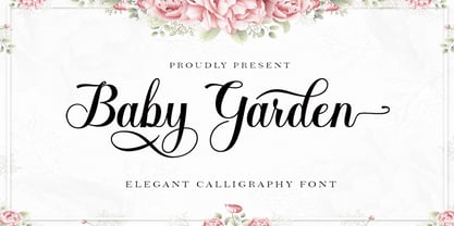 Baby Garden is a beautiful light handwritten font with a unique feel and a stunning impact. It will add a luxury spark to any design project that you wish to create! This font is PUA encoded which means you can access all of the amazing glyphs and ligatures with ease!
 - Victoria Signate by Letterena Studios,
$9.00 Victoria Signate is a beautiful and light handwritten font with a unique feel and a stunning impact. It will add a luxury spark to any design project that you wish to create! This font is PUA encoded which means you can access all of the amazing glyphs and ligatures with ease!
 - Amsterdam Kindom by Letterara,
$13.00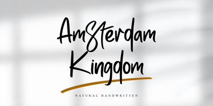 Amsterdam Kingdom is a beautiful original handwritten font with a unique feel and a stunning impact. It will add a unique spark to any design project that you wish to create! This font is PUA encoded which means you can access all of the amazing glyphs and ligatures with ease!
 - Gravelia Helani by TM Type,
$12.00 Gravelia Helani is a beautiful and light handwritten font with a unique feel and a stunning impact. It will add a luxury spark to any design project that you wish to create! This font is PUA encoded which means you can access all of the amazing glyphs and ligatures with ease!
 - Bright Melody by Zeenesia Studio,
$17.00 Bulgaria Script is a beautiful and light handwritten font with a unique feel and a stunning impact. It will add a luxury spark to any design project that you wish to create! This font is PUA encoded which means you can access all of the amazing glyphs and ligatures with ease!
 - Zt Nezto Variable by Khaiuns,
$18.00 ZT Nezto is a new work that focuses on curved areas, bringing out an elegant and refined style. The emergence of this idea was due to the constraints when designing with W&V letters which were very difficult to combine with other letters, and also the desire to present new elements in the world of typography, thus making each design more unified between letters. ZT Nezto design with this charming curved shape and still maintains the identity of each weight so it is very beautiful to apply to web design, packaging, or branding. ZT Nezto is a very useful typeface for you and it also comes in eight weights with matching italics and comes with a variety of open type features. I hope you have fun using ZT Nezto Thanks for using this font ~ Khaiuns X zelowtype
 - Zt Nezto by Khaiuns,
$14.00 ZT Nezto is a new work that focuses on curved areas, bringing out an elegant and refined style. The emergence of this idea was due to the constraints when designing with W&V letters which were very difficult to combine with other letters, and also the desire to present new elements in the world of typography, thus making each design more unified between letters. ZT Nezto design with this charming curved shape and still maintains the identity of each weight so it is very beautiful to apply to web design, packaging, or branding. ZT Nezto is a very useful typeface for you and it also comes in eight weights with matching italics and comes with a variety of open type features. I hope you have fun using ZT Nezto Thanks for using this font ~ Khaiuns X zelowtype
 - DASEGO by Twinletter,
$15.00 DASEGO, our newest font, is now available. A display typeface with an Asia theme that we made to fulfill the needs of your project with an Asian theme that you may use for projects that can be understood by audiences all over the world. We created this typeface by paying close attention to the individuality of each letter, abstract while still prioritizing optical harmony, and your project will look stunning with it. Logotypes, food banners, branding, brochure, posters, movie titles, book titles, quotes, and more may all benefit from this font. Of course, using this font in your various design projects will make them excellent and outstanding; many viewers are drawn to the striking and unusual graphic display. Start utilizing this typeface in your projects to make them stand out.
 - IMAN RG by LGF Fonts,
$10.00 This type of Richard Gans, has always seemed very striking, despite having the complexity of the sources extrusion, has its own personality, and readability unusual for this type of letters. Use it for composing posters, programs or logos was very common at the time. My father, Antonio Lage Parapar, typographer by profession, who composed the texts, which not only had it for profession, but he liked to do, always he spoke of sources and decorative elements of the type foundry Richard Gans, as well as other foundries, especially those that required the mender of them, exercised creator, many of these types they have already been recovered by professionals and companies with excellent results. I've been surrounded by these movable type, and the occasional catalog unfortunately lost. One of those guys that has always struck me visually speaking was the type IMAN Richard Gans, the typographer and more of German origin arrived in Spain, back in 1874, also a pioneer. This work to revive the type mentioned, as well as create non existing glyphs between documents and parts I've been finding, is and has been a personal pleasure all I want serve as a tribute to my father (of aopodo curiously "Richard"), the only sadness it has not been completed. Richard Gans, arrived in Spain in 1874 as a representative of several European factories. then liaised with journalistic and publishing companies, which led him knowledge required of the first sector art. In 1878 he created a center importer gadgets graphic arts and three years later he created his own type foundry. The first rotary newspaper ABC, very famous and the most advanced of the time, the brand manufactured Richard Gans.
 - ITC Novarese by ITC,
$40.99 Novarese font is the work of designer Aldo Novarese. He created 218 typeface cuts but as he was writing his book, Alfabeta, he decided to include only those he considered indispensable. He divided his fonts into 4 categories and in the designing of Novarese, took the best characteristics of each group and combined them into this font. In the style of Latin stone scripts of the second century BC. Novarese is a well-balanced and relatively wide text font with classic forms. ITC Novarese™ font field guide including best practices, font pairings and alternatives.
 - Samsheriff by Ingrimayne Type,
$5.00 Samsheriff is a large sans-serif family with a touch of quirkiness. It contains an eclectic mix of letter styles but is very legible. The origin of this typeface was in the caps-only letters used for the novelty font Coffinated. Adding lower-case letters, additional widths, additional weights, and italics resulted in the 30 styles that make up the Samsheriff family.
 - Hoverunit by Typodermic,
$11.95 Introducing Hoverunit: the typeface that will take your design projects to new heights! This font is a throwback to the golden age of sci-fi, with a twist of modern creativity that will give your work an unmistakable edge. Inspired by the magnetic ink typefaces of the 1960s, Hoverunit has been brought back to life with a futuristic twist. Its sharp angles, sleek lines, and retro-futuristic feel make it the perfect choice for your next sci-fi-themed project. Whether you’re designing a book cover, movie poster, or album art, Hoverunit will give your work a unique and creative look. The Hoverunit typeface is available in a range of weights and styles, so you can use it for everything from headlines to body copy. And with its unique design, it’s sure to capture the attention of anyone who sees it. So why settle for boring, traditional typefaces when you can take your designs to the next level with Hoverunit? Try it today and see for yourself why this font is the perfect choice for all your creative projects. Most Latin-based European writing systems are supported, including the following languages. Afaan Oromo, Afar, Afrikaans, Albanian, Alsatian, Aromanian, Aymara, Bashkir (Latin), Basque, Belarusian (Latin), Bemba, Bikol, Bosnian, Breton, Cape Verdean, Creole, Catalan, Cebuano, Chamorro, Chavacano, Chichewa, Crimean Tatar (Latin), Croatian, Czech, Danish, Dawan, Dholuo, Dutch, English, Estonian, Faroese, Fijian, Filipino, Finnish, French, Frisian, Friulian, Gagauz (Latin), Galician, Ganda, Genoese, German, Greenlandic, Guadeloupean Creole, Haitian Creole, Hawaiian, Hiligaynon, Hungarian, Icelandic, Ilocano, Indonesian, Irish, Italian, Jamaican, Kaqchikel, Karakalpak (Latin), Kashubian, Kikongo, Kinyarwanda, Kirundi, Kurdish (Latin), Latvian, Lithuanian, Lombard, Low Saxon, Luxembourgish, Maasai, Makhuwa, Malay, Maltese, Māori, Moldovan, Montenegrin, Ndebele, Neapolitan, Norwegian, Novial, Occitan, Ossetian (Latin), Papiamento, Piedmontese, Polish, Portuguese, Quechua, Rarotongan, Romanian, Romansh, Sami, Sango, Saramaccan, Sardinian, Scottish Gaelic, Serbian (Latin), Shona, Sicilian, Silesian, Slovak, Slovenian, Somali, Sorbian, Sotho, Spanish, Swahili, Swazi, Swedish, Tagalog, Tahitian, Tetum, Tongan, Tshiluba, Tsonga, Tswana, Tumbuka, Turkish, Turkmen (Latin), Tuvaluan, Uzbek (Latin), Venetian, Vepsian, Võro, Walloon, Waray-Waray, Wayuu, Welsh, Wolof, Xhosa, Yapese, Zapotec Zulu and Zuni.
 - Korataki by Typodermic,
$11.95 Discover the mesmerizing power of Korataki—the ultimate contemporary font that pays tribute to the iconic ultramodern style of the 1970s classic, China/Chimes. With its simplistic yet striking industrial design, Korataki captures the essence of a bygone era while simultaneously bringing it into the modern age. The beauty of this font lies in its ability to communicate with unparalleled clarity and precision, evoking a sense of wonder and intrigue in the mind of the beholder. Whether you’re looking to make a bold statement or convey a subtle message, Korataki has got you covered. With seven distinct weights and accompanying italics, as well as OpenType alternates for A, G, Q, and 4, this font is fully customizable to suit your every need. Let Korataki guide you on a journey of creativity and self-expression. With its wide industrial design and timeless aesthetic, it’s sure to make a lasting impression on anyone who beholds it. Most Latin-based European, and some Cyrillic-based writing systems are supported, including the following languages. A Afaan Oromo, Afar, Afrikaans, Albanian, Alsatian, Aromanian, Aymara, Bashkir (Latin), Basque, Belarusian (Latin), Bemba, Bikol, Bosnian, Breton, Bulgarian, Cape Verdean, Creole, Catalan, Cebuano, Chamorro, Chavacano, Chichewa, Crimean Tatar (Latin), Croatian, Czech, Danish, Dawan, Dholuo, Dutch, English, Estonian, Faroese, Fijian, Filipino, Finnish, French, Frisian, Friulian, Gagauz (Latin), Galician, Ganda, Genoese, German, Greenlandic, Guadeloupean Creole, Haitian Creole, Hawaiian, Hiligaynon, Hungarian, Icelandic, Ilocano, Indonesian, Irish, Italian, Jamaican, Kaqchikel, Karakalpak (Latin), Kashubian, Kikongo, Kinyarwanda, Kirundi, Komi-Permyak, Kurdish (Latin), Latvian, Lithuanian, Lombard, Low Saxon, Luxembourgish, Maasai, Macedonian, Makhuwa, Malay, Maltese, Māori, Moldovan, Montenegrin, Ndebele, Neapolitan, Norwegian, Novial, Occitan, Ossetian, Ossetian (Latin), Papiamento, Piedmontese, Polish, Portuguese, Quechua, Rarotongan, Romanian, Romansh, Russian, Sami, Sango, Saramaccan, Sardinian, Scottish Gaelic, Serbian, Serbian (Latin), Shona, Sicilian, Silesian, Slovak, Slovenian, Somali, Sorbian, Sotho, Spanish, Swahili, Swazi, Swedish, Tagalog, Tahitian, Tetum, Tongan, Tshiluba, Tsonga, Tswana, Tumbuka, Turkish, Turkmen (Latin), Tuvaluan, Ukrainian, Uzbek (Latin), Venetian, Vepsian, Võro, Walloon, Waray-Waray, Wayuu, Welsh, Wolof, Xhosa, Yapese, Zapotec Zulu and Zuni.
 - Arkham77 by Jvne77 Studio,
$20.00 Inspired by the works of Howard Philips Lovecraft (1890-1936), and the city of Arkham lying abroad the Miskatonic River... witth all those witchcrafts secrecy and the infamous Necronomicon. The Elder Ones and the mighty Cthulhu, who lies and not dies within the dephts of the ocean in R'lyeh he's awaiting... arf, anyway this font will well set for posters, detective stories or horror books, pulps and others... *Full western latin language with most diacritics and numbers* Included in this set: - ARKHAM77 Black (More formal display) 560 glyphes - ARKHAM77 Elegante (for a creepiest rendition) 590 glyphes - ARKHAM77 Titles (as its name do not tells, for credits, or simple text) 560 glyphes - ARKHAM77 Extras (Embellish your work with this cool collection of frames and ornaments) +100 glyphes
 - Synthemesc by Typodermic,
$11.95 Picture this: you’re sitting in the Korova Milk Bar, sipping on a glass of the old moloko plus, and suddenly, you’re hit with the realization that your designs are missing something. That something, my dear malchiks and devotchkas, is this typeface. Its unconventional style will make your work stand out from the rest and leave your audience in awe. It’s not just about making your designs look pretty, though. It’s about making a statement, about challenging the norm. This font is all about breaking the rules, just like Alex and his droogs did in the streets of London. So, my fellow dim-witted bratchnies, don’t miss out on the opportunity to add a touch of surreal eccentricity to your work. Get this Clockwork Orange-inspired typeface today, and let your designs become a symbol of rebellion and creativity. Most Latin-based European writing systems are supported, including the following languages. Afaan Oromo, Afar, Afrikaans, Albanian, Alsatian, Aromanian, Aymara, Bashkir (Latin), Basque, Belarusian (Latin), Bemba, Bikol, Bosnian, Breton, Cape Verdean, Creole, Catalan, Cebuano, Chamorro, Chavacano, Chichewa, Crimean Tatar (Latin), Croatian, Czech, Danish, Dawan, Dholuo, Dutch, English, Estonian, Faroese, Fijian, Filipino, Finnish, French, Frisian, Friulian, Gagauz (Latin), Galician, Ganda, Genoese, German, Greenlandic, Guadeloupean Creole, Haitian Creole, Hawaiian, Hiligaynon, Hungarian, Icelandic, Ilocano, Indonesian, Irish, Italian, Jamaican, Kaqchikel, Karakalpak (Latin), Kashubian, Kikongo, Kinyarwanda, Kirundi, Kurdish (Latin), Latvian, Lithuanian, Lombard, Low Saxon, Luxembourgish, Maasai, Makhuwa, Malay, Maltese, Māori, Moldovan, Montenegrin, Ndebele, Neapolitan, Norwegian, Novial, Occitan, Ossetian (Latin), Papiamento, Piedmontese, Polish, Portuguese, Quechua, Rarotongan, Romanian, Romansh, Sami, Sango, Saramaccan, Sardinian, Scottish Gaelic, Serbian (Latin), Shona, Sicilian, Silesian, Slovak, Slovenian, Somali, Sorbian, Sotho, Spanish, Swahili, Swazi, Swedish, Tagalog, Tahitian, Tetum, Tongan, Tshiluba, Tsonga, Tswana, Tumbuka, Turkish, Turkmen (Latin), Tuvaluan, Uzbek (Latin), Venetian, Vepsian, Võro, Walloon, Waray-Waray, Wayuu, Welsh, Wolof, Xhosa, Yapese, Zapotec Zulu and Zuni.
 - Velino Sans Condensed by DSType,
$55.00 Velino is the most recent of our Premium Typefaces. The serif version comes in two packages with three widths: Velino, Velino Condensed and Velino Compressed. The Display package contains high contrast typefaces, with a modern flair, very feminine but with plenty of character, specially designed for fine print in big text sizes. The Text package was designed for any running text. It’s proportions and colors make it the ideal for text, even in very difficult conditions such as newspaper printing. We also designed the perfect companion to this enormous type system: Velino Poster, a Slab Serif typeface with only one weight and it’s respective italic, but with plenty of muscle, for every time some extra strength is needed, like setting very big text, magazine covers or newspaper’s special sections. Finally we designed Velino Sans and Velino Sans Condensed to perfectly match the weight and proportions of Velino, all with matching italics.
 - Velino Condensed Text by DSType,
$55.00 Velino is the most recent of our Premium Typefaces. The serif version comes in two packages with three widths: Velino, Velino Condensed and Velino Compressed. The Display package contains high contrast typefaces, with a modern flair, very feminine but with plenty of character, specially designed for fine print in big text sizes. The Text package was designed for any running text. It’s proportions and colors make it the ideal for text, even in very difficult conditions such as newspaper printing. We also designed the perfect companion to this enormous type system: Velino Poster, a Slab Serif typeface with only one weight and it’s respective italic, but with plenty of muscle, for every time some extra strength is needed, like setting very big text, magazine covers or newspaper’s special sections. Finally we designed Velino Sans and Velino Sans Condensed to perfectly match the weight and proportions of Velino, all with matching italics.
 - Velino Sans by DSType,
$55.00 Velino is the most recent of our Premium Typefaces. The serif version comes in two packages with three widths: Velino, Velino Condensed and Velino Compressed. The Display package contains high contrast typefaces, with a modern flair, very feminine but with plenty of character, specially designed for fine print in big text sizes. The Text package was designed for any running text. Its proportions and colors make it the ideal for text, even in very difficult conditions such as newspaper printing. We also designed the perfect companion to this enormous type system: Velino Poster, a Slab Serif typeface with only one weight and its respective italic, but with plenty of muscle, for every time some extra strength is needed, like setting very big text, magazine covers or newspapers’ special sections. Finally we designed Velino Sans and Velino Sans Condensed to perfectly match the weight and proportions of Velino, all with matching italics.
 - Velino Display by DSType,
$55.00 Velino is the most recent of our Premium Typefaces. The serif version comes in two packages with three widths: Velino, Velino Condensed and Velino Compressed. The Display package contains high contrast typefaces, with a modern flair, very feminine but with plenty of character, specially designed for fine print in big text sizes. The Text package was designed for any running text. It’s proportions and colors make it the ideal for text, even in very difficult conditions such as newspaper printing. We also designed the perfect companion to this enormous type system: Velino Poster, a Slab Serif typeface with only one weight and it’s respective italic, but with plenty of muscle, for every time some extra strength is needed, like setting very big text, magazine covers or newspaper’s special sections. Finally we designed Velino Sans and Velino Sans Condensed to perfectly match the weight and proportions of Velino, all with matching italics.
 - Velino Compressed Display by DSType,
$55.00 Velino is the most recent of our Premium Typefaces. The serif version comes in two packages with three widths: Velino, Velino Condensed and Velino Compressed. The Display package contains high contrast typefaces, with a modern flair, very feminine but with plenty of character, specially designed for fine print in big text sizes. The Text package was designed for any running text. It’s proportions and colors make it the ideal for text, even in very difficult conditions such as newspaper printing. We also designed the perfect companion to this enormous type system: Velino Poster, a Slab Serif typeface with only one weight and it’s respective italic, but with plenty of muscle, for every time some extra strength is needed, like setting very big text, magazine covers or newspaper’s special sections. Finally we designed Velino Sans and Velino Sans Condensed to perfectly match the weight and proportions of Velino, all with matching italics.
 - Velino Compressed Text by DSType,
$55.00 Velino is the most recent of our Premium Typefaces. The serif version comes in two packages with three widths: Velino, Velino Condensed and Velino Compressed. The Display package contains high contrast typefaces, with a modern flair, very feminine but with plenty of character, specially designed for fine print in big text sizes. The Text package was designed for any running text. It’s proportions and colors make it the ideal for text, even in very difficult conditions such as newspaper printing. We also designed the perfect companion to this enormous type system: Velino Poster, a Slab Serif typeface with only one weight and it’s respective italic, but with plenty of muscle, for every time some extra strength is needed, like setting very big text, magazine covers or newspaper’s special sections. Finally we designed Velino Sans and Velino Sans Condensed to perfectly match the weight and proportions of Velino, all with matching italics.
 - Velino Poster by DSType,
$55.00 Velino is the most recent of our Premium Typefaces. The serif version comes in two packages with three widths: Velino, Velino Condensed and Velino Compressed. The Display package contains high contrast typefaces, with a modern flair, very feminine but with plenty of character, specially designed for fine print in big text sizes. The Text package was designed for any running text. It’s proportions and colors make it the ideal for text, even in very difficult conditions such as newspaper printing. We also designed the perfect companion to this enormous type system: Velino Poster, a Slab Serif typeface with only one weight and it’s respective italic, but with plenty of muscle, for every time some extra strength is needed, like setting very big text, magazine covers or newspaper’s special sections. Finally we designed Velino Sans and Velino Sans Condensed to perfectly match the weight and proportions of Velino, all with matching italics.
 - Velino Condensed Display by DSType,
$55.00 Velino is the most recent of our Premium Typefaces. The serif version comes in two packages with three widths: Velino, Velino Condensed and Velino Compressed. The Display package contains high contrast typefaces, with a modern flair, very feminine but with plenty of character, specially designed for fine print in big text sizes. The Text package was designed for any running text. It’s proportions and colors make it the ideal for text, even in very difficult conditions such as newspaper printing. We also designed the perfect companion to this enormous type system: Velino Poster, a Slab Serif typeface with only one weight and it’s respective italic, but with plenty of muscle, for every time some extra strength is needed, like setting very big text, magazine covers or newspaper’s special sections. Finally we designed Velino Sans and Velino Sans Condensed to perfectly match the weight and proportions of Velino, all with matching italics.
 - Big Clyde by Galapagos,
$39.00In designing an advertising poster to show off the unconventional Safefont typeface, Steve drew what appeared as relatively traditional letterforms for the expository text. When these characters were as well received as the typeface which was the subject of the poster, Steve decided to expand them into a full-fledged graffiti style typeface of their own. While exploring where this new design might lead, Steve worked to elaborate the poster segment which had inspired it. He soon found himself staring at a drawing of a weapons-wielding Bonnie and Clyde. The desperate duo resonated with the graphic elements of the drawn letters; thus leading to the effortless fleshing out of the design, and to its name, Big Clyde. - Morning Cookie by Bogstav,
$17.00 Yet again, a font inspired by my work as a kindergarten teacher! The other day, I had a conversation with some of the kids, about what they ate for breakfast. Some had oatmeal, some bread and others yogurt. But this kid - he insisted that every morning, his mother would serve him cookies, “morning cookies”. It sounded too good to be true, and when I asked his mother, it turned out that “cookies” were actually bread, but to make it sound more appetising, they called it cookies! The letters are rounded and in some way quite naive, but still clear and legible. With an extreme ascender and descender, the font stands out with its oddities. I’ve added 3 different versions of each lowercase letter!
 - Parametra by URW Type Foundry,
$39.99 This humanistic sans serif distinguishes itself by its Japanese calligraphy influence. Being written with a felt tip rather than with a brush, its Japanese connotation is remote and non-dominant, thus providing excellent readability and a charm of its own. Parametra is a very elegant and modern typeface achieved by the strong form reduction of the individual characters and at the same time harmonizing them by given parameters. It is something of its own, but quite legible and well-suited for small text. Also, Parametra and Bohemian can be mixed perfectly since their proportions and dimensions are the same.
 - Sinkwitz Gotisch by preussTYPE,
$29.00 Sinkwitz Gotisch is a new release of the font of the same name originally designed by Paul Sinkwitz in 1942. The Sinkwitz Gotisch was 1942 by Schriftguss AG Dresden font cast first cast and later supplied by the East German firm VEB Typoart. Paul Sinkwitz (1899-1981) has created them. This font displays not the characteristics of a chunky Gothic, which have influenced the image of national socialism. Paul Sinkwitz was a painter, graphic artist, wood engraver, was interested in religious topics, which he had presented in numerous graphics. But also his interpretation of his Gothic font is modern, without having the font this is ugly. In addition to the GOTISCH he created Roman Uppercase letters, which perfectly harmonize with the lowercase letters. This extra font is called BASTARD. The digital version of Sinkwitz is a beneficial addition to a Gothic with calligraphic character and should be in any historically interested graphic design.
 - Bennet Display by Lipton Letter Design,
$29.00 Bennet, Richard Lipton’s spirited serif superfamily, was inspired by Moth Design’s logotype and stationery system for the North Bennet Street School in Boston. Initially modest in concept, Bennet grew to an expansive suite of 96 fonts tuned for editorial use. The three widths of Bennet’s Display and Banner sizes—Regular, Condensed, and Extra Condensed—are ideal for precise fitting of newspaper and magazine headlines. Lipton developed graded text styles for the series, offering users precise variations to help compensate for varying degrees of ink spread on different types of paper stock during the printing process. For example, because of ink absorption, the lightest grade—Bennet Text One—printed on low-quality newsprint stock will have the same gray value as the darkest grade—Bennet Text Four—on superior coated paper. (Bennet Text Two is the default grade and offered here.) Bennet also provides for a stellar reading experience in digital media, its carefully considered details vibrant yet legible on-screen.
 - Bennet Text by Lipton Letter Design,
$29.00 Bennet, Richard Lipton’s spirited serif superfamily, was inspired by Moth Design’s logotype and stationery system for the North Bennet Street School in Boston. Initially modest in concept, Bennet grew to an expansive suite of 96 fonts tuned for editorial use. The three widths of Bennet’s Display and Banner sizes—Regular, Condensed, and Extra Condensed—are ideal for precise fitting of newspaper and magazine headlines. Lipton developed graded text styles for the series, offering users precise variations to help compensate for varying degrees of ink spread on different types of paper stock during the printing process. For example, because of ink absorption, the lightest grade—Bennet Text One—printed on low-quality newsprint stock will have the same gray value as the darkest grade—Bennet Text Four—on superior coated paper. (Bennet Text Two is the default grade and offered here. Additional grades are available upon request.) Bennet also provides for a stellar reading experience in digital media, its carefully considered details vibrant yet legible on-screen.
 - Bennet Banner by Lipton Letter Design,
$29.00 Bennet, Richard Lipton’s spirited serif superfamily, was inspired by Moth Design’s logotype and stationery system for the North Bennet Street School in Boston. Initially modest in concept, Bennet grew to an expansive suite of 96 fonts tuned for editorial use. The three widths of Bennet’s Display and Banner sizes—Regular, Condensed, and Extra Condensed—are ideal for precise fitting of newspaper and magazine headlines. Lipton developed graded text styles for the series, offering users precise variations to help compensate for varying degrees of ink spread on different types of paper stock during the printing process. For example, because of ink absorption, the lightest grade—Bennet Text One—printed on low-quality newsprint stock will have the same gray value as the darkest grade—Bennet Text Four—on superior coated paper. (Bennet Text Two is the default grade and offered here.) Bennet also provides for a stellar reading experience in digital media, its carefully considered details vibrant yet legible on-screen.
 - Helena Signature by Pixesia Studio,
$15.00 Introducing Helena Signature - Signature Script Font Coming with special features combined with such an elegant style, Helena Signature becomes one of a kind typeface that you'll surely need. With its unique, bubbly yet extravagant mode, this Helena Signature typeface will suit any occasion. The handwriting style of this Helena Signature typeface not only shows the authenticity but also provides such a familiar and personal feeling—which adds the kind of intimacy that the readers are probably seeking. The beauty of its style is also engaging, easily catches the readers eye and creates the eager for them to read any kind of message that the Helena Signature is delivering. Hope you Like it. Thanks.
 - REVOKA by Twinletter,
$15.00 Revoka is a display typeface with the notion of an Asian font with unique and modern traits. Fonts with unusual shapes will brighten up your project and give it a unique pattern, giving it an attractive, appealing, and natural feel. Logotypes, food banners, branding, brochure, posters, movie titles, book titles, quotes, and more may all benefit from this font. Of course, using this font in your various design projects will make them excellent and outstanding; many viewers are drawn to the striking and unusual graphic display. Start utilizing this typeface in your projects to make them stand out.
 - Nyxali by Typodermic,
$11.95 Nyxali exudes an industrial ruggedness, a typeface that is not content to be relegated to the background. No, Nyxali demands attention, with its rusted metal stamping style that creates an impression of hard work and gritty determination. This typeface’s design is inspired by a misaligned mechanism that is not afraid to show its imperfections. The result speaks to the rough-and-tumble nature of life and the willingness to get one’s hands dirty to get the job done. Nyxali’s alphabet is not content to be perfect; instead, it embraces the irregularity that comes with the cryptic stamping process. But make no mistake, while Nyxali may be rough around the edges, it is not without refinement. The letter pair ligatures are a testament to this, breaking up the monotony of plain, repeating characters and adding a touch of sophistication to an otherwise brutal design. With Nyxali, you can infuse your message with an element of cryptic allure, drawing in your audience with its mysterious and edgy charm. So, if you’re looking for a font that is bold, rugged, and industrial, look no further than Nyxali. It’s the perfect choice for designers who want to inject some personality into their designs and give their message an authentic, industrial edge. Most Latin-based European writing systems are supported, including the following languages. Afaan Oromo, Afar, Afrikaans, Albanian, Alsatian, Aromanian, Aymara, Bashkir (Latin), Basque, Belarusian (Latin), Bemba, Bikol, Bosnian, Breton, Cape Verdean, Creole, Catalan, Cebuano, Chamorro, Chavacano, Chichewa, Crimean Tatar (Latin), Croatian, Czech, Danish, Dawan, Dholuo, Dutch, English, Estonian, Faroese, Fijian, Filipino, Finnish, French, Frisian, Friulian, Gagauz (Latin), Galician, Ganda, Genoese, German, Greenlandic, Guadeloupean Creole, Haitian Creole, Hawaiian, Hiligaynon, Hungarian, Icelandic, Ilocano, Indonesian, Irish, Italian, Jamaican, Kaqchikel, Karakalpak (Latin), Kashubian, Kikongo, Kinyarwanda, Kirundi, Kurdish (Latin), Latvian, Lithuanian, Lombard, Low Saxon, Luxembourgish, Maasai, Makhuwa, Malay, Maltese, Māori, Moldovan, Montenegrin, Ndebele, Neapolitan, Norwegian, Novial, Occitan, Ossetian (Latin), Papiamento, Piedmontese, Polish, Portuguese, Quechua, Rarotongan, Romanian, Romansh, Sami, Sango, Saramaccan, Sardinian, Scottish Gaelic, Serbian (Latin), Shona, Sicilian, Silesian, Slovak, Slovenian, Somali, Sorbian, Sotho, Spanish, Swahili, Swazi, Swedish, Tagalog, Tahitian, Tetum, Tongan, Tshiluba, Tsonga, Tswana, Tumbuka, Turkish, Turkmen (Latin), Tuvaluan, Uzbek (Latin), Venetian, Vepsian, Võro, Walloon, Waray-Waray, Wayuu, Welsh, Wolof, Xhosa, Yapese, Zapotec Zulu and Zuni.
 - HS Almohandis by Hiba Studio,
$59.00 HS Almohandis is an Arabic display typeface. It is useful for book titles and graphic projects where a contemporary, streamlined look is desired. The font is based on the simple lines of modern and simplified Kufi calligraphy, that support Arabic, Persian and Urdu. This font was created in the beginning as regular weight with the font HS Alhandasi in 2007 for use in technical and engineering company. The company tends to follow the geometrical shape with equal dimensions in both vertical and horizontal storks. There is also a tendency to make all characters to be similar to oval shape with the impression that they are all geometrical and clear. I followed that with Bold weight in 2011. The difference between this font and HS Almohandis is that its characters have a sharp baseline.