10,000 search results
(0.038 seconds)
- Aguero Serif by Craft Supply Co,
$15.00 Aguero Serif – Clean & Elegant Serif Font is a modern serif font family whose design refers us to the style of transitional serifs. The distinctive features of Aguero Serif – Clean & Elegant Serif Font are the relatively low contrast of strokes, the slightly squarish shapes of round characters and the emphasized businesslike nature.
 - Futura Headline EF Pro by Elsner+Flake,
$103.00 The design of Futura seems to be timeless. This typeface family which had been developed in 1926 by Paul Renner for the Bauer Type Foundry in the style of constructivism and as part of the Bauhaus movement, experienced, however, in the course of the past 90 years, repeated time-appropriate revivals which guaranteed its on-going popularity. The version of the Futura EF Pro contains the original character constructions which Dennis Megaw described as the “first designs of Futura” in 1938 in “20th century sans serif types, Typography no. 7” (See: Dr. Christopher Burke: Paul Renner, Princeton Architectural Press, New York 1998). What makes it exceptional is the extension into three weights: “Text”, “Headline” and “Index” which came about as part of a degree dissertation at the Hochschule für Bildende Künste (HFBK) in Hamburg. In this context, the accompanying documentation “Die Kritik der reinen Futura” (“The Critique of the Pure Futura”) by Katharina Strauer was published by the Materialverlag, Hamburg, in 2003. Some copies are still available at Elsner+Flake.
 - Futura Text EF Pro by Elsner+Flake,
$103.00 The design of Futura seems to be timeless. This typeface family which had been developed in 1926 by Paul Renner for the Bauer Type Foundry in the style of constructivism and as part of the Bauhaus movement, experienced, however, in the course of the past 90 years, repeated time-appropriate revivals which guaranteed its on-going popularity. The version of the Futura EF Pro contains the original character constructions which Dennis Megaw described as the “first designs of Futura” in 1938 in “20th century sans serif types, Typography no. 7” (See: Dr. Christopher Burke: Paul Renner, Princeton Architectural Press, New York 1998). What makes it exceptional is the extension into three weights: “Text”, “Headline” and “Index” which came about as part of a degree dissertation at the Hochschule für Bildende Künste (HFBK) in Hamburg. In this context, the accompanying documentation “Die Kritik der reinen Futura” (“The Critique of the Pure Futura”) by Katharina Strauer was published by the Materialverlag, Hamburg, in 2003. Some copies are still available at Elsner+Flake.
 - Elido by Kontour Type,
$50.00 Elido (Odile in reverse) is the sans counterpart to the Odile type. Together they form a sans/serif superfamily with a wide range of variations for editorial use. Elido follows Odile’s proportions and matches the weight and typographic color of its serif twin. Elido is a sans with classical proportions. A slight geometric hint and open counters convey an airy feel. Elido’s family structure and relations within echo the conceptual approach of Odile. The arched stroke low off the stem reveals a script characteristic most pronounced in the Elido Upright Italic. This particular interpretation is gradually diminished in the Italic and becomes even less emphasized in the Regular. Six balanced weights, from an elegant Light to a pronounced Black, are in tune with three display solutions and a set of beautiful Ornaments. These variants allow for a diverse and multifaceted typography for the discerning type user. Sans serif initials amount to a rare finding. The charming monolinear Elido Initials come in two flavors, elaborate and rational, designed to hold their own in editorial and headline sizes. This type design boasts an extensive character set, many OpenType features including roman and italic Small Caps, five sets of numerals, beautiful ligatures, and many more. OT stylistic variants (with accents) offer a one-story “a” for the roman weights, alternate “g” and “s” designs for the italics, and a variant glyph “s” for the Upright Italic. These distinct qualities with its versatile and sincere traits make Elido an excellent choice for text and display use.
 - Golden Clouds by Anastasia Kuznetsova,
$22.00 Say hello to Golden Clouds :) A charming and cute font duo with handwritten letters and doodles!! Bring some irresistible fun to your design with Golden Clouds Font Duo! This playful font duo consists of a fast-flowing signature font and a charming font with small capital letters as the perfect companion. But that's not all - the set also includes a bonus Doodle font containing hand-drawn drawings designed to give your "Golden Clouds" fonts the appeal of handmade. Golden Clouds Script • A clean, smooth handwritten signature font containing uppercase and lowercase characters, numbers and a wide range of punctuation marks. Golden Clouds SmallCaps • Clean, charming handwritten font with capital letters. Golden Clouds Doodles • A set of hand-drawn drawings designed in combination with Script and Small Caps fonts. Just set it as your own font and enter any character to create each drawing. "Golden Clouds" is ideal for everyday use in greeting cards, illustrations, quotes, original branding, book covers, children's books, packaging and much more :) Font Features: A-Z; a-z character set; 1 language (English); numbers and punctuation marks, symbols. Fonts can be opened and used in any software that can read standard fonts, even in MS Word. No special software is required to get started. It is recommended to use it in Adobe Illustrator or Adobe Photoshop. Made with love and magic ♡ Thank you for reading it, and do not hesitate to send me a message if you have any questions! ~ Anastasia
 - Hua by YXType,
$14.99 Hua type family is a sans-serif with very humanist details to represent the essence of nature. It features 14 weights from the very thin to the very bold, generously covering a wide range of the natural spectrum. Aiming to represent the soft and elegant side of nature, Hua features very unique italics that have their own take on the identity. The letterforms of the italic fonts are inspired by the lineage of both traditional calligraphic approaches for serifs and much simpler forms for sans-serifs. Hua provides very crisp performances on screens and its large x-height combined with fine-tuned proportions help it retain legibility very well on smaller sizes. Features: • Support for 200+ Latin languages • Double & single storie “a” & “g” • Unique italic letterforms • Low contrast with unique details • Small caps with symbols • Arbitrary and defined fractions • Support for superscript & subscript in normal & scientific alignments • Proportional lining, proportional old-style, tabular lining, tabular old-style
 - Heritage Signature by Lunas Type,
$19.00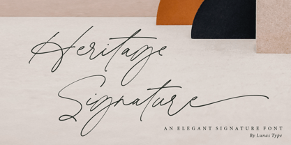 Introducing, Heritage Signature! Heritage Signature is a modern and stylish signature font. This Font have natural flow and unique shape for each letter. Heritage Signature is perfect for many design needs such as merch, T-shirts, signature logo, wedding, book covers, social media posts, websites, events, and many more. What’s you get : – Ending Swashes, beginning swashes, Love connector swashes. – Underline Swashes (just type _1, _2, etc) – Numeral & Punctuation. – ligature. – Multilingual Support. Enjoy Designing! Thanks! Lunas Type
 - Groovy 3D Caps JNL by Jeff Levine,
$29.00 It all started with a simple idea back in 1998: do a digital version of a "lost" 70's typeface, and make up the missing letters that were not present in the only available example Jeff Levine had to work with. Jeff wasn't yet doing his own digital font creation, so he hooked up with Brad Nelson who owns a small foundry called Brain Eaters Fonts. Together, they collaborated on "Action Is"- a freeware font named after the source of the type example. This was a title page for a commemorative photo album of images from the 60's TV music show "Where the Action Is", formerly hosted by Jeff's employer at the time, singer-writer-producer Steve Alaimo. The free font took off like a rocket, being released just at the peak of the 60’s/70’s retro craze in the late 1990’s, and it was EVERYWHERE! It showed up on TV shows, packaging and web design -- and was even spotted on signage used on the side of a major amusement resort’s retro-themed hotel. From that point on, Jeff kept getting requests for a version with a lower case. Although they shared the copyright in the freeware version, Brad Nelson gave Jeff his blessing to re-work and take Action Is into the realm of commercial type. Newly improved and re-released as Groovy Happening JNL, it became one of Jeff's better selling type designs. A simplified, yet similar font was issued called Groovy Summer JNL. Now, after about a decade, Jeff had decided to clean up the 3-D (drop shadow) version that was originally freeware with many minute design flaws and re-release it commercially. Groovy 3D Caps JNL is an all-caps, limited character set font which ties in well with the previous releases, yet retains itís 1960s-1970s era charm. The font flag art is courtesy of Barbara D. Berney and is used by permission.
 - Core Sans ES by S-Core,
$29.00 The Core Sans ES Family is a rounded version of Core Sans E and a part of the Core Sans Series such as Core Sans N, M, A, G, D. This is a modernized grotesque font family with horizontal terminals, low stroke contrast, enclosed apertures and little line width variation. Its tall x-height makes the text legible and the spaces between individual letter forms are precisely adjusted to create the perfect typesetting. The Core Sans ES Family consists of 9 Weights (Thin, ExtraLight, Light, Regular, Medium, Bold, ExtraBold, Heavy, Black) and Italics for each format. It supports WGL4, which provides a wide range of character sets (CE, Greek, Cyrillic and Eastern European characters). Each font includes support for Superiors and Inferiors, Fractions, Tabular numbers, Arrows, Mathematical operators and Opentype Features such as Proportional Figures, Tabular Figures, Numerators, Denominators, Superscript, Scientific Inferiors, Subscript, Fractions, Case Features and Standard Ligatures. We highly recommend it for use in books, web pages, screen displays, and so on.
 - Ionic No 5 by Monotype,
$51.99 Ionic No5 is a refresh of a classic Linotype Clarendon-style serif, another restored classic from the Monotype library, much like the recent updates to Walbaum and Helvetica Now. The original typeface was designed to be printed and read at small sizes, popular with newspapers in the 20th Century at its birth. The restoration and refinement of this typeface has bestowed a greater sense of clarity and directness, smartly stylish, and an utterly captivating appeal. Because these styles were so popular for books and newspapers for so long we associate them with being editorial or bookish, not dull, but thoughtful. Designers today can use that association to their advantage as a visual shortcut to convey similar meaning and tone. More attention was given on modernising the typeface with precious use and the introduction of sharp edges & finishes. The thinnest weights can give a dancing typewriter aesthetic, being low stroke contrast. The heavy weights have an unquestionable presence on the page. Overall, the typeface has a richness and almost illustrative quality about it. The true depth of Ionic No.5 could enable each weight to be a poster by itself. Ionic N°5™ font field guide including best practices, font pairings and alternatives.
 - Braves Factor by Ditatype,
$29.00 Brave Factor is a display font mixture of the script font features providing capital letters in round, adorable proportions. Such round letters express so smooth, warm, friendly nuances that it is suitable to create attractive, fun nuances. In spite of the big, round shapes, this font maintains the original script font features, which are still legible, such as the smooth curves elements and the unique scratches flowing in some of the letters. Such script elements can add beauty and personal touches to the font. Some of the letters may have curvy curves, while the others have sharp ones to show you interesting visual dynamics and to liven up the font. Furthermore, the font’s letters have been carefully crafted to be as legible as possible without ignoring its aesthetic parts. In addition, you may enjoy the available features here as well. Features: Ligatures Multilingual Supports PUA Encoded Numerals and Punctuations Brave Factor fits best for any design projects requiring prominent, yet friendly displays such as titles, logos, posters, brandings, advertisements, and so on. Find out more ways to use this font by taking a look at the font preview. Thanks for purchasing our fonts. Hopefully, you have a great time using our font. Feel free to contact us anytime for further information or when you have trouble with the font. Thanks a lot and happy designing.
 - Mirantz by insigne,
$32.00 Y’all ready for this? Now starting for Insigne: the new serif Mirantz. This rookie all-star plays a precise game every game, cutting at all the right angles to leave your reader impressed and ready to see more. You can always count on Mirantz to lead with solid mechanics and a clean style, but don’t be surprised when the face keeps it real with a little individual flare and creativity. This personal touch is nothing short of elegance in every appearance. So what makes us love this rookie above the other great players in the field? Contrast, for one. Mirantz brings more contrast to the game than most serifs out there. The serifs on this face have a crisp, sharp wedge that naturally draws the reader’s eye. You can’t help but fall in love with its clean, natural style. Mirantz also features a tall x-height and regular proportions that can play a number of positions on the page and still stay strong through the last half of the copy or even the final period. Mirantz is a solid powerhouse player, containing a complete set of small capitals and nine weights from thin to bold. It can play well both down low and up top with its subscripts and superscripts and can move your reader’s eye easily across the copy with its titling capitals, condensed and extended variants, and open style figures. With its options covering more than 72 Latin-based languages, look for this newcomer to have international success in the near future. It you haven’t set your draft picks for this next round of projects, think hard before passing up Mirantz. A capable serif like this one is a guaranteed asset to any team of fonts. Production assistance from Lucas Azevedo.
 - FF Hertz by FontFont,
$68.99 Low stroke contrast, generous spacing, and fine-grained weights from Light to Extra Bold make FF Hertz a workhorse text typeface which holds up well under today’s widely varying output conditions from print to screen. The quite dark Book style works well on e-ink displays which usually tend to thin out letters, as well as in print when you want to evoke the solid letter image of the hot-metal type era. Two sizes of Small Caps are included: A larger size for abbreviations and acronyms, and a smaller size matching the height of the lowercase letters. FF Hertz is a uniwidth design, that means each letter occupies the same space in all weights. This feature allows the user to switch between weights (but not between Roman and Italic styles) without text reflow. Jens Kutilek began work on FF Hertz in 2012. From a drawing exercise on a low-resolution grid (a technique proposed by Tim Ahrens to avoid fiddling with details too early), it soon evolved into a bigger project combining a multitude of influences which up until that point had only been floating around in his head, including his mother’s 1970s typewriter with its wonderful numbers, Hermann Zapf’s Melior as well as his forgotten Mergenthaler Antiqua (an interpretation of the Modern genre), and old German cartographic lettering styles. Jens likes to imagine FF Hertz used in scientific books or for an edition of Lovecraftian horror stories.
 - Agathe Ledden by Sabrcreative,
$25.00 Discover Agathe Ledden, a captivating brush script font that brings a dynamic and expressive touch to your designs. With its fluid brush strokes, Agathe Ledden exudes a sense of energy and authenticity, making it perfect for adding a personal and artistic flair to your projects. Whether you're designing logos, branding materials, posters, or social media graphics, this versatile script font is sure to leave a lasting impression. Agathe Ledden offers a harmonious blend of uppercase and lowercase letters, ensuring a seamless flow and balance in your typography. Its natural and organic appearance creates a handcrafted feel, evoking a sense of warmth and personality in your designs. With the inclusion of numbers and punctuations, Agathe Ledden ensures that your message is communicated effectively and professionally. This script font is not limited by language barriers, as it features multilingual support. It allows you to reach a global audience and incorporate different languages seamlessly into your designs. Whether you're targeting local or international markets, Agathe Ledden enables you to connect with diverse audiences and create a truly inclusive experience. Agathe Ledden also features PUA encoding, granting easy access to a variety of ligatures. These ligatures add stylistic variations and decorative elements, giving you the freedom to customize and enhance your text. The versatility of Agathe Ledden allows you to create unique and captivating designs that reflect your individual style and vision.
 - Lombardia Script by Mans Greback,
$69.00 Lombardia Script is a creative and decorative script font that exudes vividness and elegance. This font is perfect for designing logotypes, tattoos, and other projects that require a signature-like quality. Designed with the art of calligraphy in mind, Lombardia Script features a delicate and expressive stroke that gives it a natural and authentic look. Its ink and brush-like appearance adds to its creativity and uniqueness, making it a great choice for any project that requires a touch of sophistication. Lombardia Script comes in four styles: Regular, Italic, Bold, and Bold Italic. This range of styles provides versatility and allows for dynamic and creative designs. With its beautiful and flowing letterforms, Lombardia Script is the perfect choice for adding a touch of elegance and creativity to any project. Use underscores _ anywhere in a word to make a swash. Example: Wonder_woman Use multiple underscores to make different swashes. Example: Extra__vagant The font is built with advanced OpenType functionality and has a guaranteed top-notch quality, containing stylistic and contextual alternates, ligatures and more features; all to give you full control and customizability. It has extensive lingual support, covering all Latin-based languages, from Northern Europe to South Africa, from America to South-East Asia. It contains all characters and symbols you'll ever need, including all punctuation and numbers.
 - Ultra System by Set Sail Studios,
$14.00 Introducing Ultra System; A modern exploration of 8 fonts, each carefully designed to naturally compliment one another. With 6 clean sans fonts and 2 textured script fonts, Ultra System gives you a variety of ways to combine and arrange each font, allowing you to create striking & modern typographic designs. This typeface collection consists of 8 fonts; Ultra System Script • A textured, bouncy & flowing marker script font containing upper & lowercase characters, numerals, and a large range of punctuation. Ultra System Script Alt • This is a second version of Ultra System Script, with a completely new set of both upper and lowercase characters. If you wanted to avoid letters looking the same each time to recreate a custom-made style, or try a different word shape, simply switch to this font for an additional layout option. Ultra System Sans • A wide, bold sans font containing uppercase only characters, numerals, and a large range of punctuation. Ultra System Sans Line One • A thick outlined version of Ultra System Sans, pair this with other Ultra System Sans fonts to add emphasis to words or phrases. Ultra System Sans Line Two • A thin outlined version of Ultra System Sans, pair this with other Ultra System Sans fonts to add emphasis to words or phrases. Ultra System Sans Italic • Italic variations are included for all 3 Ultra System Sans fonts. FAQs; Accessing Ligatures • Ligatures are supported by most desktop graphics & text software (not just the fancy ones!), including Photoshop, Illustrator, InDesign, Word, Pages & Keynote. Many programs will automatically have this feature switched on for you, but if you need any help accessing then please feel free to drop me a message. Language Support • All Ultra System fonts support the following languages; English, French, Italian, Spanish, Portuguese, German, Swedish, Norwegian, Danish, Dutch, Finnish, Indonesian, Malay, Hungarian, Polish, Croatian, Turkish, Romanian, Czech, Latvian, Lithuanian, Slovak, Slovenian
 - Bluestar by Melvastype,
$29.00 Bluestar is a roundhand script with modern touch. It has round terminals and quite low stroke contrast. It has five weights in upright and italic styles. Bluestar has two sets of capital letters; one is more basic and subtle and the other (Stylistic Set 1) is bigger and fancier. Bluestar has also lots of alternates for ascender, descenders, end swashes etc. to give a good amount of possibilities to play with and make some unique designs. It also has few options for tails and underlines.
 - Fedtspiller by PizzaDude.dk,
$16.00 Fedtspiller is danish and the definition could be someone who plays with a low risk and defensive (at least when talking about soccer) Although there is a slight negative feeling to that, I remember several guys when playing soccer as a kid who benefitted as playing as a "Fedtspiller" :) Anyway, Fedtspiller is a legible comic/text font with softened edges. Comes in both Regular, Scribble and Rough - all of these versions include Contextual Alternates (4 different versions of each lowercase letter) and multilingual support
 - Azbuka by Monotype,
$29.99 The Azbuka™ typeface family has its roots in a fairly pedestrian source. “The idea came in part from an old sign in London that read ‘SPRINKLER STOP VALVE’,” says Dave Farey, designer of the typeface. Like all good sign spotters, Farey took a photograph of the sign and filed it away for possible use in a lettering or typeface design project. In Prague a number of years later, the street signs reminded Farey of the London signage - and his camera came out again. Comparing the two back in his studio, he realized that the signs from London and Prague were not as similar as he initially thought. However, they were enough alike to serve as the foundation for a no-frills, 21st century sans serif typeface family. “I wanted to draw a wide range of weights, italic and condensed designs all in one go,” recalls Farey, “rather than add on to the family later.” His goal was to create a family that could be used for text and display copy, with sufficient weights to provide a broad typographic palette. Indeed, the completed design, created in collaboration with fellow type designer Richard Dawson, consists of twenty typefaces in eight weights ranging from extra light to extra black. The five mid-range designs have complementary italics. Seven condensed designs round out the family. Azbuka’s lighter weights perform remarkably well in blocks of text composition. “They’re clean and legible - and perhaps a little boring,” says Farey, “but they are perfect for copy with a down-to-earth, yet contemporary flavor.” The heavier weights are equally well suited for a variety of display uses. The designs are authoritative but not overbearing and will readily make a strong statement without calling attention to themselves. The condensed weights of Azbuka are ideal for those instances where you have a lot to say - and not much room to say it. The name Azbuka? It’s Russian for “alphabet.” And what more appropriate name could there be for this utilitarian, industrial-strength type family than alphabet? The Azbuka family is available as a suite of OpenType Pro fonts. Graphic communicators can now work with this versatile design while taking advantage of OpenType’s capabilities. The Azbuka Pro fonts also offer an extended character set that supports most Central European and many Eastern European languages
 - Hakodate by Arendxstudio,
$16.00 Hakodate is a very unique and elegant font for you to use in your design project because it adapts to various themes. Hakodate is a font with distinctive handwritten characters and is perfect for branding projects, logos, wedding designs, media posts, advertisements, product packaging, product designs, labels, photography, watermarks, invitations, stationery, and any project that needs a handwritten feel. Features : • Character Set A-Z • Numerals & Punctuations (OpenType Standard) • Accents (Multilingual characters) • Ligature There it is! I really hope you enjoy it - comments and likes are always welcome and accepted. More importantly, don't hesitate to send a message if you have a problem or question. Now just read this, go there and make it happen!
 - Dunyah by IbraCreative,
$17.00 Dunyah – An Organic Marker Script Typeface Dunyah, an organic marker script typeface, embodies a distinctive blend of fluidity and authenticity, making it a captivating choice for a range of creative endeavors. With each stroke, Dunyah exudes a handcrafted essence, emulating the natural and dynamic flow of freehand markers. Its letters dance gracefully across the canvas, maintaining a harmonious balance between sophistication and approachability. The typeface’s organic design captures the nuanced irregularities of authentic handwriting, providing a unique and personalized touch to any project. Whether used for branding, invitations, or artistic displays, Dunyah effortlessly infuses a sense of warmth and character, creating a visually engaging experience for those who encounter its expressive, nature-inspired charm. Dunyah is perfect for branding projects, logo, wedding designs, social media posts, advertisements, product packaging, product designs, label, photography, watermark, invitation, stationery, game, fashion and any projects. Fonts include multilingual support for; Afrikaans, Albanian, Czech, Danish, Dutch, English, Estonian, Finnish, French, German, Hungarian, Italian, Latvian, Lithuanian, Norwegian, Polish, Portuguese, Slovak, Slovenian, Spanish, Swedish.
 - Baekrajan by Arendxstudio,
$18.00 Baekrajan is a luxurious, casual and distinctive script that is perfect for your branding design, wedding invitations, business cards, and more. Baekrajan features Uppercase and Lowercase characters, figures and ligature standards that are very realistic. There it is! I really hope you enjoy it - comments & likes are always welcome and accepted. More importantly, don't hesitate to send a message if you have a problem or question. Now just read this, go there and make it happen :)
 - Dry Hayrick by Nathatype,
$29.00 Ready to enhance your branding? Looking for that “something” that’ll make your audience go WOW and clients get on board immediately? If you need to create a big, bold logo for your business, work on a poster for an event, or whatever your project may be-then we've got what you want. Dry Hayrick- A Display Font Dry Hayrick is a display font. was fully thought out to easily meld inside your designs. An excellent choice to add the right amount of playfulness. This custom-made font was specifically designed to fit whatever you need! The best choice for your logo, book cover, poster, t-shirt, branding, and advertisement needs. Our font always includes Multilingual Support to make your branding reach a global audience. Features: Ligatures Stylistic Set Swahes PUA Encoded Numerals and Punctuation Thank you for downloading premium fonts from Nathatype
 - Duvall by John Moore Type Foundry,
$19.95 Duvall is an idealization created from the Edward J. Duvall lettering. Mr. Duvall was a teacher in lettering, who was well known for his book “Modern Sign Painting” in the late 40s and early 50s. Duvall cursive script is presented in five weights, Duvall 1, as a light version, to Duvall 5 as a bold version, and Duvall Style a decorative typeface with Inline, ideal for set in color layers combined with Duvall 5. Duvall is a Script font with low contrast, not intended to be used as a type of reading, but is however well adapted to small sizes because its simple form is easy to read. It is advisable to use this font for large to medium sizes. Duvall is ideal for composition, ordinal, superior and inferior numbers, and thanks to the OpenType features you can compose with alternate characters, old style numbers and with a complete set of glyphs for Eastern and Western European languages. The Duvall set comes with a font called Duvall Ribbons, a dingbats font with which you can create interesting headlines with the taste of the advertising of the 50s. Duvall FunWords is a dingbats playing with funny words in English, French and Spanish phrases. Duvall is ideal for packaging, signs, banners, branding and graphic design in general and can be combined harmonically with your favorite sans fonts.
 - Elisetta by Sudtipos,
$39.00 Musical notes and letterforms, silences and white spaces, pentagrams and lines, music and writing have much in common and go beyond time, cultures, styles and locations. This new typeface emerges from the blend between the lyrics and the harmony, rhythm, femininity and luminosity of the traditional musical forms. It`s not about blues or rock, tango or salsa, instead it recovers the neoclassical characteristics of the current musical notation system and revitalize the essence of its signs. Taking care of both the function and the form, Elisetta has been specially designed for the writing of texts and musical sheets considering all its elements and communication needs. This source of inspiration also makes the font really good for extensive texts, since its design is based on situations that require high line performance, great readability and high aesthetic coherence. With 5 variables that vary in weight and style, the typography gathers asymmetry and organic nature in vertical structure, narrow horizontal proportions, high x height and extreme contrast between black and white. Elisetta Book has been created for the writing of clear texts and long lines composed in small sizes inside and outside the pentagram; Elisetta Italic intensifies the organic nature of the musical keys by offering softer signs, contextual alternates and initial caps; finally, Elisetta Display increase and emphasize the contrast between vertical stems and horizontal lines to highlight short texts and titles. For those who love music and for those who like romantic forms, this typography has a lot to offer: Elisetta is the best option to write light words with style, compose clear and rhythmic lines and read comfortable paragraphs with high performance. You can tell everybody this is your font, how wonderful life is while you're in the world! * This typeface was originally designed and supervised as «Elisa», the main project of the Master in Typography at University of Buenos Aires, Argentina.
 - Saint Petersburg by Haksen,
$14.00 "Saint Petersburg" fonts were created to look as close to a natural handwritten script as possible by including over 20 ligatures. With built-in OpenType features, this script comes to life as if you are writing it yourself. It's highly recommended to use it in OpenType capable software - there are plenty out there nowadays as technology catches up with design. Other than Photoshop, Illustrator and Indesign, many standard simple programs now come with Opentype capabilities - even the most basic ones such as Apple’s TextEdit, Pages, Keynote, iBooks Author, etc. Even Word has found ways to incorporate it. Your download will receive 4 font files, designed to work as perfect companions or simply as strong standalone typefaces. WHAT'S INCLUDED : 1. Saint Petersburg • A clean, free-flowing script font containing upper & lowercase characters, numerals and a large range of punctuation. 2. Saint Petersburg Alt • This is a second version of Saint Petersburg Script, with a completely new set of upper & lowercase characters. If you wanted to avoid letters looking the same each time to recreate a custom-made style, or try a different word shape, simply switch to this font for an additional layout option. 3. Saint Petersburg Slant • The Slant Version of the point 1. 4. Saint Petersburg Slant Alt • The Slant Version of the point 2. I surveyed mostly common letter combinations and made 20 Discretionary ligatures with following letter combos: aa bb ee ff ll ss tt at et it ot sl st rt ut att ett itt ott utt (in Saint Petersburg & Slant Version) aa bb ee ff ll ss tt at et it ot sl st rt ut att ett itt ott utt (in Saint Petersburg Alt & Slant Version) By using these ligatures, you can give realistic handlettered style, escaping font "pattern" effect.
 - Cuba by Design is Culture,
$39.00 The inspiration for Cuba comes from a sign for the restaurant "La Flor de Cuba" on Bergenline Avenue in Union City, New Jersey. Its blocky, dimensional forms are reminiscent of letterforms seen in signs throughout Latin America from, Colombia, to Mexico, to Spain, to Union City. Its quirky forms are meant to evoke a sense of hand painted signage.
 - PF Champion Script Pro by Parachute,
$125.00 PF Champion Script Pro is perhaps the most advanced and powerful calligraphic family ever made. It received an award for Excellence in Type Design from the International Type Design Competition ‘Modern Cyrillic 2009’ which was held in Moscow. Most recently, it received another award from the 3rd International Eastern Type Design Competition - Granshan Awards 2010. This typeface was first presented in June 2007 at the 3rd International Conference on Typography and Visual Communication (ICTVC) and was met with rave reviews. It is based mainly on the manuscripts of the 18th century English calligrapher Joseph Champion. Developed over a period of two and a half years, each one of the 2 weights is loaded with 4300 glyphs(!), offering simultaneous support for all European languages based on the Latin, Greek and Cyrillic scripts. Furthermore, a wide selection of alternate forms and ligatures is included for all languages, in order to accommodate diverse design aesthetics. These alternates are either applied automatically through an advanced programming scheme, or manually through several OpenType features. An attempt was made to design a contemporary script typeface with classic roots, by following certain guidelines, i.e. lowercase characters were designed so they are less inclined, have a higher x-height and are less condensed than the original. Several characters were stripped-off their connecting lines in order to enhance legibility. Four sets of alternate swashed capitals as well as a plethora of ornaments and frames (117) was included. Small caps and their alternate forms were designed to replace the capitals which disrupt the flow of text within a sentence with their extravagant swashes. All characters were carefully designed with the proper weight in order to sustain harsh printing conditions (on special papers), a situation which affects mainly the light connecting parts of calligraphic typefaces. Finally, it was programmed in such a way as to preserve handwriting qualities, by designing an extensive array of ligatures and alternate glyphs in all languages, never before released or incorporated within the same font.
 - Monolight by Mostardesign,
$25.00 The Monolight font family is a modern and versatile creation that perfectly blends roundness and simplicity to give your designs a modern and elegant look. With its low-contrast characteristics, this font family can be used for a wide variety of communication projects, ranging from advertising posters to institutional communication media, to professional presentations. In addition to its aesthetic design, Monolight offers advanced technical features, including a set of stylistic variants that allow you to explore different options for customizing letter style. This font is also case sensitive, meaning uppercase and lowercase letters are designed to work harmoniously together. Furthermore, Monolight comes equipped with a complete set of old-style and tabular numerals, providing great precision in tables and professional documents. This feature is particularly useful for professionals in marketing, finance, and accounting who seek to give their tables a professional and well-organized appearance. Finally, the Monolight font is available in 9 weights ranging from Thin to Heavy with corresponding italics, allowing designers to play with contrasts and typographic effects to give their creations a unique and personalized look. With its advanced features and elegant design, the Monolight font is the perfect tool for communication and design professionals looking to create modern and professional projects that stand out from the competition.
 - FlyHigh by Ingrimayne Type,
$12.95 FlyHigh is a decorative text face with slab serifs. It comes in eight styles: plain, semibold, bold, extrabold, italic, semibold italic, bold italic, and extrabold italic. Its low x-height makes it more appropriate for uses such as invitations than for book text.
 - Kungfu Brush by Ditatype,
$29.00 Kungfu Brush is a captivating game-themed display font designed in uppercase, infusing the essence of martial arts and the artistry of brush strokes. It features a distinct brush-style accent that brings a sense of handcrafted artistry to each letter. Inspired by the fluid movements of martial arts, the font captures the energy and elegance of brush strokes. This unique feature adds a touch of creativity and authenticity, making this font stand out from conventional display fonts. Designed with fairly low contrast, Kungfu Brush prioritizes a balanced and harmonious visual experience. The subtle differences in stroke width across the letters create a smooth and comfortable reading experience. With its uppercase design, Kungfu Brush exudes power and strength. Each letter commands attention and showcases the boldness of martial arts. The font's uppercase style adds a sense of authority and captures the spirit of determination found in the martial arts realm. You can also enjoy the available features here. Features: Multilingual Supports PUA Encoded Numerals and Punctuations Kungfu Brush fits in headlines, logos, posters, titles, branding materials, print media, editorial layouts, website headers, and any projects that aim to capture the essence of combat, adventure, and discipline. Find out more ways to use this font by taking a look at the font preview. Thanks for purchasing our fonts. Hopefully, you have a great time using our font. Feel free to contact us anytime for further information or when you have trouble with the font. Thanks a lot and happy designing.
 - Sancoale Gothic by insigne,
$35.00 In comparison to the powerful and commanding original, Sancoale Gothic is a more sober version of Sancoale. The medium contrast between thick and thin strokes makes for a typeface that stands out with striking clarity in longer texts, yet is very readable. This new addition to the Sancoale family is a perfect alternative if you want to use a different style than the original family. Using the utmost care and restraint, the designer strove to avoid overbearing futurism in favor of a typeface with clean lines and clear forms. Show your customers the world with Sancoale Gothic, a versatile sans with a wide range of styles, from delicate thins to bold, hefty weights that dominate the page and screen with confidence and futuristic flair. A fresh, friendly voice for all kinds of uses, from corporate statements to fashion, Sancoale Gothic is a versatile sans with a wide range of styles, from delicate thins to bold, hefty weights that dominate the page and screen with confidence and futuristic flair. Sancoale Gothic has a distinct personality, which allows you to create a wide range of projects, including posters and websites. The Sancoale Gothic fonts come in many varieties, so you can go with a light or thick weight, depending on what fits your project best. With their sweeping curves, the heavy fonts are meant for huge headings on posters and websites. The Sancoale Gothic family is made up of 48 distinct styles, with 660 glyphs and supports 70 languages, allowing you to communicate with your customers all over the world. Small Capitals and other OpenType features abound! The design is sleek with no stems or spurs in the default character set, but OpenType alternates have alternates with stems. OpenType capable applications such as Quark or the Adobe suite can take full advantage of the automatically replacing ligatures and alternates. The superfamily offers an array of optical sizes, contrasting weights, and contrasting optical sizes to discover the right balance, contrast, and optical size for your design. Prepare to be blown away by Sancoale Gothic’s smooth curves and captivating allure. Sancoale Gothic is perfect for both a contemporary and forward looking style. Sancoale Gothic is both practical and unique, in a standalone capacity or with the companion Sancoale fonts. Use it to make an impact today.
 - BLUSH BEAR - Personal use only

- PUDSEY BEAR - Personal use only

- Angelin Heart by Yumna Type,
$16.00 Want to travel your audience to a world of gorgeous, elegant, versatile, yet modern? Looking for a font that makes your projects to spark happiness? Then, you go to the right way. Introducing Angelin Heart- A Calligraphy Font A modern and stylish handcrafted signature font that’ll make your audience swoon and enhance your projects. Suitable for social media posts and ads, printed quotes, t-shirt designs, packaging, or even as a modern text overlay to any background image. Angelin Heart includes Multilingual Options to make your branding globally acceptable. Features: Alternates Standard Ligatures Stylistic Sets Swashes Multilingual Support (67 languages) PUA Encoded Numerals and Punctuation
 - Alecko by Evolutionfonts,
$- Alecko is a distinctive didone-style typeface, which is strongly influenced by calligraphy, but is at the same time drawn with mathematical precision. Its advantages are summarized in its slogan: “One typeface, many possibilities”. Once you decide to use it, you can alter its look in a variety of ways: Should the contrast between the horizontal and vertical strokes of the glyphs be high or low? Is it appropriate to apply engraving to the letters (and what color?). Should the glyphs be connected to one another? Alecko is equipped with a lot of alternative characters, which are automatically inserted as you type, in order to achieve a “handwritten” look, however, it can also work without them. Each of these options is appropriate depending on the design context and we want to encourage you to explore every one of them, which is why we sell the whole family for a considerably smaller price, than the combined price of all weights. And If you don't feel like spending money at all, just download the free weight. Have fun.
 - M Banquet P PRC by Monotype HK,
$523.99 M Banquet is a humanistic script written by a Chinese restaurant owner, which the name ‘Banquet’ comes from. It is a calligraphic style that always being seen in traditional Chinese banquet menu. Incorporated a feeling of masculinity, fill with strength and energy and attracts eyeballs of customers. It was written with a thin ball pen in a unique, personal and expressive writing style, such that it is realistic, natural and masculine. Contrast of strokes is low and the text is visible and eye-catching. Its light to medium stems (豎) make it suitable for small text to subheading with little conglutination. All strokes are irregular, inconsistent, irregularly oriented and tightly coupled. Spatial distribution, positioning, size and relative proportion of radicals fully reflect a natural and personal style. It is one of the few proportional-width font in a full scale. It is best suited for casual lively atmosphere, illustrations, set upright (non-slanted), non-condensed.
 - M Banquet P HK by Monotype HK,
$523.99 M Banquet is a humanistic script written by a Chinese restaurant owner, which the name ‘Banquet’ comes from. It is a calligraphic style that always being seen in traditional Chinese banquet menu. Incorporated a feeling of masculinity, fill with strength and energy and attracts eyeballs of customers. It was written with a thin ball pen in a unique, personal and expressive writing style, such that it is realistic, natural and masculine. Contrast of strokes is low and the text is visible and eye-catching. Its light to medium stems (豎) make it suitable for small text to subheading with little conglutination. All strokes are irregular, inconsistent, irregularly oriented and tightly coupled. Spatial distribution, positioning, size and relative proportion of radicals fully reflect a natural and personal style. It is one of the few proportional-width font in a full scale. It is best suited for casual lively atmosphere, illustrations, set upright (non-slanted), non-condensed.
 - Promea by YXType,
$19.00 Promea is a Grotesk font meticulously designed with precise engineering in mind. Its amount of kerning, support for tabular/proportional figures, small caps, slashed zero, and fractions will make sure it performs well in all types of environments. Even the auto-centering colon among numbers will make your typography shine! The stylistic inktraps combined with low x-height and high contrast will surely bring you the sharpest typographic experience ever. The font is perfect for text environments like magazines, but it excels at displaying its full range of characteristics. Features: Smallcaps Tabular & proportional figures Small figures & fractions Slashed zero Double/single-story a & g Colon auto-centering vertically among figures (e.g. 10:00)
 - Birdsong by Arendxstudio,
$15.00 Introducing my latest font Birdsong, a handwritten font which is very elegant and modern. Ideal for logos, branding names, posters, podcasts and so on. This is perfect for you all. Features uppercase and lowercase, numbers and punctuation, ligatures and swashes. Birdsong is multi-lingual. There it is! I really hope you enjoy it. Comments and likes are always welcome and accepted. More importantly, don't hesitate to send a message if you have a problem or question. Now just read this, go there and make it happen.

