10,000 search results
(0.032 seconds)
- Shinobu by Lurinzu Studios,
$15.75 "Shinobu" is an elegant psychedelic display font that combines characteristics of Art Nouveau and Modren San serif types. The name "Shinobu" comes from the anime character " Shinobu Kocho" from an anime called "Demon Slayer". Like "Shinobu's" characteristics, This exudes elegance and poshness while still having that quirkiness. This display font is intended to be used in big-scale designs such as headlines, posters, flyers, apparel, quotes, greeting cards, product packaging, album covers, movies, and more. *This font includes letters, numbers, alternates, and all essential marks needed.
 - ALS Klementina by Art. Lebedev Studio,
$63.00 Klementina is a cursive typeface based on brush pen handwriting. It has flowing feminine shapes and letters drawn with care and love, much like you find in a romantic young lady's album. All characters settle into a line with ease, partially thanks to a number of ligatures and contextual alternates that help you avoid unpleasant combinations. This type is ideal to set something personal and touching. It will have this effect regardless of the presence of any sense in the text. Due to the attention paid to fine details it looks great even in big sizes. Klementina will come as a helping muse to any designer working with wedding invitations, announcements, gift and delicatessen packaging, or magazine layouts.
 - Pretty Night by Haksen,
$10.00 Hello Guys, In this case I will let You know if I’ve released new font product with the name “Pretty Night” “Pretty Night” is a font that is designed with a natural impression on every scratch, As you can see in the preview how "Pretty Night" is written like handwriting, it is suitable for various brands. What You Will Get darling? :) - Pretty Night otf - Pretty Night S-1 otf - Pretty Night S-2 otf - Bonus swash and doodle otf - Bonus swash and doodle otf S - Bonus swash and doodle otf S2 Please enjoy and have fun with this font. Thanks
 - Honesty by Océane Moutot,
$32.99 Honesty is sans serif font with flared stems. As such, it belongs to the incise genre which is historically inspired by the roman civilisation and letters carved in granite or marble. One of the major example of it is the Trajan’s Column in Rome which inspired a font called Trajan, designed by Carol Twombly in 1989. Honesty is also inspired by more brutal font such as the Albertus, designed in 1938 by Berthed Wolpe, and its shape is highly influence by the work of the hammer. Despite this brutality and urgency due to the carving technique, the design of Honesty bring softness to it thanks to its low contrast and smooth curves. Honesty’s design include 16 styles, from thin to black in roman and italic.
 - Mykonos by Deniart Systems,
$20.00 A geometrical, modern, angular design inspired by the Greek Key. It's complex yet simple, creating smooth, continuously flowing print. This font is well suited for headlines, posters, greeting cards, and much more.
 - Sashay Script by Ivan Angelic,
$19.99 Sashay Script is an elegant yet friendly script font. It is a rich smooth voice that gives an immediate human connection to any design. Do you need to display: speech; thought; emotions; desires…Sashay Script says it all in a clear legible script. It struts down the runway with panache, accompanied by: 13 Icons, 42 Ligatures and 21 Alternates. Although it is clearly a font that represents handwriting, it is very versatile and usable in that it is: easy to read; has good flow and looks great in both paragraph form or as a standalone word or line. As a bonus, since each and every letter was crafted from the ground up, Sashay Script can be used at larger sizes without losing any of its elegance as its edging is well groomed, without the raw edges that can be the terror of handwritten fonts at larger sizes. Sashay Arrows & Underlines was designed to match with Sashay Script. Often a font such as Sashay is used descriptively and the flow and line-weight of the 68 arrows and underlines match Sashay Script in look and feel. Please take a look at the gallery posters that show both Sashay Script and Sashay Arrows & Underlines, in use. We just know you'll have a perfect project for this little model of a font 'Sashaying' down the font runway.
 - Nefertiti by JAB,
$12.00As you can see, Nefertiti is a font based on ancient Egyptian hieroglyphs and could be classified as a fun-font. I've always been really interested in Egyptology and a couple of years ago I thought it would be great to be able to write in hieroglyphs. I started to study them but soon realized it would take me a long time to be able to do this. Still, I was determined to find a way around this problem. At some point I came up with the idea of rearranging and reforming the hieroglyphs so as to resemble the English alphabet. During this process I tried as much as possible to preserve their ethos and appearance. However, since they are designed to write in English with, it's obvious that they are not always going to look like the real thing. Despite this, I'm really happy with the final result and I think many Pharaohphiles who just want to have some fun will be also. The only difference in this font between lower and upper case characters, is that the latter are set between two parallel, horizontal lines. These are for use with brackets (motif ends) to form cartouches - elongated ovals for names and/or titles. Try typing the following using the upper case in the sample text box. e.g. (JOHN} The zigzagged vertical lines at each end, separate the motifs from the hieroglyphs. Note the three types of ends/brackets. These lines are also used to separated words from one another and to give a more authentic appearance. So pressing the space bar gives a zigzagged line - not a space. They can also be used at any point within a cartouche to separate first and last names or titles. e.g. ; (JOHN;BROWN} walked straight home after work. Notice the eye glyph (period/full stop) at the end of the sentence. This is the only punctuation mark which can be used within a cartouche, e.g. after Mr. or to add a more Egyptian appearance to a name or title. e.g. (MR>;JOHN;BROWN} Parallel lines dividing hieroglyphical inscriptions and writing into rows or columns are very common. To incorporate these in a body of text, simple use the underline U. e.g. (OSIRUS) and {ISIS} were important gods of the ancient Egyptians. (HORUS) {HATHOR} and [RA],the sun god, were also highly revered deities. The punctuation marks available are shown below. . , " " ' ! ? "where is the king?" The font also includes the numbers 0-9, the following mathematical symbols and the hash sign(Scarab beetle). Once again, I've tried to make them look as Egyptian as possible; whether I've succeeded or not is open to debate. e.g. + - x / = # This font is named after Akhenaten's beautiful wife, Nefertiti, who's image can be seen in the graphic on this page. - Daisy Girl by Subectype,
$18.00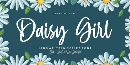 Daisy Girl is a flowing handwritten font, described by an elegant touch, perfect for your favorite projects. Fall in love with its incredibly distinct and timeless style and use it to create spectacular designs! Enjoy the font, feel free to comment or feedback, send me PM or email. Thank you!
 - November Script by Fenotype,
$29.95 November Script is a continuously flowing and spinning font family. It was originally designed for an award winning art calendar published by TAIK (University of Industrial Art & Design) In 2007. Afterwards the font has been waiting for its second coming. November Script is well suitable for headlines, posters, flyers and schoolbooks.
 - Nur Hidayah by Anomali Creative,
$10.00 Introducing Nur Hidayah Arabic Calligraphic Font this is an Arabic display style font that weaves intellect with imagination in a harmonious flow of letterforms. Nur Hidayah Arabic Calligraphic Font demonstrates a mysterious beauty of Arabic typography which is found to be essential for narrative content titling. The font is also suitable for branding and visual advertising. in the Arabic Language, Nur Hidayah refers to the Holy Enlightment. It also indicates the person who’s allready get a clear bright enlightment in their spiritual journey. The font features a unique writing style with a solid geometric structure which suits titling and creative heading. Nur Hidayah Arabic Calligraphic Font consists of three (3) style; Regular, dotted and Bold.
 - Gmbh Sans by EchadType,
$9.99 GMBH SANS The architectural sans-serif in sharp junctions silhouette. Designed as a display typeface for headline sizes. Typeface maintains it's unique identity even in all lowercase letters due to 21 degrees slanted stems (vertical strokes of letters). Variable typefaces provides subtle gradation of 6 weights. Each weight retains the same character width (except character i and l). Typeface supports: Latin characters with diacritical marks; Cyrillic characters (Ukrainian, Russian); Hebrew; Contains additional monetary symbols (₿Ξ₴₹₪)
 - Ocean Beach by LLW Studio,
$22.00 Ocean Beach is a fun, retro, all-caps Nautical Art Deco headline font. It sports geometric letterforms, perfect circles and highly stylized crossbars with waves on several letters—think the beach, flags rippling in the breeze and Fred and Ginger tap-dancing merrily on the deck of a ship! The inspiration for this font are the many whimsical nautical-themed buildings still to be found dotting the landscapes of America, from South Beach in Miami to hidden gems tucked away in industrial areas of southern California. I was fascinated by some of them when I was growing up, and in doing research on Art Deco styles I found many images of these wonderful buildings sporting portholes, streamlined moderne details and even faux rivets. Ocean Beach is created with a 3-stroke detail, and the complexity of the design will be appreciated better in larger sizes of type (36 pts or larger). Use this font for any application that needs a bold, decorative or Art Deco look; great for signage, magazine layout, illustration, posters and packaging.
 - Jheronimus by Aronetiv,
$9.99 Jheronimus is a neo-humanistic grotesque. A font with an open aperture. It has straight terminals and a moderated height of the lowercase characters. Jheronimus is a font with a uniform ordered rhythm. Well readable on the screen in small size. Consistent letter proportions. The rounded elements are pill shaped and the font has pronounced connections strokes. Punctuation marks are well decorated. Jheronimus will satisfy the demanding typographer. There are oldstyle figures in the best traditions of humanism. The bright recognizable character is combined with a clear form. This creates a sharp, crystal impression. Jheronimus is suitable for the design of an ambitious, temperamental text. It is stylistically similar to the paintings of the Dutch artist Hieronymus Bosch. From this comes its name.
 - Jessen-Schrift by profonts,
$41.99 The original Jessen typeface, named in reminiscence of the great supporter of the printing art at the end of the 19th century, Peter Jessen, was designed in the years of 1924 until 1930. Bible Gothic was created by the famous German designer Rudolf Koch. Ralph M. Unger digitized this font exclusively for profonts in 2005, keeping his digitization as close as possible to the original design of Koch in order to preserve the distinguished character and the partly unconventional, original forms. The concept of a Bible Gothic was developing for years in Koch's mind and drove the direction of his work, but only after the experience with his Neuland design could he start the creation of his Peter Jessen typeface. Produced quite like Neuland, Jessen, however, is much more refined and more accurate in detail than Neuland. At first glance, it seems to look plain and simple, but if you look closer, the richness of its distinguished upper case forms unfold to a perfectly clear flow of text
 - Bambe by Gian Studio,
$10.00 INTRODUCING BAMBE is handwritten, made with a brush, this font will rip your text with unmistakable energy, a dynamic and spontaneous flow. To help you create a stunning custom handwritten look, Bambe is perfect for magazines, t-shirts, packaging, logos, advertisements, quotes, branding, posters, editorials, cover artwork, films, websites, etc. BAMBE contains uppercase letters and some alternative characters, punctuation marks, numbers. Also includes the added bonus of a handcrafted, perfectly designed swash for headlines and short text. BAMBE encoded with Unicode PUA, Allows full access to all additional characters without designing any special software. Mac users can use Font Book, and Windows users can use Character Map to view and copy any additional characters for pasting into your favorite text editor / application. Thank you very much for viewing and Enjoying it!
 - Plantin by Monotype,
$29.99 Plantin is a Renaissance Roman as seen through a late–industrial-revolution paradigm. Its forms aim to celebrate fine sixteenth century book typography with the requirements of mechanized typesetting and mass production in mind. How did this anomalous design come about? In 1912 Frank Hinman Pierpont of English Monotype visited the Plantin-Moretus Museum in Antwerp, returning home with “knowledge, hundreds of photographs, and a stack of antique typeset specimens including a few examples of Robert Granjon’s.” Together with Fritz Stelzer of the Monotype Drawing Office, Pierpont took one of these overinked proofs taken from worn type to use as the basis of a new text face for machine composition. Body text set in Plantin produces a dark, rich texture that’s suited to editorial and book work, though it also performs its tasks on screen with ease. Its historical roots lend the message it sets a sense of gravity and authenticity. The family covers four text weights complete with italics, with four condensed headline styles and a caps-only titling cut. Plantin font field guide including best practices, font pairings and alternatives.
 - Linguine by Fenotype,
$19.95 Linguine is a flowing script family with plenty of automatic ligatures, Swash initials, Small caps and Ornaments. You can easily access these features in any Opentype savvy program.
 - Void Reaver by Zamjump,
$17.00 Introducing Void Reaver, a chilling masterpiece perfectly blending the themes of crash and horror. This unique typeface is meticulously crafted to evoke an unsettling and edgy atmosphere, making it an ideal choice for various applications. This font is your go-to choice for infusing a dark and mysterious atmosphere into a variety of creative projects, from social media graphics to website design. Elevate your designs with a font that leaves a lasting impression and invites exploration into the realms of crash and horror.
 - Liaisons by The Ampersand Forest,
$35.00 A Belle Époque humanist serif in two styles: crisp, high-contrast Haut-Monde and soft, low-contrast Demimonde… When you design a lot of display pieces, you’re often in need of tall, slim type. Liaisons provides that, in a distinct fin-de-siècle style inspired by the great posters of the Gilded Age from Sweden, Denmark, France, and Scotland. (The ampersand alone is a bit of a love letter to Charles Rennie Mackintosh!) Both styles use the same slim skeleton, and are named after the stratum of society where one might find… a “dancing partner.” HAUT-MONDE is a high contrast face of the sort that says “High Society.” Elegant and sleek, it speaks to the refinement of the moneyed classes of a bygone era. Great for high-end products, too! DEMIMONDE is soft and low-contrast — more reminiscent of hand-lettering on Art Nouveau/Jugendstil/Wiener Werkstätte advertisements and posters. A comfortably chic display face all around! Both typefaces feature full Western and Eastern Latin character sets, as well as full Cyrillic/Slavic ones. And, perhaps best of all, both typefaces feature capitals with high, middle, and low waists, so you can change up the look as you see fit! Part of The Ampersand Forest's Sondheim Series
 - Arsenica by Zetafonts,
$39.00 Arsenica is a serif typeface designed by Francesco Canovaro for Zetafonts, and developed by a design team including Mario De Libero, Andrea Tartarelli and Cosimo Lorenzo Pancini. The design of Arsenica takes its inspiration from Italian poster design at the beginning of the century, a time where typography, lettering and illustration where closely interwoven. Dawning nationalist movements, rather than using the modernist language, pushed on traditional Old Style letterforms often imbued with Art Nouveau and Deco sensibility. Artists like Giorgio Muggiani not only illustrated posters for Cinzano, Pirelli and Rinascente, but also provided logo design for newspapers, like "Il Popolo d'Italia". Starting from this mix of eclectic influences, Canovaro first developed the Arsenica Antiqua family, designed as display typeface that keeps the original Old Style low-contrast, wide proportions and quirky stylistic inventions. These where then distilled in a high contrast, Arsenica Display family, expanding the weight range to include both poster, ultra-bold weights and lighter weights that give the design a distinct calligraphic flavour. Bringing the letterforms into contemporary taste meant also developing alternate letterforms that were included in the Arsenica Alternate family, that drops the art nouveau details in favour of a more controlled modern serif aesthetic. Finally, Arsenica Text was developed by expanding the design space in the optical size axis, creating a low contrast, strongly readable old style typeface family, with a reduced weight set, oriented for long body copy typesetting. The final result is a superfamily of 41 weights, covering the design space with an expanded charset of over 900 glyphs, with full coverage of over 200 languages using latin and Cyrillic alphabets. All the weights of Arsenica come with a full set of open type features allowing to explore its vintage-inspired visual inventions thanks to stylistic sets, discretionary ligatures, contextual alternates and positional numbers. Two variable typefaces are included in the full family, allowing you to explore the design space and precisely control not only the weight but also the optical size design variations. • Suggested uses: perfect for elegant modern branding and logo design, fascinating editorial design, expressive packaging and countless other projects. • 43 styles: 7 weights + 7 italics, 4 different styles + 2 variable fonts. • 942 glyphs in each weight. • Useful OpenType features: Access All Alternates, Contextual Alternates, Case-Sensitive Forms, Glyph Composition / Decomposition, Discretionary Ligatures, Kerning, Lining Figures, Localized Forms, Mark Positioning, Mark to Mark Positioning, Oldstyle Figures, Ordinals, Stylistic Alternates, Stylistic Set 1, Stylistic Set 2, Stylistic Set 3, Stylistic Set 4, Stylistic Set 5, Stylistic Set 6, Stylistic Set 7, Stylistic Set 8, Stylistic Set 9, Slashed Zero. • 216 languages supported (extended Latin and Cyrillic alphabets): English, Spanish, Portuguese, French, Russian, German, Javanese (Latin), Turkish, Italian, Polish, Afaan Oromo, Azeri, Tagalog, Sundanese (Latin), Filipino, Moldovan, Romanian, Indonesian, Dutch, Cebuano, Igbo, Malay, Uzbek (Latin), Kurdish (Latin), Swahili, Hungarian, Czech, Haitian Creole, Hiligaynon, Afrikaans, Somali, Zulu, Serbian, Swedish, Bulgarian, Shona, Quechua, Albanian, Catalan, Chichewa, Ilocano, Kikongo, Kinyarwanda, Neapolitan, Xhosa, Tshiluba, Slovak, Danish, Gikuyu, Finnish, Norwegian, Sicilian, Sotho (Southern), Kirundi, Tswana, Sotho (Northern), Belarusian (Latin), Turkmen (Latin), Bemba, Lombard, Lithuanian, Tsonga, Wolof, Jamaican, Dholuo, Galician, Ganda, Low Saxon, Waray-Waray, Makhuwa, Bikol, Kapampangan (Latin), Aymara, Zarma, Ndebele, Slovenian, Tumbuka, Venetian, Genoese, Piedmontese, Swazi, Zazaki, Latvian, Nahuatl, Silesian, Bashkir (Latin), Sardinian, Estonian, Afar, Cape Verdean Creole, Maasai, Occitan, Tetum, Oshiwambo, Basque, Welsh, Chavacano, Dawan, Montenegrin, Walloon, Asturian, Kaqchikel, Ossetian (Latin), Zapotec, Frisian, Guadeloupean Creole, Q’eqchi’, Karakalpak (Latin), Crimean Tatar (Latin), Sango, Luxembourgish, Samoan, Maltese, Tzotzil, Fijian, Friulian, Icelandic, Sranan, Wayuu, Papiamento, Aromanian, Corsican, Breton, Amis, Gagauz (Latin), Māori, Tok Pisin, Tongan, Alsatian, Atayal, Kiribati, Seychellois Creole, Võro, Tahitian, Scottish Gaelic, Chamorro, Greenlandic (Kalaallisut), Kashubian, Faroese, Rarotongan, Sorbian (Upper Sorbian), Karelian (Latin), Romansh, Chickasaw, Arvanitic (Latin), Nagamese Creole, Saramaccan, Ladin, Palauan, Sami (Northern Sami), Sorbian (Lower Sorbian), Drehu, Wallisian, Aragonese, Mirandese, Tuvaluan, Xavante, Zuni, Montagnais, Hawaiian, Marquesan, Niuean, Yapese, Vepsian, Bislama, Hopi, Megleno-Romanian, Creek, Aranese, Rotokas, Tokelauan, Mohawk, Onĕipŏt, Warlpiri, Cimbrian, Sami (Lule Sami), Jèrriais, Arrernte, Murrinh-Patha, Kala Lagaw Ya, Cofán, Gwich’in, Seri, Sami (Southern Sami), Istro-Romanian, Wik-Mungkan, Anuta, Cornish, Sami (Inari Sami), Yindjibarndi, Noongar, Hotcąk (Latin), Meriam Mir, Manx, Shawnee, Gooniyandi, Ido, Wiradjuri, Hän, Ngiyambaa, Delaware, Potawatomi, Abenaki, Esperanto, Folkspraak, Interglossa, Interlingua, Latin, Latino sine Flexione, Lojban, Novial, Occidental, Old Icelandic, Old Norse, Slovio (Latin), Volapük.
 - Aerodyne by Mysterylab,
$10.00 Introducing Aerodyne, a highly versatile font family with seven weights and italics. While both modern and sleek in its line quality and flow, the fundamentals of this font set takes many of its design cues from more antiquated typestyles of the Roman era, especially in the capital letter set. Pair that up with the influence of mid-20th century humanist letterforms, and you have a type that is full of individual character, but with a smooth uniformity that conjures great beauty and individuality without drawing too much undue attention to itself. The subtle serifs give the font a unique character at both text and display sizes.
 - Thawed by Larin Type Co,
$13.00 Thawed This is a display font of a narrow specialization, its letters seem to have melted and flowed, but at the same time it retains the shape of the letters and is well read. It is perfect for branding, logos, labels, short display inscriptions and advertising materials from flyers to billboards. This font includes drops of style, they make it possible to make the font more voluminous and give detail.
 - Swatch it - Unknown license

- RussianQuality - Unknown license

- Sweden Funkis Straight - Unknown license

- Prima Sans by Bitstream,
$29.99Prima is a series of fonts designed at Bitstream by Jim Lyles (Sans and Serif) and Sue Zafarana (Sans Mono), released in 1998. The fonts have been tuned to give exceptionally good quality at low screen resolutions. The fonts are therefore suitable for sustained use in browsers and other applications where users read for long periods from the screen. Of course, Prima looks great printed out too. - Prima Serif by Bitstream,
$29.99Prima is a series of fonts designed at Bitstream by Jim Lyles (Sans and Serif) and Sue Zafarana (Sans Mono), released in 1998. The fonts have been tuned to give exceptionally good quality at low screen resolutions. The fonts are therefore suitable for sustained use in browsers and other applications where users read for long periods from the screen. Of course, Prima looks great printed out too. - Costumed Hero JNL by Jeff Levine,
$29.00 Comic books are filled with pages full of the daring adventures of crime fighters with colorful costumes, amazing abilities and wondrous powers. They have enthralled kids of all ages since the 1930s. Costumed Hero JNL emulates both the hand lettered cover titles of those vintage comics as well as the title credits from a 1960s television show based on one of these characters. With its non-conforming letter shapes and varying widths, the lighthearted look of classic comic title art can be yours. The font is available in both regular and oblique versions.
 - Wezer by Putracetol,
$24.00 The Wezer - Display Bold Font Duo is a unique and bold typeface that breaks away from the conventional font styles. It offers two distinct versions: rounded and display, both designed to bring something entirely fresh to the table. The purpose behind creating this font was to introduce a one-of-a-kind typeface that stands out in the design world. Wezer is the ideal choice for projects that require a touch of quirkiness and originality, making it perfect for logos, branding, headlines, posters, titles, billboards, banners, and any design that dares to be different.
 - Fresh Script by TRF,
$15.00 Fresh Script is a handwritten calligraphy font, free flowing, casual and with an elegant touch. This modern style font is perfect to be applied in various formal forms such as invitations, labels, restaurant menus, logos, fashion, make up, stationery, novels, magazines, books, greeting / wedding cards, packaging, labels or any type of advertising purpose. Fresh Script has 385 glyphs and 190 alternative characters, including various language support. With OpenType features with alternative styles and elegant ligatures. The OpenType feature does not work automatically, but you can access it manually and for the best results needed for your creativity in combining this Glyph variation.
 - Voguella by Mokatype Studio,
$19.00 Hello Introducing, Voguella - Luxurious Serif Display is elegant, inspired by the famous Elegant logo, perfect for the purposes of designing templates, brochures, videos, advertising branding, logos, and more. Perfect for adding a unique twist to word-mark logos, monograms, or pull quotes. What's Included: Standard glyphs Web Font International Accent Works on PC & Mac Simple installations Accessible in Adobe Illustrator, Adobe Photoshop, Adobe InDesign, even work on Microsoft Word. PUA Encoded Characters - Fully accessible without additional design software. Fonts include multilingual support Image used: All photographs/pictures/vectors used in the preview are not included, they are intended for illustration purposes only.
 - Trevor by TypeTogether,
$36.80 Teo Tuominen’s Trevor took its first breath as a revival of an 18th century antiqua, but culminated in an entirely new and good-natured family. Trevor is an affable slab serif in nature: both heavy and kind. Known for their familiarity and their dark colour, the terminals of slab serifs put additional weight along the line to maintain an inky presence. Their clunky forms reveal slight immaturity and arouse the reader’s sympathy for the subject at hand. Trevor connects with others by consciously riding the line between being personal and commanding. One goal with Trevor was to pair the robust nature of a low contrast slab serif with more sophisticated elements, such as the ball terminals. So wherever one looks in Trevor, rounded corners rule the day, softening the overall appearance by mimicking ink spread made by old metal type. The easygoing look is tempered by very few inktraps and sharp corners, mostly to the inside of characters and in acute angles. Whatever Trevor is paired with, it has an altruistic outlook in that it sees the best in others. It’s the neighbourly type family — the neighbour you actually want. Trevor’s almost monolinear weight and high x-height give it a typewriter look in the extralight and light weights, but the whole family was made to work with many other font styles, design work, and information structures. It certainly finds its home in packaging and advertising, its sturdy verticality and narrowness fit the needs of headlines and intro text, and its seven weights are primed for plays and involved text needing many layers of distinction. The black weight is treated like a separate display style with altered ball terminals and serifs to capitalise on the added heft. Trevor’s seven roman weights cover the Latin A Extended glyph set to bring its kindly and commanding outlook to your projects. Along with alternate version of the ‘R’ in the black weight, its OpenType features include both tabular and proportional lining and oldstyle figures, ligatures, and fractions. The complete Trevor family, along with our entire catalogue, has been optimised for today’s varied screen uses.
 - Monkton Book Condensed by Club Type,
$36.99 Packing more copy in a narrow space is the main reason for using a condensed type. Characters with a more ovular shape tend to be less wide than their circular counterparts and will allow for more letters per line. In narrow columns for example, this typeface can provide up to 25% more copy than the regular typeface in the same space. Another reason is when a larger type size is called for — used sparingly it is useful for headings or headlines. For emphasis, narrower letters can provide a stark contrast in the flow of reading, creating impact while retaining typographic character. Condensed types can specially useful in tables and charts because typically both use few words in each block. If space now allows, you may think about the luxury of a larger point size. This optimizes space while keeping your typography more easily legible.
 - Athelas by TypeTogether,
$65.00 An attempt to go back towards the beauty of fine book printing, inspired in Britain's literary classics. Athelas takes full advantage of the typographic silence, that white space in the margins, between the columns, the lines, the words, the lettershapes and finally, within the characters themselves. It is also intended to take advantage of the great advances and technical developments made in offset printing. Athelas shows its best side in finely crafted book editions and good printing conditions. Athelas has a large character set that covers most of the languages that use the Latin script. Although inspired in British literature, this typeface respects the cultural values behind different languages, where diacritic marks have an utterly important role. Athelas features four weights and about 800 characters per weight, including small caps, discretionary ligatures, fractions, a complete range of numerals for every use and a set of ornaments and arrows.
 - Nightclubber by Device,
$29.00 The late 70s and early 80s is sometimes considered to be the period when headline typography went off the rails. Growing up in that period, some designers may beg to differ. Many geometric designs were available in dry-transfer and for the typositor, and were used everywhere a youth-culture look was appropriate - annuals, comics, club flyers, high-street boutiques, TV-advertised compila tion albums. Nightclubber is a fond homage to the excesses of the period, and should be used back-lit in pink neon or at a rakish 45 degree slant across a blurred photograph of a glitter ball.
 - Kunstschau by Hanoded,
$15.00 The 1908 art exhibition in Vienna (Kunstschau 1908) featured works by Josef Hoffmann, Cark Otto Czeschka and Gustav Klimt, who showcased his famous painting 'The Kiss'. Kunstschau font was modeled on a stamp, designed by Austrian artist Bertold Löffler, for the 1908 exhibition. Kunstschau is a loose, handwritten font which comes with a distinct all caps upper and lower case, plus an extensive language support.
 - Baby Doodles by Outside the Line,
$19.00 Fun, little illustrations of baby toys, baby clothes and baby stuff. 27 darling doodle-like baby illustrations and 3 script and printed baby titles. This font is another of the many picture and doodles fonts from this foundry.
 - Cajoun by Linotype,
$29.99Cajoun is a bold serif face from German designer Hans-Jürgen Ellenberger. The letters sit visually low on their baseline, in part due to their small x-height. Also, the curved portions of the letterforms have an old-style distribution of weight, which pulls the eye downward. This font has a contemporary feel, however, with crisp edges, and some pointy terminals. The typeface also contains old style figures. Cajoun is recommended for use in larger applications, where the eye can get a change to dance along its wide curves. Cajoun was designed in 2002, and is part of the Take Type 5 collection from Linotype GmbH." - Joyosa by Autographis,
$39.50 Joyosa is an elaborate script written with a broad pen; it gives the impression of a flowing ribbon.
 - Ceres by Wilton Foundry,
$29.00 Ceres is has its roots in Cyan, our other font family. Like Cyan, Ceres has a complementary lowercase that provides more versatility than a classic Roman. It is arguably more elegant than Cyan with its accentuated serifs. The lowercase "e" and "g" give Ceres a distinct calligraphic personality. Ceres, the font, derived its name from Ceres the Roman goddess. In Roman mythology, Ceres is the goddess of growing plants (particularly cereals) and of motherly love. Ceres was usually equated with the Greek goddess Demeter. Ceres was the daughter of Saturn and Ops, wife-sister of Jupiter, mother of Proserpina by Jupiter and sister of Juno, Vesta, Neptune and Pluto. Ceres made up a trinity with Liber and Libera, who were two other agricultural gods. She also had twelve minor gods who assisted her, and they were in charge of specific aspects of farming.


