10,000 search results
(0.029 seconds)
- Arabetics Latte by Arabetics,
$59.00 Arabetics Latte is a Latin Serif typeface with a comprehensive support for the Arabetic scripts, including Quranic texts. While its seemingly-idiosyncratic Latin design eliminates the excessive usage of serifs and offsets the visual effects of several geometrically-intense glyphs, its Times Romanesque proportions gives a full nod to the beginnings of Latin types and produces an overall stable look-and-feel of a classical Serif style, making it suitable for both text and display applications. Liberal spacing is maintained throughout to match that of the Arabic text and is further supplemented by a careful implementation of a typical Latin kerning. The overall design of this font, including metrics and dimensions, was intended to make its Latin harmonize well with most other Arabetics foundry fonts. Arabetics Latte fully supports MS 1252 Western and 1256 Arabic code pages, in addition to all the transliteration characters required by the ALA-LC Romanization tables. Users can either select an accented character directly or form it by keying the desired combining diacritic mark following an unaccented character. For Arabic, it fully supports Unicode 6.1, and the latest Arabic Supplement and Extended-A Unicode blocks. The Arabic design of this font family follows the Mutamathil Taqlidi design style with connected glyphs, emphasizing vertical strokes to bring added harmony, and utilizing slightly varying x-heights to match that found in Latin. The Mutamathil Taqlidi type style uses one glyph for every basic Arabic Unicode character or letter, as defined by the Unicode Standards, and one additional final form glyph, for each freely-connecting letter of the Arabic cursive text. Arabetics Latte includes the required Lam-Alif ligatures in addition to all vowel diacritic ligatures. Soft-vowel diacritic marks (harakat) are selectively positioned with most of them appearing on similar high and low levels—top left corner—, to clearly distinguish them from the letters. Tatweel is a zero-width glyph. Keying the tatweel key (shft-j) before Alif-Lam-Lam-Ha will display the Allah ligature. Arabetics Latte includes both Arabic and Arabic-Indic numerals, in addition to generous number of punctuation and mathematical symbols. Available in both OpenType and TrueType formats, it includes two weights, regular and bold, each has normal, Italic, and left-slanted styles.
 - Bolognaise by Balpirick,
$15.00 Bolognaise is a relaxed and flowing handwritten font, created with the help of a beautiful brush pen. Fall in love with its incredibly distinct and timeless style and use it to create spectacular designs!
 - Cholla by Emigre,
$49.00 The Cholla typeface family was designed by Sibylle Hagmann in 1998-99 and named after a species of cactus she encountered in the Mojave Desert. Cholla was originally developed for the Art Center College of Design in Pasadena, California. There, art director Denise Gonzales Crisp and associate designer, Carla Figueroa, collaborated with Hagmann to create a series of fonts that would offer a great deal of variation. The variety was needed to echo the school's nine different departments, yet together the fonts had to exude a unified feel. It was first used in the radically designed 1999/2000 Art Center catalog which won a honorable mention in I.D. magazine and was featured in Eye No. 31. Originally Hagmann set out to design a typeface that, as she recalls, "I could feel comfortable making, first of all, and one that would serve a purpose and had a clear idea behind it, and something that I would want to use myself." Stylistically Hagmann set out to create "12 cuts with slightly different personalities, with different ideas applied. For example the bold weight isn't simply the Regular with weight gain, but has bold letterforms with their own peculiar details. What all weights share and what is the necessary unifying detail is the tapered curve - marked out, for example, in the lowercase b's left top and bottom of the bowl." Gonzales adds: "The forms seemed classical as well. This combination could have a long life, and be timely. I also saw - at least in the beginnings of Cholla - forms that connoted hybrid, of inter-connection, of human and machine growing together. These notions seem appropriate for a school that teaches design and art." Greek version by Panos Haratzopoulos.
 - Minehead by Hanoded,
$15.00 As a family, we love to go camping. We have a big Norwegian tunnel tent (4 season - with room for a wood stove), some really warm down sleeping bags and a primitive field kitchen. Even though our camping trips are usually devoid of luxury, the kids love them! We always choose campsites that are close to nature, like a national park or in the mountains. A couple of years ago, we toured the southern part of England and one of our camping stops was in Exmoor National Park. Minehead is a small coastal town, not far from where we camped, so I named this font after a fond memory! Minehead is a handmade display font. It was loosely based on Haettenschweiler. Use it for your packaging, your tourist information leaflets and your book covers. And do visit Minehead one day!
 - Reservation Wide by TypeTrust,
$30.00Reservation Wide is intended for headlines with its relatively snug letterspacing and extended forms. Its simplicity will accommodate smaller sizes and lower resolution displays. OpenType Stylistic Alternates for characters 'a', 'g' and 't' lend an even simpler finish. The hand-drawn curves and angled stroke endings temper the otherwise rigid proportions of the family. This painterly tendency becomes more apparent in the heavier weights keeping them from looking too imposing. The design first took shape as a custom font named Majestos for the cable channel The Food Network . It can be found in their growing online and printed presence in addition to their broadcast identity for which it was developed. - Swoley by Luxfont,
$40.00 Introducing the Swoley family of cool 3D color fonts - where the letters are like a liquid flowing into glyphs, creating an amazing fluid visual effect. This unique type family combines realism and modernity, adding amazing details to your projects. Pairs perfectly with Volufont. Features: - Real Plastic effect - Kerning IMPORTANT: - Check the glyphs in the font before buying! - SVG fonts contain raster letters.
 - Blackbow by MKGD,
$13.00 Blackbow is a font that takes its inspiration from three enticing subjects. Firstly, it’s sheer, lace-like construction captures the allure of lingerie. Secondly, it possesses and projects the sometimes dour but always POEtic trappings of Goth culture. And lastly, it conveys the stylish, provocative accoutrements of Steampunk. When blended together, Blackbow is a font that suggests the rapture of dark temptation in the sultriest of ways. Blackbow has a glyph count of 389 and supports the following languages Afrikaans, Albanian, Asu, Basque, Bemba, Bena, Bosnian, Catalan, Chiga, Colognian, Cornish, Croatian, Czech, Danish, Embu, English, Esperanto, Estonian, Faroese, Filipino, Finnish, French, Friulian, Galician, German, Gusii, Hungarian, Icelandic, Indonesian, Irish, Italian, Kabuverdianu, Kalaallisut, Kalenjin, Kamba, Kikuyu, Kinyarwanda, Latvian, Lithuanian, Low German, Lower Sorbian, Luo, Luxembourgish, Luyia, Machame, Makhuwa-Meetto, Makonde, Malagasy, Malay, Maltese, Manx, Meru, Morisyen, North Ndebele, Norwegian Bokmål, Norwegian Nynorsk, Nyankole, Oromo, Polish, Portuguese, Romanian, Romansh, Rombo, Rundi, Rwa, Samburu, Sango, Sangu, Scottish Gaelic, Sena, Shambala, Shona, Slovak, Slovenian, Soga, Somali, Spanish, Swahili, Swedish, Swiss German, Taita, Teso, Turkmen, Upper Sorbian, Vunjo, Walser, Zulu
 - Moby by Beware of the moose,
$15.99 Moby is based on a grid of squares and has four different variations – from sharp corners to rounded with two steps in between. The letter is playful despite its grid and has the most common punctuation marks making the moby usable in most western european languages ... and even usable for Icelandic texts. The letter is named after my dog, the cutest Barbet (French water dog) in the world.
 - Keswick by Hanoded,
$15.00 Keswick is a beautiful small town in the English Lake District. It is a good place to hang out for a while and explore the surrounding National Park. During your stay you could visit the Keswick Pencil Factory - which brings us to this nice font… Keswick font was created using a 6B pencil (the crumbly, soft kind) and a lot of patience. I have to admit, the pencil used was not made in Keswick. Sorry 'bout that…
 - Meno Text by Lipton Letter Design,
$29.00 Richard Lipton designed Meno in 1994 as a modest yet elegant workhorse serif family in seven styles. In 2016, he expanded this spirited oldstyle into a 78–style superfamily. The romans gain their energy from French baroque forms cut late in the 16th century by Robert Granjon, the italics from Dirk Voskens’ work in 17th-century Amsterdam. Meno consists of three carefully drawn optical sizes—Text, Display, and Banner, with Condensed and Extra Condensed widths added to the latter two cuts. Steadfast in text settings, Meno is replete with alternate forms, swashes, and other enhancements that showcase Lipton’s masterful calligraphic hand. The series offers a complete solution for achieving high-end editorial typography.
 - Meno Display by Lipton Letter Design,
$29.00 Richard Lipton designed Meno in 1994 as a modest yet elegant workhorse serif family in seven styles. In 2016, he expanded this spirited oldstyle into a 78–style superfamily. The romans gain their energy from French baroque forms cut late in the 16th century by Robert Granjon, the italics from Dirk Voskens’ work in 17th-century Amsterdam. Meno consists of three carefully drawn optical sizes—Text, Display, and Banner, with Condensed and Extra Condensed widths added to the latter two cuts. Steadfast in text settings, Meno is replete with alternate forms, swashes, and other enhancements that showcase Lipton’s masterful calligraphic hand. The series offers a complete solution for achieving high-end editorial typography.
 - Meno Banner by Lipton Letter Design,
$29.00 Richard Lipton designed Meno in 1994 as a modest yet elegant workhorse serif family in seven styles. In 2016, he expanded this spirited oldstyle into a 78–style superfamily. The romans gain their energy from French baroque forms cut late in the 16th century by Robert Granjon, the italics from Dirk Voskens’ work in 17th-century Amsterdam. Meno consists of three carefully drawn optical sizes—Text, Display, and Banner, with Condensed and Extra Condensed widths added to the latter two cuts. Steadfast in text settings, Meno is replete with alternate forms, swashes, and other enhancements that showcase Lipton’s masterful calligraphic hand. The series offers a complete solution for achieving high-end editorial typography.
 - Alana Smooth by Laura Worthington,
$39.00 Alana is a connected script that glows with casual elegance. Its inviting letterforms work well in settings such as letter-writing and menu details; even at small sizes. Alana includes over 300 alternates, including swash capitals and ornamented forms to customize titles, headlines, packaging, and wordmarks. Alana includes 62 matching ornaments: botanical fleurons, birds, and cute lil’ bugs. See what's included! This font has been specially coded for access of all the swashes, alternates and ornaments without the need for professional design software! Info and instructions here.
 - Monarky by YXType,
$22.00 Monark family is designed with legibility and wide language support in mind. Rooted in Fyodor Dostoevsky's Crime and Punishment, it captures the anguish & distortion atmosphere and suppresses them into ruthless letterforms. Top-heavy stems, heavy serifs, and low-contrast forms are all extractions of Dostoevsky's dilemma. Rest assure this typeface would bring you all the needs for advanced typography with true small caps with symbols, 4 styles of figures, support for inferior/superiors, and more than 200 Latin languages. Features: • Support for 200+ Latin languages • Low contrast with unique details • Unique Italic letterforms • Small caps with symbols • Arbitrary and pre-defined fractions • Support for superscript & subscript in normal & scientific alignments • Proportional lining, proportional old-style, tabular lining, tabular old-style
 - Trashbone by Arterfak Project,
$18.00 Introducing Trashbone, a playful marker font, designed with an additional rusty effect applied to the strokes. This font represented courage, youth, spirit, freedom, that recommended for many themes such as sports, dark, teen, movement, adventure, etc. Equipped with ligatures, alternates, and multilingual support! Thank you for visiting and enjoy!
 - ITC Whiskey by ITC,
$29.99Jochen Schuss, the Biedenkopf, Germany, designer who was most recently responsible for ITC Vino Bianco, has created in ITC Whiskey a condensed display face that's both angular and soft at the same time. While the letterforms of Whiskey are clearly roman, there's a slight reminiscence of blackletter in the face's narrow proportions, its dark weight, and its persistent internal angle - not quite the 45 degrees common in a classic German textura, but a gentler angle of 25 or 30 degrees. And the counters are all rounded, as are the ends of all the strokes, giving Whiskey a comfortable friendliness despite its severe structure. The character set includes an alternate z" and an "ft" ligature." - Eckmann by Linotype,
$29.99The font Eckmann is named after its designer, Otto Eckmann, and appeared with the Klingspor font foundry in 1900. The influence of the Jugendstil is clear to see in the flowing floral contours of the letters. This font was made for larger point sizes, like on posters, and while relatively legible, it is not meant for smaller print. The font was often used in book titles and advertisements of the 19th century and today Eckmann is often used to suggest a feeling of nostalgia and is often found on the Jugendstil facades in Germany, Austria and Switzerland. - Bixbite Stone by Lemonthe,
$17.00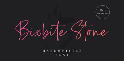 Bixbite Stone is a elegant and flowing handwritten font. 160+ ligatures are included in this font. It is the best choice for creating eye catching logos, branding, wedding design, product packaging and quotes. Every letter has a unique and beautiful touch, which will make your design come alive!
 - Cintia Bela by TM Type,
$12.00 Cintia Bela is a smooth, elegant, and flowing calligraphy font perfect for your favorite projects. Fall in love with its completely different and timeless style, and use it to create spectacular designs! This font is PUA encoded, which means you can access all the glyphs and sweeps with ease!
 - Weird Better by Heyfonts,
$15.00 Weird Better fonts are typography designs that imitate or simulate the appearance of liquids. They are often fluid and dynamic in nature, providing an illusion of movement and flow in letters and characters. Weird Better fonts can be created using different design techniques, including hand-drawn illustrations, digital effects, or 3D modeling software. Some common features of liquid fonts include: Fluid and dynamic appearance: Weird Better fonts have a free-flowing and organic appearance, mimicking the look and movement of liquids such as water, ink, or paint. Variations in thickness: The thickness of the lines and curves in Weird Better fonts can vary, creating an uneven and organic appearance. Versatile use: Weird Better fonts are commonly used in creative designs such as logos, album covers, and advertising campaigns to create an eye-catching and memorable visual impact. Overall, Weird Better fonts are a unique and creative way to portray text, giving a sense of energy, motion, and fluidity to design projects.
 - Liquidity by Heyfonts,
$15.00 Liquidity fonts are typography designs that imitate or simulate the appearance of liquids. They are often fluid and dynamic in nature, providing an illusion of movement and flow in letters and characters. Liquid fonts can be created using different design techniques, including hand-drawn illustrations, digital effects, or 3D modeling software. Some common features of Liquidity fonts include: Fluid and dynamic appearance: Liquidity fonts have a free-flowing and organic appearance, mimicking the look and movement of liquids such as water, ink, or paint. Variations in thickness: The thickness of the lines and curves in liquid fonts can vary, creating an uneven and organic appearance. Versatile use: Liquidity fonts are commonly used in creative designs such as logos, album covers, and advertising campaigns to create an eye-catching and memorable visual impact. Overall, Liquidity fonts are a unique and creative way to portray text, giving a sense of energy, motion, and fluidity to design projects.
 - Surfside by Victory Type,
$14.00 These are the letters I doodled in the margins of my high school notebooks. As it turns out, a man named Milt Glaser doodled them first. He doodled a lot of other amazing things too. Mr. Glaser called his blocky alphabet Baby Teeth. I think the type looks better when it says Surfside, so that's what I called my incarnation. This version has been digitized and expanded, and is available for Mac and PC. These letters remind me of the 80s and the 90s, of Gotcha shorts, Ocean Pacific shirts and fluorescent windbreakers. Surfside matched my Airwalks. They're big and bold. Clunky and funky. Spices up words. Makes 'em look great! Surfside is cool and available for a low low price... scoop it up today!
 - FG Jennie by YOFF,
$14.95 Jennie in a box - a very well flowing scriptfont that's appealing for almost any task.
 - Jenson Old Style by ITC,
$29.00In 1458, Charles VII sent the Frenchman Nicolas Jenson to learn the craft of movable type in Mainz, the city where Gutenberg was working. Jenson was supposed to return to France with his newly learned skills, but instead he traveled to Italy, as did other itinerant printers of the time. From 1468 on, he was in Venice, where he flourished as a punchcutter, printer and publisher. He was probably the first non-German printer of movable type, and he produced about 150 editions. Though his punches have vanished, his books have not, and those produced from about 1470 until his death in 1480 have served as a source of inspiration for type designers over centuries. His Roman type is often called the first true Roman." Notable in almost all Jensonian Romans is the angled crossbar on the lowercase e, which is known as the "Venetian Oldstyle e." Jenson Old Style™ was designed by Freda Sack and Colin Brignall for Letraset in 1982. Because of its darkness, this version is best used for display designs that call for a sense of old-world elegance and solidity." - Teja by Eurotypo,
$59.00 “Teja” font was inspired in the lettering styles printed on enamel advertising signs. The enameled iron signs were, from 1880s until the 1950s, amongst the most striking features of streets and railway stations in most towns and villages around the world. “Teja” was designed specially for use in logotypes, advertising and packaging. It is interesting to note the use of free-flowing lettering to perform its own eye-catching.
 - Yasmine Mutlaq by Arabetics,
$29.00 The Yasmine Mutlaq type family follows the guidelines of the Mutamathil Mutlaq type style. It has one glyph per basic Arabic Unicode character or letter. Each glyph is completely symmetrical around its vertical axis to facilitate bi-directional ordering. This family does not include any required ligatures and does not use glyph substitutions or forming but it does use marks positioning. Text strings composed using types of this family are non-cursive with stand-alone isolated glyphs. Yasmine Mutlaq employs four x-height values, two above and two below the x-axis. Its design uses curves with equally distributed weight. This family includes both Arabic and Arabic-Indic numerals, all required diacritic marks, in addition to all standard English keyboard punctuations and major currency symbols. It is available in regular styles. Also included is an additional font, Yasmine Mutlaq bidi that encodes same glyphs as symbols to facilitate user input from left to right using a Latin keyboard. The fonts in this family support the following scripts: Arabic, Persian, Urdu, Pashtu, Kurdish, Baluchi, Kashmiri, Kazakh, Sindhi, Uyghur, Turkic, and all extended Arabic scripts.
 - Blossoming Constellation by Letterhanna Studio,
$19.00 Introducing "Blossoming Constellation," a free-spirited handwritten font that gracefully weaves the celestial allure of constellations with the untamed beauty of blossoming flowers. Each letter in this font carries the essence of a wandering spirit, capturing the whimsy and wonder of the universe. With its flowing lines and delicate details, "Blossoming Constellation" invites you to express your creativity with the boundless freedom of a free spirit.
 - Monotype Lydian by Monotype,
$40.99 Lydian is an unusual sans serif face with strongly calligraphic letter shapes, originally cut by American Type Founders. The eye-catching nature of the Lydian font family has made it popular for use in magazines and advertising as well as in newspapers for headlines and introductions. The cursive has an even more marked pen-drawn structure.
 - Divenire by CAST,
$45.00 Divenire is derived from a custom typeface designed for the Partito Democratico (Italian Democratic Party), it is used in their political communication. It has variation of tension in its design, alternating curved and almost straight elements. The glyphlist includes many alternatives like a set of odd punctuation marks: the famous "interrobang" and others, starting from Hervé Bazin's work.
 - Aure Brash by Aure Font Design,
$23.00 Aure Brash speaks with the cheeky inuendo of a sassy parrot. The quirky forms of this unique outline font engage the reader with a subtext of whimsy. Designed for its visual impact, Brash stands out as a title font and offers delightful possibilities for graphic imagery. Brash is an original design developed by Aurora Isaac. After more than a decade in development, 2018 marks the first release of the CJ and KB glyphsets. The CJ glyphset is a full text font with an extended set of lowercase and uppercase glyphs supporting a variety of European languages. Additional glyphs include standard ligatures, four variations of the ampersand, and check-mark and happy-face with their companions x-mark and grumpy-face. Numbers are available in lining and oldstyle versions, with numerators and denominators for forming fractions. Companion glyphs include Roman numerals, specialized glyphs for indicating ordinals, and a variety of mathematical symbols and operators. The CJ glyphset also includes an extended set of glyphs for typesetting Western Astrology. These glyphs are also available separately in the KB glyphset: a symbol font re-coded to allow easy keyboard access for the most commonly used glyphs. Brash is not designed for use in extended text. It shows its strength paired with strong text fonts such as Aure Jane or Aure Teddy. Used sparingly, Brash will add witty highlights to catch the reader's eye. Give Aure Brash a trial run! You may discover a permanent place for this font family in your typographic palette. AureFontDesign.com
 - House Doodles by Outside the Line,
$19.00 Little houses, little houses and none are the same. Cute cottages, beautiful bungalows, homey homes and darling dwellings to use to make ads, flyers, invitations for moving, change of address, open house parties, address stamps... Some have a lot of detail so use them at larger sizes. The less detailed for can be used in a smaller size.
 - Pallada by ParaType,
$25.00 A decorative face of freestyle flowing letterforms, it is stylized a little under wide brush calligraphy. Its letterforms are characterized with one-side serifs. For use in book heading, advertising and display matter. The face designed by Natalya Vasilyeva and licensed by ParaType in 2007.
 - Rose Pink by Olivetype,
$18.00 Introducing Rose Pink, a fun and exciting font suitable for any creative project. From product packaging to logos, this font is the perfect way to express your creativity with a bold style and playful look. The whimsical and flowing curves of this font also can help create a sense of lightheartedness in your design. project. Thank You and Happy Designing!
 - Bolda Display by The Infamous Foundry,
$29.00 Bolda Display is a a-z lowercase display font in two styles; regular and outline. Lowercase is regular and uppercase is outline. Inspired by the 1970’s tennis, dart and ping pong fashion. Perfect for headlines, logos and everything above the body.
 - Dijon Stencil JNL by Jeff Levine,
$29.00 A vintage French metal marking stencil for Comandon and Company was the inspiration for the 1400th type design from Jeff Levine Fonts. Dijon Stencil JNL is a condensed serif design with thin stroke weights and is available in both regular and oblique versions.
 - Camille by Arabetics,
$45.00 Camille was designed with exaggerated emphasis on letter vertical characteristic, by virtually eliminating the typical Arabic horizontal line look. This font glyph weights and look and feel are heavily influenced by early Kufic Quranic calligraphy style. Camille supports all Arabetic scripts covered by Unicode 6.1, and the latest Arabic Supplement and Extended-A Unicode blocks, including support for Quranic texts. This font family includes two letter spacing flavors: isolated for small text and overlapped for large or display text. The two spacing flavors have one weight each with a normal and a left-slanted Italic version. The script design of this font family follows the Arabetics Mutamathil Taqlidi style utilizing varying x-heights. The Mutamathil Taqlidi type style uses one glyph per every basic Arabic Unicode character or letter, as defined by the Unicode Standards, and one additional final form glyph, for each freely-connecting letter of the Arabic cursive text. Camille includes the required Lam-Alif ligatures in addition to all vowel diacritic ligatures. Soft-vowel diacritic marks (harakat) are selectively positioned with most of them appearing on similar high and low levels—top left corner—, to clearly distinguish them from the letters. Tatweel is a zero-width glyph.
 - Office Stamps JNL by Jeff Levine,
$29.00Office Stamps JNL is a collection of twenty-six images recreating the familiar 'stock' rubber stamps used in offices for decades before self-inking stamps and desktop printing made them relics of the past. Modeled from vintage sources, all of the images have been re-drawn by Jeff Levine to have a crisper look than simply utilizing scanned imprints of old marking devices. - Sommerwerk Ink by Sommerwerk,
$29.00 This font is inspired by typography found on old German shop windows. It is a script font, but instead of imitating human handwriting and the gestures connected to it, the goal was to come up with a new writing flow and stroke order. As opposed to handwriting Latin script letters, which normally means drawing each character and then connecting it to the next one, the strokes of this font run across multiple glyphs. Intentionally, the design aims to achieve a flowing transition between each glyph without making use of contextual alternates, taking the limitations of classic machine lettering as a challenge.
 - Vaccine Sans by ParaType,
$30.00 Vaccine Sans is a humanist sans-serif font family with soft terminals, but stem junctions on the contrary use hard constructions. Such combination of basic design features makes the font distinct and strong in setting and delicate and soft in appearance. This design peculiarity, together with very low contrast, produces a range of qualities needed for small sizes, low quality print and bad reading conditions. Vaccine Sans has a modern stylish design and takes its rightful place among popular faces. The family consists of 10 members — five weights with the corresponding italics. It can be used in a wide range of applications — magazines, advertising, corporate identity, urban navigation, packaging, children books, etc. Designed by Manvel Shmavonyan with the participation of Alexandra Korolkova and Gayaneh Bagdasaryan.
 - Kleist Fraktur by RMU,
$25.00 In the late 1920s Walter Tiemann cut this font for Klingspor Brothers in Offenbach am Main. It comes close to Luthersche Fraktur and, though quite slender, possesses a good gray value and readability. This blackletter font fits excellently into narrow columns. Kleist Fraktur contains a bunch of useful ligatures, and by typing 'N - o - period', marking this combination and activating OT feature Ordinals you get an oldstyle numbersign.