10,000 search results
(0.238 seconds)
- Archie by Canada Type,
$39.95 Archie is a wide attention-grabber based on a simple geometric alphabet drawn in the early 1930s by Dutch calligrapher and lettering artist Martin Meijer. This digital family expands considerably on the original letters, adding biform shapes, small caps, italics across the board, and support for many Latin-based languages. Archie's eye-catching forms are meant for clear, seamless and strong message delivery. In its upright styles, strong vertical strokes emphasize the sense of confidence and importance, and in its italics, that emphasis is further affirmed by a natural sense of urgency. This kind of alphabet is perfect for display typography aiming at the glance-and-go crowd. When used properly and placed prominently, no eye can escape it. The basic Archie family is comprised of six basic fonts, while the Pro set combines all three uprights in one font and all three italics in another.
 - Hupp Fraktur by RMU,
$25.00 Otto Hupp's blackletter font, released by Klingspor in 1911, took its inspiration from the then dominating Art Nouveau designs. Some of its capitals express this with their lovely swash forms, and make this fraktur font less stiff. Hupp Fraktur contains a bunch of usefull ligarures, and by typing 'N', 'o' and period you get an oldstyle numbersign by activating the Ordinals feature.
 - Pagnol by Typorium,
$15.00 The Pagnol typeface has been designed with a principle developed by A. M. Cassandre in 1937, when the great French designer created the Peignot typeface following paleographic studies on the evolution of letterforms. Researches in the history of writing have proved that the lowercase "a" is at its origin nothing but the "A" shape transformed through centuries by scribes until the invention of printing. A large number of lowercases meanwhile kept their original shapes. If the scribes’ hand didn’t find the necessity to simplify them, it is only because these letters could be easily written. Integrating the classical shapes of capitals to the lowercases has already been used, keeping the lowercases which are only a deformation of capitals. Nevertheless, the respect of readability imposes to keep ascendants and descendants from traditional lowercases which serve as optical focus points in a text and make reading easier. The particularity of Pagnol is to use rounded shapes on top and bottom of pointed capital letters to make them fit with corresponding lowercases (Aa, Mm, Nn, Vv, Ww, Zz). Lowercases proportions are wide, to be in tune with classic lowercase shapes in order to optimize readability. Five weights in roman and italic have been designed to offer a wide palette of typographic possibilities in all sizes and all paper and screen supports.
 - Palatino Arabic by Linotype,
$187.99 Palatino Arabic is a collaboration between Lebanese designer Nadine Chahine and Prof. Hermann Zapf. The design is based on the Al-Ahram typeface designed by Zapf in 1956 but reworked and modified to fit the Palatino nova family. The design is Naskh in style but with a strong influence of the Thuluth style as well. This is evident in the swash-like finials and the wide proportions of the letterforms. It is designed for use in print in both large and small sizes. The counters are wide open to allow for better readability in small sizes as well as to maintain an open and friendly appearance. The font has 1091 glyphs and includes a large number of extra ligatures and stylistic alternates as well as the basic Latin part of Palatino nova and support for Arabic, Persian, and Urdu. It also includes proportional and tabular numerals for the supported languages. Palatino Arabic wins Type Directors Club award. Each year, the New York-based Type Directors Club judges typeface designs from all over the world in their TDC2 contest. Linotype is pleased to announce that a very new typeface of its own is among 2008’s winners: Palatino Arabic. A collaboration between Nadine Chahine and Prof. Hermann Zapf, this face is an extension of Zapf’s Al-Ahram Arabic type from 1956 recreated to join the Palatino nova family.
 - Frutiger by Linotype,
$42.99 In 1968, Adrian Frutiger was commissioned to develop a sign and directional system for the new Charles de Gaulle Airport in Paris. Though everyone thought he would want to use his successful Univers font family, Frutiger decided instead to make a new sans serif typeface that would be suitable for the specific legibility requirements of airport signage: easy recognition from the distances and angles of driving and walking. The resulting font was in accord with the modern architecture of the airport. In 1976, he expanded and completed the family for D. Stempel AG in conjunction with Linotype, and it was named Frutiger. The Frutiger™ family is neither strictly geometric nor humanistic in construction; its forms are designed so that each individual character is quickly and easily recognized. Such distinctness makes it good for signage and display work. Although it was originally intended for the large scale of an airport, the full family has a warmth and subtlety that have, in recent years, made it popular for the smaller scale of body text in magazines and booklets. The family has 14 weights and 14 companion fonts with Central European characters and accents. Another 14 Cyrillic companion fonts are available as well. See also the new revised version Frutiger Next from the Linotype Platinum Collection. Featured in: Best Fonts for Logos
 - Spathe Pro by DBSV,
$10.00 About family “SpathePro” Spathe(Sword) the guy… There are many versions of the expression spathe, some of them are: A guy who says things by name we say is a sword, is correct in explaining a situation or an event. Sometimes we say again that a woman is beautiful and has a body like a sword!! It is one of the four versions of the pack of cards for example "ace sword". We also say of someone that he won a case with his sword (his sword), with transparency and knowledge of the case. It is also one of the oldest weapons used by humans in wars, sometimes used by the defendants to resolve their differences or for reasons of honor. While even today it is an Olympic game as fencing. This is a font as sharp as a swordfish… This series is composed and includes ten fonts with 630 glyphs each, with true italics, true Sloping and supports of course: Latin, Greek & Cyrillic.
 - Giambattista by Wiescher Design,
$39.50 Giambattista is a long-time project of mine finally come to an end. After redesigning all of Giambattista Bodoni's work and then some additional cuts I started a long time ago with this Non-Bodoni Bodoni. The idea came to me while redesigning the original Chancellerosa (chancery). I thought Bodoni just didn't have the right approach to a chancery, this was just not his cup of tea! Maybe that is why he never used the Chancellerosa very much for his own printshop in Parma. So I thought someone has to design a script, that looks like Bodoni could have designed it but is more lively than his. Over the years I have been working on and off on the face and it turned out to become three typefaces which can be freely mixed. Here is my modern version of a script in the style of Giambattista, meant as an hommage, I called it Giambattista. Your modern scribe Gert Wiescher
 - Bitstream Vera Sans - Unknown license

- Ramisa Faux by Twinletter,
$15.00 Ramisa is a Japanese-style font that is designed as uniquely as possible to create a beautiful and easy-to-read combination of sentences. Of course, this font is also very flexible for you to use in your various projects, ensuring that your project has a fantastic and appealing appearance that will be remembered by all audiences. Logotypes, food banners, branding, brochure, posters, movie titles, book titles, quotes, and more may all benefit from this font. Of course, using this font in your various design projects will make them excellent and outstanding; many viewers are drawn to the striking and unusual graphic display. Start utilizing this typeface in your projects to make them stand out.
 - Price Didone by Eclectotype,
$25.00 PUBLIC SERVICE ANNOUNCEMENT: Price Didone has inspired a full alphabetic font - Mastadoni, so if you're after more than numerals, head over there! Price Didone is a font with a singular purpose: The setting of elegant, stylish price tags. As such it is non-alphabetic, featuring instead numerals, a large array of currency symbols, and a smattering of typographic niceties such as quotes, brackets, pilcrow, daggers and a very curvaceous ampersand. Certain currency symbols that are not independent glyphs (Q, Ft, kr etc.) are included as their constituent letters, some of which also have automatic ligatures for that little something extra. There are currency symbols included which have not (yet) been accepted to unicode, such as the Russian Ruble and Bitcoin symbols. For ease of access, these can be typed using the standard ligatures feature. See features below for the full list. Features: Automatic Fractions - with fractions feature engaged, arbitrary fractions are a doddle. Stylistic Sets: SS01 - an alternate look for 4 SS02 - a double stroked dollar symbol SS03- the # sign becomes a stylish numero Stylistic Alternates - for software that doesn't support stylistic sets, the above three features are grouped into the one SALT feature. Standard Ligatures - certain typed combinations automatically change to different glyphs: B|| = Bitcoin symbol P- = Russian Ruble RM = Malaysian Rimgit symbol Rp = Indonesian Rupiah Rs = Rupees Ft = Hungarian Forint kr = Kroner symbol % off;%off;%ff = Special percent off ligature Discretionary Ligatures - this feature sets decimal prices like $5.95 with the numerals after the period smaller and raised from the baseline, underlined by a nice swoosh. It also shrinks the dollar, sterling, and Euro symbols for a more authentic look. While intended for one sole purpose, Price Didone could nevertheless be quite versatile. Quote marks and typographic symbols can be used for decoration. Everybody loves a nice ampersand and this is one I'm really proud of. Or you might just want some pretty numbers for your house, or sports jersey, or just to stand out a little from the rest of your text. Whatever use you may have in mind, go for it. And do let me know if your currency symbol isn't included, and I'll quickly add it to the glyph set in future versions.
 - Kontrast Grotesk by DizajnDesign,
$55.00 Kontrast Grotesk represents a contrast in type design based on a different principle. It was inspired by W. A. Dwiggins and his experiments with the stroke variations. Contrast in this typeface is created not only with the influence of the writing tool (the thickness of horizontal strokes in relation to vertical), but by setting the primary and secondary construction strokes of the characters (e.g. glyph “E”). The grotesque types are usually with no or minimal contrast. Having the contrast has created a new and original look of this typeface without compromising the legibility. The fonts are designed for fluent reading on the screen. A little wider proportions are specially welcome with no need for saving a space as it is in printed media. Kontrast Grotesk family consists of five weights, with italics, small caps and italic small caps. Fonts contains a range of opentype features.
 - Kabusi by Twinletter,
$15.00 Kabusi San Serif is a premium font family with 18 different styles to choose from. Designed to aid you in the creation of visually stunning projects of all types. It is the most widely used typeface on the internet, in printed materials, and in other design projects. This Kabusi San Serif font embodies both modernity and classicism while remaining simple and clean in appearance. Apart from their great looks, this premium font family will assist you in giving your company a more unique look that will pay off! of course, your various design projects will be perfect and extraordinary if you use this font because this font is equipped with a font family, both for titles and subtitles and sentence text, start using our fonts for your extraordinary projects.
 - Mayonez by Sardiez,
$29.00 Mayonez is a typeface with rational structure and axis but softened with rounded contours and cupped serifs, getting as result a balance between seriousness and friendliness. The shapes have a soft appearance but without lacking definition. A more fluid structure influenced by calligraphy is proposed for the italic variants, in this case the uppercase letters adopted a simplified semiserif structure that works better with the lowercase letters. Also the figures are very different from the roman version and follow more faithfully the italic style. In an attempt to give Cyrillic lowercase romans a fresh look, symmetrical serifs inherited from the versal tendency are mostly avoided thus getting simpler structures closer to the latin forms. This type is good for commercial and editorial uses like advertising, packaging and pages with showy headlines where a warm touch wants to be given. The character set includes a group of figures and currency symbols with standard height and another suited to match better with lowercase letters. Mayonez was selected to be part of the Communication Arts Typography annual in 2015.
 - Black Angel by GlyphStyle,
$18.00 Black Angel is signature text with natural style and flow. Black Angel is perfect for branding projects, logos, wedding designs, social media posts, advertisements, product packaging, product designs, labels, photography, watermarks, invitations, stationery, and any project that requires a sense of handwritten signature. Font features: Uppercase Lowercase Numerals & Punctuation Stylistic alternates Ligatures Swashes Multi-language Support
 - Brilanys Signature by Multype Studio,
$19.00 Brilanys Signature is a clean, elegant hand-drawn script font with unique curves and an elegant inky flow. Features : uppercase, lowercase, symbol, number, ligature, and also support multi language. Brilanys Signature is perfect for photography, watermark, social media posts, advertisements, logos & branding, invitation, product designs, label, stationery, wedding designs, product packaging, special events or anything that need handwriting taste.
 - Hello Amelinda by Muksal Creatives,
$12.00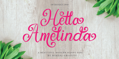 Hello Amelinda is an incredibly unique handwritten font. Masterfully designed to become a true favorite,Hello Amelinda feels incredibly elegant and flowing. It looks stunning on wedding invitations, thank you cards, quotes, greeting cards, logos, business cards and every other design which needs a handwritten touch. It features a varying baseline, smooth lines, gorgeous glyphs and stunning alternates.
 - Bristany by Multype Studio,
$14.00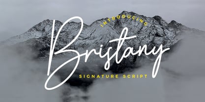 Bristany is a clean, elegant hand-drawn script font with unique curves and an elegant inky flow. Features : uppercase, lowercase, symbol, number, ligature, and also support multi language. Bristany is perfect for photography, watermark, social media posts, advertisements, logos & branding, invitation, product designs, label, stationery, wedding designs, product packaging, special events or anything that need handwriting taste.
 - Bastony Signature by Multype Studio,
$18.00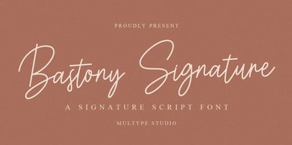 Bastony Signature is is a simple and classy font with unique curves and an elegant inky flow. Features : uppercase, lowercase, symbol, number, ligature, and also support multi language. Bastony Signature is perfect for photography, watermark, social media posts, advertisements, logos & branding, invitation, product designs, label, stationery, wedding designs, product packaging, special events or anything that need handwriting taste.
 - TT Supermolot by TypeType,
$29.00 You are on the page of the old display version of the TT Supermolot font. In 2019, we released an entirely new, completely redesigned and significantly expanded version of the typeface called TT Supermolot Neue. In addition to 54 styles, TT Supermolot Neue has stylistic alternates, ligatures, old-style figures and many other useful OpenType features. Before you buy the old display version of the font, we suggest that you pay attention to the new superfamily TT Supermolot Neue and study it in more detail. - TT Supermolot Condensed is the narrow version of the TT Supermolot font family. Thanks to its open forms, TT Supermolot Condensed fits perfectly into any contemporary technological design and navigation systems. We've already seen this font family in the sports theme (as the main font for hockey teams branding), we've seen TT Supermolot as the main font inside the gameplay of a popular 3D-shooter. Information transfer in the high-tech areas is the ideal environment for this font family, also TT Supermolot Condensed fits well into army, space, and innovation themes. We've tried to create a maximum number of convenient weights (Thin, Light, Regular, Bold, Black) for you to be able to use this family anywhere, from mobile apps and web pages to big state fairs branding.
 - TT Supermolot Condensed by TypeType,
$29.00 You are on the page of the old display version of the TT Supermolot Condensed font. In 2019, we released an entirely new, completely redesigned, and significantly expanded version of the typeface called TT Supermolot Neue. In addition to 54 styles, TT Supermolot Neue has stylistic alternates, ligatures, old-style figures and many other useful OpenType features. Before you buy the old display version of the font, we suggest that you pay attention to the new superfamily TT Supermolot Neue and study it in more detail. - TT Supermolot Condensed is the narrow version of the TT Supermolot font family. Thanks to its open forms, TT Supermolot Condensed fits perfectly into any contemporary technological design and navigation systems. We've already seen this font family in the sports theme (as the main font for hockey teams branding), we've seen TT Supermolot as the main font inside the gameplay of a popular 3D-shooter. Information transfer in the high-tech areas is the ideal environment for this font family, also TT Supermolot Condensed fits well into army, space, and innovation themes. We've tried to create a maximum number of convenient weights (Thin, Light, Regular, Bold, Black) for you to be able to use this family anywhere, from mobile apps and web pages to big state fairs branding.
 - Off Yer Trolley by Hanoded,
$10.00 I really like the UK and I quite enjoy the British slang. Off Yer Trolley is one such expression. It means ‘behaving in an unusual way or doing something silly’. It just popped in my head when I was looking for a name for this rather silly font. Off Yer Trolley is a handmade cartoon or kids font. As the name implies, this font certainly behaves in an unusual way and you can use it for something silly as well!
 - Pastrami on Rye by Typodermic,
$11.95 Introducing Pastrami on Rye—the comic-style font that is anything but conventional. With its rough-hewn appearance and constructed style, this font adds a unique edge to any design project. Unlike other comic-style fonts that are based on pen and ink, Pastrami on Rye is inspired by cut paper and fabric. The result is a bold, organic look that is both playful and professional. One of the standout features of this font is the serifed “I” in the capital position. This adds a touch of elegance to the font and is perfect for personal pronouns or acronyms. But that’s not all—if you’re using an OpenType savvy application, you can enjoy the benefit of automatic shuffling of letters and numerals. This means your designs will have a more natural, hand-drawn effect without any additional effort on your part. Pastrami on Rye is a font that works well in any application that supports OpenType standard ligatures. Whether you’re designing a logo, creating a comic book, or adding a unique touch to a marketing campaign, this font is sure to stand out. Why settle for a boring, generic font when you can add the organic, bold look of Pastrami on Rye to your designs? Try it today and see the difference for yourself! Most Latin-based European writing systems are supported, including the following languages. Afaan Oromo, Afar, Afrikaans, Albanian, Alsatian, Aromanian, Aymara, Bashkir (Latin), Basque, Belarusian (Latin), Bemba, Bikol, Bosnian, Breton, Cape Verdean, Creole, Catalan, Cebuano, Chamorro, Chavacano, Chichewa, Crimean Tatar (Latin), Croatian, Czech, Danish, Dawan, Dholuo, Dutch, English, Estonian, Faroese, Fijian, Filipino, Finnish, French, Frisian, Friulian, Gagauz (Latin), Galician, Ganda, Genoese, German, Greenlandic, Guadeloupean Creole, Haitian Creole, Hawaiian, Hiligaynon, Hungarian, Icelandic, Ilocano, Indonesian, Irish, Italian, Jamaican, Kaqchikel, Karakalpak (Latin), Kashubian, Kikongo, Kinyarwanda, Kirundi, Kurdish (Latin), Latvian, Lithuanian, Lombard, Low Saxon, Luxembourgish, Maasai, Makhuwa, Malay, Maltese, Māori, Moldovan, Montenegrin, Ndebele, Neapolitan, Norwegian, Novial, Occitan, Ossetian (Latin), Papiamento, Piedmontese, Polish, Portuguese, Quechua, Rarotongan, Romanian, Romansh, Sami, Sango, Saramaccan, Sardinian, Scottish Gaelic, Serbian (Latin), Shona, Sicilian, Silesian, Slovak, Slovenian, Somali, Sorbian, Sotho, Spanish, Swahili, Swazi, Swedish, Tagalog, Tahitian, Tetum, Tongan, Tshiluba, Tsonga, Tswana, Tumbuka, Turkish, Turkmen (Latin), Tuvaluan, Uzbek (Latin), Venetian, Vepsian, Võro, Walloon, Waray-Waray, Wayuu, Welsh, Wolof, Xhosa, Yapese, Zapotec Zulu and Zuni.
 - Trocadero Pro by RMU,
$35.00 In 1927 Albert Auspurg cut Trocadero for the Trennert foundry in Hamburg. This new version is not a mere digitalization, but many letterforms were altered and updated, and missing links in the complete alphabet had been drawn afresh. Out came a beautiful cursive font with a certain charm of its own which covers beside the West European languages also those of Central Europe and Turkish.
 - Poynter Old Style by Font Bureau,
$40.00 In the 1670s, Christopher Plantin was the largest publisher of his day. Hendrik van den Keere cut for him an astounding series of romans. As Stanley Morison once observed, such types adopted features of Flemish blackletter to strengthen elegant French romans. Large on the body, strong in color, economical in fit, widely (if anonymously) distributed, they established effective standards for all that followed; FB 1997–2000
 - Outgribe NF by Nick's Fonts,
$10.00This rough, raw typeface is based on the lettering in Ben Shahn's iconic poster protesting the execution of Bartolomeo Vanzetti and Nicolo Sacco in 1927. All possible uppercase and lowercase forms have been kerned, and activating Contextual Alternates in OpenType-aware applications will alternate those forms for a more random appearance. Both versions contain the complete Latin 1252, Central European 1250 and Turkish 1254 character sets. - Punch Tape JNL by Jeff Levine,
$29.00 Punch Tape JNL emulates the old-style pin-punched paper tapes that were used in everything from ticker tapes to moving electronic signage to early digital typesetting equipment. Pin punch characters were also used in the early days of banking as a secure way of canceling a check so that it was rendered useless if re-submitted. In this version, the "dots" are square rather than round.
 - Old Towne No 536 by Linotype,
$29.99Old Town No. 536 is a homage to the old woodtypes. These became especially popular through their use on wanted posters in Wild West films. Adrian Frutiger also designed his typeface Westside in this style. Due to its robust figures, Old Town No. 536 is particularly effective when used in headlines. It belongs stylistically to the Italienne typefaces, whose serifs are thicker than the strokes. - Aish by 4RM Font,
$15.00 Aish font is an authentic handwritten font. This font combines simple style with authenticity of the font in its creation. suitable for use in simple themed graphic designs.
 - Paranoid Android by Comicraft,
$29.00Fonts are Inhuman and Human Fonts are IN! Now, the Comicraft Cybernetics Corporation is proud to announce the first in a new line of fonts with GFP... Genuine Font Personalities. Paranoid Android is an outer alloy, inner void, solitary solenoid GFP prototype -- you can tell, can't you? Finally a font that knows its place as a digital servant to the human race. What will Comicraft think of next? No, don't bother to answer that, Comicraftsmen are fifty thousand times more intelligent than you and even they don't know the answer. Warning: Nothing left to be enjoyed, every diode rheumatoid*, terminally Paranoid Android is not so much a font, and more a kind of electronic sulking device. Share and Enjoy! *The moving parts on the left side of this font are in a solid state. It may sit in a corner and rust, or just fall apart where it's standing. - Eckhardt Poster Text JNL by Jeff Levine,
$29.00 Eckhardt Poster Text JNL continues Jeff Levine's series of sign painter-oriented fonts, named in honor of his good friend Albert Eckhardt, Jr. (who ran Allied signs in Miami, Florida from 1959 until his passing). Sign painters are the true heroes of lettering, for they make the alphabet and style fit the job. Printers and layout artists were constricted by metal and wood type; that is until photo lettering, then digital type opened up unexplored territories in design possibilities. There is a unique charm (and nowadays pretty much a lost art) to hand-lettering word copy in a way that draws the eye like an arrow to a target. Even a simple sanserif such as Eckhardt Poster Text JNL can have the effect of that hand lettering when applied to posters and pages with plenty of white space and matching type designs of the period.
 - Phiz by Shinntype,
$29.00 Phiz is a diverse suite of 28 decorative fonts based on Figgins Sans Extra Bold. Classic (10 fonts), Rounded (7 fonts), Rough (4 fonts) and Particles (7 fonts). The Rough and Particles styles emerge as a unique niche—neither imitating distressed printing (e.g. the “rusty” look), nor casual, hand-drawn styles. These type designs are conceived and executed as complex algorithmically-generated graphic procedures, in which repetitive elements have been artfully applied to the Sans capitals, and manually nuanced. As such they also differ substantially from textured glyph shapes that have been cut out from larger pattern fields, for the constituent particles are disposed in relation to the specific shape of each character they define. The caps-with-small-caps format was chosen for two reasons. Firstly, titling display usage is predominantly capitals, and secondly, rather like optical scaling, having the same resolution of texture available in two different “sizes” (upper and lower case) should prove useful in the hierarchy of page layout—not primarily for setting upper and lower case text as caps-with-small-capitals, although this is of course an option. All figures and major symbols (punctuation and currency) are provided in both cap and small cap height.
 - Eksja by Protimient,
$29.00 Eksja is a modern slab serif available in four weights, each with a corresponding italic. All the fonts in the family have small caps, the extended latin character set, diacritical f-ligatures, enclosed numerals (numbers in circles) and case-sensitive punctuation. The general design of the typeface has been with a strong human touch in mind. The ends of the serifs have been given a subtle rounding, just enough to take the edge off which, when coupled with the largely humanist structure of the design, creates an open, friendly and approachable design, abandoning the usual geometric severity commonly associated with slab serif typefaces. Eksja contains quite a comprehensive numerals system. Obviously, each font has the standard proportionally and tabularly spaced lining and old-style figures but, crucially, the tabular numerals share the exact same width in each font variant. That means that you can choose to use the thin, regular, bold, black and their italic forms all in the same setting and they will always line up. In addition to the 'normal' numerals there are super-script and sub-script numerals and OpenType fractions that can be automatically composed as you type. There are also the enclosed numerals, numbers inside a circle, that are useful for numerically listing items and, thanks to the wizardry of OpenType, they can contain any number of digits (typically, enclosed numerals are precomposed single digits, only encompassing the 0–9 range, the enclosed numerals in Eksja can go to double digits, triple digits or, in fact, any number of digits*). *The automation of the enclosed numerals is accessed via either "Stylistic Set #1" or "Stylistic Alternates" which requires the use of an application that supports OpenType stylistic sets or stylistic alternates, such as Adobe's InDesign or Photoshop.
 - Right Swipe by Din Studio,
$25.00 Right Swipe is a fantastic sans serif brush font duo. The sans serif font, in the Right Swipe, is the epitome of simplicity and elegance. Designed in uppercase, it boasts clean lines and a minimalist aesthetic, making a versatile look. This sans serif typeface is all about timeless sophistication and modern appeal. In contrast to its sans serif, the brush font adds a touch of creativity and spontaneity to the duo. The brush font's characters are made in round shapes and consistent proportions, creating a harmonious appearance. Each letter is meticulously crafted with fluid strokes, evoking a sense of warmth and approachability. Together, this duo offers a harmonious balance of elegance and creativity. This combination of a simple and refined sans serif font with a warm and inviting brush font allows you to strike the perfect tone for your design projects. In addition, enjoy the features here. Features: Multilingual Supports PUA Encoded Numerals and Punctuations Right Swipe fits in headlines, logos, posters, flyers, branding materials, print media, editorial layouts, and many more vintage-inspired designs. Find out more ways to use this font by taking a look at the font preview. Thanks for purchasing our fonts. Hopefully, you have a great time using our font. Feel free to contact us anytime for further information or when you have trouble with the font. Thanks a lot and happy designing.
 - Kolega by Just My Type,
$25.00 Maybe I should have named this font “Communist Block”. But it also works well for Colonial-style tavern signs. It’s square, geometric and rigid, and is the perfect thing for totalitarian themes. The family consists of three fonts: Kolega (“Comrade” in Polish), Kolega Tall, and Kolega Podrobska (Fake Comrade). Kolega and Kolega Tall are fully charactered with U.S., European, Greek and Cyrillic glyphs. The latter font is meant to use in English only; although it contains many accents and character variations, they mean nothing. It’s a joke.
 - Remus by RMU,
$25.00 Both fonts of the Remus family are complete redesigns of turn-of-the-century fonts. The regular style is based upon an inhouse design of Schelter & Giesecke in 1889, called Romanisch. This font was adopted by other German foundries and slightly modified and a bold version was added. Due to their proportions, these fonts fit perfectly into narrow columns, and still they are very legible. In January 2023, an Italic style was added. Here too it is recommended to use both ligature features Standard and Discretionary.
 - HS Almaha by Hiba Studio,
$50.00 HS Almaha is a modern OpenType Arabic Typeface. It combines the features of linear Naskh and modern Kufi. Segments of its letters are curvy and sharp. They are refinement more readable and present in extended texts in magazines, newspapers, books and other publications. This typeface supports Arabic, Persian, Urdu and Kurdish languages and it contains four weights; light, regular, medium and bold which can add to the library of Arabic fonts contemporary models that meet with the purposes of various designs for all tastes.
 - Whitehaven by Greater Albion Typefounders,
$8.95 Whitehaven is the spirit of the Art Deco movement made into a very solid and blocky Sans Serif font. The name owes its inspiration to Whitehaven Mansions, a block of flats where that greatest of 1930s detectives, Hercule Poirot lived. Use this to make bold statements, to give posters and designs a taste of thee 30s, and wherever you want to be clear and definitive. Whitehaven is offered in two widths and a range of embossed and engraved styles for flexibility in design work.
 - Architype Vierkant by The Foundry,
$50.00 Architype Crouwel is a collection of typefaces created in collaboration with Wim Crouwel, following his agreement with The Foundry, to recreate his experimental alphabets as digital fonts. Crouwel's most recognized work was for the Van Abbe and Stedelijk museums (1954 –72) where he established his reputation for radical, grid-based design. Architype Vierkant was developed from the few letterforms that Crouwel created for an opening spread in a 1972 Drupa catalogue, on the theme ‘typo vision international’ – this single reference showed an interesting interplay of the experimental ideas underpinning his controversial ‘new alphabet’ and Fodor.
 - Fansan by W Type Foundry,
$25.00 Organic and sublime, Fansan is an Art Nouveau type family that includes roman, italic, and optical sizes. Its roots can be found in famous works such as Benguiat, Windsor, and Melbourne — worldwide typographic references which all have a sense of being imperfectly appealing. The aesthetic influence of Art Nouveau on Fansan can be seen in the top-heavy stress found in most characters. Applying this stress consistently throughout the character set was a significant challenge in the design of the family. The sharp terminals of numerous lowercase characters — including the a, f and g — provide a visual link between the upper and lowercase forms. As a result, Fansan is able to be elegant and pointed in its lighter weights, and playful and full of character in its heavier styles. Fansan is ideally suited for use at display sizes where personality is needed.
 - Petrarka by HiH,
$12.00 Petrarka may be described as a Condensed, Sans-Serif, Semi-Fatface Roman. Huh? Bear with me on this. The Fatface is a name given to the popular nineteenth-century romans that where characterized by an extremity of contrast between the thick and thin stroke. The earliest example that is generally familiar is Thorowgood, believed to have been designed by Robert Thorne and released by Thorowgood Foundry in 1820 as "Five-line Pica No. 5." Copied by many foundries, it became one of the more popular advertising types of the day. Later, in the period from about 1890 to 1950, you find a number of typeface designs with the thin stroke beefed up a bit, not quite so extreme. What you might call Semi-Fatfaced Romans begin to replace the extreme Fatfaces. Serifed designs like Bauer’s Bernard Roman Extra Bold and ATF’s Bold Antique appear. In addition, we see the development of semi-fatface lineals or Sans-Serif Semi-Fatfaces. Examples include Britannic (Stephenson Blake), Chambord Bold (Olive), Koloss (Ludwig & Mayer), Matthews (ATF) and Radiant Heavy (Ludlow). Petrarka has much in common with this latter group, but is distinguished by two salient features: it is condensed and it shows a strong blackletter influence, as seen in the ‘H’ particularly. Petrark was released about 1900 by the German foundry of Schelter & Giesecke of Leipzig and is one of the designs of the period that attempts to reconcile roman and blackletter traditions. Making a cameo appearance in this Multi-Lingual font is the Anglo-Saxon letter yogh (#729), which, along with the thorn and the eth, is always useful for preparing flyers in Old English. There are still pockets of resistance to the Norman French influence that washed up on England’s shores in 1066. This font stands with King Canute, seeking to hold back the tide (ignoring the fact that Canute was a Dane). Support the fight to preserve Anglo-Saxon culture. Buy Petrarka ML today. Petrarka Initials brings together the Petrarka upper case letters with a very sympatico Art Nouveau rendering of a female face.
