10,000 search results
(0.042 seconds)
- Government Stencil JNL by Jeff Levine,
$29.00 A poster for the 1952 film “Diplomatic Courier” featured the title hand lettered in a bold serif stencil design. With some modifications, this served as the model for Government Stencil JNL, which is available in both regular and oblique versions.
 - Courant by Hanoded,
$20.00 Courant means "newspaper". Courant font was modeled on 17th century Dutch newspapers and most of the glyphs are authentic. The 'modern' glyphs, like @, $, €, * and several others have been designed by me, as they were not in use in the 1600's.
 - Dot Soon NF by Nick's Fonts,
$10.00Based on Alan Dempsey's design for Letraset in the 70s Pinball, these dots will add dash to any headline. All versions of this font include the Unicode 1250 Central European character set in addition to the standard Unicode 1252 Latin set. - Midnight Flame by Rochart,
$22.00 Introducing Midnight Flame, a powerful Blackletter/Gothic font with an array of amazing features. This font showcases the essence of medieval calligraphy with its bold and dramatic letterforms, evoking a sense of mystique and elegance. With Midnight Flame, you’ll have access to 7 stylistic alternates, allowing you to experiment and create unique and captivating designs. The ligature feature further enhances the flow and continuity of the text, adding an extra level of sophistication. Additionally, Midnight Flame is designed to support multiple languages, making it versatile and inclusive for various projects. Whether you’re working on branding, logo design, apparel, or editorial pieces, this font will make a striking impact. But that’s not all! As a bonus, you’ll also receive a complementary font brush, adding a touch of organic and handcrafted feel to your designs. Unleash the power of Midnight Flame and ignite your creativity with this captivating Blackletter/Gothic font. Let its medieval charm and modern versatility elevate your projects to new heights. To enable the OpenType Stylistic alternates, you need a program that supports OpenType features, such as Adobe Illustrator CS, Adobe Indesign & CorelDraw X6-X7. Guides to access all alternates glyph : http://adobe.ly/1m1fn4Y Cheers!
 - Austragen by Almarkha Type,
$35.00 Introducing Austragen - Beautiful Bold Serif inspired by the famous minimalist logo, perfect for the purposes of designing templates, brochures, videos, advertising branding, logos and more. Perfect for adding a unique twist to word-mark logos, monograms or pull quotes. Austragen has 11 unique ligatures and 50 Alternate Glyphs as well as numbers and punctuation making it super fantastic. Like all of my fonts it is inspired by lettering from the good old past, but it still has a strong modern appearance. Its wide range of stylistic alternates allows versatile design options and works perfectly for headlines, logos, posters, packaging,,coffee shops, restaurants, magazine's headers, signs or gift/post cards,cafe's and weddings.
 - Freewill by Gassstype,
$27.00 Freewill - Handmade Rough Brush Font with ligature and Multilanguage support.inspired by the famous minimalist logo, perfect for the purposes of designing templates, brochures, videos, advertising branding, logos and more. Perfect for adding a unique twist to word-mark logos, as well as numbers and punctuation making it super fantastic. Like all of my fonts it is inspired by lettering from the good old past, but it still has a strong modern appearance. Its wide range of stylistic alternates allows versatile design options and works perfectly for headlines, logos, posters, packaging,,coffee shops, restaurants, magazine's headers, signs or gift/post cards,cafe's and weddings.Best for halloween poster, horror poster, childrenbook, cartoon, comic etc
 - December Brush by Lucky Type,
$14.00 December Brush is a natural handwritten font made with brushes, to help you make a special, stunning handwritten look. December Brush comes with alternative characters, binders, punctuation marks, numbers. Also includes extra bonuses, handcrafted perfectly for headlines and short texts. Use for magazines, t-shirts, packaging, logos, advertisements, quotes, branding, weddings, posters, editorials, art covers, films, websites, etc. December Brush is encoded with Unicode PUA, allowing full access to all additional characters without having to design special software. Mac users can use the Font Book, and Windows users can use the Character Map to view and copy any of the additional characters to paste into your favorite text editor / application. Thank you very much for viewing!
 - Fatum by ParaType,
$25.00 Fatum™ is a new original ultrablack slab serif typeface that was initiated by the impression of the TDC 2011 exhibition. Redundant stem thickness and closed character shapes make a feeling that counterspaces are the narrow slits cut in massive character bodies. Fatum can be used in large sizes in placards, playbills, in the headings of magazines, newspapers and Web-pages, as initials in book setting, for typographic illustrations and compositions. Ultrablack weight also gives a possibility to insert pictures, ornaments or other decorations into the contours of letters. This typeface was designed by Sveta Morozova and released by ParaType in 2013.
 - Stray by Tour De Force,
$25.00 Stray might be the lonesome cowboy in this big odd world, but it's his just public façade. Stray is handsome player that works well with any team or in any environment. He doesn't have a horse, but he can be the one, he can carry any weight. OK, let's talk serious now: Stray is distinctive geometric sans serif family in 9 weights and matching Italics. By it's design, Stray flirts with humanistic typefaces in some elements, while on the other side, we can see vintage letter forms as well. It is well balanced typeface, fully legible in any (reasonable) size, with power to present versatile tasks and situations. Specific joining of letter stem and bowl is one of design characteristics of Stray, so it is not just another geometric sans family, it really differs in it's own details. Contains extended Latin character map support and Cyrillic (no localizations, sorry). As any serious working horse family, it is equipped with decent OpenType features like Small Caps (for basic Latin only), Fractions, Tabular Figures, Denominator, Numerator, Ordinals and Ligatures. It also comes with small interesting set of dingbats. This Stray is not homeless, he just looks for the proper job :-)
 - Bixa by Novo Typo,
$26.00 Bixa is a chromatic typeface designed for display use. Bixa comes in 13 different layers containing 11 weights for beautiful color combinations. Bixa was originally designed for the Typewood project in 2015. Read more about this project here. In 2016 we launched the chromatic web version of Bixa. More information about Bixa Color here. Bixa was awarded by the Type Directors Club New York and the European Design Awards in 2016. Bixa is designed by Novo Typo in 2015. Youtube
 - Achispado by Linotype,
$29.99Achispado which means tipsy or slightly drunk in Spanish is the name of a crazy funk font that was designed by Richard Yeend in 2003. Full of comic almost architectural elements bit and pieces of the entire history of lettering come together to create the letterforms of this typeface. Text set in Achispado will look just plain fun if a little tipsy at the same time! Achispado could be used in large display settings, in fashion or on jewelry items. - Roadkill by Device,
$39.00 Derived from a photograph Rian Hughes took in Hong Kong, the Roadkill family of typefaces is a literal interpretation of rough and worn road lettering. The original provided almost all of the key character shapes, with the others being designed to keep the unique hand painted feel intact. Most of the letters have alternate versions provided. This font works equally well at wider letterspacing settings. Roadkill Alternates provides curved versions of the 2 and the S, a G with higher crossbar, and less worn versions of several other characters. The heavy version packs even more gritty wallop in a non-condensed and blacker weight. Roadkill Heavy packs even more gritty wallop in a non-condensed and blacker weight. Use in conjuction with the original Roadkill and Roadkill Alternates. A set of arrows and other road symbols again taken directly from tarmac to Mac, thus preserving the worn and eroded appearance of the original characters is also part of the Roadkill family.
 - EraMax 123 by Our House Graphics,
$15.00 EraMax 123 is a multi-layered display geometric sans serif, meant to be set BIG, for large, colourful statements. It's the perfect face for packaging, posters & branding, where a strong, colourful voice is needed... Did I mention posters? The "Max" in EraMax comes from the ultra bold weight, but also, and mainly as a tip of the hat to Peter Max, the designer and artist, known for creating so many images which have come to be emblematic of the sixties and seventies. The bold gradient effects in some of his posters were the inspiration behind the dotted and striped layers. This font's vintage flavour truly stand out in a retro setting, but also has a modern flavour that lends it the flexibility to work well in a more contemporary context. This is the second of what is to be an extended family of typefaces based on the original hand painted signage found in the T. H. & B Railway station in Hamilton Ontario, a classic Art Moderne building, designed by the New York architectural firm of Fellheimer and Wagner for the Toronto Hamilton and Buffalo Railway line and completed in 1933.
 - DASEGO by Twinletter,
$15.00 DASEGO, our newest font, is now available. A display typeface with an Asia theme that we made to fulfill the needs of your project with an Asian theme that you may use for projects that can be understood by audiences all over the world. We created this typeface by paying close attention to the individuality of each letter, abstract while still prioritizing optical harmony, and your project will look stunning with it. Logotypes, food banners, branding, brochure, posters, movie titles, book titles, quotes, and more may all benefit from this font. Of course, using this font in your various design projects will make them excellent and outstanding; many viewers are drawn to the striking and unusual graphic display. Start utilizing this typeface in your projects to make them stand out.
 - Craftsman by Woodside Graphics,
$19.95The Craftsman font is a faithful reproduction of the logo, or Title typeface used for Gustav Stickley's "Craftsman" Magazine, the foremost journal of the American Arts & Crafts Movement during its publication years of 1901-1916. It is an All-Caps font, with condensed and closely-spaced characters, specifically designed for titles and headlines. The "Craftsman" font is available in two versions: "Craftsman Regular" and "Craftsman Outline." Each is two fonts in one, in the sense that the capital letters are contained in a hand-drawn box (as on the cover of "The Craftsman" Magazine). Lower-case characters are identical, but without the box. Thus, the two may be used separately, or in combination, to achieve a desired effect. - Atyp BL by Suitcase Type Foundry,
$39.00 The sources of inspiration for the Atyp typeface are spread out widely both stylistically and chronologically. The basic proportions of the uppercase refer to the elementary geometric constructions of the Bauhaus. The subtle details in the drawing of the characters and the microscopic adjustments, which evoke the illusion of uniformity and mechanical purity, pay homage to the rationalism of the typefaces popular in the International Style. The increased contrast of the joints of the bowls and shoulders in the Display weight, which in certain diagonal curves transition into almost deconstructive permutations. For a change these take delight in doing things on purpose, teasing readability and breaking the rules of the new millennium's typography. Atyp was created by adapting a typeface originally made for a commercial television station. The potential of the neutral grotesque, proven by its excellent readability on screens, gave the impetus for its preparation into an extremely wide character set. Coherence across all eight key masters lays the groundwork ideally for using the variable font format. The key benefits of this technology are a significant reduction in data consumption in the case of web fonts, as well as an unlimited access to the full range of styles, which in turn is a significant benefit in the area of responsive design.
 - P22 Rakugaki by IHOF,
$24.95 Rakugaki means "scribble" in Japanese. This font expresses casual handwriting with warmth and simplicity. The bold weight of Rakugaki is harmoniously integrated in all three writing systems, Katakana, Hiragana and Latin. The enclosed key charts give instructions for character placement in Katakana and Hiragana.
 - Skolar PE by Rosetta,
$70.00 Originally developed for academic publishing, Skolar asserts credibility and sustains comfortable reading. It has established itself as a go-to choice for all kinds of scholarly texts, no matter the field or school of thought: it handles the minutiae of linguistic, scientific, and editorial typography with ease. A classic with a twist, Skolar brings a trace of human touch to serious typography. Thanks to this knack for subtlety, it is also successfully used in other genres from branding to children’s literature. Skolar PE has a vast character set that caters to nearly four hundred languages and transliteration systems (Pinyin, IAST/Sanskrit) using Latin, Cyrillic, and Greek (including polytonic). Its larger x-height, robust serifs, low contrast, and its deft italic make it a pleasure to read even at small sizes. With Skolar, footnotes and bibliography become readers’ best friends. The OpenType feature set is engineered for the most rigorous editorial settings. Tabular, proportional, old-style, and lining figures as well as a full set of fractions, ordinals, and scientific superiors and inferiors will stand up to any conjectural challenge. Language-sensitive forms and compound diacritics will handle the demands of many linguistic texts. The companion families Skolar Gujarati, Skolar Devanagari, Skolar Sans PE, and Skolar Sans Arabic expand its typographic and semantic potential even further.
 - Totoey by MKGD,
$13.00 Most of my fonts tend to skew more to the darker side in terms of themes and uses. So, as a challenge, I took it upon myself to design a font through the eyes of my wife. Josephine, having a sunny and carefree disposition, gave this font her blessing as being certifiably fun and cheerful. The name of the font comes from the Cantonese translation for "peach" (tow); and saying it twice (toto) is just a cuter way of putting it. Sort of like "Peachy". It's been my nickname for Josephine for as long as I can remember. Totoey has a glyph count of 390 and supports the following languages; Supported Languages: Afrikaans, Albanian, Asu, Basque, Bemba, Bena, Bosnian, Catalan, Chiga, Colognian, Cornish, Croatian, Czech, Danish, Embu, English, Esperanto, Estonian, Faroese, Filipino, Finnish, French, Friulian, Galician, German, Gusii, Hungarian, Icelandic, Indonesian, Irish, Italian, Kabuverdianu, Kalaallisut, Kalenjin, Kamba, Kikuyu, Kinyarwanda, Latvian, Lithuanian, Low German, Lower Sorbian, Luo, Luxembourgish, Luyia, Machame, Makhuwa-Meetto, Makonde, Malagasy, Malay, Maltese, Manx, Meru, Morisyen, North Ndebele, Norwegian Bokmål, Norwegian Nynorsk, Nyankole, Oromo, Polish, Portuguese, Romanian, Romansh, Rombo, Rundi, Rwa, Samburu, Sango, Sangu, Scottish Gaelic, Sena, Shambala, Shona, Slovak, Slovenian, Soga, Somali, Spanish, Swahili, Swedish, Swiss German, Taita, Teso, Turkmen, Upper Sorbian, Vunjo, Walser, Zulu
 - Verse Sans by Hubert Jocham Type,
$39.00 In 2006 the art director of Emotion, a women’s psychology magazine, asked me to design a copy typeface for them. Before I actually got the job I started to work on a serif. I wanted it to be feminine but still clear and modern. On one hand there are the floral round elements and on the other hand the angular serifs. In the composition I wanted the two extremes to work together. All the other elements had to be harmonized. The proportions needed to match the magazine’s requirements. The ascenders and descenders are short enough to work in narrow columns but long enough to work in small sizes. As you can imagine, the emotion-job never happened. In copy you should not get heavier than Heavy. Extrabold and Ultrabold work best in display.
 - Nima by Naghi Naghachian,
$64.00 I dedicate this font family to Nima Yooshij (1896-1960), the great poet and innovator of Persian poetry. Nima is a new creation of Naghi Naghashian. Nima design fulfills the following needs: A. Explicitly crafted for use in electronic media fulfills the demands of electronic communication. B. Suitability for multiple applications. Gives the widest potential acceptability. C. Extreme legibility not only in small sizes, but also when the type is filtered or skewed, e.g., in Photoshop or Illustrator. Nima's simplified forms may be artificial obliqued in InDesign or Illustrator, without any loss in quality for the effected text. D. An attractive typographic image. Nima was developed for multiple languages and writing conventions. Nima supports Arabic, Persian and Urdu. It also includes proportional and tabular numerals for the supported languages. E. The highest degree of calligraphic grace and the clarity of geometric typography. This typeface offers a fine balance between calligraphic tradition and the Roman aesthetic common in Latin typography.
 - Portaso by Larin Type Co,
$12.00 PORTASO This is a vintage display font inspired by signage, logos in the style of the wild west of the old time. This is a great find for creating logos, various kinds of designs in vintage and wild West style. Portaso font family has only Capital letters and alternates to them. Also the Stamp style has a different texture for upper and lowercase. This collection includes 14 font styles: regular, rough, two shadows for regular style and two shadows for rough style and stamp style, also vintage, vintage rough, two shadows for vintage style and two shadows for vintage rough style and stamp style,
 - Bright Bridge by Putracetol,
$28.00 Bright Bride - Beautiful Script Font Introducing Bright Bride, a stunning and elegant script font that exudes sophistication and beauty. This font was carefully crafted with the intention of adding a touch of glamour to any design project. Its clean lines and flowing curves create a sense of grace and charm, making it perfect for wedding invitations, branding projects, social media posts, and much more. For those seeking a romantic and feminine touch, Bright Bride is the perfect font choice. Its delicate strokes and intricate details add a level of elegance that is sure to catch the eye of any viewer. Pair it with soft pastels or classic black and white to create a stunning contrast that will make your designs stand out. One of the standout features of Bright Bride is its OpenType alternates and ligatures. These unique letter combinations add an extra level of creativity and customization to your designs. Plus, with full multilingual support, this font can be used for projects in a variety of languages. The Bright Bride font package includes three different file formats: OTF, TTF, and WOFF. This makes it easy to use the font across a variety of design software and platforms. Whether you're a professional graphic designer or a casual hobbyist, this font is sure to be a valuable addition to your design arsenal. If you're looking for a font that is both stunning and versatile, look no further than Bright Bride. Its unique combination of elegance and creativity make it a perfect fit for a wide range of projects. So why wait? Add Bright Bride to your font collection today and start creating designs that are truly unforgettable. In summary, Bright Bride is a beautiful and sophisticated script font with delicate strokes and intricate details. It comes with OpenType alternates and ligatures, multilingual support, and three different file formats: OTF, TTF, and WOFF. This font is perfect for wedding invitations, branding projects, social media posts, and more.
 - Abnormal by Jan Buble,
$20.00 Are you getting bored by the growing number of sans-serif fonts that absolutely lack character? Do clean typography and sleek curves repulse you? Maybe it’s time to forget the normal and set sail into the murky waters of abnormality. Abnormal features four styles, ranging from an almost monolinear Light to a reverse-contrast Bold. The design pays homage to 19th century poster typefaces, with their crude character and unconventional means of catching the eye. It is one of the few typefaces out there that features reversed contrast and no serifs. These properties make it an ideal choice for large headlines, posters, flyers and essentially all applications where getting attention is a paramount. Abnormal offers extended language support, standard ligatures, alternative lowercase “a”, fractions, ordinals and a plethora of quirkiness at your disposal.
 - Aeris by Linotype,
$29.99 Aeris™ typeface is a contemporary book face created by the American designer Tom Grace. It combines the proportions and rhythm of a sans serif font with the high contrasts and flexed strokes of script faces, while the open counters also ensure optimal legibility. Tom Grace focuses on providing subtle differentiations in his cuts and, as a consequence, this font family has its own individual structure: there are A and B variants of the basic forms regular, italic, bold and bold italic, and a display version for use in titles that also comes in A and B variants. It is advisable to use the A variant for larger font sizes, while the slightly more emphasized B variant can be recommended for smaller font sizes. Where the basic forms are to be mixed together in a work, it is important to use the corresponding A/B variants throughout as their designs have been carefully coordinated. Aeris is available in the OpenType Pro format and thus includes a wide range of different glyphs. The font family can be used in various environments, such as books, magazines, advertisements and promotional materials, but it is also the perfect choice for printed corporate documentation.
 - Wisdom Teeth by DM Founts,
$20.00 Wisdom Teeth is the fifth typeface released by DM Founts. It's a modern and personal take on the original Baby Teeth font by Milton Glaser, and inspired by the lettering used for the Pac-Man series of games (and its clones). This typeface was around 25 years in the making, and was made in response to the large number of hideously bad clones of Baby Teeth circulating around the Internet. Version 1.0 Included in Version 1.0 are a number of accent characters, and alternate characters for A and Y, along with the usual ASCII characters. For the time being this is an all caps typeface. Please let me know your thoughts and suggestions, and I may add some more characters in the near future.
 - FS Alvar by Fontsmith,
$80.00 The classic modernist FS Alvar grew out of a library of pure modular shapes gathered by Fontsmith’s master of the abstract starting point, Mr Phil Garnham. “It was a collection that just had to be explored and brought to life in a typographic voice. “We debated long and hard about this. It was big decision to make a shift away from the typefaces that people knew us for. And we didn’t want to compromise our reputation of well crafted typographic quality”. Modular forms A headline font that’s both graphic and functional, in the modernist tradition, FS Alvar focused Fontsmith’s eyes on the bigger issue of what makes a font show its age. “Looking at those fonts from the 1980s that were supposed to represent the ‘future’,” says Phil, “they looked so dated now. With Alvar, we weren’t concerned with creating future-thinking typography but with exploring form for form’s sake, and how that can evolve to create letterforms. Modular forms with a typographic eye.” Stencilled The concept for Alvar first materialised back in 2001 with some sketches Phil made while still at Middlesex University. Eight years later, something made him dig them out again. “There was something really nice about the proportions of that first design. Working on it again, I thought about it properly, but it still needed something to give it that edge. “Jason stood up in the studio and supplied the missing link: ‘Why don’t we make it stencilled?’ He didn’t mean in an obvious way, but by building a kind of architectural stencil into the form. It worked and the idea of using an architect’s name (Alvar Aalto) to describe the font felt perfect.” Featured in... The three weights of FS Alvar are made for standout headlines in advertising campaigns and magazines. Alvar has had a starring role in campaigns for brands from Nike to Amnesty International, as well as on CD covers, record labels and packaging.
 - Cumhuriyet World by Fontuma,
$34.00 Cumhuriyet means “the form of government in which the nation holds the sovereignty and uses it through deputies elected for certain periods”. The reason why I gave this name to the font is that 2023 is the centennial anniversary of the Republic of Turkey, which was founded by Atatürk. This typeface, which is sans serif, consists of three families: ▪ Cumhuriyet: Font family with Latin letters ▪ Cumhuriyet Pro: Font family including Latin, Arabic and Hebrew alphabets ▪ Cumhuriyet World: Font family including Latin, Cyrillic, Greek, Arabic and Hebrew alphabets Cumhuriyet World is a family of multi-purpose typefaces designed in a geometric style. This font is suitable for use in printed products, media and digital media, as well as in every field that is the subject of writing.
 - All Americans by Mevstory Studio,
$25.00 Introducing All Americans Font Duo, a classy, contemporary pair of brush and sans fonts. With a stylish didot-style serif font and a free-flowing, expressive script companion, All Americans offers beautiful typographic harmony for a diversity of design projects, including logos & branding, wedding designs, social media posts, advertisements & product designs.
 - Sweet Candy Pink Script by Mindtype Co.,
$19.00 Sweet Candy Pink Script a beautiful modern calligraphy font with Extrude Shadow Style. Comes with 2 layered font handwritten, sophisticated flows. Sweet Candy Pink Script offers beautiful typographic harmony for a diversity of design projects, signature, stationery, logo, typography quotes, including logos & branding, wedding designs, social media posts, advertisements & product designs.
 - Halloween Monoline by Letterafandi Studio,
$8.00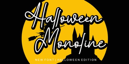 Halloween Monoline is a Script Monoline font by Letterafa Studio. It has flowing letters that will give your designs a unique and sweet look. Halloween Monoline font is perfect; logos, greeting cards, a package design, a brand identity, craft design, any DIY project, book title, wedding invitation, packaging, and more.
 - Yustine Signature by Lemonthe,
$14.00 Yustine Signature is a signature script font, featuring a lovely flow. It has a clean and smooth vibe and it will be a hit for any design that you want to add it to. Is perfect for many different project such as logos & branding, invitation, product designs, label, photography, and more.
 - Zenoa by Brenners Template,
$19.00 Zenoa Display Serif Font Family - They are sharp and sensitive, but connected-oriented. That's why they're designed by incorporating hook glyphs into an elegant serif style. Somewhat high contrast between vertical and horizontal, they reveal the strong individuality of each glyph, so you can create creative layouts. The meticulous design stands out so that readability and individuality can be expressed in harmony. And, these are the special excellences of this font family: Stylish Alternates and Ligatures where calligraphic subtlety is artistically connected. These OpenType features are decorative pleasures of using this font family more functionally. Please check first if the app you are using supports these features. They are easy to use in Adobe apps such as Photoshop and Illustrator. Alternates : A, B, C, D, E, F, G, H, J, K, L, M, N, P, Q, R, S, T, U, V, W, X, Y. Standard Ligatures : ff, fi, fl Discretionary ligatures : Am, Ba, Ca, Ch, De, En, Fr, Ge, Ha, In, Lo, Mi, No, Pa, Ro, Sa, Th, Va, Wo, Yo, an, bi, ck, de, ee, gn, ha,ie, lo, mo, no, oo, pr, ro, ss, st, te, um, ve, we, yo. Supported Languages: Western Europe, Central/Eastern Europe, Baltic, Turkish, Romanian
 - Amaboxi by Scholtz Fonts,
$19.00In Amaboxi the upper-case letters are all placed upon a background inspired by the cardboard boxes that many people in Africa use to carry their possessions. The box takes its shape from the character and conversely, the character is influenced by the shape of the box. All characters except the six "fractions" are included in Amaboxi. It includes all upper and lower case letters as well as all numerals, punctuation, accented and special characters. All characters have been letter-spaced and kerned in terms of the box (not the character). This improves legibility, however, the inter-character spacing has been minimized so that there is often a very slight overlap between the boxes of adjacent characters. This generates an exciting and variable "white space" around the characters. - Caslon Graphique by ITC,
$29.99 The Englishman William Caslon punchcut many roman, italic, and non-Latin typefaces from 1720 until his death in 1766. At that time most types were being imported to England from Dutch sources, so Caslon was influenced by the characteristics of Dutch types. He did, however, achieve a level of craft that enabled his recognition as the first great English punchcutter. Caslon's roman became so popular that it was known as the script of kings, although on the other side of the political spectrum (and the ocean), the Americans used it for their Declaration of Independence in 1776. The original Caslon specimen sheets and punches have long provided a fertile source for the range of types bearing his name. Identifying characteristics of most Caslons include a cap A with a scooped-out apex; a cap C with two full serifs; and in the italic, a swashed lowercase v and w. Caslon's types have achieved legendary status among printers and typographers, and are considered safe, solid, and dependable. Caslon Antique was designed by Berne Nadall and brought out by the American type foundry Barnhart Bros & Spindler in 1896 to 1898. It doesn't bear any resemblance to Caslon, but has the quaint crudeness of what people imagine type looked like in the eighteenth century. Use Caslon Antique for that old-timey" effect in graphic designs. It looks best in large sizes for titles or initials. Caslon Black was designed by David Farey in the 1990s, and consists of one relatively narrow and very black weight. It is intended exclusively for titles or headlines. Caslon Black has a hint of the original Caslon lurking in the shadows of its shapes, but has taken on its own robust expression. Caslon Graphique was designed by Leslie Usherwood in the 1980s. The basic forms are close to the original Caslon, but this version has wide heavy forms with very high contrast between the hairline thin strokes and the fat main strokes. This precisely drawn and stylized Caslon has verve; it's ideal for headlines or initials in large sizes."
 - Octagon by Nariswari Creativitype,
$8.00 Octagon is a basic sans serif font. This font showing a simplicity in design and readable. One of the feature is the optical kerning precisision, that supporting ellegantly in the writting result Hope this font will be fit on your next design project. If you have any question please feel free to contact.
 - Monotage by Fargun Studio,
$14.00 Monotage a modern combination Monoline Script and Sans. Monotage Font Duo, a classy, contemporary pair of Monoline Script and Sans. With a stylish didot-style Sans font and a free-flowing, expressive script companion, Silver South offers beautiful typographic harmony for a diversity of design projects, including logos & branding, wedding designs, social media posts, advertisements & product designs. Monotage Script • A clean, free-flowing script font containing upper & lowercase characters, numerals and a large range of punctuation. Monotage Sans • A classy Sans font containing uppercase characters, numerals and a large range of punctuation. Creates a perfect pairing contrast with Monotage Script fonts. Monotage Script Ligatures & Alternates • Monotage Monoline Script also includes 5 character ligatures and 130 alternates. To enable the OpenType Stylistic alternates, you need a program that supports OpenType features such as Adobe Illustrator CS, Adobe Indesign & CorelDraw X6-X7. There are additional ways to access alternates, using Character Map (Windows), Nexus Font (Windows), Font Book (Mac) or a software program such as PopChar (for Windows and Mac).
 - BAQ Rounded by Thinkdust,
$10.00 BAQ Rounded sets itself up as a simplistic and blocky font, but it hides a deeper form. With indents in all the right places, this font creates a double image in our mind, of the form we see and the form we know, letters that bulge into blobs and letters that are easy to follow. This double image results in a casual, over the top yet easy to read font designed for relaxing and carefree messages.
 - Amienne by Typodermic,
$11.95 Looking for a typeface that’s full of life and energy? Look no further than Amienne! This charmingly informal brush script typeface is perfect for all your creative projects. With a nimble rhythm that moves gracefully across the page, Amienne is sure to capture attention and add a touch of whimsy to any design. But that’s not all—Amienne also features ligatures, which means that certain letter combinations will be replaced with custom glyphs to create a more natural-looking brush flow. This gives your text a unique and organic feel that’s perfect for everything from invitations to packaging design. And with both Regular and Bold styles available, you can choose the perfect weight to suit your project. Whether you’re creating a bold headline or a delicate script, Amienne has you covered. So why settle for a boring font when you can add a touch of charm and personality with Amienne? Try it out today and see the difference for yourself! Most Latin-based European, Greek, and some Cyrillic-based writing systems are supported, including the following languages. Afaan Oromo, Afar, Afrikaans, Albanian, Alsatian, Aromanian, Aymara, Bashkir (Latin), Basque, Belarusian (Latin), Bemba, Bikol, Bosnian, Breton, Bulgarian, Cape Verdean, Creole, Catalan, Cebuano, Chamorro, Chavacano, Chichewa, Crimean Tatar (Latin), Croatian, Czech, Danish, Dawan, Dholuo, Dutch, English, Estonian, Faroese, Fijian, Filipino, Finnish, French, Frisian, Friulian, Gagauz (Latin), Galician, Ganda, Genoese, German, Greek, Greenlandic, Guadeloupean Creole, Haitian Creole, Hawaiian, Hiligaynon, Hungarian, Icelandic, Ilocano, Indonesian, Irish, Italian, Jamaican, Kaqchikel, Karakalpak (Latin), Kashubian, Kikongo, Kinyarwanda, Kirundi, Komi-Permyak, Kurdish (Latin), Latvian, Lithuanian, Lombard, Low Saxon, Luxembourgish, Maasai, Macedonian, Makhuwa, Malay, Maltese, Māori, Moldovan, Montenegrin, Ndebele, Neapolitan, Norwegian, Novial, Occitan, Ossetian, Ossetian (Latin), Papiamento, Piedmontese, Polish, Portuguese, Quechua, Rarotongan, Romanian, Romansh, Russian, Sami, Sango, Saramaccan, Sardinian, Scottish Gaelic, Serbian, Serbian (Latin), Shona, Sicilian, Silesian, Slovak, Slovenian, Somali, Sorbian, Sotho, Spanish, Swahili, Swazi, Swedish, Tagalog, Tahitian, Tetum, Tongan, Tshiluba, Tsonga, Tswana, Tumbuka, Turkish, Turkmen (Latin), Tuvaluan, Uzbek (Latin), Ukrainian, Venetian, Vepsian, Võro, Walloon, Waray-Waray, Wayuu, Welsh, Wolof, Xhosa, Yapese, Zapotec Zulu and Zuni.
 - Prossimo by Studio Sun,
$16.00 This font is strongly inspired by the Futurism (Futurismo) movement in the early 20th century; with its simple shapes and strong structure, this font can be used to give a contemporary look to any design. Available in 3 styles (Display, Stencil, Text), this font is great for logos, headlines, posters, and UI/UX design. It can be used in various design applications such as print or web.