10,000 search results
(0.055 seconds)
- Dream Reacher by Asenbayu,
$14.00 Reacher is a creative stylish ligature serif font. Each letter is beautifully crafted which has an elegant look that attracts a tall, minimalist and slender shape. Reacher font is a typeface that combines the elegance of a serif with a unique and decorative binding, creating a more harmonious and visually appealing look. This font has alternate and ligature features, perfect for using it in creative and artistic designs, such as logos, branding, headlines, titles, invitations, posters and more. Reacher font features: kerning, standard glyphs, stylistic alternates, stylistic ligatures, symbol, punctuation and multilanguages supported. Note: To use the alternate and ligature features, please look in the Glyph Panel / Character Map in your software to be able to access all the glyphs in this font. The ligature style in this font is simply "Standard Ligature", meaning it appears automatically. To set your desired letter binding, you can block letters or add them from the glyph panel. Thank you!
 - SCR-N by URW Type Foundry,
$39.99 SCR fonts are screen optimized (also called 'pixel fonts'). Unlike standard fonts (and like the few well-hinted fonts like Verdana or Arial), they give a crisp look on screen at very small sizes, thus increasing legibility. The perfect applications for those fonts are web pages and software user interfaces (computer, cellular phones, console games and any other system that uses a screen interface). Unlike most pixel fonts, SCR fonts contain kerning information. Kerning is the adjustment of space between certain pairs of characters (like 'AV') to make text look more fluid, thus increasing legibility and appeal. To benefit from this feature, auto-kerning must be activated in the application. In Photoshop, kerning must be set to 'Metrics'. Although SCR fonts are optimized for screen, they can be used for print (in Illustrator or Indesign for example) for a decorative 'computer text' effect. In this case, there is no constraint: they can be used as any other font. For screen use (in Photoshop, Fireworks, Flash... ), they have to keep aligned with the screen pixel grid not to look blurred or distorted. To achieve this, here are the guidelines to follow: RESOLUTION If the application permits it (Photoshop, Fireworks), document resolution must be set to 72 pixels per inch. SIZE The font size must be set to 10 (or multiples of 10) points. POSITIONING & ALIGNMENT The reference points of text fields and text blocks (upper left corner for left aligned text, upper right for right aligned text) must be positioned at integer values of pixels. In Photoshop, text can be precisely moved with [Edit Free Transform]. In Flash, movie clips containing text fields must also be positioned at integer values on the stage. Text must be aligned to the left or right only. Center alignment can be simulated with left alignment by adding spaces at the begin of each line. To dispense with the positioning and alignment constraints, text anti-aliasing can be turned off if the application permits it (Photoshop, Flash MX 2004). OTHER SETTINGS Leading (line spacing), tracking (letter spacing), manual kerning and baseline shift must be set either to integer values of points or to multiples of 100 units (depending on the application). Vertical and horizontal scaling must be set to 100%. Faux bold or Faux italic must not be used. The document must neither be resized on export, nor allow resizing (Flash Movies).
 - SCR-I by URW Type Foundry,
$39.99 SCR fonts are screen optimized (also called 'pixel fonts'). Unlike standard fonts (and like the few well-hinted fonts like Verdana or Arial), they give a crisp look on screen at very small sizes, thus increasing legibility. The perfect applications for those fonts are web pages and software user interfaces (computer, cellular phones, console games and any other system that uses a screen interface). Unlike most pixel fonts, SCR fonts contain kerning information. Kerning is the adjustment of space between certain pairs of characters (like 'AV') to make text look more fluid, thus increasing legibility and appeal. To benefit from this feature, auto-kerning must be activated in the application. In Photoshop, kerning must be set to 'Metrics'. Although SCR fonts are optimized for screen, they can be used for print (in Illustrator or Indesign for example) for a decorative 'computer text' effect. In this case, there is no constraint: they can be used as any other font. For screen use (in Photoshop, Fireworks, Flash... ), they have to keep aligned with the screen pixel grid not to look blurred or distorted. To achieve this, here are the guidelines to follow: RESOLUTION If the application permits it (Photoshop, Fireworks), document resolution must be set to 72 pixels per inch. SIZE The font size must be set to 10 (or multiples of 10) points. POSITIONING & ALIGNMENT The reference points of text fields and text blocks (upper left corner for left aligned text, upper right for right aligned text) must be positioned at integer values of pixels. In Photoshop, text can be precisely moved with [Edit Free Transform]. In Flash, movie clips containing text fields must also be positioned at integer values on the stage. Text must be aligned to the left or right only. Center alignment can be simulated with left alignment by adding spaces at the begin of each line. To dispense with the positioning and alignment constraints, text anti-aliasing can be turned off if the application permits it (Photoshop, Flash MX 2004). OTHER SETTINGS Leading (line spacing), tracking (letter spacing), manual kerning and baseline shift must be set either to integer values of points or to multiples of 100 units (depending on the application). Vertical and horizontal scaling must be set to 100%. Faux bold or Faux italic must not be used. The document must neither be resized on export, nor allow resizing (Flash Movies).
 - Punkaholic by Sharkshock,
$115.00 Punkaholic started out as a loopy, all caps display font with a semi condensed feel. Before completion some of the letters such as A and W were given a more traditional look and were penciled in for alternates. In the end, however, they were added as uppercase characters instead. For this reason most words in lowercase vary in appearance from their uppercase counterparts. This dichotomy between straight lined capitals and rounded ones makes for some interesting contrasts. Punkaholic works best in less formal settings such as café menus, t-shirts, or children’s publications. It comes in 3 styles and contains Latin, extended Latin, punctuation, and kerning.
 - Hello Stylish by Get Studio,
$15.00 Hello Stylish is a chic script font with sweet flowing and natural pressure. This font is a great choice for a watermark on photography, signature logo design, quotes, album cover, business cards, and many other design projects. Includes a full set of gorgeous uppercase and lowercase letters, numerals, a large range of punctuation, OpenType Features such as Stylistic Alternate, Contextual Alternate, and a lot of ligatures.
 - Ongunkan Adinkra Script by Runic World Tamgacı,
$80.00 The Adinkra alphabet is a way to write some of the languages spoken in Ghana and Ivory Coast, such as Akan, Dagbani, Ewe and Ga. It is a simplified version of the Adinkra symbols, and was introduced in 2015 by Charles M. Korankye, who has written a number of books about it. According to tradition, the Adinkra symbols were created by Nana Kwadwo Agyemang Adinkra, the King Gyaman people in the Ashanti region of Ghana from 1810 to 1820. Or they were created by Gyaman people, and the king liked them so much that he wore them on his clothes and named that after himself. The Adinkra symbols are used as decoration, logos, arts, sculpture, pottery and so on. The symbols represent sayings, proverbs or concepts, such as wisdom, authority, strength, unity, love adaptability, wealth, peace, war or agreement. Since Unicode codes have not been assigned yet, it is designed on a latin-based font. Please contact me if you want changes to the keyboard layout.
 - Primal Signature by Lemonthe,
$14.00 Primal Signature is a perfect signature font, with a natural & stylish flow. Primal Signature Font is perfect for many different project such as logos & branding, invitation, stationery, wedding designs, social media posts, advertisements, product packaging, product designs, label, photography, special events or anything.
 - Saulifriend by Brithos Type,
$11.00 Saulifriend feels incredibly elegant and flowing. It looks stunning on wedding invitations, thank you cards, quotes, greeting cards, logos, business cards and every other design which needs a handwritten touch. It features a varying baseline, smooth lines, gorgeous glyphs and stunning alternates.
 - Butter Jelly by Typesthetic Studio,
$13.00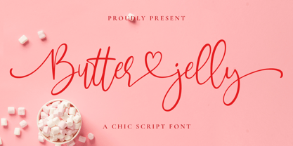 Butter Jelly is a modern calligraphy font with handwritten, sophisticated flows. It is full of hearts and glyphs. With exaggerated strokes and a bouncy baseline, Butter Jelly is perfect for logos, wedding stationery, cards, gift designs, photography, watermark, product packaging and handwritten quotes.
 - Kaliurang Signature by Letterafandi Studio,
$10.00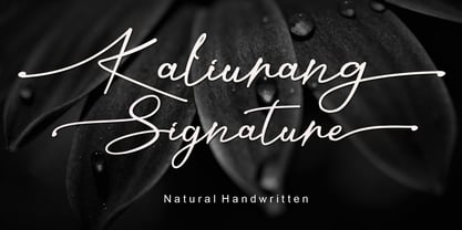 Kaliurang Signature is a modern handwritten font by Letterafa Studio. It has flowing letters that will give your designs a unique and sweet look. Kaliurang Signature is perfect for logos, greeting cards, package design, brand identity, craft design and any DIY project.
 - Kamila Arthur by PeachCreme,
$19.00 "Kamila Arthur" was inspired by clean handwriting with a natural monoline flow. It contains lovely beginning, ending and connecting lowercase heart swashes. It appears to be an excellent tandem for minimalist wedding designs. Please, note that heart glyphs connect only lowercase letters.
 - Sign Rathi by Lemonthe,
$15.00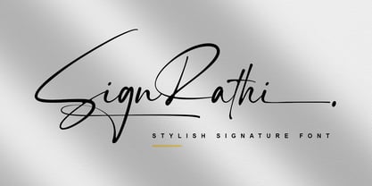 SignRathi is a perfect signature font, with a natural & stylish flow. SignRathi Font is perfect for many different project such as logos & branding, invitation, stationery, wedding designs, social media posts, advertisements, product packaging, product designs, label, photography, watermark, special events or anything.
 - Janelotus by Lemonthe,
$14.00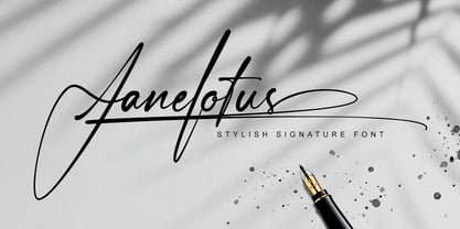 Janelotus is a perfect signature font, with a natural & stylish flow. Janelotus Font is perfect for many different project such as logos & branding, invitation, stationery, wedding designs, social media posts, advertisements, product packaging, product designs, label, photography, watermark, special events or anything.
 - Stripy Matey by Gleb Guralnyk,
$14.00 Hello! Introducing a geometric style font — Stripy Matey. It's a vintage look smooth typeface built of dashed flowing lines. Stripy Matey font has multilingual support (check out a screenshot with available letters and signs). Thank you and wish you a peaceful sky!
 - Haney love by Muksal Creatives,
$12.00 Haney Love feels incredibly elegant and flowing. It looks stunning on wedding invitations, thank you cards, quotes, greeting cards, logos, business cards and every other design which needs a handwritten touch. It features a varying baseline, smooth lines, gorgeous glyphs and stunning alternates.
 - Dontheus by Lemonthe,
$12.00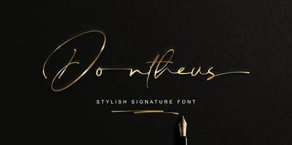 Dontheus is a Stylish Signature font, with a natural & stylish flow. Dontheus Font is perfect for many different project such as logos & branding, invitation, stationery, wedding designs, social media posts, advertisements, product packaging, product designs, label, photography, watermark, special events or anything.
 - Christmas Heart by Letterafandi Studio,
$14.00 Christmas Heart feels incredibly elegant and flowing. It looks stunning on wedding invitations, thank you cards, quotes, greeting cards, logos, business cards and every other design which needs a handwritten touch. It features a varying baseline, smooth lines, gorgeous glyphs and stunning alternates.
 - KG Two Is Better Than One by Kimberly Geswein,
$5.00 This font was created in honor of my husband for our 12th wedding anniversary. 14 years ago, I met this tall, skinny guy from Indiana in the lobby of a hotel in Hong Kong. We talked. The next day, we had lunch together. And that night we had dinner together. And the next day. And the next. We met just before my 19th birthday, and on my birthday he took me to the top of Victoria Peak, where we looked out over the city of Hong Kong- such a beautiful place to begin a lifetime of love! We spent 4 months together in Hong Kong, falling in love with each other and with the beautiful city we were privileged to call home for that short time. We married the next year. We've lived in Indiana, Texas, China, Kentucky, and Florida over those 12 years of marriage and have welcomed 2 daughters into our lives. I know beyond a shadow of a doubt that he completes my life in a way I didn't know was possible. And I know that I'm blessed beyond words to have a supportive, wonderful, encouraging husband who is also a loving, involved, caring dad to our daughters. This font is for you, Keith!
 - Vocaloid - Personal use only

- Blessed Love by Create Big Supply,
$15.00 With its unique style, Blessed Love brings a touch of elegance and charm to your designs, regardless of the topic or purpose. Whether you're working on branding, invitations, posters, or any other creative endeavor, this font has the potential to elevate your creations and leave a lasting impression. Blessed Love features both uppercase and lowercase letterforms, offering versatility and allowing you to experiment with various typographic compositions. Complete with numbers, punctuation marks, and extensive multilingual support, this font ensures seamless integration into your design projects, catering to diverse audiences across the globe. One of the standout features of Blessed Love is its PUA Encoding, which provides easy access to special characters and glyphs. This empowers you to infuse your designs with unique flourishes and personalized touches, allowing your creativity to shine. Embrace the cool and friendly vibe of Blessed Love and unlock a world of design possibilities. With its extensive character set and exceptional versatility, this font is ready to enhance your projects and create a memorable visual experience.
 - Ad Lib by Image Club,
$29.99Ad Lib designed by Freeman Craw for the American Type Founders (ATF) in 1961. A bold Grotesque with irregular rectangular counters in round characters. This type was designed by cutting the letter images out and thus has some wood-cut character. Some lower case characters have slight inclination. Initially numerous alternative characters were provided. Unusual shapes make this typeface useful for advertising and display work. - Ammer Handwriting by Schriftlabor,
$18.99 Austrian Cartoonist Wolfgang Ammer lent his handwriting to this font, which was produced by Miriam Surányi. Wolfgang already uses the font in his daily routine: It facilitates corrections and translations of his cartoons for international newspapers. Rich in contextual alternates, Ammer contains about 1800 glyphs. Each character has multiple alternates. And a complex OpenType substitution feature makes sure that the same variant does not appear twice in a line. As a special gimmick, the font contains a Tic Tac Toe game: To activate it, type a # and turn on stylistic set 20. Then use digits 1–9 for setting the naughts and crosses on their places. The enclosed TT variant has a reduced glyph set and therefore a smaller file size, hence it is better suited for use on the web.
 - Nazare by Ndiscover,
$39.00 It all started with a Portuguese soap packaging from the first half of the 20th Century. The 5 uppercase letters that spell NAZARÉ were sufficient to drive the creation of this design. Nazaré fits in a semi-serif category and it has a large contrast. It works outstandingly in display use specially in the bolder weights that have even more contrast. The regular weights have a more moderate contrast and an overall less extravagant design, fitting best in the typographical conventions. this provides a better render in text use. You can use this font in large headlines, logos, posters, book covers, and general display use as well as short strings of text. Nazaré is the name of a small Portuguese fishing village known for its giant waves and peculiar people.
 - Tellumo by Monotype,
$52.99 Tellumo, a new humanist geometric sans serif typeface, has all the attributes you need for a workhorse sans with a few surprising details. It has moderate proportions, a low stroke contrast, open apertures, and an x-height that makes it drive with ease in running text. A modest range of six weights, from Thin to ExtraBold, make it versatile without being overwhelming. The lightest and heaviest weights are best saved for headlines and subheads. It features a set of swash caps that can add magnitude and sparkle to short headlines, making it excel in packaging designs. Tellumo feels at home with Mid-century Modern and Art Deco aesthetics. It looks precise, tidy, and welcoming for architecture and home goods. It looks clean, fresh and modern for beauty and wellness, or elegant and approachable for fashion. It has a balance of clarity and personality, suitable for branding and advertising of all kinds, print & digital design alike. Tellumo radiates warmth, charm, and joyfulness from its geometric foundation.
 - Tellumo Variable by Monotype,
$313.99 Tellumo, a new humanist geometric sans serif typeface, has all the attributes you need for a workhorse sans with a few surprising details. It has moderate proportions, a low stroke contrast, open apertures, and an x-height that makes it drive with ease in running text. A modest range of six weights, from Thin to ExtraBold, make it versatile without being overwhelming. The lightest and heaviest weights are best saved for headlines and subheads. It features a set of swash caps that can add magnitude and sparkle to short headlines, making it excel in packaging designs. Tellumo feels at home with Mid-century Modern and Art Deco aesthetics. It looks precise, tidy, and welcoming for architecture and home goods. It looks clean, fresh and modern for beauty and wellness, or elegant and approachable for fashion. It has a balance of clarity and personality, suitable for branding and advertising of all kinds, print & digital design alike. Tellumo radiates warmth, charm, and joyfulness from its geometric foundation.
 - Murisa Baby Fish by Murisa Studio,
$10.00 Murisa BabyFish is our next font in early 2022. This font is inspired by the joy of children playing. Their joy is reflected in the creation of this font. Cheerful, joyful and colorful, are the strengths of this font. This font is perfect for use in your products that are targeting children and teenagers. Babyfish will lead your product to success. Get it right now.
 - Anker by Supremat,
$39.00 Anker is a super-wide and heavy typeface. At the same time, it has a very large contrast between vertical and horizontal stems. This gives it a certain defiant and aggressive character. The name Anker means anchor in German. That is something very heavy in weight and at the same time has sharp and thin elements in the design. This is reflected in the Anker. Suitable for super large titles, short words, logos or typographic compositions.
 - Alasassy Caps by Leksen Design,
$19.00 Bring some sass to your signage! Alasassy is a font inspired from Sharpie pen drawings, featuring ink ball terminals. The lowercase letters are a mix of uppercase and lowercase letters that share the same cap height and baseline. There are several alternate characters with a mix of high and low crossbars as well as crossbar overhang options and language support for each. This display font will bring some zest to your logo, signage, packaging design or large titles on book covers or advertising. It is a great combination of an organic, hand drawn feel but still clean and crisp enough to look professional.
 - ITC Tremor by ITC,
$29.99ITC Tremor is the work of British designer Alan Dempsey. You might think that it looks like the letters are in a seismically lively geological zone, but Dempsey had other kinds of motion in mind. Most of the faces I design come from trace 'work-outs' for advertising products. In the case of Tremor, it was to reflect a lively teenager," says Dempsey. The result is ITC Tremor, a cartoony slab serif typeface with irregular angles, straight-edged curves, and lines surrounding each character, making them look like they are jittery. - 1848 Barricades by GLC,
$38.00 This family was inspired from a lot of 1848-1850 French engraved documents reproducing handwritten texts talking about the Paris' insurrection days in June 1848 (described by Victor Hugo in Les misérables) . It seems that all were first written using quill pens, as the strokes are too much heavy and bold for metal pens and even though the engraver work is very fine. We have added only a few characters, most of them were present in the originals. The TTF and OTF versions are enriched with more than 50 ligatures or alternate characters.
 - 946 Latin by Roman Type,
$35.00 946 is a multilingual techno-style family developed by Berlin-based type designer Roman Wilhelm (RomanType). While more and more text families have recently been extended to a multilingual and multi-script level, not so much attention has been given to the more decorative styles. The 946 family does exactly that. A lot of care has been given to the various diacritics: they were designed a little more brutal, a little more European than with some other fonts of this category. Do also watch out for the non-Latin legs of this family. 946 is inspired by electronic music. When Roman found a second-hand Roland TR-606 drum machine in a store in his hometown back in 1995, he started to hang out with would-be DJs and musicians, trying to play the beats that went around the globe. When he started to study visual communication three years later, he was assigned the matriculation number of 946, which has now become the name of this family. Language support: Afrikaans, Albanian, Catalan, Croatian, Czech, Danish, Dutch, English, Estonian, Finnish, French, German, Hungarian, Icelandic, Italian, Latvian, Lithuanian, Maltese, Norwegian, Polish, Portuguese, Romanian, Slovak, Slovenian, Spanish, Swedish, Turkish, Vietnamese, Zulu. Do also watch out for the other script versions of this family!
 - Gaz by Typodermic,
$11.95 Introducing Gaz, the square display typeface inspired by the gasoline station signs of the twentieth century. Sign painters used to refer to this type of lettering as “stovepipe”, due to its sharp angles and rounded corners. Gaz’s unique squareness exudes a vintage industrial charm, while still maintaining a friendly, almost organic feel. Gaz is available in seven weights and italics, giving you the flexibility to create a wide range of designs. But that’s not all. Gaz also comes in five greasy effect styles, perfect for creating that worn, grungy look. The ligatures contained in these styles are automatically substituted in most applications, projecting a more natural and authentic tone. Whether you’re creating a bold poster, an eye-catching logo, or a sleek website design, Gaz is the perfect choice for adding a touch of vintage industrial style. Try Gaz today and bring a piece of the past into your designs. Most Latin-based European writing systems are supported, including the following languages. Afaan Oromo, Afar, Afrikaans, Albanian, Alsatian, Aromanian, Aymara, Bashkir (Latin), Basque, Belarusian (Latin), Bemba, Bikol, Bosnian, Breton, Cape Verdean, Creole, Catalan, Cebuano, Chamorro, Chavacano, Chichewa, Crimean Tatar (Latin), Croatian, Czech, Danish, Dawan, Dholuo, Dutch, English, Estonian, Faroese, Fijian, Filipino, Finnish, French, Frisian, Friulian, Gagauz (Latin), Galician, Ganda, Genoese, German, Greenlandic, Guadeloupean Creole, Haitian Creole, Hawaiian, Hiligaynon, Hungarian, Icelandic, Ilocano, Indonesian, Irish, Italian, Jamaican, Kaqchikel, Karakalpak (Latin), Kashubian, Kikongo, Kinyarwanda, Kirundi, Kurdish (Latin), Latvian, Lithuanian, Lombard, Low Saxon, Luxembourgish, Maasai, Makhuwa, Malay, Maltese, Māori, Moldovan, Montenegrin, Ndebele, Neapolitan, Norwegian, Novial, Occitan, Ossetian (Latin), Papiamento, Piedmontese, Polish, Portuguese, Quechua, Rarotongan, Romanian, Romansh, Sami, Sango, Saramaccan, Sardinian, Scottish Gaelic, Serbian (Latin), Shona, Sicilian, Silesian, Slovak, Slovenian, Somali, Sorbian, Sotho, Spanish, Swahili, Swazi, Swedish, Tagalog, Tahitian, Tetum, Tongan, Tshiluba, Tsonga, Tswana, Tumbuka, Turkish, Turkmen (Latin), Tuvaluan, Uzbek (Latin), Venetian, Vepsian, Võro, Walloon, Waray-Waray, Wayuu, Welsh, Wolof, Xhosa, Yapese, Zapotec Zulu and Zuni.
 - Decora One by Naghi Naghachian,
$82.00 Decora one is a typographic innovation. It is the first of a series of typeface that gives the typographer and other graphic artists the possibility to use modern initials. It enables, moreover, the use of this typeface for decorative headlines and is suitable for manipulations in both vector-based and pixel-based graphic programs. Typographies in countries worldwide, whose alphabets derive from the Roman one, are dependent on such innovations in order to meet the increasing demands of modern communication. This typeface implies at the same time an enrichment of the possibilities for typographical design, which in turn increases the delight in such design. It gives me great pleasure to present this series of new typefaces to my creative colleagues worldwide.
 - Joanna Sans Nova by Monotype,
$50.99 The Joanna® Sans Nova family is the only typeface in the Eric Gill Series that was not initially designed by Gill. Created by Monotype Studio designer Terrance Weinzierl over a three-year period with digital applications at the forefront of the design criteria, Joanna Sans Nova is a humanist sans serif based primarily on Gill’s original Joanna. The design comprises 16 fonts, from thin to black, each with a complementary italic. Joanna Sans Nova has a larger x-height to ensure high levels of legibility – even on small digital screens. Due to its inherent humanist proportions, Joanna Sans Nova is surprisingly comfortable for longer form reading. Its low contrast in character stroke weights also improves imaging in a variety of environments. In addition, the calligraphic and fluid details enable the roman and italic designs to shine in headlines and other display uses. Joanna Sans features a robust range of OpenType features for fine typography, including small caps, old style figures, proportional figures, ligatures, superscript and subscript figures and support for fractions. With over 1000 glyphs per font, Joanna Sans supports more than 50 languages – in Latin, Greek and Cyrillic scripts. “I've always been a fan of Gill’s work, explains Weinzierl, and found the simple, humanist qualities of Joanna really fitting for a sans serif design. I wanted to make something with Gill flavor, but with more harmony in the extreme weights than Gill Sans – and with my twist on it. I went through six or seven different italic designs before landing on the current direction.” “The original Joanna had a very distinct italic, Weinzierl continues. “It’s very condensed, and has a very shallow angle. I wanted to have an italic that stood out, but in a different way. I took a cursive direction for the italic details, which are wider and slanted more, both improving character legibility.” The Joanna Sans Nova typeface family is part of the new Eric Gill series, drawing on Monotype’s heritage to remaster and expand and revitalize Eric Gill’s body of work, with more weights, more characters and more languages to meet a wide range of design requirements. The series also brings to life new elements inspired by some of Gill’s unreleased work, discovered in Monotype’s archive of original typeface drawings and materials of the last century.
 - Clavo by Dada Studio,
$29.00 Clavo was picked for the EXHIBITION CALL FOR TYPE - NEW TYPEFACES and is presented in the Gutenberg Museum in Mainz, Germany. Clavo is a multipurpose font family. Its warmth comes from subtle details, classical proportions and traditional forms, while harmonious structure prevents distraction while reading. This makes Clavo a universal typeface. In all sizes, from caption to display. The family consists of ten weights. They were not created in a linear way. The steps between the weights were adjusted carefully to avoid a mechanical graduation, in favor of optical harmony. Clavo covers all latin languages. It contains a wide set of numerals, small capitals, fractions and other OpenType goodies. And of course every weight comes with matching italics.
 - Heinemann Special by Heinemann Collection,
$39.00 The Heinemann fonts were initially developed by the in-house design team at Heinemann educational publishing out of the necessity to find the perfect font for use in early primary reading books and literacy products. Basic Heinemann is defined by longer ascenders and descenders, which help children to distinguish between letters; rounded edges on all letterforms, which help the reader focus on the individual letter shape; and modified characters (eg., a and g), which ensure instant recognition of letterforms. Heinemann Special offers further modified characters and kerning pairs ideal for dyslexic or special-needs use (eg., a, d, and b). The Heinemann fonts were developed in partnership with children, literacy advisors, teachers of special needs/dyslexia, and primary-school teachers and are now available in response to hundreds of requests from publishers, designers, and teachers to purchase them. They have been tested in schools and learning institutions over an 8-year period, and they are a favorite for use in both print and electronic products. The modern, clean aesthetic of the fonts ensures that their use can spread beyond educational applications.
 - YT basic Latin by Yangtype,
$9.00 The reason you should buy this font is simple and clear. This is because we have accumulated experience in realistic typography. This typeface exists as a unity with diversity. The intuitive form of letters and the subtlety of letter spacing create artistic value in the combination of words and sentences.
 - Monotype Grotesque by Monotype,
$40.99 This updating of Berthold’s Ideal Grotesque was supervised at Monotype in 1926 by F.H. Pierpont. With some of the eccentricities in the borrowed original reduced, this series retains enough character to have become one of the world’s great sanserifs.
 - Hattan Antique by Solotype,
$19.95This font is a somewhat modified version of the original issued by the Manhattan Type Foundry in the 1880s. This New York foundry was in business for less than five years, so its fonts are not too well known. - Elfabet - Unknown license


