10,000 search results
(0.044 seconds)
- ITC Quorum by ITC,
$29.99Australian typographer Harry Pears continues to explore ancient type forms while maintaining his consultancy business Typeface Research Pty. Ltd., of Lake Cathie, Australia. Born in Quirindi, Australia, Harry has had a long career in printing and graphic arts and has been the guiding force behind the creation of the Lindisfarne Nova family. Lindisfarne Nova Incised and Lindisfarne Runes are wonderful illustrative companions to the Lindisfarne Nova text fonts. In a unique partnership, Harry develops the concepts, and calligrapher Margaret Layson brings the designs to life. They both then work on the digital incarnation in a true collaboration. - Fun Time Nouveau JNL by Jeff Levine,
$29.00 “One Hundred Alphabets for the Show Card Writer” was published in 1919 to afford sign artists the ability to create signs and show cards in then-contemporary lettering styles. One such alphabet was big, bold and representative of the Art Nouveau stylings popular in the early part of the 20th Century. Most likely it was applied to store sales and public events that were casual and informal, for its letter forms are free of any constraints. This design is now available as Fun Time Nouveau JNL in both regular and oblique versions.
 - HeyPumpkin by Ingrimayne Type,
$14.95 HeyPumkin is a letterbat font designed for use in the late autumn, when the leaves are falling and the harvest is underway. October 31 is an especially good time to use it. The upper- and lower-case letters are almost identical. If you want a version of this face without the pumpkins, try Ingone. Buried in the font is another set of letters on pumpkins. They are on unicode characters in the 2400 block, circled digits and letters. These characters can also be accessed using the OpenType stylistic sets feature. (The alternative characters are further developed in a separate typeface, part of the InsideLetters family.)
 - Allograph JNL by Jeff Levine,
$29.00According to the dictionary, the way a letter is formed or shaped within a writing system is an allograph... and Allograph JNL from Jeff Levine takes on unusual shapes. Using characters from Jeff's Printing Set JNL font, they were printed out white-on-black, and the paper was torn into abstract pieces and then scanned in order to create this edgy looking font. - Take Note by wearecolt,
$9.00 Take Note Craft Handwritten Display Introducing Take Note, a beautiful and playful handwritten font. Using ligatures and stylistic alternatives for a natural flow and feel. A cute handwritten font for logotype, blog heading or even Instagram quotes.
 - Elementarz Pro by GRIN3 (Nowak),
$29.00 Elementarz Pro is a handwritten, monoline, fully connected script with ligatures and contextual alternates to help with flow and readability. Language support includes Western, Central and Eastern European character sets, as well as Baltic and Turkish languages.
 - HU Malrang by Heummdesign,
$30.00 'HU Malrang' is a font that gives a round and soft feel to its tightly packed modules. This font has a variable function, allowing users to fine-tune the thickness they want. (Available only in Adobe programs.) Six basic weights are provided so that they can be used even in programs that do not apply the variable function.
 - Adelbrook by Vibrant Types,
$36.00 Adelbrook is a dynamic serif typeface that keeps calm. It enriches text with the archaic structure of humanist type, because its characters arrange in a harmonious rhythm with a dynamic stroke, asymmetric serifs and stems that lean in the direction of reading. These characters have gravity and are firmly on the baseline. The tapered stems define a heaviness that end in emphasized foot serifs. Actually all the details are heftier the lower they are. This is particularly evident in a subtle vertical hairline variation, light or unapplied head serifs, and clipped upper dots. The clearness of the semi-serif italics with a brushy nature integrates perfectly in a subtle way. All these details result in a sophisticated text typeface with a sharp contemporary design.
 - White Rabbit - Unknown license

- Ongunkan Old Hungarian Runic by Runic World Tamgacı,
$50.00 It was used in parts of Transylvania until the 1850s, although it was banned by Istvan, the first Christian king of the Hungarians (Szekel), in line with an order to "destroy all pre-Christian inscriptions". Hungarian runic script was usually written on wood-stone pieces in the bustrofedon style. In this method, the writing was written consecutively from right to left and from left to right. This article is available in Bosnian, Carpathian and Glozel editions. Whenever possible, I will present the fonts in these versions.
 - Magistral by ParaType,
$30.00The first three weights of the family were designed at ParaType (ParaGraph) in 1997 by Dmitry Kirsanov . They were based on the artworks of Moscow graphic designer Andrey Kryukov (1923-1997). The original version was developed by Kryukov at the end of the sixties for Russian railways. The proportions and elements of construction were inspired by Eurostile (1962) by Aldo Novarese. It is intended for use in advertising and display typography. In 2009, Dmitry added the new styles, corrected the old ones, and enhanced them with extended character sets. - Corleone by FontMesa,
$- Corleone was originally designed as a two font family in 2001 and offered for free. This year we've expanded the font family to twelve fonts including small caps and italics. While the new Corleone has been greatly refined and is a much more professional quality font we've decided to still offer the original two fonts for free. Corleone is the perfect font for t-shirts and other merch, the new small caps make this font stand out and bring attention to whatever you use it on. Corleone is the font you can't refuse. Tech notes: Corleone was designed after a famous movie logo in the 1970's with a title name that sounds a lot like The Grandfather if you know what I mean. The movies had three installments, my original font was patterned after the logo for the third movie, the new Corleone Primo and Secondo versions are patterned after the logos of the first two movies. The differences are noticed mostly in the lowercase letters. One thing you will not find in this font family is the puppeteer or puppet master hand because it's been registered as a separate trademark of Paramount Pictures. If you're using an application that works in layers then you'll be interested in the four extra over score glyphs included in some of the versions of this font. Sorry, MS Word does not work in layers so this feature will not work in MS Word. When you open up the glyph map in Adobe Creative Suite you should see the over score glyphs when you scroll down to the bottom. These extra over score glyphs allow you to extend the top line of a single capital letter, with four different lengths you should be able to mix and match to achieve the length that you desire. When using the over score glyphs it's best to divide your word or headline into separate text objects, the cap being one object and the remaining letters being the second. If you try using the over score glyphs on a single text object then with each over score that you add the text after it will get pushed down the line.
 - Aramus by Hackberry Font Foundry,
$24.95 Aramus is a new serif font in my continuing objective of designing book fonts that I can really use. In many ways, Aramus is a very different direction for me. It comes from a scan of an old display face that has been radically modified to a much smaller x-height than I have been using lately, plus taller ascenders. Many of the characters needed a lot of correction to bring them into my taste. In general, I have decided that many of my fonts create a type color that is too dense. Aramus is an attempt to get away from that look. Although Amitale has been a very successful book family and excellent to work with, I find I still need something more open with a lighter color. Aramus is the first look at the new direction. The original hand-cut serifs vary a lot, different for almost every character. This gives a little looseness and helps the lightness I am looking for. It will be interesting to see where this all goes. This is a normal serif for me in that it has caps, lowercase, small caps with the appropriate figures for each case. This font has all the OpenType features in the set for 2009. I didn't bother with the CE accents (though I can add them upon request. They will be in the final new book family). There are several ligatures for your fun and enjoyment: bb gg ff fi fl ffi ffl ffy fj ft tt ty Wh Th and more. Like all of my fonts, there are: caps, lowercase, small caps, proportional lining figures, proportional oldstyle figures, & small cap figures, plus numerators, denominators, superiors, inferiors, and a complete set of ordinals 1st through infinity. Enjoy!
 - Retrolight by Almarkha Type,
$29.00 Introducing Neon Font called Retrolight A unique Fonts with Retro Style can make your logotype become more interesting. inspired by real world neon light signs, it features minimal letter forms with smooth rounded corners and, true to real neon tubes, strictly uses lines with open start and end points. This font is perfect for adding your own glowing light effects or can be used to actually design real world neon signs. Retrolight fonts is perfect for your project and allows you to create designs, headlines, posters, logos, badges, t-shirts and many more that are beautiful. It is also best used for posts, logos, posters, certificates, labels and more.
 - Avaneonz by Almarkha Type,
$29.00 Introducing Neon Font called Avaneonz A unique Fonts with Retro Style can make your logotype become more interesting. inspired by real world neon light signs, it features minimal letter forms with smooth rounded corners and, true to real neon tubes, strictly uses lines with open start and end points. This font is perfect for adding your own glowing light effects or can be used to actually design real world neon signs. Avaneonz fonts is perfect for your project and allows you to create designs, headlines, posters, logos, badges, t-shirts and many more that are beautiful. It is also best used for posts, logos, posters, certificates, labels and more.
 - Neonblitz by Almarkha Type,
$33.00 Introducing Neon Font called Neonblitz A unique Fonts with Retro Style can make your logotype become more interesting. inspired by real world neon light signs, it features minimal letter forms with smooth rounded corners and, true to real neon tubes, strictly uses lines with open start and end points. This font is perfect for adding your own glowing light effects or can be used to actually design real world neon signs. Neonblitz fonts is perfect for your project and allows you to create designs, headlines, posters, logos, badges, t-shirts and many more that are beautiful. It is also best used for posts, logos, posters, certificates, labels and more.
 - Stacker by Almarkha Type,
$29.00 Introducing Neon Sci-fi Futuristic Font called Stacker A unique Fonts with Futuristic Style can make your logotype become more interesting. inspired by real world neon light signs, it features minimal letter forms with smooth rounded corners and, true to real neon tubes, strictly uses lines with open start and end points. This font is perfect for adding your own glowing light effects or can be used to actually design real world neon signs. Stacker fonts is perfect for your project and allows you to create designs, headlines, posters, logos, badges, and many more that are beautiful. It is also best used for posts, logos, posters, labels and more.
 - ITC Puamana by ITC,
$29.99From the fluid brushstrokes of Teri Kahan's lettering comes a tropical treasure: ITC Puamana, graceful as a palm tree in the ocean breeze. “Puamana” is a Hawaiian word with several meanings; among them are “the blossoming of miraculous power” and “sea breeze.” ITC Puamana captures the essence of the tropics, suggesting the sway of palm trees in the ocean air. With its ragged edges and italic slant, this brush-written alphabet has a unique visual texture that graces the page with spirited movement. Sketched on the beach in Maui by west coast designer Teri Kahan, ITC Puamana first saw life as apparel art for a Hawaiian clothing company. Now this versatile typeface is a complete alphabet that's useful for both text and titles. ITC Puamana can be put to use in everything from book jackets to in-store signage. - Evalfey by insigne,
$35.00 Love at first sight: Evalfey is a script you will find yourself falling for. It has a smooth, sophisticated look to it, but don't be fooled by its elegant appearance – this script is actually very simple and easy to use. The tall x-height, flag like terminals and flame-like smooth, sweeping strokes give this font a fluid, flowing quality that will help enhance your design. Evalfey Script is a great font for a wedding invitation or similar. The elegant, brushed look and strong "nuptial" feel make this the perfect choice for wedding invitations, save-the-date cards, thank you notes, and more. Evalfey is the perfect font for any wedding invitation or ceremony. Simple and elegant, Evalfey is a good choice for the wedding that likes to stand out from the crowd. The tall x height, graceful flag-like terminals, and wavy sweeping strokes give this font a regal appeal. Evalfey is a perfect combination of elegance and simplicity for your wedding invitation, announcement card or other special document. Production assistance from Lucas Azevedo and ikern.
 - Shopping Guide by Jeff Levine,
$29.00 While watching the 1947 holiday classic “Miracle on 34th Street”, one scene in particular presented a chance to develop a retro type design. ‘Kris Kringle’ suggests to a mother visiting with her child in the Macy’s toy department to try Gimbel’s for a toy she couldn’t find at the store. The news of this behavior reaches Mr. Macy himself, who embraces the practice as a brilliant marketing strategy. A number of departments are then presented with reference books containing competitor ads, and the visual of the cover stating “R.H. Macy & Co. Shopping Guide for the Convenience of Our Customers” shows on screen. The thin, Art Deco sans serif monoline with a few serif-like hooks added onto some characters became the basis for Shopping Guide JNL, which is available in both regular and oblique versions.
 - Cultured by Create Big Supply,
$17.00 Discover the charm of Cultured, a captivating handwritten font that adds a touch of elegance to your designs. With its natural feel and resemblance to authentic handwriting, Cultured brings a personal and intimate touch to your projects. Whether you're designing wedding invitations, stationary art, or eye-catching social media posts, this font will elevate your creations and leave a lasting impression. Cultured features a comprehensive set of both uppercase and lowercase letters, offering versatility and creative freedom in your typographic endeavors. It also includes numbers and punctuation, ensuring seamless integration into your designs for a polished and cohesive look. With multilingual support, this font enables you to effectively communicate your message across different languages and engage with a diverse audience. One of the highlights of Cultured is its collection of ligatures, which enhance the natural flow and connectivity of the font. These ligatures provide a seamless transition between letters, creating a visually pleasing and handcrafted appearance. Each stroke showcases the attention to detail and cares put into crafting this font, making it a standout choice for projects that require a touch of sophistication. With PUA encoding, accessing the amazing glyphs and ligatures of Cultured is effortless. This feature allows you to unlock the full potential of the font, giving you the freedom to explore unique combinations and tailor your designs to perfection. Experience the elegance and artistry of Cultured and elevate your designs with their handwritten allure. Add a personal and refined touch to your projects and captivate your audience with this exquisite font.
 - Saevul by Sealoung,
$25.00 Saevul is a Modern Serif typeface with a unique and classy style. This font has a graceful and unique alternates style, which is perfect for your classy projects. Saevul Modern Serif will be perfect for many projects: fashion, magazines, logos, branding, photography, invitations, quotes, blog headers, posters, advertisements, postcards, etc. What's Included? Upper & lower case letters, numbers, punctuation marks Alternative Multilingual support
 - Chrysante by Mans Greback,
$29.00 Chrysante is a flowing pen script. The typeface was drawn and created by Måns Grebäck between 2018 and 2020. Its thin lines are inspired by mid-century advertising, emits optimism and has a strong personality. The ink script family consists of three weights: Chrysante Thin, Chrysante Medium and Chrysante Bold. Its multiple alternate alphabets gives the font a true handwritten feeling. Use it for a logotype, a greeting card or as a headline. The font contains all characters you'll ever need, including all punctuation and numbers. It has an extensive lingual support, covering all European Latin-based scripts.
 - Rustic Revival by Letterhend,
$17.00 Stand out from the crowd with the Rustic Revival font's ligature option. These unique character combinations add visual interest and enhance the flow of your text, giving it a casual and classic, perfect for eye-catching posters, attention-grabbing banners, and impactful headlines, Rustic Revival helps your designs stand out from the crowd and leave a lasting impression. Features : Uppercase & lowercase Numbers and punctuation Alternates & Ligatures Multilingual PUA encoded We highly recommend using a program that supports OpenType features and Glyphs panels like many of Adobe apps and Corel Draw, so you can see and access all Glyph variations.
 - Poster Brush by Fenotype,
$18.00Poster Brush is a hand drawn font pair with lots of character. Poster Brush is packed with OpenType features - Contextual Alternates changes prevents identical double letters from being next to each other. With Stylistic Alternates you can manually change the letters. When you turn on Discretionary Ligatures you’ll get interlocking ligatures when typing with caps. Poster Brush Script is equipped with Standard Ligatures and Contextual Alternates to keep the flow smooth. It also has Swash alternates for certain letters. Poster Brush & Poster Brush Script work great together or as themselves. For the best price purchase the whole family. - Dom Loves Mary by Correspondence Ink,
$39.99 Dom Loves Mary has a baby brother! Check out Fratello Nick here: http://www.myfonts.com/fonts/correspondence-ink/fratello-nick/ The DomLovesMary font family has all you need to create unique, custom stationery products. THE INSPIRATION BEHIND THE DOMLOVESMARY FONT FAMILY: DomLovesMary is named in memory of Dominic and Mary Sementelli, Debi’s in-laws. Dom and Mary were opposites who were truly “made for each other”. A snazzy dresser, Mary was feisty, loved to dance, sing, and be the life of the party. Dom was cool, calm and collected and was happy to shine the spotlight on the love of his life. They balanced each other out in a really great way. Going through some of her in-laws old photos, Debi found their wedding album. She was struck by the beautiful look on their faces as they got ready to start their life together. She saw the excitement, joy and anticipation of them envisioning “Una Bella Vita!” (A beautiful life!) She decided to create a hand-lettered font with them in mind represented by two totally different lettering styles that were, like Dom and Mary, “made for each other”. It’s her way of honoring them and sharing their beautiful life with all of the couples just starting theirs together. They truly had “Una Bella Vita” and we hope you do too. WHAT'S UNIQUE ABOUT THE DOMLOVESMARY FONT FAMILY: The SCRIPT & TEXT FONTS are lettering styles that were made to compliment each other. With a vintage, classic feel, they will add elegance to your design, while the TEXT serves to offer support with easy to read simplicity. In addition to the standard character set, each of the uniquely styled script fonts includes a collection of flourished ornaments. Use them to create corners, headers or other embellishments to complete the look. And if you really want to fancy things up, we offer two sets of 72 additional flourishes that were specifically made to add to upper and lower case letters for easy customization. Dress them up with one, two or more. It’s like choosing simple pearls or piling on the glitz! Or combine several to create unique flourished ornaments of your own. To add even more panache, we're pleased to present our ready made set of most frequently used ADD-ON WORDS. Created with the wedding client in mind, this set of 66 includes envelope friendly titles: Mr and Mrs, Mr, Mrs, Miss, Ms, Doctor, the Doctors, as well as words to fill out your invitation suite: RSVP, Respond, Save the Date, Accommodations, Directions and more! Easily create Bride and Groom signs or Thank You cards or tags with the click of a key. Or use angled words like “and, at, to, on, for, from and of” to add a special touch to your large groups of copy. PACKAGES: We are pleased to have a variety of customers. From professional invitation designers to DIY brides, publishing companies and website / blog designers among others. So we've created packages to help fit their diverse needs. Purchase just one of our beautiful DomLovesMary SCRIPT fonts, each with its collection of included flourishes or the PRO VERSION complete with ALL THREE script fonts and a combined total of over 100 flourished ornaments. Add our TEXT font, a set of FLOURISHES or ADD-ON WORDS. Love the idea of customizing your letters with all the possible combinations? We offer a special price when you purchase both sets of flourishes. Or choose our Accoutrements Package containing both sets of FLOURISHES for letter customization as well as our ADD-ON WORDS. Want to have it all? The “DomLovesMary Total Design” package is for you. Each of these packages are offered at a 25% savings. WHAT PROGRAM WILL YOU USE?: All of the font options come in both Pro and Standard format fonts. For those with programs that can take advantage of OpenType features (click on the link to see if the program your using is one of them) the Pro fonts are for you. http://www.typotheque.com/fonts/opentype_feature_support/ For others without the ability to use Open Type features, we provide all of the script fonts that comprise the Pro Version as separate versions (Regular, Contextual and Stylistic). If you are using a program like Microsoft Word, and want all three script fonts, you can still purchase the Pro Version (a $50.00 savings), and install the individual fonts bundled in the Standard Fonts folder. We have set it up so they will appear separately as DomLovesMary, DomLovesMary Contextual and DomLovesMary Stylistic in your fonts list. Exciting news! In an effort to help our customers access all the goodies that are normally only available in Open Type Capable programs (like the flourished ornaments that come with our script fonts), we have found a simple application that allows you to do just that. For this reason, we've made sure to unicode all of our characters and glyphs so that they will work in this type of program. There may be others, but we checked this one out and found that it works. Check out PopChar
 - VLNL Bint by VetteLetters,
$35.00 Kornelis de Vries, a headmaster from the Dutch province of Friesland, cultivated new potato breeds that he named after pupils in his school. In the early 1900s he came up with the tasty Bintje (a Frisian girl’s name) and it became a big success – in Belgium and France it has remained the most popular potato for french fries to this day, more than a century since its introduction. Donald Roos took 10 kilos of fresh Bintje potatoes and cut the Bint typeface by hand with a short, sharp knife. He then inked each character once and printed it twice; the second, lighter printing is accommodated in the lower case alphabet. The Bint family offers a script to make the letters bounce up and down the baseline; with OpenType functionality the font randomly chooses each character from the upper- or lowercase alphabet. ‘Tabular lining figures’ will activate a series of negative numerals in boxes; ‘Discretionary ligatures’ activates specially designed letter combinations like ‘www’ as well as arrows and stars. Bint has a distinct, slightly rough handmade appearance, making it useful for a wide range of designs.
 - P22 CoDependent by IHOF,
$24.95 P22 CoDependent is a revival of the Independant typeface from 1930 created by Dutch designer Johannes Nicolaas Coenraad Collette along with Jos Dufour from Belgium. Independant was released in metal by the Belgian division of the Amsterdam Type Foundry in commemoration of the 100th anniversary of the independence of Belgium from the Netherlands. Despite the name, the two fonts contained in the set, Regular and Shadow, are not codependent upon each other. They can be used alone, but together they can create a dynamic two-color option. There have been other fonts inspired by and revived directly from Independant, but this version adheres the original design with the added consideration of how the shadow version will overlap.
 - Bathysphere by Kickingbird,
$24.00 This steam era typeface, created by Gustav Schroeder in 1884, found popular use on soap box labels and tobacco tins during its initial release. Then, later, a successful and stout revival of Gustav's face, named Othello, was carried out by Morris Fuller Benton in 1934, and the typeface's appeal widened to include items such as broadside posters featuring Boris Karloff's Frankenstein. After metal gave way to film type, Gustav's creation experienced a brief fashion moment in the 1960's, but then disappeared entirely, never re-surfacing as a full digital typeface. With the release of Bathysphere, the typeface comes full circle, having been completely redrawn from scratch using Gustav's original specimens. The new extended language support establishes the typeface firmly in the modern era, while Bathysphere's refinement of subtle blunt corners restores a deep-sea grace to this iron giant.
 - ITC Kendo by ITC,
$29.99 ITC Kendo is the work of British designer Phill Grimshaw, suggesting the dash and verve of quick, sketchy calligraphy, complete with splatters of ink. Grimshaw says he worked deliberately against his own habits to create the forms, drawing the letters with slow deliberation" and a pointed pen. He overloaded the pen with ink and drew on rough paper, "applying a lot of pressure at the beginning of a stroke and easing off towards the terminals. Accidental splashes occurred frequently owing to the nib catching the 'tooth' of the paper." Those splashes were refined into features which enhance but do not overwhelm the characters and carefully worked so as not to leave an obvious white strip of unsplattered space between lines and letters. The initial capitals can be used alone or combined with the lowercase alphabet, and the font includes a full set of f-ligatures and some extra ligatures as well as decorative elements."
 - Party Lover by Sinfa,
$12.00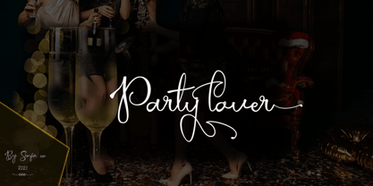 Party lover is a charming script font with a subtle and coarse signature font style, complemented by alternative fonts to make it look more charming, this font is perfect for completing your collection for logo, invitation, branding, label, trademark, and other needs. This font contains: Uppercase & Lowercase, and lowercase Alternative Symbols & Punctuation Marks OpenType Features attention ... that OpenType Features require software like Photoshop / Illustrator CC. Please try, thank you ...!
 - Forbes by Linotype,
$29.99 Forbes consists of one bold weight and is an alphabet in the style of the bold English slab serifs, as made evident by its flexed serifs. This style first made its appearance in the 19th century. It was used at first only on posters but later became available in smaller point sizes and was then be used for titling and headlines. With its robust figures, Forbes should be used exclusively for these applications in middle and large point sizes.
 - Stuph by Tail Spin Studio,
$25.00Stuph Light is a collection of drawings pulled from one of the many sketch books Steve Zafarana is always doodling in. Because they are in a font, the drawings can be used in font format or opened and manipulated in vector programs like Freehand or Illustrator. Stuph Light continues to inflict upon an unsuspecting public Steves’ cockeyed outlook on the world that was started with ITC Fontoonies, ITC Gargoonies and ITC Backyard Beasties. Will this lunacy ever end? - Monkton Aged by Club Type,
$36.99 This antique-aged version of Monkton can be used to imitate old letterpress printed documents such as old English text. The rough edges resemble ink spread on paper to give an old look. The inspiration for this typeface family came from my childhood experiences at Monkton, amidst an historic part of the South West of England. Studies of the original incised capitals of the Trajan column in Rome were analysed and polished for this modern version. The lower case letterforms and numerals were then created in sympathy, taking their proportions from the incised letters of local gravestones. Its name honours not only the area where the original alphabet was conceived and drawn, but also the people responsible for fostering my initial interest in letters.
 - Wakefield by Galapagos,
$39.00A gentle breeze caressed his face as his body took on the easy posture of a dancer on break. Flickering sparklets of light sprinkled the glass-smooth surface of the aqua liquid on which he floated. His mind wandered; he was only days away from his scheduled departure date. This day was no different from a hundred other days he had spent melded to his windsurfer, skittering along the breadth of the modest lake, soaking up the sun's rays and forgetting about the entire rest of the world. Lake Quannapowitt, and the town of Wakefield, Massachusetts, were familiar to Steve, a long-time resident of the picturesque New England town. This is where he grew up; this is where he married and lived for many years; and this is the place he was preparing to leave, not one week hence. Not generally prone to nostalgia, it was in just such a state he nonetheless found himself once Zephyrus retreated, as was his custom, periodically, while patrolling the resplendent lake. Steve was going to miss the lake, and he was going to miss the town. How many hours of how many days had he spent exactly like this, standing on his motionless board, waiting for his sail to fill, and staring at the lake's shores, its tiny beach, the town Common with its carefully maintained greenery, and equally well-tended gazebo, the Center church - its spire shadow piercing the water's edge, like a scissor-cut the better to begin a full-fabric tear? Yes, he was going to miss this place - this town which all of a sudden had become a place out of time, just as he was about to become a person out of place. Once this idea struck him, he couldn't shake it. He was transported back in time four score years, now watching his ancestors walk along the shore. Nothing in view belied this belief - not the church's century old architecture, not the gazebo frozen in time, nor the timeless sands of the beach, nor the unchanging Common. Everything belonged exactly where it was, and where it always would be. This, he decided, was how he would remember his hometown. And this is when it occurred to Steve to design a typeface that would evoke these images and musings - a typeface with an old-fashioned look, reflected in high crossbars, an x-height small in size relative to its uppercase, and an intangible quality reminiscent of small-town quaintness. Wakefield, the typeface, was born on Lake Quannapowitt in the town for which it was named, shortly before Steve moved away. It is at once a tribute to his birthplace and a keepsake. - Whomp by Sudtipos,
$59.00 Whomp takes its inspiration from the work of an American master in sign painting and alphabet manipulation: Alf Becker . In 1932, Becker began designing a series of alphabets to be published in Signs of the Times magazine at the rate of one alphabet per month. Nine years later, 100 of those alphabets were compiled in one book that became an enormous success among sign painters. In the late 1990s and early 2000s, many Alf Becker alphabets were digitized with blurbs that falsely credit an “Alf Becker typeface”. Alf Becker was not really a typeface kind of guy. He was more of a calligrapher and sign painter. His alphabets were either incomplete or full of variations on different letters, and didn't become typefaces until the digital era. This particular Becker alphabet was quite incomplete. In fact, it wasn't a showing of an alphabet, but words on a poster. Alejandro Paul took the challenge of drawing, digitizing, restructuring, and finally building a complete usable typeface from that partial alphabet. He then extended his pleasure by once again playing with the wonderful possibilities of OpenType. Whomp comes with more than 100 alternates, tons of swashy endings and ligatures, all built into the font and accessible through OpenType palettes in programs that support such features. This is the in-your-face kind of font that stands among other Becker-based alphabets as paying most homage to the vision of this great American artist who saw letters as live ever-changing beings. Whomp is right at home when used on packaging, signage, posters, and entertainment related products.
 - Trellis by Adriprints,
$25.00 The Trellis font family was an effort to combine my love for Art Nouveau and storybook lettering. The capital letters are intricately illustrated and fully appreciated when magnified. Trellis is a font family decidedly decorative and ready for greeting cards and holiday cheer. I was inspired by Storybook caps for the capital letters, and wanted to combine it with some lettering from early 20th century posters. What are its main characteristics and features? Leaves intertwined and growing out of the ends of the capital letters. Although it's highly decorative, it remains legible. Usage recommendations - Holiday Greetings, scrapbooking, personal seals since the capitals are quite attractive.
 - Lovingly Friends by My Creative Land,
$35.00 Introducing “Lovingly Friends” - a community of fonts that get along together as good as best friends do. All of the fonts - Sans, Serif, Notes, Script and Extras are packed with stylistic alternates and ligatures, you can combine them the way you like - they will look balanced together as well as individually. Script and Engraved fonts also have a Shadow style - to add more personality to your designs. You can download the Specimen & Instructions pdf here http://bit.ly/2x975US Since the Christmas is not that far away (time flies!), the Extras font has a set of Winter Holidays elements - so you could create and send your best wishes to your friends in no time. While all the fonts are fully unicode mapped so you can use them in ANY application, they are still best used in an OpenType aware application. If the application you are using doesn’t support OpenType features, you can use Character Map (Windows) or Font Book (Mac) to select the glyphs you need. Hope you enjoy the fonts as much as I enjoyed creating them! P.S. The flowers used in the preview images are from Liza Glanz 4 in 1 Elegant Watercolor Collection https://crmrkt.com/do4Wpb
 - Night Train by FontMesa,
$19.95 Night Train is a new font built from the ground up; while Night Train may resemble an old classic wood type there are a few lines that make this font a little more modern setting it apart from other wood type revivals. If you're a railroad enthusiast you're sure to enjoy the steam locomotive graphic located on the less than and greater than keys on all versions of this font, due to the fine detail of this train illustration the best printing results will be at 600dpi or higher on a laser printer. An alternate K and R are within the Night Train fonts, for Win Type1 these alternates are on the left and right bracket keys, for Truetype and OpenType you may access the alternates by using the Character Map in Windows or Adobe Illustrator, for OpenType you may also find them on the stylistic alternates page of the glyph map in Illustrator. There's something new with Night Train that the sign making people will love, for the first time FontMesa is pleased to offer a block shadowed version in four directions. One fill font is all that is needed for all four open faced fonts, you'll need an application that works in layers in order to use the fill font with the open faced fonts, simply place the fill font in its own layer then move it behind one of the open faced fonts of Night Train. The Night Train name has been on my list to use as a font name for a few years, a friend from years ago used to sail his boat in the Mackinac race from Chicago to Mackinac Island, the name of that boat was the Night Train. Watching the 2010 Olympic four man U.S. bobsled team win gold with their sled also called Night Train has inspired me to complete this font.
 - ITC Stepp by ITC,
$29.99When Hal Taylor saw the 1930 logo for the Stetson Shoe Company of Weymouth, Massachusetts, he didn't run out and buy a pair of loafers. Instead, he seized on this striking example of an Art Deco logotype as the basis for a new typeface design. “I was impressed with the delicate and sophisticated letter forms,” Taylor recalls, “particularly the enlarged cap S -- in any other case it would have seemed unbalanced, but in the context of this logo, it worked perfectly.” All the letters in the original all-caps Stetson Shoe logo were rendered with condensed proportions except the O, which was a perfect circle. While the prominent O added visual interest to the logo, Taylor knew that such a character would limit his typeface to display applications. For versatility's sake, he drew his O for ITC Stepp with the same proportions as the rest of the alphabet. Taylor also gave the logotype's inverted S a more traditional design, but kept the original as an alternate character in the OpenType font. Taylor's toughest challenge during the design process was creating a lowercase. “A good type design tells you what it wants to be,” he says, “and after a little while the Stepp caps began to tell me what the lowercase should look like.” Taylor's lowercase is slightly more conventional than the caps. The jaunty g" and almost upside-down "s" add subtle charm, while the capital letters provide the broader gestures of Stepp's personality. Together, they create a versatile and distinctive typeface design. One of Hal Taylor's first jobs was as a photo-lettering typographer in Philadelphia, setting headlines and creating custom lettering. This was followed by a stint doing finished lettering for John Langdon, whose ambigrams appear in Dan Brown's best-selling novel, Angels & Demons. Today, Taylor works as a graphic designer in the publishing industry, but he still finds time to create an occasional hand-lettered book jacket, and draw handsome typeface designs. ITC Stepp is available in four weights, ranging from Light to Ultra Bold. All four weights have companion italics, and the lightest three weights also offer a suite of small caps."
