10,000 search results
(0.018 seconds)
- Yalta Sans by Linotype,
$29.00 Yalta Sans combines the warmth of a traditional humanist design, the clarity of a grotesque and the modernity of a square sans. Several design traits contribute to this melding of diverse typographic concepts. Characters find their foundation in stroke-based shapes rather than constructed forms. Curve stokes are also slightly squared and counters are open. Curved strokes join verticals at nearly right angles to create a strong horizontal stress, aiding the reading process. The resulting design is exceptionally legible while still inviting. Although Yalta Sans is clearly differentiated from its calligraphic ancestors, many details of the design emulate the distinctive characteristics of typefaces from the Renaissance. Tapering horizontal stokes also give Yalta Sans a dynamic relationship with linear grotesque while its angled stroke terminals echo the work of a calligraphic brush Yalta Sans italics are cursive designs that are in keeping with humanistic letterforms and are markedly narrower than the Roman characters. Lining and old style figures, small caps and a suite of ligatures also make for a remarkably versatile typeface family.
 - ITC Magnifico by ITC,
$29.99ITC Magnifico Daytime and ITC Magnifico Nighttime are inspired by nineteenth-century decorated types and letterings. “Although they are designed as display typefaces, their use is not limited to large headings. Usually three-dimensional types are employed in gigantic headings in large posters, but I thought it would be interesting if such decorative types were used as well in small sizes, say at 12 point,” says designer Akira Kobayashi. “There were a few examples of small three-dimensional types used in cards printed in the nineteenth-century. I studied their letterforms carefully and became more and more interested in those small three-dimensional types. The outlines of ITC Magnifico are robust enough to endure use at small sizes. Sometimes the angle or the shape of the 'shadow' had to be slightly modified or even illogical, because the letterforms ought to look as simple as possible. The resulting types are fairly easy to read at small sizes, and I hope that at large sizes those occasional oddities will appear charming.” - De Fonte Plus by Ingo,
$39.00 A variation of ”Helvetica according to the blur principle.“ The underlying typeface is ”Helvetica“, the only true ”run-of-the-mill“ typeface of the twentieth century. The distortion principle used simulates the photographic effect of halation and/or overexposure. The light weight, »DeFonte Léger«, nearly breaks on the thin points, whereas on those points where the lines meet or cross, dark spots remain. The characters are ”nibbled at“ from the inner and outer brightness. On the normal and semibold typestyles, »DeFonte Normale« and »DeFonte Demi Gras«, the effect is limited almost exclusively to the end strokes and corners, which appears to be strongly rounded off. The bold version »DeFonte Gros« is especially attractive. As a result of ”overexposure“, counters (internal spaces) are closed in, while characters become blurred and turn into spots; new characteristic forms are created which are astoundingly legible. The fat version »DeFonte Gros« is particularly appealing. “Overexposure” leads to drifted counters, letters blur into spots; new characteristic forms emerge, which are surprisingly easy to read.
 - Arise by Monotype,
$30.00 Arise is a humanist typeface designed for both text and display purposes. Its an understated type family with enough subtle nuances and personality to add distinction to your own typographic compositions. As can be seen in the /a/c/f/g/r/y/ glyphs, hooked terminals are a key feature of this typeface. These terminals are blade-like in appearance, defining a distinctive character that is unusual, yet balanced and refined. Practical features include 38 capital swash alternates for intial and final forms that can be particularly effective when used in titling and branding situations. Small caps are also included (along with matching diacritics) – these are designed to harmonise with regular lowercase forms so that you may easily achieve unicase-style typography. There are 18 fonts altogether, with 9 weights from ExtraLight to Ultra in both roman and italic. Arise has an extensive character set that covers all Latin European languages. Key features: 9 Weights Roman & Italic Small Caps 38 Alternates Old Style Figures European Language Support (Latin) 700+ Glyphs per font.
 - Fave by Aerotype,
$48.00 The hand-brushed Fave™ Set has ten informal scripts and other handwritten fonts made up of two subfamilies: Fave and the even-more informal Fave Casual, each have a primary script with a bold version and three other handwritten faces for a total of ten typefaces spanning the casual spectrum. All are optimized for large type use too so they look as good up close as they do set at smaller sizes. OpenType features The Fave family has a few features that happen largely in the background. All of the fonts use the OpenType Standard Ligature feature to automatically differentiate consecutive lowercase letters and numbers (using separate glyphs) and like our previous release Turbinado, they also automatically differentiate like characters that are separated by another letter. Alternate characters The script fonts have alternate uppercase and lowercase characters including multiple t (and double t) crossbar alternates that can be selected from the OpenType glyph table. Enable Contextual Alternates feature to automatically insert a bigger crossbar as the surrounding letters allow throughout a text box or document. You can also make your own custom lowercase t and crossbar to fit any situation–all of the lowercase t ascenders and crossbars are available separately in the OpenType glyph table, and can be combined and moved around manually. Stylistic sets and other goodies Fave Script and its bold counterpart have two Stylistic Sets. When enabled, one automatically substitutes non-connecting alternate characters at the ends of words, the other substitutes even bigger t crossbars than the Standard Ligature feature does. Smart apostrophes and ligatures Other subtle but hopefully helpful features include smart apostrophes, which insert themselves between two script characters in common situations without breaking their connection, and a few ligatures that also make character connections more seamless.
 - Avenir Next Cyrillic by Linotype,
$49.00 The original Avenir typeface was designed by Adrian Frutiger in 1988, after years of having an interest in sans serif typefaces. The word Avenir means “future” in French and hints that the typeface owes some of its interpretation to Futura. But unlike Futura, Avenir is not purely geometric; it has vertical strokes that are thicker than the horizontals, an “o” that is not a perfect circle, and shortened ascenders. These nuances aid in legibility and give Avenir a harmonious and sensible appearance for both texts and headlines. In 2012, Akira Kobayashi worked alongside Avenir’s esteemed creator Adrian Frutiger to bring Avenir Next to life, as a new take on the classic Avenir. The goal of the project was to take a beautifully designed sans and update it so that its technical standards surpass the status quo, leaving us with a truly superior sans family. Since then, Monotype expanded the typeface to accommodate more languages. Akira’s deep familiarity with existing iterations of the Frutiger designs, along with his understanding of the design philosophy of the man himself, made him uniquely suited to lead the creation of different language fonts. Avenir Next World family, the most recent release from Monotype, is an expansive family of fonts that offers support for more than 150 languages and scripts that include Latin, Cyrillic, Greek, Hebrew, Arabic, Georgian, Armenian and Thai. Avenir Next World contains 10 weights, from UltraLight to Heavy. The respective 10 Italic styles do not support Arabic, Georgian and Thai, since Italic styles are unfamiliar in these scripts/languages. Separate Non-Latin products to support just the Arabic, Cyrillic, Georgian, Hebrew and Thai script are also available for those who do not need the full language support.
 - Avenir Next World by Linotype,
$149.00 The original Avenir typeface was designed by Adrian Frutiger in 1988, after years of having an interest in sans serif typefaces. The word Avenir means “future” in French and hints that the typeface owes some of its interpretation to Futura. But unlike Futura, Avenir is not purely geometric; it has vertical strokes that are thicker than the horizontals, an “o” that is not a perfect circle, and shortened ascenders. These nuances aid in legibility and give Avenir a harmonious and sensible appearance for both texts and headlines. In 2012, Akira Kobayashi worked alongside Avenir’s esteemed creator Adrian Frutiger to bring Avenir Next to life, as a new take on the classic Avenir. The goal of the project was to take a beautifully designed sans and update it so that its technical standards surpass the status quo, leaving us with a truly superior sans family. Since then, Monotype expanded the typeface to accommodate more languages. Akira’s deep familiarity with existing iterations of the Frutiger designs, along with his understanding of the design philosophy of the man himself, made him uniquely suited to lead the creation of different language fonts. Avenir Next World family, the most recent release from Monotype, is an expansive family of fonts that offers support for more than 150 languages and scripts that include Latin, Cyrillic, Greek, Hebrew, Arabic, Georgian, Armenian and Thai. Avenir Next World contains 10 weights, from UltraLight to Heavy. The respective 10 Italic styles do not support Arabic, Georgian and Thai, since Italic styles are unfamiliar in these scripts/languages. Separate Non-Latin products to support just the Arabic, Cyrillic, Georgian, Hebrew and Thai script are also available for those who do not need the full language support.
 - Navaja by Andinistas,
$39.95 Very few letter types with the context of grunge style fonts offer hierarchies to differentiate words in sentences or paragraphs. With Navaja I developed a font family that meets this need. This family is useful to organize the information into a hierarchy with an eroded look. Its central idea mixes grotesque, geometric and humanistic letter conventions. This way, Navaja is a grunge-sans with dense proportions to make graphic design with eroded character. Its main purpose appeared when one of my customers asked me for a t-shirt design for a fan club of an important football player. For this reason its starting point were stained and muddy letters characterizing the toughness and coldness of the sport. Over time their glyphs began to imitate the robustness of "wood type & Tuscan Type" widely used in posters in the late nineteenth century. Its purpose was strengthened in a family with 6 members that when mixed they produce mind catching contrast levels ideal for designing T-shirts, stickers, flyers, brochures, posters, billboards, cinema or TV. Therefore its variants are short up and down height X combined with different widths that by working together produce information that radiates outstanding apparently destroyed controlled violence. Navaja Dingbats consists of 52 illustrations useful for frames and textures. In that vein, the origin of each member comes from skeletons of Roman and Italic calligraphy. The low amount of contrast between thick and thin lines matching the contours apparently gnawed but strictly regulated by optical adjustments equating the sum between full and empty areas. Factors such as finishes, shapes and counter internal and external forms are meticulously planned although its scruffy look which strategic arrangements are offset to provide color typographical homogeneous. And in conclusion, I have plans to continue expanding the family with more complete versions in the future.
 - Avenir Next Hebrew by Linotype,
$79.00 The original Avenir typeface was designed by Adrian Frutiger in 1988, after years of having an interest in sans serif typefaces. The word Avenir means “future” in French and hints that the typeface owes some of its interpretation to Futura. But unlike Futura, Avenir is not purely geometric; it has vertical strokes that are thicker than the horizontals, an “o” that is not a perfect circle, and shortened ascenders. These nuances aid in legibility and give Avenir a harmonious and sensible appearance for both texts and headlines. In 2012, Akira Kobayashi worked alongside Avenir’s esteemed creator Adrian Frutiger to bring Avenir Next to life, as a new take on the classic Avenir. The goal of the project was to take a beautifully designed sans and update it so that its technical standards surpass the status quo, leaving us with a truly superior sans family. Since then, Monotype expanded the typeface to accommodate more languages. Akira’s deep familiarity with existing iterations of the Frutiger designs, along with his understanding of the design philosophy of the man himself, made him uniquely suited to lead the creation of different language fonts. Avenir Next World family, the most recent release from Monotype, is an expansive family of fonts that offers support for more than 150 languages and scripts that include Latin, Cyrillic, Greek, Hebrew, Arabic, Georgian, Armenian and Thai. Avenir Next World contains 10 weights, from UltraLight to Heavy. The respective 10 Italic styles do not support Arabic, Georgian and Thai, since Italic styles are unfamiliar in these scripts/languages. Separate Non-Latin products to support just the Arabic, Cyrillic, Georgian, Hebrew and Thai script are also available for those who do not need the full language support.
 - ÉconoSans Pro by Ingo,
$41.00 The most space-saving sans serif This font saves more space than any of its kind! Slim proportions, but not “condensed” Characters which nearly touch Sparse ascenders and descenders Distinct forms How close to each other can the characters of a font get? Theoretically, as close as you want. But obviously, the words should still be legible. And as any designer knows, body clearance of characters also depends on other parameters such as point size and line spacing. In practice, there are always situations in which as much information as possible has to be positioned in as little space as possible. The ingoFont ÉconoSans is made for exactly this purpose. Even the name of the font implies its function: French for the infinitive “to save” is “économiser.” Now if that doesn’t sound good… The shapes of the upper and lower case letters are completely matter-of-fact, the way a modern font has got to be. The letters c e, and s are wide open to their neighbors. An especially distinguished trait of this font is the design of the “triangular” characters v w y x k z and A V W Y Z K X M N. And the open form of B R and P is also not typical in a sans serif. The distance between letters is kept tight and often the characters nearly touch, but only nearly. With ÉconoSans you gain approximately 20% more text in a line than with »Tahoma«, and even still more than 10% compared to »Helvetica«. ÉconoSans also includes tabular figures as well as ligatures. Among the ligatures, the double mm is especially unusual and is hardly familiar, but can contribute greatly to saving space without catching the reader’s eye.
 - Gambler by Fenotype,
$25.00 Gambler is a characteristic display type collection of 7 font styles with both clean and textured -making it total 14 fonts designed to play together. Gambler strikes with witty and elegant appeal combining vintage and modern elements. Gambler is an effective set for creating identities for branding, posters, book covers, headlines, logotypes, prints on garments, restaurant menus, beer labels and so on, both offline and online. Gambler Script is a smooth contrasted script that comes in two weights and it is packed with plenty of OpenType features: Standard Ligatures and Contextual Alternates are automatically on and they help to keep the flow and connections smooth. From Stylistic Alternates you’ll find characters with pointed endings and some other small variations. For extra flair try Swash or Titling Alternates. Gambler Script is PUA encoded so you can access the extra characters in most graphic design softwares. Gambler Brush is a soft brush script with low contrast and large x-height. Gambler Brush comes with following OpenType features: Standard Ligatures and Contextual Alternates that are automatically on and that keep the connections smooth. For less uneven word picture try Stylistic or Swash Alternates. Gambler Brush is PUA encoded so you can access the extra characters in most graphic design softwares. Gambler Flare is a flared serif with sharp edges and wide characters Gambler Flare comes in two weights. Gambler Gothic is a rigid condensed sans serif that comes in two styles: Regular and Shadow. Gambler Gothic Shadow has a narrow lining giving a three dimensional expression to the font. Gambler fonts are designed to play together, in pairs, or all together but they also work great as themselves or combined with other Fenotype Fonts.
 - Adinah by Brink,
$30.00 Adinah is a lively brush script with a strong sense of rhythm. Adinah’s expressive letterforms are based on pointed brush calligraphy with a hint of sign painting. This Sign painting influence reveals itself the further you dig into the family styles. Eight combined styles are complimented by a sub family of Six Layered Font options.
 - Zentenar Initialen by ARTypes,
$35.00Zentenar Initialen is based on the initials designed by Prof. F. H. E. Schneidler, c. 1937, for his Zentenar-Fraktur types. Alternative letters are contained in the AR font. Aa Bb Cc Dd Ee Ff Gg Hh Ii Jj Kk Ll Mm Nn Oo Pp Qq Rr Ss Tt Uu Vv Ww Xx Yy Zz - Patty Day by Ingrimayne Type,
$14.95 March may be a good time to use this typeface. PattyDay is a caps-only typeface in which the letters are decorated with shamrocks or clovers. Some but not all of the lower-case letters are different from the upper-case letters. If you want a version of this face without the shamrocks, try Ingone.
 - Beyond Comfort by Tom Chalky,
$16.00 Introducing Beyond Comfort - A classy and stylish font duo inspired by 80's editorial type. At first glance, they look pixel perfect, but on further inspection, you'll notice perfect imperfections, revealing that the fonts are in fact entirely hand-drawn; As all of my fonts are, adding to the overall character of the duo.
 - Signate Grotesk by Sign Studio,
$18.00 Signate Grotesk comes in 9 weights. The dimensions are synchronous from Thin to Black and are also equipped with an Italic style of 12 degrees. Equipped with Cyrillic characters will provide good language support. Can stand alone or as a support for other typography. Very versatile for writing official documents, logotypes, product branding, website design.
 - Tristero by Illuminaut Designs,
$10.00 “Behind the hieroglyphic streets there would either be a transcendent meaning, or only the earth.... Another mode of meaning behind the obvious, or none.” Tristero is an expansive geometric sans with letter forms that are both classic and quirky. There are over 550 characters in 3 weights. A versatile typeface with a friendly character.
 - M Comic 2 HK by Monotype HK,
$523.99 Stripy strokes with more open to curves, designed for Young Urban Professionals! HK series fonts are in Unicode encoding and consists of BIG 5 character set and HKSCS characters. The character glyphs are based on the regular Traditional Chinese writing form and style. It is generally used in Taiwan ROC, Hong Kong and Macau.
 - Quare Zombie by Struggle Studio,
$10.00 Quare Zombie is an old typeface, comes in a clean and elegant style. There are 5 files in this font such as: Regular and Engraving with tattoo additions and Monoline Fonts. Quare Zombie is great for all types of looks from branding, emblems, advertisements, t-shirts, etc. Notes: (Quare Zombie Extras Tattoos are sold separately)
 - ALS Agrus by Art. Lebedev Studio,
$63.00 Agrus in Ukrainian means "gooseberry". The letters are rounded like the berries and the sharp end elements remind of the barbs. In fact, the font is an intricate italic type. Optical compensations are purely decorative and rhyme with thin connecting lines. Design of this font is one hundred percent due to “strength of material”
 - The Candy by DainType,
$15.00 When the conditions are met, a heart is attached to the capital letter. It feels soft and lovely. It goes well with wedding cards, invitations, elegant brochures, web images, and promotional materials. If you do not apply the open type feature, the letters without hearts are applied, so you can use it in two moods.
 - Square Cat by Lalelum,
$12.99 This is a blocky typeface with thick lines and no serifs. It's a modern design with a hint of vintage lettering with a thicker vertical line on one side of each letter. Most letters are square shaped. The two styles are regualar and hollow, with the hollow style having the thicker areas hollowed out.
 - BIKES by Lauren Ashpole,
$15.00 Do you enjoy bicycles? So much that when you aren't riding them you spend your time on bike related design? Then this font is for you. BIKES is a dingbat font that lives up to its name. The capital letters are detailed silhouettes of cycles while the lowercase are simplified versions for smaller uses.
 - Simple Nib by Attractype,
$10.00 Simple Nib is a simple, modern and elegant serif font. The corners of each letter are rounded, making them dynamic and eye-catching for any design project. The embedded standard features are enough to meet your standard typography needs. However, if you like this font and need additional features, please feel free to contact me.
 - Latinate by K-Type,
$20.00 LATINATE is a condensed Latin typeface whose sharp serifs are not as fiercely pointed as traditional Latins. The fonts are derived from the serial numbers of bus tickets issued by the Bell Punch Company in the mid twentieth century, and the LATINATE ROUGH font is a distressed version based on scans of coarsely printed tickets.
 - Ambassador by Juraj Chrastina,
$39.00 Hairline display fonts are elegant and subtle with touch of luxury. They are the Champagne of type. Ambassador represents a classy typeface best suitable for magazines, cosmetics packaging, advertising or any kind of fine and sensitive design. The quality of the display-oriented spacing and kerning of this font is ensured by Igino Marini.
 - TOCinRings by Ingrimayne Type,
$14.95 TOCinRings has letters in circles. The letters are from a typewriter font called TiredOfCourier. The typeface contains characters that can add color to letters. There are two ways to do this. One uses layers and the other a combination of characters, some with zero width. This pdf file explains the how this can be done.
 - ALS Dulsinea by Art. Lebedev Studio,
$63.00 Decorative font based on XIX century Cyrillic handwriting. Dulsinea is a handwriting-based font, that is why most of the letters are tied to each other. Such handwriting is often seen in documents dated 2nd half of the XIX century. Its special features are rounded lengthy movements and unusual for present days sequence of strokes.
 - URW Geometric Extended by URW Type Foundry,
$35.99 URW Geometric Extended is the matching complement for the URW Geometric, including 20 additional extended styles. URW Geometric is a sans serif typeface inspired by the German geometric typefaces of the 1920s but designed for modern usability. The character shapes have optimized proportions and an improved balance, the x-height is increased, ascenders and descenders are decreased. Special glyphs, which are often designed afterwards for the original geometric typefaces from the 1920s, are perfectly integrated in the URW Geometric. These design characteristics increase the usability and legibility tremendously. With its 10 weights ranging from Thin to Black, plus 10 additional oblique styles, it has a great versatility in mind. The extreme light styles shine bright in large sizes, the middle weights are perfect for body copy and the bolder variants for the use of emphasis information or bring a strong impact to headlines and information. The optically balanced styles are designed to work in perfect harmony together. URW Geometric is functional, strong, simple and harmonized in form, and at a glance appears as a modern variant of its predecessors. Apart from the basic characters the design has an extra focus on the special glyphs. These are designed for today’s needs. For example: the email glyph looks modern and unique, including a perfectly balanced spacing. The number sign, in modern use called “hashtag”, is space saving and optically balanced for body text. Additionally, various extra and alternate glyphs are designed to provide a friendly usability. Including a wide Latin language support and character sets, URW Geometric is perfectly designed for today’s requirements.
 - Gundrada ML by HiH,
$12.00 Gundrada ML was inspired by the lettering on the tomb of Gundrada de Warenne. She was buried at Southover Church at Lewes, Sussex, in the south of England in 1085. The Latin inscription on her tomb, STIRPS GUNDRADA DUCUM, meaning “Gundrada, descendant of the Duke” may have led to the speculation that she was the daughter of William, Duke of Normandy and bastard son of Robert the Devil of Normandy and Arletta, daughter of a tanner in Falaise. In 1066 William defeated Harold at the Battle of Hastings and was crowned William I of England. More commonly known as William the Conquerer, he commissioned a string of forts around the kingdom and charged trusted Norman Barons to control the contentious Anglo-Saxon population. William de Warenne, husband of Gundrada, was one of these Barons. There has also been the suggestion that Gundrada may have been the daughter of William’s wife, Matilda of Flanders, by a previous marriage. According to the Dictionary of National Biography (Oxford University Press, Oxford, England 1921-22), both of these contentions are in dispute. Searching the past of a thousand years ago is like wandering in a heavy fog: facts are only dimly in view. Regardless, I know that I found these letterforms immediately engaging in their simplicity. Unadorned and unsophisticated, they have a direct honesty that rests well in the company of humanistic sans serifs like Franklin Gothic or Gill Sans, appealing to a contemporary sensibility. The lettering on the tomb is in upper case only. Although Gundrada does not sound Norman French to me, her husband certainly and her father probably were Norman French. Nonetheless, the man that carved her tombstone was probably Anglo-Saxon, like most of the people. For that reason, we are quite comfortable with a fairly generic lower case from an Anglo-Saxon document of the time. The time was a time of transition, of contending language influences. This font reflects some of that tension. Features 1. Multi-Lingual Font with 389 glyphs and 698 Kerning Pairs. 2. OpenType GSUB layout features: onum, dlig, liga, salt & hist. 3. Tabular Figures and Alternate Old-Style Figures. 4. Alternate Ruled Caps (line above and below, matching to brackets). 5. Central Europe, Western Europe, Turkish and Baltic Code Pages. 6. Additional accents for Cornish and Old Gaelic. 7. Stylistic alternates A, E, y and #. 8. Ligatures ST, Th, fi and fl. 9. Historic alternate longs. The zip package includes two versions of the font at no extra charge. There is an OTF version which is in Open PS (Post Script Type 1) format and a TTF version which is in Open TT (True Type)format. Use whichever works best for your applications.
 - Tritto by Cool Fonts,
$24.00 Tritto is what happens after you give up a pencil and start using a mouse. It's some wild handwriting that you definitely didn't learn in school. Fun with attitude, great for all sorts of things.
 - Mango Style by Creativemedialab,
$20.00 Mango Style is a modern branding font with a stylish script alternates. This font is ideal for crafting logos for fashion, apparel brand, luxury projects. Tips: Insert stylish alternates between words for more fashionable look
 - Hello Dudley by Tlatous Type,
$19.00 Introducing Hello Dudley by Tlatous Type. Hello dudley is a Modern Handwritten Font. This font is perfect for product packaging, branding project, megazine, social media, wedding, or just used to express words above the background.
 - Joy Kids by Tlatous Type,
$19.00 Introducing Joy kids by Tlatous Type. Joy Kids is a Modern Handwritten Font. This font is perfect for product packaging, branding project, megazine, social media, wedding, or just used to express words above the background.
 - Matcha Dalgona by Tlatous Type,
$19.00 Introducing Matcha Dalgona by Tlatous Type. Matcha Dalgona is a Modern Handwritten Font. This font is perfect for product packaging, branding project, megazine, social media, wedding, or just used to express words above the background.
 - Sandikza by Falling Angel,
$- Sandikza started out as an idea for a metal titles and some games. Or anything that was printed distorted. In other word something harsh. It makes a death or dirt feeling anywhere it is used.
 - Marylane by Motokiwo,
$17.00 Marylane, a monoline script font that’s great for headline, logo, poster, signage, and more. It supports basic latin multilingual characters and you can also customize with alternates character into the words that great for you.
 - Cavendish by Essentials Studio,
$15.00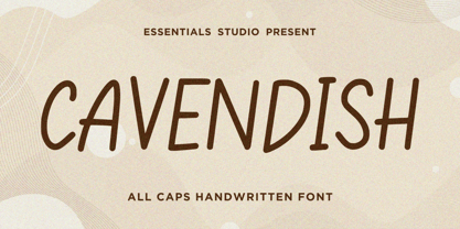 Introducing by Essentials Studio Proudly Present, CAVENDISH CAVENDISH Is a A Cute Handwritten Font CAVENDISH is perfect for product packaging, branding project, megazine, social media, wedding, or just used to express words above the background.
 - Donut & Candy by Tlatous Type,
$19.00 Introducing Donut & Candy by Tlatous Type. Dinut & Candy is a Modern Handwritten Font. This font is perfect for product packaging, branding project, megazine, social media, wedding, or just used to express words above the background.
 - Santaria by Essentials Studio,
$16.00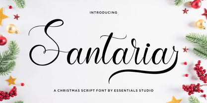 Introducing by Essentials Studio Proudly Present, Santaria Santaria Is a Modern Christmas Script Font Santaria is perfect for product packaging, branding project, megazine, social media, wedding, or just used to express words above the background.