10,000 search results
(0.02 seconds)
- Aku Cinta by MC Creative,
$10.00 Aku Cinta is monoline script font which natural movement and romance style. is perfect for branding projects, logo, wedding designs, social media posts, advertisements, product packaging, product designs, label, photography, watermark, invitation, stationery and any projects that need handwriting taste. What’s Included : Standard glyphs Ligature Works on PC & Mac Simple installations Accessible in the Adobe Illustrator, Adobe Photoshop, Adobe InDesign, even work on Microsoft Word. PUA Encoded Characters – Fully accessible without additional design software. Fonts include multilingual support for; ä ö ü Ä Ö Ü ß ¿ ¡
 - Keithey by Enigma Lettering Studio,
$16.00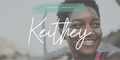 Introducing by Enigma Lettering Studio Proudly Present, Keithey Kithey is a Signature Style Font Keithey is perfect for product packaging, branding project, megazine, social media, wedding, or just used to express words above the background. Keithey also come with Multi-Lingual Support. We highly recommend using a program that supports OpenType features and Glyphs panels like many of Adobe apps and Corel Draw, so you can see and access all Glyph variations. Enjoy the font, feel free to comment or feedback, send me PM or email.
 - Angela Sweet by Illushvara,
$12.00 Hello, Happy to share our new font "Angela Sweet" is a beautiful modern font, described by an crafty touch, perfect for your favorite projects. Fall in love with its incredibly distinct and timeless style and use it to create spectacular designs! Angela Sweet is perfect for product packaging, branding project, magazine, social media, wedding, or just used to express words above the background Features : - Uppercase and lowercase - Numbers - Symbols - Multilingual Accent If you have any question, don’t hesitate to contact me. Happy Designing !!! Thank You, Bayu Suwirya
 - Hallysoon by MC Creative,
$9.00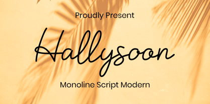 Hallysoon is monoline script font which natural movement and elegant for signature style. is perfect for branding projects, logo, wedding designs, social media posts, advertisements, product packaging, product designs, label, photography, watermark, invitation, stationery and any projects that need handwriting taste. ________________________________________ What’s Included : • Standard Glyphs • Ligature • Works on PC & Mac • Simple installations • Accessible in the Adobe Illustrator, Adobe Photoshop, Adobe InDesign, even work on Microsoft Word. • PUA Encoded Characters – Fully accessible without additional design software. • Fonts include multilingual support for; ä ö ü Ä Ö Ü ß ¿ ¡________________________________________
 - Asher Punk by Allouse Studio,
$16.00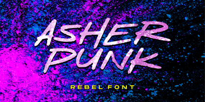 Proudly Presenting, Asher Punk a Rebel Handwritten Font. Asher Punk is perfect for any tittles, logo, product packaging, branding project, megazine, social media, wedding, or just used to express words above the background. Asher Punk also come with Multi-Lingual support. We highly recommend using a program that supports OpenType features and Glyphs panels like many of Adobe apps and Corel Draw, so you can see and access all Glyph variations. Enjoy the font, feel free to comment or feedback, send me PM or email. Thank You!
 - Delisha by Nissa Nana,
$20.00 Delisha is a beautiful script font. It has a classy, elegant, and modern look which can be used for logos, branding, invitations, stationary, wedding designs, social media posts, and every other design which needs a handwritten touch. What's included: Delisha OTF Numeral and Punctuation Stylistic Alternates , Ligatures, and Swashes International Language Works on PC & Mac Simple installations Accessible in Adobe Illustrator, Adobe Photoshop, Adobe InDesign, even works on Microsoft Word. Thank you for your purchase! Hope you enjoy with our font! Best Regards, Nissa Studio
 - Naofumi by Allouse Studio,
$16.00 Proudly Present, Naoufumi a Rough Brush Font. Naofumi come along with Multi-Lingual Support to fulfill your need. We highly recommend using a program that supports OpenType features and Glyphs panels like many of Adobe apps and Corel Draw, so you can see and access all Glyph variations. Naoufumi is perfect for any tittle, product packaging, branding project, megazine, social media, wedding, or just used to express words above the background. Enjoy the font, feel free to comment or feedback, send me PM or email. Thank You!
 - Hettada by MC Creative,
$9.00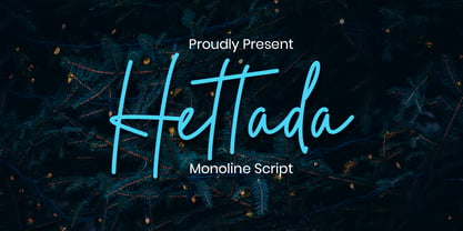 Hettada is monoline script font which natural movement and elegant for handwritten style. is perfect for branding projects, logo, wedding designs, social media posts, advertisements, product packaging, product designs, label, photography, watermark, invitation, stationery and any projects that need handwriting taste. What’s Included : Standard Glyphs Ligature Works on PC & Mac Simple installations Accessible in the Adobe Illustrator, Adobe Photoshop, Adobe InDesign, even work on Microsoft Word. PUA Encoded Characters – Fully accessible without additional design software. Fonts include multilingual support for; ä ö ü Ä Ö Ü ß ¿ ¡
 - Raphika by MC Creative,
$19.00 **Raphika** is handwritting script font which natural movement and elegant style. **Raphika** perfect for branding projects, logo, wedding designs, social media posts, advertisements, product packaging, product designs, label, photography, watermark, invitation, stationery and any projects that need handwriting taste. What’s Included : Standard glyphs Ligature Works on PC & Mac Simple installations Accessible in the Adobe Illustrator, Adobe Photoshop, Adobe InDesign, even work on Microsoft Word. PUA Encoded Characters – Fully accessible without additional design software. Fonts include multilingual support for; ä ö ü Ä Ö Ü ß ¿ ¡
 - Bhenay Signature by MC Creative,
$10.00 Bhenay Signature is script font which natural movement and elegant for signature style. is perfect for branding projects, logo, wedding designs, social media posts, advertisements, product packaging, product designs, label, photography, watermark, invitation, stationery and any projects that need handwriting taste. What’s Included : Standard glyphs Ligature Works on PC & Mac Accessible in the Adobe Illustrator, Adobe Photoshop, Adobe InDesign, even work on Microsoft Word. PUA Encoded Characters – Fully accessible without additional design software. Fonts include multilingual support for; ä ö ü Ä Ö Ü ß ¿ ¡
 - Katarine by Suitcase Type Foundry,
$75.00From today's point of view Katarine has a rather unusual origin. Initially an all-caps display face, what was to become the Medium weight of the family was augmented with a lower case, then the character set was completed by adding all the missing glyphs. The next step was the creation of the Light and the Bold weights with matching Italics. This working method compromised the relationships between the characters across the different weights After some consideration the decision was made to start over and draw the complete family from scratch. This time the "conventional" process was followed — first the Light and Bold weights were designed. Those extremes were used to interpolate the Regular, Medium and Semibold weights. When compared to the original, the glyphs of the new fonts are slightly wider. The construction of the letters is sturdy, with an x-height that varies from the heaviest to the lightest weights. The relationship of the stem weight between the horizontal and vertical strokes is carefully balanced. Characters are open and firm; the italics have room to breathe. The original fonts included two sets of small caps — Small Caps and Petite Caps. However neither set were suited for emphasis, with the Small Caps being too tall and the Petite Caps too short. We decided to replace them both with one set of traditional small caps, slightly taller than the x-height, perfectly suited for emphasis in text usage. The original version of Katarine was partly incorporated into the new OpenType versions. Thus most of the original arrows, frames and boxes can be found in the new Katarine. Each individual weight now contains 830 glyphs, nine sets of numerals, small caps, numerous ligatures and fractions. An additional font named Numbers contains numerals in circles and squares, and is now augmented with accented caps and a number of terminal alternatives, which can easily be accessed through stylistic sets. We also added two extra variants, Experts Regular and Experts Black (in inverted form). Katarine Std preserves the solid construction and excellent legibility of the original family, but has now become a fully featured OpenType typeface. Katarine is suited for a broad range of applications, from simple layouts to intricate corporate systems. It is the typeface of choice where the cold, austere character of modern sans serifs are inappropriate, yet simple shapes and good legibility are required. - Postea by TypeTogether,
$47.00 The Postea font family is Veronika Burian and José Scaglione’s take on German geometric typefaces, reshaped with the right attributes for setting paragraphs and headings, and perfect for branding and text use. Some typefaces are a rough tool, like a pumice rock: abrasive to the senses, unforgiving, and unhelpful for most reading situations. Postea is an obsidian: smooth and classy, with attractive nuances in any light. The classic curves and purposeful details keep its individuality intact while allowing it to fit an incredible range of geometric font needs. Because of these qualities, Postea makes normal reading in paragraphs a cinch and your branding memorable. Compared to midcentury attributes of restraint and a sparse appearance, Postea’s deliberate play between character widths injects life and distinctiveness into its personality. The default ‘t, f’ have lyrical doses akin to a robust evening drink and are rounded out with a serpentine ‘s’ and rotund ‘o, g, b’. Another nice surprise awaits: spacing for the Hairline weight is tighter for optimal use in large headings and titles, while the regular weights have the expected, slightly looser spacing for text. Setting the test word ‘bogarts’ brings all this together nicely, invoking a balance between a constructed and human feel while brushing away the dust from a century of derivatives. Postea is opinionated and its modern stylistic sets allow it to be accommodating with softer, specially-designed alternative characters. SS01 replaces ‘b, f, M, m, t’, while SS02 changes only the lowercase ‘a’ to the round style, and SS03 swaps out the angled ‘y’ for a straight version. The fourth and sixth stylistic sets are packed with wallpaper-worthy geometric patterns, ornaments, arrows, and symbols aplenty. Postea’s 14 styles (seven upright and italic) and two variable fonts are accompanied by an all-new family of icons in three weights, which we developed a new, easy way to activate. Simply bookend the desired icon name with colons (:arrowUp: :chargingStation: :aid: :firstAid:), making sure to capitalise each word after the first word, then highlight and activate SS05. Icons include wayfinding, social interface, sanitary precautions like face masks, thermometers, and hand washing, and much more. Postea is resilient in the number of ways the family can be used, and its recognisable characters make it a prime selection for branding, signage, corporate typefaces, and magazines. Beginning with midcentury virtues, Postea is the rational response for text — a lyrical take on geometric sans serifs.
 - Morris Sans by Linotype,
$40.99 Morris Sans is a newly revised and extended version of a small geometric family of typefaces originally produced by Morris Fuller Benton in 1930 for ATF. His initial design consisted of an alphabet of squared capital letters with a unique twist that characterized its appearance: corners with rounded exteriors and right-angle interiors. The types were intended for use in the fine print found on business cards, banking or financial forms, and contracts. But over the ensuing decades, this design became a popular element in all sorts of design environments, and several foundries revived the typeface in digital form. Since digital fonts are bicameral, with slots for both upper and lowercase letters, new cuts of the type opted filled the lowercase slots with small caps. In 2006, Linotype commissioned its own version of the typeface-an extension for 21st century use. Under the advisement of Linotype's type director Akira Kobayashi, Dan Reynolds redrew the uppercase and added an original lowercase for the first time. Additionally, a number of extras were brought into the fonts, including six figure styles (tabular and proportional lining figures, tabular and proportional oldstyle figures, and special tabular and proportional small cap" figures). Small caps, which have become an iconic element over time, are accessible in each font as an OpenType feature. To differentiate this version from the original, Linotype's new family is named Morris Sans, in honor of Morris Fuller Benton. All fonts in the Morris Sans family are OpenType Com fonts; they include a character set capable of setting 48 European languages that employ the Roman alphabet, including all Central and Eastern Europe languages, those from the Baltics, and Turkish. This glyph coverage extends to the small caps as well. Morris Sans is a wide typeface, especially in its regular widths; the condensed faces set a more conventional line of text. The new lowercase letters are less geometric than the uppercase, except for those that share the same basic forms (e.g., c, o, and s). Instead of following this geometric trend, the new lowercase tends to strengthen the humanist elements that were present in several characters from the original type, including the uppercase D and the figures 5, 6, and 9. Morris Sans also sports a number of glyphic flares, like the stroke found on the original uppercase Q. Morris Sans is a clean, modern design best suited for headlines, advertising, posters, expressive signage (especially on storefronts), and corporate identity work."
 - Gundrada ML by HiH,
$12.00 Gundrada ML was inspired by the lettering on the tomb of Gundrada de Warenne. She was buried at Southover Church at Lewes, Sussex, in the south of England in 1085. The Latin inscription on her tomb, STIRPS GUNDRADA DUCUM, meaning “Gundrada, descendant of the Duke” may have led to the speculation that she was the daughter of William, Duke of Normandy and bastard son of Robert the Devil of Normandy and Arletta, daughter of a tanner in Falaise. In 1066 William defeated Harold at the Battle of Hastings and was crowned William I of England. More commonly known as William the Conquerer, he commissioned a string of forts around the kingdom and charged trusted Norman Barons to control the contentious Anglo-Saxon population. William de Warenne, husband of Gundrada, was one of these Barons. There has also been the suggestion that Gundrada may have been the daughter of William’s wife, Matilda of Flanders, by a previous marriage. According to the Dictionary of National Biography (Oxford University Press, Oxford, England 1921-22), both of these contentions are in dispute. Searching the past of a thousand years ago is like wandering in a heavy fog: facts are only dimly in view. Regardless, I know that I found these letterforms immediately engaging in their simplicity. Unadorned and unsophisticated, they have a direct honesty that rests well in the company of humanistic sans serifs like Franklin Gothic or Gill Sans, appealing to a contemporary sensibility. The lettering on the tomb is in upper case only. Although Gundrada does not sound Norman French to me, her husband certainly and her father probably were Norman French. Nonetheless, the man that carved her tombstone was probably Anglo-Saxon, like most of the people. For that reason, we are quite comfortable with a fairly generic lower case from an Anglo-Saxon document of the time. The time was a time of transition, of contending language influences. This font reflects some of that tension. Features 1. Multi-Lingual Font with 389 glyphs and 698 Kerning Pairs. 2. OpenType GSUB layout features: onum, dlig, liga, salt & hist. 3. Tabular Figures and Alternate Old-Style Figures. 4. Alternate Ruled Caps (line above and below, matching to brackets). 5. Central Europe, Western Europe, Turkish and Baltic Code Pages. 6. Additional accents for Cornish and Old Gaelic. 7. Stylistic alternates A, E, y and #. 8. Ligatures ST, Th, fi and fl. 9. Historic alternate longs. The zip package includes two versions of the font at no extra charge. There is an OTF version which is in Open PS (Post Script Type 1) format and a TTF version which is in Open TT (True Type)format. Use whichever works best for your applications.
 - Graffiti Drips by m u r,
$15.00 Capitals are messy. Lowercase letters are clean. A drippy, runny, messy graffiti font.
 - Sonata Allegro by Tamar Fonts,
$35.00 “The Emperor Has Clothes” Like in music — the Allegro Sonata form consists of three main sections—the Exposition (section), the Development, and the Recapitulation — so in regard to this Allegro Sonata font family — there is an Exposition (font), a Development, and a Recapitulation—in which each theme is restated alongside its development material. While the Recapitulation font is perfect for titling and branding, the Exposition is perfect for branding {as demonstrated in the Inspiration Gallery pertaining this font} as well as being a comfortable read in long runs of text. The Exposition rounded, mono-line, with great x height, contemporary—A Synthesis Between Geometric & Hand-drawn—font, is at times geometric and at times hand drawn; in the end it all came down to finding the balance in a typeface between the robustness needed to function as a text face and enough refinement to look good as a display font. Following the Exposition, comes the Development (section), decorative, botanic-like, exuberant and playful font, signifying ABUNDANCE [of possibilities] & BENEVOLENCE—in regard to each theme/character, and to demonstrate—that 'structures' in music, are solid structures—like architecture {contrary to the words of J. W. von Goethe, who said: “Music is liquid architecture; Architecture is frozen music”}, just in some spiritual domain that is far beyond one's physical senses to grasp. Like in my art and music works in which I consider its 'Texture' element of vital importance, so is the case when it comes to type, as apparent in my previous Phone Pro/Polyphony font, as well as in this current Sonata Allegro/Development font. Each glyph has its own uniqueness, and when meeting with others, will provide dynamic and pleasing proximity. And due to the [individualistic] nature of this Development font, just a minimal amount of kerning/pairing were necessary... The development font is an extravagant design that looks best when used at large sizes—perfect for titling, logo, product packaging, branding project, wedding, or just used to express words against some [light or dark] background. Finally, “The (Exposition Font) Emperor Has (the Development Font) Clothes!” As said, there are three fonts/styles altogether in this Sonata Allegro type family, designed with the intention of harmonizing between Latin and Hebrew, which makes it an ideal font for the side-by-side use of Latin and Hebrew characters. However, they are being sold separately (kindly search for “Sonata Allegro Hebrew” on this MyFonts site), so they are economical for those interested just in either one of them. My aim is to shake up the type-design world with a range of distinctive fonts which break away from the generic letterforms, to make your design projects stand out—as a graphic designer, add this font to your most creative ideas for projects. This typeface has [lots of ligatures /] OpenType features, to enhance your designs even more — happy designing! Sonata Allegro Features: · 3 Weights/Styles · Multilingual Support · Proportional Figures & Ligatures While using this product, if you encounter any problem or spot something we may have missed, please don't hesitate to write to us; we would love to hear your feedback—in order to further fine-tune our products. Copyright Tamar Fonts/Hillel Glueck 2022 ALL RIGHTS RESERVED Any unauthorized distribution of my work is strictly prohibited, and will be prosecuted; do the right thing, and do not participate in the piracy of my typefaces; if you appreciate my work, then please pay for it and help me prosper — thank you!
 - Sonata Allegro Hebrew by Tamar Fonts,
$35.00 “The Emperor Has Clothes” Like in music — the Allegro Sonata form consists of three main sections—the Exposition (section), the Development, and the Recapitulation — so in regard to this Allegro Sonata font family — there is an Exposition (font), a Development, and a Recapitulation—in which each theme is restated alongside its development material. While the Recapitulation font is perfect for titling and branding, the Exposition is perfect for branding {as demonstrated in the Inspiration Gallery pertaining this font} as well as being a comfortable read in long runs of text. The Exposition rounded, mono-line, with great x height, contemporary—A Synthesis Between Geometric & Hand-drawn—font, is at times geometric and at times hand drawn; in the end it all came down to finding the balance in a typeface between the robustness needed to function as a text face and enough refinement to look good as a display font. Following the Exposition, comes the Development (section), decorative, botanic-like, exuberant and playful font, signifying ABUNDANCE [of possibilities] & BENEVOLENCE—in regard to each theme/character, and to demonstrate—that 'structures' in music, are solid structures—like architecture {contrary to the words of J. W. von Goethe, who said: “Music is liquid architecture; Architecture is frozen music”}, just in some spiritual domain that is far beyond one's physical senses to grasp. Like in my art and music works in which I consider its 'Texture' element of vital importance, so is the case when it comes to type, as apparent in my previous Phone Pro/Polyphony font, as well as in this current Sonata Allegro/Development font. Each glyph has its own uniqueness, and when meeting with others, will provide dynamic and pleasing proximity. And due to the [individualistic] nature of this Development font, just a minimal amount of kerning/pairing were necessary... The development font is an extravagant design that looks best when used at large sizes—perfect for titling, logo, product packaging, branding project, wedding, or just used to express words against some [light or dark] background. Finally, “The (Exposition Font) Emperor Has (the Development Font) Clothes!” As said, there are three fonts/styles altogether in this Sonata Allegro type family, designed with the intention of harmonizing between Latin and Hebrew, which makes it an ideal font for the side-by-side use of Latin and Hebrew characters. However, they are being sold separately (kindly search for “Sonata Allegro Hebrew” on this MyFonts site), so they are economical for those interested just in either one of them. My aim is to shake up the type-design world with a range of distinctive fonts which break away from the generic letterforms, to make your design projects stand out—as a graphic designer, add this font to your most creative ideas for projects. This typeface has [lots of ligatures /] OpenType features, to enhance your designs even more — happy designing! Sonata Allegro Features: · 3 Weights/Styles · Multilingual Support · Proportional Figures & Ligatures While using this product, if you encounter any problem or spot something we may have missed, please don't hesitate to write to us; we would love to hear your feedback—in order to further fine-tune our products. Copyright Tamar Fonts/Hillel Glueck 2022 ALL RIGHTS RESERVED Any unauthorized distribution of my work is strictly prohibited, and will be prosecuted; do the right thing, and do not participate in the piracy of my typefaces; if you appreciate my work, then please pay for it and help me prosper — thank you!
 - Limon by Typesenses,
$49.00 Limon was entirely hand drawn and carefully digitised to get accurate curves but keeping the handmade look. The script fonts are smart scripts, plenty of alternates designed to preserve the calligraphic rhythm. Limon is a beautiful option for menus, magazine covers, wedding invitations, cards and all kind of stationery, packaging and labels. Default positional forms appear while you are writing when Standard Ligatures and Contextual Alternates features are on. Just keep them activated and let Limon Script do the rest. It warrants that all the connections will look good. Also, you can activate stylistic alternates, swash, titling and stylistic sets to have options for capitals, initials and terminals. Each Script Font reaches a total of more than 2900 glyphs (languages for every alternate included). Use professional software that widely support Open Type features. Otherwise, you may not have access to some glyphs. For further information about features and alternates, see the User Guide. Limon has extensive Western, Central and Eastern European language support. Limon Script matches very well with Dress and Chonky When life gives you Limon, make a beautiful design!
 - Matrijs by Hanoded,
$10.00 Matrijs is the Dutch word for mold. It comes from the Latin word for mother or womb and is somewhat similar to the English word Matrix. Matrijs is a handmade Garamond which can be used for a wide range of projects.
 - Fruitygreen by Linotype,
$29.99 Fruitygreen is Indonesian designer Andi AW. Masry's second typeface following Coomeec™. Idiosyncratic but appealing forms are the signature feature of Fruitygreen™ and provide this new typeface with its truly distinctive character that you can utilize for your projects - and not just in headlines. The unique forms of fruits are not only individually fascinating, but are just as captivating when they are brought together, for example as decoration on a dining table. For Masry, these can be compared with an alphabet whose letters spell out in combination different words and with this as his inspiration, he based his designs for Fruitygreen on the versatile forms of fruits. However, it was not the whole fruits as such but rather small sections of their curves and ends that he decided to use. It is not only because of the characteristic line terminals that the rounded characters of Fruitygreen seem at first glance reminiscent of a brush-written calligraphic typeface; these are traces of the creation process, in which Masry used a digital brush. At the same time, Fruitygreen is by no means simply a brush font. Its dynamic characters reference biological forms and there is definitely something amoeba-like about them, particularly in the bolder variants, and they exude the same serenity and harmony that is inherent to organic structures. The many unconventionally shaped characters also provide for optical contrast. There is, for example, the very scaled down g", the open "q" and the lowercase "r", which has the form of the capital letter. Other letters, such as the sinuous "k" and the rounded uppercase "F" impart an exotic touch to Fruitygreen. Similarly remarkable is the "@", that has only a semi-circle. Available to the designer are other characters that can be used to accentuate a design, such as swash capitals and numerous ligatures. And, last but not least, there are also various numeral sets with oldstyle and lining figures for setting proportional text and table columns together with a selection of symbols, such as arrows and, appropriately, fruits. "
 - Museum Ornaments by T4 Foundry,
$7.00Museum Borders and Ornaments is part of a typographical treasure, the Norstedts type collection in Sweden. Type designer Torbjörn Olsson has painstakingly translated the original 34 Ornament matrices in the collection to Open Type. Among them are several of Granjon's arabesques, as well as symbols from both Swedish and Danish typefoundries. The signs were cut in the 16th, 17th and 18th centuries. The old Swedish name for these "type trademarks" were "rössjor". Museum Borders and Ornaments is an OpenType creation, for both PC and Mac. Swedish type foundry T4 premiere new fonts every month. Museum Borders and Ornaments is our tenth introduction. Museum Borders and Ornaments is part of the growing Museum type family. Museum also includes Museum Tertia Cursive, an exquisite 1700's typeface with modern additions, and Museum Fournier, a set of Rococo capitals designed by Pierre Simon Fournier le Jeune circa 1760. - Quarzo by Corradine Fonts,
$39.95 This script font is inspired by the flexible nib strokes to create a concatenation of refinement with character mixing the contrast with pronounced but rounded angles. This angles along with the inktraps give the font a better performance when printing. Texts will have a very even rhythm due to its consistency on the stroke’s angle and spacing. The words can receive a dramatic touch by using the wide range of glyphs with curly and refined ornamentation. There are lots of caps and number variants dressed up with a variety of swashes. Also, two sets of versatile ornaments will be found: a first set of ending flourishes that match with any lowercase letter and a second set of independent flourishes to be placed around the words. Quarzo will give a great sophistication level to invitations, cards, tags, menus, advertising and packaging. Its character map covers Western and Central European characters.
 - Planet Adventure by Putracetol,
$28.00 Introducing PLANET ADVENTURE - SCIFI FONT. This font is inspired by techno circuit boards, combined with the scifi font type. PLANET ADVENTURE is great for any kind of display purpose from logos, Tshirt, apparel, product packaging, tittle header, poster, merchandise, social media, labels, branding. The alternative characters were divided into several Open Type features such as Swash, Stylistic Sets, Stylistic Alternates, Contextual Alternates, and Ligature. The Open Type features can be accessed by using Open Type savvy programs such as Adobe Illustrator, Adobe InDesign, Adobe Photoshop Corel Draw X version, And Microsoft Word. This font is also support multi language.
 - Amaro by Autographis,
$39.50 Amaro is the Italian word for bitter (amaro) herbal drinks like Ramazotti, Averna and a trillion lesser known ones. These liquors were the literal base for this elaborate set of four fonts. Each has different uppercase letters and some of the lowercase letters vary as well. Amaro-A, B, and C can be mixed freely. The Amaro-D has underlining swashes in two different lengths, the uppercase has the shorter underlines and the lowercase the longer ones. I throw these in for free and the entire set is very reasonably priced. Enjoy and cheers to you!
 - Robusto by Galapagos,
$39.00Thirteen or 14 years ago I admired, out loud, a book I found on a shelf in Matt Carter's office. That Christmas I was pleasantly surprised to find that Matt had found another copy of the book and he gave it to me. The book was about the life of Oswald Cooper and it contained numerous specimens of Cooper's lettering jobs. Among them was an interesting image of 7 letter that spelled out the word 'Robusto'. These letters were used as the model for the font Robusto. All I needed to do was develop 221 other glyphs to finish the font. - Galatia Script by Amarlettering,
$15.00 Galatia Script comes with 444+ glyphs. The alternative characters were divided into several OpenType features such as Swash, Stylistic Sets, Stylistic Alternates, Contextual Alternates. The OpenType features can be accessed by using OpenType savvy programs such as Adobe Illustrator, Adobe InDesign, Adobe Photoshop Corel Draw X version, And Microsoft Word. This Font has PUA unicode (specially coded fonts) so that all the alternate characters can easily be accessed in full by a craftsman or designer. Galatia Script Contains: - Uppercase & Lowercase - International Language & Symbols - Punctuation & Numbers - PUA Unicode - Stylistic Alternates - Stylistic Set 1-19 - Contextual Alternates - Galatia script.OTF
 - Aparo by DSType,
$40.00 Typography or Calligraphy. Unconnected or Connected. For us, at DSType Foundry, that was the main question. With Aparo, we tried to bring the best of the two worlds into a single, yet complex, typeface. Aparo appears to be a very simple bold italic roman typeface, but it has plenty of calligraphic flair, including swashes that make your words stand out, collision detectors so that you don't get weird combinations, alternate characters activated by default for improved calligraphic effect and a very extended character set in a total of 897 glyphs. Download our detailed type specimen for complete information on Aparo.
 - Blueberry Jam by Hanoded,
$15.00 I love blueberries. When my brother and I were young, we used to pick them in the forest by the bucket. Afterwards, we’d always look like victims of a serial killer, but it was all worth it, as nothing quite tastes likes homemade blueberry jam. I don’t know why I named this cute little font Blueberry Jam. Maybe I was craving some… Blueberry Jam is a highly legible, extremely cute and very handmade font. It would look good on just anything, but book covers, product packaging and homemade jam labels come to mind. Blueberry Jam comes with a bucketload of diacritics.
 - Willow by Adobe,
$29.00Willow is an Adobe Originals typeface designed in 1990 by Joy Redick for the Adobe Wood Type series. Willow is a condensed typeface modeled on nineteenth-century wood types known as Clarendons (wood type Clarendons do not resemble the English metal types of that name). Clarendon condensed faces were originally so well-designed that words or a line of display type have an even color that is remarkable for wood types. Taken from proofs of type in the Rob Roy Kelly Collection housed at the University of Texas at Austin, Willow can be used for display work such packaging, advertising, and posters. - Narrow Deco JNL by Jeff Levine,
$29.00 The hand lettered word ‘puzzles’ from the box cover of a 1940s set of metal “connected” puzzle pieces manufactured by the A.C. Gilbert Company was the initial typographic model, but some additions and changes were made. Instead of the right side of the ‘P’ being a semi-circle, it was changed to a more conservative ‘’squared’ look. After drawing out all of the necessary glyphs, the overall height of the characters was extended to make the letters and numbers appear taller and narrower. The end result is Narrow Deco JNL, which is available in both regular and oblique versions.
 - Jantan by Sulthan Studio,
$13.00 Jantan is a new fresh & modern script with a handmade calligraphy style, decorative characters and a dancing baseline! So beautiful on invitation like greeting cards, branding materials, business cards, quotes, posters, and more. The alternative characters were divided into several OpenType features such as Stylistic Alternates, and Ligatures. The OpenType features can be accessed by using OpenType savvy programs such as Adobe Illustrator, Adobe InDesign, Adobe Photoshop Corel Draw X version, And Microsoft Word. And this Font has given PUA unicode (specially coded fonts). so that all the alternate characters can easily be accessed in full by a craftsman or designer.
 - LiebeRobots by LiebeFonts,
$19.90 LiebeRobots is not your average collection of mean termination machines. LiebeRobots are friendly and polite. Some are from Mars, some from Venus, and some are probably from Germany. Most are from the future, some are from the past. And a handful are even from the 60s. LiebeRobots probably is the most comprehensive collection of hand-drawn robots ever. They look great on almost any greeting card, birthday card or invitation. LiebeRobots also serve as a perfect companion to any informal graphic design that needs a personal, handmade touch.
 - Tinkuy Patterns by Sudtipos,
$29.00 Meaning of Tinkuy. Tinkuy is a Quechua word that means a meeting of opposing forces that complement each other. A meeting of opposites and differences. A meeting point where different thoughts, interests, feelings and aspirations confront and converge, providing the resurgence of new ways of thinking and that are embodied in confrontational actions, in mobilizations that seek change. Tinkuy patterns is born from the analysis of different archaeological pieces of native cultures of the Andes, where the visual signs that are recorded on them are related to the concept of encounter. It is part of the research project Crónicas Visuales del Abya Yala by designer Vanessa A. Zúñiga Tinizaray. — The Tinkuy Patterns. The Tinkuy Patterns system is divided into six files containing a total of more than 2650 modules that can be combined together creating an infinite range of possibilities. The digitization of the typeface family has been carried out by Ale Paul, through the Sudtipos foundry. An infinite number of possible combinations can be accessed by using the letters on the keyboard. Although a certain shape predominates in each set, they can be combined with each other.
 - Weg by Huerta Tipográfica,
$18.00 WEG* font is an experimental type system where legibility isn’t the focus. This project studies how glyphs are constructed and how their ductus can be modified. I explored how far I can move the limits if I don’t worry about the legibility. In Weg, letters are built by a single line that connects them, along with words and paragraphs. When weight decreases, the legibility of the signs increases. This is the first stage. It’s a project in expansion. The set contains uppercase, lining figures and basic punctuation in three weights: Regular, Light and Thin. The current supported languages are Spanish, Guaraní and English. If you need any other language, please let me know. I would like to expand the character set. Second stage project WEG is an experimental in-expansion font family. Here I present to you the second stage. I’m planning the first upgrade for middle 2021. I’m preparing a pattern set for July 2021. Here you can see the first four patterns. If you buy the font before July 2021, you’ll get this upgrade! • Second stage April - July 2021: pattern set (first four ready). • This upgrade will be available on August 2021.
 - ITC Schuss Hand by ITC,
$29.99Designed by German graphic designer Jochen Schuss. ITC Schuss Hand and ITC Schuss Hand Bold can probably best be described as excellent all around scripts useful for a broad spectrum of advertising purposes as well as for those applications that benefit from a refined handwritten appearance. The characters themselves have a soft, almost “liquid” appearance which is enhanced by the subtle swelling at most of the stroke terminals. The slightly condensed nature of the characters plus a relatively large x-height ensures that both weights are ideal for the advertising arena. An additional feature on ITC Schuss Hand and ITC Schuss Hand Bold are the capital letters which can actually be used on their own in word settings whereas most script capitals are designed just for initialing purposes. The designer has also invested a good deal of careful thought to the way in which a high percentage of the lowercase letter combinations overlap to create an authentic hand-scripted appearance. This, together with the italicized letter forms, will make Schuss Hand and Schuss Hand Bold ideal candidates for those occasions when paper correspondence requires an informal style. So, as is claimed, an excellent all around script style. - Linotype Punkt by Linotype,
$29.99 Linotype Punkt, from US designer Mischa Leiner, is part of the TakeType Library, chosen from the entries of the Linotype-sponsored International Digital Type Design Contest 1999 for inclusion on the TakeType 3 CD. This font, from US designer Mischa Leiner is available in three weights, light, regular and bold. The basic forms are those of a robust sans serif, however the figures are composed of evenly placed dots, hence the name Punkt, the German word for dot. This distinguishing characteristic lets this font look as though it appears on a background of light. One other unique trait of this font is the nature of the three weights. The figures of each weight have exactly the same measurements, the same width, breadth, etc. The only variable measurements are those of the individual dots making up the forms, making the bold weight much darker than the light while retaining the same outer contours. Linotype Punkt should be used in larger point sizes, as when it is too small the dots blur together and rob the font of its 'light'. The font is therefore best for headlines in large and very large point sizes.
 - Shibori by Dumadi,
$35.00 Meet our new brand font design, Shibori which is designed and created by Dumadistyle. Shibori is a playful typeface font created for a multipurpose creative fun project. Its fun, cheerful and joyful characteristics are designed for children-friendly product display. Kids storybook cover, youtube for kids thumbnail, the font will surely be sparkling the joy. What’s Included : + Shibori (OTF) + Standard glyphs + Style Alternate + Ligature + Works on PC & Mac, Simple installations + Multilingual Accent This Font Support Languages : Afrikaans, Albanian, Asu, Basque, Bemba, Bena, Breton, Catalan, Chiga, Cornish, Danish, Dutch, English, Estonian, Faroese, Filipino, Finnish, French, Friulian, Galician, German, Gusii, Indonesian, Irish, Italian, Kabuverdianu, Kalenjin, Kinyarwanda, Luo, Luxembourgish, Luyia, Machame, Makhuwa, Meetto, Makonde, Malagasy, Manx, Morisyen, North, Ndebele, Norwegian, Bokmål, Norwegian, Nynorsk, Nyankole, Oromo, Portuguese, Quechua, Romansh, Rombo, Rundi, Rwa, Samburu, Sango, Sangu, Scottish, Gaelic, Sena, Shambala, Shona, Soga, Somali, Spanish, Swahili, Swedish, Swiss, German, Taita, Teso, Uzbek (Latin), Volapük, Vunjo, Zulu. Accessible in Adobe Illustrator, Adobe Photoshop, Adobe InDesign, even work on Microsoft Word. PUA Encoded Characters – Fully accessible without additional design software. Fonts include multilingual support + Image used: All photographs/pictures/vectors used in the preview are not included, they are intended for illustration purposes only. Thanks
 - Axeo by Asritype,
$13.00 Axeo is a freeform serif typeface. With more than 500 glyphs for each cut, Axeo supporting wide Latin Base Languages. The font structures is sans-serif typeface. Then, the fonts is made into serif (serifed) using rhombus and adapted/modified rhombus (before remove overlaps) placed on its appropriate positions. This fonts is released first, while the sans-serif is being in process. There are 10 fonts; 5 weight in normal width: Light, Regular, Medium, Bold, and Black; and 4 in semi-condensed: Light, Regular, Medium, Bold and Black, too. The fonts has some minor character variations, all are sets in SS01.There are also standard and discretionary ligatures, arrow, some geometric shapes and ornaments. With its sansserif structure, the Medium, Bold and Black fonts is playful with text effect in various applications such MS Word, CorelDraw or others to enhance the appearance. Its serif form will make unique enhancements. Thus, the fonts is suitable for Branding, logos, cards, advertisements, banners, display and more; for the main texts or its companions. While the light, regular and medium fonts can also be used as description text, card text, note, caption and longer non-formal texts or other usages.
 - Ellie Script by Fenotype,
$25.00 Ellie Script is a hand drawn signature style typeface. Ellie is great for branding, headlines, invitation cards, poems, posters or as a logotype. Boasting over 600 glyphs, Ellie is equipped with handy OpenType features - Contextual Alternates and Standard Ligatures are automatically on and they help to keep the connections smooth and text varied to simulate hand writing. In addition Ellie Script is equipped with Swash and Stylistic Alternates that can be used for more customised look and in addition it has Stylistic Alternates that can be used for long end swash to a word. If that isn’t enough there are also Discretionary Ligatures: certain letter pairs like th, lt, or, is are made into more showy. They work best in shorter texts. Ellie has three ampersands and two sets of numerals, and even more alternates can be found from the Character Window. Ellie Script is PUA encoded so you can access the extras in most graphic design softwares. Ellie Script Ornaments is a set of strokes and arrows with the same look so that they can be used to complement layouts with Ellie Script. Have fun!
 - Ongunkan Ogham by Runic World Tamgacı,
$50.00 This font is a latin based version of the ogham alphabet used in the writing of the old irish language. It can be used on Latin keyboards. I will make a unicode font version of this font in the future. Ogham (/ˈɒɡəm/ OG-əm, Modern Irish: [ˈoː(ə)mˠ]; Middle Irish: ogum, ogom, later ogam [ˈɔɣəmˠ] is an Early Medieval alphabet used primarily to write the early Irish language (in the "orthodox" inscriptions, 4th to 6th centuries CE), and later the Old Irish language (scholastic ogham, 6th to 9th centuries). There are roughly 400 surviving orthodox inscriptions on stone monuments throughout Ireland and western Britain, the bulk of which are in southern Munster. The largest number outside Ireland are in Pembrokeshire, Wales. The vast majority of the inscriptions consist of personal names. According to the High Medieval Bríatharogam, the names of various trees can be ascribed to individual letters. For this reason, ogam is sometimes known as the Celtic tree alphabet. The etymology of the word ogam or ogham remains unclear. One possible origin is from the Irish og-úaim 'point-seam', referring to the seam made by the point of a sharp weapon.