10,000 search results
(0.026 seconds)
- Blukade Script by FadeLine Studio,
$12.00 Blukade is a handwritten script with a style elegant, sweet and simple. Very suitable to meet your various design needs that are trending now, and also includes a set of Extras to add even more beauty.
 - Jungoat by BonjourType,
$12.00 Give your designs an authentic handmade feel. The Jungoat font is perfect for stationery, logos, social media or just using the word background above. Featured fonts: Uppercase, Lowercase, Numbers, Symbols, Accents, Alternative Styles, Swash, and also supports multilingual Thank you!
 - Compliments by E-phemera,
$20.00 Compliments was inspired by a few hand-lettered words on a 1930s brochure by Western Union entitled “The Yellow Blank is Correct for Every Social Need.” It is now available in OpenType format with contextual alternates for a better script effect.
 - Display Dots Two Serif by Gerald Gallo,
$20.00 Display Dots Two Serif is a display font not intended for text use. It, along with its sans counterpart were designed specifically for display, headline, logotype, branding, and similar applications. Display Dots Two Serif has an uppercase alphabet, numbers, and punctuation.
 - Lakeland JNL by Jeff Levine,
$29.00 Lakeland JNL was inspired by lettering seen on a vintage container of Yankee brand motor oil. Originally all-caps on the package, the remaining characters were developed to expand on this casual semi-script design which was popular during the 1940s.
 - Artlessness by sugargliderz,
$18.00 I used a technical pen to the trace the letters in an alphabet learning book for this font. Of course, I drew several letters by freehand as if I were practicing, and included all of them together as a Stylistic Set.
 - Westmore by Solotype,
$19.95Based on one of the earliest Tuscans, from Thorowgood's foundry. The original was very poorly rendered in 1822, but keep in mind that decorative types were still quite new in the early 1800s. We redrew it, but kept it recognizable. - Mintage by Prioritype,
$19.00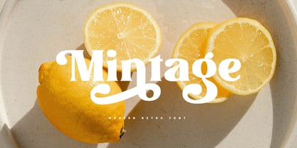 Introducing Mintage: Modern & retro font with a variety of alternative characters to make every word you make more eye-catching. Great for social media post designs, branding, merchandise, posters etc. Features: Uppercase, Lowercase, Numeral, Punctuation, Multilingual, Ligature, Alternates & PUA Encoded.
 - Kane by Device,
$29.00 Based on the Batman logo, this font (and a medium weight which is unreleased) were designed especially for Rian Hughes' "Batman: Black and White" comic book. It retains the signature reversed-stress weight distribution, seen to best effect on the A.
 - Printers Choice JNL by Jeff Levine,
$29.00 Banners, arrows with numbers, cartoon cuts, decorative elements and ad helpers make up the assortment of classic images found in Printers Choice JNL. Each were carefully re-drawn from vintage sources to offer a wide variety of topics and uses.
 - PR Foxtail 01 by PR Fonts,
$5.00 The bushy weed commonly known as foxtail provides the inspiration for this set of ornaments, and reveals its connection to the prairies. The appearance has an affinity to cowboy themed work and would combine well with wood type decorative text.
 - Sunlight JNL by Jeff Levine,
$29.00Sunlight JNL takes the classic wood type from Jeff Levine's Twelve Oaks JNL and shatters it with bursts of light for a novelty effect. Limited to a very basic character set, it's best used for short words and phrases in headlines. - Florry by Gleb Guralnyk,
$14.00 Florry is a modern, trendy, display typeface with a lot of ligatures that helps to make each word unique. It has a multilingual support. All available characters you can see on the 5th screenshot. Thank you & have a nice day!
 - Ru'ach by ITC,
$29.99Ru'ach is the work of British designer Timothy Donaldson, a dynamic, dry brush script typeface. The typeface should be set with close letter and word spacing. Donaldson's experiments with writing tools on different surfaces resulted in Ru'ach's strong, confident letterforms. - Wanderlust Letters by Cultivated Mind,
$29.00 Wanderlust letters is a beautiful hand painted script that comes with a set of extras. All letters have been carefully painted giving your words a wonderful flow. Wanderlust can be used for fashion, apparel, stationery, magazines, film, books and marketing.
 - Flomic by Sergey Melnikov,
$24.00 Ukrainian type designer Melnikov Sergey created Flomic font between 2015 and 2016. Flomic is a geometric sans built from a folded lines. Most effective when used in short words or phrases at larger sizes, where the details can be appreciated.
 - Ambie Skratch by Amber Phillips,
$15.00Ambie Skratch was inspired by grudge fonts, as well as rock music, and deconstructed art work. It was made by shacking a sharpie marker in a fast angled motion. Then these images were scanned and altered further on the computer. - Unstable by A New Machine,
$25.00 This almost-all-caps display font features a variable baseline to give it an unstable look. Also, the upper and lower cases differ slightly and can be used to add some alternates in words with letters next to each other.
 - Tenison by AVP,
$29.00 Tenison is a semi-formal script which echoes the way the designer was taught to write in school. It is not overly decorative and it is highly legible. All lowercase characters link with each other, just as we were taught.
 - Liquida by Resistenza,
$49.00 Liquida is a decorative script font with slanted inclination. All characters were designed with brush and walnut ink on paper using real ink drops to generate a trickling effect. A display typeface perfect to set a refreshing liquified lettering in seconds!
 - GretchenHello by Ingrimayne Type,
$9.95 GretchenHello is a typeface family of informal hand printing that looks as if it were done with a calligraphic pen. It has tall ascenders and long descenders that give it a certain elegance. The family has three weights, each with italics.
 - Adhesive Letters JNL by Jeff Levine,
$29.00 Adhesive Letters JNL was drawn from sample letters and numbers once manufactured by the Tablet and Ticket Company of Chicago. Originally sold under the brand name of Willson's, these gummed letters were available in a number of styles and sizes.
 - Gretel Script by Typejockeys,
$25.00 This quirky script is packed with features. Best of all: Optical sizes! The three style family is based on the writing of calligrapher Natascha Safarik. All glyphs were redrawn manually to produce vector shapes that look perfect in literally every size!
 - Santino by Sudtipos,
$39.00 Santino is a rounded monoline, post-bauhaus geometric font with smooth extremes and a touch of modern sensuality. It is named after Ariel "Negro" Di Lisio's son. The fonts were designed by Ariel Di Lisio and digitized by Alejandro Paul.
 - Goudy Heavyface by Bitstream,
$29.99This face was designed in 1925 as the Monotype answer to the very popular Cooper Black. Goudy is also quite similar in appearance to Ludlow Black and Pabst Extra Bold, both of which were also done in response to Cooper Black. - Oracle Bone by Okaycat,
$29.95 Oracle Bone is a font showing ancient glyphs which were used long ago for divination in China. In Chinese this oracle bone script is called "pinyin". Oracle Bone is a latin font with a pinyin glyph in place of each letter.
 - Disclover by Zang-O-Fonts,
$25.00Disclover came about when I was doodling on a pad of paper. I was thinking about contemporary font designs, and disclover came to mind. The original sketches were scanned and then re-drawn in Illustrator. The name is just made up. - Display Dots Two Sans by Gerald Gallo,
$20.00 Display Dots Two Sans is a display font not intended for text use. It, along with its serif counterpart were designed specifically for display, headline, logotype, branding, and similar applications. Display Dots Two Sans has an uppercase alphabet, numbers, and punctuation.
 - Vadstenakursive by Monotype,
$29.99The Vadstenakursiv font was inspired by letterforms first used in the Vadstena nunnery, Sweden, founded by Birgitta, later canonized Saint Birgitta and buried in Rome 1373. These letterforms were also used in documents for different guilds, and on commercial documents. - Huntsman by Solotype,
$19.95Issued from the Haddon Foundry in England. Most of their original faces had names beginning with H, like their own name. Some of their types were designed by Phil May, but we cannot guarantee that this is one of them. - Compact by ParaType,
$25.00 The typeface was designed at ParaType (ParaGraph) in 1991 by Vladimir Yefimov. Based on Anons by Gennady Baryshnikov. An extra condensed sans serif. For use in advertising and display typography. The decorative styles were added in 1997 by Alexander Tarbeev.
 - Bindweed by Solotype,
$19.95From an old wood type owned by a San Francisco printer. Wood types were customarily given somewhat generic names (Antique Tuscan) or, more frequently, numbers to identify them. Our clients liked colorful, easily-remembered names better, and so did we. - Alfereta by Solotype,
$19.95This popular type was manufactured by the Crescent Type Foundry of Chicago and sold on their behalf by a half dozen other foundries. Introduced in the early 1890s, just as tastes were swinging away from the excesses of the Victorian period. - Demian by ITC,
$29.99Demian is the work of Dutch designer Jan Van Dijk. It is an informal script font whose capitals should serve as initials to the word settings of the lower case letters. Demian has the spontaneous, flowing look of true handwriting. - Sumida Script by Hanoded,
$15.00 Sumida is a special ward in Tokyo AND the river running through the city. Sumida script is a nice, handwritten font, which was made using a sharpie pen. Sumida Script comes with double letter ligatures and an extensive language support.
 - Brownstone Sans by Sudtipos,
$59.00 One design sparks another. As Alejandro Paul experimented with the strokes and curves of the monoline script Business Penmanship, he discovered interesting new forms and shapes that didn't fit the Spencerian theme of that typeface. These forms simmered in Ale’s subconscious over the next three years, during which time he visited New York City, pored over rare type specimen books in the New York Public Library, and explored Brooklyn’s neighborhoods. Brownstone, the face born from these explorations, is an original 21st-century design, yet one subtly infused with historical and cultural references -- keen observers might spot influences from decorative typefaces of 19th-century foundries. And just as faces from that era were influenced by contemporary architecture, the frames included with Brownstone echo the ornate iron railings of Park Slope’s row houses. (There’s also a slight 1960s vibe to Brownstone, of novelty swash-sans photocompositing faces, that can be played up at your discretion.) Influences aside, Brownstone has broad appeal to modern audiences. A soft, monoline sans-serif, with elements of Swiss geometry (see the ‘k’ and ‘x’), its marriage of highly legible, draftsman-like letterforms with decorative swashes and ornaments reflects the old-meets-new aesthetic of the DIY craft culture seen in Brooklyn and other urban centers. It’s ornamental but unfussy, romantic but understated. Brownstone includes character sets for Latin-based languages, including Western and Eastern European, Baltic, Turkish, Maltese, Celtic and Welsh. Over 1500 glyphs, including small capitals, swash characters, alternates, and ligatures, in both Light and Thin weights. Ornamental frames are also included in both weights. The Brownstone Frames fonts are available as separate fonts in the new Brownstone Slab family.
 - Wordless Script by Sudtipos,
$59.00 We are very happy to announce the release of our first collaboration with master calligrapher, designer and illustrator Gabriel Martínez Meave from México. The first in the series of new designs is Wordless Script, an emotional calligraphic typeface published by Sudtipos. Speechless. Breathless. Wordless. There are letters that transcend simple functionality and sheer legibility, to be recognized instead by their style, their charm, their emotion. It’s like when we don’t remember the exact sentences, but we recall the tone of the voice of a loved one: it just doesn’t matter WHAT he or she said, but HOW he or she said it. Wordless Script is the font of choice for writing those things that go beyond words. Based on the connected-scripts of late 18th-century England, this typeface preserves the irregular finish and gestural strokes of the pointed nib. It is, so to speak, a personal rendition of the English roundhand as originally executed with the bird’s quill. Imbued with a Rococo, neoclassical, romantic spirit, Wordless radiates the gallantry of a time when the celebrated «douceur de vivre» that Talleyrand was so fond of was still alive and well; echoes of which still haunt us in our eclectic 21st-century, which has once again come to appreciate these magnificent styles of old. Wordless features alternate variants of most letters, ligatures and multiple calligraphic endings, ideal for elegant labels, high-end packaging and personalized stationery, as well as compositions for selected brands, exquisite titlings, verses, letters and short texts, like those meant to be read with the eyes only or intended for whispering into someone’s ear.
 - Astrid Grotesk by Eclectotype,
$40.00 Astrid Grotesk is a normalized version of Schizotype Grotesk. Normalized; not neutralized. Where many neo-grotesks appear cold with their harsh neutrality, Astrid has a warmth, eminating from its (for want of a better word) clunkiness. With the latest update, it becomes a true workhorse, with a range of widths and italics for the normal widths. Astrid Grotesk, while being clearly a neo-grotesk in appearance, has a personality all of its own. Standout characters include the f and t, and the default binocular g, unusual in neo-grotesks. And the right angled terminals on c, e and s. Stylistic sets offer up alternate forms of a, g, y, I, @, dutch IJ, german eszett and l. A full complement of numerals is included: proportional and tabular, lining and oldstyle, plus fractions, subscript and superscript. Note also that the tabular figures are duplexed across weights - very useful when highlighting specific entries in tables. The tabular figures feature also substitutes in fixed width (across all weights) comma and period, so your decimals line up perfectly always. Lastly, case sensitive forms of certain glyphs are included for all-cap settings. This typeface will be useful for corporate identities and branding work. It’s spaced more for text settings in the normal width, and gets more display-optimized as the width decreases, but with careful tracking, all styles can sing at display sizes. Bored of those other Swiss style typefaces? Astrid Grotesk could be the face you need to breathe new life into your designs. Coupled with Schizotype Grotesk, its more eccentric cousin, you've got an unorthodox branding system ready to use straight out of the box.
 - Corzinair by Typodermic,
$11.95 Introducing Corzinair—the typeface that exudes confidence and practicality. Its rugged serifs add a touch of grit and determination to any message. Perfect for businesses looking to make a bold statement, Corzinair was inspired by the iconic IBM Selectric typewriter fonts of the 1960s. Its wide, squarish shapes are reminiscent of a time when simplicity and functionality were the driving forces of innovation. Available in three weights—regular, bold, and italic—Corzinair is versatile enough to suit any design need. And with separate Small-Caps styles, it’s even easier to deploy on the web and in applications. Make your mark with Corzinair—the typeface that means business. Most Latin-based European writing systems are supported, including the following languages. Afaan Oromo, Afar, Afrikaans, Albanian, Alsatian, Aromanian, Aymara, Bashkir (Latin), Basque, Belarusian (Latin), Bemba, Bikol, Bosnian, Breton, Cape Verdean, Creole, Catalan, Cebuano, Chamorro, Chavacano, Chichewa, Crimean Tatar (Latin), Croatian, Czech, Danish, Dawan, Dholuo, Dutch, English, Estonian, Faroese, Fijian, Filipino, Finnish, French, Frisian, Friulian, Gagauz (Latin), Galician, Ganda, Genoese, German, Greenlandic, Guadeloupean Creole, Haitian Creole, Hawaiian, Hiligaynon, Hungarian, Icelandic, Ilocano, Indonesian, Irish, Italian, Jamaican, Kaqchikel, Karakalpak (Latin), Kashubian, Kikongo, Kinyarwanda, Kirundi, Kurdish (Latin), Latvian, Lithuanian, Lombard, Low Saxon, Luxembourgish, Maasai, Makhuwa, Malay, Maltese, Māori, Moldovan, Montenegrin, Ndebele, Neapolitan, Norwegian, Novial, Occitan, Ossetian (Latin), Papiamento, Piedmontese, Polish, Portuguese, Quechua, Rarotongan, Romanian, Romansh, Sami, Sango, Saramaccan, Sardinian, Scottish Gaelic, Serbian (Latin), Shona, Sicilian, Silesian, Slovak, Slovenian, Somali, Sorbian, Sotho, Spanish, Swahili, Swazi, Swedish, Tagalog, Tahitian, Tetum, Tongan, Tshiluba, Tsonga, Tswana, Tumbuka, Turkish, Turkmen (Latin), Tuvaluan, Uzbek (Latin), Venetian, Vepsian, Võro, Walloon, Waray-Waray, Wayuu, Welsh, Wolof, Xhosa, Yapese, Zapotec Zulu and Zuni.
 - Dever by insigne,
$24.00 Dever’s brute, industrial lines are rounded up in this new typeface from Jeremy Dooley. Dever combines plenty of inspirations. It’s the flair of the Wild West melded with a shout out to the sign painters and package lettering artists of the 1800s. Dever’s big, bold, and handy frame moves through all three of the family’s strapping members. First is the sans. No doubts on what this brother’s like. Dever Sans is as straight-forward as you’ll find in this family with its four separate weights and numerous distressed options. The second of the kin’s a bit of half-breed, you might say. Pointed serifs bring a sharpness to this outfit. Rounding out the family is Dever Wedge, a bit of wild rodeo all its own. This poke’s a quick draw with any of its 107 font, and with it’s auto-replacing alternates, no two repeating characters are alike. You’re guaranteed a great show anytime Dever leaves the chute. The route to Dever was long, with many a switchback. The Wedge variant was designed first, shelved, then developed into Plathorn. But I wanted to return to those brutish forms and decided to round out the family with a sans, serif and plenty of other options. Any of the Dever family have an extended character set including Central and Eastern European languages. The strong faces have specially adapted sub-families, too, so they’re bound and determined to have an outstanding impact at whatever size you use ‘em. It’s a hard ride ahead corralling all those words. Be sure and add these able-bodied boys to your posse today!