5,709 search results
(0.671 seconds)
- Stars & Love by Roland Hüse Design,
$22.00 Stars & Love is a bold, cursive brush calligraphy font, influenced by retro script style with a friendly rounded look and flourished elegance. It features stylistic alternates, contextual alternates, standard ligatures and terminal forms (beginning and ending characters are a bit different) that ensures multiple options for you to choose from for your design work. This font comes in two instances, a Bottom Heavy and a Regular version. Being friendly yet elegant in its visual presence, Stars & Love is perfect for Love theme designs, premium packaging, stationery design, invitations, posters, logos, custom products and more. The Character set covers most Latin languages. Font Guide PDF Font presentation video For feedback, customisation or extra character request please email me at fonts@rolandhuse.com Font Features: • Latin character set: Uppercase & Lowercase A - Z • Stylistic Alternates (up to 3 Sets) • Contextual Alternates (Initial and Final Forms) • Standard Ligatures • Underline Swashes (Stylistic alternates for underscore) • Numerals & Punctuation • Accented Characters • Symbols (Currencies and basic symbols such as @ # % etc.) Please refer to the Font Guide pdf for more details. To access all features of Stars & Love such as stylistic alternates etc., it's highly recommended to use professional design software such as Adobe Illustrator, Adobe Photoshop, Adobe InDesign or Procreate (via 'add text' feature).
 - London Boutique by Mans Greback,
$69.00 London Boutique is a bold and cute script font that combines rustic charm and fine art elegance. Its cursive strokes and handwriting style give it a personalized touch that is perfect for adding a decorative flair to your designs. Designed with a focus on independent shop usage, London Boutique features fine swashes that add a touch of sophistication to any project. Whether you're creating logos, branding, or social media posts, this font is versatile enough to handle it all. London Boutique comes in four styles: Regular, Italic, Bold, and Bold Italic. This range of styles provides flexibility and allows for dynamic and creative designs. Use underscore _ anywhere in a word to make a swash. Example: Luxure_Shops Use multiple underscores to make different swashes. Example: Angel___Stars Use # before or after any letter to make an initial or finishing swash. Example: #loveletter# The font is built with advanced OpenType functionality and has a guaranteed top-notch quality, containing stylistic and contextual alternates, ligatures and more features; all to give you full control and customizability. It has extensive lingual support, covering all Latin-based languages, from Northern Europe to South Africa, from America to South-East Asia. It contains all characters and symbols you'll ever need, including all punctuation and numbers.
 - Business Penmanship by Sudtipos,
$79.00 Business Penmanship is an ode to the business handwriting from the era penmanship was a highly-valued part of business education and practice. In the early 1800s, Platt Rogers Spencer (1800-1864) created what would become the most widely accepted and prized cursive writing method used in business. Before the American Civil War, Spencer was the undisputed king of handwriting. He was also an outspoken supporter of American business education. By the late 1800s business education included some focus on penmanship, and there were many colleges that specialized in it. One of the most influential penmanship schools was founded by Charles Paxton Zaner and his partner E. W. Bloser. Later on, in the early 1900s Austin Palmer introduced the Palmer Method of business penmanship, and it soon became the most popular handwriting system in the United States. Business Penmanship is a single feature-rich font that includes over 1100 characters, covering ligatures, alternates, a large set of beginning and ending extensions, as well as a wide range of Latin-based languages, including Turkish and the languages of Central and Eastern Europe and the Baltic region. To take advantage of all the OpenType features included in the font, please use within programs that support such advanced typography.
 - Peleguer by Tipo Pèpel,
$22.00 Peleguer typeface is the reinterpretation of the characters that the valencias goldsmiths Peleguer Manuel, father and son had opened and merged between 1779 and 1783 on behalf of the Royal Economic Society of Friends of the Land of Valencia “in order to create a Factory letters. Then during that time, reached 6 degrees of open letters (small pica, pica, gross pica, text, great primer and double pica). It appears that the letters never were done, and were themselves Manuel Peleguer who kept the punches and dies, leading to create a foundry-printing which only came out 5 or 6 books or documents for the single year of 1784 . One of these books, “Praise in the solemn funeral service …” made with the degree of “gross pica” samples were selected to take the characters for subsequent drawings on the following parameters for the unity and a contemporary look to the source: Keep the proportions of the original source (but unifying the shapes of the serifs, as these were different according to repose at baseline or in descending order). Match the counterforms and match the fallen traces from the cursive. En short, “catch” the formal essence of the source and following update current typographic design criteria to achieve a source with good legibility and subtle personality.
 - Diane Script by GroupType,
$27.00 In 1995, FontHaus came upon a rare opportunity to create a revival of Aries, a little known and previously unavailable typeface by the legendary Eric Gill. Discovering a lost typeface by one of the major designers of the 20th Century, was the discovery of a buried treasure, and being the first type company to release it was an honor. Thirteen years later, FontHaus came across another little known typeface treasure: Diane. Designed by the legendary French designer Roger Excoffon in 1956, this remarkable script has never been faithfully recreated until now. In close collaboration with Mark Simonson, FontHaus and Mr. Simonson painstakingly researched rare type books, publications, European metal type services, and period showings from the United States, England, Germany and from the University of Groningen in the Netherlands. Finding full specimens of the font turned out to be quite a challenge. In most cases, only the caps and lowercase were shown. Furthermore, the more we researched Diane, many curious facts came to light. The caps in earlier specimens of Diane are completely different from specimens published later, suggesting that the face was redesigned at some point, perhaps in the mid-1960s. So we are left with two different sets of caps. The original had very elaborate, swirly strokes, very characteristic of Excoffon¹s gestural designs for posters and logos. Later on, these appear to have been replaced by a set of simpler, more traditional script caps. The original caps are criticized in one source Mark found (Practical Handbook on Display Typefaces, 1959) as being "exquisite" but "not highly legible". Perhaps this is what led to the simpler caps being introduced. Nevertheless, FontHaus's release includes not only both sets of caps, but a range of alternates and a number of new characters not originally available such as the Euro, and a magnificent alternate Ampersand to name a few.
 - FS Jack by Fontsmith,
$80.00 a, g, k and y It was a forensic examination by Jason Smith of his existing designs that laid the groundwork for FS Jack. Jason made a list of unique characteristics that would give the sans serif font its typographic thumbprint, which included an unusually large x-height and slightly off-the-wall letters like the lower-case “a”, “g”, “k” and “y”. “I wanted to make something that was slightly uncomfortable,” says Jason, “and in doing so simplify the quirkiness down to a few letters.” Fernando Mello did “the rest of the cooking”, filling the design out and making the additional weights. Tipos Latinos Upon its release in 2010, FS Jack was submitted by Fernando, who is Brazilian, for the esteemed type design biennial, Tipos Latinos, where it was selected as a winner in the Families category. It went on to be selected for type exhibitions throughout Latin America and around the world. “FS Jack is a workhorse,” says Fernando, “but also very ownable and distinctive, and available in a good range of weights, crafted by Jason and I.” Corporate “FS Jack took a couple of years to get noticed and is still fairly underused,” says Jason, “which is good in a way, for our Brandfont clients that have adopted it.” FS Jack was chosen as the signature font for The Shard in London, from its signage down to business cards. Fontsmith also worked with Lloyds Bank to customise FS Jack into a bespoke font for the bank’s updated brand identity – part of Fontsmith’s Brandfont service, which you can read about here. Fat Jack Included in the FS Jack family – just – is FS Jack Poster, the super-heavy weight of the range. “That was a last minute addition,” says Fernando, “after Jason and I started talking about how much we liked Gill KO, a typeface that is almost comically fat.”
 - PackardClipperNF - 100% free

- LittleRickeyNF - Unknown license

- IndochineNF - 100% free

- PonsonbyNF - 100% free

- DrumagStudioNF - 100% free

- PointsWest - 100% free

- BuenosAiresNF - 100% free

- MarchMadnessNF - 100% free

- Jugendstil Initials by HiH,
$16.00 Jugendstil Initials were designed by Heinrich Vogeler around 1905, based on the German blackletter tradition. A similar set of initials by Vogeler, but based on roman letters was released by Rudhardsche Geisserei of Offenbach at about this time. I believe the originals were woodcuts. The backgrounds to the letterforms may be seen as examples of Heimatkunst, an art movement within Germany that drew deliberate inspiration from the rural countryside. Like the Arts and Crafts Movement in England a little earlier, Heimatkunst may be seen, in part, as a romantic rejection of urban industrialization, while at the same time representing a back-to-roots nationalism. Like any river, it was fed by many streams. Jugendstil Initials is an experiment with which I am most pleased. It is far and away the most complex font HiH has produced and I was uncertain whether or not it could be done successfully. To oversimplify, a font is produced by creating outlines of each character, using points along the outline to define the contour. A simple sans-serif letter A with crossbar can be created using as few as 10 points. We decided to make a comparison of the number of points we used to define the uppercase A in various fonts. Cori, Gaiety Girl and Page No 508 all use 12 points. Patent Reclame uses 39 and Publicity Headline uses 43. All the rest of the A’s, except the decorative initials, fall somewhere in between. The initial letters run from 48 points for Schnorr Initials to 255 for Morris Initials Two, with 150 being about average. Then there is a jump to 418 points for Morris Initials One and, finally, to 1626 points for Jugendstil Initials. And this was only after we selectively simplified the designs so our font creation software (Fontographer) could render them. The average was 1678, not including X and Y. There was no X and Y in the original design and we have provided simple stand-ins to fill out the alphabet, without trying to imitate the style of the orginal design. We did a lot of looking to find a compatible lower case. We decided that Morris Gothic from the same period was the best match in color, design and historical context. We felt so strongly about the choice that we decided to produce our Morris Gothic font for the purpose of providing a lower case for Jugendstil Initials. The long s, as well as the ligatures ch and ck are provided. at 181, 123 (leftbrace) and 125 (rightbrace) respectively. This font was a lot of work, but I think it was worth it. I hope you agree.
 - Thoroughfare JNL by Jeff Levine,
$29.00 The Art Deco style of the 1930s offers many variants of the popular "streamline" look in hand lettering found on old sheet music titles. Thoroughfare JNL is one such example of a monoline design with the interesting curves and angles that was considered so modern and up to the minute for its time.
 - Artshow by BeJota,
$24.00 Artshow is the updated and rounded version of "Galeria", a slab font inspired by monospaced typefaces, organic architecture, and contemporary art galleries. The union between pronounced curved and straight shapes results in a typography with strong character. This font family comes with 18 styles and is ideal for editorial design, branding and posters.
 - Mashiny by Multype Studio,
$23.00 Mashiny is a handwritten font with unique curves and an elegant inky flow. Features : uppercase, lowercase, symbol, number, ligature, and also support multi language. Mashiny is perfect for photography, watermark, social media posts, advertisements, logos & branding, invitation, product designs, label, stationery, wedding designs, product packaging, special events or anything that need handwriting taste.
 - Dragon Scribble by Sipanji21,
$10.00 Dragon Scribble Graffiti is a display font with Curved graffiti style. It will elevate a wide range of design projects to the highest level, be it branding, headings, wedding designs, tittle, signatures, logos, labels, movie, video, magazine, logotype, crafting, packaging, advertising and much more! thank you very much, and have a nice day.
 - Bylum by Adam B. Ford,
$16.00 Bylum is put together with a bulbous line segment that makes up the bulk of the font. The verticals bulge out in the middle, the curves vary in width along their lengths. This gives the font a relaxed sway to it even while its verticals are upright and its design is fairly regimented.
 - Shake Your Head by PizzaDude.dk,
$20.00Shake Your Head is a grafitti font which involves both smooth curves and ragged edges. Somewhat a mixture between the grungy lines of TagBoyHardcore and the more elegant swings of TagStarHardcore. Furthermore Shake Your Head is spaced very tight and kerned even tighter in order to keep my way of writing tagfonts! - Anderella by Sabrcreative,
$25.00 Unleash the beauty of flowing script with the Anderella Script Font. This typeface is a symphony of graceful curves and exquisite details, perfect for adding a touch of sophistication to your creative projects. With a harmonious blend of uppercase and lowercase characters, Anderella brings a sense of balance and versatility to your typography.
 - Barricada by Sudtipos,
$49.00 Barricada is a loud-voiced typeface with small counters that gives an interesting strong weight. Moreover, it has a solid structure providing strength. Its curved serifs and swashes give a touch of softness and make the letters a little playful. This is the right option to set a fresh and solid text.
 - Endymion by Greater Albion Typefounders,
$10.00 Endymion is a Tuscan display face that speaks of traditional fairgrounds and circuses, or 19th century poster design and even of the wild west. Its name derives from its ogee curves, which have been likened to the bluebell (Endymion) flower. Bring a sense of lively fun to your next design with Endymion.
 - Jemina by Creativemedialab,
$20.00 Jemina is a modern, unique serif font. The dynamic curve of each letter looks elegant and charismatic and will be the center of attention for the eye which sees it. The abstract feel of its characters strikes a balance between modern and classic typography. Perfect for branding, logo, and fashion-related concepts.
 - Embossanova by Emboss,
$29.00 Embossanova was initially sketched to be a monospaced typeface but quickly took on a life of its own. It developed serifs and numerous arcs and stroke weights. I wanted it to retain a pre computer/unmathematical feel so there is a slight variation on curved characters and their relationship to the X height.
 - Vivala Re by Johannes Hoffmann,
$15.00 The design of Vivala Re highlights a powerful contrast between thin curved lines and straight stems. The inline style is not limited to the inside of the strokes but is actively incorporated into the design. This font is well suited for all headlines in posters, book design, magazines, brochures and web design.
 - Hunters Think by Lettersiro,
$8,990.00 Hunters Think is modern bold script font. Made carefully to get the best curves and unique form that never exist before. Hunters Think is Suitable for any graphic designs such as branding materials, t-shirt, print, business cards, logo, poster, t-shirt, photography, quotes .etc. this font special for big company only
 - Calliform by Lemonthe,
$12.00 Calliform is a modern script calligraphy font with an elegant classical touch, featuring sharp strokes and carefully designed curves. Equipped with 70 decorative alternate characters, it is a suitable choice for various design projects such as logos, branding, greeting cards, wedding designs, printing, advertising, packaging, wall decoration, titles, web design, and more.
 - Belora Vintage by Mainelli,
$17.00 Introducing Belora Vintage, a bold serif font with soft, bold edges and curves giving it a groovy 70s feel. Belora Vintage has separate lowercase and uppercase letters, as well as numbers, punctuation, and multilingual letters. With alternates and ligatures it's perfect for fancy retro-style logos, or bold header text and much more.
 - Jilkyway by PizzaDude.dk,
$20.00Jilkyway is a truly weird font. Here and there you might spot some sanity in the weird font curves. But as you type, your text becomes more and more weird! The font is also suitable for text written in ALL CAPS! You will need to use OpenType supporting applications to use the autoligatures. - Moon Time by Supfonts,
$17.00 This modern calligraphy monoline script has been attentively written with gentle curves to produce a font that's completely distinctive and original. It contains a full set of lower & uppercase letters, a large range of punctuation, numerals, and multilingual support. Perfect for adding an elegant and unique touch to your lettering projects and branding.
 - Backslash by Silverdav,
$16.00 Backslash is a new display serif typeface with nicely balanced curves, tons of alternative characters, ornaments, multilingual support and unique ligatures. Its wide range of stylistic alternates allows for versatile design options and works perfectly for headlines, logos, posters, packaging, T-shirts, postcards, bold magazine imagery, wedding invitations, branding and so much more.
 - Risa by K-Type,
$20.00 Risa is an easygoing sans serif for display and text. With a dash of deco and a soupçon of sixties, gentle curves grace diagonal strokes bestowing a sensual tenderness that is further enhanced by subtle soft cornering throughout and a swollen fullness at the baseline, bottom-heaviness that helps make Risa highly legible.
 - Measly by Amarlettering,
$15.00 Measly Script is a delicate and elegant script font with a modern and sophisticated appearance. Its thin letterforms feature fluid strokes and subtle curves, creating a graceful and refined feel. The font is perfect for designs that require a sense of elegance and sophistication, such as wedding invitations, branding, or editorial design.
 - Mahgony by Multype Studio,
$23.00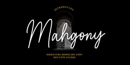 Mahgony is a signature monoline script font with unique and elegant curves. Features : uppercase, lowercase, symbol, number, ligature, and also support multi language. Mahgony is perfect for photography, watermark, social media posts, advertisements, logos & branding, invitation, product designs, label, stationery, wedding designs, product packaging, special events or anything that need handwriting taste.
 - Bellasia Hawainis by Inermedia Studio,
$15.00 Introducing the beautiful and delicate handmade Bellasia Hawainis Font. Fonts designed for your design and business needs. It has beautiful and charming letters with more than 150 characters. Subtle curves will make your business stand out even more in the market. A few Glyph and Swash will add a punch to your masterpiece.
 - Regan by The Northern Block,
$19.30 A finely crafted sans serif typeface with an uncomplicated appearance. Soft curves are mixed with minimal angles to create a readable font ideally suited for identity, editorial and online uses. Details include 10 weights with italics, 540 characters, 5 variations of numerals, small caps, stylistic alternatives, manually edited kerning and Opentype features.
 - Caliny by Marc Lohner,
$21.00 This cheerful font family combines cuteness and fun, making it a great choice for any kid’s app, book, toy, packaging, movie, theme park and so much more. Caliny’s curves are drawn with care and love. It covers more than 200 languages and has some advanced typographic features, like case sensitive forms to offer.
 - P22 Spiggie Pro by IHOF,
$24.95 Spiggie is a sans-serif, whose name came to me on a Shetland beach. The beach traces a tight curve between the shoreline and the sea paralleled in the fonts controlled yet smooth character. The design language reaches back to the art deco period and the 1920s, yet retains a distinct modern flavor.


